Custom Woven Labels for jewelry brands do more than identify a logo. They change how the packaging feels in the hand, how it photographs, and how deliberate the whole brand looks before the customer even opens the box. On a soft pouch, a folded insert, or a tied ribbon tag, that small textile detail can make the difference between packaging that feels finished and packaging that feels generic.
That is why Custom Woven Labels for jewelry brands keep showing up in premium product packaging and retail packaging programs that need a cleaner, more permanent look. A good woven label adds structure and texture; a poor one blurs the mark, frays at the edge, or looks mismatched against the rest of the package branding. The effect is immediate, and buyers notice it fast.
Why Woven Labels Change How Jewelry Packaging Feels
A jewelry purchase is often a touch-heavy experience. The customer lifts the box, slides out the pouch, unwraps tissue, and feels the fabric before they even see the piece. That is where a woven label earns its keep. It gives the hand something clean, tight, and intentional to read, which is a very different signal from a flimsy sticker or a fuzzy heat-transfer mark.
For many brands, the label is not really about identification alone. It is a cue that the business cares about details. A neatly woven brand mark on a velvet pouch or linen bag can elevate even minimalist packaging, while a label with weak contrast or uneven edges can make the whole set feel less considered. That matters because jewelry buyers are often reading quality through small physical cues.
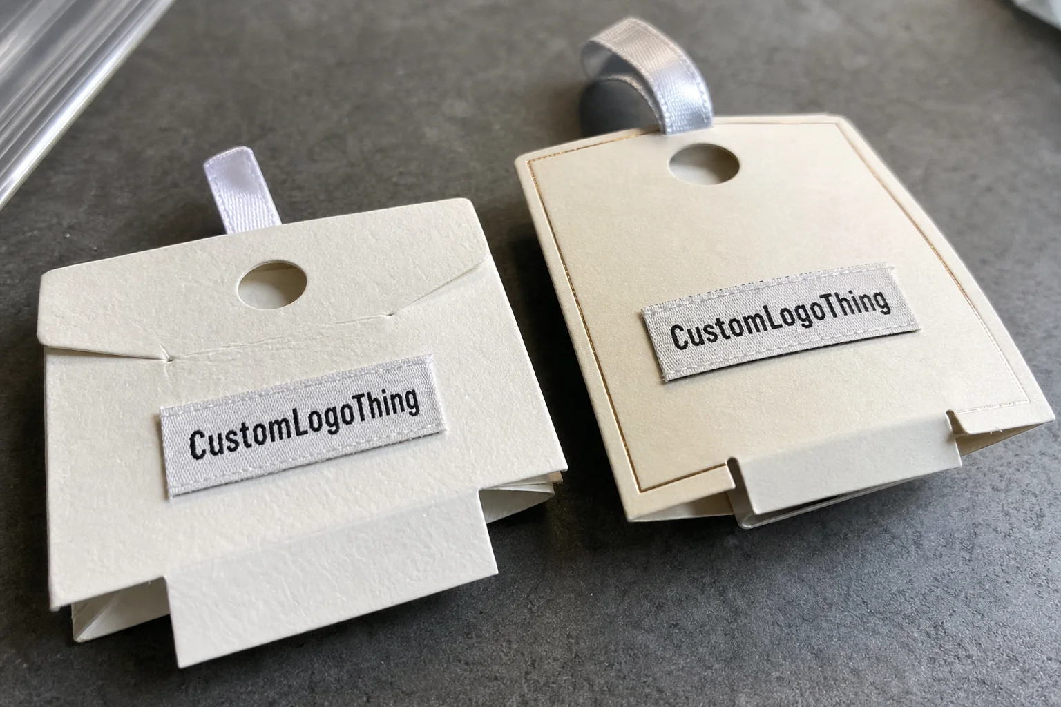
Common applications include pouch seams, dust bags, card sleeves, hang tags, and gift wrap accents. I also see woven labels used as small sewn tabs on presentation bags, where the textile finish matches the rest of the package instead of fighting it. In practice, this works especially well for brands that want custom printed boxes for the outer carton but still need a softer, tactile element inside the unboxing.
From a packaging design point of view, the label sits right at the intersection of aesthetics, durability, and production practicality. That is a useful place to be if your goal is a brand system that feels disciplined rather than decorative. For broader packaging formats that have to stay coordinated, Custom Packaging Products can help keep the system aligned.
A jewelry label should not feel like an afterthought. If the packaging is supposed to carry premium value, every visible material has to support that story, even the smallest woven tag.
How Woven Labels Are Built From Artwork to Finish
The production path is straightforward, but each step matters. It starts with artwork cleanup, where the logo is simplified for weaving. Then the file is digitized into a loom-ready format, which is not the same thing as simply sending a JPEG or PDF to press. After that comes loom setup, a sample weave or strike-off in many cases, cutting, folding, and final inspection.
That difference between woven and printed labels is important. Printed labels put ink on top of a substrate; woven labels build the mark into the structure itself. The result is usually sharper edge definition, a more textile-forward look, and better long-term wear. For jewelry packaging, that usually translates into a label that feels more composed and less disposable.
Thread choice and weave density do a lot of the visual work. A tighter weave can hold small letters and narrow icon details better, which is useful if your mark includes fine serif type, a delicate monogram, or a thin line illustration. If the weave is too loose, those details can collapse into visual noise. That is one of the main reasons buyers are sometimes disappointed after approving artwork that looked fine on screen.
Finishing changes how the label attaches and how it sits on the packaging. Common options include:
- End fold, which tucks the edges under for sewing into seams.
- Center fold, which works well as a loop around a pouch edge or ribbon.
- Loop fold, which gives a compact hanging presentation.
- Straight cut, which is useful when the label will be attached in a custom way later.
There are limits, and it is better to know them early. Very small text, gradient-heavy artwork, and ultra-thin lines usually need simplification before weaving. If a logo depends on delicate shading or intricate detail, it may still work, but it has to be adapted with care rather than copied line for line.
Spec Choices That Matter for Small Luxury Packaging
Size is the first decision that affects readability. Jewelry packaging often has limited space, so the label has to fit the pouch, ribbon, or tag without overwhelming it. A label that is too large starts to look like a patch; one that is too small loses clarity, especially once stitching, fold allowances, and seam placement are accounted for. The finished size should be chosen from the actual package, not from the logo file alone.
Color contrast is the second major issue. A logo that looks crisp on a white screen can disappear on champagne satin, charcoal velvet, or natural linen if the thread colors are too close. Warm retail lighting and product photography also change how colors read. A dark mark on a mid-tone fabric usually photographs better than a low-contrast pairing, which is something brands often find out too late.
Backing choice depends on the application method. Sew-on remains the most common for pouch seams and soft goods. Iron-on can work on some textiles, although jewelry packaging rarely needs it unless the label is part of a broader textile system. Adhesive-backed options are useful for certain tags or rigid surfaces, but they are not ideal on textured fabrics. No-backing builds in flexibility, which can help if the finishing team is attaching labels in a custom workflow.
Edge finish and fold style change both durability and perception. A clean fold keeps threads tucked away and helps the label sit flatter. A straight cut can look fine, but it usually needs a careful application plan to avoid exposed edges. The feel matters too. Some brands want a crisp woven mark that stands away from the fabric slightly; others want a softer label that disappears into satin, velvet, or linen and lets the jewelry itself stay in focus.
If you are working across multiple packaging elements, consistency matters more than novelty. A woven label on a pouch, a matching card sleeve, and a tied wrap should look like they belong to the same brand system. That is part of package branding, not just decoration.
For material compatibility and sustainability considerations, it is worth checking references from FSC when your packaging includes paper-based components, and from EPA packaging guidance when you are making broader material decisions across the pack.
Process and Timeline for Custom Label Production
The best projects move quickly because the artwork and specs are ready before the first quote goes out. A clean inquiry should include the logo file, the target size, the intended application, the quantity, the color references, and the fold or backing preference. If the buyer has already checked the label against the pouch or box it will live on, the proof stage tends to be much cleaner.
Proofing usually covers logo cleanup, size confirmation, thread color selection, and the finishing method. This is where production decisions become real. A brand might think it wants a large label, but once it is mocked up against a jewelry pouch, the better choice is often smaller and more restrained. The reverse happens too: a tiny label that looked elegant in the file can vanish on the actual packaging.
Typical lead time depends on order size and complexity, but a simple woven label job often moves through proofing and production in about 12 to 15 business days after approval, with shipping added on top. More colors, more detail, specialty finishing, or a rush request can extend that. That is not a defect in the process; it is just how loom setup and quality checks work.
Shipping can matter as much as manufacturing if the labels are tied to a launch, a seasonal collection, or a rebrand. A label arriving three days late can hold up the final assembly of boxes, pouches, or tags. If the project is part of a broader packaging refresh, align the schedule with any custom printed boxes or retail packaging deliverables so the pieces do not land out of sequence.
One practical rule helps a lot: finalize the spec early. Small changes after proof approval create the most friction because they touch setup, thread selection, and often the proof cycle itself. That is why a buyer who can lock the artwork and application method before ordering usually gets better timing and fewer surprises.
Custom Woven Labels for Jewelry Brands: Cost, MOQ, and Quote Drivers
Price depends on a few concrete variables, not vague market conditions. Size, weave density, color count, finishing method, and total quantity are the biggest drivers. If a logo needs tight weave resolution, multiple thread colors, or a special fold, the quote rises because the setup and production time rise with it.
MOQ is another point buyers often underestimate. Lower quantities usually have a higher unit cost because the setup work is spread across fewer labels. Larger runs almost always make sense for jewelry brands that use the same pouch or card sleeve across multiple product lines, because the label can be reused across collections and still feel current.
| Option | Typical Use | What Drives Cost | Best Fit |
|---|---|---|---|
| Simple woven label | Pouches, dust bags, insert sleeves | Standard size, fewer colors, basic fold | Brands prioritizing value and clean branding |
| Detailed woven label | Monograms, fine marks, small logos | Tighter weave, more setup time, proof iterations | Brands with intricate logo design |
| Specialty finish | Premium packaging accents, multi-use labels | Custom backing, custom cut, rush timing | Launches with fixed deadlines |
A useful quote should include dimensions, fold style, intended use, quantity, artwork complexity, and whether the label is going on fabric, paper, or a rigid surface. Without that information, suppliers have to guess. Guessing is how pricing gets distorted and how expectations break down later.
The cheapest quote is not automatically the best value. If a low-cost option blurs the logo, frays at the edge, or feels out of place beside the rest of the product packaging, the brand pays for it in perception. For labels and related components that have to work together, Custom Labels & Tags is the most direct place to compare formats.
In buyer conversations, I usually steer the decision back to three questions: Does the label read clearly, does it fit the packaging, and does the price make sense over the full run? If the answer is yes to all three, the spec is probably balanced.
Common Mistakes That Make Jewelry Labels Look Off
The most common mistake is making the label too small for the logo. A mark that looks elegant at full size can collapse once it is reduced for a pouch seam or narrow tag. Tiny letters become unreadable first, then thin lines, then any decorative detail that was never meant to live at that scale.
Low-contrast color choices create another problem. A soft gold thread on beige satin may seem refined in a mockup, but under store lighting it can fade into the background. The same issue shows up in photography, where the label may look muddy instead of crisp. Strong contrast is not always the most luxurious choice, but it is usually the most reliable.
Overly complex artwork is a close third. Fine filigree, hairline strokes, and tiny type can all force the weave to soften detail. That is not a production mistake; it is a limitation of the medium. The fix is usually to simplify the logo a little rather than force the label to do more than the weave can reasonably support.
There is also a fit problem that shows up a lot: the wrong backing or fold for the surface. A stiff label on a soft pouch seam can pucker. An adhesive label on a textured surface can lift early. A straight-cut label attached without a clean finish can look unfinished. All of that changes the perceived quality of the packaging even if the weave itself is fine.
Finally, buyers sometimes approve artwork without checking how the brand name, website, or care text will read at the finished size. That is avoidable. The proof should be evaluated at the actual dimensions, not as a zoomed-in file on a monitor.
Expert Tips for a Cleaner, More Luxurious Finish
My first recommendation is simple: simplify the logo just enough to help the weave. That does not mean flattening the identity. It means protecting the brand mark by removing details that disappear at small scale. Script logos and jewelry emblems are especially sensitive to this, because elegance can turn into clutter very quickly if the weave is too busy.
Test the label against the real packaging color, not just the screen version. Thread palettes shift more than people expect once they are placed on satin, velvet, linen, coated paper, or uncoated paper. A thread combination that looked balanced in a proof file can feel too warm, too dull, or too close to the substrate in hand.
Consistency in placement matters more than many teams realize. If the brand uses the same label position across pouches, sleeves, and gift wrap accents, the whole set feels more disciplined. That repetition is part of strong packaging design because it teaches the customer to recognize the brand without forcing the logo to do all the work.
Order a sample or strike-off if the logo is detailed, the quantity is large, or the launch date is fixed. That small extra step often prevents expensive rework later. It is also the best way to confirm thread sheen, edge behavior, and exact readability before the full run starts.
In practical terms, the final luxury effect usually comes from a handful of small decisions: tighter edge finish, cleaner stitch placement, better contrast, and a label size that respects the package. None of those are dramatic individually, but together they make the label feel more expensive than the spec sheet alone would suggest.
The best-looking jewelry labels rarely rely on complexity. They rely on clear artwork, clean weave, and a fit that respects the packaging around it.
Next Steps Before You Request a Quote
Before you ask for pricing, gather the basics: logo file, target size, intended application, quantity, color references, fold preference, and any backing requirement. That gives the supplier enough information to quote accurately and prevents the common back-and-forth that slows everything down.
Then compare the label against the packaging it will actually live on. A woven label that looks great in isolation may be too wide for a pouch seam or too bold for a delicate box insert. Checking it against the real materials early catches scale and contrast issues before they become production problems.
It also helps to set priorities in order. Decide whether readability, softness, speed, or budget matters most. That order will shape the spec in a sensible way. If speed is critical, the artwork may need to be simpler. If softness is most important, the backing and fold should reflect that. If budget is the main concern, the design should be adjusted with setup and quantity in mind.
The most useful quote request is specific, not vague. Two realistic specs will usually produce better pricing and fewer revisions than one broad request asking for options. That is true whether the label is part of a pouch program, a box insert, or a broader branded packaging system with multiple touchpoints.
Done properly, custom woven labels for jewelry brands become a small but powerful part of the product story. The spec is clear, the artwork is simplified for weave, the label fits the packaging, and the timeline is built in from the start. That is the formula that keeps custom woven labels for jewelry brands looking polished instead of merely present.
What size custom woven labels work best for jewelry pouches?
Most jewelry pouches need a compact label that stays readable without overwhelming the product, often in the small-to-medium range rather than oversized branding. The final pouch width and seam placement should drive the size choice, and the logo should still read cleanly once it is reduced to that scale.
Are woven labels better than printed labels for jewelry packaging?
Woven labels usually feel more premium because the artwork is built into the fabric structure instead of sitting on top of it. Printed labels can work in some packaging setups, but woven construction is often the better fit when the brand wants texture, durability, and a more finished look.
How long do custom woven labels for jewelry brands usually take?
A typical project includes proofing, production, and shipping, so the total timeline depends on how fast the artwork and specs are approved. Simple orders move faster; detailed logos, larger quantities, and specialty finishing usually add time.
What affects the price most on a small woven label order?
Quantity, size, weave complexity, number of colors, and fold or backing choice usually drive the biggest pricing differences. Rush timing and custom finishing can also raise the quote, especially on smaller runs where setup costs are spread across fewer labels.
Can custom woven labels be used on jewelry boxes, pouches, and hang tags?
Yes, but the application method should match the surface, since a sew-on label, adhesive label, or attached tag each behaves differently. The safest approach is to plan the label around the full packaging system so the look stays consistent across every touchpoint.