Die cut labels printing looks simple until the job has to survive real packaging, real handling, and a real ship date. On a screen, it is easy to imagine a shape, trim it, and move on. In production, the cut can drift, adhesive can misbehave on a coated carton, and a clean-looking design can become costly the moment the path gets too complex.
For apparel brands, die cut labels do more than decorate a package. They can seal tissue, brand a mailer, dress up an insert, or replace a plain rectangle with something that feels intentional. Buyers notice surface details quickly, so the label has to do its job visually and mechanically. That only happens when material, finish, and application method are matched to the surface.
The cheapest quote is not always the cheapest label. A low number can hide weak adhesion, slow application, reprint risk, or a finish that scuffs before the parcel reaches the customer. The better question is whether the label performs on the package it will actually touch.
Why Die Cut Labels Printing Feels Simple Until It Hits Production
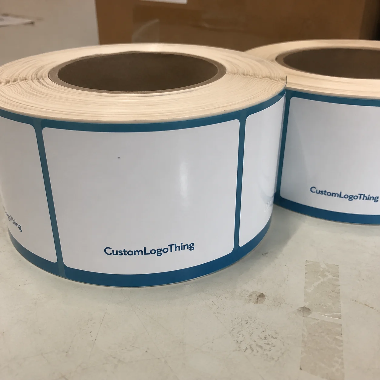
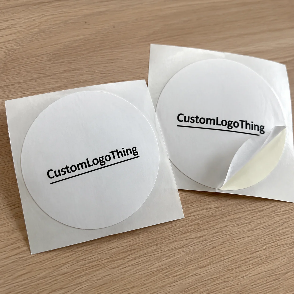
Die cut labels are custom-shaped labels trimmed to the outline of the artwork rather than a standard square or rectangle. That custom edge is the main appeal. A logo badge, crest, or simple mark feels more deliberate when the label follows the form of the design.
Brands use them for hang tag seals, care-label overlays, inserts, tissue wrap, mailers, and box branding. The same label often has to behave on more than one surface. Kraft board is not the same as coated cardstock, and poly mailers respond differently again. A label that sits flat on one surface may curl or lift on another. That is why die cut labels printing is not just an artwork choice. It is a substrate and adhesive decision.
Shape drives risk. Smooth outer curves are easy to run. Sharp inside corners, tiny cutouts, and thin connecting bridges slow production and increase waste. A file can look elegant and still be a poor production candidate.
Buyers often focus on the proof and forget how the label will be applied, stored, shipped, and opened. Those stages matter. A label that opens the package neatly and stays put during transit is useful. One that curls at the edges or leaves residue is not.
How Custom Die Cut Labels Are Made From File to Finished Roll
The process starts with file review. A printer checks the vector artwork, confirms the final size, and creates or verifies the dieline. The dieline is the cut map. It shows where the label will be trimmed, where the bleed extends, and where the safe area begins. If the linework is messy, production has to compensate for it, and small errors become visible in the final stack.
For die cut labels printing, the cut path should usually live on a separate vector layer with a clearly named outline. Bleed needs to extend beyond the cut edge. Text, logos, and critical details need margin inside the trim. Tight borders are risky because even a small shift can make the border look uneven or clip a stroke.
Print method depends on quantity and repeatability. Digital printing is usually the best fit for shorter runs, faster turnarounds, and variable artwork. Flexographic printing becomes more economical as volume rises and the artwork stays stable across reorders. Offset printing can still make sense for some paper-based work where fine detail and color control matter, though it is not the default for every label job.
Color management is another quiet decision with visible consequences. CMYK is common. Spot colors are used when brand matching needs tighter control or when a specific ink build is safer than a screen approximation. If a brand color has to stay consistent across SKUs and reorders, that is a quality control issue, not a cosmetic preference.
After printing, the labels move into finishing. That can include die cutting, kiss cutting, slitting into rolls, sheeting, varnish, or lamination. Roll format is typical for hand application or dispenser use. Sheet format is often easier for packing teams that store labels flat or apply them in batches.
Before shipment, the order should be checked for cut registration, color consistency, adhesive behavior, and edge quality. Good production teams look for misalignment, lifting, smudging, and inconsistent release before the job leaves the press.
Material, Adhesive, and Finish Choices That Change Performance
Material choice does most of the heavy lifting. Paper stocks are common for lightweight packaging, short-term branding, and lower-cost runs. Film materials such as polypropylene or polyester are a better fit when moisture, abrasion, or transit handling are part of the spec. Specialty stocks can add texture or a more premium feel, but they also change the price and can be less forgiving on uneven surfaces.
Adhesive is where many buyers under-spec the job. A medium-tack adhesive is often the safest starting point for apparel packaging because it usually holds on coated paper, cardboard, and Poly Mailers Without becoming a removal problem. Low-tack options can work for temporary promotions or secondary inserts. High-tack adhesives are useful when the label must stay put through shipping friction, but they can be too aggressive for delicate packaging.
Finish changes both appearance and performance. Matte reduces glare and usually improves readability under harsh lighting. Gloss increases color punch and can make a design feel brighter, though it can also show scuffs more easily. Soft-touch has a premium feel, but it is not always the right answer if the label will be stacked, rubbed, or handled often. Lamination adds scuff resistance and some moisture protection, but it also changes the tactile feel and increases cost.
Environmental conditions matter. Humidity can soften paper-based labels. Friction in transit can dull glossy surfaces. A textured kraft board can reduce edge hold. Labels also behave differently on curved mailers than they do on flat cartons. A one-surface test is not enough. Test the actual package types that will be used in fulfillment.
For brands that care about sourcing, ask whether the stock is FSC-certified or otherwise traceable. That information should live in the spec sheet, not in the sales pitch. If a sustainability claim is part of the packaging story, the label construction should support it. The FSC standard is a reasonable starting point: fsc.org.
If shipping durability is part of the requirement, it is also worth looking at packaging test resources from organizations such as ista.org. Labels are judged twice: once at application, and again after vibration, stacking, temperature swings, and handling.
Shape, Size, and Artwork Rules That Keep Labels Clean
Shape is where die cut labels printing can either feel polished or become difficult to produce. Simple outlines are easy to manage. Complex silhouettes, very tight interior cutouts, and thin bridges between design elements create more opportunity for failure.
For clothing brands, useful label sizes usually sit in the middle: large enough to hold the logo, small enough to stay out of the way of the packaging. A 2 x 3 inch or 3 x 4 inch label is often enough for a mailer seal or a short brand statement. Smaller labels usually work better on tissue wrap, where the goal is subtlety rather than dominance.
Typography needs to survive the real process, not just a zoomed-in PDF. Hairline strokes, tiny serifs, and very small text can disappear after trimming and handling. Keep legal copy, if it must exist, separate from decorative type so the branding does not inherit the burden of being readable at a distance and legible after the trim.
Clean files speed up approval. A proper bleed, a clear trim outline, and a separate dieline layer save time for prepress and reduce the chance of a mistake slipping into production. Flattened artwork with no clear structure usually causes back-and-forth.
A label that looks precise on screen but fails at the edge is usually a file problem, not a printing mystery.
Roll direction and core size matter too if the labels will be used with applicators. So does gap spacing. Those details may look minor in a quote request, but they affect production and can create stoppages if they are wrong.
Cost, MOQ, and Quote Drivers That Move Your Price
Most pricing swings come from a short list of variables: quantity, size, shape complexity, material, adhesive, finish, and whether the job is a repeat or a one-off. Simple labels printed digitally in modest volume can be cost-effective. Short runs with premium films, custom shapes, and protective lamination move the price up quickly.
MOQ, or minimum order quantity, exists because a printer has to pay for setup, calibration, inspection, and handling before the first usable label is packed. Lower minimums are convenient, but they usually come with a higher unit cost. For a new packaging design, a smaller order is often the rational choice because it reduces the cost of being wrong.
In broad terms, small custom runs can land anywhere from a few cents to well under a dollar per label depending on construction, with premium short-run jobs sitting higher. Larger repeat orders usually drive the per-unit price down once the press is running consistently.
| Option | Typical Use | Price Pressure | Practical Tradeoff |
|---|---|---|---|
| Paper, digital print, basic die cut | Short-run packaging seals and inserts | Lower | Good value, but less durable on rough surfaces |
| Film, digital print, medium-tack adhesive | Poly mailers, coated cartons, transit-safe branding | Middle | Better performance, moderate cost increase |
| Premium stock, lamination, custom shape | High-visibility apparel presentation | Higher | Stronger shelf appeal, more setup and finish cost |
| Large repeat run, flexographic printing | Consistent branded packaging across many SKUs | Lowest at scale | Best unit economics, but only once volume justifies setup |
Comparing quotes only works if the specs match: same quantity, stock, adhesive, finish, and packing format. A cheaper quote on a different construction is not a useful comparison. It is just a different product with a different number.
Hidden costs are worth watching. Artwork revision fees, rush charges, special carton packing, and reprints caused by weak files can change a quote quickly. Ask how many proof rounds are included and whether there is a fee for dieline creation.
Production Steps, Timeline, and Approval Gates
The cleanest jobs follow a predictable sequence: quote request, file review, proof creation, approval, print production, cutting, finishing, quality check, and shipment. If one step is vague, the schedule starts to slip because production depends on sign-off.
Lead time depends on complexity. A repeat label with approved artwork and an unchanged spec can move quickly, sometimes in about 3 to 5 business days after approval if the queue is open. A new die cut shape, a material change, or a finish that needs extra testing can push the job into the 7 to 15 business day range, sometimes longer if revisions stack up.
Missing dielines are a common delay. So are late approvals and copy changes after proofing has started. That creates rework, and rework always costs time. A printer that pushes back on unclear artwork is usually protecting the run from avoidable waste.
Before production begins, there should be an explicit approval gate. Confirm size, material, adhesive, finish, format, quantity, and target ship date. If the label must align with a folded tissue edge or a carton flap, the application method should be part of that approval too. A proof is not just a visual. It is a production agreement.
For buyers managing multiple SKUs, archive the final spec after the first approved run. Keep the dieline, final PDF, material code, adhesive note, and format together. Reorders become faster, and the risk of someone remembering the old version incorrectly drops sharply.
Common Mistakes, Expert Checks, and Next Steps
The mistakes that hurt results most are usually basic. They are also easy to prevent once they are named clearly.
- Approving artwork without a physical sample or press proof.
- Using type that is too small to survive trimming and handling.
- Choosing the wrong adhesive for coated paper, plastic, or textured board.
- Ignoring how the label behaves after transit, stacking, or temperature swings.
- Comparing quotes with different materials and treating them as equivalent.
One of the best checks is also the least glamorous: test the label on the actual surface it will touch. Not a random sample board. The actual mailer. The actual carton. The actual tissue wrap. Cardboard, poly, and coated paper behave differently, and that is usually where problems start.
Another useful check is to view the proof at practical size, not only zoomed in. A mark that reads well at 400 percent may be too delicate once it is cut and handled. Dense black on matte stock may look stronger than the same artwork on gloss.
If you are planning a new order, keep the pre-order checklist tight: final artwork, dieline, quantity, finish, adhesive, packing format, target ship date, and application surface. If the supplier asks for more context, give it before requesting the final price.
For Brands That Need a cleaner buying process, request a sample or proof first, then compare two or three quotes using identical specs. Confirm the full run only after the sample passes real-use testing. That is the practical way to avoid a proof that looks fine but fails in fulfillment.
Die cut labels printing works best when the label is treated as part of the packaging system, not as decoration added at the end. Get the file right, choose the adhesive for the surface, match the finish to the handling, and verify the label under shipping conditions before the full run starts.
How does die cut labels printing differ from standard label printing?
Die cut labels are trimmed to a custom outline, while standard labels are usually rectangles or squares. The custom shape gives apparel packaging a more tailored look, but it also adds more work around the dieline, bleed, and cutting process. The file has to be prepared more carefully.
What affects the price of die cut label printing most?
Quantity is usually the biggest driver because setup cost gets spread over the run. After that, shape complexity, material, adhesive strength, and finish all move the price. Rush timing, packing format, and file revisions can push costs higher too.
Which adhesive is best for clothing labels and packaging?
A medium-tack adhesive is often the safest starting point for clothing packaging because it usually holds well without being overly aggressive. The right choice depends on the surface. Test on coated paper, plastic mailers, and textured cartons separately before placing a full order.
How long does die cut labels printing usually take?
Simple repeat orders can move quickly once the proof is approved and the press schedule is open. New custom shapes take longer because they need dieline checks, proofing, and sometimes sample approval. Clean vector files and fast sign-off reduce lead time.
What should I send for an accurate quote on die cut labels printing?
Send the final artwork, target quantity, finished size, shape, substrate preference, adhesive type, and finish. Include how the label will be used so the printer can recommend the right construction instead of guessing. If you already have a dieline, attach it. If not, ask for one before pricing so the quote matches the actual job.