Buyer Fit Snapshot
| Best fit | Foil Stamped Logo on Boxes projects where brand print, material claims, artwork control, MOQ, and repeat-order consistency need to be specified before quoting. |
|---|---|
| Quote inputs | Share finished size, material target, print colors, finish, packing count, annual reorder estimate, ship-to region, and any compliance wording. |
| Proofing check | Approve dieline scale, logo placement, barcode or warning zones, color tolerance, closure strength, and carton packing before bulk production. |
| Main risk | Vague material claims, crowded artwork, missing packing details, or unclear freight terms can make a low unit price expensive after revisions. |
Fast answer: Foil Stamped Logo on Boxes: Design, Cost, and Process should be specified like a repeatable production item. The safest quote records material, print method, finish, artwork proof, packing count, and reorder notes in one written spec.
Production checks before approval
Compare the actual filled-product size with the drawing, then confirm tolerance on folds, seals, hang holes, label areas, and retail display edges. Reserve space for logos, QR codes, warning copy, and material claims before decorative graphics fill the panel.
Quote comparison points
Review material grade, print process, finish, sampling route, tooling charges, carton quantity, and freight assumptions side by side. A quote is only useful when the supplier can repeat the same color, closure quality, and packing count on the next order.
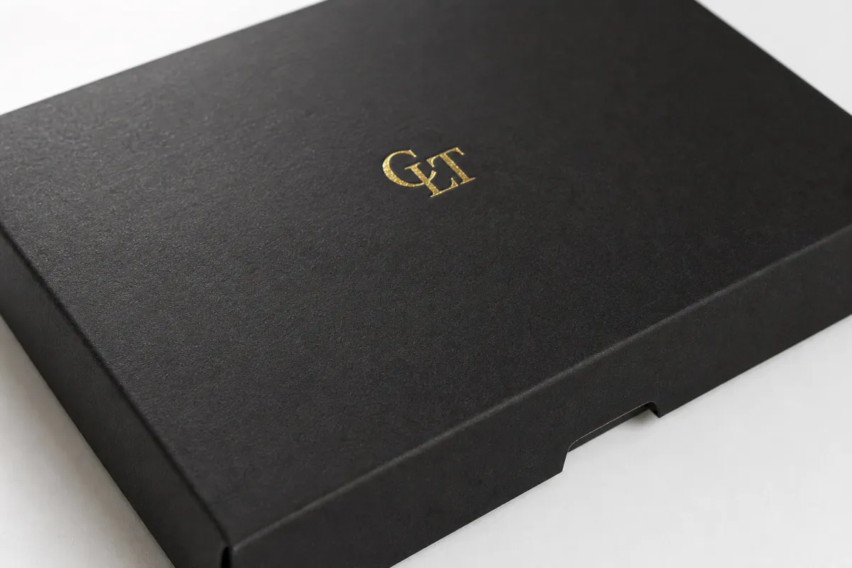
A foil stamped logo on boxes changes the first few seconds of a packaging experience. The eye catches the metallic detail before a customer reads the copy or studies the carton structure, and that quick flash of light does a lot of heavy lifting. It tells the shopper the package was designed with intention instead of tossed together as an afterthought.
That is why this finish keeps showing up on gift sets, subscription mailers, cosmetic cartons, and premium retail packs. A foil stamped logo on boxes gives the surface a signal of care, but it does not need to shout to do the job. I have seen plenty of projects where one clean mark on the lid did more for the brand than a full-panel treatment ever could.
Most buyers do not ask whether foil looks attractive. They ask how the foil stamped logo on boxes will behave on the chosen board, how much setup the artwork will require, and whether the finish supports the brand story without adding unnecessary cost. A good place to start is the box style itself, and the formats in our Custom Packaging Products lineup offer a practical look at what can be decorated cleanly.
Foil Stamped Logo on Boxes: Why It Changes the Shelf Story
A foil stamped logo on boxes works because it creates a reflective surface that printed ink cannot match in the same way. Light moves across the foil as the box moves, which gives the logo presence from several feet away on a shelf and adds a small reveal during unboxing before the lid even opens. That moment is a big reason foil still feels premium, even though the process itself is based on straightforward heat and pressure.
The foil is not sprayed, brushed, or laid down like ink. A thin metallic or pigmented layer transfers from a carrier film onto the board under a heated die, so the logo sits as a crisp decorative surface rather than a flat printed patch. That is what gives a foil stamped logo on boxes a controlled, intentional look. With clean artwork and the right stock, the result can feel formal, celebratory, heritage-driven, or minimal, depending on the rest of the design.
Buyers sometimes overcomplicate the effect before they even settle on the structure. A foil stamped logo on boxes can feel expensive with a very small decorated area if the layout is disciplined. A single logo on the lid of a rigid set-up box often says more than full-panel decoration, especially when the carton has a strong color, good board weight, and enough negative space to let the metal finish breathe.
The finish signal never comes from foil alone. The board, the fold style, the print finish, and the amount of coverage all shape the final impression. A foil stamped logo on boxes can look quiet and tailored on a matte black coated carton, or bright and celebratory on a cream board with a warm gold foil. Same process, different personality.
From a production point of view, the cleanest jobs usually start with restraint. If the brand mark is strong, the foil does not need to race it. A small logo centered well on the lid often feels more confident than a crowded panel trying to prove a point.
“The best foil work usually looks restrained in the file and rich in the hand. If the logo is doing too much, the box starts to lose the premium feel you were trying to create.”
That is why the finish matters so much on launch kits, event boxes, holiday packs, and any carton that needs to do part of the selling before the product is opened. A foil stamped logo on boxes can signal trust, gift-worthiness, and brand discipline in one move, but only if the design is built to suit the substrate instead of fighting it.
How a Foil Stamped Logo on Boxes Is Made
The mechanics are simple, even if the setup work is not. A foil stamped logo on boxes starts with artwork that is converted into a die or plate. That die is mounted in a press, heat and pressure are applied, and the foil transfers onto the surface where the design lands. The foil itself usually has a carrier film, a release layer, a color or metallic layer, and an adhesive layer that activates under the right temperature and pressure.
The press operator balances several variables at once. Temperature, dwell time, and pressure all shape how cleanly the foil releases, and the ideal setting depends on the stock. Smooth coated board usually gives an easier transfer. Textured or soft-touch surfaces can require more testing because the surface texture interrupts contact points. A foil stamped logo on boxes that looks flawless on screen may still need a physical proof before production is locked.
The die matters as well. Magnesium dies are often used for shorter runs or faster turnaround because they are relatively economical and quick to make. Brass dies last longer and can be the better choice for extended runs or designs with finer detail that need repeatability. In both cases, the die controls the edges of the image, which is why clean vector artwork and sensible line weights matter so much for a foil stamped logo on boxes.
Registration is another detail that separates a tidy result from a frustrating one. If the foil needs to align with embossing, a printed border, or a specific panel edge, the press has to hold that position consistently across the run. Small shifts become obvious quickly, especially on dark boards or logos with thin type. A well-set foil stamped logo on boxes should look deliberate, centered, and locked in place, not like it drifted during the press cycle.
Here is the normal production flow in practical terms:
- Artwork and dieline are reviewed together so the logo lands on the right panel.
- The foil color, stock, and coverage area are confirmed before tooling starts.
- The die is made and mounted, then the press is calibrated on the actual board.
- A proof or sample is checked for edge quality, registration, and reflectivity.
- Full production runs, then the cartons are inspected, packed, and staged for shipment.
That sequence sounds ordinary, yet it is where most quality differences show up. A foil stamped logo on boxes that is planned well from the start usually has fewer surprises at press time, fewer rejected sheets, and a cleaner finish overall.
Foil Stamped Logo on Boxes Cost: What Actually Drives Pricing
Pricing for a foil stamped logo on boxes usually comes down to a handful of repeatable inputs: die creation, press setup, foil type, coverage area, quantity, and how many separate foil hits the design needs. A simple one-color logo on one panel is far easier to price than a large layout that wraps across multiple sides or combines foil with embossing. The more moving parts, the more setup time and the more careful the press work has to be.
In real quoting, the cleanest art is usually the least expensive to produce. A foil stamped logo on boxes with bold type and moderate spacing tends to run more efficiently than a design full of tiny serifs, hairline rules, or intricate line art. Larger filled areas also need attention because they can increase the chance of uneven transfer or visible texture variation. That is not always a deal-breaker, but it does affect labor, test sheets, and scrap.
Quantity matters a great deal. Small runs usually carry a higher unit cost because the setup is spread across fewer cartons, while larger runs tend to lower the per-box number. For example, a simple foil logo on a folding carton might land somewhere around $0.10-$0.25 per unit in a larger run after setup, while a short run can sit closer to $0.30-$0.75 per unit depending on board choice and finishing complexity. Tooling for a basic die may start around $75-$250, though more detailed or longer-life dies can cost more.
If the project includes embossing, spot UV, or a specialty board, the quote has to account for each stage separately. A foil stamped logo on boxes is often the first premium effect a brand wants, but it is not always the only one. The smartest quotes are built around the final dieline, the exact material, and the intended print stack, not around a rough idea of the box shape. That is where a clear spec sheet saves time and money.
I would also be careful with any quote that looks too neat without seeing the actual board. A small shift in coating, lamination, or carton construction can change the press setup enough to matter. The numbers below are useful for planning, but they are directional rather than universal.
| Project type | Typical setup | Indicative unit impact at 5,000 pcs | Best fit |
|---|---|---|---|
| Single foil logo on smooth folded carton | One die, one foil color, one press pass | $0.10-$0.25 | Retail cartons, subscription mailers, lightweight gift packaging |
| Foil logo on rigid box lid | One die, tighter alignment, thicker board | $0.18-$0.40 | Luxury sets, presentation boxes, launch kits |
| Foil plus embossing | Two-step or combined tooling | $0.25-$0.60 | Premium branding where depth matters as much as shine |
| Large foil coverage or multiple foil colors | More setup, more waste, more test sheets | $0.35-$0.85 | Seasonal packs, event editions, ornate brand systems |
Those numbers are directional, not universal, because stock choice and finishing stack can move them quickly. A foil stamped logo on boxes on a coated SBS or C1S board will usually be easier to decorate than the same art on a textured or soft-touch surface. If you are building a quote from scratch, it helps to share the box size, quantity, foil color, artwork file, and target ship date all at once. That is the fastest path to a realistic number on Custom Packaging Products that matches the job instead of guessing at it.
Production Steps and Timeline for Foil Stamped Boxes
The schedule for a foil stamped logo on boxes is usually shaped more by approval and tooling than by the foil transfer itself. A straightforward project often moves through artwork review, proof approval, die making, press setup, production, and inspection. If the dieline is final and the art is ready, the process stays clean. If the logo keeps moving, the timeline stretches. That part is not glamorous, but it is the reality of packaged goods work.
In many production schedules, the longest lead items are the die and the press slot. A foil stamped logo on boxes may only need a single decoration step, but the die still has to be manufactured and mounted correctly, and the press has to be available at the right time. Common lead times can land around 10-15 business days after proof approval for a simple project, while more complex boxes or multi-step finishes can push closer to 15-20 business days or more depending on workload and stock availability.
Rush orders can happen, but they usually come with tradeoffs. You may lose some stock choices, or the art team may have to approve proofs faster than feels comfortable. Sometimes the charge is higher because the job needs special scheduling, overtime, or expedited tooling. A foil stamped logo on boxes can still be rushed responsibly, but the box style and decoration stack need to support that pace. If the project requires a laminated rigid box, an insert, and two decoration processes, the calendar will not behave like a simple folding carton.
For shipping-heavy packaging, teams sometimes validate the finished pack against ISTA testing guidance or similar distribution thinking, especially if the decorative finish must survive handling as well as display. A foil stamped logo on boxes should not just look good on the bench; it should also hold up through carton movement, pack-out, transit, and shelf presentation. That is particularly true for e-commerce mailers and club-store packs where edges take repeated contact.
A good planning rule is simple: lock the dieline first, lock the material second, and lock the artwork third. When those three pieces move together, a foil stamped logo on boxes is much easier to schedule cleanly and much less likely to end up in a last-minute revision loop.
Materials, Artwork, and Finish Choices That Shape the Result
The surface is half the story. A foil stamped logo on boxes usually looks crispest on smooth coated paperboard because the die has consistent contact and the foil releases evenly. Coated SBS, C1S artboard, and other smooth premium boards tend to be the easiest surfaces to control. Uncoated papers can still work, but they may pull a little more texture into the final mark. Textured and specialty stocks can be beautiful, though they nearly always deserve a sample run before production is locked.
Soft-touch lamination deserves special care. It feels rich in the hand, but it can slightly change the way the foil releases, especially if the artwork contains small details or tight spacing. A foil stamped logo on boxes over soft-touch material often benefits from a bolder logo, a slightly larger type size, and a test proof on the exact board. The same idea applies to corrugated board and rigid board: both can look excellent, but the surface construction and fiber movement are different enough to affect the final result.
Artwork should be built for the process, not just for the brand deck. Bold type, clean vector shapes, and moderate spacing usually stamp better than fine-line art or tiny punctuation. If the logo includes a lot of narrow counters, the foil can close in and reduce readability. A foil stamped logo on boxes is most effective when the design gives the press room to breathe. That does not mean the logo has to be big. It means the shapes need to be disciplined.
- Gold foil often reads classic, warm, and gift-ready.
- Silver foil feels cleaner, cooler, and more contemporary.
- Black foil can be subtle on light stocks and sharply elegant on deep colors.
- Holographic foil is better for short-run energy than quiet luxury.
- Specialty colors work well when the brand system already leans that way.
Brand fit matters as much as reflectivity. A foil stamped logo on boxes can feel modern when paired with a minimal serif or a clean sans-serif and plenty of white space. The same foil can feel vintage if the logo is ornate and the board has a textured or natural finish. If the brand wants a premium but restrained look, a small logo with one thoughtful foil color often beats a large area of decoration. That is especially true on subscription boxes and product presentation kits where the unboxing sequence is part of the experience.
For teams sourcing responsibly, it is worth checking whether the board can be specified with FSC certification and confirming chain-of-custody paperwork with the printer or converter. The FSC framework is widely recognized, and it gives buyers a clean way to document sourcing choices without guessing about the paper trail. A foil stamped logo on boxes can still be premium and still be sourced thoughtfully; those goals do not fight each other.
Combination effects can help, but only when they are used with restraint. Embossing adds depth, debossing gives a quieter impression, and spot UV creates contrast around the logo. A foil stamped logo on boxes paired with embossing often feels the most dimensional, though it adds another layer of tooling and registration work. If the artwork is already strong, the smartest finish is not always the busiest one.
Common Mistakes When Ordering Foil Stamped Packaging
The most common mistake is treating a foil stamped logo on boxes like a digital effect that can be fixed later. It cannot. The substrate, the artwork, and the press setup all need to be aligned before the run starts. If the file is crowded or the box material is wrong, the foil will show those problems immediately. Hot stamping has a way of being honest.
“If the logo needs a microscope to look impressive in the file, the press will not rescue it. It will usually make the weakness easier to see.”
Here are the errors that come up most often in real production work:
- Overly fine artwork: Hairline strokes, tiny serifs, and crowded letter spacing can fill in or lose edge definition.
- Only approving on screen: A digital mockup cannot show how the foil behaves on the actual board surface.
- Choosing the wrong substrate: A foil stamped logo on boxes may look sharp on one stock and blotchy on another.
- Too much foil coverage: Large filled areas can feel heavy and increase the cost without improving the brand signal.
- Ignoring production timing: Late approvals, missing dielines, and shifting quantities create avoidable delays.
One thing buyers often underestimate is how much the box surface changes the mood of the finish. A foil stamped logo on boxes can look bright and celebratory on a coated white board, but a little more subdued on a natural or textured stock. That is not a defect. It is simply the material telling the truth about itself. The best projects let the stock do some of the work instead of asking foil to cover every branding need.
Another trap is overdecorating the carton because the brand team wants the box to feel expensive. In practice, a smaller logo in the right place often reads more premium than a large foil field with no breathing room. A foil stamped logo on boxes should support the hierarchy of the design, not flatten it. If the product name, brand mark, and finish all compete for attention, the effect gets noisy fast.
For shipping or retail programs that need repeatability, it also helps to keep the artwork and the ordering process simple. A foil stamped logo on boxes becomes much easier to run when the dieline is final, the run quantity is stable, and the proof is approved without last-minute changes. That discipline saves money, but more importantly, it protects the look of the packaging across the entire lot.
Expert Tips and Next Steps for Your Foil Stamped Logo on Boxes
If you want the best result, start with the final structure before you polish the artwork. A foil stamped logo on boxes behaves differently on a folding carton, a rigid set-up box, and a corrugated mailer, so the box style should be locked before anyone starts making design compromises. Once the structure is set, the logo can be sized, positioned, and spaced in a way that matches the surface instead of fighting it.
Ask for a sample whenever the schedule allows it. A foil stamped logo on boxes can look brighter, flatter, or more textured than expected depending on the stock and the foil color. A physical proof takes the guesswork out of the job, and it helps everyone agree on what premium actually means for that specific project. If the carton will be opened under store lighting, shelf lighting, or indoor shipping light, test it under those conditions too.
My practical advice is to keep the foil area deliberate. A focused mark often feels more refined than a logo that tries to cover too much of the panel. That is why a foil stamped logo on boxes usually performs best when the mark is intentional, well placed, and supported by enough quiet space around it. The eye needs a resting point. Without that, even good foil can start to look busy.
If you are comparing box formats or planning a new launch, start by gathering the dieline, quantity, board choice, target ship date, and preferred foil direction. Then match that brief against the right packaging style from our Custom Packaging Products catalog so the structure and decoration work together from the start. A foil stamped logo on boxes is one of the simplest ways to make packaging feel premium, but it only works at its best when the material, artwork, and schedule are all aligned. Get those pieces right, and a foil stamped logo on boxes will do exactly what it is supposed to do: make the box feel worth opening before the product is even seen.
What is the difference between a foil stamped logo on boxes and metallic ink?
Foil stamping transfers a thin metallic or pigmented film with heat and pressure, while metallic ink is printed like a normal color layer. A foil stamped logo on boxes usually looks sharper and more reflective, especially on clean type and logo marks. Metallic ink can be useful for budget-sensitive jobs, but it usually does not match the depth or edge crispness of true foil.
What box materials work best for a foil stamped logo on boxes?
Smooth coated paperboard usually gives the cleanest transfer and the most predictable result. Uncoated, textured, and specialty stocks can still work, but they often need testing because the foil behavior changes with the surface. Heavy corrugate and assembled rigid boxes are also possible, as long as the structure and finish are checked before production.
How much does a foil stamped logo on boxes usually cost?
Pricing depends on setup, die creation, foil type, number of foil areas, and the total quantity ordered. Smaller runs usually have a higher unit cost because the setup is spread across fewer boxes, while larger runs usually lower the price per piece. If you want a clean quote, send the dieline, material choice, quantity, and target turnaround together.
How long does production take for foil stamped packaging?
The schedule depends on artwork approval, die making, press availability, and the board you choose. A simple foil-only project is usually faster than a design that combines embossing, spot UV, or multiple decoration steps. If you need a rush timeline, fast proof approval and flexible stock choices make a real difference.
Can I combine foil stamping with embossing or spot UV on the same box?
Yes, and that combination is common on premium cartons and presentation boxes. The design still needs to be checked for registration, line weight, and substrate behavior so the finishes do not fight each other. A physical proof is especially useful when the foil stamped logo on boxes is small or the alignment between effects has to be precise.


