Mesh trucker Hats Logo Placement looks easy until the artwork meets an actual cap. The front panel curves, the seam breaks the center line, and the mesh back makes the whole shape less forgiving than a flat mockup suggests. A logo that feels bold on screen can look crowded, distorted, or strangely small once it is stitched, patched, or printed onto the hat.
That is why placement is not a decorative afterthought. It affects legibility, cost, turnaround, and the decoration method you can realistically use. The goal is not to max out every inch of the crown. The goal is to make the logo read cleanly from a normal viewing distance and still look balanced after production does its usual little bit of damage.
The best mesh trucker Hats Logo Placement decisions start with a simple question: what needs to be seen first? Once that is clear, sizing, stitch count, color count, and decoration method all become easier to control. Skip that step, and the order usually turns into a round of avoidable revisions.
Mesh Trucker Hats Logo Placement: Why the Front Panel Is Not a Billboard
A trucker hat gives less usable room than most buyers expect. The front panel is the only part that behaves like a real canvas, and even that space is constrained by the bill seam, the curve of the crown, and the structure of the foam or buckram insert behind the fabric. On a standard structured trucker, a practical embroidery area often lands around 4.5 to 5.25 inches wide and 2.25 to 2.75 inches tall. Low-profile caps usually shrink that further. If the blank is soft-front or unstructured, the usable area can feel even tighter because the panel flexes more during wear.
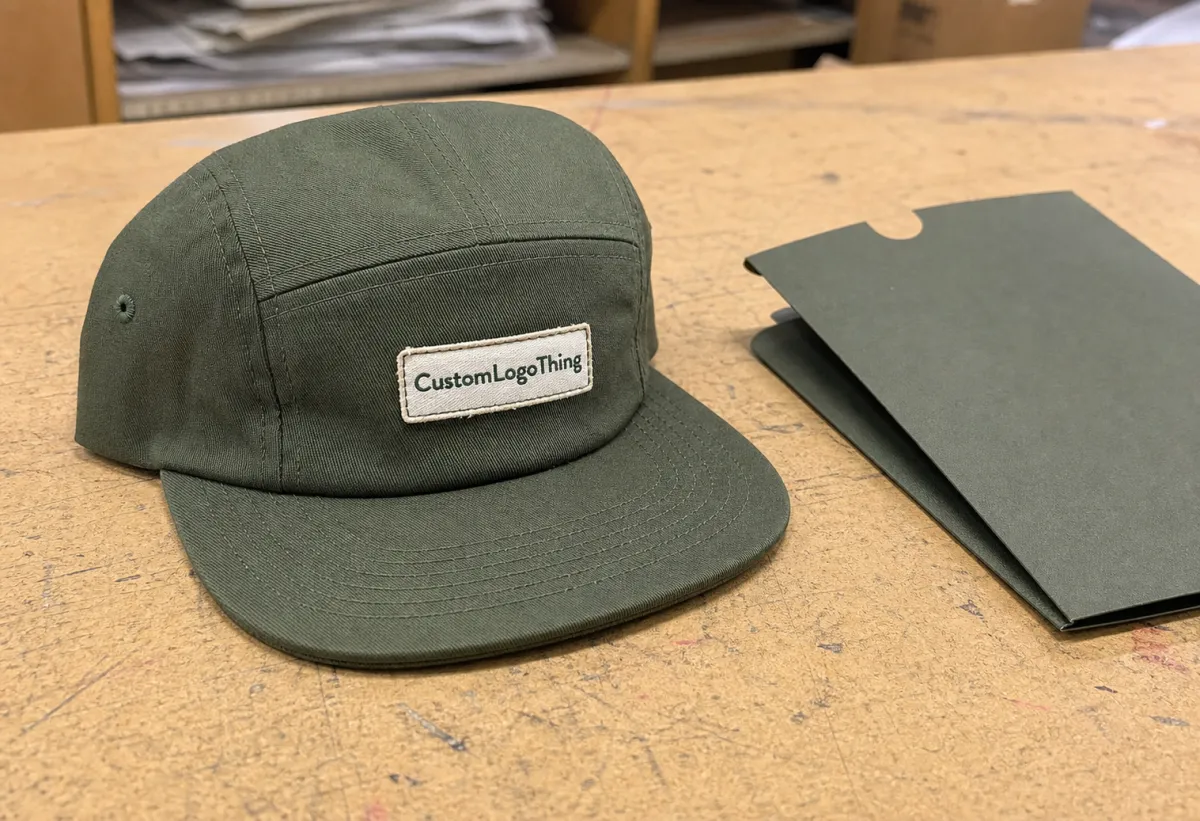
Most buyers are choosing between five placements: front-center, left or right side, bill, back tab, or a smaller mark near the lower front panel. Front-center gives the strongest visibility and the cleanest reading distance. Side placement works for secondary branding, event names, department IDs, or sponsor marks. The back tab is tiny by design. That is fine if the logo only needs to whisper. It is useless if it is supposed to carry the whole brand.
Mesh trucker Hats Logo Placement also changes with the hat build. Foam-front truckers usually accept larger graphics and sharper edges because the front is flatter. Fabric-front truckers sit somewhere in the middle. Mesh-back styles are more textured and more flexible, which means the same logo that looks polished on a foam front can feel cramped on a mesh cap. The decoration method matters too. A woven patch can tolerate more detail than direct embroidery, while a printed mark may look clean but only if the front panel is stable enough to hold it.
There is a reason experienced buyers favor restraint. A logo that fits the panel is not automatically a logo that reads well. On hats, bold and clean usually beats large and crowded. A smaller mark with proper spacing often looks more premium than a stretched design that tries to occupy every available millimeter.
A hat is not a poster. If the logo needs to fight the seams, it is already losing.
From a practical sourcing angle, the easiest wins usually come from choosing one focal point and letting the rest of the crown stay quiet. That does not mean shrinking the brand into anonymity. It means using the cap shape honestly instead of pretending the front panel is wider than it is.
How Mesh Construction Changes Embroidery and Print Behavior
Mesh changes the rules. Embroidery needs a stable surface because the needle pulls thread through the cap and the stitch structure depends on the fabric staying put. The more open the material, the more likely a fine line will buckle, blur, or disappear after the hat flexes a few times. Thin strokes, tiny lettering, and dense fill patterns are the first things to fail. A logo with delicate cutouts may look tidy in a vector file and still come out messy on a curved crown.
Print behaves differently, but it is not magically safer. Heat transfer, screen print, and similar methods are best suited to structured, flatter areas. Open mesh back panels do not offer enough surface for consistent adhesion, so decoration usually stays on the front panel or another solid section. If someone suggests printing a large logo across the mesh itself, ask how it is being attached and how it is expected to hold up in use. Most of the time, the honest answer is that it will not hold up very long.
That is why hat style matters as much as the artwork. A high-crown trucker gives more vertical room and usually handles a larger center logo better. A low-profile trucker pulls the design lower and tighter, which makes compact badges, short wordmarks, and stacked text easier to read than long horizontal slogans. The same artwork can feel balanced on one crown and awkward on another. No mystery there. The hat shape is doing half the design work.
Decoration choice should follow the structure, not the other way around. One-location embroidery is often the cleanest and most durable option for front panels. Woven patches are useful when the artwork has too much detail for thread alone. PVC patches can handle bolder shapes and a more dimensional look, but they are not right for every brand. Print can work for certain front-panel applications, especially when the logo uses broad color blocks and limited detail. The problem is that every method carries its own trade-offs in cost, texture, and long-term wear.
For larger programs, quality also extends beyond the hat. Shipping, carton strength, and folding method matter if the order is moving through retail or fulfillment channels. Basic transit testing standards from ISTA are useful because crushed cartons can flatten crowns and make even a well-placed logo look sloppy when the box is opened. If the order includes hang tags or inserts, FSC-certified paper is a sensible choice when the packaging needs to match a cleaner sourcing story.
Panel Size, Stitch Count, and Artwork Limits That Decide Placement
The fastest way to avoid endless proof changes is to ask for the actual production limits before approving anything. Three numbers matter more than the mockup: maximum width, maximum height, and safe margin from the seam and bill. On trucker hats, a safe margin of roughly 0.125 to 0.25 inches from the seam is common, but the usable area shifts with crown height, insert stiffness, and the exact stitch path. A logo can be technically “fit” and still look wrong if it sits too close to the seam.
Stitch count is the other constraint that changes the whole equation. A simple one-color mark may digitize at 5,000 to 7,000 stitches. Add multiple colors, fills, outlines, and small lettering, and the file can jump to 10,000 to 14,000 stitches or more. More stitches usually mean higher cost and more chance that tiny details soften during production. A logo with thin script or negative space often looks better a bit smaller, because the embroidery machine is not especially sentimental about hairline detail.
Brand hierarchy should drive the layout. The main logo belongs on the front panel. A secondary icon can sit on the side. A short phrase or tiny wordmark can go on the back tab if it is there for recognition rather than impact. That order keeps the hat readable from a distance and prevents the front, side, and back from competing like they all paid rent.
- Front-center: Best for primary branding and the strongest first read.
- Side hit: Useful for sub-brands, sponsor marks, departments, or events.
- Back tab: Works for subtle identification, not for a main logo.
- Lower front panel: Helpful on low crowns when the art needs to sit tighter.
File quality matters here too. A clean vector file lets the digitizer control stitch direction, underlay, and spacing. Raster files can be used for reference, but they are not the place to make placement decisions. If the logo relies on gradients, hairline strokes, or tiny type, simplify the art before production. That is not a design compromise. It is a survival tactic.
For buyers comparing mesh trucker Hats Logo Placement across multiple styles, one more detail pays off: ask whether the hat is structured, semi-structured, or unstructured. That one label changes how much the front panel can support, especially once thread tension and crown curve enter the picture.
Process, Proofs, and Turnaround: What Happens After You Approve Art
Most orders follow the same sequence: file review, digitizing, placement mockup, proof approval, sample or first-run confirmation if needed, production, and packing. The part that actually determines whether the logo sits well is digitizing. That is where the artwork becomes machine-ready. It is also where the design gets translated into a stitch map, so this is not the moment to assume the machine will “figure it out.” It will. Sometimes badly.
The proof is the checkpoint that matters. A proper proof should show the exact hat style, color, logo size, and placement relative to the seam and bill. A generic cap silhouette with your logo floating somewhere near the front is not a proof. It is a hope with a file attached. If the vendor cannot show how far the art sits from the seam, ask for a corrected mockup before approving anything.
Turnaround depends more on artwork readiness than on the blank itself. Repeat orders with no changes can move quickly. New logos, color adjustments, and layout revisions slow everything down. A simple repeat often ships in 7 to 10 business days after proof approval. New artwork or more complicated placements usually land in the 12 to 15 business day range, sometimes longer if the queue is packed or the order needs multiple proof rounds. Rush work can happen, but rush work costs more because production does not bend for free.
For a clean handoff, the order request should include the following:
- Send a vector file whenever possible, ideally AI, EPS, or PDF.
- Name the exact hat style and color, not just “truckers.”
- State the preferred placement in plain language.
- Approve the proof only after the size and balance look right on the actual crown shape.
If the order includes a patch, ask whether the patch is sewn, heat-applied, or both. If it is embroidery, ask how the underlay is being handled near the seam. If it is print, ask what surface the print is actually going on. Those questions sound small until the first sample shows you why they were worth asking.
Cost, MOQ, and Unit Price: What Actually Moves the Quote
Pricing is mostly a function of decisions. Hat style, decoration method, stitch count, color count, logo size, and the number of locations all affect the quote. Front-center embroidery is usually the least expensive and easiest to approve. Add a side hit, and setup and labor go up. Add a second decoration method, and the order gets more expensive again. None of that is mysterious. It is just labor plus time plus more opportunities for things to go wrong.
Minimum order quantity varies by supplier and by decoration type. Some quotes start at 24 pieces. Others begin at 48 or 72, especially when the job involves a specific blank or more complex production steps. Lower minimums are useful for testing a market or approving a new logo setup, but per-unit pricing usually improves once the order reaches 100, 250, or 500+ pieces.
| Placement option | Typical use | Common add-on cost | Tradeoff |
|---|---|---|---|
| Front-center only | Main logo, team name, retail branding | Baseline on most quotes | Best value and easiest to approve |
| Front + side hit | Sponsor mark, department ID, event branding | About $0.75-$2.00 per hat | More setup and slightly longer production |
| Front + back branding | Main logo plus small wordmark or slogan | About $1.00-$2.50 per hat | Back text must stay very small to read well |
| Two-location embroidery with larger stitch count | Premium merch or retail programs | About $1.50-$3.50 per hat | Higher cost, more proofing, more room for error |
For rough planning, decorated truckers often land around $8-$14 per hat at 48 to 72 pieces, $6-$10 per hat at 250 to 500 pieces, and $4.75-$8 per hat at 1,000+ pieces when the art is simple and the blank is standard. Better blanks, premium patches, custom color matching, and multiple decoration locations move those numbers upward quickly. That is normal. The quote is not just about the cap; it is about how much work the cap forces the factory to do.
Do not compare decoration price alone. Compare the total landed cost: hat, decoration, digitizing, samples, freight, and any packing extras. If there are branded inserts or retail cartons, ask whether they are included or billed separately. Small add-ons are rarely small on the invoice.
The cheapest quote usually belongs to the simplest setup. That is not a trick. It is arithmetic.
A practical buyer also checks what happens if the art changes after approval. A revision to size or placement can add a rework fee, a new digitizing fee, or both. That is another reason to settle the placement early instead of trying to rescue the logo after the proof is already locked.
The Placement Mistakes That Make Hats Look Cheap
The quickest way to make a good hat look bargain-bin is to stuff the artwork into a space that cannot support it. When the logo touches the seams, wraps awkwardly around the curve, or crowds the bill seam, it reads as forced. Tiny lettering and thin script disappear on curved mesh. Long taglines stretched across the front panel make the hat feel noisy, especially on low-profile truckers where the crown is already tight.
Color contrast causes just as many problems. Dark art on a dark panel can vanish. Pale logos on bright mesh can get washed out in daylight. A design that looks crisp on a white mockup may look dull on a heather gray, black, or navy cap. The only useful test is the actual colorway, not the cheerful template in the approval email.
Height matters, too. Too low, and the logo looks like it slipped toward the bill. Too high, and it feels detached from the crown. The sweet spot usually sits centered on the front panel with enough breathing room to feel intentional. There is a reason that placement gets used so often. It works.
Another common miss is approving a layout based on a screen preview instead of a production proof. Digital mockups hide seam interference, crown curvature, and thread distortion. They are useful for direction, not final judgment. A real proof is not a nuisance. It is where bad assumptions get interrupted before they become boxes of hats.
- Keep the logo away from seams and stitch breaks.
- Use bold shapes instead of fragile linework.
- Test contrast on the exact cap colorway.
- Approve the actual hat style, not a generic blank.
Packaging can also make a clean placement look sloppy if cartons get crushed in transit. That is not a decoration issue, but it becomes one the moment the hats arrive flattened and misshapen. Proper packing does not fix a bad logo layout. It does protect a good one.
Next Steps Before You Request a Quote
Before requesting pricing, get the artwork and the placement decision out of the fuzzy stage. Measure the logo. Decide which part must stay readable. Pick the exact trucker style. Then choose whether the front panel should carry the main mark or whether a smaller side or back treatment makes more sense for the budget and the use case.
The cleanest quote request includes three things: a vector file, the preferred hat style, and a short note about placement. If comparing options, ask for front-only, front-plus-side, and front-plus-back pricing. That gives a useful read on how much each extra location costs without turning the process into guesswork.
- Confirm the main mark: Decide which logo element must be seen first.
- Set the size: Give a width or height target, not just “make it big.”
- Choose the method: Embroidery, patch, or print should fit the design.
- Approve the proof: Check the balance against the actual cap shape.
- Lock the timeline: Get the ship date before production starts.
If the order includes tags, inserts, or retail packaging, keep those pieces on the same approval path. Mismatched packaging can make a polished hat program feel half-finished. Nobody wants the stitching to look careful while the carton looks like it survived a bad week.
For buyers comparing Mesh Trucker Hats logo placement across different styles, the practical rule is simple: preserve readability first, then cost, then decoration flair. Get the order of those priorities right and the hat usually looks better, ships cleaner, and costs less to fix.
Good placement is a geometry problem disguised as branding. Solve the geometry first. The logo will take care of the rest.
Where is the best logo placement on mesh trucker hats?
Front-center is usually the strongest choice because it gives the best visibility and the cleanest reading distance. If the logo is wide, detailed, or heavily scripted, a smaller front hit often looks better than a stretched design that crowds the seams.
Can mesh trucker hats logo placement include side or back branding?
Yes. Side and back placements are common for secondary branding, sponsor marks, or small team identifiers. Those spots work best with simple artwork because the available space is tight and the logo needs to read quickly.
Does embroidery work better than print for trucker hat placement?
Usually, yes. Embroidery handles the textured front panel and curved crown better than most print methods. Print can work on structured areas, but fine detail and edge durability are more limited on mesh-style caps.
How do I know if my logo is too big for the front panel?
If the art touches seams, wraps awkwardly around the curve, or needs tiny text to fit, it is probably too large. A mockup with healthy margin around the logo is a better sign than trying to use every millimeter of the panel.
What file should I send for mesh trucker hats logo placement?
Send a vector file whenever possible, such as AI, EPS, or PDF, so the artwork can be digitized cleanly. Include the preferred hat style, logo size, and placement notes so the proof shows exactly where the brand should sit.


