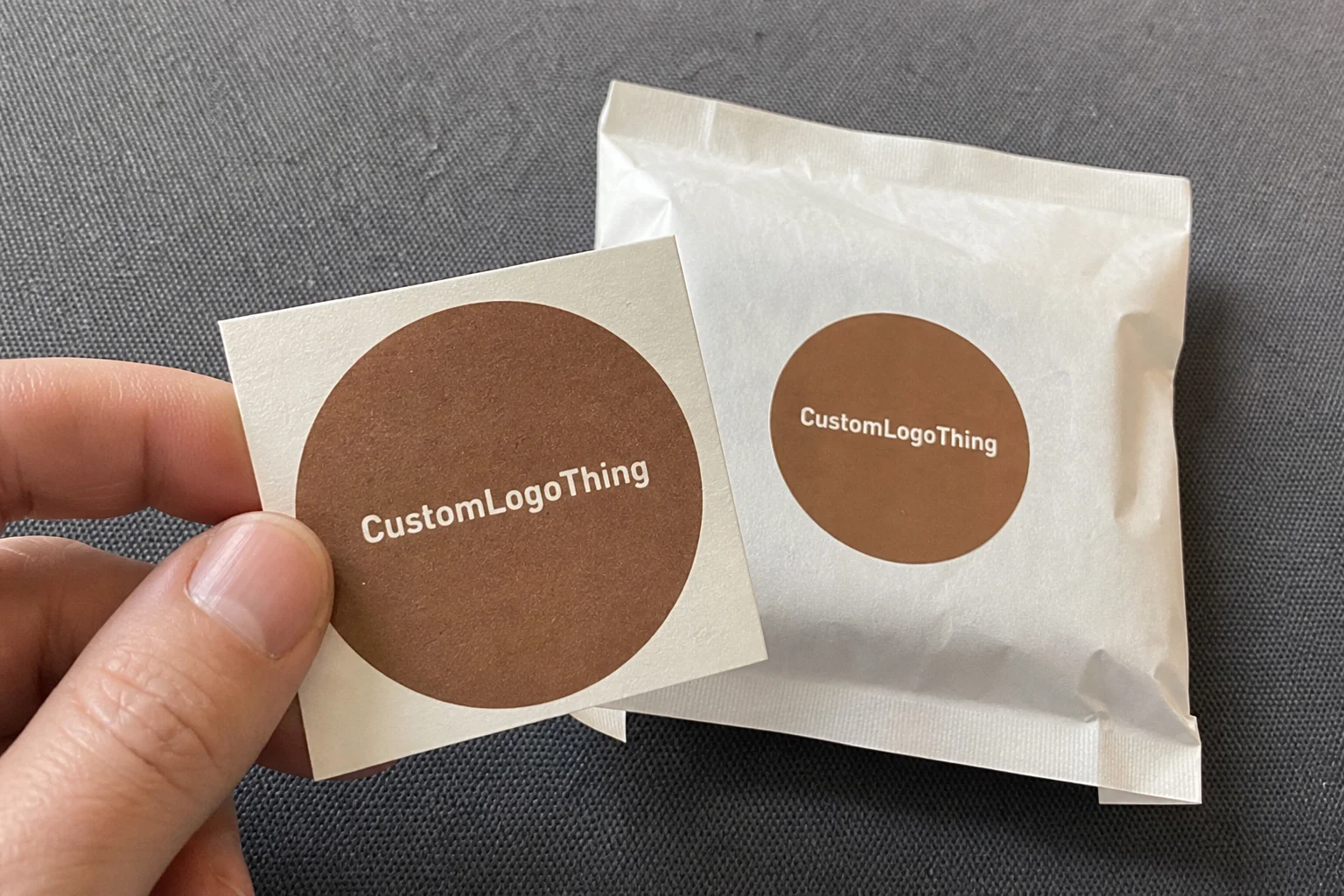
Buyer Fit Snapshot
| Best fit | Gourmet Chocolate Box Packaging Design projects where brand print, material claims, artwork control, MOQ, and repeat-order consistency need to be specified before quoting. |
|---|---|
| Quote inputs | Share finished size, material target, print colors, finish, packing count, annual reorder estimate, ship-to region, and any compliance wording. |
| Proofing check | Approve dieline scale, logo placement, barcode or warning zones, color tolerance, closure strength, and carton packing before bulk production. |
| Main risk | Vague material claims, crowded artwork, missing packing details, or unclear freight terms can make a low unit price expensive after revisions. |
Fast answer: Gourmet Chocolate Box Packaging Design: Structure, Print Proof, Packing, and Reorder Risk should be specified like a repeatable production item. The safest quote records material, print method, finish, artwork proof, packing count, and reorder notes in one written spec.
Production checks before approval
Compare the actual filled-product size with the drawing, then confirm tolerance on folds, seals, hang holes, label areas, and retail display edges. Reserve space for logos, QR codes, warning copy, and material claims before decorative graphics fill the panel.
Quote comparison points
Review material grade, print process, finish, sampling route, tooling charges, carton quantity, and freight assumptions side by side. A quote is only useful when the supplier can repeat the same color, closure quality, and packing count on the next order.
Gourmet chocolate Box Packaging Design looks straightforward from a distance, yet after two decades on factory floors, I can say the real work begins long before ink reaches the board. I’ve watched a gorgeous box with rich black foil and velvet lamination fail because the insert was 2 millimeters too loose, and I’ve seen a plain structure outperform a luxury display because it held truffles perfectly through a hot freight lane and three weeks of retail handling. That is the heart of gourmet chocolate box packaging design: it has to protect delicate confections, carry the brand story, and still feel special in a customer’s hands. In practical production terms, that usually means deciding early whether the outer carton will be a 350gsm C1S artboard folding box, a 2.0mm chipboard rigid setup, or a sleeve-and-tray system built for a 9-piece or 16-piece assortment.
Custom Logo Things works with brands that need packaging to do more than sit on a shelf, and that is exactly why gourmet chocolate box packaging design deserves a practical, production-minded approach. A premium chocolate box is not just decoration. It manages bloom risk, fragrance transfer, crush resistance, unboxing rhythm, and shelf presence all at once, usually while staying inside a tight cost target and a launch window that cannot slip by a week. I’ve seen artisan chocolatiers lose a holiday season because they treated the box like an afterthought, then had to reorder after the first shipment arrived with scuffed corners and broken pieces, which is the kind of call nobody wants to take on a Friday afternoon. For a 5,000-piece run, a well-specified folding carton might land near $0.15 to $0.28 per unit depending on print colors, coating, and insert complexity, while a Rigid Gift Box with foil and a custom tray can move beyond $1.50 per unit very quickly.
What Gourmet Chocolate Box Packaging Design Really Means
In plain terms, gourmet chocolate box packaging design is the combination of structure, graphics, protection, and presentation built specifically for premium confectionery. That means the box has to fit the chocolate assortment, support the brand positioning, and stand up to real handling from filling lines to courier trucks to boutique counters. A truffle box with a loose lid and thin paperboard might look acceptable in a mockup, but on a production run it can bow, crush, or shift just enough to dull the whole experience. A well-built design for a 12-piece assortment often starts with a dieline sized to the exact cavity layout, such as a 210 mm by 160 mm outer footprint with a 15 mm shoulder allowance for the lid.
What most people get wrong is assuming the print finish is the product. Honestly, it isn’t. I once reviewed a batch of 9-piece bonbon boxes at a facility in New Jersey where the gold foil looked flawless under the lights, but the lid wall was too soft, so the corner tabs deformed during pallet stacking. The customer had to replace nearly 8% of the order before the boxes even reached retail. That failure had nothing to do with artwork and everything to do with structure, insert fit, and board stiffness, especially because the project was built on a 300gsm coated board instead of the 350gsm C1S artboard the spec sheet had called for.
Premium confectionery also has to deal with chocolate behavior. Cocoa butter can bloom under temperature swings, strong scents can transfer if the inner materials are poor, and delicate shells crack if the box lets the pieces rattle. Good gourmet chocolate box packaging design accounts for all of that. It distinguishes a standard candy carton from a true luxury presentation by using heavier paperboard, refined wrap materials, tighter construction tolerances, and a more deliberate opening sequence. In warmer supply chains, especially routes running through Houston, Dubai, or Singapore, even a 3 mm cavity error can turn into damaged ganache pieces by the time the box reaches retail.
Luxury packaging is not merely about looking expensive. It shapes perceived flavor quality, giftability, and trust. If the outer carton feels stiff, the print is crisp, and the insert holds each praline like it belongs in a jewelry tray, the customer expects care in the recipe too. That connection matters in gourmet chocolate box packaging design, because buyers often judge the product before they take a bite. For more box options, I’d also suggest browsing Custom Packaging Products when you’re comparing structural formats and finishes. A rigid shoulder box wrapped in specialty paper from a converter in Dongguan will tell a very different brand story than a simple tuck-end carton made on a short-run press in Chicago.
“A premium chocolate box should make the customer feel that the maker respected every gram of the product.” That’s something a confectionery client told me after a launch in Chicago, and I’ve repeated it ever since because it still rings true on the line.
From an industry standpoint, this is where brand packaging, product packaging, and retail packaging all meet. The exterior has to sell, the interior has to protect, and the whole piece has to be manufacturable at volume without losing the handcrafted feel that gourmet chocolate buyers expect. In practice, that means coordinating the printer, die-cutter, laminator, and hand-assembly crew, often across cities like Shenzhen, Ningbo, or Milan, where specialty finishing and rigid box assembly are especially common.
How Gourmet Chocolate Box Packaging Works from Factory to Shelf
The production flow for gourmet chocolate box packaging design starts with a dieline, not a mood board. We first map the actual piece count, the chocolate dimensions, and the opening direction, then we build the structure around those real measurements. On a good day, that means a clean cardboard drawing, a clear glue map, and a sample that fits the first time. On a bad day, it means revising the insert cavity by fractions of a millimeter because one bonbon has a taller dome than the rest. A factory in Zhejiang once had to adjust a 24-piece insert by 1.2 mm on the top row just to keep the truffles from rubbing the lid liner during closure.
After dieline creation, material selection decides how the box will behave. Folding cartons often use SBS board or ivory board, while Rigid Setup Boxes rely on chipboard wrapped in printed or specialty paper. Sleeve-and-tray systems are popular for assortments because they create a controlled reveal, and drawer boxes add that satisfying pull that customers remember. Magnetic Closure Boxes have become common in luxury gifting, though I always remind clients that the magnet has to be placed precisely or the lid will feel crooked and cheap. In gourmet chocolate box packaging design, small alignment errors are very visible, especially on a 4-color printed surface with a soft-touch laminate.
Printing and finishing come next. A box may be litho printed, then laminated with matte, gloss, or soft-touch film; or it may be wrapped in textured paper with foil stamping and embossing. Spot UV can make a logo pop against a dark field, but too much of it can create fingerprints and handling marks. I’ve watched a team in a Guangdong plant rework a 12-piece chocolate box because the foil registration drifted 1.5 mm, and even that tiny shift made the brand mark look unbalanced on the front panel. Good gourmet chocolate box packaging design depends on those tiny tolerances, right down to the die-cut shoulder line and the edge wrap on a 2.5mm greyboard shell.
Inserts are a category all their own. Depending on the piece shape, factories may use thermoformed plastic, molded pulp, E-flute partitions, or paperboard dividers. Truffles with soft ganache need a different cavity profile than solid bars or molded pralines. When the insert is right, the reveal feels clean and each piece stays centered. When it is wrong, the chocolates slide, tilt, or crush into one another during transit. For a premium assortment, a molded pulp tray with 12 cavities can cost about $0.22 to $0.40 per unit at 5,000 pieces, while a vacuum-formed PET tray may run lower but may not fit the brand’s sustainability goals.
Quality control is where experienced factories earn their keep. We check alignment, glue coverage, closure force, insert fit, and carton squareness. Transit simulation matters too, and standards such as ISTA testing help verify how a package behaves under vibration, drop, and compression. For material and environmental considerations, the EPA recycling guidance is useful when comparing recyclable structures. In real production, gourmet chocolate box packaging design succeeds when the box still looks pristine after simulated shipping, not just under studio lights. A carton that survives a 24-hour conditioning cycle at 23°C and 50% relative humidity is far more dependable than one that only survives a tabletop photo shoot.
One factory-floor memory stands out. I was visiting a confectionery pack-out area where the crew was hand-filling 24-piece boxes at roughly 1,200 units per shift, and the operator kept rejecting cartons because the closure flap was sticking by just a fraction. That tiny friction point slowed the line by 18 minutes every hour. Once they adjusted the paper caliper and reduced the glue bead, the whole line moved faster and the boxes felt more premium. That is the kind of operational detail people miss when they focus only on the artwork. In that case, the fix was as simple as changing from a 280gsm liner to a 300gsm coated wrap and moving the glue line by 2 mm.
Key Design Factors That Shape Cost, Performance, and Appeal
Material choice has a direct effect on both cost and perceived value in gourmet chocolate box packaging design. SBS board gives a clean print surface and works well for folding cartons, while ivory board offers a slightly different feel depending on the coating. Recycled paperboard can support a more sustainable brand story, but it needs careful testing if the design includes heavy foil or deep embossing. For rigid boxes, chipboard wrapped in specialty paper still leads the premium segment because of its stiffness and shelf presence. A 350gsm C1S artboard carton can be economical for 3,000 to 10,000 units, while a 2.0mm chipboard setup box demands more labor but delivers a heavier hand feel.
Brand positioning matters just as much as the substrate. A seasonal gift box sold at a department store may need more visual drama and stronger shelf blocking, while an artisan retail line might benefit from restrained typography and tactile paper. Subscription Packaging for Chocolate behaves differently again because it has to survive repeated shipping, not just a one-time display. I’ve sat in supplier meetings where the brand team wanted a high-gloss, heavily decorated box, but the logistics team needed a stronger mailer style with better crush resistance. That tension is normal in gourmet chocolate box packaging design, and the best solutions usually come from balancing those priorities instead of letting one side dominate completely. In practical terms, a mailer-style carton shipped from a facility in Los Angeles may need E-flute reinforcement and a 200 lb test outer shipper, while the retail gift carton stays refined and presentation-driven.
Piece count changes everything. A 4-piece box can often use a simpler tray and a lighter carton, while a 9-piece assortment may need more intricate cavity spacing and a stronger lid panel. A 24-piece configuration usually drives board usage up, increases insert complexity, and makes freight efficiency more important because every extra millimeter in height affects pallet count. Exact configuration matters because a 3 mm change in cavity depth can determine whether the top layer of chocolates clears the lid cleanly or gets scuffed during closure. On a 16-piece layout, even the distance between cavities may need to be held within 0.5 mm if the chocolates are hand-dipped and vary slightly in height.
Pricing in gourmet chocolate box packaging design usually comes down to board grade, print method, decoration count, order quantity, and whether the insert is custom-made. For example, a 5,000-piece run of a straight folding carton with a single-color print might land around $0.18 to $0.35 per unit depending on structure and local labor, while a rigid magnetic box with foil, embossing, and a custom insert can move into the $1.20 to $3.50 range very quickly. That spread is why I always push clients to define the target shelf price before they approve the packaging concept. Otherwise, the box can eat the margin before the chocolate is even filled. In a Shenzhen production line, the difference between a standard tuck carton and a wrapped rigid box can also mean an extra 2 to 3 days of assembly time for every 10,000 units.
Food safety and shelf life deserve more attention than they get. Chocolate does not like humidity, odor migration, or uncontrolled heat. If the box will sit in a warehouse at 30°C or ship through a humid lane, the inner liner and coating choices matter. A grease-resistant inner wrap, proper ventilation strategy where needed, and a well-chosen closure can make a big difference. This is one area where gourmet chocolate box packaging design should be tested with real samples in real conditions, not guessed from a screen. A wax-free inner wrap, a low-odor adhesive, and a food-safe ink system can make the difference between a clean tasting note and a faint carton smell at the first bite.
Another factory story: a client once insisted on a very soft-touch laminate because it felt “luxury,” but their chocolate bars were being sold in a café environment where customers handled the boxes constantly. Within two weeks, the surfaces showed scuffs and dark fingerprints. We switched the outer wrap to a matte film with better scuff resistance and added a subtle embossed logo. Sales improved because the packaging still felt premium after customers touched it. That is the practical side of package branding, and it is why I often recommend testing at least two finish options before final sign-off.
Step-by-Step Process for Designing a Gourmet Chocolate Box
The best gourmet chocolate box packaging design projects begin with a product brief that is brutally specific. I want the chocolate type, piece count, exact dimensions, target market, retail channel, shipping method, and shelf life requirement before we sketch anything. If the assortment includes mixed shapes such as domes, squares, and dipped bars, the tallest piece becomes the controlling dimension. If the box is for e-commerce, the outer carton and the inner presentation tray need to work together, not fight each other. For a 9-piece gourmet line, I would want the exact cavity map and the ingredient panel size before approving a single artwork route.
Next comes structure selection. A rigid setup box may be the right answer for a high-end gifting line, while a folding carton may be smarter for a lower price point or a higher-volume retail launch. Drawer boxes and sleeve-and-tray constructions work well when the brand wants a controlled reveal, and Magnetic Closure Boxes bring strong perceived value if the budget allows. I always tell clients to choose the box around the product first and the marketing effect second, because the wrong structure can make even beautiful gourmet chocolate box packaging design feel awkward in use. If the retailer wants a compact footprint, a 185 mm by 120 mm folding carton with a paperboard insert may outperform a larger rigid box that costs twice as much to ship.
The dieline should be built around the actual product measurements, not a rough estimate from the last supplier. I’ve had to rescue projects where the team used “close enough” dimensions and discovered that the production insert was 4 mm short on one side, leaving the pralines free to migrate during shipment. Measure the piece count, account for wrapping films or liners, and confirm the opening clearance with the fill team. That is how you avoid expensive rework later. A good pre-production sample should also verify lid depth, glue flap tolerance, and whether the tray can be inserted without scraping the printed wrap.
Material and finish selection should support the brand story. If the brand is earthy and artisan, a natural kraft wrap with minimal ink can feel honest and modern. If the line is formal and celebratory, a deep navy board with metallic foil and an embossed crest may be more suitable. In gourmet chocolate box packaging design, the finish is not just decoration; it is a signal. Soft-touch coating tells a different story than high-gloss varnish, and a textured paper wrap communicates craftsmanship in a way that plain board often cannot. For a luxury assortment sold in Paris or London, a 157gsm art paper wrap over 2.0mm greyboard often delivers the right balance of rigidity and tactility.
Prototype and test the package with real chocolate fill-ins. I mean actual product, not foam cubes or blank samples. Check the fit, movement, stacking, and opening sequence, then close the box and shake it lightly by hand. That simple test has saved more projects than any fancy rendering I’ve seen. If the chocolate touches the lid or rattles in the cavity, the box needs to change. If the closure requires too much force, the customer experience will suffer. That is true whether you are building one of the simplest gourmet chocolate box packaging design concepts or a highly decorated luxury gift box. In one Shanghai sample room, we caught a lid rub on the second prototype because the paper wrap added 0.6 mm of thickness that the CAD file had not accounted for.
Before full production, approve the print proof and pre-production sample carefully. Check color against brand standards, verify that the barcode scans, confirm ingredient space, and inspect the foil, embossing, or spot UV under normal room light. I once watched a client approve a beautiful black carton only to discover the legal text had been placed where the tray hid it during presentation. That mistake cost them a week. It is a classic packaging design issue: the creative looks perfect until the physical box tells the truth. I always ask for a closed-box proof and an open-box proof because the inside panel is often where the final surprise lives.
- Start with exact dimensions and piece count.
- Choose the structure that fits the budget and channel.
- Select board, wrap, and insert materials together.
- Prototype with real chocolates, not substitutes.
- Approve artwork, proof, and pre-production samples before release.
That sequence sounds basic, but on a busy factory schedule it is the difference between a smooth launch and a week of emergency calls. Good gourmet chocolate box packaging design rewards methodical work. In a well-run plant in Suzhou or Ho Chi Minh City, that methodical approach also shortens make-ready time because every department already knows which version is final.
Timeline, Production Planning, and What to Expect
The timeline for gourmet chocolate box packaging design usually starts with concept development and dieline approval, then moves into artwork preparation, sampling, production, assembly, and shipping. For a straightforward folding carton, the process can move fairly quickly once the proof is approved. Rigid boxes, custom inserts, and specialty finishes add more steps and require more coordination between the printer, laminator, die-cutting team, and assembly crew. A simple carton line in Guangzhou may be ready sooner than a magnetic rigid project assembled by hand in Jiangsu, because the latter usually requires more touchpoints.
In practical terms, I usually see 12 to 15 business days for sample development after the basic structure is locked, then another 15 to 30 business days for full production depending on the complexity and volume. That estimate can shift if the project needs hand-assembly, multiple foil colors, or a custom insert tool. Rush orders are possible, but they usually raise costs because they compress scheduling and can reduce material options. If a client asks for accelerated gourmet chocolate box packaging design, I always warn them that finishing choices may need to be simplified to keep the job on track. A 7-day rush on a rigid box may also mean air freight instead of sea freight, which can add several hundred dollars to a small order.
Seasonal demand is another major variable. Holiday gifting pushes box capacity hard, especially for premium confectionery, and paper supply can tighten when multiple brands are ordering the same structural style. Cocoa supply and ingredient cost swings also affect the commercial side, which in turn affects how much money is left for packaging. I’ve seen launches delayed because the chocolate formula changed first, then the packaging dimensions had to be revised after the fill weight changed by 6 grams per piece. That kind of change can require a new insert cavity and a revised carton height, even if the artwork itself stays untouched.
Building a realistic launch calendar matters more than most people think. Add time for sample rounds, internal approvals, legal copy review, and one contingency window for changes. If your artwork team needs five days, your sales team needs three more, and your compliance review takes a week, a “simple” project can suddenly eat an entire month before production even starts. The smartest gourmet chocolate box packaging design schedules are the ones that assume at least one revision cycle. In a typical project, I recommend leaving at least 3 to 5 business days between sample approval and PO release so the factory can reserve board, foil, and insert materials without scrambling.
One supplier negotiation I still remember involved a luxury confectioner who wanted a very complex drawer box with a custom ribbon pull and foil inside and out. The timeline looked fine on paper, but the ribbon color had to be matched to the outer print, and that required an extra sourcing round. We solved it, but only after the team accepted a slightly simpler ribbon width and a more standard stock shade. That saved both time and budget, and the final box still looked elegant. The factory in Dongguan turned the revised sample in 13 business days after proof approval, which kept the launch on schedule.
Common Mistakes in Gourmet Chocolate Box Packaging Design
The biggest mistake in gourmet chocolate box packaging design is putting aesthetics ahead of protection. A box can look beautiful in a render and still fail in transit if the insert is weak or the board is too thin. Chocolate is fragile, and premium customers tend to notice damage instantly because they are paying for an experience, not just a snack. Broken shells, smudged coatings, and rattling pieces lead to complaints and refunds faster than almost any other packaging issue. I once saw a 6-piece truffle assortment lose nearly 12% of its retail value because the lid flexed enough to dent the top row during courier delivery.
Another common error is choosing a box that is too large. Extra space might seem luxurious, but if the chocolates can move around, the package feels cheaper, not better. A well-sized box should cradle the product, not simply surround it. I’ve seen 12-piece assortments placed in oversized rigid boxes because the marketing team wanted a “bigger” look, and the result was a tray that shifted on every delivery. That is bad gourmet chocolate box packaging design because the customer senses the waste immediately. A tighter footprint, even if it is only 8 mm smaller in each direction, often feels more premium because it looks considered instead of empty.
Weak closures and poor glue lines are frequent failure points. A magnetic lid that does not align properly feels off by touch before it is seen by eye. A folded carton with inconsistent adhesive coverage can open in shipping or warp under humidity. Flimsy inserts are even worse because they allow the chocolates to migrate and rub against one another. In premium packaging, that kind of movement is unacceptable. A glue bead that is just 1 mm too wide can even prevent a clean closure on a high-speed folding line in a factory outside Shenzhen.
It is also easy to overuse finishes. Foil, embossing, debossing, spot UV, and metallic inks all have a place, but if you stack too many effects on a single panel, the design can become noisy and expensive. Worse, the brand message gets lost. I’ve told clients more than once that the most luxurious box is not necessarily the most decorated one; it is the one that feels intentional. In strong gourmet chocolate box packaging design, restraint often reads as confidence. A single deep copper foil logo on a matte charcoal carton can feel far more elegant than four competing effects layered together.
Labeling errors can trigger last-minute chaos. Ingredient space, nutrition panels, barcode placement, lot code area, and regulatory copy must all be planned early. If those elements are squeezed in at the end, the whole layout gets compromised. That is especially true in retail packaging where shelf standards and scanning requirements cannot be ignored. I’ve seen a beautiful front panel get redesigned three times because the legal team needed more room for required copy. Even a 10 mm barcode shift can force a complete front-panel reflow if the design is already crowded.
Expert Tips for Better Premium Chocolate Packaging
Strong hierarchy makes gourmet chocolate box packaging design easier to read and more elegant to look at. The logo should not fight with the flavor name, and the flavor cue should not bury the brand story. A smart front panel often uses one bold focal point, one supporting line, and a controlled amount of negative space. That clarity helps customers understand the product in about two seconds, which matters a great deal on a crowded shelf. In a shop on Madison Avenue, I saw a 14-piece praline box outsell a more ornate competitor simply because the nameplate was easier to read from six feet away.
Balance tactile details with everyday handling. Soft-touch coating feels wonderful, but if the box will be stacked, shipped, or repeatedly touched, you need to know whether it scuffs easily. Embossing adds a physical cue that can make a logo memorable, yet heavy embossing on a thin board can weaken the panel. In my experience, the best gourmet chocolate box packaging design choices are the ones that look luxurious in hand and still hold up after a full day of retail handling. A 350gsm board with a satin aqueous coating often outperforms a more delicate film when the box is handled by customers in store after store.
Choose inserts that protect the product while keeping the reveal graceful. A well-designed insert should hold each piece securely but still allow the customer to lift the lid and see a clean arrangement. Paperboard partitions work well when the design wants a recyclable solution, while molded pulp gives a more natural texture and can support sustainability goals. Thermoformed trays can produce a very precise fit, though they may not suit every brand story. The right answer depends on the chocolate shape, weight, and presentation style. For a 16-piece luxury box, I often prefer a paperboard tray with 1.5 mm walls because it gives structure without adding unnecessary plastic.
Sustainability can absolutely coexist with luxury, and I’ve seen plenty of successful examples that prove it. FSC-certified board, recyclable paper wraps, minimal-plastic construction, and molded fiber inserts can all support premium positioning if the print and structure are handled thoughtfully. For certification context, FSC is a useful reference point when you’re selecting responsibly sourced material. In gourmet chocolate box packaging design, sustainability works best when it is built into the structure rather than pasted on as a message after the fact. A recyclable 2-piece rigid carton with paper hinges and a molded pulp tray can still feel refined if the embossing and typography are carefully managed.
Test under real conditions before you commit to volume. Heat, vibration, stacking pressure, and retail handling all expose weak points. I like to place sample boxes in a warm room for several hours, then move them by hand the same way a warehouse picker would. If the lid bows, the insert shifts, or the foil scratches too easily, you will see those issues at scale. This is the kind of practical check that separates polished concept work from dependable product packaging. On a recent project, a sample held up well at 22°C but failed after 6 hours at 30°C, which told us the adhesive and wrap combination needed a better thermal margin.
“A box doesn’t need to scream luxury to feel luxurious,” a long-time chocolate buyer told me during a packaging review, “but it does need to feel deliberate.” That line stuck with me because it perfectly describes thoughtful package branding.
Practical Next Steps for Your Chocolate Box Project
Before you speak with a packaging partner, gather exact product dimensions, piece counts, flavor assortment details, and your target retail price. If you know the box must protect a 9-piece assortment in a 220 mm by 145 mm footprint, you can have a far more useful conversation than if you only say “something elegant.” That kind of preparation saves time and lowers the risk of redesign. It also helps your gourmet chocolate box packaging design budget stay grounded in reality. For a project of 5,000 units, being able to say you need a 350gsm C1S artboard carton with a matte aqueous finish immediately narrows the quote range.
Bring brand assets and compliance copy together early. Logo files, Pantone references, ingredient text, nutrition panels, barcode requirements, and any legal marks should be ready before artwork begins. If your team is still hunting for the latest logo version while the dieline is already in production, you are almost guaranteed to create delays. Custom printed boxes work best when structure and artwork are developed in the same conversation, not in separate silos. I usually advise clients to lock the copy deck at least 5 business days before proof approval so the factory can proceed without last-minute text changes.
Request a sample kit or material swatch set so you can compare board weights, finishes, and insert options in hand. A 350gsm folding board feels very different from a 16pt SBS sheet, and a soft-touch laminate behaves differently than a satin varnish under finger pressure. On the factory floor, that tactile comparison can settle disagreements in minutes. It is one of the fastest ways to narrow down the right gourmet chocolate box packaging design direction. In a sample room in Shenzhen, I once watched a client choose a matte paper wrap over a gloss film simply because the matte option felt more stable in the hand and photographed better under warm light.
Plan a prototype review with actual fill-in testing. Put the chocolates into the sample box, close it, ship it internally if possible, and open it again after handling. See whether the product stays aligned, whether the unboxing feels intentional, and whether the lid or closure needs adjustment. That review should include someone from marketing, someone from operations, and someone who understands the product margins. I’ve watched a project save thousands because the team noticed a tray edge was catching on the sleeve before the order went to press. Even a 20-minute test run can expose an issue that would cost weeks if discovered after shipment.
Finally, build a decision list that ranks your priorities. If luxury feel is more important than lowest price, say so. If shipping strength matters more than decorative complexity, say that too. If sustainability is a hard requirement, make it a design criterion instead of a nice-to-have. Good gourmet chocolate box packaging design gets much easier when the team knows what matters most. A clear priority list can also help your supplier decide whether to quote a 2.0mm rigid box in 12 business days or a simpler folding carton in 7 to 10 business days.
At Custom Logo Things, we help brands turn those choices into real, manufacturable packaging rather than pretty ideas that fail on the line. If you are planning a premium confectionery launch, the smartest move is to start with structure, budget, and fit, then build the visual story around those realities. That is how a chocolate box earns its place on the shelf and in the customer’s memory. A disciplined brief, a tested sample, and a realistic production calendar will usually beat a purely decorative concept every time.
Gourmet Chocolate Box Packaging Design: decision table
| Decision area | Best fit | What to verify | Risk if skipped |
|---|---|---|---|
| Board or flute choice | Product protection, stacking strength, and shipping distance | Caliper/flute, crush resistance, and sample fit | Weak structure or oversized cartons increase damage and freight cost |
| Print and finish | Retail presentation, unboxing, and shelf recognition | Color proof, coating, scuff resistance, and logo placement | A good dieline can still look cheap if finish and color drift |
| Packing method | Hand packing, ecommerce fulfillment, or retail-ready cartons | Inner count, master carton, label position, and warehouse handling | Good packaging slows operations if pack-out is ignored |
Frequently Asked Questions
What makes gourmet chocolate box packaging design different from standard candy boxes?
It uses more refined materials, tighter structural tolerances, and higher-end finishes to match premium product positioning. It is designed around protection, presentation, and unboxing experience, not just storage. A standard candy carton might use a lighter 300gsm board, while a gourmet box often starts at 350gsm C1S artboard or a 2.0mm rigid setup depending on the channel and price point.
How do I choose the right insert for gourmet chocolate box packaging design?
Match the insert to the exact chocolate shape, weight, and movement risk. Use paperboard, molded pulp, or thermoformed options based on budget, sustainability goals, and presentation style. For a 12-piece box, a paperboard insert with 1.5 mm partitions may be enough, while a hand-finished praline assortment sold in a gift market like Tokyo or Milan may benefit from molded pulp or custom thermoformed cavities.
What affects pricing the most in gourmet chocolate box packaging design?
Material grade, box structure, print complexity, specialty finishes, insert type, and order quantity are the biggest drivers. Rigid boxes and custom inserts usually cost more than folding cartons, but they can deliver a stronger premium impression. For example, a 5,000-piece folding carton can sometimes be produced around $0.15 to $0.30 per unit, while a foil-stamped rigid box can easily rise above $1.20 per unit depending on where it is manufactured, such as Shenzhen, Dongguan, or Ningbo.
How long does the packaging process usually take?
Timing depends on sampling rounds, artwork readiness, material availability, and whether the box is rigid or folding carton style. Extra time is needed for custom inserts, foil stamping, embossing, or seasonal production windows. A typical schedule is 12-15 business days from proof approval for samples, then 15-30 business days for full production, with shipping time added on top if the factory is in southern China or eastern Europe.
Can gourmet chocolate box packaging design be sustainable and still look luxury?
Yes, by using FSC-certified board, recyclable paper wraps, and clean structural design with minimal waste. Sustainability and luxury can work together when the print, texture, and closure system are thoughtfully engineered. A recyclable rigid box with paper hinges, soy-based inks, and a molded pulp tray can still feel premium if the surface is finished with a refined matte coating and crisp foil detail.
One last thought from the factory side: the strongest gourmet chocolate box packaging design is the one that makes the customer feel the product was handled carefully from the first board sheet to the final ribbon pull. If the box is beautiful, protects the chocolates, fits the budget, and ships without drama, then you have done the real work. That is the standard I’ve always used, and it has served every serious confectionery client well. Whether the job is built in Guangdong, New Jersey, or northern Italy, the same rule applies: the box must earn its place by performing as well as it looks.