Buyer Fit Snapshot
| Best fit | Green Packaging with Logo projects where brand print, material claims, artwork control, MOQ, and repeat-order consistency need to be specified before quoting. |
|---|---|
| Quote inputs | Share finished size, material target, print colors, finish, packing count, annual reorder estimate, ship-to region, and any compliance wording. |
| Proofing check | Approve dieline scale, logo placement, barcode or warning zones, color tolerance, closure strength, and carton packing before bulk production. |
| Main risk | Vague material claims, crowded artwork, missing packing details, or unclear freight terms can make a low unit price expensive after revisions. |
Fast answer: Green Packaging with Logo: Quote Scope, Sample Proof, MOQ, and Lead Time should be specified like a repeatable production item. The safest quote records material, print method, finish, artwork proof, packing count, and reorder notes in one written spec.
Production checks before approval
Compare the actual filled-product size with the drawing, then confirm tolerance on folds, seals, hang holes, label areas, and retail display edges. Reserve space for logos, QR codes, warning copy, and material claims before decorative graphics fill the panel.
Quote comparison points
Review material grade, print process, finish, sampling route, tooling charges, carton quantity, and freight assumptions side by side. A quote is only useful when the supplier can repeat the same color, closure quality, and packing count on the next order.
On a noisy pack line in Shenzhen’s Longhua district, I once watched a buyer reject a carton because it looked “too simple,” then come back two hours later and approve a version that used 18% less board, one fewer insert, and a cleaner one-color logo printed in water-based black on 350gsm C1S artboard. I still remember standing there with a sample in my hand, half amused and half relieved, because the whole conversation had turned on the exact thing people often miss: green Packaging with Logo is usually strongest when it does less, not more, while still protecting the product and carrying the brand with confidence.
I’ve seen the same pattern in corrugated plants in Dongguan, folding-carton shops in Xiamen, and subscription-box programs across Ohio, California, and Ontario: the packaging that earns the best reaction is not always the thickest or the flashiest. Honestly, that drives marketers a little crazy sometimes, which is fair, but the package that wins is the one that matches the product, the shipping lane, and the disposal route with enough discipline that the brand still looks sharp, the damage rate stays low, and the material footprint stays under control. That is the real promise of green packaging with logo, and it is a lot more practical than many people assume.
There is also a trust issue here that people don’t discuss enough. A brand can say “eco-friendly” all day long, but if the box arrives crushed, the ink smears, or the insert is overbuilt for the item inside, customers notice. They may not know the technical language, but they can tell when the packaging was designed with care. That part matters, because good sustainability work has to survive contact with real operations, not just a pitch deck.
What Green Packaging with Logo Really Means
At its simplest, green packaging with logo means packaging made from recyclable, recycled, compostable, renewable, or source-reduced materials that still carries clear brand graphics through printing, embossing, stamping, or labeling. That sounds straightforward, but in factory terms it covers a lot of decisions: fiber sourcing, coating selection, adhesive chemistry, carton size, ink coverage, and how the package behaves after a customer opens it. I’ve had plenty of conversations where someone said, “We just need an eco-friendly box with a logo,” and I had to stop myself from laughing a little, because that phrase can mean ten different things before lunch, especially if you are sitting across from a converter in Shenzhen or Suzhou with a real schedule on the wall.
I think one of the biggest misunderstandings is treating “green” as a material label instead of a system choice. Paper versus plastic is only the starting point. A kraft mailer with heavy lamination and oversized void fill can create more waste than a well-sized corrugated shipper with a simple logo and a water-based coating. I’ve seen brands spend money on recycled-content board, then wipe out the environmental benefit by specifying double-wall cartons for a lightweight accessory that could have shipped in E-flute. That sort of thing makes me want to hand people a calculator and a tape measure at the same time, because a 220 x 160 x 60 mm carton can often do the same job as a box that is 30% larger.
Meaningful sustainability claims are specific. FSC-certified paperboard means the fiber chain was audited through the Forest Stewardship Council’s custody system, which is very different from a vague “eco paper” claim printed on the box flap. Post-consumer recycled content tells you how much recovered material is in the board. Soy-based inks and water-based coatings can improve recoverability in certain paper-based formats, but they still need to match the substrate and the recycling stream. For background on recycling principles, I often point clients to the EPA recycling guidance and, for fiber sourcing, the FSC website. A claim backed by a chain-of-custody certificate from a mill in Guangdong is much easier to defend than a generic “earth-friendly” badge.
What I tell clients in plain English is this: green packaging with logo should still look branded, feel intentional, and perform through transit, shelf handling, and customer unboxing. It does not need to look plain or generic. In fact, some of the best package branding I’ve seen uses a restrained layout, a clean die line, and a subtle emboss or one-color mark that feels more premium than a loud, ink-heavy print job. My opinion? Quiet confidence beats shouting every single time, especially on a 400gsm recycled board with a matte aqueous finish.
“We changed to a slimmer carton and kept the logo simple. Damage dropped, freight dropped, and our customers started commenting on the packaging more than they had with the glossy old box.”
That quote came from a skincare client in Columbus, Ohio, after we moved her retail packaging from a laminated SBS structure to a 400gsm FSC-certified board with a single-color flexo print and a 1.5 mm embossed logo. The box looked calmer, but the brand looked more confident. That is the sweet spot for green packaging with logo.
And because honesty builds credibility, I should say this outright: not every product can use the lightest possible package and still survive the trip. Glass, chilled goods, high-value electronics, and awkwardly shaped items may need extra structure. The trick is to add only what the product actually needs, not what feels safe on paper.
How Sustainable Logo Packaging Works in Production
Production starts with substrate selection, and that one decision influences almost everything else. A paperboard converting line will behave differently from a corrugated board line, and both differ from molded fiber or a flexible mailer program. In a folding-carton plant in Dongguan, for example, I’ve watched operators tune the wet-end, the die cut, and the glue line to handle recycled fiber that naturally behaves a bit differently from virgin board. The material is never just “paper”; it has caliper, stiffness, porosity, and coating response that affect the final result. I remember one run where the board looked beautiful on the sample table and then started acting moody the second it hit production speed at 180 cartons per minute.
For green packaging with logo, the common material families are usually these:
- Kraft paper and kraft paperboard for a natural, recycled look with good print contrast when handled well, especially in 120gsm to 350gsm ranges.
- Corrugated board for shipping strength, especially in E-flute, B-flute, and C-flute structures used in factories across Shenzhen, Foshan, and Ningbo.
- Molded fiber for trays, inserts, and protective forms where shape and cushioning matter, often formed from bagasse or recovered paper pulp.
- Recycled chipboard and paperboard for lightweight retail packaging and folding cartons, including 300gsm, 350gsm, and 400gsm grades.
- Bio-based or recyclable mono-material films for certain flexible formats, depending on the recovery route and the local MRF infrastructure.
Printing choice matters just as much as the substrate. A flexographic press running water-based inks is often a strong fit for corrugated mailers, shipping cartons, and simple one-color branded packaging. Offset litho still earns its keep for higher graphics quality on folding cartons, especially when a brand needs tight color control across a retail wall. Digital systems are helpful for shorter runs, variable data, and quick artwork changes, though the material compatibility has to be checked carefully. I’ve seen a digital job fail because the coating on the board was too absorbent and the blacks looked muddy after drying, which is the kind of problem you only catch when you print a real sample, not a PDF. PDFs are great until they lie to you, especially when the proof is showing a Pantone 433 C but the actual board is a warm recycled tone from a mill in Hebei.
Die-cutting and folding are where sustainability and efficiency often meet. A better structural design reduces waste at the converting stage and can also reduce freight emissions by lowering package size. Flat-pack formats, self-locking tabs, and fewer internal components often save material without hurting protection. One cosmetics account I visited in Los Angeles was using three paperboard inserts and a foam cradle; by converting that setup to a molded fiber tray with a tighter fit, we removed a whole assembly step and cut the pack-out time by roughly 22 seconds per unit. That is not a small detail in a busy line, especially when the line is already moving like it had three coffees before shift start.
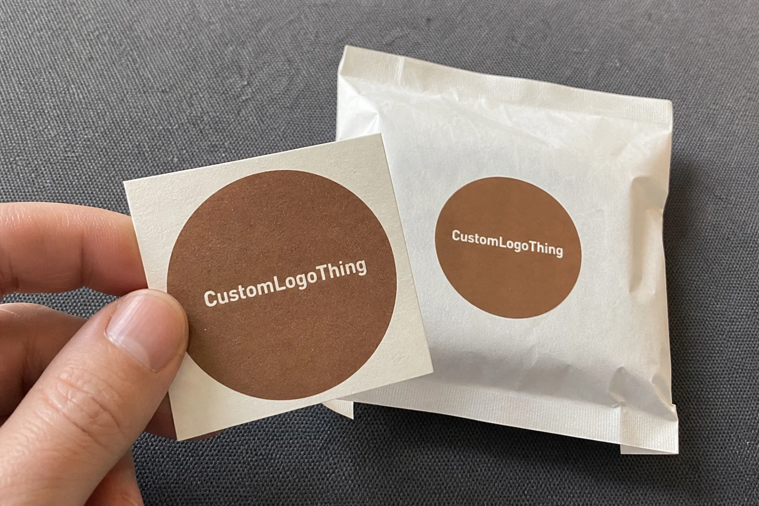
Branding methods can stay recovery-friendly if they are chosen carefully. A one-color flexo logo on kraft often looks cleaner than a full flood of ink. Blind embossing gives dimension without adding material. Hot stamping can work in small areas, but I always ask whether the metallic effect is worth the recycling tradeoff for that specific format. Labels are fine in many cases, especially when they are paper-based and minimal, but oversized synthetic labels can complicate sorting. Green packaging with logo works best when the decoration follows the substrate instead of fighting it, and a 20 mm blind-emboss mark often says more than a large foil panel ever could.
On the engineering side, the box size itself is a sustainability decision. Right-sizing reduces board usage, void fill, and dimensional weight charges. In a shipping operation I audited for a DTC apparel brand in Indianapolis, the cartons were 18% larger than the product stack required, which meant more corrugate, more tape, and more truck space. After resizing, the program used less material per order and improved the customer unboxing experience because the shirt no longer swam around inside the box. That kind of change is one reason green packaging with logo is not just a design conversation; it is a logistics conversation too.
If you need a starting point for structural formats, the team at Custom Logo Things can help with Custom Packaging Products that are built around practical print methods and material choices. For smaller retail launches, I often recommend starting with a structure that can be prototyped quickly, then adjusting board grade or insert style after real transit testing in the same week, not three months later.
Key Factors That Affect Cost, Performance, and Appearance
Cost in green packaging with logo is shaped by a handful of variables that buyers sometimes underestimate. Material choice is the obvious one, but board caliper, print complexity, finish level, order quantity, and tooling all move the price in real ways. A simple one-color kraft mailer can be surprisingly economical at 5,000 units, while a premium folding carton with tight registration, embossing, and spot coating can climb quickly because of plate work, setup time, and scrap during press bring-up. Honestly, the quote sheet can look calm right up until someone asks for “just a little more premium,” and then suddenly everybody in the room is studying the ceiling.
Here is the kind of pricing logic I see on factory quotes all the time: a 350gsm recycled paperboard carton with a single-color flexo logo might land around $0.18 to $0.32 per unit at 5,000 pieces, depending on size and shipping region. In some South China plants, the same style can dip closer to $0.15 per unit for 5000 pieces if the size is standardized and the print remains one color with no special finish. Add two more colors, a matte aqueous coat, and a custom insert, and the same format can move into a very different range. If you switch to molded fiber, the tooling can add upfront cost, but the unit economics may improve over a longer run. The exact number depends on the structure, the cavity count, and the mold complexity, so I never promise a price without seeing dimensions and artwork first. Anyone who does is either optimistic or not paying attention.
Performance matters just as much as cost. Eco-friendly packaging still has to pass real tests: crush, drop, vibration, moisture exposure, and stack compression. In practice, I like to see shipping packs checked against relevant ISTA methods, because a box that looks lovely in the sample room can fail badly on a parcel line with corner drops and conveyor impact. If you need a reference point for transport testing, the ISTA testing standards are a solid place to start. I once saw a recycled-content mailer pass visual approval, then fail a 30-inch drop test because the tuck flap needed 4 mm more engagement. That tiny geometry change saved the whole program, and the fix cost less than one afternoon of rework in a Ningbo packing facility.
Appearance is where many brands get nervous, especially with kraft or heavily recycled surfaces. These stocks absorb ink differently, and the color can shift warmer or duller than the proof on coated art paper. That is not a defect; it is a material reality. Minimal design often looks stronger here. A clean logo, a careful choice of ink density, and a lot of deliberate whitespace can make green packaging with logo feel premium without the high-gloss sheen that often fights sustainability goals. If the design calls for white ink on natural kraft, a thicker flood of 12–14 microns may be needed to keep the mark legible.
Compliance and sourcing deserve their own check. If a supplier says the box contains recycled content, ask for the percentage. If the claim is compostable, ask for the certification and the intended disposal environment. If the package is recyclable, ask whether that means curbside in your target market or only in specialized collection. Many brands get burned by assuming a claim travels the same way in every region. It does not. A package that is accepted in one municipality may not be accepted in another, and that matters if you ship nationally or internationally, from Texas to Toronto or from Berlin to Brisbane.
Here is the practical way I frame it to clients: green packaging with logo should support the brand, protect the product, and hold up under real handling, not just a showroom test. If one of those three is weak, the package will cost you later through returns, complaints, or rework. A carton that saves $0.02 per unit but generates a 3% damage spike is not saving money; it is borrowing trouble.
Step-by-Step Process to Create Green Packaging with Logo
The cleanest projects start with a product audit. Measure the product dimensions, the unit weight, fragility, and the shipping method before you pick a format. A glass serum bottle, for example, needs different protection than a cotton T-shirt or a boxed candle. You also need to know whether the package will sit on a retail shelf, ship Direct to Consumer, or do both. I’ve seen brands skip this step and then wonder why their elegant retail box is crushing in a parcel ship lane. The carton wasn’t wrong; the brief was incomplete, especially if the product was a 180 ml bottle shipping out of a warehouse in New Jersey on a Friday afternoon.
Next comes material selection. For paper-based programs, decide whether kraft, recycled chipboard, corrugated, or FSC-certified paperboard fits the job. For protective inserts, consider molded fiber if the shape works, especially when the item needs corner support. Flexible options can make sense for low-weight goods, but they must be matched carefully to recyclability goals and local disposal systems. If the product is luxury skincare, the look may need a smoother board; if it is a hardware accessory, durability may Matter More Than surface elegance. That is why green packaging with logo is never one-size-fits-all, and why a 325gsm ivory board can be the right call for one item while a 400gsm kraft-liner corrugated shell is better for another.
The logo application plan should be set early. Decide whether the mark will be one color or multiple colors, how large it needs to be for shelf visibility, and whether placement should sit on the lid, side panel, or closure flap. I usually ask whether the structure itself can carry enough branding through shape, edge treatment, or embossing so the print can stay restrained. That approach often reduces ink coverage while improving the package’s overall feel. A loud logo on a weak structure does not help much; a simple logo on a well-built carton often looks smarter, especially when the artwork is built around a 2 mm spine and a clean 45-degree tuck.
Prototyping is where a lot of mistakes get caught cheaply. Good programs include sample cuts, print proofs, fit checks, and transit simulations before full production. In one client meeting for a home fragrance line, we found that the candle insert looked perfect in CAD, but the wax jar rattled on a live sample because the shoulder taper was 2 degrees different from the drawing. That type of issue is common, and it is exactly why I push physical samples instead of relying only on screen renders. If the brief includes custom printed boxes, insist on a hands-on proof, ideally on the exact 350gsm board or E-flute you plan to run.
Production timeline planning keeps the whole program from drifting. A typical path includes artwork approval, tool creation, material procurement, press setup, converting, quality inspection, and shipping. A simple in-stock paperboard run might finish in 12 to 15 business days from proof approval, while a new structure that requires a custom die, molded insert tooling, or supplier testing can take much longer. If the project is running through a factory in Shenzhen or a carton plant in Ho Chi Minh City, I still build a buffer because paper mills, converting lines, and freight lanes all have their own surprises. That buffer is cheaper than rushing, and it saves a lot of gray hair.
After launch, review what happened in the field. Track damage rates, customer comments, return reasons, and line efficiency. If the first run used 10,000 units, compare the actual waste rate to the estimate, because that is where future savings often show up. One apparel brand I worked with discovered that switching from a glossy inner carton to a matte recycled board reduced scuff complaints by 31% and improved assembly speed by a few seconds per pack. Not every program gets a clean win like that, but the data usually tells a useful story if you collect it, especially when the fulfillment center is moving 1,200 orders a day.
If you need support building a packaging stack from concept to pilot, Custom Logo Things can help with brand-forward packaging options that are designed with production realities in mind. That matters more than people think, because good green packaging with logo is made in the details, not in the mood board.
Common Mistakes Brands Make with Sustainable Branded Packaging
One mistake I see constantly is choosing a recycled-looking stock without checking contrast. Dark kraft and rough recycled board can swallow fine text and thin logos. If the mark is too delicate, it disappears at arm’s length, and then the packaging fails at the one job it had besides protection: communication. For green packaging with logo, readability matters as much as the sustainability story, and a 7 pt type size on brown kraft is often asking for trouble.
Over-packaging is another problem that survives even in eco-friendly packaging programs. A box can be made from recycled board and still be wasteful if it has two oversized inserts, a plastic window, and a stack of filler materials. I’ve seen brands celebrate a recycled label while shipping a 120-gram item in a carton built for 220 grams. The material may be better than before, but the structural logic is still off. That is not a win in my book, especially when the inner tray is die-cut from a 1.2 mm liner that never needed to exist.
Greenwashing is risky, and buyers are getting sharper about it. If a package is described as biodegradable, compostable, or recyclable, the claim should match the actual format and the real disposal path. A compostable claim without certification can create more customer confusion than value. A recyclable claim on a mixed-material structure can be misleading if local recovery systems cannot process it. I encourage clients to use precise language, because vague claims erode trust fast, and one bad claim can damage a launch in Chicago, London, and Sydney all at once.
Another mistake is choosing appearance over performance. A beautiful carton that collapses on a conveyor or scuffs badly in shipment creates more waste through returns, replacements, and angry reviews. I still remember a beverage client who insisted on a thin paperboard sleeve for a chilled product; the sleeve looked great in the studio, but it buckled in humid storage and had to be replaced after the first pilot. That failed brief cost more than a sturdier option would have from the start. Green packaging with logo should not sacrifice the product to win a styling contest, especially when the storage room sits at 28°C and 70% humidity.
Ordering too late causes its own chain reaction. Skip prototyping, rush artwork, and you often end up with material substitutions, print compromises, or inflated freight. I’ve sat in supplier meetings where a brand wanted a sustainable carton in three weeks, but the custom die had not even been approved and the board grade needed an alternative because the original mill was out of stock. Those situations can be managed, but they almost always cost more than a planned launch. Good packaging design needs calendar time, not just creativity, and that usually means starting the quote process 6 to 8 weeks before the launch window.
Expert Tips for Better Branding and Lower Waste
The best advice I can give is simple: design around the substrate instead of fighting it. Kraft has a different personality than coated white board. Molded fiber has texture, shadow, and natural variation. Corrugated board has strength but also visible flute behavior. When the logo, typography, and layout respect those traits, the packaging feels intentional, and green packaging with logo comes across as smart rather than compromised. A 1-color mark on a rough 300gsm kraft liner can feel more considered than a full-color print trying too hard.
Use fewer inks where possible. A one-color print with strong placement often looks cleaner and reduces press complexity. Simple artwork also lowers the chance of registration issues, especially on recycled boards where the surface is less uniform. White space helps too. I know some marketing teams worry that minimal layouts look too plain, but in practice, the restraint often creates a more upscale package branding effect. It gives the product room to breathe, which is nicer than cramming every surface with copy until the box looks like it’s trying to win an argument.
Choose closure methods that suit the carton style. Self-locking folds can remove tape from the workflow. Minimal adhesive can reduce material use and make end-of-life recovery easier. Fiber-based alternatives may work well where a plastic closure would be unnecessary. I once visited a subscription-box line in Texas where switching from a tape-heavy closure to a die-cut tuck reduced pack time by 14% and cut tape usage almost completely. That kind of operational cleanup is exactly what green packaging with logo should aim for.
Ask sharper sourcing questions. A supplier should be able to tell you minimum order quantity, lead time, recycled content documentation, ink system, and whether samples can be run on the exact material you plan to buy. If they cannot give you those answers clearly, keep looking. I like suppliers who can speak in grams per square meter, flute profile, and coating compatibility because that usually means they understand the conversion process, not just the sales pitch. A factory in Guangdong that can quote 350gsm board, E-flute carton specs, and 12-day sampling is usually a better partner than one that only talks in vague promises.
Test the package in real shipping lanes, not just in a lab. Lab conditions are useful, and I respect ISTA-style testing, but the real world adds humidity swings, carrier handling, warehouse stacking, and customer behavior. A mailer that survives a controlled drop may still arrive scuffed after a three-hub parcel route in summer heat. I always say the most honest test is the one that includes the actual distance, the actual carrier, and the actual product weight. That is where green packaging with logo proves its value, whether the parcel is moving through Memphis, Dallas, or Toronto.
If your team is still choosing between formats, it can help to compare Custom Packaging Products side by side with structural samples. A physical comparison often settles debates that a spreadsheet cannot, especially when the goal is to balance eco-friendly packaging, shelf presence, and production cost on a real quote sheet with real numbers.
Next Steps for Choosing the Right Green Packaging with Logo
The decision path is cleaner than most teams expect. Start by defining the sustainability goal: lower material usage, higher recycled content, better recyclability, less freight impact, or all four. Then confirm the product protection needs, because no environmental benefit is worth a spike in breakage or returns. After that, choose the material system, and only then decide how the logo should sit on the substrate. That sequence keeps green packaging with logo grounded in function instead of trend, whether the package is a folding carton from Shenzhen or a mailer from a plant in Pennsylvania.
Before requesting quotes, gather the package dimensions, product weight, shipping mode, and any required certifications. If you need FSC, recycled content verification, or compostability documentation, state that clearly from the beginning. Also prepare print-ready artwork in the right format, because a 300 dpi PDF is not the same thing as a packaging file with proper bleeds, folds, and dieline layers. I’ve watched weeks disappear because artwork came in as a flattened image with no separation. That delay is avoidable, and yes, it is as annoying as it sounds, especially when the production window was already only 15 business days.
Ask for at least two or three material options so you can compare cost, appearance, and environmental profile side by side. A recycled corrugated option, a paperboard option, and a molded fiber option may all solve the same basic problem differently. One may be cheaper, one may feel more premium, and one may reduce waste more effectively. You will not know which one wins until you see the sample and compare real numbers. Good green packaging with logo decisions are made with data, not assumptions, and a side-by-side quote from Dongguan, Ningbo, or Kunshan often makes the tradeoffs obvious fast.
I also recommend a small test run before a full rollout, especially for subscription boxes, retail packaging with strict shelf presentation, or new product launches where the first impression carries a lot of weight. A 500- to 1,000-unit pilot can reveal fit issues, print shifts, and customer reactions before the full order lands. That small investment often saves a lot of time and board. I have seen one pilot uncover a sizing error that would have wasted nearly 8,000 cartons if it had gone straight to production, and the correction took only a 3 mm change in the dieline.
In the end, the best green packaging with logo is the one that protects the product, communicates the brand clearly, and minimizes waste across the full lifecycle. If you get those three pieces aligned, you do not need to overcomplicate the rest. The box can be simple, the print can be restrained, and the result can still feel polished, intentional, and fully on-brand.
Green packaging with logo is not a compromise. When it is engineered well, it is better packaging, cleaner branding, and smarter material use in one package. That is the standard I have tried to hold on factory floors in Shenzhen and Dongguan, in supplier meetings in Xiamen and Ningbo, and at every table where someone asked whether “more” automatically meant “better.” Usually, it does not.
If you are sorting through options for a launch, the most practical move is to define the product’s protection needs first, then choose the lightest structure that still passes transit testing, and finally place the logo where it can do its job without forcing extra ink, coatings, or inserts. That order of operations keeps the packaging honest, which is really the whole point.
Green Packaging with Logo: decision table
| Decision area | Best fit | What to verify | Risk if skipped |
|---|---|---|---|
| Claim type | Recycled, FSC, compostable, recyclable, or plastic-reduced packaging | Certificate, material percentage, and claim wording | Unclear claims create greenwashing risk |
| Performance tradeoff | Protection, print quality, and shelf feel | Strength, moisture behavior, ink choice, and finish limits | Eco material is chosen but does not protect the product |
| End-of-life path | Customer disposal, retail requirements, or municipal recycling | Label wording, inserts, and documentation | The buyer cannot understand how to dispose of it |
FAQs
What materials are best for green packaging with logo?
The best material depends on the product, but kraft paperboard, recycled corrugated board, molded fiber, and FSC-certified paperboard are common choices for green packaging with logo. For flexible formats, brands may use recycled-content paper mailers or recyclable mono-material films where appropriate. The right option should balance printability, strength, and end-of-life recovery, and a 350gsm C1S board or E-flute corrugate is often a practical place to start.
Is green packaging with logo more expensive than standard packaging?
Not always. Material choice, run length, print complexity, and box size often matter more than the sustainability label alone. Simpler print designs and right-sized structures can offset higher material costs, and pricing often improves when brands reduce excess packaging and shipping volume. In many programs, green packaging with logo becomes cost-competitive once the structure is optimized, with some 5,000-piece runs pricing near $0.15 to $0.32 per unit depending on format and finish.
How do you print a logo on eco-friendly packaging without ruining recyclability?
Use compatible printing methods such as flexographic or digital printing with water-based inks when possible. Keep finishes minimal and avoid unnecessary plastic laminations or mixed-material effects that complicate recycling. Choose inks and coatings that match the recovery route of the substrate so green packaging with logo stays practical after use, whether the carton is made in Shenzhen or printed in a plant in Jiangsu.
How long does it take to produce custom green packaging with logo?
Timing depends on artwork approval, tooling, material availability, and order quantity. A simple run may move quickly if the material is in stock, while custom structures usually need prototype and testing time first. The safest timeline includes sample review, production setup, and buffer time for revisions so green packaging with logo does not get rushed; a straightforward in-stock run is often 12 to 15 business days from proof approval.
How can I tell if a green packaging claim is legitimate?
Ask for documentation such as recycled content percentages, FSC or similar chain-of-custody details, and compostability certification if claimed. Check whether the package is recyclable in your target market, since disposal options vary by region. Legitimate claims are specific, measurable, and tied to the actual packaging format, which is the standard I trust for green packaging with logo.