Buyer Fit Snapshot
| Best fit | to color coded logistics packaging for packaging buyers comparing material specs, print proof, MOQ, unit cost, freight, and repeat-order risk where brand print, material, artwork control, and repeat-order consistency matter. |
|---|---|
| Quote inputs | Share finished size, material target, print colors, finish, packing count, annual reorder estimate, and delivery region. |
| Proofing check | Approve dieline scale, logo placement, barcode or warning zones, color tolerance, and any recyclable or compostable wording before bulk production. |
| Main risk | Vague material claims, crowded artwork, or missing packing details can create delays even when the unit price looks attractive. |
Fast answer: To Color Coded Logistics Packaging: Material, Print, MOQ, and Cost should be specified like a repeatable production item. The safest quote includes material, print method, finish, artwork proof, carton packing, and reorder notes in one written spec.
What to confirm before approving the packaging proof
Check the product dimensions against the actual filled item, not only the sales mockup. Ask for tolerance on folds, seals, hang holes, label areas, and retail display edges. If the package carries a logo, QR code, warning copy, or legal claim, reserve that space before decorative graphics fill the panel.
How to compare quotes without losing quality
Compare board or film grade, print process, finish, sampling route, tooling charges, carton quantity, and freight assumptions side by side. A lower quote is only useful if the supplier can repeat the same color, closure quality, and packing count on the next order.
The guide to color coded logistics packaging starts with a warehouse reality that I have seen play out more than once: speed is useless if nobody can tell what they are looking at. A carton that answers the question before a worker has to ask it will save more time than a polished spreadsheet ever can. Two seconds of recognition beats ten seconds of hesitation, and those little gaps pile up across a shift, a route, and a full week of dispatch.
Color turns memory into a visible rule. A red carton may mean rush, a blue tote may mean returns, and a yellow label may flag fragile contents or special handling. None of that is fancy. It is practical. The best systems do not ask a tired picker to remember five exceptions after lunch. They make the exception obvious before the box reaches the dock.
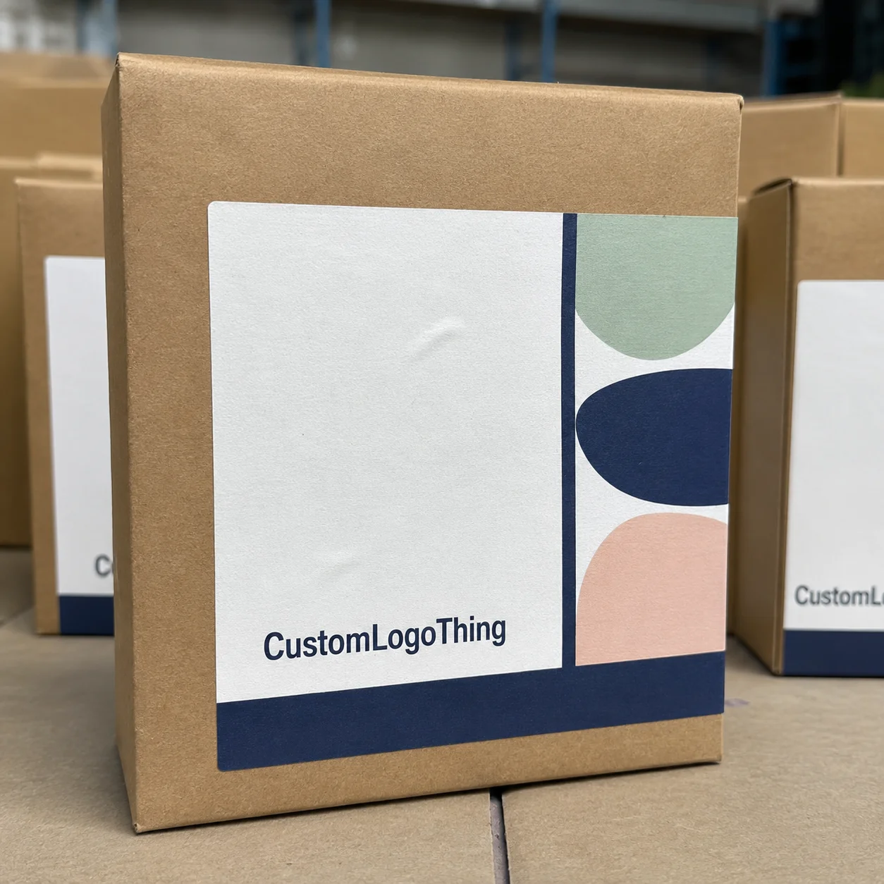
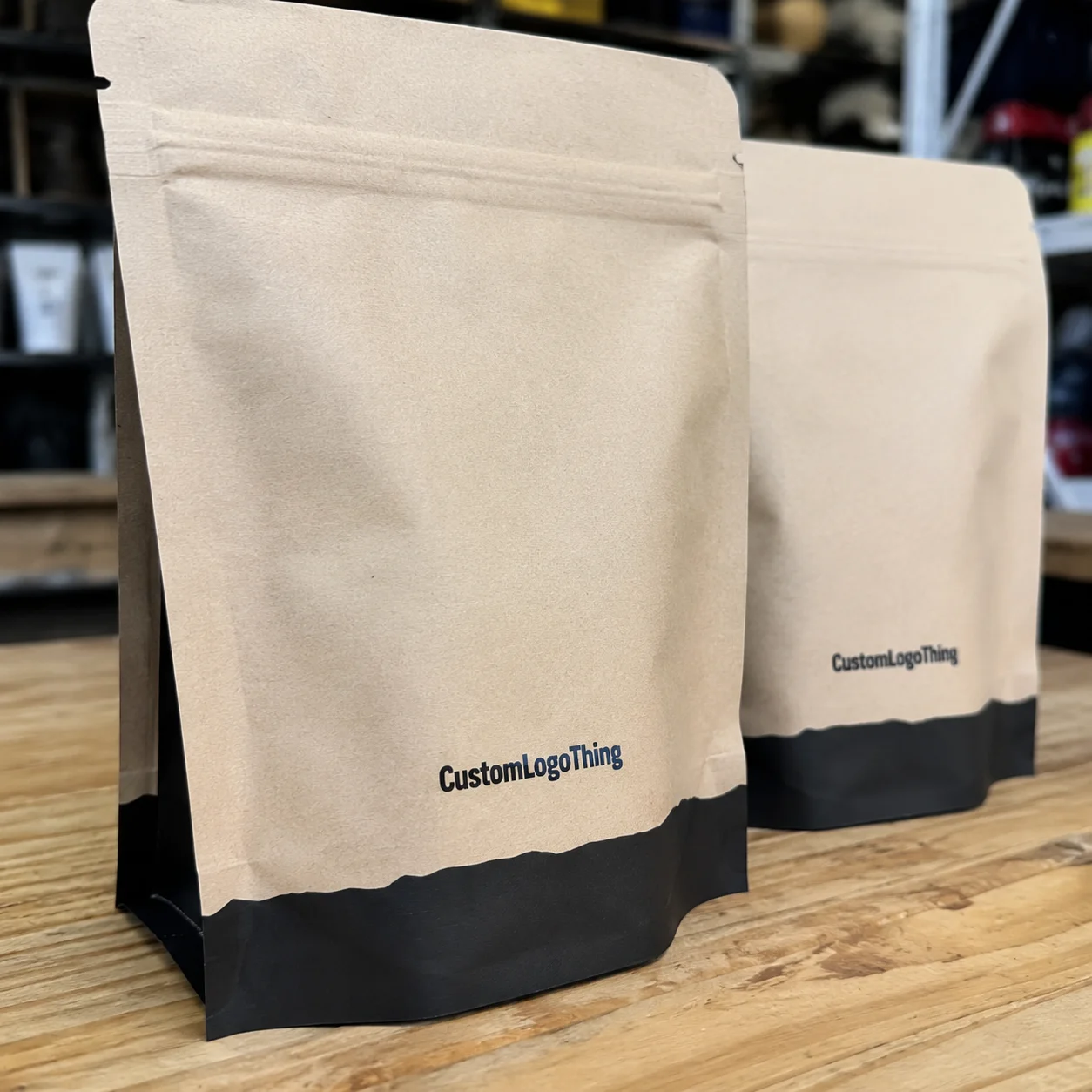
For brands focused on package branding, the challenge is getting the operational signal right without turning the packaging into a design exercise that forgets the warehouse. Good branded packaging can still work hard. Good packaging design can still travel well. If you are sourcing through Custom Packaging Products, the structure, print method, and surface finish matter just as much as the color story. I have seen a beautiful mockup fall apart the second it met a conveyor, which was, frankly, a little embarrassing for everyone involved.
A serious guide to color coded logistics packaging does not pretend color fixes every bottleneck. It does not. It does lower the mental load in busy lanes, crowded docks, and multi-shift environments where a small mistake can ripple through the day. That is a narrower promise, and a better one. Honest systems age better than dramatic ones.
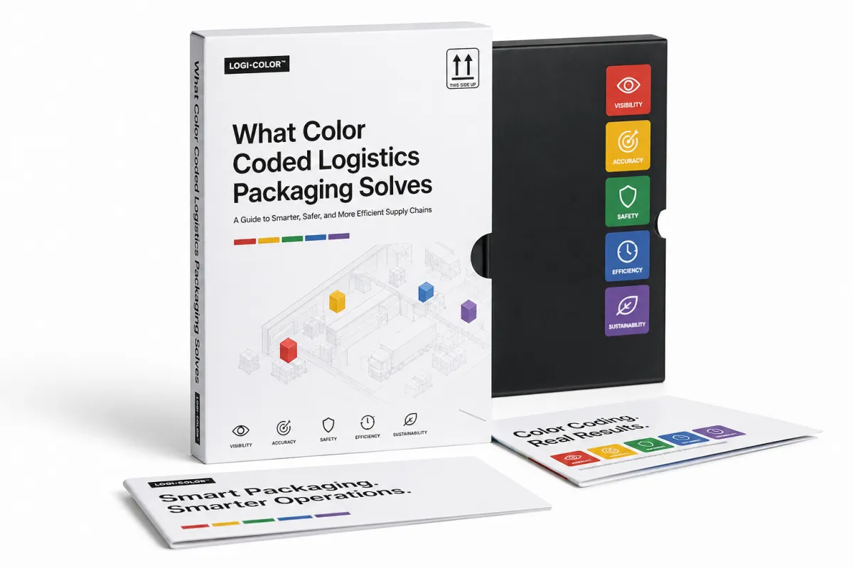
Guide to Color Coded Logistics Packaging: What It Solves
Walk into a dock where every carton looks almost identical and the problem appears immediately. Same size. Same print. Same label format. One pallet is for local delivery, another is for export, another must stay cold, and one belongs in returns. Under pressure, those distinctions blur. That is where the guide to color coded logistics packaging earns its place.
Color coded logistics packaging solves a recognition problem. People do not read every line on every carton when the pace is high. They scan. They sort. They move. The eye catches a cue faster than the brain can parse a long label, which is exactly why color becomes useful. The packaging tells the truth before anyone has time to doubt it.
The guide to color coded logistics packaging also improves handoffs. Receiving, staging, cross-dock transfers, and last-mile dispatch all depend on quick visual judgment. A strong color system can mark destination, priority, hazard class, or handling rule. One shade may mean "do not stack." Another may mark a parcel for route 4. Another may separate returns from outbound stock. That is not decoration. That is process control with a visual face.
Memory-based systems usually fail first when volume rises, shifts change, or new hires arrive with little time to learn the ropes. A clear code reduces picking errors, shortens training, and makes audits easier because the team can verify the rule at a glance. That is the quiet appeal of the guide to color coded logistics packaging. It removes a layer of friction people do not always know they are carrying.
"If a picker has to stop and think about what the color means, the code is already too weak." That is the blunt version, and the blunt version is usually the useful one.
There is another payoff buyers often miss. The guide to color coded logistics packaging can support compliance without forcing every carton to read like a legal memo. When a zone, class, or route is visible in one glance, supervisors spend less time correcting avoidable mistakes. Less correction means less waste, less rework, and fewer conversations that begin with a sigh.
Not every operation needs a wide palette. Most do better with a restrained one. The guide to color coded logistics packaging works best when each color has one job and that job is documented. Once people start inventing extra meanings, the whole system turns muddy. A rainbow is not a process. It is a process problem with better lighting.
So the clean conclusion is simple: the guide to color coded logistics packaging is a warehouse tool. It reduces picking errors, speeds sorting, supports handling rules, and makes work easier to trust. If your current process depends on people remembering too much, the weakness is already there. Color merely exposes it.
Guide to Color Coded Logistics Packaging: How It Works
The guide to color coded logistics packaging works by attaching one visual cue to one operational rule. Not several rules. Not "kind of urgent." One rule. The structure stays manageable when the business decides what the color means before anyone orders boxes or labels.
Color can appear in a few places: on cartons, liners, tape, labels, tags, returnable totes, or pallet wrap. Some facilities only need a high-contrast colored band on a white or kraft base. Others need stronger signaling across multiple packaging components. The guide to color coded logistics packaging is not tied to one format. It can sit on top of standard packaging or be built into fully Custom Printed Boxes.
Many teams start with the color they like and work backward. That approach causes trouble. The guide to color coded logistics packaging should begin with the business rule. What needs to move faster? What needs to stay apart? What needs a different handling path? Only after those answers are clear should anyone choose blue, green, orange, or red. Picking the color first is a little like buying a lock before deciding which door it belongs on.
A practical structure usually looks like this:
- One color, one rule - for example, blue for returnable totes and yellow for fragile goods.
- One format across the site - cartons, tags, and tape should never contradict each other.
- One legend - a reference sheet at packing stations, dispatch desks, and receiving points.
- One owner - someone has to maintain the standard as SKU logic changes.
The guide to color coded logistics packaging also needs a written standard. Without that, teams drift. A driver thinks green means priority. A picker thinks green means zone B. A supervisor thinks green means cold storage. Nobody is exactly wrong, which is the worst kind of wrong because it can survive for months.
Common use cases are straightforward. Zone picking systems color-code lanes. Temperature-sensitive goods may use a clear band for cold-chain handling. Cross-dock routing can mark cartons by destination. Returnable packaging can use a distinct color so empty units never mix with outbound stock. Fragile items can get a bright warning panel that cuts through poor light and short attention spans.
The guide to color coded logistics packaging works better when paired with short text or simple graphics. A color plus a brief descriptor like "FRAGILE," "RETURN," or "ROUTE 4" is stronger than color alone. That matters because not everyone sees color the same way, and not every facility has ideal lighting. A label that depends only on hue asks for trouble. That is not a theoretical concern; it is a floor-level one.
If the packaging also carries brand elements, keep the brand role secondary. That may sound strict, yet it saves money and headaches. Product packaging can hold the logo and still support the code. Retail packaging can still look polished. The operational signal has to remain obvious. If the attractive part hides the useful part, the system fails where it matters most.
The guide to color coded logistics packaging usually breaks down in two ways. The first is vagueness: meanings change by team, shift, or site. The second is excess: too many colors, too many stripe patterns, and a legend that looks like it was assembled by committee after a long week. Neither version helps the people moving the goods.
Key Factors That Decide Whether It Works
The guide to color coded logistics packaging is not a universal fix. A 40-SKU operation with one shift and steady outbound lanes needs something very different from a 4,000-SKU warehouse with cold storage, returns, and overnight dispatch. Complexity raises the stakes. The more variables you have, the more disciplined the code needs to be.
Product mix and flow come first. A narrow packaging mix can run on four to six colors, one legend, and one meaning per color. Mixed cartons, poly mailers, totes, and pallets may need an added layer of distinction by packaging format. That is not overkill. It is the cost of reality showing up on the floor.
Visibility matters more than most buyers expect. A muted blue on gray board disappears under warehouse lighting. A pale yellow on uncoated stock can look washed out once dust and handling take their turn. Strong contrast, clean print, and sensible label placement are not optional if the guide to color coded logistics packaging needs to survive real conditions.
Durability matters just as much. If the color rubs off, fades in sunlight, scuffs on a conveyor, or peels during transit, the system becomes expensive theater. Warehouses do not care whether the proof looked beautiful. They care whether one forklift nick makes the signal unreadable. For transit testing, many teams reference ISTA test methods and packaging performance standards, which is a sensible starting point when the package spends time in rough handling.
Accessibility is another real constraint. Color blindness affects a meaningful share of the workforce, so the guide to color coded logistics packaging should never depend on color alone. Add icons, short text, shape cues, or placement rules so the system still works if somebody cannot distinguish red from brown, green from gray, or orange from yellow under bad light.
Training is not a soft factor. It is one of the biggest predictors of success. The best guide to color coded logistics packaging fails if the team sees the legend once and never again. A one-page standard, short shift training, and a visible master chart at the point of use do more than a thick binder full of theory. Binders sit. Dock workers move.
Material choice belongs in the conversation too. Paperboard, corrugated board, adhesive labels, and tape each behave differently. Some surfaces hold color well. Others do not. Some adhesives hold up in cold chain environments. Others peel after a humidity swing. If your operation needs sustainability proof points, paperboard sourced through FSC certification standards can support the claim, but only if the rest of the specification is equally disciplined. Good logo, weak substrate, poor result.
From a packaging design standpoint, the guide to color coded logistics packaging has to live inside the visual system of the warehouse, not the fantasy of a mockup. That means testing under bad light, in dusty zones, on fast shifts, and with tired people. If it only works in the sample room, it does not work where the labor happens. I have watched teams approve a bright swatch in a conference room, then discover it practically disappeared under sodium lights. Nobody wants that surprise on go-live day.
One more warning: do not let procurement pick colors in isolation. Buying the cheapest label stock or the cheapest printed carton is a classic false economy. A few cents saved per unit can create far more cost in sorting time, mispicks, and rework. The guide to color coded logistics packaging should be judged on total process cost, not unit price alone.
Guide to Color Coded Logistics Packaging: Cost and Pricing
The guide to color coded logistics packaging needs a cost model people can actually use. Buyers usually compare three things: material cost, print cost, and operational cost. That order makes sense. Focus only on the carton price and you can end up paying for the same mistake all day long in labor.
For low-volume systems, stock packaging plus color labels or color tape is often the least expensive place to begin. A label-based setup keeps upfront spend under control while the logic gets tested. In many facilities, that means something in the range of a few cents to roughly $0.12 per unit for simple labels, depending on size, adhesive, and quantity. Add design and setup, and the first order may still stay modest. The guide to color coded logistics packaging works well here because the process gets proven before anyone commits to full print.
For higher volume, Custom Printed Boxes or totes can reduce labor over time. A printed color band, route panel, or handling block usually costs more per unit at launch, yet it can save seconds on every pack and sort. Those seconds add up. At 5,000 units, a custom print run might land around $0.18-$0.28 per unit for a simple one- or two-color carton, depending on board grade, coverage, and quantity. More coverage, more color changes, or special coatings push the number higher. That is the expected tradeoff, not a flaw.
The guide to color coded logistics packaging becomes easier to compare when the options sit side by side.
| Option | Typical Use | Upfront Cost | Operational Benefit | Tradeoff |
|---|---|---|---|---|
| Stock carton + color label | Pilot runs, small warehouses, changing rules | Low | Fast to launch, easy to adjust | More manual application labor |
| Color tape + printed legend | Zone sorting, tote marking, temporary rollout | Low to medium | Very flexible, easy to retrain | Can look messy if unmanaged |
| Custom printed boxes | Stable SKU flows, branded packaging, higher volume | Medium | Less handling time, cleaner visual system | Higher setup and changeover costs |
| Fully customized packaging system | Multi-site operations, strict handling rules | Higher | Best standardization and visibility | Requires training and governance |
The table is not a sales pitch for the priciest option. It is a way to keep people from comparing unrelated things. The guide to color coded logistics packaging should match process maturity. If routing changes every week, custom print may be too rigid. If the process is stable and labor is expensive, stock labels may be leaving money behind.
Hidden costs deserve attention. Inventory carrying costs rise when too many color variants sit on a shelf. Waste appears when a color scheme changes and old stock must be scrapped. Training time has a price. So does rework after a bad launch. A cheap-looking scheme can become expensive in a hurry if people keep asking, "What does this color mean?"
This is also where packaging branding enters the room. Good package branding can support the operational code, especially when the same carton handles transit and presentation. The problem begins when retail packaging ambitions overrule warehouse function. If the logo gets larger while the code gets smaller, the buyer has purchased a design problem, not a logistics solution.
Comparing suppliers calls for samples, print methods, board specs, and a realistic delivery window. For common custom jobs, lead times often run 12-15 business days from proof approval, sometimes longer if the artwork is complex or the substrate is special. If someone promises impossible speed without asking about structure, expect surprises. The guide to color coded logistics packaging rewards vendors who speak in specifics, not slogans.
If you want to widen the product mix, a supplier like Custom Packaging Products can help compare stock structures with custom print options without forcing a rushed commitment. That usually leads to better decisions, and fewer awkward phone calls later.
Guide to Color Coded Logistics Packaging: Step-by-Step Rollout and Timeline
The guide to color coded logistics packaging should roll out like a process change, not a branding reveal. Start with the workflow. Map routes, exceptions, return paths, and failure points. Find where packages get misread, where handoffs slow down, and where the same SKU gets treated differently by different teams. Skip that part and you are guessing with prettier materials.
Step one is rule design. Assign one meaning to each color. Write it down. Keep the definitions narrow. The guide to color coded logistics packaging works best when the rules are almost boring. Red means urgent dispatch. Blue means returns. Green means standard outbound. Yellow means fragile. Orange means temperature-sensitive. Black means hold for inspection. Simple wins because simple survives a busy floor.
Step two is documentation. Build a one-page visual standard. Include the color, the meaning, the packaging format, where it appears, and who owns it. Put that sheet where work happens: the dock, the packing table, the receiving desk. A standard hidden in a file folder is not a standard. It is a file folder. That sounds obvious, but I have seen the hidden version more times than I would like to admit.
Step three is sampling. Before ordering full production, ask for prototypes or short-run samples. Check them under real light, with dirty hands, under fluorescent fixtures, and at a distance. If the color code is hard to read from five to ten feet away, it is probably too subtle. This is the right moment to test tape, adhesive, print contrast, and label placement. A process that looks neat in a PDF can fail in a warehouse with remarkable speed.
Step four is the pilot. Do not launch the guide to color coded logistics packaging across the whole facility and hope the team sorts it out. Pick one lane, one product family, or one shift. Run it for two to four weeks. Measure error rate, picking speed, and how often supervisors have to explain the system again. That last measure is often the most revealing. If the questions keep repeating, the code is not clear yet.
Step five is sign-off and retraining. Ask the team where the code feels unclear. If three workers misunderstand the same color, the standard needs revision. The best pilot feedback is usually plain and unsparing: "This blue works," or "That yellow is too pale," or "The label needs to sit higher because the tape gets buried." That is useful data. Use it. Do not try to spin it.
Step six is rollout. Scale only after the pilot is stable. Order enough inventory to prevent random substitutions. Keep the legend visible. Train the first shift before the others. Then repeat training for every new hire. The guide to color coded logistics packaging is not a one-time project. It is a controlled system that needs reinforcement.
Timelines vary. A simple rollout can happen in a few weeks if the workflow is already mapped. A larger site with several product groups may need one to three months, especially if sampling, approvals, and retraining are involved. The slowest part is usually agreement, not production. People debate color meanings longer than it takes to print the boxes.
One practical habit helps a lot: use a master legend at packing stations, dispatch desks, and receiving points. Make it impossible to miss. Add a short "if color means X, do Y" note beside it. If you want the guide to color coded logistics packaging to stay alive, make the instructions visible to the people doing the work, not just the people approving the budget.
Another useful habit: keep a change log. If a color meaning changes, the old stock needs a plan. Nothing erodes trust faster than a code that was updated in one meeting but not in the warehouse. The guide to color coded logistics packaging only works if the team believes the system is current.
Guide to Color Coded Logistics Packaging: Common Mistakes to Avoid
The easiest mistake is using too many colors. Once the system turns into a rainbow, nobody remembers what half of it means. The guide to color coded logistics packaging usually works best in the four-to-six-color range unless the operation has a very strong reason to expand. More colors do not equal more intelligence. Often they equal more confusion.
Another common mistake is allowing meanings to drift by site or shift. If one warehouse uses green for priority and another uses green for standard, the company does not have a system. It has a rumor. The guide to color coded logistics packaging needs standardization across the business, or at least very clear exceptions that nobody can miss.
Vague rules create their own mess. "Use blue for urgent stuff" sounds simple until three departments define urgent in three different ways. Better to tie every color to a specific product, lane, or handling class. The guide to color coded logistics packaging is only useful when people know exactly what action follows the color they see.
Weak print contrast is another quiet failure. Many teams approve a color because it looks good on screen. That is not a warehouse test. Real conditions include dust, glare, hand oils, rough stacking, and low light. If the signal is hard to see in the facility, the code will break faster than anyone expects.
Durability mistakes are expensive. Labels that peel, ink that scuffs, tape that lifts, or coatings that smear all weaken trust in the system. Once workers stop believing the code will stay legible, they begin ignoring it. The guide to color coded logistics packaging does not survive that kind of confidence loss for long.
Training mistakes cause just as much damage. A one-minute mention in a kickoff meeting is not training. Neither is a PDF nobody reads. Show the team the color reference, explain the rule, and check comprehension on the floor. Even a short five-question check can save weeks of rework. I would rather spend fifteen minutes answering dumb questions up front than spend three weeks untangling bad assumptions later.
Design can also get in the way. Strong package branding helps. Overdesigned branding does not. If the logo, the art, and the promo copy crowd out the handling signal, the packaging fails its first job. It is still packaging. It still has to function.
The guide to color coded logistics packaging should be reviewed after a few weeks in the field. If the same error keeps showing up, the issue is probably not the worker. It is the system. That is the part people prefer to skip. The box did not confuse anyone. The process design did.
Expert Tips for Your Next Steps with Color Coded Logistics Packaging
If you want the guide to color coded logistics packaging to pay off, keep the palette small. Four to six colors is usually enough. More can work, but only if the operation is mature enough to manage them without drift. In most warehouses, clarity matters more than range. The system should feel obvious after a week, not after a classroom session and a prayer.
Place a master legend wherever the decision happens. Packing stations. Dispatch desks. Receiving points. Returns areas. If the legend lives on one wall only, it is not a system. It is wall art with a job title. The guide to color coded logistics packaging should be visible exactly where the work gets done.
Test before you scale. A two-week pilot with measurable error reduction says more than a full launch full of polite applause and a stack of complaints. Track three numbers: mispick rate, sort time, and staff questions per shift. If those improve, you have evidence. If they do not, adjust the code before ordering more inventory.
Keep the materials honest. Ask suppliers for substrate details, adhesive specs, print method, and sample photos in real lighting. If the packaging sits inside a larger retail packaging or product packaging strategy, make sure the visual style supports the logistics rules instead of hiding them. A clean structure beats a busy design every time.
Work with a supplier who can talk tradeoffs without reaching for marketing fluff. That usually means discussing stock versus custom printed boxes, single-color versus multi-color print, and whether a small short-run sample makes more sense than a full production order. If you need a broader source for custom packaging, Custom Packaging Products is a sensible place to compare options without overcommitting too early.
It also helps to think in ranges instead of fantasies. A label-first rollout might cost very little upfront and give you a fast read on process behavior. A full custom print program can lower labor later, but only if the operation is stable enough to justify the setup. Faster visibility now, or more efficiency later. That is the real decision.
The guide to color coded logistics packaging is usually most valuable in places where people have been relying on tribal knowledge. Once a system becomes "ask Jerry, he knows the blue one," the business has already lost control of the process. The fix is not heroics. It is a better visual standard.
If sustainability matters in your package branding, check the paper and board chain carefully. If transit abuse is a concern, ask for performance testing. If the site is growing fast, document the code now before expansion multiplies the mess. That difference separates a tidy system from a future cleanup project. The work gets harder later, not easier, so the setup deserves real attention now.
Here is the short sequence that tends to work: audit the workflow, define the colors, write the legend, order samples, test in the warehouse, train the first shift, then scale. It sounds plain because it is effective. The guide to color coded logistics packaging is not magic. It is disciplined visual management.
When the system is built properly, the guide to color coded logistics packaging becomes one of those quiet improvements that saves time every day without asking for applause. That kind of packaging decision earns respect. It keeps doing its job and does not demand a medal for behaving as expected.
And yes, the guide to color coded logistics packaging can support branded packaging too. The brand just needs to stay in its lane. People ship boxes, not mood boards.
What is the guide to color coded logistics packaging?
The guide to color coded logistics packaging is a visual management system that assigns a defined meaning to each color used on cartons, labels, tape, totes, or pallet wrap. In practice, it helps a warehouse sort faster, reduce mispicks, and make handling instructions visible at a glance. The best version pairs color with short text or icons so the rule still works in dim light, across shifts, and for staff who may not read the code instantly.
Think of it as warehouse labeling with a stronger memory aid. Instead of asking workers to parse dense instructions on every unit, the system uses route labels, handling marks, and packaging signals to make the next action obvious. That is why the guide to color coded logistics packaging tends to matter most where speed, accuracy, and consistency all collide.
There is also an important boundary here. Color coding can support process control, but it does not override regulations for hazardous materials, food contact, export paperwork, or other compliance requirements. If a product falls under a formal standard, the color system has to sit alongside that standard, not replace it. Trustworthy packaging systems know their limits.
How do I choose colors for color coded logistics packaging?
Start with the business rule first, not the color preference. Use high-contrast colors that are easy to tell apart in your lighting and on your packaging material. Keep the palette small so workers can learn it quickly and remember it under pressure. The guide to color coded logistics packaging should be built around operations, not aesthetics.
Is color coded logistics packaging worth it for a small warehouse?
Yes, if you have repeat mistakes, multiple handling paths, or fast-moving picks. Small operations usually benefit from simple label-based systems before moving to fully custom packaging. The ROI often shows up in fewer errors, faster sorting, and less retraining. The guide to color coded logistics packaging can be a low-risk way to clean up a messy workflow.
How much does color coded logistics packaging cost?
Costs vary based on print method, order volume, material, and whether you use stock or custom packaging. Label-based systems are usually cheaper upfront. Custom printed packaging can cost more at launch but may lower labor and sorting costs later. A simple pilot often gives the best cost read before a full rollout of the guide to color coded logistics packaging.
How long does a rollout usually take?
A simple pilot can be done in a few weeks if the workflow is already mapped. A larger rollout usually needs time for sampling, team training, and process testing. The slowest part is usually agreement, not production. The guide to color coded logistics packaging works best when the planning is done before the boxes arrive.
What is the biggest mistake with color coded logistics packaging?
Using too many colors and too many meanings. Launching without a written standard or legend is another common failure. Skipping durability and readability checks in real warehouse conditions can also wreck the system fast. The guide to color coded logistics packaging should stay simple, visible, and consistent if you want it to stick.
If you are serious about making the guide to color coded logistics packaging work, treat it like a warehouse control tool, not a style choice. Audit the workflow, assign one meaning to each color, prove the code on the floor, and keep the legend visible where decisions happen. Do that, and the packaging starts doing real work instead of merely looking organized for a week. In short, the guide to color coded logistics packaging only earns its keep when the rules are simple enough to survive a busy dock and strict enough to stay consistent after launch.