A hang tag can shift how a serum, lipstick, or fragrance is judged before anyone opens the box. A flimsy one can do the opposite. That is why this Hang Tags Material guide for beauty brands starts with substrate choice rather than artwork: the stock, finish, and thickness quietly shape whether a product feels premium, clean, credible, or disposable.
From a packaging buyer’s angle, hang tags are not decorative extras. They carry shade names, ingredients, barcodes, promo copy, compliance notes, and sometimes a sustainability claim that needs to survive scrutiny. If a tag tears, curls, smudges, or scans badly, the issue is usually material selection, not design talent.
Why hang tag material changes how beauty products are perceived
Beauty packaging is visual, but hang tags are tactile. Shoppers often touch the tag before they touch the bottle. A $24 serum with a thin, floppy tag reads differently from the same serum with a rigid, well-printed tag on FSC certified stock. Price perception in beauty is surprisingly sensitive to these details.
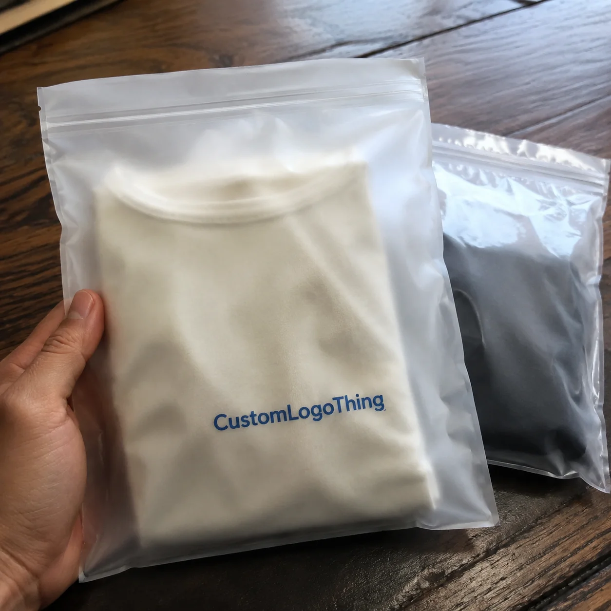
Hang tags show up in several formats: neck hangers on bottles, carton tags on gift sets, ribbon-tied tags on candles and perfumes, and small product tags attached to retail displays or sampler kits. In each case, the tag is doing two jobs at once. It brands the product and communicates practical information.
That split matters because different beauty categories ask for different signals. A clean beauty line may need a restrained recycled look. A fragrance tag may need to feel giftable and expensive. A clinical skincare brand may want something crisp, quiet, and almost lab-like. Same component. Different message.
“Most brands do not get judged on the artwork first. They get judged on whether the material feels like the price point is honest.”
There is a compliance angle too. Hang tags often need room for batch codes, barcode space, ingredients, warning statements, and SKU identifiers. When the stock is too absorbent, too dark, or too delicate, the information becomes harder to read and quality teams start asking awkward questions. In beauty packaging, the wrong material can create a problem long before the design looks finished.
How hang tag materials behave in real beauty packaging
Material choice looks simple on a sample sheet. In actual use, it is less forgiving. Bathroom humidity, oily hands, shipping abrasion, and carton friction all affect performance. Skincare products are especially exposed because they often sit in steamy bathrooms or travel kits. Fragrance and haircare tags face repeated handling, so edge wear appears quickly.
Paperboard is the workhorse. It holds print well, die-cuts cleanly, and supports premium finishing such as foil, embossing, debossing, and spot UV. A 350gsm C1S or C2S card is common for beauty hang tags because it offers enough stiffness without becoming bulky. For a matte, minimal look, uncoated stock gives a softer handfeel. For vivid color and sharp imagery, coated stock usually performs better.
Kraft paper tells a different story almost immediately. It signals natural, earthy, and less processed, which is why it appears so often in botanical skincare and indie wellness lines. The trade-off is lower contrast. Small text, pale inks, and delicate graphics can disappear into the surface if the artwork is not adjusted for the stock.
Recycled paper and post-consumer waste stocks can support eco messaging, but the print result depends on fiber mix, coating level, and surface consistency. Some recycled materials have a beautiful, honest texture. Others are more variable, so proofing matters more than it does on premium coated card. A sample that looks warm and organic on one run can look blotchy on another if the source stock shifts.
Textured stocks and cotton papers push the tactile side further. They can feel handcrafted or high-end, but they also change how ink sits on the surface. Fine serif type, tiny icons, and pale color palettes need testing. If the design relies on precision, not every tactile paper is a safe choice.
Synthetic or plastic-based tags can be useful in moisture-heavy environments. They make more sense for utility-driven products, travel formats, or spa use than for luxury cosmetics. Still, they have a place. A tag that survives steam, splashes, and repeated handling is better than a beautiful one that degrades in a week.
Attachment details matter more than many teams expect. A thick tag with a tiny punched hole can tear under stress. A lightweight tag with a heavy cotton cord can swing awkwardly and look underdeveloped. For bundles and gift sets, the hole size, cord weight, and knot method should be tested with the actual stock in hand, not just in a mockup.
Finishing is the last layer, and it can help or hurt the overall effect. Soft-touch lamination makes a tag feel more luxurious, but it may reduce recyclability depending on the construction. Spot UV adds contrast. Foil draws the eye. Edge painting can make a thick tag look intentional instead of simply thick. The substrate has to support the finish, though. Put too much detail on a rough stock and the result can look muddy rather than refined.
Shipping standards also matter more than people assume. Organizations such as ISTA set testing frameworks that help brands think about transit stress, vibration, and compression; see ISTA testing standards. That is not only relevant to corrugated cartons. Tags attached to cartons, kits, and secondary packaging feel those same stresses during handling.
Key material factors every beauty brand should compare
Before choosing a stock, compare four things: durability, rigidity, sustainability, and print compatibility. Those four variables explain most tag decisions. The rest is preference, and preference matters, but it should not override performance.
Durability and handling
A good hang tag should survive warehouse handling, retail browsing, and unboxing without fraying at the edges or curling around the string hole. If the product ships in bulk and gets packed, unpacked, and displayed multiple times, choose a stock with better tear resistance and a finish that resists scuffing. A lightweight tag may save a few cents, but if it arrives bent, the savings disappear quickly.
Thickness and perceived quality
GSM or point thickness changes the feel of a tag immediately. A thin 250gsm card can work for low-cost promotions, but prestige beauty usually looks better at 300gsm to 400gsm, depending on the size and attachment method. Too thick, and the tag can feel overbuilt or awkward on small bottles. Too thin, and the message feels temporary. The right middle ground depends on tag size, hole placement, and whether the product hangs freely or sits against a carton.
Sustainability and claims
Clean beauty brands often want recycled content, FSC sourcing, or lower-impact materials. Those are sensible priorities, but claims have to be accurate. A tag can be printed on FSC certified stock and still use a plastic lamination that complicates recycling. Recycled materials can be a strong choice, especially if the surface still takes color cleanly. If a brand wants to highlight post-consumer waste content, ask for documentation rather than relying on vague wording.
If sustainability is a priority across the packaging line, the U.S. EPA’s packaging and waste guidance is a useful reference point for terminology and responsible material choices: EPA sustainable packaging guidance.
Brand compatibility and readability
Minimalist, botanical, clinical, and trend-driven brands each need different visual behavior from the stock. Dark or heavily textured materials can hide small legal text. Bright coated stock can make color cosmetics pop, but it may feel too glossy for a low-key dermatologist-led line. Readability matters more than many creative teams admit. A beautiful tag that hides the barcode is not a good tag.
Regulatory space is non-negotiable in some categories. If the hang tag includes ingredients, warnings, or usage directions, leave margin for legibility. For fragrance, where polished presentation is part of the product story, a tag that is too crowded can make the line look cheap even if the print quality is excellent.
| Material type | Best fit | Typical strengths | Watch-outs |
|---|---|---|---|
| Coated cardstock | Color cosmetics, fragrance, gift sets | Sharp print, vivid color, clean edges | Can feel less natural |
| Kraft paper | Botanical skincare, indie wellness | Earthy look, strong brand signal | Lower contrast for small text |
| Recycled paper | Clean beauty, eco-led lines | Supports sustainability messaging | Surface consistency varies |
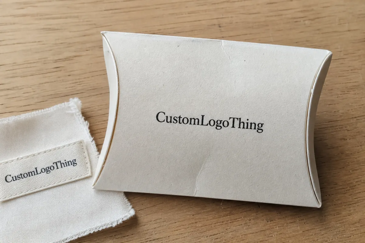
| Cotton paper | Prestige, artisan, gift-focused beauty | Soft feel, premium texture | Higher cost, needs proofing |
| Synthetic stock | Bathroom, spa, travel-heavy use | Moisture resistance, durability | May not suit natural branding |
Hang tags material guide for beauty brands: choosing the right stock
The easiest way to choose is to start with the product, not the printer. A neck tag for a serum bottle does not need the same construction as a ribbon tag for a holiday set. This Hang Tags Material guide for beauty brands works best when the use case comes first, then the stock shortlist.
- Define the product type. Skincare, fragrance, makeup, haircare, and gift sets each face different handling conditions.
- Choose the channel. Retail shelf, DTC unboxing, subscription kit, spa counter, or trade show sample.
- Set the brand position. Luxury, clinical, natural, indie, or color-forward.
- Match the stock. Pick the substrate that supports the look and the practical demands.
For earthy skincare, kraft paper or recycled card can make a strong first impression. For fragrance and prestige cosmetics, coated card or thick matte stock usually looks cleaner and more expensive. If the product will sit in humid environments, soft-touch laminated card or synthetic stock may be worth the extra cost. That is not always necessary, but it is often the safer choice for spa kits and travel formats.
There is a useful rule of thumb: if the tag is supposed to disappear into the branding, choose a stock that matches the packaging finish closely. If the tag is supposed to stand out, give it contrast through texture, thickness, or finish. A matte bottle with a glossy tag can look deliberate. A gloss bottle with a flimsy tag can look accidental.
One more practical test: ask for samples and place them beside the actual bottle, jar, or carton under the lighting where the product will be sold. Daylight, warm retail LEDs, and bathroom lighting all change how white points, texture, and color depth read. A paper that looks elegant on a desk can feel too gray next to a bright cream carton.
For brands that want more integrated packaging support, our Custom Labels & Tags page is useful for comparing tag constructions with label formats. If you want to see how material decisions show up in real projects, the Case Studies section gives a more grounded view than a polished render ever could.
Cost, pricing, and MOQ: what changes your quote
Pricing is usually driven by eight variables: material, thickness, size, print sides, color count, finish, attachment type, and quantity. The more custom the build, the more setup costs matter. A simple 2 x 3 inch tag on standard stock with one-sided print may be far more economical than a die-cut tag with foil, embossing, and custom stringing.
For context, small-run beauty tags often land around $0.18 to $0.28 per unit for 5,000 pieces on standard cardstock, while premium stocks or special finishes can push higher. On larger runs, the unit price usually drops, sometimes sharply. That is where MOQ planning becomes strategic. Startups may want lower quantities to reduce risk, but established brands can often save by consolidating SKUs or ordering in larger batches.
Special effects are where quotes tend to climb. Rounded corners are inexpensive. Custom die-cuts cost more. Foil, embossing, and spot UV add setup time and material waste. Variable data, such as batch-specific codes or serialized tags, can also increase production complexity. None of these are bad choices. They just need to earn their place on the tag.
Here is the comparison many teams skip: a smarter stock with strong typography can outperform an expensive finish if the audience does not care about the extra embellishment. A clean recycled card with excellent layout may sell better than a heavily decorated tag that feels off-brand. Price should support the brand story, not fight it.
Production steps, timeline, and lead time expectations
The production path is fairly predictable, but small delays can ripple through a launch calendar. It usually starts with the brief, then moves to quote, material selection, proofing, sampling, approval, print, finishing, and shipment. Each step can add time if the team changes direction midstream.
Typical delays come from artwork revisions, unavailable paper stocks, special finishes, and seasonal demand spikes. Holiday gifting slows the queue. So can a request for a very specific shade of white or a custom textured stock that has to be sourced separately. For most standard projects, print-ready files and clear specs keep momentum moving.
For color-critical beauty brands, printed samples are worth requesting when possible. Screen proofs tell you layout. Printed proofs tell you reality. That includes color density, foil behavior, edge quality, and how the stock responds to ink. If your packaging uses several whites, taupes, or pale skin-tone shades, the proof stage is where mistakes are cheapest to fix.
Lead time depends heavily on quantity and complexity, but simple tags on standard stock often move faster than specialty tags with custom die-cuts or premium finishes. Build extra time into launch campaigns, influencer kits, and retail rollouts. A good rule is to assume you will need more time than the first optimistic estimate. That is not pessimism; that is a production schedule with experience behind it.
Shipping and carton stress matter too. If the tags are packed with other components or shipped in corrugated cardboard cartons, transit testing can reveal whether corners are likely to crush or edges will scuff. Packaging decisions should be tested as a system, not as isolated parts.
Common mistakes beauty brands make with hang tag materials
The first mistake is choosing a flimsy stock for a premium product. If the bottle costs real money, the tag should not look like an afterthought. The mismatch is obvious in retail, and shoppers notice it faster than teams expect.
The second is choosing a heavily textured or dark material and then crowding it with tiny text. Beauty tags often need ingredient snippets, usage notes, and barcodes. If legibility suffers, the design has failed its job.
The third is ignoring moisture. Bathroom shelves, gym bags, spa counters, and sample kits all expose tags to friction and humidity. Paper that feels fine in a meeting can curl badly in use. That is especially true for uncoated stocks without protective finish.
The fourth is overspending on luxury finishes that do not fit the audience. A premium foil treatment can look fantastic. It can also feel unnecessary on a value-driven launch or a brand that wins on ingredient transparency rather than ornament.
The fifth is approving from a screen only. Material, texture, and sheen are not virtual decisions. They need physical review under real lighting, beside the actual packaging. That is where the packaging judgment happens.
Expert tips and next steps for ordering the right tags
If you want a cleaner buying process, start with a shortlist of two or three materials rather than a dozen. Then compare them physically. That keeps the creative team focused and helps procurement avoid endless rounds of “what if we tried…” conversations.
Match finish to brand story. Matte tends to support clean beauty. Soft-touch suits prestige lines. Kraft paper works for natural or botanical positioning. Coated stock is usually the best choice when vivid color and sharp detail are the priority. None of these is universally right. The best choice depends on the SKU, the audience, and the shelf environment.
Ask your supplier about paper source, finish durability, color consistency, and how the tag handles stringing or grommets. If the line is sustainability-led, ask for documentation on recycled content, FSC certified sourcing, and whether the construction still supports recyclable disposal. Do not assume a tag is eco-friendlier just because it looks beige.
A simple comparison sheet can save time. Score each option on feel, durability, print quality, cost, and brand fit. That makes decisions easier for marketing, operations, and leadership. It also reduces the chance that someone picks the most attractive sample without checking whether it can actually survive the product’s use case.
My practical advice: audit your packaging lineup, identify one hero SKU, and test two or three tag materials before scaling across the full range. If the winner holds up on that one product, you have probably found a direction worth repeating. That is how a Hang Tags Material guide for beauty brands becomes a buying tool instead of another file in a shared folder.
The real finish line is simple: the right tag material makes the product feel intentional, supports compliance, and keeps the brand story believable. That is the kind of decision buyers remember.
What is the best hang tag material for beauty brands starting with skincare?
For skincare, matte coated stock, recycled paper, or kraft usually work well depending on the brand position. Choose moisture resistance if the product will live in bathrooms or be handled often. A sample comparison helps confirm whether the tag still feels premium beside the bottle or jar.
Which hang tag material looks most premium for beauty products?
Thick soft-touch or textured cardstock often feels most premium in hand. Foil, embossing, and carefully chosen color can amplify the effect, but the base stock still matters most. Premium should match the product price and audience, not just look expensive on paper.
How do I choose between recycled paper and coated stock for beauty hang tags?
Recycled paper supports eco-focused branding and often feels more natural or artisanal. Coated stock usually delivers sharper print and brighter color, which helps for bold cosmetics or fragrance lines. Decide based on brand story, print needs, and how the tag will hold up in use.
What affects the cost of custom hang tags the most?
Material thickness, finish, quantity, number of print colors, and special effects are major cost drivers. Custom shapes and finishing steps like foil or embossing usually increase setup costs. Higher quantities often lower unit cost, so batching SKUs can improve pricing.
How long does it usually take to produce custom hang tags for beauty brands?
Timeline depends on proofing, quantity, material availability, and finishing complexity. Simple tags on standard stock move faster than specialty tags with custom die-cuts or premium finishes. Build extra time into launch schedules for approvals, revisions, and shipping.