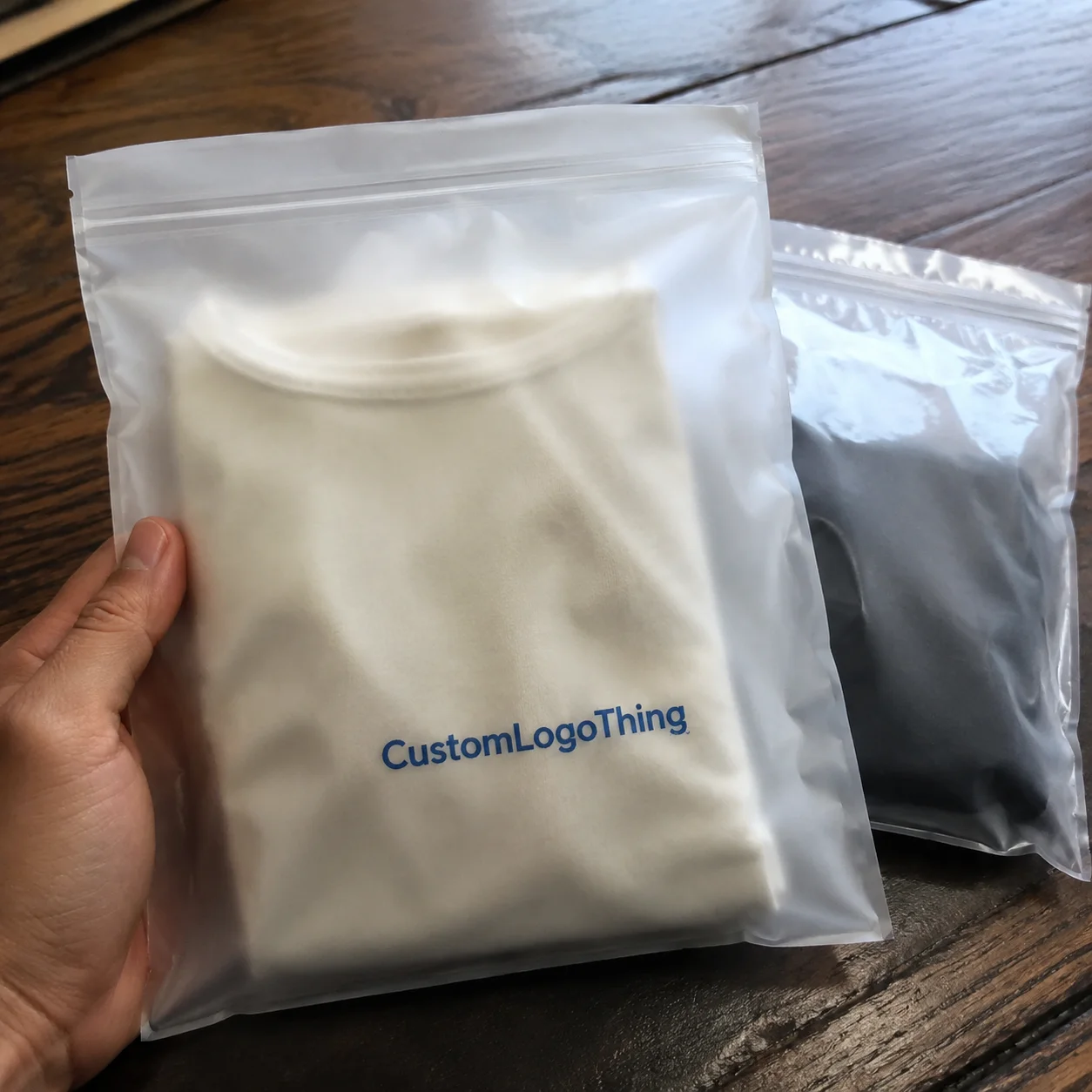
For skincare brands, packaging is often judged in seconds, and a Hang Tags Material guide for skincare brands is really a guide to how that first impression holds up under real retail conditions. A tag sits beside a glossy bottle, a matte carton, and a carefully written ingredient story; if the stock feels flimsy or the print looks muddy, the product can read cheaper than it is.
The tag’s job is bigger than many teams expect. It may carry brand story, usage cues, ingredient highlights, pricing, barcodes, or compliance details, all without making the pack feel crowded. Material choice shapes that balance more than artwork alone. A textured recycled sheet suggests natural care. A coated board reads sharper and more clinical. A poor choice can quietly undermine trust, especially in skincare, where shoppers often judge efficacy and safety from visual cues before they read the back label.
That is why this Hang Tags Material guide for skincare brands focuses on the practical side of selection: how stock affects durability, finish, print fidelity, cost, and the way a tag survives handling after it leaves the press.
Why hang tag materials matter more than most skincare brands think
Skincare hang tags usually live inside highly controlled packaging systems. Think frosted pumps, amber glass, minimalist cartons, and labels where every millimeter feels intentional. The tag cannot look like an afterthought. A 350gsm uncoated tag can support a natural brand story in a way a thin 250gsm sheet often cannot. The difference shows up immediately in hand feel, edge stiffness, and how the tag sits on shelf.
The tag also bridges design and information. For a serum, cleanser, or body wash, it may need to communicate skin type, hero ingredients, scent notes, usage directions, and recycling information. If the material causes feathering, glare, or readability problems, the message gets lost. From a packaging buyer’s point of view, that is a commercial issue, not a cosmetic one.
Material quality can influence trust even when the design itself is strong. A soft-touch finish on a premium line can make the product feel considered. A thin, curling tag can make a $40 facial oil look like a sample. Buyers notice this quickly, and consumers do too.
Many skincare teams underinvest here. They spend time on bottle color and carton copy, then treat the hang tag as a minor add-on. In practice, it is part of the system. That system has to work visually, tactually, and operationally.
How hang tag materials work in real skincare packaging
A hang tag is not just paper. It is a stack of decisions. The substrate, coating or finish, print method, die-cut shape, attachment string, and any special effect all change the final result. On a standard run, a brand might use 300gsm–400gsm paperboard, a silk or matte coating, offset or digital printing, and cotton or paper string. Add foil, embossing, or spot UV, and the production path gets longer and more expensive.
Material behavior matters under handling. Skincare products move through warehouses, fulfillment centers, retail shelving, and sometimes humid bathrooms once they reach the consumer. Tags on bath oils or body lotions can scuff, curl, or absorb moisture if the stock is too light or too porous. A material that looks elegant in a sample pack may fail after a week on the shelf. Testing under typical retail temperature and humidity is not overkill; it is basic quality control.
Surface texture also changes perception. Matte and uncoated stocks often read softer, more earthy, and more ingredient-led. Coated stocks, especially with a gloss or satin finish, sharpen color and fine detail. That can be a better fit for active-ingredient skincare, where precision and clarity matter. If the design includes tiny legal copy or a barcode, smooth coated stock usually prints cleaner than rough kraft paper.
Finishing choices push the message in different directions. Soft-touch lamination feels luxurious, but it can mute a natural-paper effect. Kraft paper signals honesty and simplicity, though it can darken colors and reduce contrast. Recycled materials support eco positioning, but the fiber mix can affect brightness and consistency. There is no universal best option. There is only the best option for a specific brand story and use case.
For brands building a broader packaging system, think in families. A cleanser box might use a different paper family than the hang tag, but the finishes should still speak the same language. If you need related labeling support, our Custom Labels & Tags page is a useful starting point, and the Case Studies section shows how material decisions change across product lines.
Key material factors: durability, finish, sustainability, and brand fit
Durability is the first filter. Tags on neck bottles, boxed sets, or retail hooks need enough stiffness to stay upright and survive transport. In practice, that means paying attention to caliper, not just GSM. A 400gsm recycled board may still feel softer than a 350gsm coated SBS sheet if the fiber structure is more open. Edge wear matters too, especially on tags with square corners or exposed die cuts.
Finish is the second filter, and it does more marketing work than many teams realize. Premium luxe brands often benefit from soft-touch lamination, subtle foil, or blind embossing. Clean clinical lines usually work better with white coated stock, restrained ink coverage, and minimal texture. Natural or apothecary-style brands lean toward kraft, cotton-like textures, or lightly speckled recycled materials. The finish should reinforce the promise, not fight it.
Sustainability has become a real purchasing criterion, not just a mood-board line. Buyers ask about FSC certified paper, post-consumer waste content, plastic-free attachments, and whether the build is actually recyclable. A paper face stock alone does not make a package sustainable. If the tag includes a laminated coating, plastic string, or mixed-material embellishment that cannot be separated, the recycling story gets weaker. For deeper standards context, packaging teams often reference guidance from the FSC and materials handling information from the EPA.
Brand fit comes down to product personality. A jelly cleanser with bright graphics may look better on a smooth satin stock. A botanical serum with restrained typography may feel more credible on uncoated recycled paper. A derm-led line often benefits from high contrast and excellent legibility. That means avoiding materials that make 5-point legal copy blur into the background.
| Material type | Typical look | Best for | Trade-off |
|---|---|---|---|
| Uncoated premium paper | Soft, natural, tactile | Botanical, clean beauty, artisan skincare | Less color pop and more visible fiber texture |
| Coated paperboard | Sharp, bright, polished | Clinical, ingredient-led, modern skincare | Can feel less earthy or handmade |
| Kraft paper | Warm, raw, organic | Eco-focused or minimal brands | Lower contrast for small text and dark artwork |
| Recycled stock | Natural with visible fiber variation | Sustainability-forward lines | Color consistency can vary more than virgin board |
| Soft-touch laminated board | Velvety, premium, muted | Luxury skincare and gift sets | Often more expensive and less recyclable as a composite |
Thickness is another lever that affects both perception and cost. Heavier stock usually feels more trustworthy, but once you move into custom die cuts, foil, or multi-part attachment systems, the cost climbs quickly. From a design perspective, that makes material choice a branding decision as much as a print decision.
Cost, pricing, MOQ, and unit cost trade-offs
Skincare brands often ask for a price per tag, but that number only makes sense once the variables are controlled. The main cost drivers are stock, size, color count, finish, die-cut complexity, foil or embossing, stringing, and packing labor. A simple two-color hang tag on standard uncoated paper may cost roughly $0.08-$0.18 per unit at larger volumes. Add soft-touch lamination, foil, and a custom shape, and the same piece can move into the $0.22-$0.45 range or more, depending on quantity and setup.
Minimum order quantities matter because they shape cash flow. Startups often want 500 to 1,000 pieces to test a new cleanser or serum line. Established brands may order 5,000 to 20,000 pieces to support a launch window or rebrand. Lower MOQs are useful, but they usually raise the unit price because prepress, cutting, and setup costs get spread across fewer pieces. That is normal.
The cheapest option can become the most expensive mistake. A low-cost tag that curls, tears at the hole, or prints too dark can trigger reprints. Reprinting 2,000 tags because the stock was too flimsy is a much bigger hit than paying a few cents more for the right material on the first order. This happens more often than brands expect: line-item price gets optimized, then quality gets paid for twice.
A practical way to compare suppliers is to request two quotes on the same artwork: one with a standard stock and one with a premium or eco-focused upgrade. Keep size, color count, and quantity identical. That gives you a fair comparison and reveals where the real cost jump sits.
For context, packaging buyers also compare the hang tag against other printed components such as carton sleeves or insert cards made from corrugated cardboard or folding board. That comparison is useful, but the tag has its own role. It must survive handling, communicate quickly, and support the product’s shelf identity.
Process and timeline: production steps from file to delivery
The path from concept to delivery is usually straightforward, but not short. A typical run moves through material selection, artwork setup, proofing, sampling, print production, finishing, assembly, quality check, and shipping. Each step has room for delay if the files are incomplete or the specification is unclear.
Custom die lines are one of the biggest timing variables. If the tag shape is simple, production tends to move faster. If the piece needs a custom cutout, rounded perforation, foil, embossing, or a specialty stringing method, the schedule expands. For a standard hang tag, a sensible lead time is often 10-15 business days after proof approval. More complex builds can stretch to 15-25 business days, especially if samples are required before full production.
Approval speed matters as much as press speed. A brand that returns proofs in 24 hours usually moves much faster than one that takes four days to answer a color question or approve a copy edit. Small delays multiply across packaging programs, especially when cartons, labels, and inserts are being produced in parallel.
If your launch includes multiple packaging components, build the hang tag timeline into the master calendar early. It is easier to align one tag run with a carton run than to squeeze it in after the bottle labels have already shipped.
For brands that want to understand quality control beyond print alone, industry testing organizations such as ISTA are useful references for handling and transit expectations. The exact test protocol depends on your distribution channel, but the principle is simple: if packaging moves through a warehouse, it should be tested like it will be handled in a warehouse.
Step-by-step guide to choosing the right hang tag material
Step 1: Define the product story. Is the line clinical, luxurious, earthy, clean, or dermatologist-led? A bright, active-ingredient serum needs a different visual language than a calming balm or a spa-oriented body cream.
Step 2: Match the material to the use case. A single bottle tag does not need the same structure as a gift set tag. Sample kits, holiday bundles, and retail shelf displays may need thicker board or better scuff resistance than a short-run promo tag.
Step 3: Shortlist stocks by performance. The usual contenders are recycled paper, kraft paper, coated paperboard, uncoated premium paper, and specialty textured material. If sustainability is central, specify FSC certified or recycled materials early so you are not redesigning after the quote comes in.
Step 4: Test readability with real content. Do not approve a design using placeholder text. Use the actual ingredient list, legal copy, barcode placement, and any warning statements. Fine typography that looks beautiful on screen can collapse on textured stock. Contrast is not optional in skincare packaging.
Step 5: Check attachment and durability. A tag is only as good as its hole placement and string choice. Cotton string, paper string, and narrow recycled ties each behave differently. If the tag is attached to a neck bottle or a hook display, test whether it swings, twists, or tears under handling.
Step 6: Compare quotes against brand goals. A lower-cost stock may work fine for a limited edition, while a premium line may justify soft-touch lamination or embossing. Approve a sample first if the order is large enough to make a mistake expensive.
- Request sample swatches from at least two material families.
- Print the same artwork on each sample.
- Check legibility at arm’s length and in store lighting.
- Handle the sample for edge wear, bending, and scuffing.
- Choose the stock that supports both the product and the channel.
If your brand extends into body care, hair care, or seasonal sets, choose a material system that can scale. A consistent tag family across cleansers, serums, masks, and gift bundles saves design time later and keeps the shelf story coherent. That is one reason many teams pair a tag system with a larger custom packaging standard rather than treating each SKU as a one-off.
Common mistakes skincare brands make with hang tag materials
The first mistake is choosing a stock that looks beautiful in a digital mockup but feels too light in hand. Screens hide stiffness. A tag that feels weak can make the product seem less serious, even if the design is strong.
The second mistake is using highly textured or dark material for tiny text. This causes trouble with ingredient lists, barcodes, batch codes, and compliance copy. If the copy needs to stay visible, surface texture should never overpower readability.
The third mistake is over-specifying finishes. Foil, embossing, spot UV, and soft-touch can all look good, but stacking too many effects can make the tag feel crowded or inconsistent with the rest of the packaging system. One tactile focal point usually does more work than three competing effects.
The fourth mistake is ignoring sustainability claims. A brand may choose recycled paper but pair it with plastic string or a coating that undermines recyclability. That is not necessarily wrong, but it should be intentional. If the product is marketed as clean beauty or aligned with biodegradable packaging, the whole build should support that message.
The fifth mistake is skipping prototypes. Tags can curl, smudge, crack at the fold, or tear around the hole, especially if the stock is too thin or the die cut is too tight. A prototype costs less than a rerun. Every time.
Expert tips for making smarter material decisions
Use one tactile hero element, not five. A premium paper texture can carry the design without needing foil, gloss, embossing, and specialty varnish all at once. Subtle often feels more expensive because it feels controlled.
Keep contrast high. Skincare packaging often includes small claims, ingredient notes, directions, and regulatory copy. On uncoated or kraft paper, dark charcoal or black type usually performs better than pale gray. If the tag carries a barcode, test scan performance before signing off.
Ask for samples under the same light where the product will be sold and photographed. Retail lighting and studio lighting do not behave the same way. A stock that looks warm and elegant under daylight may look dull under cool shelf lighting.
Verify the full build if sustainability matters. That means inks, coatings, attachments, and any adhesive points, not just the paper face stock. FSC certified paper is a strong start, but it is only one piece of the claim. If you want recycled materials to carry the message, the details have to match.
Choose with future product lines in mind. A tag system that works for a cleanser should be adaptable for serums, masks, and gift sets. That reduces redesign costs later and keeps the brand’s packaging language consistent as the line expands.
Packaging teams often spend more time comparing bottle shapes than hang tag stock, yet the tag is one of the few components consumers touch directly. That tactile moment is brief, but it is real. The wrong choice can weaken the story. The right one can make a modest product look thoughtfully built.
Bottom line: a smart Hang Tags Material guide for skincare brands is not about choosing the fanciest paper. It is about matching material to message, durability, cost, and sustainability claims so the tag supports the skincare product instead of competing with it. If you get that balance right, the hang tag becomes a quiet credibility tool, which is exactly what good packaging should do.
What is the best hang tag material for skincare brands with a premium look?
Premium skincare often performs well with thick uncoated, soft-touch, or lightly textured paper stocks because they feel refined without looking overly busy. If the brand leans clinical or luxury, a cleaner coated stock with restrained foil or embossing can work, as long as readability stays strong.
Which hang tag material is best for eco-conscious skincare packaging?
Recycled kraft or FSC-certified uncoated paper is often the strongest fit when sustainability messaging matters. Make sure coatings, adhesives, and string choices also support the sustainability claim; the paper alone does not tell the full story.
How do I compare hang tag pricing for different materials?
Compare like for like by keeping size, color count, finish, and quantity consistent across quotes. Ask for unit cost, MOQ, and any setup or finishing fees so you can see where the real price difference comes from.
How long is the typical hang tag production timeline?
Simple runs usually move faster than custom-shaped or multi-finish projects, which need more proofing and production steps. The fastest way to reduce lead time is to approve artwork quickly, provide final die lines, and avoid late-stage copy changes.
Can hang tag materials affect print quality on skincare packaging?
Yes—smooth coated stocks usually hold fine details and crisp color better, while uncoated or textured papers create a softer, more natural look. If your artwork uses tiny text or subtle tonal gradients, request a sample or proof on the actual material before full production.