Buyer Fit Snapshot
| Best fit | Create Custom Packaging Designs projects where brand print, material claims, artwork control, MOQ, and repeat-order consistency need to be specified before quoting. |
|---|---|
| Quote inputs | Share finished size, material target, print colors, finish, packing count, annual reorder estimate, ship-to region, and any compliance wording. |
| Proofing check | Approve dieline scale, logo placement, barcode or warning zones, color tolerance, closure strength, and carton packing before bulk production. |
| Main risk | Vague material claims, crowded artwork, missing packing details, or unclear freight terms can make a low unit price expensive after revisions. |
Fast answer: Create Custom Packaging Designs: Quote Scope, Sample Proof, MOQ, and Lead Time should be specified like a repeatable production item. The safest quote records material, print method, finish, artwork proof, packing count, and reorder notes in one written spec.
Production checks before approval
Compare the actual filled-product size with the drawing, then confirm tolerance on folds, seals, hang holes, label areas, and retail display edges. Reserve space for logos, QR codes, warning copy, and material claims before decorative graphics fill the panel.
Quote comparison points
Review material grade, print process, finish, sampling route, tooling charges, carton quantity, and freight assumptions side by side. A quote is only useful when the supplier can repeat the same color, closure quality, and packing count on the next order.
If you want to understand how to Create Custom Packaging Designs, start with the ugly truth: the prettiest mockup in the world can still fail on press, and I’ve watched that failure turn into a $3,000 mistake faster than a sales rep can say “it’ll be fine.” The gap between packaging that looks polished on a screen and packaging that actually prints well lives in the dieline, the board grade, and the finishing choice nobody wanted to discuss. A 350gsm C1S artboard with matte lamination will behave very differently from a 1.5mm rigid chipboard wrapped in printed paper. Gorgeous on a laptop. A disaster in real life. Love that for everyone involved.
I’m Sarah Chen, and I’ve spent 12 years in custom printing, standing on factory floors in Shenzhen, arguing with a plant manager at 7:40 a.m. over fold accuracy, and telling clients that their “simple box” needed a second proof because the barcode was sitting right on a seam. That’s the real job. How to create Custom Packaging Designs is not just graphics. It’s structure, materials, print limits, and brand story all behaving like adults in the same room. Which, frankly, is harder than it sounds. I’ve also sat through proof reviews in Dongguan where one missing 2 mm bleed created a mess nobody wanted to pay for.
If you get it right, packaging does more than hold a product. It protects the shipment, sells the product, and gives your brand a memory hook people remember two days later. If you get it wrong, you end up with crushed corners, muddy color, or a box that looks gorgeous in Photoshop and embarrassing on the shelf. I’ve seen both. Too many times, honestly. A $0.15-per-unit folding carton can outperform a $2.40 rigid box if the structure and artwork are smarter, which is the kind of annoying truth procurement teams hate and finance teams adore.
How to Create Custom Packaging Designs: What It Really Means
The easiest way to explain how to create Custom Packaging Designs is this: you’re designing a container and a sales tool at the same time. Structure, graphics, materials, finishes, and production constraints have to work together. If one piece is off, the whole thing feels cheap or awkward. And yes, the factory will notice before your customer does. Usually with a pause, a raised eyebrow, and the kind of silence that says, “who approved this?” In a Guangzhou print shop, that pause can last exactly long enough to cost you another proof round.
Years ago, I visited a folding carton plant in Shenzhen where a client had approved a gorgeous full-bleed black box with tiny silver text. On screen, it looked premium. On the press sheet, it looked like somebody sneezed graphite. The black ink density was inconsistent, the silver foil wandered off the registration marks, and the final correction cost nearly $3,000 between rework and freight. That’s the expensive lesson: designing for a mockup is not the same as designing for production. I still remember the client’s face when we laid the proof next to the sample. Total “oh no” energy, right there under fluorescent lights.
When people ask me how to create custom packaging designs, I tell them to think in five layers:
- Structure — mailer box, folding carton, rigid box, insert, sleeve, tray, or shipper.
- Graphics — logo, messaging, color system, imagery, typography, and barcode placement.
- Material — corrugated board, SBS paperboard, kraft, rigid chipboard, or specialty substrates.
- Finishes — matte lamination, gloss, soft-touch, foil, embossing, spot UV, or varnish.
- Production limits — bleed, safe zones, seam placement, ink coverage, and machine tolerances.
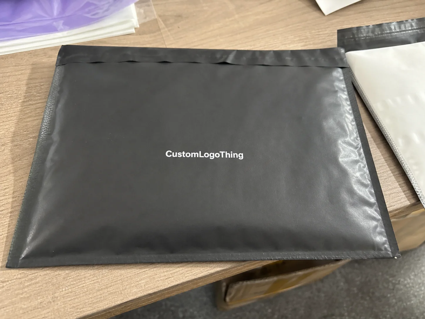
Packaging is not decoration. It affects shelf presence, shipping protection, unboxing experience, and brand recall. A box with strong package branding can do more selling than a paid ad, especially for ecommerce and retail packaging where the carton is the first physical touchpoint. I’ve watched a plain brown mailer with one smart inside print outperform a pricey full-color outer box because the experience felt intentional instead of noisy. People notice that stuff. They may not say it out loud, but they absolutely notice. A kraft mailer with a single black logo and a 1-color insert can cost under $0.65/unit at 5,000 pieces and still look premium if the structure and typography are doing their jobs.
Here’s the part people skip: how to create custom packaging designs starts with production reality. A lovely design that ignores the fold lines, glue tab, or print registration is just an art project with a freight bill. I’m not ضد pretty design. I like pretty design. I just like it to survive the pressroom. Wild concept, I know. On a corrugated mailer run in Dongguan, even a 1.5 mm shift in seam placement can turn a clean concept into a reprint order.
You should expect the process to follow a normal rhythm: creative brief, dieline, artwork, sampling, revisions, and final production approval. If someone promises a perfect result with no sample, no proof review, and no check on fit, they are either lucky or not being honest. I’d bet on the second one. Suppliers love optimism right up until the first reprint invoice lands. In most factories I’ve worked with in Shenzhen and Ningbo, the real timeline is typically 12-15 business days from proof approval to finished samples, then another 10-25 business days for production depending on quantity and finishing.
How Custom Packaging Design Works From Brief to Box
Good how to create custom packaging designs workflow starts with roles. The brand owner decides the goal, the designer shapes the visual system, the packaging supplier checks structure and printability, and the print team makes sure the thing can be made without smoke coming out of the machine. That division matters because “I thought you were checking that” is not a production strategy. It is, however, a very common excuse. In a Suzhou conversion plant, I’ve seen three departments point at one misaligned barcode for 15 minutes before anyone admitted the file was wrong.
In one client meeting, a beauty brand in Los Angeles came in with a retail packaging concept that had six sides of copy, a foil pattern, and a magnetic closure. Pretty? Absolutely. Efficient? Not even slightly. We reduced it to a simpler rigid box with a foil logo, interior print, and a tray insert. Their unit cost dropped by 18%, from $2.20 to $1.80 per unit at 10,000 pieces, and the customer still got the premium feel they wanted. That’s what smart packaging design does: it prioritizes the part people will actually see and touch. Honestly, I think half of packaging problems are really just ego problems wearing a nice font.
The technical backbone is the dieline. That’s the flat template showing cut lines, fold lines, glue tabs, and safe zones. If your artwork ignores the dieline, you’ll end up with faces split by seams, logos wrapped over a fold, or copy hiding where nobody can read it. I’ve had a designer argue that the logo “looked centered” on the screen, which is adorable until the seam lands through the wordmark on the finished box. We all had a very educational afternoon. A 2 mm offset on a 120 mm panel is enough to make a premium carton look like it was assembled by someone with no sleep and no respect.
Here’s what the core terms mean in plain English:
- Bleed — extra artwork extending past the trim edge so no white slivers appear after cutting.
- Safe zone — the area inside the trim where text and important graphics should stay.
- Fold lines — places where the board bends, which can crack ink or distort artwork.
- Glue tabs — the hidden area that bonds the box together; nothing vital should sit there.
- Registration — the alignment between colors and print layers; poor registration makes clean art look sloppy.
Material selection changes the look more than most founders expect. A 350gsm C1S artboard behaves differently than a 1.5mm rigid chipboard wrapped in printed paper. Corrugated mailers give more protection but less fine detail than a folding carton. Kraft looks honest and earthy, but dark ink can absorb differently and shift the tone. If you want custom printed boxes that feel premium, the paper or board choice is half the design. The other half is not pretending the substrate will magically fix bad art. For example, a white SBS board printed in Shanghai may hold sharper gradients than a natural kraft liner from Hebei, even when both are technically “premium.”
Print method matters too. Offset printing handles fine details and large runs well. Digital printing can work for shorter quantities and quick prototypes. Flexo often shows up in corrugated packaging and shipper boxes. None of them are magical. Each has tradeoffs, and I’ve sat with suppliers long enough to know that “best method” usually means “best for this quantity, this board, and this budget.” If a rep says otherwise, I start looking for the catch. There is always a catch. It just wears a friendly smile. A 5,000-piece offset run might come in at $0.18/unit for a folding carton, while a 300-piece digital prototype could be $2.50/unit because setup is spread over fewer boxes.
The timing is usually straightforward if nobody keeps changing their mind. A normal workflow looks like this:
- Concept review — 1 to 3 business days for early direction.
- File setup — 1 to 2 business days if dielines and assets are ready.
- Digital proofing — 2 to 5 business days depending on feedback.
- Physical sampling — 5 to 12 business days for most custom packaging projects.
- Production — 10 to 25 business days based on quantity, materials, and finishing.
Delays usually happen in two places. First, artwork arrives late, which forces the whole schedule to slide. Second, someone changes structure after approval because they “just want to see one more option.” That one more option can add a week. Sometimes two. I’ve watched a launch date move because the brand wanted the insert 4 mm tighter after the sample was already approved. Four millimeters. That little. Enough to make a production manager stare into the middle distance like they were reconsidering every life choice. In one case out of Dongguan, that tiny tweak pushed shipping from a Friday to the following Wednesday, which is a long time in ecommerce terms.
For packaging standards, I always tell clients to ask about testing and compliance if the product is fragile, hazardous, or shipping long distance. ISTA testing matters for ecommerce drops, and ASTM references can matter for materials and performance. If you need sustainability claims or certified sourcing, check FSC at fsc.org. For transport and packaging waste context, the EPA has useful guidance at epa.gov. Nobody gets bonus points for guessing. Not from me, anyway. If you’re manufacturing in China, ask whether the supplier can provide FSC chain-of-custody paperwork from a certified mill in Guangdong or Zhejiang before you approve anything.
Key Factors That Shape Custom Packaging Design Costs
People search how to create custom packaging designs for the creative steps. Then the quote lands, and suddenly everyone becomes very interested in math. Fair. Packaging pricing is a mix of structure, quantity, material, and finish, and the same box can cost wildly different amounts depending on what you ask it to do. A folding carton in 350gsm C1S artboard may cost $0.15 per unit for 5,000 pieces, while the same design in a rigid setup with wrapped chipboard can jump to $2.40 per unit or more.
The biggest pricing drivers are simple. Box style, dimensions, board type, print coverage, finishing, inserts, and order quantity. A small folding carton with one-color print might run around $0.18/unit for 5,000 pieces. A rigid box with soft-touch lamination, foil, and a custom tray can climb to $2.40/unit or more, especially if you want low quantities. That’s not greed. That’s tooling, labor, material, and machine time. Paper does not negotiate. Machines care even less. If you ask for embossed foil on a 250-piece run in Shenzhen, the setup cost alone can make everyone in the room go quiet for a second.
I once negotiated with a converter in Dongguan who wanted to charge a setup fee of $450 for a short run of 1,000 mailers. The client almost choked. Then we looked at the actual job: custom size, full-color print, white ink underlay, and die cutting. The fee was annoying, sure, but it was not random. Setup costs, plate charges, and make-ready time make small runs feel expensive because they are expensive. The machine doesn’t care that your launch budget is emotional. It’s rude like that. On a 1,000-piece corrugated job, plate making alone can add $120 to $250 before you even talk about freight from the factory in China to your warehouse in California.
Here’s a useful way to compare common options:
| Packaging Option | Typical Use | Approx. Unit Cost | Main Tradeoff |
|---|---|---|---|
| Folding carton | Cosmetics, supplements, electronics accessories | $0.18–$0.65 | Lower material cost, less crush protection |
| Corrugated mailer | Ecommerce shipping, subscription boxes | $0.55–$1.40 | Better protection, less refined surface |
| Rigid box | Gift sets, premium retail packaging | $1.80–$4.50 | Premium look, higher labor and material cost |
| Sleeve + tray | Specialty product packaging | $0.90–$2.20 | Good presentation, more pieces to assemble |
Finishes can swing the budget hard. Matte lamination is usually cheaper than soft-touch, and soft-touch can make fingerprints less obvious, but it adds cost. Spot UV on a logo can look sharp, but if you cover the whole front panel, the line item climbs. Foil looks expensive because it is expensive, especially on large solid areas where registration has to be tight. I’ve seen clients choose one-color print on a kraft box and get a cleaner premium effect than a crowded five-color design with three finishes and no visual hierarchy. That’s the trick: restraint usually beats decoration. A small spot UV logo might add $0.08 to $0.15 per unit on a 5,000-piece run, while full-panel foil can add $0.25 or more.
Sampling deserves its own budget. A prototype is not wasted money if it saves you from printing 8,000 wrong boxes. I usually tell clients to reserve 5% to 10% of the packaging budget for sampling, revisions, and one unexpected issue. Sometimes the sample reveals a fit issue, sometimes it reveals a color shift, and sometimes it just proves the original idea was too complicated for the target price point. Painful, yes. Useful, absolutely. Nobody celebrates a prototype until it saves the project. I’ve had a brand save $2,600 by catching an insert tolerance problem on a sample made in Shenzhen instead of on the full production run.
If you are comparing suppliers, ask for baseline quotes from places like Custom Packaging Products, Uline, Packlane, and local corrugated converters. Not because every quote is apples-to-apples. It isn’t. But it gives you a floor. Uline is often handy for stock sizes, Packlane is helpful for quick custom mockups, and a local converter may beat them on freight or turnaround if your spec is straightforward. I’ve seen companies save $700 on freight alone by switching from a distant supplier to one closer to their fulfillment center. Freight is where budgets go to die, apparently. A plant in Qingdao may quote cheaper boxes, but shipping them to a Los Angeles 3PL can erase the advantage fast.
One honest warning: the lowest quote is not always the best deal. A cheap box with sloppy die cuts or weak board can cost more in returns, damage, or brand embarrassment. That part never shows up in the first spreadsheet. The first spreadsheet is always so optimistic. Adorable, really. A $0.11 unit cost means nothing if 3% of cartons crush in transit and the customer support team spends two weeks apologizing.
Step-by-Step: How to Create Custom Packaging Designs
If you want the practical version of how to create custom packaging designs, here it is. Start with the product, not the pretty part. Size, weight, fragility, shipping method, and customer experience shape every other decision. A 2 oz serum bottle needs different product packaging than a 3-pound candle set, and pretending otherwise is how you end up with broken corners and angry emails. I remember one candle launch where the box looked fantastic in the mockup and then folded like a lawn chair in transit. Not ideal. The fix was a sturdier 400gsm board and a tighter insert, which added $0.12 per unit and saved the whole launch.
I keep a simple rule: packaging should fit the product and the promise. If the product ships in a poly mailer, don’t design a rigid retail box just because it feels fancy. If the item sits on a boutique shelf, don’t treat it like a warehouse carton. The format has to match the use case. Simple. Not easy. Different thing. A clean folding carton from a Guangdong factory can look premium with 1-color black ink and a single foil mark if the structure is right.
1. Build the packaging brief
A good brief saves money. Write down the product dimensions, target quantity, budget ceiling, brand goals, messaging, and whether the packaging is for ecommerce, retail, or both. Include the logo files, copy, barcode, and any required claims. If the brief says “premium” and nothing else, that is not a brief. That is a mood. A very expensive mood, usually. I like briefs that mention exact numbers: 120 mm x 80 mm x 45 mm carton, 5,000 pieces, target cost under $0.60/unit, and a 12-15 business day sample window after proof approval.
I’ve had brands hand me a folder with 19 inspiration images and no measurements. Cute, but not helpful. A complete brief should answer these questions:
- What product is inside?
- How fragile is it?
- Will it ship individually or in cartons?
- Do you need custom inserts?
- Do you want branded packaging for retail display or shipping first?
2. Pick the right packaging format
This is where many people go wrong. They choose the visual style before the structure. Don’t. A mailer box, a folding carton, and a rigid box solve different problems. Mailers are great for ecommerce. Folding cartons work well for lighter retail items. Rigid boxes deliver a more premium opening experience. If you choose the wrong structure, no amount of graphic design will save it. Honestly, I think structure does more heavy lifting than most people want to admit. A mailer made in Shenzhen with E-flute corrugated board can protect a subscription kit far better than a gorgeous but flimsy paperboard sleeve.
I once watched a client insist on a tuck-end carton for a glass device that weighed nearly 2.5 pounds. The box looked elegant, then collapsed in transit because the insert wasn’t doing enough. We switched to a corrugated set-up with a molded pulp insert, and the damage rate dropped sharply. That is the sort of unglamorous decision that makes packaging work. No one posts about it on Instagram, but that’s the part that keeps products alive. The redesign took 9 days from brief to revised proof, and the return rate fell from 4.8% to under 1% on the next shipment.
3. Work on the dieline, not a fantasy
Use the supplier’s template. Always. A packaging designer can make art, but the template is the rulebook. Set your file in CMYK, keep logos as vector artwork, check image resolution at 300 DPI, and make sure all critical elements stay inside the safe zone. If your supplier gives you a dieline with a separate layer for cut and fold lines, keep those layers locked. They are not decoration. I’ve seen a Shanghai converter reject a file because the designer put artwork on the cut line and then acted surprised when the blade didn’t care about their mood board.
Ask whether the supplier wants fonts outlined or embedded. Most print-ready files should have type outlined to avoid font replacement problems. I learned that lesson when a brand’s carefully chosen display font turned into Arial on a proof because someone forgot to package the file properly. Small mistake. Big annoyance. The kind that makes you stare at your screen and question humanity for a second. If you’re sending files to a factory in Ningbo or Xiamen, confirm the export settings before 5 p.m. local time, because that’s when production teams stop being generous.
4. Review proofs like your money depends on it
Because it does. Digital proofs help check layout, copy, barcode placement, and general structure. But they are not a true color match. If color matters, ask for a press proof or physical sample. Look at the sample under the lighting where the product will actually live: retail shelf lighting, office lighting, warehouse light, whatever applies. A cool white LED in a Shenzhen sample room can make a warm beige look gray if you don’t check it under the same lighting the product will face in the US or UK.
How to create custom packaging designs properly means you do not approve a proof while rushing between meetings. I tell clients to check the logo, legal copy, weights, barcode readability, finish notes, and orientation of the box once assembled. Turn the sample over. Open it. Close it. If there’s an insert, put the real product inside. A box that fits an empty tray is not good enough. Your product is not imaginary, so the fit shouldn’t be either. I also recommend measuring the final sample with calipers, because “looks close enough” has cost me more than one afternoon.
5. Confirm production approval only once
Final approval should be final. That sounds obvious, but I’ve seen “approved” files come back with one more logo move, one more line of copy, or one more structural tweak. That kind of churn burns time and money. Be certain about the board, the finish, the print method, and the quantity before you sign off. Changing your mind after approval is basically a tax on indecision. If a factory in Dongguan has already pulled plates and cut dies, every extra tweak is a real cost, not a philosophical one.
Here’s the order I recommend:
- Brief and measurements
- Format and structure selection
- Dieline setup
- Artwork creation
- Digital proof review
- Physical sample review
- Final approval
- Production and shipment
That process is not glamorous, but it works. And yes, it is the backbone of how to create custom packaging designs that actually reach customers looking the way you intended. Which, bizarrely, is still a high bar for some teams. A clean production path in Shenzhen or Guangzhou is often the difference between a launch that feels polished and one that feels like damage control.
Common Mistakes When You Create Custom Packaging Designs
Most mistakes in how to create custom packaging designs are not dramatic. They are boring. Tiny text. Bad contrast. Wrong dimensions. A barcode parked on a fold. Nothing cinematic. Just expensive. The kind of expensive that shows up in reprints and quiet meetings. A 6 mm barcode shift can stop a packing line in its tracks in a warehouse outside Chicago or a fulfillment center in New Jersey, which is a very unfun way to learn about tolerances.
The first mistake is designing like the packaging will only ever live on a screen. Screens forgive a lot. Carton board does not. I’ve seen delicate gray text vanish on kraft stock because the contrast was too low. I’ve seen full-bleed dark backgrounds look uneven after lamination. I’ve seen a beautiful layout become illegible because the fonts were too thin for the substrate. If you need a magnifying glass, your customer probably won’t bother. They’ll just move on, which is even worse. A 7pt font might look tasteful in Figma and awful on a 120gsm inner sleeve.
The second mistake is ignoring structure. Fold lines, seam placement, and glue tabs matter. A logo split across a seam looks sloppy. So does a line of copy running into the tuck flap. I once had a cosmetic client who wanted a centered icon on every panel, right through the areas that were going to fold and overlap. The art director loved symmetry. The pressroom loved reality. Reality won. As it usually does. Very rude, but consistent. In a factory in Zhejiang, that kind of mistake can mean another die line revision and a 3-day delay.
The third mistake is skipping the product dimensions. If the insert is too loose, the product rattles. If it is too tight, the packaging tears or the product jams. With custom printed boxes, fit is not a nice-to-have. It is basic function. For shipping, I usually want a minimum of 2 to 4 mm clearance on inserts depending on the material and the product weight. That depends on the converter and the product, of course, but zero wiggle room is usually a bad idea. Tight enough to secure. Not so tight that the box screams when you close it. For a molded pulp insert, that clearance can save a glass item from cracking in a 1.2-meter drop test.
The fourth mistake is forgetting shipping conditions. If the packaging will go through a fulfillment center, cross-dock, or long-distance delivery, then drop protection and moisture resistance matter. You do not need to build a tank, but you do need to think beyond the studio table. ISTA drop testing is useful for ecommerce packaging because it simulates handling abuse. If you ship nationwide, humidity and compression also deserve a look. A corrugated mailer from a humid port in Shenzhen can behave differently once it sits in a July warehouse in Texas for three days.
The fifth mistake is approving artwork without checking legal and operational details. Barcode size, ingredient copy, warning labels, country of origin, and recycling symbols can all matter. I’ve had a brand miss a barcode placement issue by 6 mm and the scanner failed on the packing line. Six millimeters. That’s how close packaging mistakes live to disaster. Six millimeters is apparently enough to ruin a perfectly good afternoon. Country-of-origin text, for example, may need to sit on the bottom panel in a 7pt minimum size depending on the market, so yes, that tiny line matters.
“We thought the box was done until we ran the first test ship. The product moved, the insert rattled, and the brand team finally believed me that ‘premium’ and ‘protected’ are two different jobs.”
That quote came from a client who learned the hard way that packaging design needs testing, not just approval by committee. Honestly, committee-designed packaging is often where clarity goes to die. Too many opinions. Not enough math. I’ve watched a four-person marketing team spend 45 minutes debating whether the logo should be 3 mm higher, while the production manager quietly knew the real issue was a weak glue tab.
Expert Tips to Make Custom Packaging Designs Better
If you want how to create custom packaging designs that feel smart, not busy, use one bold visual anchor. One. Not seven. A strong logo, a single hero image, or a sharp color block can carry more brand power than a front panel stuffed with three taglines and four icons. White space is not wasted space. It is contrast. It gives your design room to breathe, which is more than I can say for some packaging decks I’ve reviewed. A 60% coverage front panel often feels cleaner than a 95% coverage panel fighting for attention.
Think about the opening moment too. The outside of the box sells the click or the pickup. The inside sells the memory. I’ve worked on branded packaging where the outside stayed clean and the interior had one line of copy, a logo pattern, and a contrasting color. The cost increase was small, often under $0.10 to $0.25 per unit depending on print method, but the perceived value jumped because the unboxing felt intentional. People love a small surprise, especially when it doesn’t look like trying too hard. A 1-color interior print in a matte mailer from Guangzhou can add more emotion than a second foil finish on the outside.
Ask your supplier for a print-ready template and a production review before you finalize anything. Most decent suppliers will check the dieline, seams, and basic file issues if you give them enough time. If you work with a team through Custom Packaging Products, ask for a file check early. It is easier to fix a panel before production than to argue with a pallet of finished boxes. Trust me, pallets do not become less annoying with time. I’d rather catch a bad bleed in hour one than pay for 5,000 boxes sitting in a warehouse in Ningbo.
Choose finishes for a reason. Spot UV should highlight something important. Foil should reinforce the premium cue or logo hierarchy. Embossing should add tactile interest. Interior printing should support the unboxing, not just eat budget because someone wanted “more wow.” If every feature is fighting for attention, none of them will feel special. I’d rather see one finish used well than three finishes used like confetti. On a $0.45 folding carton, one clean foil logo can work harder than a full-panel gloss plus emboss plus spot UV combo.
Keep a reusable packaging system when you can. That means shared box sizes, common inserts, and a consistent visual language across SKUs. It reduces redesign work and can lower setup costs on future orders. I’ve seen brands save 12% to 20% on repeat packaging runs simply by standardizing a few structures instead of custom-building every single SKU from scratch. The boring option is sometimes the profitable one. Annoying, but true. A standardized mailer made in Dongguan can keep freight predictable too, which finance people love with a kind of religious intensity.
Here are a few practical upgrades I recommend often:
- Use a stronger visual hierarchy so the eye lands on the logo first, not on random copy.
- Limit color count if you are trying to control cost on custom printed boxes.
- Match finish to product category so the box feels appropriate, not gimmicky.
- Ask for press samples when brand color accuracy matters a lot.
- Test opening and re-closing if the box may be reused or returned.
Here’s the uncomfortable truth: good packaging design often looks simpler than the messy first draft. That is not because the work was easy. It is because someone made decisions. Strong product packaging is built from subtraction, not decoration overload. That’s the part most people get backward. They want more stuff. I want fewer mistakes. A clean 350gsm C1S carton with a single logo, calibrated CMYK values, and one precise finishing choice will usually outperform a crowded concept from a London agency that never spoke to the factory in Shenzhen.
Next Steps After You Finalize Custom Packaging Designs
Once you finish how to create custom packaging designs, organize everything before production starts. Put the dieline, final print files, outlined fonts, image links, approved copy, and notes about finishes into one folder. Name it clearly. “Final_final2_use_this_one” is not a system. It is a cry for help. I’ve opened folders like that and immediately lost the will to live for a minute. Use something sane like BrandName_BoxStyle_Approved_2025-08-12 and everyone will breathe easier.
Ask your supplier for one last checklist review. Confirm the barcode, quantity, board spec, finish notes, and shipping address. If you have a fulfillment center, make sure they know the carton pack size and pallet count. One missing barcode or a wrong carton dimension can slow the whole launch by days. Maybe longer if someone is “out of office” and somehow unreachable on the one day you need them. I’ve seen a misread shipping address turn a pallet truck toward the wrong dock in Los Angeles, and that was a 48-hour delay nobody budgeted for.
Then lock down the timeline. I want the proof approval date, sample approval date, production start date, and shipping date in writing. You do not need a 20-page project management deck. You need four dates and someone who will answer the phone when one of them slips. In China, if your proof is approved on Tuesday morning, a factory in Shenzhen can usually move a sample into production within 12-15 business days if the artwork stays frozen and the board is already sourced.
If this is your first launch, order a small pilot run and test the packaging in the real world. Ship it. Drop it. Stack it. Open it under normal lighting. Let someone on your team handle it without instructions. You learn more from 50 real units than from 500 imaginary opinions. And if you are selling through retail, put the box on an actual shelf and stand six feet away. That is the honest test. If it reads well there, you’re probably in decent shape. I’d rather find a weak glue seam on 50 test units in Chicago than on 5,000 finished boxes in a warehouse in Nevada.
Document what worked and what failed. Did the color hold? Did the insert stay put? Did the customer notice the inside print? Did the corrugated mailer survive rough handling? These notes make the next round faster and cheaper. I’ve watched brands cut revision time nearly in half on their second order because they wrote down the things the first launch exposed. Future you will be grateful. Present you may roll their eyes, but future you wins. A one-page packaging postmortem after launch can save $1,000 or more on the next print run.
For a fast starting point, you can browse Custom Packaging Products and compare packaging formats before you commit to a full custom run. Sometimes seeing the structure options side by side makes the decision obvious. And if it doesn’t, that’s usually a sign you should order samples before committing to a big quantity. I mean, we’re trying to avoid expensive surprises here, not collect them. A sample shipped from a factory in Guangdong might cost $40 to $120 including freight, which is cheap compared with a bad 5,000-piece run.
If you remember nothing else, remember this: how to create custom packaging designs is part creative process, part manufacturing reality, and part stubborn attention to details nobody sees until they fail. Get those details right, and the box does its job. Get them wrong, and the box becomes a very expensive lesson. I’ve paid for a few of those lessons myself (not literally every time, but close enough). The good news is that the next run is almost always better once the factory in Shenzhen, the designer in Brooklyn, and the brand team finally stop talking past each other.
FAQs
How do I create custom packaging designs if I don't have a designer?
Start with a supplier that provides dieline templates and basic file support. Then use a freelancer or in-house generalist for the visual layout if needed, but make sure they understand print production. I’ve seen many first-time brands keep the design simple and save $500 to $1,500 in avoidable revision costs because they focused on fit, print quality, and brand clarity first. Simple is not boring if it’s done well. A 2-color folding carton in 350gsm C1S artboard can look polished without a full agency budget.
How long does it take to create custom packaging designs?
Simple projects can move from brief to approved proof in a couple of weeks if your assets are ready and the structure is straightforward. Sampling and revisions usually add time, especially if you change finishes, inserts, or box style after the first proof. Production timing depends on quantity, print method, and whether tooling or custom inserts are involved. If someone promises tomorrow, I’d ask them to show their calendar. In practice, physical samples usually take 5-12 business days, and production often takes 10-25 business days after approval.
What is the average cost to create custom packaging designs?
It depends on whether you are paying for artwork only, structural design, or full packaging development. Printing costs usually rise with custom sizes, special finishes, and low quantities. Ask for separate quotes for design, sampling, and production so you can see where the money is going instead of guessing. Guessing is great for trivia night, not packaging budgets. For example, a 5,000-piece folding carton run might land around $0.18/unit, while a rigid box with foil and a tray can run $2.40/unit or higher.
What file format do I need for custom packaging design?
Most suppliers want print-ready vector files such as AI, PDF, or EPS with fonts outlined. Images should be high resolution, usually 300 DPI at final size. Always confirm dieline layers, bleed, and safe zones before sending files, because a beautiful file in the wrong format is still a problem. And yes, someone will definitely notice if the trim is off. If the factory is in Shenzhen or Dongguan, confirm whether they want linked images embedded or packaged in a separate folder before upload.
How can I make sure my custom packaging design prints correctly?
Use the supplier's dieline template and follow bleed and safe zone rules. Order a physical sample whenever color, fit, or finish matters a lot. Review text, barcodes, and logo placement carefully before production approval. That extra 20 minutes can save you from a very annoying reprint. I have seen people save thousands by being mildly obsessive here, which is frankly a habit I support. If you’re printing in Guangzhou or Shenzhen, ask for a press check or a mailed sample before the full run starts.