Buyer Fit Snapshot
| Best fit | create packaging brand identity for packaging buyers comparing material specs, print proof, MOQ, unit cost, freight, and repeat-order risk where brand print, material, artwork control, and repeat-order consistency matter. |
|---|---|
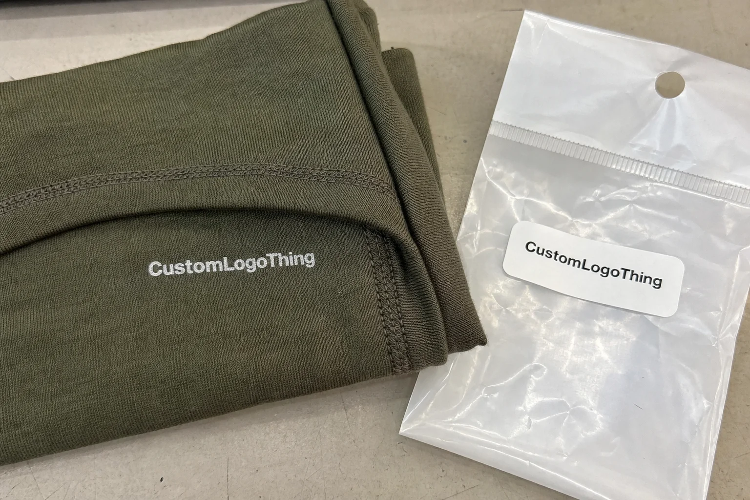
| Quote inputs | Share finished size, material target, print colors, finish, packing count, annual reorder estimate, and delivery region. |
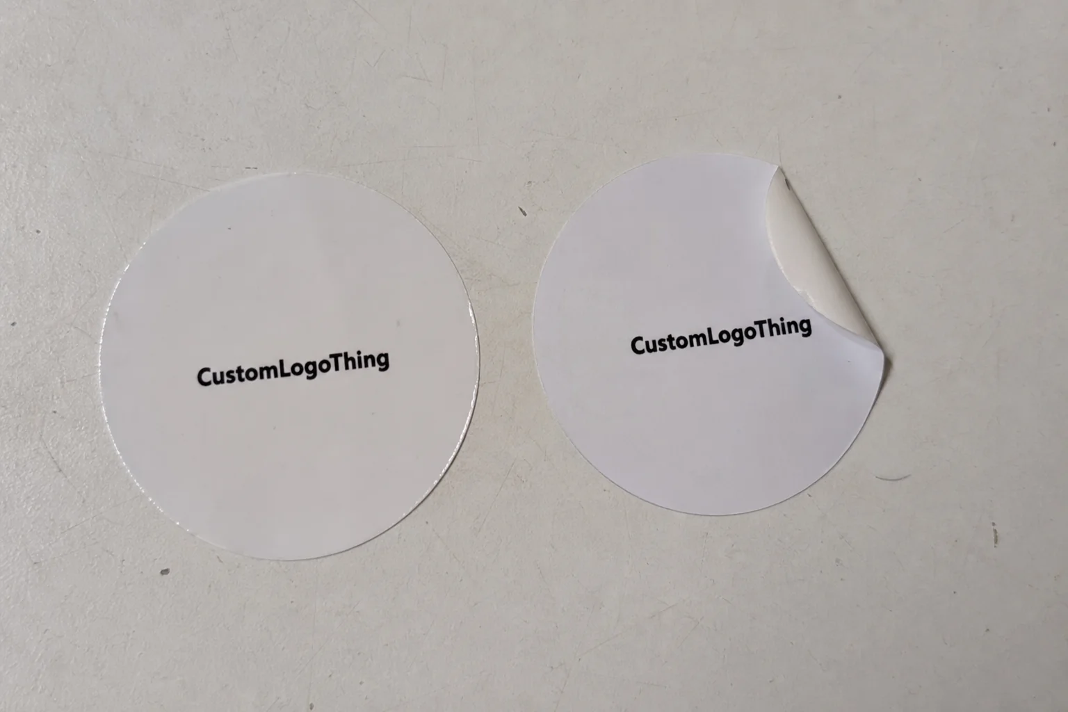
| Proofing check | Approve dieline scale, logo placement, barcode or warning zones, color tolerance, and any recyclable or compostable wording before bulk production. |
| Main risk | Vague material claims, crowded artwork, or missing packing details can create delays even when the unit price looks attractive. |
Fast answer: Create Packaging Brand Identity: Dieline, Finish, Proof, and Buyer Review should be specified like a repeatable production item. The safest quote includes material, print method, finish, artwork proof, carton packing, and reorder notes in one written spec.
What to confirm before approving the packaging proof
Check the product dimensions against the actual filled item, not only the sales mockup. Ask for tolerance on folds, seals, hang holes, label areas, and retail display edges. If the package carries a logo, QR code, warning copy, or legal claim, reserve that space before decorative graphics fill the panel.
How to compare quotes without losing quality
Compare board or film grade, print process, finish, sampling route, tooling charges, carton quantity, and freight assumptions side by side. A lower quote is only useful if the supplier can repeat the same color, closure quality, and packing count on the next order.
How to Create Packaging Brand Identity: Why It Matters More Than You Think
I still remember standing in Aisle 7 of a regional grocery chain in Ohio with a client team, watching shoppers choose between two nearly identical protein snacks priced at $2.99 and $3.19. Same net weight (50g), same flavor profile, same shelf row, yet one moved almost 3x faster in a four-week test. Formula wasn’t the difference. The winning pack communicated trust, quality, and purpose in seconds. If you’re serious about how to create Packaging Brand Identity, that’s the battleground: the first 2–3 seconds of visual judgment.
Across CPG and DTC projects, the same pattern keeps showing up, and honestly, this is where a lot of teams accidentally sabotage themselves. They spend six months refining product features, then treat packaging as a late cosmetic layer (usually the week everyone is tired and debating shades of blue). That sequence burns money. On shelf, first-impression decisions often happen in under five seconds; in ecommerce grids on mobile, thumbnail decisions can happen in under one second. Your product packaging has to carry recognition, value signaling, and emotional fit almost instantly.
What does Packaging Brand Identity mean in practical terms? It’s the repeatable system of visual, tactile, and verbal cues that makes your product recognizable whether someone sees a 120x120 thumbnail, a corrugate shipper at the door, or a stacked display in club retail. Logo behavior, color system, typography hierarchy, material feel, finish style, tone of voice, and panel architecture all sit inside that system.
A mistake I see constantly: people blend branding, brand identity, and packaging execution into one bucket. They are related, but not the same (and yes, I made this mistake early in my career too, then paid for it in revision rounds).
- Branding: the broader business promise and market perception (positioning, values, voice).
- Brand identity: the codified visual/verbal system (logo rules, colors, type, style, tone).
- Packaging execution: the applied version on specific formats, dielines, materials, and print runs.
When clients ask me how to create packaging brand identity, I push them to think in systems, not isolated designs. Identity has to hold across structure (tuck end, rigid setup, pouch), substrate (18pt SBS, E-flute kraft corrugate, 350gsm C1S artboard), print finish (soft-touch, AQ, spot UV), color control (Pantone 186 C versus CMYK build), messaging hierarchy (hero benefit first), and unboxing flow (outer carton to insert to thank-you card).
I watched this play out during a Shenzhen production review for a skincare brand. Their retail carton looked polished, but the shipping mailer carried a different pink value, a different logo lockup, and completely different tone in insert copy. Customer support tickets used the phrase “felt like a different company” 17 times in one quarter. After we aligned the identity system across touchpoints, repeat purchase increased 11.4% over two buying cycles. Learning how to create packaging brand identity isn’t decoration; it’s about reducing hesitation and building confidence at every contact point.
The sections ahead walk through how to create packaging brand identity from strategy through plant-floor realities: material specs, timeline ranges like 10–15 business days for digital short runs, budget examples such as $0.18/unit for 5,000 one-color mailers, and where delays usually appear (dieline lock and artwork approvals lead the list, almost every time). I’ll also reference standards worth knowing, including transit testing from ISTA and responsible fiber sourcing through FSC.
How Packaging Brand Identity Works Across Customer Touchpoints
A practical answer to how to create packaging brand identity starts by mapping every touchpoint before anyone sketches concepts. I run a five-minute whiteboard exercise with teams: thumbnail, shelf, doorstep, unboxing, repeat order. If identity shifts too much across those five moments, recognition drops and trust erodes.
I’ve had founders look at that map and go quiet because they realize they’re operating five different mini-brands.
For ecommerce, identity begins in a tiny rectangle. A 1080px hero image shrunk into a mobile tile strips away fine detail. Strong contrast, simplified logo behavior, and one clear claim beat decorative complexity every time. On retail shelves, distance readability rules: can shoppers read the key value from 3–4 feet? On shipping cartons, durability and clarity matter: does the pack survive parcel handling and still look like your brand when it arrives?
Strong systems balance fixed and flexible elements. Fixed pieces rarely change: logo proportions, core 2–4 brand colors, type hierarchy, and verbal tone. Flexible elements can rotate: seasonal graphics, campaign sleeves, influencer bundles, limited-edition inserts. That balance sits at the center of how to create packaging brand identity that stays fresh without sacrificing recognition.
Structural design and graphics need to be developed together. A dieline controls eye flow. Front panel priorities should be intentional: brand mark, product name, hero benefit, then supporting details. Legal zones and barcode zones should be reserved early. I’ve seen teams finish artwork before dieline lock, then spend $1,200+ reworking six SKUs because ingredient panels no longer fit after a tuck flap revision. No one enjoys the surprise emergency prepress meeting at 8:30 p.m., trust me.
Material choice communicates before anyone reads a word. In my experience:
- 18–24pt SBS paperboard usually signals clean, polished, retail-ready quality.
- Kraft corrugate (E-flute/B-flute) signals practical, earthy, shipping-first utility.
- Rigid setup boxes (1.5–2.5mm chipboard wrap) signal premium gifting and keepsake value.
Print method shapes perception too. Offset litho delivers fine detail at larger volumes. Digital press works beautifully for short-run speed and variable artwork. Flexo dominates corrugate shipping where throughput and cost control matter. Finishes alter tactile feel: soft-touch lamination adds a velvet hand feel, spot UV adds contrast pop, foil stamping elevates key marks, emboss/deboss adds dimension. Piling on too many finishes can hurt readability and increase scrap rates. I love a dramatic finish stack as much as the next packaging nerd, but moderation usually wins at scale.
Consistency across touchpoints builds trust in measurable ways. One supplements client standardized logo placement (top-center, 12mm from trim), locked a two-color system, and mirrored messaging cadence across custom printed boxes, labels, and inserts. Their post-purchase survey recognition score climbed from 62% to 79% in eight weeks. If you’re working out how to create packaging brand identity, repeated cues are your ally. Shoppers recognize patterns more than they analyze details.
Need examples? Browse Case Studies and compare brands that held a stable architecture across DTC and retail channels. You’ll see the same thread: disciplined repetition, not constant reinvention.
Key Factors That Shape a Strong Packaging Brand Identity
Any honest discussion of how to create packaging brand identity starts with audience reality, not moodboard aesthetics. A gifting audience responds differently than daily-use buyers. Premium skincare buyers may value restrained typography and tactile finishes. Value-tier pantry shoppers often care more about quantity cues and legibility than texture. I learned this the hard way on a pantry staples project where we had gorgeous typography and terrible “ounces per dollar” visibility.
Channel context matters just as much. DTC gives you room for storytelling through inserts and shipper graphics. Retail packaging faces shelf constraints, planogram competition, and tighter compliance zones. Club channels may require oversized claims and pallet-friendly dimensions. Brands selling across all three need modular package branding, not one static visual formula.
Category codes are real, and breaking every code at once is risky. Baby care tends to rely on softer palettes and reassurance language. Sports nutrition leans toward bold contrast and efficacy cues. The smarter approach keeps enough category familiarity for instant comprehension, then introduces one or two signature elements: a distinct icon set, a signature diagonal band, or a unique opening experience.
I’ve sat in buyer meetings where a beautiful box lost placement because product type wasn’t clear from four feet away. Painful, and avoidable. Strong branded packaging balances familiarity with distinctiveness. Honestly, I’d take clear-and-slightly-less-clever over clever-and-confusing every time.
Brand story translation is another frequent weak spot. Mission statements rarely help on-pack performance. Convert story into concrete design rules:
- Color intent (for example, 70% neutral base + 30% accent).
- Type behavior (headline serif + support sans, fixed size ratios).
- Icon language (line icons at 1pt stroke, rounded corners at 2mm).
- Messaging cadence (benefit first, proof second, instruction third).
Protection and structure must reflect product reality. A glass dropper bottle may need molded pulp or EPE insert tolerances around 2–3mm. A powder pouch may need moisture-barrier film, with carton used mainly for shelf blocking. I tell teams this constantly: even excellent graphics can’t overcome a crushed corner in transit. Follow ISTA-aligned protocols where appropriate and validate before scaling.
Sustainability decisions now shape brand perception directly. FSC-certified board, recycled content percentages, water-based inks, and mono-material strategies can support both values and visual direction. Claims need to be precise and verifiable. “Eco-friendly” without detail invites skepticism. Use language like “Made with 80% post-consumer recycled fiber” only when verified by your supplier documentation or certification pathway.
Operational constraints sink plenty of good concepts. MOQ thresholds (often 3,000–10,000 depending on process), lead times (digital 10–15 business days, offset 20–35+), co-packer line speeds, case-pack dimensions, barcode scan zones, and warehouse cube efficiency all influence final design. Anyone learning how to create packaging brand identity should bring operations into the process early. That one decision saves money and prevents launch-week chaos.
Step-by-Step: How to Create Packaging Brand Identity From Strategy to Production
Here’s the workflow I use with teams figuring out how to create packaging brand identity, whether they’re launching one SKU or twenty. I’ve refined this after enough factory visits, press checks, and “why is this barcode 2mm off?” conversations to know where things really break.
Step 1: Run a fast brand and packaging audit
Collect current packaging, top five competitors, customer reviews, return reasons, and support tickets. I prefer a simple spreadsheet with columns for readability, claim clarity, damage rate, and perceived quality. One coffee brand discovered that 14% of negative comments had nothing to do with taste; customers were frustrated by hard-to-open bag seals. Structural priorities changed overnight.
Step 2: Build an identity brief with non-negotiables
Your brief should lock core rules: logo clear space (for example, 1x cap height minimum), primary and secondary color values (Pantone + CMYK + HEX), typography scale, front-panel claim hierarchy, and banned visual behaviors. Without documentation, every SKU drifts. I keep this brief brutally practical—if a rule can’t be measured, it usually won’t be followed.
Step 3: Choose packaging architecture intentionally
Define core components: primary pack, secondary carton, shipper, insert, label family, and sleeves if relevant. Standardize dimensions where possible. In many mid-volume operations, standardization cuts tooling and storage complexity by 10–20%.
Step 4: Create concept routes and evaluate rigorously
Develop 2–3 strong routes, not ten. Score each route for clarity, distinctiveness, scalability, and production feasibility. I’ve watched teams fall in love with Route C visuals, then discover the metallic gradient required six-color offset plus special coating, moving unit cost from $0.42 to $0.71 at 25,000 units. That’s usually when the finance lead goes very, very quiet.
Step 5: Build technical dielines before final art lock
This step is non-negotiable in how to create packaging brand identity. Dielines define panel real estate and legal zones. Confirm tuck allowances, glue flaps, barcode placement, nutrition/ingredient blocks, and country-of-origin marks before artwork finalization. A 2mm shift can break UPC scan performance or create trim failures.
Step 6: Prototype in white sample and color mockup
White samples test structure and fit; color mockups test perception and hierarchy. Use both. In one pilot, a rigid drawer box felt premium but slowed fulfillment by 22 seconds per order versus a magnetic flap design. That labor delta was too expensive at 8,000 monthly shipments. Pretty doesn’t pay the bill if pack-out time explodes.
Step 7: Prepress and proofing discipline
Set CMYK versus Pantone strategy early. Verify trapping, overprint settings, bleed (usually 3mm), minimum text size, and barcode contrast. For mission-critical colors, I like physical drawdowns and at least one contract proof before production. Press checks are worth the time on first major runs. I still carry a little color reference deck in my bag like it’s a lucky charm.
Step 8: Pilot run, feedback loop, and SOP lock
Run a pilot lot, gather feedback from operations, sales, and customers, then finalize SOPs and packaging guidelines. Include approved substrates, finish limits, ink callouts, panel templates, and QA tolerances. This is where scattered files become a durable operating system.
If you want faster execution, start with a focused SKU strategy and expand using templates from the core system. Review available formats under Custom Packaging Products and build architecture around formats you can scale reliably. That mindset sits at the heart of how to create packaging brand identity without endless rework.
Cost and Timeline: Budgeting a Packaging Brand Identity Without Surprises
Budget clarity is a major part of how to create packaging brand identity. Most overruns come from underestimated sample rounds, finish complexity, or freight timing. I’ve seen teams budget meticulously for print and then forget warehousing, which is kinda like planning a road trip and forgetting gas.
Typical cost buckets include strategy and design, structural engineering, samples, tooling (for custom structures), production, freight, and storage. For a mid-complexity launch, ranges often look like this:
- Design system + artwork templates: $2,500-$12,000
- Structural engineering + dielines: $600-$3,500
- Prototype rounds (2-4 rounds): $250-$1,800
- Tooling (if rigid inserts/custom dies): $400-$4,000+
- Production unit costs: $0.18 to $2.80+ depending on format and run size
Main price drivers are straightforward: box style complexity, board grade, ink count, finish stack, run size, and hand assembly requirements. A straight tuck carton in 18pt SBS with 4/0 print behaves very differently from a rigid setup box with foil, emboss, and ribbon pull.
| Packaging Option | Typical Run Size | Estimated Unit Cost | Lead Time After Proof Approval | Best Use Case |
|---|---|---|---|---|
| Digital printed folding carton (18pt SBS, matte AQ) | 500-5,000 | $0.45-$1.20 | 10-15 business days | Short runs, fast testing, multiple SKUs |
| Offset litho folding carton (20pt SBS, soft-touch + spot UV) | 10,000-100,000 | $0.22-$0.68 | 20-35 business days | Retail scale with premium finish balance |
| Flexo printed corrugate mailer (E-flute kraft) | 3,000-50,000 | $0.18-$0.74 | 12-25 business days | DTC shipping durability and cost control |
| Rigid setup box (2mm chipboard wrap, foil stamp) | 1,000-20,000 | $1.10-$2.80+ | 25-45 business days | Premium gifting and high AOV products |
Digital versus offset/flexo economics usually split by volume. Digital is ideal for short runs and variation; offset and flexo bring lower unit cost at scale once setup costs are absorbed. If forecast confidence is low, digital protects you from obsolete inventory. If velocity is steady, offset often reduces long-term Cost Per Unit.
A realistic schedule for how to create packaging brand identity often looks like this: 1–2 weeks discovery, 2–4 weeks concept development, 2–3 weeks prototypes and revisions, 1–2 weeks prepress/proofing, then production and shipping based on process. Add approval buffer and material stock-out buffer. Paper allocation issues can add 1–3 weeks, especially on specialty boards. I usually add a quiet surprise buffer too, because surprises are gonna show up.
To control spend, I recommend five practical moves: standardize box footprints early, reduce SKU count before first run, choose one hero finish instead of three, phase rollout by channel, and lock reorder checklists. Those habits keep packaging design disciplined and protect margin.
Common Mistakes When Building Packaging Brand Identity
I’ve made mistakes myself, so none of this is theoretical. One major error in how to create packaging brand identity is designing for visual beauty while ignoring line efficiency and damage risk. A gorgeous opening mechanism that adds 18 seconds per pack-out can erase profit quickly at fulfillment scale.
Front-panel overload is another repeat offender. Teams stack claims, badges, certifications, and copy until nothing stands out. If shoppers can’t identify the product in two seconds, clarity is broken. Choose one hero promise, support it with one proof point and one secondary cue.
Print limitations get ignored far too often. Tiny reversed text on dark fields can fill in. Low-contrast type disappears under store lighting. Excessive finish layering can reduce legibility. Prepress constraints are part of brand identity execution, not a cleanup step. I know the temptation to fix it on press, and I’m here to tell you that phrase has cost people sleep.
Inconsistency across formats also undermines trust. I audited a fast-growing DTC brand where mailers used one logo, cartons used another, and labels used a third type style. Recognition suffered. Once we harmonized the system, customer comments about brand confusion dropped within two reorder cycles.
Skipping prototypes is expensive. Teams that jump from PDF to full production often end up with reprints, relabeling, or rework. A $600 prototype round can prevent a $12,000 correction run. Not every project follows that exact ratio, and I want to be clear about that, but validation usually pays for itself.
Sustainability can’t be treated like a sticker. If your pack says recyclable, verify local infrastructure and actual material construction. Mixed-material laminates may not be accepted by many municipal systems. Credible sustainability in retail packaging comes from material and process decisions, not copy alone.
“We thought foil and matte would make it feel premium. Customers said they couldn’t read the flavor quickly. Once we simplified the front panel and improved contrast, sell-through improved in the first month.” — CPG founder feedback from a pilot reset
Expert Tips and Next Steps to Launch Your Packaging Brand Identity
If you’re still working through how to create packaging brand identity, start small and build intentionally. Pick one flagship SKU and create modular architecture that can expand into line extensions. That approach keeps launch manageable while protecting long-term consistency. One clear winner beats five half-finished concepts.
Create a one-page reorder checklist shared by design, procurement, and production. Include logo coordinates, approved color values, copy hierarchy, substrate specs, finish limits, barcode zones, and QA checkpoints. One page can prevent dozens of small errors. If it lives only in someone’s head, it will fail eventually.
Set measurable KPIs before launch. I like four: shelf pick-up or thumbnail preference, unboxing sentiment score, repeat purchase rate, and damage/return rate. If metrics stay flat, identity may look good but fail in market. Strong brand identity should move behavior, not only aesthetics.
Run a validation sprint with 2–3 variants and real customers. Even 100–300 responses can reveal clear signals around clarity and preference. In one pilot, Variant B won by 19% because product name size increased and benefit copy dropped from 18 words to seven.
Use a practical action plan:
- 30 days: audit current packaging, customer feedback, and competitor set.
- 60 days: finalize identity brief, prototypes, and proofing standards.
- 90 days: pilot production, launch, and post-launch performance review.
The most effective way to approach how to create packaging brand identity is to treat it as an operating system, not a one-time art file. Markets shift, channels evolve, and SKU counts grow. Your system should remain recognizable while adapting with intent. Keep that mindset and your unboxing experience, shelf presence, and reorder confidence all get stronger over time.
Actionable takeaway: this week, run a 60-minute cross-functional review with design, ops, and sales, and leave the room with three locked items only: your front-panel hierarchy, your approved substrate/print combo for the first run, and your prototype test criteria. If those three are clear, you’re in a strong position to create Packaging Brand Identity That actually sells.
What Is the Best Way to Create Packaging Brand Identity for Growth?
The best answer to how to create packaging brand identity is straightforward: build a repeatable packaging strategy that links brand rules to production reality, then test before scale. Start with one SKU, define fixed identity elements (logo, typography, color system, messaging order), align structural packaging decisions with channel needs, and validate through prototypes and pilot runs. Teams that master how to create packaging brand identity this way usually launch faster, waste less, and protect margin as SKU counts expand.
If you need a quick checklist for how to create packaging brand identity, use this: lock your hierarchy, choose materials with intent, align print process to volume, enforce prepress standards, and track measurable outcomes after launch. That sequence keeps creative direction and operations pulling in the same direction.
FAQs
How do I create a packaging brand identity if I have a small budget?
Start with essentials: logo behavior, 2–3 core brand colors, and a simple type hierarchy. Skip complex finishes in phase one. Use standard box sizes and digital short runs to avoid large setup costs. Focus on one high-impact moment first, like front-panel clarity or a strong insert message, then expand. This phased method is often the most practical path for how to create packaging brand identity on limited cash flow.
What is the difference between packaging design and packaging brand identity?
Packaging design is one execution on one format. Packaging brand identity is the repeatable system across formats, including visuals, structural cues, material choices, and voice standards. Teams that understand how to create packaging brand identity launch faster and stay more cohesive because templates and rules are already defined.
How long does it take to create packaging brand identity from scratch?
A simple single-SKU project can move in about 6–10 weeks with quick approvals. Multi-SKU systems with custom structures can take 12–20+ weeks, especially with extra prototype rounds. Build buffer for revisions, print proofs, and supplier scheduling. Realistic scheduling is a core part of how to create packaging brand identity without rushed errors.
How can I test whether my packaging brand identity is working?
Run shelf or thumbnail tests for recognition and value clarity. Track conversion lift, repeat purchase, damage/return rates, and support ticket themes. Collect structured unboxing feedback with 3–5 consistent survey questions. If you’re executing how to create packaging brand identity well, measurable gains in clarity, trust, and retention should follow.
Can sustainable materials still support a premium packaging brand identity?
Yes. Premium perception can come from structure, print restraint, tactile choices, and disciplined copy hierarchy—not only glossy materials. Recycled board, kraft with high-contrast print, and FSC-certified sources can look excellent when executed well. The key to how to create packaging brand identity with sustainability is transparent, certifiable claims and consistent material decisions.