Buyer Fit Snapshot
| Best fit | Design Eye Catching Poly Mailers projects where brand print, material claims, artwork control, MOQ, and repeat-order consistency need to be specified before quoting. |
|---|---|
| Quote inputs | Share finished size, material target, print colors, finish, packing count, annual reorder estimate, ship-to region, and any compliance wording. |
| Proofing check | Approve dieline scale, logo placement, barcode or warning zones, color tolerance, closure strength, and carton packing before bulk production. |
| Main risk | Vague material claims, crowded artwork, missing packing details, or unclear freight terms can make a low unit price expensive after revisions. |
Fast answer: Design Eye Catching Poly Mailers: Material Claims, Seal Quality, and Freight Cost should be specified like a repeatable production item. The safest quote records material, print method, finish, artwork proof, packing count, and reorder notes in one written spec.
Production checks before approval
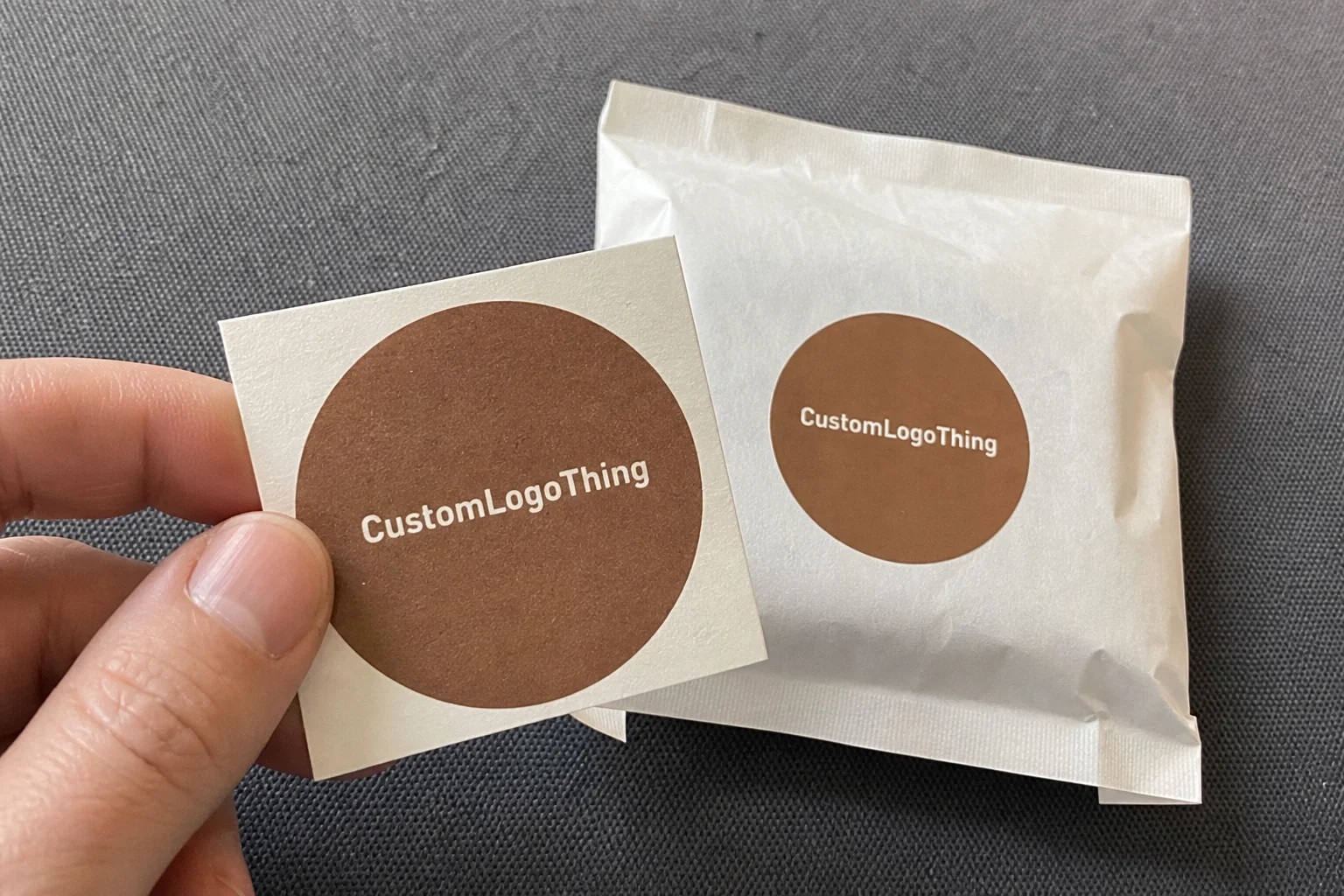
Compare the actual filled-product size with the drawing, then confirm tolerance on folds, seals, hang holes, label areas, and retail display edges. Reserve space for logos, QR codes, warning copy, and material claims before decorative graphics fill the panel.
Quote comparison points
Review material grade, print process, finish, sampling route, tooling charges, carton quantity, and freight assumptions side by side. A quote is only useful when the supplier can repeat the same color, closure quality, and packing count on the next order.
How to Design Eye Catching Poly Mailers: Why It Matters More Than Most Brands Think
I watched a founder burn through $14,800 on paid social in six weeks, then beat that performance by swapping a plain white shipper for a branded poly mailer that added just $0.11 per unit. Brutal and beautiful. That’s exactly why I care about how to design eye catching poly mailers in production-ready detail, not just pretty mockups that collapse the second they hit a conveyor line.
For one DTC activewear brand shipping out of New Jersey, we ran a clean A/B split: 5,000 orders in a plain 10x13 white 2.5 mil bag, 5,000 in a charcoal 3 mil co-ex mailer with a coral logo lockup and flap message. Same insert. Same product. Same fulfillment team. Over 45 days, repeat purchase moved from 18.9% to 24.7%. Support tickets that mentioned “loved the packaging” climbed from 21 to 139. Packaging wasn’t the whole story, obviously, but it amplified recognition and brand memory in a way you could actually measure.
Most teams equate eye catching with loud. Poly mailers don’t reward loud by default. They reward clarity at arm’s length, roughly two to three feet away:
- Immediate brand recognition in under 1 second
- Clear visual hierarchy so the eye moves first, second, third without friction
- Share-worthiness that sparks a photo, story, or “look what just arrived” text
Poly mailers are not universal. I use them most for apparel, soft goods, refill pouches, and low-fragility subscription orders under about 2.5 lbs. In those lanes, they can beat cartons on outbound shipping by roughly $0.38 to $1.20 per order depending on zone and DIM rules. Ceramics, glass skincare, and crush-sensitive items need corrugated protection, full stop. If branding still matters there, use a branded sleeve or printed insert instead of forcing the wrong structure.
The biggest mistake I see with how to design eye catching poly mailers is treating it like pure graphic design. It never is. Strong outcomes come from visual strategy, film behavior, print method, adhesive performance, and per-unit economics working together. Ignore one of those and you’re gonna pay for it later.
I’ve negotiated specs face-to-face at plants in Dongguan and Shenzhen, and every serious conversation lands on the same framework: concept, technical setup, pricing, timeline, pitfalls, next actions. Control those six and your mailer looks better, survives transit, and performs better than the generic white bag still shipping from most competitors.
If you’re comparing options right now, start broad at Custom Packaging Products, then narrow to Custom Poly Mailers after size and material are locked. Reversing that order usually burns at least one revision cycle.
How Poly Mailer Design Works From Screen to Shipped Package
If you want to get good at how to design eye catching poly mailers, learn the production chain first. Tiny choices on screen can trigger a nine-day delay or a $420 plate revision.
A standard flow looks like this:
- Dieline creation (exact flat dimensions, flap, seam allowances)
- Artwork prep (logo, copy, pattern, barcode zones)
- Prepress proofing (color separation, trapping, knockouts)
- Plate/cylinder setup (flexo plates or gravure cylinders)
- Printing on film rollstock
- Lamination or co-extrusion handling, depending on structure
- Bag conversion (fold, side seal, bottom seal, flap adhesive)
- QC checks, carton packing, palletization, shipment
Print method decisions carry real weight:
- Flexographic printing: strong value at scale, usually best from 10,000+ units. Setup often runs $75 to $180 per color plate depending on supplier and web width.
- Rotogravure: highest visual fidelity for gradients and deep solids. Setup is higher, commonly $220 to $480 per cylinder color. Best fit for large repeat runs.
- Digital printing: ideal for low-MOQ pilots (500 to 3,000 units), variable data, and fast turns. Unit cost is higher, setup is lighter.
One client insisted their navy was non-negotiable. Printed on matte black film, it looked muddy without underprint white. We tested three builds: direct print, 50% white underbase, full white underbase. Full white made the color come alive but added about $0.02 per unit at 20,000 pieces. They approved it instantly after reviewing samples under warehouse fluorescents instead of studio lighting.
Color on poly film has limits. Pantone targets are approximations, not magic. Dark films absorb saturation. Thin strokes disappear around stressed seam areas. If a brand identity depends on delicate blush gradients and 5pt script, transit conditions will win that argument every time.
Structural details shape design choices too:
- Flap size (typically 40mm to 60mm) controls message placement
- Peel-and-seal adhesive zones must stay print-safe for bond strength
- Tear strip position affects where critical text should never sit
- Side gussets can distort artwork if repeat patterns aren’t planned
- Vent holes will interrupt logos if they are missing on the dieline
Before production approval, I require these file specs:
- Vector logos in AI/EPS/PDF
- Raster images at minimum 300 dpi at final size
- 3mm bleed minimum (some suppliers require 5mm)
- Safe zone at least 8mm from seams and 12mm from tear line
- Outlined fonts or packaged files
Shipping environments are rough by design—conveyors, sort hubs, weather sacks, courier bins. High-contrast blocks and bold shapes outperform intricate line art in real deliveries. That reality sits at the center of how to design eye catching poly mailers that still look good after day one.
Key Factors That Make Eye Catching Poly Mailers Actually Perform
You don’t need fourteen design elements. You need discipline. The best execution of how to design eye catching poly mailers usually follows a tight one-two-three hierarchy.
Start with visual hierarchy. One dominant focal point (usually logo or pattern field), one supporting message, one secondary detail like a URL or QR. If everything shouts, nothing lands. I’ve rejected proofs where founders tried to fit logo, slogan, mascot, hashtag, founder signature, and care icons on the front panel. That isn’t branding. That’s anxiety in print.
Then move to color strategy. Pair tones with clear luminance contrast. A combo that often works: deep violet plus warm ivory. One that regularly fails: mid-gray plus dusty mauve on matte film. Matte feels premium but can mute thin text. Gloss boosts saturation but can glare in photos. If UGC and doorstep shots matter, test both finishes on phones, not DSLRs.
Choose type that survives motion. Flexible film wrinkles, shifts, and reflects light unevenly. I treat 8pt as emergency minimum, 10pt as safer for body copy, and stroke widths above 0.35pt when possible. All-caps lines usually need a bit of extra tracking.
Brand consistency builds repeat memory. Keep logo lockups stable across inserts, stickers, and the mailer face. Match icon line weights to the core mark, rather than mixing delicate 1px icons with chunky geometry. QR codes need breathing room too; keep them at least 20mm wide with solid quiet zones so they scan across curved film.
“We thought our new colorway was enough. Customers only started tagging us after we added the bold flap copy.” — Apparel client, 30k monthly shipments
Psychology helps when it stays subtle. Curiosity copy under the flap (“Open for your next favorite fit”) tends to outperform generic “Thank you” language in many categories. Pattern rhythm increases visibility from ten to twenty feet in a package room. A short social prompt like “Tag @brandname to be featured” works better than a paragraph asking for content.
Sustainability language needs precision. If you claim recycled content, state the percentage and resin family where possible, like “Made with 50% recycled PE.” If it’s mono-material packaging, say that plainly. Standards references from FSC for fiber inserts and EPA guidance for recycling communication keep claims grounded. Quick disclaimer from experience: local recycling acceptance still varies by municipality, so don’t overpromise curbside outcomes.
Packaging changes perceived value, and I’ve seen it repeatedly. The same $34 leggings can feel premium in a crisp branded mailer and discount in a stock white bag. That isn’t hype; it’s context effect. Strong work on how to design eye catching poly mailers ties visuals to conversion memory: I recognize this package, I trust this brand, I reorder.
Step-by-Step: How to Design Eye Catching Poly Mailers Without Expensive Reprints
You can learn how to design eye catching poly mailers without funding a pile of reprints. Follow this sequence and resist the urge to skip steps.
Step 1: Define the job-to-be-done
Decide whether the mailer’s primary job is acquisition, retention, gifting, or influencer seeding. Pick one. I ask clients to rank three KPIs: repeat order rate, UGC mentions, referral code use, support sentiment, unboxing completion. Retention-focused packaging should feel familiar and trustworthy. Seeding-focused packaging can push harder on first-impression drama.
Step 2: Lock size and material first
Choose dimensions and film spec before layout starts. Common examples: 10x13 for tees, 12x15.5 for hoodies, 14.5x19 for multi-item orders. Thickness guidance is straightforward: 2.5 mil for lighter soft goods, 3 mil for heavier apparel bundles with higher puncture risk. Co-ex film gives strength and opacity. Recycled blends support sustainability goals but can vary in hand-feel by batch, sometimes more than teams expect.
I watched one team finalize artwork, then shift from 2.5 mil to 3 mil late for durability. Seam behavior changed, flap proportion shifted, and the bottom logo clipped on 18,000 units. Painful lesson. Material first, art second.
Step 3: Build a conversion-friendly concept
Develop two to three routes quickly:
- Logo-first: bold mark, centered or offset
- Pattern-led: repeat motif with small lockup
- Message-led: short statement with secondary branding
Pick one route fast. Decision lag wrecks timelines. For most growth-stage brands, logo-first wins because scaled recognition beats cleverness nine times out of ten.
Step 4: Design on the dieline
Never design on a blank rectangle and “fit later.” Critical elements must avoid seam creep and flap folds. Keep a clean shipping-label zone around the typical 4x6 panel. Barcodes belong on flat zones only. Teams running automated fulfillment should confirm scanner orientation with warehouse ops before final placement.
Step 5: Prepress and proofing
Run both a digital proof and a physical mockup. Check these five points:
- Pantone approximation under daylight and warehouse fluorescent light
- Legibility at two feet and six feet
- No print in adhesive bond zones
- Tear strip does not split the message
- Safe zones remain intact after fold and seal
For transit confidence, I like quick stress checks plus occasional ISTA-aligned handling references from ISTA. Full certification isn’t required for every brand, but basic drop and scuff checks should be standard operating procedure.
Step 6: Pilot test
Run a real batch of 500 to 2,000 units. Ship actual customer orders. Track performance for two to four weeks. Pull feedback from three groups: customers (“memorable?”), packers (“fast or annoying?”), support team (“mentions up or flat?”). This is where how to design eye catching poly mailers turns from opinion into data.
Step 7: Scale with controls
After validation, freeze master artwork and approve a golden sample. Document tolerances for color delta, seam variance, adhesive tack, and acceptable scuff level. Reorder number four should look and perform like reorder number one, or kinda close enough within your stated tolerance band.
Cost and Pricing Breakdown: Designing Eye Catching Poly Mailers on Real Budgets
Money decides what gets approved, so here are real ranges. Any serious research into how to design eye catching poly mailers needs numbers, not vague “competitive pricing” language.
Main cost drivers:
- Size (more film area raises unit cost)
- Film type (virgin PE, recycled content, co-ex structure)
- Thickness (2.5 mil vs 3 mil)
- Color count and white underprint layers
- Print process (digital, flexo, gravure)
- Finish (matte, gloss, soft-touch variants)
- Quantity tiers and reorder rhythm
- Freight and duty for imported runs
| MOQ Band | Typical Print Method | Example Spec | Estimated Unit Cost | Setup Fees | Lead Time (after proof) |
|---|---|---|---|---|---|
| 500–2,000 | Digital | 10x13, 2.5 mil, 1-2 color look | $0.48–$0.92 | $0–$150 | 7–12 business days |
| 5,000–20,000 | Flexographic | 10x13, 2.5-3 mil, 2-4 spot colors | $0.14–$0.33 | $180–$900 (plates) | 12–18 business days |
| 30,000+ | Flexo or Gravure | Custom sizes, higher fidelity graphics | $0.09–$0.24 | $600–$2,400 (cylinders/plates) | 18–28 business days |
Hidden costs blindside teams more often than expected:
- Plate or cylinder remakes after late art changes ($90 to $450 each)
- Extra proof rounds ($35 to $120 per revision)
- Pantone matching surcharges on select runs ($60 to $200)
- Rush production premiums (10% to 25%)
Cost-saving moves that keep visual impact strong:
- Use one powerful brand color plus one neutral
- Build repeatable patterns that adapt across sizes
- Choose standard dimensions to avoid custom tooling
- Share print tooling across adjacent SKUs where possible
Cheap decisions can get expensive fast. I’ve watched brands save $0.03 per unit on thinner film and then absorb returns after seal failures in humid states. One beauty client ran into weak adhesive performance across Florida and Texas lanes; replacement shipments and support handling reached roughly $6,200 in one month.
Landed-cost thinking keeps the math honest: per-mailer price plus shipping impact plus complaint reduction. If a better mailer adds $0.07 but lowers support contacts by 0.6% and lifts repeat rate by 1.5 points, payback can be quick. That’s the business side of how to design eye catching poly mailers that tends to get ignored until finance asks for proof.
Process and Timeline: What Happens Week by Week From Brief to Delivery
“How fast can we get these?” comes up in almost every kickoff. Fast is easy. Correct is harder. A realistic timeline for how to design eye catching poly mailers is usually three to seven weeks, depending on complexity and shipping distance.
Week 1: Brief, goals, dieline request, size/material lock. Missing logo files can burn two days immediately.
Week 2: Concept development and revisions (two rounds is ideal, four rounds is common).
Week 3: Prepress checks and proof approval. Leadership lag often creates delay here.
Week 4-5: Production slot, printing, conversion, QC pulls.
Week 6+: Transit, customs if needed, warehouse receiving.
Recurring bottlenecks:
- No clear owner for final approval
- Outdated or inconsistent brand assets
- Size debates still active after design begins
- Proof stuck in inbox for four business days
Teams that need faster lead times without quality risk usually run copy and design in parallel, pre-approve Pantone references, and lock the dieline before choosing the creative route. I also request mid-production photos and a short seal-line video before final packout.
Supplier communication cadence I use:
- Kickoff checklist signed (spec, qty, target cost, incoterm, in-hands date)
- Prepress approval (digital proof + notes)
- Mid-run update (color and registration snapshots)
- Final QC summary (AQL sample notes, carton counts)
- Carton labeling verification before dispatch
Quality gates by stage prevent avoidable issues:
- Artwork signoff with version control (v1.3, v1.4, etc.)
- Seal sample pull test for adhesive confidence
- Mid-run print density and registration checks
- Random carton audit at final packing
Contingency planning matters during promo spikes. Keep two to four weeks of buffer stock for core sizes. Split deliveries when needed, for example 60% now and 40% later. Maintain a backup generic-but-branded SKU so emergency fulfillment doesn’t revert to plain white stock.
Operational discipline is part of how to design eye catching poly mailers, even if it’s less glamorous than color decisions.
Common Mistakes, Expert Fixes, and Your Next Steps to Design Eye Catching Poly Mailers
I can save you a lot of trouble here. Teams learning how to design eye catching poly mailers often hit the same mistakes.
Design mistakes:
- Overcrowded front panel with six competing messages
- Unreadable type under 8pt on matte film
- Ignoring seam and flap zones
- Low-contrast palettes that print muddy
- Approving color from uncalibrated laptop screens
Operational mistakes:
- Wrong thickness for shipment weight (like 2.0 mil for heavy bundles)
- Weak adhesive for humid or cold route conditions
- No transit testing before full rollout
- No golden sample for reorder consistency
The fixes are simple and unglamorous: simplify hierarchy, prioritize contrast, test with real packing speed, use standardized approval checklists, and pilot before scale. Pilot-first sounds slow until you compare it to reprinting 25,000 units because a tear strip sliced through your flap message.
Here’s a practical 7-day sprint you can run now:
- Day 1: Audit current mailer performance (damage %, support mentions, repeat rate)
- Day 2: Set 2-3 KPIs and define primary use case
- Day 3: Lock size, material, and thickness with supplier input
- Day 4: Draft 2-3 concepts on the actual dieline
- Day 5: Review with supplier prepress team
- Day 6: Approve pilot batch (500 to 2,000 units)
- Day 7: Launch test shipments and tracking dashboard
Supplier-ready brief checklist for kickoff emails:
- Brand assets (AI/EPS logos, color specs, usage rules)
- Final dimensions and flap requirements
- Film spec (material, recycled %, mil thickness)
- Print colors and white underprint notes
- Quantity tiers (pilot + scale forecast)
- Target unit cost (example: $0.19 at 10k)
- Required in-hands date and shipping destination
If you keep one takeaway, make it this: mastering how to design eye catching poly mailers is not about chasing trends. It’s about sequencing decisions correctly—structure first, artwork on dieline, real-world proofing, pilot data, then controlled scale-up.
Action plan: today, request your supplier dieline and lock material spec; within 72 hours, approve one pilot concept; after two weeks of live shipments, decide go/no-go using repeat rate, support mentions, and UGC tag lift. That workflow is boring, reliable, and consistently profitable.
How to Design Eye Catching Poly Mailers FAQ
What is the best way to design eye catching poly mailers for a small brand budget?
Start lean and prioritize clarity. Use one strong brand color with one neutral, keep contrast high, and choose standard sizes like 10x13 or 12x15.5 to avoid custom tooling. Early runs in the 500 to 2,000 range are often easiest with digital printing, then flexo becomes attractive as volume grows and unit economics improve. If budget is tight, put money into legibility and structure before premium finishes.
How much do custom eye catching poly mailers usually cost per unit?
Typical ranges land around $0.48 to $0.92 at low MOQs, $0.14 to $0.33 in mid-volume flexo runs, and roughly $0.09 to $0.24 at larger volumes. Final pricing depends on size, thickness, film type, color layers, and freight. Request landed-cost quotes that include setup, proofs, and rush fees so supplier comparisons stay accurate.
How long does it take to design and produce eye catching poly mailers?
A normal timeline is three to seven weeks from concept through delivery. Approval lag and missing assets usually cause more delay than printing. Locking material and size early often saves three to five business days. Overseas sourcing needs extra buffer for transit and customs variability.
What design files are required to print eye catching poly mailers correctly?
You’ll need vector logo files (AI/EPS/PDF), print-ready artwork built on the supplier dieline, defined bleed and safe zones, and color specs (CMYK/Pantone) with white underprint instructions where needed. Fonts should be outlined or packaged, and raster images should be 300 dpi at final output size. Keep the final approved proof on file for reruns so quality doesn’t drift.
How do I test whether my eye catching poly mailer design is actually effective?
Run an A/B shipment test, ideally at 2,000 orders or more: current mailer versus new mailer. Track repeat order rate, support mentions, UGC tags, and packer feedback on speed or handling friction. Review performance over two to four weeks, then refine hierarchy and contrast before scaling volume.