Buyer Fit Snapshot
| Best fit | Design Product Labels and Last projects where brand print, material claims, artwork control, MOQ, and repeat-order consistency need to be specified before quoting. |
|---|---|
| Quote inputs | Share finished size, material target, print colors, finish, packing count, annual reorder estimate, ship-to region, and any compliance wording. |
| Proofing check | Approve dieline scale, logo placement, barcode or warning zones, color tolerance, closure strength, and carton packing before bulk production. |
| Main risk | Vague material claims, crowded artwork, missing packing details, or unclear freight terms can make a low unit price expensive after revisions. |
Fast answer: Design Product Labels and Last: Material, Adhesive, Artwork, and MOQ should be specified like a repeatable production item. The safest quote records material, print method, finish, artwork proof, packing count, and reorder notes in one written spec.
Production checks before approval
Compare the actual filled-product size with the drawing, then confirm tolerance on folds, seals, hang holes, label areas, and retail display edges. Reserve space for logos, QR codes, warning copy, and material claims before decorative graphics fill the panel.
Quote comparison points
Review material grade, print process, finish, sampling route, tooling charges, carton quantity, and freight assumptions side by side. A quote is only useful when the supplier can repeat the same color, closure quality, and packing count on the next order.
If you want to understand how to Design Product Labels that survive real manufacturing, you have to think past artwork and into the practical details of adhesives, container curvature, moisture, and line speed. I’ve watched a beautiful label fail on a filling line in less than 20 minutes because the adhesive was right for a dry carton but wrong for a chilled bottle coming out of a refrigerated case in Monterrey, Nuevo León. That’s the kind of problem people miss when they’re only staring at a screen, and it is exactly why label engineering matters as much as visual design.
At Custom Logo Things, I’ve seen the same pattern again and again: the brands that perform best treat how to design product labels as both a creative task and a packaging engineering task. The label has to sell the product, yes, but it also has to stick, stay readable, scan properly, and hold up from packout to the retail shelf. Those are very different jobs, and both matter. I remember one launch where the marketing team loved the artwork so much they were practically hugging the proof sheet, but the label itself couldn’t survive a cold-room test in Chicago, Illinois. Gorgeous design, terrible execution. A classic factory heartbreak.
“The best label isn’t the prettiest file in the folder; it’s the one that still looks right after filling, shipping, and a week in a refrigerated display case.”
What Product Label Design Really Means
People often ask me how to design product labels, and the first thing I tell them is this: a label is not just a graphic. It’s a combination of branding, legibility, substrate choice, finish selection, durability, and required product information, all working together on a curved, textured, or sometimes damp surface. If one of those pieces is off, the whole package feels off. I’ve seen labels that looked elegant in Adobe Illustrator and then turned into a wrinkled little mess once they met a condensation-heavy bottle filled at 38°F in a plant outside Grand Rapids, Michigan. The screen lies sometimes; the shelf never does.
I learned that lesson years ago during a run of labels for a cold-brew coffee client in Portland, Oregon. The artwork looked fantastic on proof sheets, with a deep matte black and a copper accent that made the brand feel premium. Once the bottles came off the chiller and hit humid warehouse air, the paper stock started to wrinkle near the seam, and the label lost that clean, tight look the brand team expected. The artwork was fine; the construction wasn’t. That project taught me a lesson I still repeat to clients: design is only half the job, and the other half is the physical reality of materials, temperature, and handling.
That’s why how to design product labels has to start with the use case. Is the product going into a dry pantry, a freezer, a bath-and-body shelf, a refrigerated case, or a shipping carton? Each of those environments changes the answer. A hand-poured soap in a dry boutique in Asheville, North Carolina can use a very different label structure than a sauce bottle that gets splashed during filling and then travels through distribution on a humid truck from Dallas, Texas to Atlanta, Georgia. Even the same brand can need different label constructions for different SKUs, which is one of those annoyingly practical truths nobody puts on the mood board.
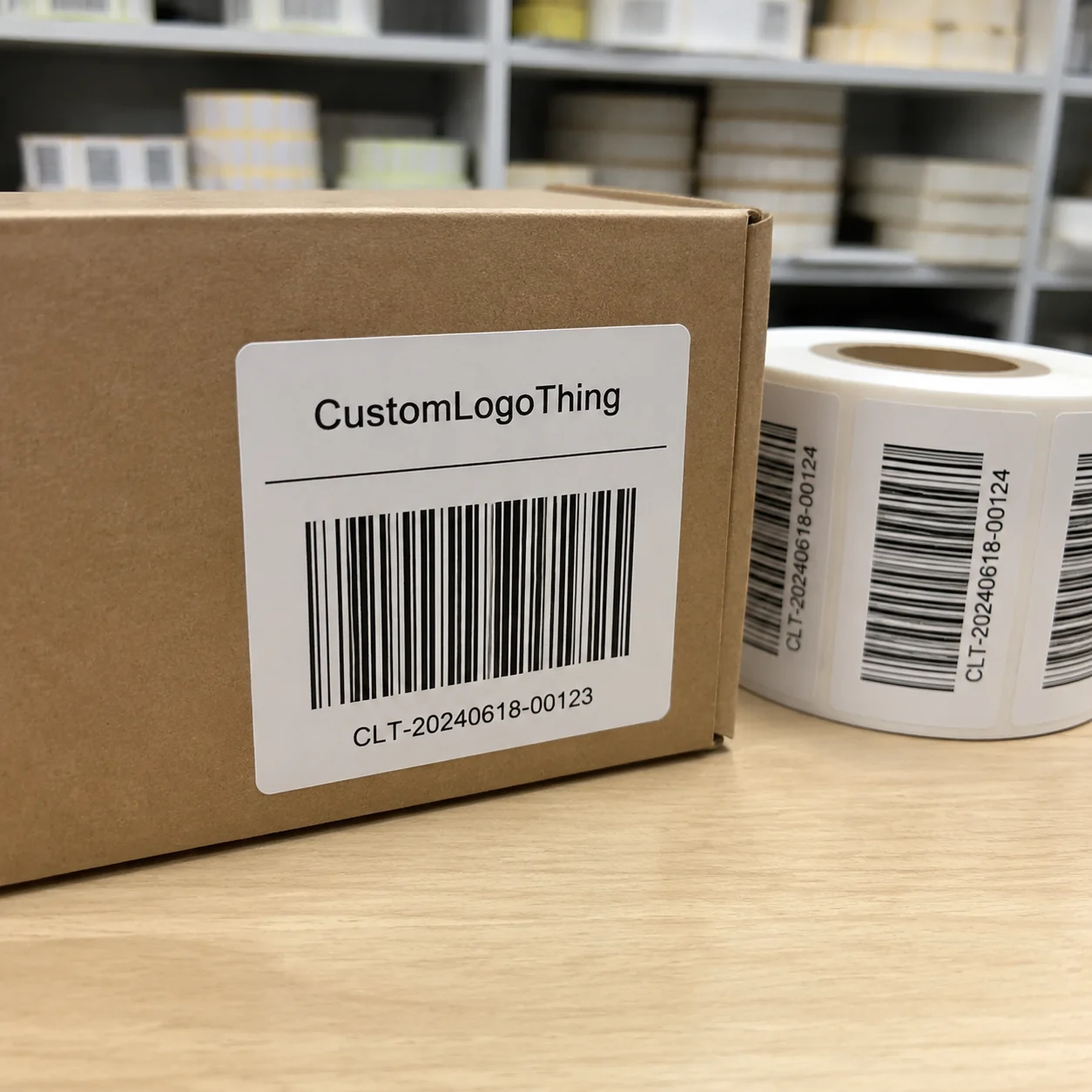
It also helps to separate the terminology, because these words get mixed up all the time. A label usually refers to a printed piece applied to Packaging for Branding, content, or compliance. A sticker is often treated as a more casual term, though in production it can be label stock with a kiss cut. A decal is often a transfer-style graphic or specialty application. A shrink sleeve wraps the entire container and shrinks with heat, which is a different production method entirely. If you’re trying to figure out how to design product labels, knowing which format you need saves time, money, and a lot of print revisions. And yes, print revisions can multiply like rabbits if nobody defines the format early.
Honestly, many brand teams start too close to the artwork and too far from the package. They choose fonts, colors, and icons before they’ve measured the bottle neck, the shoulder radius, or the available wrap panel. That approach makes the design feel detached from the container. The package should shape the design, not the other way around. I’d even say the container is the boss here, whether the design team likes it or not, especially when the bottle is a 9-ounce amber glass cylinder with a 1.75-inch label panel and a molded seam running straight down the back.
How Product Labels Work on the Packline and Shelf
The practical side of how to design product labels starts on the production floor. A label’s journey usually goes from concept to file prep, then material selection, printing, die cutting, application, and final inspection. If a brand skips one of those stages, the label usually teaches them the lesson the hard way, and the cost shows up in wasted rolls, line stoppage, or a pallet of rejected product. I’ve seen a line stop over a label edge lifting by a hair’s breadth on a filling line in Louisville, Kentucky. A hair. The kind of thing you’d never notice in a design review, but on a packline it becomes everyone’s problem in five minutes flat.
On a fast line, pressure-sensitive labels are the workhorse. They arrive on rolls, peel from a liner, and apply with an automatic or semi-automatic labeler. I’ve stood next to applicators running 120 containers per minute, and the difference between a good label and a bad one becomes obvious fast. If the release liner curl is inconsistent or the adhesive tack is wrong, the label starts drifting, skewing, or flagging at the edge. That kind of issue can slow a line down by 10% or more, which is expensive very quickly. On a line running 12,000 units per shift in Columbus, Ohio, even a 10% slowdown can mean a full hour of lost output. The machine operator notices first, the production lead notices second, and then the whole room gets a little quieter than usual.
Cut-and-stack labels still have their place too, especially for certain beverage, food, and personal care applications where a different application method makes sense. Direct thermal labels are common for shipping and logistics, but they are not the answer for every consumer-facing package because the image can fade under heat or sunlight. If you’re learning how to design product labels, it helps to understand the application method before you design the artwork around it. Otherwise you end up building a pretty file for a process that was never going to love it back.
Container shape matters more than people expect. Flat panels are easy. Tapered bottles, rounded jars, and flexible pouches are not. I’ve seen a beautiful amber glass bottle with a 2.5-inch wrap label look perfect on the render and then wrinkle badly near the shoulder because the designer ignored the taper. On cold-fill products, edge lift can appear after condensation forms, especially if the adhesive wasn’t chosen for low-temperature surfaces. A jar with a 3-inch diameter and a short 0.25-inch shoulder can behave very differently from a straight-sided 16-ounce PET bottle. Those are real production-floor realities, not theoretical problems. They’re the kind of reality that makes you mutter, “Well, that looked great until gravity and moisture got involved.”
Shelf performance is the other half of the story. A label has to be readable from a distance of 3 to 6 feet, and then credible up close when a shopper picks it up. That means your hierarchy matters: brand first, product name second, variant third, and supporting claims after that. If the shelf message is muddy, the product can disappear even when the print quality is excellent. That’s one of the most common mistakes I see when people ask how to design product labels. The label might be beautiful, but if a shopper has to squint to figure out whether it’s lavender, mint, or some obscure botanical no one can pronounce, the sale is already in trouble. On a crowded shelf in Seattle, Washington, that split-second clarity can be worth more than a fancy finish.
For standards and testing references, I often point clients to organizations like ISTA for distribution testing and Packaging Machinery Manufacturers Institute resources and packaging industry guidance through PMMI and related industry materials. If a label needs to survive shipping abuse, temperature swings, or rough handling, those references are worth reviewing before you approve a final file. They won’t make the label look prettier, but they will help keep it alive long enough to matter.
How to Design Product Labels: Key Factors That Shape a Great Result
If I had to reduce how to design product labels to a few decisions that matter most, I’d start with hierarchy, material, finish, compliance, and size. Those five choices carry more weight than fancy illustration, because they determine whether the label communicates clearly and performs under real conditions. I’ve seen plenty of labels with clever art direction that still failed because the basics were treated like an afterthought, including one beauty line printed on 350gsm C1S artboard in a converted sleeve style that looked gorgeous in the studio and bulged at the seam in Austin, Texas.
Brand hierarchy is the order in which the eye reads the label. The product name should usually be the anchor, with the brand mark supporting it, not fighting it. I’ve seen labels where the logo was six times more prominent than the actual product name, which sounds stylish until a shopper has no idea what’s inside the bottle. Typography has to work hard here. Choose typefaces with clean character spacing and enough weight to remain legible at your final print size, not just enlarged on a computer screen. If the label needs a magnifying glass in the aisle, we’ve got a problem, especially at 1.5 mm cap height on a 3-ounce dropper bottle.
Color contrast is another one people underestimate. A dark green product name on a black background may look elegant in a mockup, but it can disappear under retail lighting. I usually advise clients to test contrast at actual size and under warm and cool light sources, because store lighting varies more than design teams think. If you’re serious about how to design product labels, readability beats decoration every time. I’m all for style, but not at the expense of a customer being able to tell what they’re buying from 4 feet away in a fluorescent-lit store in Phoenix, Arizona.
Material choice should follow the product environment. Paper labels are cost-effective and can work beautifully on dry, indoor products. BOPP is a strong choice for moisture resistance and chemical resistance, which is why you see it so often on beverages, bath products, and some household items. Vinyl and polyester bring durability and abrasion resistance, especially for industrial or outdoor use. Textured stocks can add a handcrafted feel, but they are not ideal if you need high moisture resistance or very fine barcode scanning performance. A 2.0-mil white BOPP with permanent acrylic adhesive can be a strong baseline for a refrigerated beverage line in Charlotte, North Carolina, while a 60# uncoated paper stock may be better for a dry candle jar sold in Santa Fe, New Mexico. The material needs to fit the environment, not just the brand mood board.
Finish has a real effect on the final impression. Gloss can make colors pop and signal energy. Matte feels calmer and often more artisanal. Soft-touch lamination gives a premium tactile feel, but it can scuff in some conditions if the product is handled a lot. Foil and spot UV can raise shelf appeal, though they also add cost and introduce more variables during print. On labels that need to scan consistently, I also check whether the finish interferes with barcode contrast or reflectivity. A beautiful finish that makes the barcode hard to read is a production problem waiting to happen. And yes, I’ve had a late-night call about exactly that after a 25,000-piece print run in Milwaukee, Wisconsin. It is not the call you want to get after everyone thought the file was “basically done.”
Compliance is not optional. Depending on the category, your label may need ingredient statements, warning text, net contents, batch coding, allergens, recycling marks, or country-specific disclosures. For food, cosmetics, supplements, chemicals, and alcohol, the rules differ, and you should verify them before print. The FSC also matters if you want to source responsible paper materials with chain-of-custody documentation. A good label design respects both brand and regulation. I know, compliance isn’t glamorous. But neither is a recall, especially when it comes with warehouse returns from three regions and a truckload of rework.
Size and proportion deserve more respect than they usually get. A label that covers 90% of a jar may look impressive in a mockup, but it can be hard to apply cleanly if the container has a pronounced shoulder or seam. A label that is too small can make the package feel cheap and leave the shelf message weak. When I advise clients on how to design product labels, I ask for the exact container dimensions, the available flat panel width, and the wrap allowance before I touch layout. For a 12-ounce jar, that might mean a 7.25-inch wrap allowance with a 0.125-inch gap at the seam; for a 500 mL bottle, it might mean a 2.75-inch by 4.5-inch front panel. That keeps the design grounded in reality and prevents the whole project from floating off into fantasy-land where every jar is magically flat and every bottle is perfectly cylindrical.
Custom Labels & Tags can be a smart option if your packaging needs a specific fit, special shape, or a label format that aligns with your line setup. For brands that want a coordinated package set, I often suggest reviewing Custom Labels & Tags alongside the main carton or insert system so the visual language stays consistent across the whole package. Consistency is one of those quiet things that makes a brand feel trustworthy without shouting about it, whether the order is 2,000 pieces or 50,000 pieces out of a facility in the Dallas–Fort Worth area.
Step-by-Step Process for Designing Product Labels
When clients ask me how to design product labels from scratch, I walk them through a sequence that starts with facts, not aesthetics. The first step is to gather the product and container specifications: bottle diameter, jar height, panel width, surface texture, cap style, fill temperature, and application method. I’ve seen projects saved simply because someone measured the real bottle instead of relying on a vendor catalog photo. That one detail can prevent a very expensive redesign later. I still remember one team swearing the jar was “standard,” which turned out to mean “standard-ish, depending on who you ask.” That phrase has haunted my inbox ever since, especially when the actual jar was a 4.5-inch-tall PET container made in a plant near Nashville, Tennessee.
Next comes the audience and environment. A label for a premium skincare product in a boutique spa should not look or behave exactly like a label for a sports nutrition beverage that moves through gym coolers and delivery trucks. Ask where the product sits, who picks it up, and what they expect from it. In my experience, the strongest labels feel appropriate before the shopper reads a single word. You can almost feel the category fit in your hand before you even get to the copy, whether it’s a $32 serum in a frosted bottle or a $4.99 energy shot in a cold case in Denver, Colorado.
Then build a content checklist. This sounds basic, but it’s where many projects slip. You need the logo, product name, variant or flavor, net contents, directions, warnings, ingredients, legal copy, barcode, QR code if needed, and any claims that must be supported. I once sat through a client meeting where the marketing team loved the front label, then legal asked for three extra lines of copy on the back panel, and the whole layout had to be reworked because no one reserved space early enough. That is why how to design product labels is really about planning layout around content volume. If the back panel is an afterthought, it will punish you later, usually by forcing a second proof cycle and adding 2 to 4 business days to the schedule.
After that, create the artwork file with proper technical setup. Use the correct dieline, include bleed, protect the safe zone, and build at print resolution appropriate for the process. For digital label printing, 300 dpi at final size is a common baseline for raster elements, though vector artwork is always better for logos and text. If the label includes a barcode, check its quiet zone and placement carefully. A barcode that is too close to a fold, seam, or trim edge can fail scan testing even if it looks fine visually. Ask me how I know. Actually, don’t; the answer involves a very grumpy warehouse clerk, a pallet of 18,000 units, and an afternoon in Kansas City, Missouri I’d rather not repeat.
Then comes proofing. I strongly recommend a physical or near-physical test whenever the product environment is challenging. If the product will be refrigerated, test the label on a chilled container. If it will be handled with oily hands, test the finish and print rub resistance. If condensation is part of the journey, expose the sample to it. A digital PDF is useful, but it cannot tell you what an adhesive does on a wet surface. PDFs are great for review; they are not magic, despite what some teams seem to believe at 5:45 p.m. on a Friday, especially when a launch is scheduled for Monday at 8 a.m. in a distribution center outside Raleigh, North Carolina.
Here’s the sequence I use with clients who want how to design product labels without wasting time:
- Confirm container specs and fill conditions.
- Write a label content sheet with every required line of copy.
- Choose label stock, adhesive, and finish based on the environment.
- Build the layout with bleed, trim, and safe zones.
- Review a proof on the actual container.
- Test adhesion, rub resistance, and scan quality.
- Approve final files only after the physical sample passes.
I’ve also found that communication with the printer early in the process saves a lot of trouble. A good label converter can tell you whether your idea needs a different adhesive, a more flexible film, or a modified die line. When I visited a converter in the Midwest a few years back, the press operator showed me how a 1/16-inch change in label width can improve application stability on a high-speed round bottle line. That kind of shop-floor knowledge is gold. It’s the sort of detail you only get from someone who has actually stood next to the machine while it’s running, not from a glossy brochure. A 0.0625-inch adjustment in width can be the difference between perfect application and a run of skewed labels in a facility in Rockford, Illinois.
Product Label Cost, Pricing, and Budget Planning
Budget questions come up early whenever someone asks how to design product labels, and for good reason. Label cost is not one number; it’s a stack of variables. Size, shape complexity, material, print method, quantity, adhesive type, finish, and custom tooling all influence the final quote. A simple 3-inch by 2-inch paper label in a high volume can be surprisingly economical, while a specialty contour-cut polyester label with spot UV and a cold-temperature adhesive can cost several times more per unit. For example, a straightforward 3" x 2" white paper label might land around $0.15 per unit for 5,000 pieces, while a digitally printed BOPP label with a matte laminate and contour cut could be closer to $0.42 per unit at the same quantity. That spread can make a finance team look like it just got bad news from the dentist.
Short runs usually cost more per label because setup is spread across fewer pieces. That includes prepress time, press setup, die cutting, and material waste during make-ready. Larger runs usually bring the unit cost down because the setup work is diluted across more labels and material yield improves. I’ve seen a brand save nearly 22% on unit cost just by moving from a 2,500-piece emergency run to a 10,000-piece planned run, though that only made sense because their shelf demand supported the volume. Planning ahead is boring, sure, but boring can be profitable. In many cases, a 10,000-piece order can shave 1 to 3 cents off the per-unit cost compared with a 2,500-piece order, which adds up quickly across a launch in Los Angeles, California.
Special finishes raise costs, but sometimes they earn their keep. Foil, embossing, and spot UV can make a brand stand out, especially in crowded categories like skincare, craft beverages, and premium snacks. The trick is knowing where those dollars matter. If your product competes in a boutique with ten competitors on the shelf, a premium finish may be worth it. If it’s a utility product sold mostly by distributors, clear hierarchy and solid durability may Matter More Than a flashy effect. I’m pretty opinionated about this: don’t pay for sparkle if the buyer just needs to find bleach, broth, or shampoo fast, especially when a foil detail can add $0.08 to $0.18 per label depending on setup and coverage.
There are also hidden costs that people forget to include. Custom dies can add tool charges, often $150 to $450 depending on complexity and supplier location. Specialty inks may increase lead time and cost. Rush production often comes with a premium. If you need multiple proof rounds because the content was not finalized, that adds time and sometimes fees. A label that looks inexpensive on paper can become costly if it causes application issues or needs reprints after launch. That’s why how to design product labels should always include a total cost view, not just a unit price. The cheapest quote can be a trap if it ignores the realities of the line.
Here’s the budgeting advice I give startups: start with the simplest label that still fits the brand and the product environment. Use a clean material, a reliable adhesive, and a finish that matches the audience without overcomplicating the order. Once the product proves itself in market, you can upgrade to premium materials or special effects. Established brands can plan more aggressively, especially if they already know their annual volumes and their line conditions. That approach saves everybody from ordering a gold-foil masterpiece before the first case is even sold, which is how you end up with 8,000 labels in a warehouse in Indianapolis, Indiana and no launch date.
Also, compare cost per finished package, not label price alone. If a cheaper label peels during shipping, smudges in refrigeration, or causes downtime on the applicator, it stops being cheap very quickly. I’ve watched a packaging manager pay 8% more for a better adhesive and save far more than that by avoiding one line stoppage and one rework cycle. That is a real factory-floor calculation, not a sales pitch. Honestly, I’d take the slightly pricier label that behaves itself over the bargain label that starts drama at the worst possible moment, especially when the line is moving 90 units per minute in a plant near Salt Lake City, Utah.
Common Product Label Mistakes to Avoid
One of the biggest mistakes in how to design product labels is overcrowding. Designers sometimes try to fit too many messages into too little space, and the result is a wall of tiny text that no shopper will read. White space is not wasted space. It gives the eye somewhere to rest and helps the product name stand out on a crowded shelf. I’ve told more than one client that a label does not become more persuasive just because you cram it full of copy. It usually just becomes harder to read, especially when the front panel is only 2.75 inches wide on a small cosmetic jar from a supplier in Miami, Florida.
Low contrast is another common issue. Pale gray text on a cream background may look refined in a studio mockup, but it can disappear under store lighting or shrink to illegibility when printed at smaller sizes. Decorative fonts can cause the same problem. If a script font is so ornate that it hurts readability at 4 feet away, it is working against the packaging, not for it. I like a nice typeface as much as the next person, but I like customers being able to read it even more, especially in stores with LED lights and glossy shelving in San Diego, California.
Choosing the wrong stock or adhesive is a mistake I’ve seen more than once. A label intended for a dry cardboard carton will not always perform well on a cold, wet bottle straight from a refrigerated filler. Nor will a standard adhesive always stay put on an oily surface, a textured jar, or a curved container with a tight radius. I still remember a personal care run where the labels looked beautiful on the sample bench, then started lifting at the corners because the bottles had a slight oil residue from handling. The fix was not a design change; it was a material and adhesive change. The frustrating part? The design team had already celebrated the “final” approval, which made the callback feel even more unnecessary, especially on a 15,000-piece batch in Newark, New Jersey.
Ignoring the dieline is another way to create problems. If trim tolerances, bleed, and safe zones are not respected, text can get chopped, borders can appear uneven, and logos can drift too close to the edge. This is especially common on contour-cut labels with unusual shapes. A designer may love the file on screen, but if the die is off by even a small fraction, the whole label can look sloppy. A beautiful border that gets sliced unevenly is one of those little things that will annoy you forever, like a 0.08-inch misalignment that shows up on a production proof in St. Louis, Missouri.
Skipping compliance review is risky too. Whether the product needs ingredient statements, warning text, FDA-style formatting, or recycling language, the label should be checked before print. Barcodes should be tested, not assumed. A label that looks correct but fails scanning at the warehouse can create avoidable headaches. If you want to get serious about how to design product labels, build compliance into the workflow early and have the right people review the copy. I know that sounds less exciting than talking about finishes, but a clean launch beats a beautiful correction any day, particularly when the correction costs an extra 2 business days and a reprint truck from Phoenix, Arizona.
Another mistake is relying only on digital mockups. Mockups are useful, but they can hide wrinkles, show unrealistic color, and flatten texture that matters in real life. The difference between a PDF and a finished label on a 32-ounce PET bottle can be dramatic. A mockup can tell you the story; a physical sample tells you the truth. I’ve had mockups look so perfect that the final sample felt almost disappointing—until the sample proved it could survive the real packaging line, which, thankfully, is the whole point. A matte laminate that photographs beautifully may still show scuffing after 40 rub cycles on the line in Omaha, Nebraska.
Expert Tips and Next Steps for Better Label Design
If you want practical advice on how to design product labels that hold up, start with a real sample container in your hand. Measure it with a caliper if you can. Check the seam, the shoulder, the diameter, and the actual flat area available for graphics. I’ve done this at client tables with a ruler, a sample bottle, and a printed mockup, and it always reveals something the art file didn’t show. There is something oddly satisfying about discovering the exact problem before it turns into a production mess, especially when the bottle turns out to need a 3.125-inch wrap instead of the 3-inch spec in the vendor sheet.
Bring the printer into the conversation early. A label converter or packaging supplier can help match your intended finish to the product environment before you get too far down the design path. If the container will be refrigerated, tell them. If the product is oily, tell them. If the label needs to survive abrasion in a shipping carton, tell them. The more specific you are, the better the material recommendation will be. And the more likely you are to avoid the classic “we thought that stock would be fine” conversation later, which tends to happen after a sample run in a facility near Boston, Massachusetts.
I also recommend a small proof run or test batch before scaling up, especially for products that see temperature swings, moisture, or rough handling. One of the smartest beverage founders I worked with ordered 500 test labels before committing to 25,000 pieces. It slowed the launch by a few days, but it caught a condensation issue that would have turned into a much bigger problem later. That’s smart manufacturing, plain and simple. I wish more teams would do this instead of treating the first big run like a high-stakes gamble, especially when 500 test pieces can be produced in 2 to 3 business days and save a $6,000 reprint later.
Timelines move much faster when the content is organized. If you have the copy, dieline, container specs, and approval chain ready before design starts, a simple project might move from brief to proof in about 5 to 7 business days, with print following after approval depending on quantity and finish. For most standard digital label jobs, production is typically 12-15 business days from proof approval, while specialty materials, foil, or complex die cutting can push that to 18-25 business days. There is no shortcut if the information is incomplete. I know everyone wants speed, but speed without clarity just means you get to the wrong answer faster, sometimes from a pressroom in Richmond, Virginia with no easy rerun.
Here are the next steps I’d suggest if you’re serious about how to design product labels well:
- Gather exact container dimensions, including curvature and panel width.
- Write a complete label content sheet with every line of copy.
- Choose a material and finish that match the product’s environment.
- Request a proof on the actual package, not just a flat PDF.
- Test adhesion, rub resistance, and scan performance before full production.
If you are building a broader packaging system, it can help to coordinate labels with inserts, tags, and outer packaging so the full presentation feels deliberate. That is one reason many brands review Custom Labels & Tags as part of their packaging plan rather than as an afterthought. When the pieces work together, the brand looks more trustworthy and the production team has fewer surprises. It also saves those awkward moments where the carton looks upscale and the label looks like it wandered in from a different project, which is particularly noticeable when the carton prints in Ohio and the label prints in Southern California.
One more thing I tell clients often: do not confuse expensive with effective. A premium label is not automatically a better label. The best label is the one that fits the product, the container, the line, the shelf, and the customer’s expectation. That is the real answer to how to design product labels. Fancy is fine. Functional is better. Functional that also looks great? That’s the sweet spot, and it usually comes from a design built around a real production spec instead of a mood board from last quarter.
If you remember only one principle, remember this: design for the package in real life, not for the render. The package has to survive motion, moisture, friction, temperature, and human handling. A good label carries the brand through all of it, whether it is shipped 1,200 miles by truck or packed by hand in a small facility in Tampa, Florida.
And yes, how to design product labels can feel like a lot of moving parts at first. Once you understand the material, the container, the environment, and the compliance needs, the process becomes much more manageable. That’s when the label stops being a gamble and starts becoming a dependable part of the product experience. Which, in my opinion, is exactly how it should be.
How to Design Product Labels That Sell and Last: decision table
| Decision area | Best fit | What to verify | Risk if skipped |
|---|---|---|---|
| Substrate | Labels, stickers, ribbons, inserts, tags, and tissue paper | Paper/film type, adhesive, GSM, roll direction, and finish | The print looks right but fails during application or handling |
| Artwork control | Brand color, barcode, QR code, and small text clarity | Vector file, Pantone target, safe area, and proof route | Small details blur or shift across a full production run |
| Use environment | Retail display, shipping, food-safe handling, or gift presentation | Moisture, rubbing, heat, and surface compatibility | A pretty sample fails in the real use case |
FAQs
How do you design product labels for curved bottles?
Use the container’s exact diameter and the usable panel width before you build the dieline. Choose a flexible pressure-sensitive material such as BOPP when the bottle needs a little conformability, and keep critical text away from the edges so curvature does not distort readability. I always recommend a physical test on the actual bottle because a label that looks fine on a flat PDF can wrinkle, lift, or overlap the seam once it wraps around a real container. On a 3.25-inch-diameter bottle, even a 0.125-inch shift can change how the panel sits. Curved bottles are generous that way—they will reveal every design mistake with absolutely no mercy.
What size should a product label be?
Base the size on the flat or wraparound area of the actual container, not on a generic online template. Leave room for bleed, safe zones, and any required copy such as ingredients or warnings. The label should also balance shelf readability with coverage, so the product name can be seen quickly from a few feet away. A paper mockup or proof on the real package is the best way to confirm the fit before production. If you can, check the label at actual viewing distance too, because what looks “nice and tidy” on a desk sometimes disappears in a real aisle, especially on a 6-ounce jar with a 2.5-inch front panel.
How much does it cost to design and print product labels?
Pricing depends on label size, quantity, material, finish, print method, and whether you need custom dies or specialty adhesives. Small runs usually carry a higher per-label cost because setup is spread over fewer pieces. Premium details like foil or spot UV add cost, but they can improve shelf presence if the category demands it. I advise brands to ask for the total finished unit cost, including proofing and possible reprint risk, rather than looking at label price alone. For instance, a basic 5,000-piece run can be about $0.15 per unit on paper stock, while a laminated BOPP label with special die cutting may climb to $0.35 or more per unit. That way nobody gets surprised later when the “cheap” option starts acting expensive.
How long does the product label design process take?
Simple projects can move quickly if the copy, container specs, and approval chain are already organized. Delays usually come from missing information, compliance review, or multiple proof revisions. A clean process includes a brief, design, proofing, testing, and final approval before print. If the product environment is tricky, add time for condensation, rub, or adhesion testing so the label performs properly after launch. For standard jobs, production is typically 12-15 business days from proof approval, while more complex projects with foil, multiple SKUs, or custom tooling may take 18-25 business days. I’d rather tell a client it takes an extra few days than pretend the first sample will magically solve itself.
What makes a product label look professional?
Strong hierarchy, crisp typography, and high-contrast color choices create instant clarity. The material and finish should fit both the brand and the product environment, because a label that looks premium but fails in use does not feel professional for long. Proper sizing, barcode placement, and durable adhesion matter just as much as visual design. A label feels truly polished when it looks good and survives the real-world handling that comes with shipping, stocking, and customer use. In other words, it has to earn the right to look good, whether it’s printed on 2.0-mil BOPP in Ohio or on textured paper stock in North Carolina.