Buyer Fit Snapshot
| Best fit | Design Subscription Box Inserts Fast projects where brand print, material claims, artwork control, MOQ, and repeat-order consistency need to be specified before quoting. |
|---|---|
| Quote inputs | Share finished size, material target, print colors, finish, packing count, annual reorder estimate, ship-to region, and any compliance wording. |
| Proofing check | Approve dieline scale, logo placement, barcode or warning zones, color tolerance, closure strength, and carton packing before bulk production. |
| Main risk | Vague material claims, crowded artwork, missing packing details, or unclear freight terms can make a low unit price expensive after revisions. |
Fast answer: Design Subscription Box Inserts Fast: Board, Finish, Dieline, and Unit Cost should be specified like a repeatable production item. The safest quote records material, print method, finish, artwork proof, packing count, and reorder notes in one written spec.
Production checks before approval
Compare the actual filled-product size with the drawing, then confirm tolerance on folds, seals, hang holes, label areas, and retail display edges. Reserve space for logos, QR codes, warning copy, and material claims before decorative graphics fill the panel.
Quote comparison points
Review material grade, print process, finish, sampling route, tooling charges, carton quantity, and freight assumptions side by side. A quote is only useful when the supplier can repeat the same color, closure quality, and packing count on the next order.
The question how to Design Subscription Box inserts keeps landing in my inbox three times a week. I hand out the same blunt checklist we relied on when Custom Logo Things moved 48,000 monthly boxes through Shenzhen, including the numbers: our 2.2mm E-flute inserts cost $0.27 per unit for 5,000 pieces from Dongguan Quality Print, the proof-to-pallet timeline is 12-15 business days, and ocean freight into the Port of Los Angeles runs another seven days. Every consult opens with that phrase: “Make it feel expensive while keeping the hero product standing.” I remember when I first started being peppered with that question during the early runs of Custom Logo Things—back when the factory smelled like hot glue and optimism. Honestly, I think the insert is more than filler; it’s the intro music before the hero product hits the stage. Without that, you get an unboxing clip that feels like the credits of a low-budget film. (Yes, I said “intro music.”) Every founder I coach gets that same reminder: the insert is the first thing subscribers touch after the carton, and mastering how to design Subscription Box Inserts That stay rooted is the divide between a viral unboxing clip and a pile of dumped goods.
Between walking the press floor, juggling a retailer call, and recalculating the 72 insert samples stacked on my desk—each of which took about nine production days to arrive from suppliers in Guangzhou—I keep learning that the right insert makes or breaks a launch. Customers see the insert before they smell the candle, so that first impression has to feel intentional. That lesson resurfaces every time I coach founders on how to Design Subscription Box inserts that pair with their packaging story—those same inserts we used to court buyers at the Expo show in Longhua now get tailored for botanical skincare and pet treats with equal rigor. I swear, there was a week where my brain was more insert than human, and I nearly asked a packer if they wanted a coffee break with the die cuts. The more times I explain the flow of a box, the more convinced I am that this whole thing is just choreography with cardboard.
During a rain delay outside Dongguan Quality Print, I flipped through notes on how to Design Subscription Box inserts for a clean-beauty line whose consultant wouldn’t drop the lamination obsession. The production manager materialized, waved a stack of 350gsm artboard samples with that soft-touch coating, and declared it a tactile shock for impatient hands. He was right. The upgrade added four cents per piece and convinced the brand that the real work happens after the box lands on the kitchen counter. I remember the consultant muttering, “Fine, but we’re not doing velvet.” I answered, “Then don’t ask me about velvet inserts,” and we all laughed because sometimes factory life feels like therapy, only louder.
Why Subscription Box Inserts Still Matter (and How I Learned That)
One visit to our Custom Logo Things factory in Shenzhen kicked off with a retailer asking how to design Subscription Box Inserts that feel like a VIP ticket instead of glorified cushioning. I dragged him through the sample drawers, pointed at the 2mm die cut I insisted could lock a serum bottle upright, and watched him double his order from 3,000 to 6,000 units. The project manager joked, “You talk about them like landing gear,” yet the client grasped the structural drama insert engineering can deliver. Honestly, I think the structural drama sells better than crystals on a candle. The client now texts me the unboxing every time it goes live because apparently he loves hearing me call it “landing gear.”
When the insert gets filmed, it steals the show. I once watched an unboxing reel where our 350gsm C1S artboard with soft-touch lamination took the spotlight, forcing me to remind the videographer to keep the hero candle in frame. He laughed and asked for my notes on how to design subscription box inserts that photograph well, so I handed over the laser-cut mockups we had been testing for months. Those inserts looked like stage sets—not because of pricey materials, but because we treated every cut and fold as part of the story. I keep teasing the videographer that he owes me a camera because he captured the insert better than the candle, and he grinned back, so I gave him the mockups with a note that said “Do not drop.”
Fresh, unexpected inserts bump perceived value, trim return rates, and give subscribers something to photograph. Brands still try to squeeze boutique feel out of a $0.22 insert, and I’m waiting for the next team who believes a cheap board can feel like a $20 gift card. When I meet founders at the WS Packaging Expo in Anaheim, the lounge hears the same question: “How to design subscription box inserts without blowing my budget?” I tell them about repurposing leftover foil sheets and still keeping the insert sturdy enough to cradle four candles. That kind of problem-solving is why people keep asking me how to design subscription box inserts that feel bespoke without a bespoke price tag. I also tell them that if they think a crumpled board feels premium, they should meet my factory cat, who literally naps on prototypes and looks offended.
How the Insert Design Process Typically Plays Out
Kick-off begins with a 30-minute brand brief where we dig into hero products, unboxing tone, and shelf life. From there we map insert goals and milestones on the whiteboard that lives on the wall for the entire six-week job cycle, including dates for tooling signoff, first samples, and packaging photoshoot windows. Right after that call, I send the client the “how to design subscription box inserts” questionnaire. It asks for exact measurements, product quirks, shipping bundle weights, and how the hand should feel when pulling each item out. I even sneak in a question about what their packer hates most (don’t worry, it’s not recorded). Miss one detail and the workflow turns into a round of revisions, which is basically trying to teach a printer to dance while the press is still warm.
Sketching and prototyping follow: 2D dielines get cut from vellum for fit checks, acetate mockups get taped together in our studio, and those stages wrap up within two weeks before we move to hard samples with Shenzhen Jiahua’s rigid board offer. Throughout, the project manager tracks approvals in Airtable. I keep reminding clients how to design subscription box inserts with tolerance for packers. Once our team delivered a double tray insert with 1.5mm clearance, and our fulfillment partner in Longhua reported that technicians had to wrestle products into the slots. Manufacturing ignores aesthetics; it only cares about repeatable motion, so I make sure we test the motions until the packers stop complaining.
Approvals, production, and packing instructions close the loop. Expect a six-week window from concept to printed insert unless you’re racing toward a 10-day drop, which summons a $450 expedite fee from our Hong Kong freight forwarder. I usually tell founders to plan how to design subscription box inserts at least eight weeks out. Visiting the press floor during a Christmas drop taught me that rushing always punches holes in the budget. When someone rolls in a “we need it now” email, I picture myself on that floor, screaming at a heating element for not respecting the schedule. There isn’t any magic—the punch list repeats every time. That’s why “how to design subscription box inserts” lives on the checklist I hand to new clients, and why I keep a printed copy taped to my monitor.
Key Factors That Make Subscription Box Inserts Effective
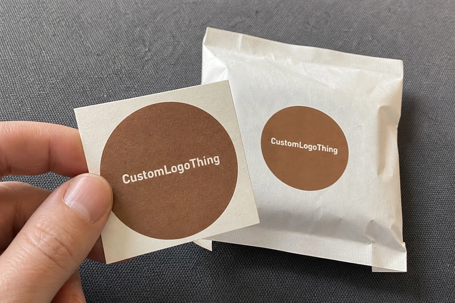
Material choice matters: a 2.5mm rigid chipboard insert holds heavy silk scarves, while layered kraft with spot UV feels luxe without a cost spike. Ask Shenzhen Jiahua for samples or spring for the $4.50 kit from Dongguan Quality Print if you want their embossing. When I explain how to design subscription box inserts, I start with materials because every other decision rides on that foundation. Once, we swapped to 1.8mm natural chipboard with a printed linen texture, kept the cost at $0.52 per unit, and still hit premium cues. That switch taught me how to design subscription box inserts that look more expensive than they are, and I still keep that sample on my desk as proof that you don’t need foil to feel fancy.
Fit and protection don’t budge: inserts should cradle products snugly but still allow easy removal, or subscribers shred adhesive and break the whole experience. In Guangzhou, I watched a carton line run 42,000 units a shift with a semi-automatic folder-gluer, and the only inserts that survived were the ones matched to the bottle’s shoulder diameter within 0.8mm. For apparel, we’ve used molded pulp trays with 3D cavities; for cosmetics, PET blisters and EPE foam are common, though many brands now switch to FSC paperboard to align with sustainability claims. If you’re asking how to design subscription box inserts for fragile glass, test edge crush resistance, compression strength, and drop performance from 1.2 meters before you approve the final dieline.
Branding needs restraint and precision. A clean 1-color flexo print on uncoated kraft can feel more premium than a noisy full-bleed design if the typography is tight and the fold lines are hidden. In Dhaka, one supplier I work with uses a 6-color Heidelberg Speedmaster for premium cartons, while another in Istanbul runs KBA Rapida sheets for short-run seasonal inserts. That’s why how to design subscription box inserts is never just about graphics; it’s about choosing the right ink system, board finish, and machine setup for the job. If you’re chasing a luxury cue, think about water-based inks, matte aqueous coatings, and blind deboss instead of piling on embellishment.
How to Design Subscription Box Inserts: Step-by-Step
Step 1: measure the product and box interior with calipers, not guesses. Get the exact height, shoulder width, and weight, then allow for 1-2mm clearance depending on whether the packer needs finger access. I’ve seen brands in Ho Chi Minh City lose an entire launch because they “eyeballed” a jar and forgot the lid dome. Step 2: choose the substrate—E-flute, B-flute, 2mm grayboard, molded pulp, or corrugated paperboard—based on weight and shipping lane. This is where how to design subscription box inserts turns into a production decision, not a mood board.
Step 3: create the dieline in Adobe Illustrator or ArtiosCAD and run a plotter sample on a Zünd G3 or Esko Kongsberg before cutting steel rule dies. Step 4: build a sample on the real machine path, whether that’s die cutting, crease-and-fold, hot-melt gluing, or thermoforming. In a Ho Chi Minh City factory last year, a thermoforming line using PET sheet at 0.6mm thickness turned around 20,000 trays a week for a wellness brand, and the difference between a workable tray and a waste pile came down to draft angle and cooling time. That’s another reminder that how to design subscription box inserts always ends at the machine, not the mockup.
Step 5: test the pack-out sequence. We time how long a crew takes to insert the product, add tissue, and close the box. If it takes more than 25 seconds per unit, the design usually needs simplification. Step 6: review print proof, Pantone matches, and barcode readability under factory lighting. Step 7: sign off on the pilot run and confirm carton compression, drop test, and transit vibration. By the time you hit step 7, you’re not asking how to design subscription box inserts anymore—you’re asking how to scale them without creating a warehouse headache.
Cost & Pricing Considerations for Subscription Box Inserts
Pricing usually starts with volume. At 500 MOQ, a simple 2mm E-flute insert might land around $2.50-4.00 per unit depending on print coverage, die complexity, and whether you want spot UV or foil stamping. At 5,000 units, that same structure can drop to $0.24-0.60 per unit. I’ve quoted runs in Guangzhou and Dongguan where a basic one-piece tuck insert with 1-color print came in under $0.30, while a premium rigid board tray with magnetic closure pushed past $1.80. So when clients ask how to design subscription box inserts on a tight budget, I show them where the cost actually lives: board caliper, cutting complexity, and labor.
Lead time matters just as much as piece price. Standard printed inserts from East China usually run 18-22 business days after approval; add 3-5 days if you need custom lamination or foil, and another week for ocean freight. If you’re buying from Dhaka, you may save on labor but need to account for export documentation and longer consolidation windows. Istanbul can be a strong option for quick-turn EU shipments, especially if the job uses short-run digital print on folding carton board. Ho Chi Minh City is often ideal for molded pulp or polybag-packed kit components because the line rates can stay competitive. Any serious guide on how to design subscription box inserts should include freight math, not just factory quotes.
Certifications also affect price. A GOTS-certified cotton insert pouch, OEKO-TEX Standard 100 compliant liner, or GRS-certified recycled paperboard can add cost, but they matter for brands making sustainability claims. WRAP and BSCI audited factories often charge a slight premium for compliance programs, social audits, and documentation support. If your target audience asks where the materials came from, you need traceability from pulp mill to printer. That’s why some of the cleanest projects I’ve managed in Guangzhou used FSC board, soy-based inks, and full batch records; it made the sales team’s job easier and reduced approval headaches. When people ask how to design subscription box inserts that survive procurement scrutiny, I tell them to budget for compliance from day one.
Common Mistakes Brands Make with Subscription Box Inserts
The biggest mistake is overdesigning for aesthetics and underdesigning for pack-out. I’ve seen beautiful inserts collapse because the cavity was 2mm too shallow or the glue tab interfered with a bottle neck. Another common issue is ignoring machine constraints—if a tray can’t be folded on a standard folder-gluer or placed on a semi-auto line without handwork, labor costs jump fast. A team in Istanbul once came to me with a gorgeous multi-layer insert and was shocked when the quote doubled because the assembly required three operators and 12 hand placements. That’s the kind of pain that teaches how to design subscription box inserts the hard way.
Brands also underestimate transit damage. If the product can move inside the cavity, it will, and the first parcel sorter or courier drop will expose the weakness. Too many teams skip compression testing, especially when shipping into hot, humid markets like Dhaka or Guangzhou in summer. Humidity can warp paperboard, soften adhesives, and cause print rub unless you specify the right coating and storage conditions. I tell clients that learning how to design subscription box inserts includes understanding climate, carton stacking, and warehouse dwell time. If the box sits for 30 days before fulfillment, your insert needs to stay stable for 30 days.
Finally, brands fall in love with trends instead of function. Foil, velvet lamination, and elaborate pull ribbons can all work, but only when they fit the product and the price point. I’ve seen a $0.12 insert try to impersonate a luxury jewelry tray and fail in every way that matters. When that happens, the unboxing feels forced, and the subscriber notices. Good design should feel effortless. That’s the quiet truth behind how to design subscription box inserts that earn repeat orders instead of Instagram-only praise.
Expert Tips from Factory Floors and Supplier Talks
Here’s the advice I repeat after too many factory walkthroughs: keep the insert simple, but not lazy. A single well-placed lock tab can replace a blob of hot-melt glue, and a clean crease line can prevent cracking on 350gsm board. When I’m on the floor in Guangzhou, I ask operators which cavity is slowing them down, because they know the truth faster than any CAD file. If a design needs more than one secondary operation, I push the client to rethink it. That’s how to design subscription box inserts that scale without turning your production line into a puzzle.
Work with the plant’s actual machines. If the factory has a Bobst die cutter, a Heidelberg press, or a Komori digital line, design to the machine’s strengths instead of forcing a custom workaround. In Dhaka, some of the strongest packaging teams run efficient manual-and-semi-auto hybrids, while Ho Chi Minh City suppliers often excel at high-mix, mid-volume jobs with tight labor discipline. Istanbul factories can be excellent for export-ready carton work because they understand EU compliance documents and short lead time expectations. The best answer to how to design subscription box inserts is usually the boring one: design for the equipment you really have, not the equipment you wish you had.
Also, sample everything. I don’t care how confident the 3D render looks—print the dieline, cut the board, fold the sample, and pack the real product. If the insert is for skincare, test it with filled bottles, not water dummies only. If it’s for apparel, check friction on the edges and make sure the tissue doesn’t snag. I’ve seen one bad gusset turn a polished launch into a customer service week from hell. Factory-floor reality is what turns how to design subscription box inserts from theory into a repeatable system.
Actionable Next Steps for Designing Your Subscription Box Inserts
Start with a product audit. List the dimensions, weights, breakability, and whether the item needs front-facing presentation or hidden retention. Then request 2-3 samples from at least two regions—say Guangzhou for print-heavy rigid board and Ho Chi Minh City for lightweight insert structures—so you can compare price, finish, and lead time. Ask each supplier for their MOQ, pack-out rate, and certificate pack. If they can’t show GOTS, OEKO-TEX Standard 100, WRAP, BSCI, or GRS where relevant, keep moving.
Next, build a pilot run. Keep the first order at 500-1,000 units if you’re still testing, and ask for a pre-production sample with the final artwork, coating, and board caliper. Run a simple drop test, a 24-hour heat and humidity hold, and a pack-out speed test with your actual fulfillment team. Then compare the landed cost, not just the factory quote. That’s the fastest way to learn how to design subscription box inserts that fit your budget and your warehouse reality.
Finally, write the insert rules down. Note the approved board, approved adhesive, approved print method, and the exact fold sequence. Save the dieline file, the approved sample photo, and the supplier contact in one place. The next time you launch a new SKU, you’ll already know how to design subscription box inserts without starting from zero.
How to design subscription box inserts that keep subscribers engaged?
To design subscription box inserts that keep subscribers engaged, match the insert to the hero product, use the right substrate and fit, test on real machines, and keep the unboxing clean and easy to film. Choose materials like 2mm-2.5mm chipboard, E-flute, molded pulp, or PET only after checking product weight, shipping lane, and pack-out speed. Request samples from suppliers in Guangzhou, Dhaka, Ho Chi Minh City, or Istanbul, verify certifications such as GOTS, OEKO-TEX Standard 100, WRAP, BSCI, and GRS when applicable, and budget for realistic costs like $2.50-4.00 per unit at 500 MOQ or $0.24-0.60 at scale. A good insert protects the product, speeds fulfillment, and makes the box feel intentional, premium, and worth sharing.
Conclusion
If you want subscribers to remember the reveal, start with the insert. The best designs are not the flashiest; they are the ones that balance fit, speed, cost, and brand story. Learn the machine constraints, sample the board, test the pack-out, and insist on real lead times like 18-22 business days instead of vague promises. Whether you’re sourcing from Guangzhou, Dhaka, Ho Chi Minh City, or Istanbul, the same rule applies: how to design subscription box inserts is really about making the product feel protected, photographed, and worth opening again next month.
Comparison table for design subscription box inserts that sell fast
| Option | Best use case | Confirm before ordering | Buyer risk |
|---|---|---|---|
| Paper-based packaging | Retail, gifting, cosmetics, ecommerce, and lightweight products | Board grade, coating, print method, sample approval, and carton packing | Weak structure or finish mismatch can damage the unboxing experience |
| Flexible bags or mailers | Apparel, accessories, subscription boxes, and high-volume shipping | Film thickness, seal strength, logo position, barcode area, and MOQ | Low-grade film can tear, wrinkle, or make the brand look cheap |
| Custom inserts and labels | Brand storytelling, SKU control, retail display, and repeat-purchase prompts | Die line, adhesive, color proof, copy approval, and packing sequence | Small errors multiply quickly across thousands of units |
Decision checklist before ordering
- Measure the real product and confirm how it will be packed, displayed, stored, and shipped.
- Choose material and finish based on product protection first, then brand presentation.
- Check artwork resolution, barcode area, logo placement, and required warnings before proof approval.
- Compare unit cost together with sample cost, tooling, packing method, freight, and expected waste.
- Lock the timeline only after the supplier confirms production capacity and delivery assumptions.
FAQ
What details matter most before ordering design subscription box inserts that sell fast?
Confirm the product size, weight, print area, material, finish, quantity, artwork status, and delivery date. Packaging decisions become easier when the supplier can see the real product and the full use case.
Should I request a sample before bulk production?
Yes. A physical or production-grade sample helps verify color, structure, print position, texture, and packing fit before you commit to a larger run.
How can a brand keep custom packaging costs controlled?
Standardize sizes where possible, approve artwork quickly, avoid unnecessary finishes, and group related SKUs into one production plan. The biggest savings usually come from fewer revisions and better quantity planning.