Buyer Fit Snapshot
| Best fit | Design Subscription Box Inserts That Boost Retention projects where brand print, material claims, artwork control, MOQ, and repeat-order consistency need to be specified before quoting. |
|---|---|
| Quote inputs | Share finished size, material target, print colors, finish, packing count, annual reorder estimate, ship-to region, and any compliance wording. |
| Proofing check | Approve dieline scale, logo placement, barcode or warning zones, color tolerance, closure strength, and carton packing before bulk production. |
| Main risk | Vague material claims, crowded artwork, missing packing details, or unclear freight terms can make a low unit price expensive after revisions. |
Fast answer: Design Subscription Box Inserts That Boost Retention: Board, Finish, Dieline, and Unit Cost should be specified like a repeatable production item. The safest quote records material, print method, finish, artwork proof, packing count, and reorder notes in one written spec.
Production checks before approval
Compare the actual filled-product size with the drawing, then confirm tolerance on folds, seals, hang holes, label areas, and retail display edges. Reserve space for logos, QR codes, warning copy, and material claims before decorative graphics fill the panel.
Quote comparison points
Review material grade, print process, finish, sampling route, tooling charges, carton quantity, and freight assumptions side by side. A quote is only useful when the supplier can repeat the same color, closure quality, and packing count on the next order.
I’ve spent enough time on packing lines, client calls, and supplier negotiations to know that how to Design Subscription Box inserts can be the difference between a box that gets opened once and a box that earns a second order. A simple 4 x 6 card printed on 350gsm C1S artboard can move a customer to scan a QR code, redeem a referral, or keep a subscription alive for one more cycle. At 5,000 pieces, a basic postcard insert might cost about $0.12 to $0.18 per unit in Shenzhen, with another $0.03 to $0.06 for kitting at a fulfillment center in Ningbo or Los Angeles. That sounds small. It isn’t.
I remember one beauty brand I worked with in a Shenzhen facility near Longhua. They had a 2.7% coupon redemption rate from a basic insert, then nearly doubled it by changing the message hierarchy and moving the code above the fold. Another client in the wellness space in Austin cut support emails by 19% after adding a one-page quick-start insert with one diagram and three plain-English steps. Honestly, most people overthink the decoration and underthink the job. How to Design Subscription Box inserts starts with retention, not ornament.
In packaging, inserts are the quiet middle layer between product and relationship. They can thank, teach, cross-sell, and reassure, all in one flat piece of stock. If you treat them like filler, they behave like filler. If you treat them like a retention tool, the economics can surprise you. And yes, I have seen brands spend $1,800 on foil stamping in Dongguan and only $220 on the actual message development. Painful. Usually unnecessary.
How to Design Subscription Box Inserts: What They Are and Why They Matter
Before you sketch anything, define the insert in practical terms. A subscription box insert is any printed piece placed inside the box to guide action or strengthen the brand relationship. That includes thank-you cards, product education sheets, sample callouts, discount cards, referral cards, and storytelling pieces that explain why the product exists and how to use it well. When clients ask me how to design Subscription Box Inserts, I usually start with one question: what should the customer do after reading it within 10 seconds?
The answer changes the design. A welcome insert for a new subscriber should feel reassuring and concise. A referral card can be more direct and incentive-driven, like “Give $10, get $10” with an expiration date printed in 8pt type. A product education sheet should prioritize clarity, not charm. I’ve seen a premium candle brand use a beautiful 300gsm soft-touch card that looked expensive but failed because the wick-care instructions were buried in 7-point type. Pretty? Yes. Useful? Not enough. That card basically whispered at the customer and then wondered why nobody listened.
What makes inserts matter is their role in retention. In direct-to-consumer packaging, the box is the first physical handshake, but the insert is often the first actual conversation. It can reduce confusion, encourage repeat behavior, and make the customer feel seen. That last part matters more than many operators admit. People remember the moment they felt guided, not just delighted. A 2024 DTC beauty brand I worked with in Guangzhou saw this firsthand when a 4 x 6 “how to apply” card reduced first-month churn by 8% across 18,000 subscribers.
There’s another angle. Inserts can reduce support tickets by answering predictable questions before they become emails. They can support cross-sells by pointing to a second product or bundle. They can also create a memory cue that survives the unboxing moment. I’ve watched a product manager in a Seattle meeting pull up returns data and realize the cheapest “fix” wasn’t a formula change; it was a 5-cent insert that told buyers exactly how long to wait before first use. No drama. Just fewer angry emails.
That’s why how to design subscription box inserts is never just a graphic design question. It’s a packaging strategy question. It sits at the intersection of material choice, print cost, customer psychology, and order economics. A 350gsm C1S artboard card in Qingdao may cost $0.15 per unit for 5,000 pieces, while a die-cut piece from a premium converter in Suzhou can jump to $0.62 per unit fast. And yes, that intersection is where margins are won or lost.
“The insert isn’t a flyer. It’s a behavior prompt.” — a fulfillment director told me that during a plant visit in Dongguan, and he was right.
How Subscription Box Inserts Work in the Customer Journey
To understand how to design subscription box inserts, map them across the customer journey. The box is not the end of the sale. It’s the start of the next action. In practice, inserts work in four stages: pre-use excitement, first-use guidance, repeat engagement, and post-purchase follow-up. Each stage calls for a different tone and a different level of detail, whether the box ships from Shanghai, Los Angeles, or Manchester.
Pre-use excitement is about perceived value. A subscriber opens the lid and sees a card that says, “Your February routine starts here,” or “Keep this close for a faster first use.” That tiny sentence can shape the mood. First-use guidance is more functional. Think dosage reminders, assembly steps, care instructions, or a QR code to a 45-second video hosted on a mobile landing page. Repeat engagement is where offers matter: reorder reminders, loyalty points, or a referral incentive. Post-purchase follow-up can point the customer to social sharing, reviews, or an upgrade path.
Different insert types serve different jobs. A thank-you note can reinforce emotional value. A product education sheet can cut friction. A sample insert can spark trial of a higher-margin item. A referral card can activate word-of-mouth. I once saw a specialty tea subscription in Portland use a “brew timer” insert with one illustrated chart, and customer service calls about steeping temperature fell within two shipments. That’s a measurable outcome, not a decorative one. Their print run was 12,000 pieces on 250gsm matte stock, and the card still fit neatly under a tin canister without curling.
Psychology matters here. Inserts work because of reciprocity, surprise, and memory reinforcement. A customer who gets a useful extra piece often feels they received more than expected, even when the physical cost was low. A well-placed insert also creates a pause. That pause is valuable. It turns an automatic unboxing into a moment of attention, and attention is the scarce resource in subscription commerce. In a test I reviewed from a skincare program in Chicago, a simple “use this tonight” instruction card outperformed a generic brand story by 31% in QR scans over two monthly cycles.
Format and placement change how the message lands. A 4 x 6 postcard sits on top of the product and is impossible to miss. A folded 8.5 x 11 insert may feel more substantial, but it needs enough box depth and enough patience from the reader. A slim belly band can work for premium goods, especially when the product itself is the hero. Here’s the practical comparison I use with clients who are debating how to design subscription box inserts for a mid-volume program:
| Insert Type | Typical Size | Best Use | Approx. Unit Cost at 5,000 pcs | Main Risk |
|---|---|---|---|---|
| Postcard | 4 x 6 in. | Thank-you, promo code, quick CTA | $0.08–$0.18 | Too little space for dense copy |
| Folded card | 8.5 x 5.5 in. folded | Education, storytelling, multi-step action | $0.16–$0.32 | Higher print and folding cost |
| Multi-panel insert | Tri-fold or gate-fold | Premium launches, detailed instructions | $0.24–$0.55 | Can overwhelm if copy is not edited hard |
| Die-cut piece | Custom shape | Collector appeal, brand theater | $0.30–$0.75+ | Cost spike and production delays |
The difference between inserts that decorate and inserts that retain comes down to action. Decorative inserts are nice to look at. Functional inserts improve behavior. If an insert cannot point to a single next step, it is usually underperforming. That’s the hard truth most brands only learn after a few months of shipping boxes and reviewing weak redemption data. Nobody likes hearing that, but the paper doesn’t care about our feelings.
Key Factors That Shape Subscription Box Insert Design
Brand alignment comes first. If your box uses matte black with copper foil and a restrained serif font, the insert should not suddenly look like a coupon from a supermarket circular. I’ve seen that mismatch more than once. A premium skincare client in Seoul had an elegant carton, but their insert used bright red clip-art arrows and a loud “BUY NOW” headline. The customer feedback was blunt: it felt cheap. Not because the offer was bad, but because the execution broke trust.
Typography, color, and tone need to match the packaging system. If your outer carton says calm, the insert should not scream. If your product line is playful, the copy can be warmer and looser. The same principle applies to imagery. Use product shots, line art, or icons that align with your brand vocabulary. That consistency helps the insert feel like part of the package, not an afterthought tossed in at fulfillment. A 2-color insert printed in Xiamen with a Pantone-matched brand blue will usually hold up better than a rushed digital file with five random shades of teal.
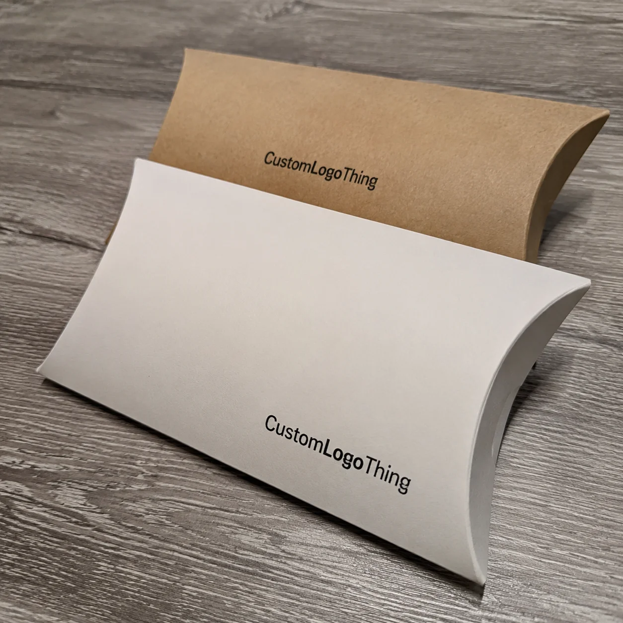
Material choice matters too. A 250gsm coated sheet prints beautifully, but it may curl in humid environments. A 350gsm C1S artboard gives a more substantial feel and works well for premium inserts. Uncoated stock can improve writeability if you want handwritten notes or stamped personalization. In my experience, the smartest choice is usually the one that survives your distribution environment. A client shipping into coastal markets once had 12% of their thin inserts arrive bent because the mailer and box combo left no room for rigidity. That’s a packaging issue, not a design issue.
Readability is non-negotiable. Small type and low contrast kill response rates. Aim for 10–12 pt for body copy in most consumer inserts, and larger if the audience skews older. Keep the callout text above the fold or in the visual center. Use one clear QR code with enough quiet space around it. Make sure there is enough contrast for scanning and enough room for a human eye to process the page in under 10 seconds. In a test print I reviewed from a plant in Hangzhou, a 1-inch QR code scanned 96% of the time, while a 0.5-inch code on glossy stock failed almost every time under warm kitchen lighting.
Cost changes the design, whether brands admit it or not. A 1-color black card on 14pt uncoated stock may cost under $0.10 at scale, while a four-color folded insert with soft-touch coating, matte lamination, and custom die-cut edges can jump past $0.50 quickly. That spread matters when you are shipping 50,000 boxes a month. How to design subscription box inserts responsibly means making sure the insert supports the unit economics, not just the mood board. For a 100,000-unit program in Nashville, even a $0.07 difference per insert means $7,000 a month. That’s not decorative money.
Audience segmentation is another filter. New subscribers need reassurance and quick wins. Loyal customers may respond better to exclusive offers or behind-the-scenes brand storytelling. Budget buyers tend to react more to savings, while premium buyers may prefer early access, sample education, or collectibles. I’ve found that a single insert design rarely performs equally well across all cohorts. That’s not failure. That’s data. A wellness brand in Vancouver saw a 26% lift in repeat purchases when it swapped the same insert into three segment-specific versions instead of using one generic card.
Operational factors also shape the final file. Do you need barcode space? Legal copy for a promotion? Expiration dates? Multilingual text for Canada or a mixed-market rollout? These details can crowd the layout fast. If you are planning how to design subscription box inserts for multiple regions, build the legal and language requirements in from day one. Retrofitting them later almost always causes a proof delay. I’ve seen a simple French/English compliance update push a project in Toronto back by 11 business days because nobody reserved space for it on the original dieline.
For compliance and sustainability, there are useful standards to know. FSC-certified paper can support sourcing claims if your supplier chain is documented, and packaging testing references from organizations like ISTA matter when inserts need to survive transit without curling or tearing. If your brand is making recycled-content claims or reducing material waste, the EPA’s packaging and materials guidance is worth a look too: EPA sustainable materials guidance. Those references won’t design the insert for you, but they help keep the story honest.
Step-by-Step Process for How to Design Subscription Box Inserts
The cleanest way to approach how to design subscription box inserts is to treat it like a mini production brief. I use six steps, and each one removes guesswork before it gets expensive. In most cases, a simple insert can move from concept to print-ready in 3 to 5 business days if the approvals are in one time zone and not passed around like a hot potato.
Step 1: Define one goal
Every insert should have a single primary job. Retention, education, upsell, referral, review generation, or onboarding. Pick one. I know that sounds narrow, but broad goals dilute response. One client wanted a card to thank customers, explain product use, promote a referral offer, and drive Instagram follows. The result looked busy and performed poorly. We cut it down to one headline, one CTA, and one QR code. Redemption improved by 23% over the next two cycles.
Step 2: Choose format and size
The box size dictates the insert size more than the design team wants to admit. Measure the internal footprint and note product height, filler material, and any curved surfaces that may snag the paper. A postcard works well when the customer only needs one action. A folded piece makes sense when you need detail. If the packout is tight, a slim insert prevents bent edges and keeps the unboxing neat. That physical fit is part of how to design subscription box inserts that people actually keep. In practice, a 4 x 6 card on 350gsm C1S artboard is a safe starting point for most boxes shipped from Guangzhou or Dongguan.
Step 3: Write the message hierarchy
Lead with the most important line. Then support it with one or two short bullets. Then close with the action. The reason is simple: readers scan first and read second. Put the value proposition at the top, not buried in paragraph three. If the insert is for new subscribers, the first line might say, “Your first use starts here.” If it is a referral piece, the first line might say, “Give $10, get $10.” Direct beats clever when the action matters, especially when the customer has about 6 seconds between lid open and product handling.
Step 4: Build the visual layout
Balance white space with hierarchy. Use one dominant focal point, not four competing ones. A QR code should be large enough to scan comfortably at arm’s length; I usually advise at least 0.8 inches square for consumer inserts, with margin around it. Keep body copy short. Use icons sparingly. If the insert includes a photograph, make sure it demonstrates the action instead of merely decorating the page. A flat, overdesigned layout can make the piece feel more like a brochure than a useful part of the box. I’ve seen a tri-fold in Minneapolis lose conversions because the customer had to unfold it twice just to find the code.
Step 5: Prototype and test in a real box
Print a few samples on the actual stock, then put them in the actual box with the actual product. This is where the paper tells the truth. I once watched a well-designed insert fail because the fold line landed exactly under a jar lid. It looked fine on screen, but in packout it curled and snagged. Real-world testing catches those mistakes early. Check readability at 12 inches, check fit against filler, and check whether the insert stays visible after shipping vibration. A proof approval on Tuesday and a packed sample by Friday can save you from a three-week reprint in the event of a sizing mistake.
Step 6: Launch, measure, refine
Once the insert ships, measure the action tied to it. Track coupon use, QR scans, referral redemptions, review volume, or support ticket volume, depending on the goal. Compare variants if possible. If one headline gets 1.8% engagement and another gets 2.6%, you have a decision, not a hunch. That is the point of learning how to design subscription box inserts as a repeatable process instead of a one-time creative exercise. A quarterly review in Dallas with shipment data and scan data beats a hallway opinion every time.
Here’s the practical sequence I recommend to clients who want speed without chaos:
- Write the insert goal in one sentence.
- Confirm box dimensions and available space.
- Draft the copy at 80% length, then cut another 20%.
- Choose stock and finish based on shipping conditions.
- Proof a physical sample inside the box.
- Track one success metric after launch.
Subscription Box Insert Timeline, Production, and Cost Planning
Timing is usually tighter than teams expect. A simple insert can move from concept to print-ready file in 3 to 5 business days if approvals are fast. Production might take another 5 to 10 business days, and fulfillment insertion depends on your co-packer’s schedule. If there is foil, die-cutting, soft-touch lamination, or a special fold, add time. When people ask me how to design subscription box inserts on a real launch calendar, I tell them to plan backward from ship date, not forward from approval date. For a campaign launching on the 28th, you want final proof approval by the 10th if you are printing in Shenzhen or Dongguan.
What slows everything down? Copy approvals, dieline changes, late-stage legal edits, and stock shortages. I’ve sat in meetings where a beautifully designed insert lost two weeks because the promo code copy had to be rewritten for a regional compliance requirement. Another time, a supplier in Suzhou ran short on a 14pt stock, and the brand had to choose between delaying launch or switching to 16pt uncoated. They chose the latter, and the insert actually felt better in hand. That’s not luck; that’s contingency planning.
Here’s a realistic planning framework by format:
| Format | Proofing Time | Production Time | Best for | Typical Cost Impact |
|---|---|---|---|---|
| Single card | 1–2 days | 5–7 business days | Quick promo or thank-you | Lowest |
| Folded insert | 2–3 days | 7–10 business days | Education or storytelling | Moderate |
| Special finish or die-cut | 3–5 days | 10–15 business days | Premium launches | Higher |
| Multi-version campaign set | 3–6 days | 10–20 business days | Segmented offers or testing | Highest administrative load |
Pricing is influenced by quantity break, paper weight, print method, and finishing. At 5,000 units, a simple one-color insert might land in the $0.08 to $0.15 range, while a four-color premium insert with coating can reach $0.25 to $0.45. Small runs are much more expensive per unit. If you only need 500 pieces, the economics can double or triple quickly. That is why how to design subscription box inserts should always be tied to forecast volume and not just aesthetics. A 500-piece reorder in Toronto can cost $0.31 per unit for a basic folded card, while a 20,000-piece run in Ningbo may drop below $0.11 per unit.
One thing I tell clients is to set a cost-per-insert ceiling before design begins. If your retention model can justify $0.12 per insert, don’t design a $0.38 piece and hope it pays off. Use the insert budget the same way you would use a freight budget or a corrugate budget. It is a line item, not a creative wish. If a co-packer in Phoenix charges $0.04 per box for insertion labor, that should be in the forecast too.
If sustainability matters to your buyer, paper sourcing and print efficiency also belong in the conversation. FSC-certified board, lower-ink coverage, and right-sized formats can reduce waste while keeping the insert useful. I’ve seen brands win trust simply by stating the stock choice and why it was selected. Transparency travels well in packaging, especially when the board is sourced in Asia and the final packout happens in California or the UK.
Common Mistakes to Avoid When Designing Subscription Box Inserts
The biggest mistake is trying to say too much. A crowded insert looks busy for about three seconds, then it gets ignored. I’ve seen brands pack six offers, three product claims, two QR codes, and a long founder letter onto one card. The customer doesn’t “engage.” They skim, then move on. If you want to know how to design subscription box inserts that people actually remember, start by removing one-third of the content before you refine the rest.
Mismatched tone is another problem. A luxury haircare box with discount-heavy language can cheapen the experience. A budget beauty box with too much brand poetry can feel disconnected from what the customer wants. The tone should reflect the product promise and the price point. I’ve sat through enough supplier reviews in Hong Kong and Shanghai to know that the wrong tone can trigger more internal debate than a material swap.
Vague calls to action underperform. “Visit our website” is weak. “Scan to reorder with 15% off by Friday” is stronger because it gives the customer a reason, a method, and a deadline. Specificity wins because behavior needs boundaries. That’s one of the simplest lessons in how to design subscription box inserts, and one of the most ignored. A promotion that expires in 14 days also gives the customer enough time to act after the box lands.
Formatting mistakes are easy to spot in hindsight. Tiny fonts, weak contrast, text too close to the fold, QR codes placed on glossy areas that reflect light, and too many decorative elements can all reduce response. A card that looks elegant in a design file may fail in a box if it cannot be read quickly in a kitchen or bedroom. Use real lighting when you proof it. I once helped a client discover their pale gray type disappeared under warm indoor bulbs in a London apartment. The file was fine. The environment was not. Packaging, as usual, had the last laugh.
Operational errors can be expensive. Don’t print a promo code that expires before the shipment lands. Don’t forget to track which version went into which SKU. Don’t approve a seasonal insert that will feel stale two months later. And don’t skip a physical size check. A 1/8 inch mistake can matter when the insert sits above a fragile product or inside a tight mailer. I’ve watched a 4 x 6 insert catch on a bottle neck in one packing line in Mexico City and force a full repack of 8,000 units.
Another trap is choosing the wrong material for the use case. If the insert needs to survive humidity, use a stock and finish that can handle it. If the insert should be writable, avoid heavy coatings that repel pens. If the box is going through rough transit, consider a thicker sheet. Packaging details are not abstract; they show up in customer hands. A matte aqueous coating on 16pt stock can be a better choice than a glossy laminate if you want better scannability and fewer fingerprints.
Expert Tips to Make Subscription Box Inserts Perform Better
Use one primary message and one measurable action. That’s the cleanest formula I know. If the insert is meant to drive a reorder, then the reorder should be the only thing the card is asking for. If it is meant to educate, then teach one thing well. I’ve watched brands improve insert performance simply by cutting down to a single headline and a single QR code. Clarity scales better than clutter, and it usually costs less than a second round of proofs in Taipei.
Tailor inserts by customer stage. New subscribers need confidence. Mid-term subscribers may need novelty. Long-term customers often respond to exclusivity or surprise. Seasonal campaigns also work well. A winter insert can highlight care instructions or limited bundles, while a summer insert can focus on travel-size add-ons or social sharing. How to design subscription box inserts becomes much easier when you stop treating the subscriber list as one flat audience. A 3-month subscriber in Sydney does not need the same message as a 14-month subscriber in Berlin.
A/B testing should be standard, not optional. Test headlines, offers, call-to-action wording, and even paper stock if the customer experience is part of the hypothesis. Keep the variable count low. Change one thing at a time. If version A gets 310 QR scans and version B gets 418 over the same order volume, you have a directional answer. That’s better than guessing, and far cheaper than debating opinions in a room full of stakeholders. If you can, run the test over at least 10,000 shipped boxes so the difference isn’t just noise.
Memorability matters too. A collectible series of inserts can encourage repeat attention. So can a mini story about the origin of the product, a founder note with a specific metric, or a QR code that unlocks a 60-second video. Limited-time offers can create urgency, but keep the timing realistic. If a customer doesn’t open the box for a week, a 24-hour deadline may feel artificial. Match the offer window to real behavior. A 7-day window is often a better fit for subscription mailboxes than a one-day flash sale.
Connect the insert to your broader retention system. If the card mentions a QR code, make sure the landing page is mobile-friendly and loads in under 3 seconds on average connections. If the insert offers a coupon, sync it with email and SMS follow-up. If it invites social sharing, make sure the hashtag is actually monitored. Packaging is physical, but the response loop is digital. The two should talk to each other, ideally without a tech stack that needs three consultants and a prayer.
One practical tip from a client meeting in Chicago: include a small internal note on the proof file for fulfillment, such as “insert must face product label” or “place under top tissue.” It sounds basic. It saves mistakes. Fulfillment teams move fast, and if the packout has 12 steps, nobody wants to guess where the insert goes. Clear instructions protect both the design and the customer experience. A 15-second note on the dieline can save a full day of rework in a warehouse outside Indianapolis.
Finally, write for the box, not for the brand deck. Packaging copy should be shorter, sharper, and more direct than website copy. If you’re still asking how to design subscription box inserts that people use, start by cutting down the adjectives and increasing the usefulness. The box is not a conference room. It’s a customer moment, usually standing over a kitchen counter at 7:40 p.m.
Next Steps for Designing Subscription Box Inserts That Work
The fastest way forward is simple: define the insert’s job, match the brand, control cost, and build around one customer action. That is the backbone of how to design subscription box inserts that support retention instead of just filling space. If you want the box to feel better and perform better, those four priorities will get you much further than a fancy finish alone. A plain card that gets 2.4% conversion beats a gorgeous one that gets 0.4% every single time.
Here’s a short action list I use when auditing a new program:
- Review your current insert and write down its single goal.
- Identify one box moment that feels underused.
- Sketch a simpler insert with one headline and one CTA.
- Check size, stock, and cost against your current packout.
- Test one version on one customer segment before scaling.
Ask your support team what customers ask most often. Ask fulfillment staff where inserts get damaged or lost. Ask the customer success team what language gets the strongest response. I’ve found that the best insert ideas often come from these practical conversations, not from a blank design board. In one factory review in Dongguan, a line supervisor pointed out that a larger card would consistently slide under the carton flap and stay visible. That simple operational insight outperformed three rounds of design tweaks. I wish every “creative brainstorm” had that much common sense.
Measure one thing first. If the goal is retention, track repeat orders. If the goal is education, track support tickets or post-purchase questions. If the goal is referral, track code redemption. Then refine. Repeat. This is how how to design subscription box inserts turns into a system instead of a one-off project. A monthly dashboard with scan rate, redemption rate, and repeat order lift is far more useful than a stack of pretty mockups in a folder.
And if you’re choosing between making the insert prettier or making it clearer, I’d choose clearer almost every time. Beautiful helps. Useful pays. That’s the tradeoff most brands get wrong.
FAQ
How do you design subscription box inserts for new subscribers?
Focus on welcome, education, and reducing first-use friction. A concise brand message, a quick-start checklist, or a QR code to onboarding content usually works better than a long sales pitch. Keep the tone calm and reassuring, and avoid stacking too many offers onto one piece. A 4 x 6 card on 350gsm C1S artboard is a practical starting point for most new-subscriber boxes shipped from Shenzhen, Dongguan, or Ningbo.
What size should subscription box inserts be?
Choose a size that fits the box without bending, blocking products, or wasting space. Common options are postcard-sized cards, folded half-sheets, or slim multi-panel inserts. Base the size on the message length, the internal box dimensions, and the print budget. For most mid-volume programs, a 4 x 6 in. postcard or an 8.5 x 5.5 in. folded card is the most efficient choice.
How much do subscription box inserts usually cost?
Costs vary by quantity, paper stock, print complexity, and finishing. Simple single-card inserts are usually the most budget-friendly option. Special coatings, folding, custom shapes, and small runs raise the unit price quickly, especially when you drop below common quantity breaks. At 5,000 pieces, a simple postcard might cost $0.08 to $0.18 per unit, while a premium folded insert can run $0.25 to $0.45.
What should be included in a subscription box insert?
Include one clear goal, such as retention, education, referral, or upsell. Add concise copy, brand-consistent visuals, and a specific call to action. If it fits the purpose, include promo codes, care instructions, QR links, or social prompts. Keep legal copy, expiration dates, and multilingual text visible if the insert is going into Canada, the EU, or another multi-region shipment.
How do you measure whether subscription box inserts are working?
Track the action tied to the insert, such as coupon use, QR scans, referral redemptions, or review volume. Compare results across versions to see which design or message performs better. Also watch support tickets, repeat orders, and social engagement for indirect effects. If one version drives 418 scans and another gets 310 over the same shipment volume, the better performer is obvious.
If you remember one thing, make it this: how to design subscription box inserts is not about stuffing paper into a box. It’s about building a small, measurable moment that helps the customer move forward, and helps the brand earn the next order.