Knit Hats with Logo Logo Placement Guide Basics
Knit Hats With Logo logo placement guide advice matters because beanies are not flat shirts, rigid boxes, or smooth tote bags. They stretch, fold, compress, and sit differently on different heads, so a logo that appears perfectly centered in a digital mockup can look low, high, tilted, or crowded once the hat is actually worn.
That is the detail many buyers miss on a first order. A left-chest polo logo has a fairly predictable field. A cuffed knit hat may offer only 2.25 to 3 inches of visible height, and even that space is shaped by the cuff fold, rib texture, seam pull, yarn recovery, and the natural curve of the forehead. A 2-inch embroidered mark can look crisp on a proof, then visually shrink against heavy acrylic ribbing.
Most buyers end up choosing from five practical placement zones: front center, front off-center, side placement, cuff placement, and small woven or patch labels. Front center is the easiest to read and the most common for uniforms, field crews, giveaways, and event merchandise. Side placement feels quieter and more retail. Cuff branding is familiar and dependable, especially when the cuff is deep enough to frame the mark cleanly. Small labels can look refined, but they need sharp contrast and tidy sewing to avoid disappearing into the knit.
Placement is not only an art decision. It is also a production decision. The strongest result balances visibility, comfort, budget, stitch behavior, decoration method, and the tone the brand wants to project. A safety crew ordering 1,000 acrylic beanies usually needs a clear front mark that reads quickly. A boutique merch run may be better served by a small woven patch, a side label, or a restrained leather patch with enough breathing room around the edge.
Practical rule: approve logo placement based on how the hat will be worn, not only how the blank looks lying flat.
How embroidery, patches, and labels change placement rules
The decoration method changes the safe zone. Direct embroidery, woven patches, leather patches, applique, and sewn labels all behave differently on knit fabric, and each one has its own tolerance for small details, curved artwork, borders, and tight spacing.
Direct embroidery works best for bold marks, short text, and simple icons. It looks integrated because the thread is stitched directly into the hat, rather than applied as a separate piece. The tradeoff is fabric movement. Soft rib-knit beanies can pucker if the stitch area is too dense, and small letters can break apart when they fall into the valleys of the knit. On many bulk orders, embroidery is still cost-efficient after digitizing, especially at quantities above 144 pieces, but the artwork has to be suitable for thread.
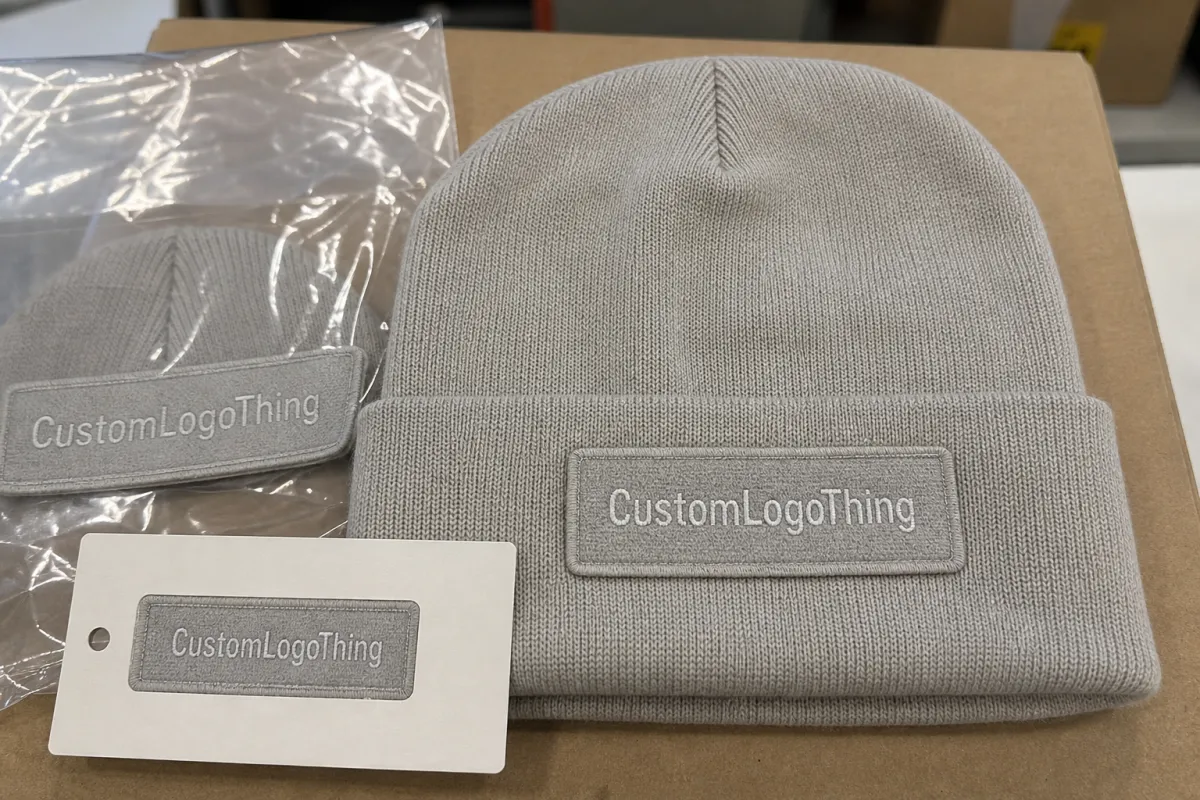
Woven patches hold smaller lettering better because the artwork is built on a flatter woven surface before the patch is sewn to the hat. They also create a defined border, which can help a logo stand apart from heather yarn, dark ribbing, or textured cuff material. Typical woven patch sizes for beanies often land around 1.5 x 2 inches to 2 x 2.5 inches, although the right size depends on the blank, the logo shape, and whether the patch is going on the cuff, front body, or side.
Leather and faux leather patches give a more outdoor, retail, or workwear feel. They suit debossed, laser-etched, or stamped artwork, but they are less forgiving when the design depends on tiny color separations or fine tonal detail. Leather and faux leather also add thickness. If the patch sits too close to a hard fold edge, it can feel bulky, curl over time, or make the cuff look stiff.
Sewn labels are small, efficient, and understated. They work well on side seams, cuff edges, and minimalist retail-style beanies, but they are not the right choice when the buyer needs strong visibility from across a room or across a jobsite. Applique sits between patch and embroidery: bolder than a label, more dimensional than direct stitching, and usually better for larger shapes than for fine detail.
The smaller or more detailed the logo, the more the method matters. The same 1.75-inch logo may succeed as a woven patch and fail as direct embroidery if the text strokes are too thin or the icon has too many small openings. A good placement decision starts with the artwork, then considers the blank, then chooses the decoration method that can reproduce the mark without forcing it into a space where it does not belong.
The hat specs that move the logo: cuff depth, stretch, seams
Hat construction quietly controls logo placement. Cuff depth is the first spec to check. A taller cuff, often around 3 inches, gives the decorator more usable front space and more margin around the design. A shallow 2-inch cuff can force a narrower logo, push the mark higher than expected, or make a patch look cramped. That may be acceptable for a small woven label. It is less forgiving for a stacked company name, badge, or multi-line department logo.
Knit gauge matters too. A tighter fine-gauge knit behaves more like a smooth textile and usually supports smaller detail better. Chunky rib knit has deeper valleys and ridges, which can make small lettering look broken or uneven. Yarn thickness has a similar effect. Heavier acrylic or wool-blend yarn creates more texture, so the logo usually needs stronger contrast, fewer thin strokes, and enough size to compete with the surface.
Stretch is the variable that causes the most surprises. Rib-knit beanies expand horizontally when worn, and the expansion is not perfectly even. A logo centered on a flat blank may appear wider and slightly lower once the front panel stretches over the forehead. Slouch beanies add another wrinkle because the crown collapses backward, shifting visual weight toward the cuff or lower front.
Seams deserve respect. Logos placed too close to a back seam, side seam, crown dart, or heavy fold can distort during production and during wear. Even 0.25 inch of extra clearance can improve readability. For direct embroidery, the decorator also needs enough stable fabric around the stitch area so the hoop, clamp, or beanie frame can hold the hat cleanly without dragging the design out of alignment.
The intended use should guide the final choice. A team beanie favors consistent front visibility. Promotional giveaways often need budget-friendly embroidery with a clear 2 to 2.5-inch-wide mark. Outdoor gear can handle patches, darker thread, and rugged contrast. Retail merch usually benefits from restraint: smaller labels, balanced spacing, and repeatable placement across black, gray, navy, safety orange, and other colorways.
Cost, MOQ, and quote factors buyers should compare
Placement affects cost because it affects labor. Center-front embroidery on a standard cuffed beanie is familiar for most decorators. Side placement, dual-location branding, curved patch positions, or unusually low cuff placement can require extra setup, slower handling, more operator attention, or additional proofing. That added time shows up in the quote.
Typical bulk beanie pricing varies widely, but decorated knit hats often land somewhere from $4.50 to $12.00 per unit at mid-range quantities, depending on blank quality, decoration method, stitch count, patch construction, and order volume. A simple embroidered logo may add roughly $1.00 to $3.50 per unit. Custom patches can run higher when the patch has a shaped border, merrowed edge, multiple colors, specialty material, heat-press backing, or a separate sew-down step.
| Branding option | Best use | Typical cost pressure | Placement notes |
|---|---|---|---|
| Direct embroidery | Simple logos, short text, bold icons | Stitch count, thread colors, digitizing | Needs a stable stitch field and clearance from folds |
| Woven patch | Detailed logos, small lettering, badges | Patch size, border, sew-down labor | Works well on cuff or front center with clean spacing |
| Leather patch | Outdoor, retail, premium merch | Material, etching, patch shape | Avoid placement too close to hard fold edges |
| Sewn label | Subtle branding, side tags, fashion look | Label type, fold style, sewing position | Best for low-key visibility, not distance readability |
MOQ can shift by placement type. A supplier may accept 72 pieces for one standard front embroidery, then require 144 or 288 pieces for a custom woven patch because patch production has its own setup. Multi-location branding can also split the run. For example, 500 hats with front logos and 500 hats with side logos may not price like one clean 1,000-piece order, because the decorator is managing two setups and two quality-control targets.
To compare quotes properly, send every supplier the same information: hat style, quantity, logo file, preferred placement, decoration method, target delivery date, and whether you need a digital proof or physical sample. Vague requests such as “logo on beanie” invite different assumptions. One supplier may quote a small front embroidery. Another may quote a woven patch. A third may assume standard cuff placement but choose a different logo width. The numbers will not mean much unless the specs match.
The lowest unit price is not always the smarter buy. If saving $0.40 per unit makes the logo fuzzy, low, tilted, or hard to read, the order loses value every time someone wears it. Beanies are visible merchandise; a small placement error can show up in team photos, retail displays, outdoor events, and employee uniforms for years.
Production steps, lead time, and approval checkpoints
A clean beanie order usually moves through seven steps: file check, placement mockup, digitizing or patch preparation, proof approval, optional sampling, full production, and finishing. Each step prevents a different failure. The file check catches low-resolution art or missing vector paths. The placement mockup catches visual balance. Digitizing translates artwork into stitches. Patch preparation translates artwork into woven, printed, leather, or applique construction.
Lead time and turnaround are not the same thing. Lead time may include art review, proofing, sample production, bulk decoration, packing, and shipping. Turnaround sometimes means production only, counted after proof approval. That distinction can change the calendar by 5 to 10 business days, which matters if the hats are tied to a launch date, event, employee kit, or winter distribution.
For many standard embroidered beanie orders, production may take around 10 to 15 business days after proof approval, with shipping added separately. Custom patches can add another 7 to 14 business days if the patch has to be produced before sewing. A physical pre-production sample adds time too, but for larger runs it can be worth the delay. Losing a week before production is easier to manage than discovering 2,000 finished hats with a logo sitting 0.5 inch too low.
Delays usually come from ordinary problems: unclear artwork, missing color references, disagreement over exact placement, or slow signoff. Thread matching is another common snag. Embroidery thread rarely matches coated Pantone colors exactly, so buyers should expect a closest-available match unless custom dyeing is part of the order. For patch work, border color, backing type, sew-down thread, and edge finish should be confirmed before production begins.
Quality control should include more than counting cartons. On knit hats, the check should confirm logo width and height, placement distance from the cuff fold or seam, thread color, patch orientation, sew-down quality, and general consistency across the run. A small amount of variation is normal because knit goods flex, but the logo should not drift noticeably from hat to hat.
For standards-minded buyers, packaging and shipping tests may also matter on large promotional distributions. Organizations such as ISTA publish transport testing procedures, while FSC certification is relevant if branded hangtags, cartons, or paperboard inserts are part of the program. Logo placement is a visual issue, but the order still has to arrive clean, counted, and saleable.
Send vector art early. Include the hat style, desired wear position, brand colors, preferred logo width, and any deadline that has real consequences. The more specific the request, the easier it is for the decorator to build a proof around the right visual hierarchy from the start.
Common placement mistakes that make a beanie look off-center
The first mistake is placing the logo too close to the cuff edge. A fold can hide part of the design, crowd the border, or make the logo feel heavy at the bottom. On a cuffed beanie, even a clean 0.375 to 0.5 inch margin can change the whole look.
The second mistake is shrinking detailed art until it technically fits. Knit texture punishes tiny letters. A slogan that reads well at 3 inches wide on a screen may blur at 1.5 inches on rib knit. If the logo depends on legal text, thin outlines, gradients, or detailed mascots, consider a woven patch, enlarge the mark, or simplify the art before proofing.
Symmetry creates another trap. A logo can be mathematically centered in the art box but still appear off-center to the eye because the icon is heavier on one side, the text has uneven weight, or the hat stretches more across one rib group than another. Good proofing is partly measurement and partly visual judgment.
Buyers also approve proofs without checking the exact blank. That is risky. A fisherman beanie, pom beanie, slouch beanie, cuffed rib beanie, and fine-gauge skull cap all wear differently. The front field changes. The fold changes. The crown changes. A placement rule that works on one style may look wrong on another, even when the logo size stays the same.
Color creates its own placement problem. Low-contrast thread on heather yarn can look tasteful up close and nearly invisible at normal viewing distance. Bright thread on a thin cuff can look loud and unbalanced. If the order uses several hat colors, ask whether the thread or patch colors will stay the same across the run or shift by colorway for readability.
Prevention is straightforward: ask for a proof that shows the logo on the actual blank hat shape, not only in a flat rectangle. If the supplier can provide a photo sample or a mockup based on the selected SKU, even better. The proof should state logo width, height, decoration method, thread or patch colors, and placement reference such as “centered on front cuff” or “0.5 inch above cuff fold.”
Practical rules for cleaner front, side, and cuff branding
Start with simpler artwork. Bold marks, short text, clear icons, and strong contrast almost always read better on knit hats than dense detail. If a logo depends on hairline strokes or tiny secondary copy, the hat is telling you something: enlarge the mark, change the decoration method, or remove the detail.
Front center is the best choice for maximum visibility. It works for crews, events, schools, sponsors, employee gifts, and field programs because people recognize the brand quickly. For many beanies, a front logo width of about 2 to 2.75 inches is a practical range, though the right size depends on the artwork, stitch density, patch shape, and blank.
Side placement is quieter. It can feel more premium because it does not announce itself as loudly, and it works especially well for small labels, restrained icons, and fashion-driven merchandise. The tradeoff is visibility. If the business goal is broad brand exposure in photos, side placement may underdeliver.
Cuff placement is the familiar retail-beanie presentation. It gives the logo a defined field and keeps the mark where people expect to see it. But cuff placement depends heavily on cuff depth. A shallow fold can make a standard logo look cramped, while a taller cuff can support a patch, stacked wordmark, or small badge with cleaner margins.
Front off-center placement can work, but it needs intention. A small mark offset to the wearer’s left can look refined on a fine-gauge beanie, while the same mark may look accidental on a chunky rib cuff if the spacing is not clearly defined. If choosing an off-center mark, specify whether the placement is from the wearer’s perspective or the viewer’s perspective. That simple wording prevents a surprising number of proofing errors.
Test the mark at real viewing distance. Not 4 inches from a laptop screen. Try 6 to 10 feet away, because that is how most people will see the hat in a warehouse, at a trade show, on a ski trip, or in a team photo. A design that looks sharp in a close-up render can fade into the knit once it is worn outdoors.
Brand consistency matters as much as single-order approval. Choose one primary rule for the line, such as centered cuff patch or left-side woven label, then keep it across black, gray, navy, red, and safety colorways unless contrast forces a change. Consistency makes the product feel planned, not improvised.
What to check before approving the final placement proof
Measure the hat first. Cuff depth, front usable space, seam location, and expected wear style should be known before final proofing. If the blank has a 2.25-inch cuff, do not approve a logo that needs 2 inches of height unless the decorator confirms the margin will still look clean after folding and handling.
Send a clean vector file, ideally AI, EPS, SVG, or a production-ready PDF. Raster art can work as a visual reference, but it should not be the only source for digitizing or patch construction. Also state the placement goal in plain language: “front center on cuff,” “small label on wearer’s left side,” or “patch centered above fold.”
If the decision is not obvious, ask for two proof versions. One standard front placement and one alternate side or cuff placement can make the better direction clear very quickly. The extra proofing time is usually minor compared with the cost of approving the wrong look on hundreds or thousands of units.
Confirm the details that affect both production and price at the same time: quantity, decoration method, logo size, number of thread colors, patch material, blank color mix, deadline, packing requirements, and shipping destination. If hangtags, polybags, carton labels, or FSC paper inserts are part of the program, include those details early rather than treating them as afterthoughts.
Before signing off, restate the approved direction in one sentence: “We are approving a centered cuff logo with a readable 2.25-inch-wide mark, balanced above the fold on the selected blank.” That sentence may sound almost too simple. It prevents expensive ambiguity.
Placement is not decoration trivia. It is the difference between a beanie people wear proudly and one that looks slightly wrong every time it appears in a photo. Use the proofing stage as a practical checkpoint, not a formality, and make sure the approved logo size, decoration method, and hat construction all support the same visual goal.
FAQ
Where should a knit hat logo sit for the cleanest look?
Front center is the most readable choice for most team, promo, and employee orders. On a cuffed beanie, the logo often looks best centered on the cuff or placed just above the fold with enough margin to avoid crowding. Side placement works better for a lower-key retail look, but it gives up some distance visibility.
How big should a beanie logo be on knit hats?
Most beanie logos need to stay bold, simple, and readable against knit texture. A common front logo width is roughly 2 to 2.75 inches, but the right size depends on the hat style, logo shape, and decoration method. Ask for a proof with actual dimensions instead of judging from a flat art file.
Is embroidery or a patch better for knit hat placement?
Embroidery is usually better for simple logos, short text, and clean brand marks. Patches are often better for detailed art, tiny lettering, badges, or a more premium retail look. Choose based on how much texture, durability, and detail your logo needs, not only on unit price.
How do logo placement and MOQ affect price on beanies?
More complex placements can increase setup time, proofing time, and handling, which may raise the unit cost. Separate placements or multi-location branding may also push MOQ higher because the supplier has to manage different setups. The fastest way to compare quotes is to give every supplier the same placement instructions, artwork, quantity, and decoration method.
What should I send before approving a knit hat placement proof?
Send vector artwork, the exact hat style, quantity, preferred placement, brand color standards, and target delivery date. Ask for a proof that shows the design on the actual blank beanie, not a generic mockup. If the order is large or the logo is detailed, consider a physical sample before full production.


