The proof is where most branded beanie problems are either prevented or quietly approved forever. A jacquard knit beanies Artwork Proof Checklist for wine shops helps you review the file as a production document, not as a charming mockup tucked into an email.
Knitting is not printing. Tiny type, thin grapevine drawings, vintage crests, delicate wine label borders, and low-contrast color palettes can turn into fuzzy oatmeal if nobody checks the artwork properly. That sounds harsh only until the cartons arrive.
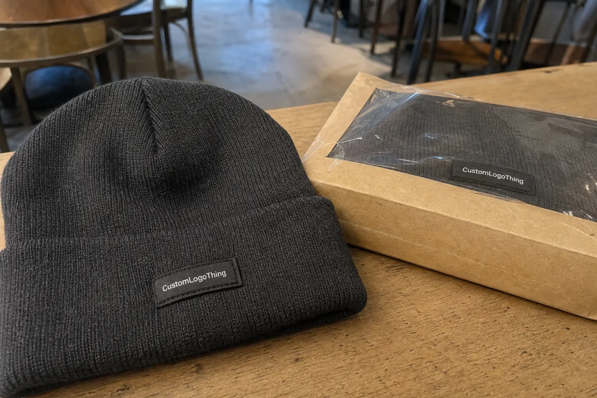
Why Wine Shops Need a Beanie Artwork Proof Checklist
Wine shops tend to approach branded merchandise differently than ski shops, breweries, and Trade Show Booths. The branding usually leans more refined: serif typography, bottle silhouettes, estate marks, tasting-room badges, corkscrews, grape clusters, and color palettes built around burgundy, cream, charcoal, forest green, navy, and soft gold. Those choices can look beautiful on a label or shelf talker, but yarn has its own rules.
A proof for custom jacquard knit beanies should show the knit layout, logo placement, yarn color mapping, fold height, cuff style, repeat pattern, pom-pom option, and sometimes an approximate beanie shape. It may also include dimensions such as a 3.5-inch cuff, a 2.75-inch logo width, or a 4-color yarn layout. Read those callouts carefully. They are not decorative confetti.
The proof is not a photo sample. It is not a fashion sketch. It is not a promise that weak artwork will somehow improve once production starts. It is a technical checkpoint, and if you approve unreadable lettering, the knitting program will usually produce unreadable lettering with impressive efficiency.
That is why the checklist matters. It gives the buyer, marketing lead, owner, or tasting room manager a structured way to catch problems before bulk knitting begins. One clean revision costs far less time than five panicked emails after 300 units are already on machines.
Practical rule: review the proof at normal viewing size. If the shop name only reads clearly at 200 percent zoom on a laptop, it probably will not read clearly on someone's forehead.
How Jacquard Knit Artwork Works on Beanies
Jacquard knitting builds the design directly into the fabric using yarn colors. The logo is not printed on top, and it is not stitched afterward like embroidery. The knitting machine switches yarns to create shapes, letters, borders, icons, or repeat patterns as the beanie is formed.
That integrated look is the reason jacquard beanies can feel more retail-worthy than many basic promotional hats. The tradeoff is detail. Artwork must be simplified into stitch-friendly blocks, because curves, tiny letters, narrow rules, and small negative spaces all have to fit into a knit grid. That grid is made of yarn, not pixels.
Embroidery sits on the surface and can sometimes hold smaller details. Jacquard becomes part of the knit structure, so a vineyard illustration that looks elegant on a wine label may need to become a clean grape icon, a simplified bottle shape, initials inside a bold border, or a short wordmark with stronger letter spacing.
Color separation matters as much as shape. Each logo color usually maps to a yarn color. Two to four colors is often the practical sweet spot for wine shop beanies. Six colors can be done in some programs, but the design may become heavier, less flexible, more expensive, and easier to misread.
Subtle palettes need extra scrutiny. Cream, bone, ivory, and warm white may look like separate brand colors in a digital file, while the available yarn chart may only offer one or two close options. Burgundy on black can look premium on a screen and nearly invisible under normal shop lighting. Charcoal on navy, dark green on black, and tan on cream create the same problem.
Layout changes the proof review, too. A front cuff logo carries different risks than an all-over corkscrew pattern around the crown. A repeating bottle-and-grape motif needs spacing checks so the repeat does not look crowded or uneven. A pom-pom adds height and changes the visual balance. A folded cuff can hide part of the design if the logo is too tall, too low, or placed without regard for the finished fold.
Logo, Color, and Sizing Details to Check Before Approval
Start with legibility. Can someone recognize the wine shop name, initials, estate mark, or bottle icon from 3 to 6 feet away? That is a realistic wearing distance. If the design only works as a close-up product shot, it is probably too fragile for jacquard knit.
Check the artwork details one by one: letter spacing, line thickness, icon simplification, border shape, symmetry, and alignment on the cuff. Look for missing dots, odd letterforms, broken curves, and details that were removed during knit conversion. Sometimes simplification is smart. Sometimes it accidentally turns an elegant crest into a blob with ambition.
Serif type deserves special attention. Many wine brands use refined lettering with thin strokes, high contrast between thick and thin parts, or small secondary lines such as “wine merchant,” “cellar,” “est.,” or a vintage year. Those details often need to be enlarged, removed, or moved to a woven label or hang tag instead of knitted into the beanie.
Color needs a practical eye. Pantone-to-yarn matching is approximate unless you are paying for custom-dyed yarn at a quantity that justifies it. For smaller promo or retail orders, you are usually approving the closest available yarn from the supplier's chart. Ask for yarn color names or codes, especially for brand-sensitive tones like burgundy, merlot, cream, taupe, charcoal, navy, and forest green.
Contrast is the part buyers often underestimate. Wine merchandising tends to reward restraint, but beanies punish timid contrast. A cream logo on a burgundy cuff usually reads better than burgundy on black. A gold accent can work if the yarn has enough brightness, but a dull tan gold against heather gray may land flat.
Confirm sizing before approval. Useful proof dimensions include overall beanie height, cuff height, logo width, logo height, repeat spacing, and pom-pom diameter if used. Common cuff heights sit around 2.5 to 3.5 inches, though suppliers vary. A 3-inch-wide logo may feel balanced on a flat proof but oversized on a smaller head, especially if the design has a heavy border.
If the proof includes callouts, material blends, or color codes, read them against the quote. A mockup image can look right while the written specs say the wrong quantity, wrong cuff color, or wrong packaging.
- Logo: readable from normal distance, not just zoomed in
- Lines: thick enough to survive stitch conversion
- Colors: selected from actual yarn options, not wishful RGB values
- Placement: centered on the cuff and not hidden by the fold
- Dimensions: logo width, logo height, cuff height, and beanie size confirmed
Cost, Pricing, MOQ, and Quote Factors for Wine Shop Beanies
Pricing depends on quantity, yarn colors, beanie style, pom-pom option, cuff construction, jacquard pattern complexity, labels, packaging, and shipping destination. Small custom knit beanie orders often carry higher unit costs because setup, artwork handling, and machine time are spread across fewer pieces. That is not supplier drama. That is math.
Many custom jacquard knit beanie programs start around a few hundred units, though minimums vary by supplier, yarn availability, and design complexity. A simple 2-color cuff logo may have a lower barrier than a 5-color all-over pattern with a pom-pom, woven label, hang tag, and individual polybag.
For planning, basic custom jacquard beanies can often land somewhere around $6 to $12 per unit at moderate quantities. More retail-ready builds with labels, pom-poms, recycled yarn claims, belly bands, or gift packaging can move into the $10 to $18+ range. Freight, rush timing, tariff changes, and special packaging can shift those numbers quickly, so treat ranges as planning references rather than quotes.
| Option | Typical Use | Cost Impact | Proof Risk |
|---|---|---|---|
| 2-color cuff logo | Staff gifts, wine club add-ons, tasting room retail | Lower to moderate | Low if logo is simplified |
| 3-4 color jacquard design | Premium shop merch or seasonal launches | Moderate | Medium; contrast and color mapping matter |
| All-over repeat pattern | Retail-focused beanies with stronger shelf appeal | Moderate to higher | Medium to high; spacing and repeat alignment matter |
| Pom-pom plus woven label | Holiday bundles and gift-ready merchandise | Higher | Medium; placement and trim colors need approval |
| Hang tag or kraft belly band | Retail display, gifting, wine club packaging | Small to moderate add-on | Low, but barcode and copy errors happen |
Adding yarn colors can raise both cost and production risk. More yarns mean more setup, more chances for color confusion, and sometimes a heavier hand feel. For most wine shops, a clean 2-color or 3-color design looks sharper than an overcomplicated 6-color interpretation of the entire brand guide.
Premium options may be worth it if the beanie is being sold as merchandise rather than handed out as a simple giveaway. Woven labels, kraft belly bands, hang tags, UPC labels, individual polybags, recycled yarn claims, and clean folding instructions can improve retail presentation. If sustainability claims matter, ask for documentation instead of relying on vague wording; for paper-based packaging components, standards from organizations such as FSC may be relevant.
Request every quote with the same specs: quantity, yarn color count, beanie style, cuff type, material blend, pom option, label option, packaging, delivery deadline, and shipping address. Otherwise you are comparing fog to fog.
Process and Timeline: From Artwork Proof to Finished Beanies
The usual production sequence is straightforward on paper: submit artwork, receive quote, confirm specs, review digital proof, approve or revise, produce a sample if needed, begin bulk knitting, finish, inspect, pack, and ship. Each step can move quickly if the buyer sends complete information. Each step can stall if the supplier has to guess.
Digital proofs are usually faster than physical samples, but they still require clean artwork and confirmed specs. A logo file named final-final-really-final does not speed anything up. Send vector artwork if available: AI, EPS, or editable PDF. A high-resolution PNG can help as a reference, but it is not the same as a production-ready vector file.
One round of thoughtful revisions is normal. Five rounds because nobody checked the wine shop name spelling internally is how timelines get ugly. For larger retail orders, gift shop launches, or premium winery merchandise, a physical pre-production sample may be smart. It adds time and cost, but it can confirm hand feel, yarn color, cuff height, stretch, and actual logo readability.
Lead time depends on yarn stock, order size, machine capacity, seasonality, packaging complexity, shipping method, and holiday rush periods. As a working planning rule, allow several weeks from proof approval for standard custom knit beanie production. Add more time if the order includes sampling, custom packaging, custom-dyed yarn, split shipments, or ocean freight.
If the beanies are tied to a wine club shipment, tasting room event, harvest party, staff uniform rollout, or holiday gift program, start earlier than feels necessary. Hard deadlines do not care that the owner was traveling or the marketing file was buried in someone's inbox.
For packaging and transit planning on larger shipments, buyers can reference standards from organizations like ISTA. A few cartons of beanies may not need formal testing, but the mindset is useful: product, packaging, carton strength, and shipping method all affect the condition of the goods when they arrive.
Step-by-Step Proof Review Before You Approve Production
A proof checklist should be boring in the best possible way. Boring prevents expensive surprises. Use the same review sequence every time so nobody skips the small details that become large complaints later.
- Compare against the approved logo file. Check spelling, icon shape, letterforms, line breaks, and whether small details were removed during knit conversion. If the full crest is too detailed, approve a simplified version intentionally.
- Review placement. Confirm whether the logo sits on the front cuff, side cuff, crown, or all-over pattern. Make sure the fold does not cut through the artwork or push the design too close to the bottom edge.
- Check dimensions. Look at logo width, logo height, cuff height, overall beanie height, and repeat spacing. A logo that feels perfect on a flat proof may feel oversized when worn.
- Approve yarn colors by name or code. If the supplier provides a yarn chart, use it. If the brand color is critical, ask about closer alternatives before approval.
- Confirm production specs. Verify quantity, size, material blend, colorway, pom option, label option, packaging, ship-to address, and deadline.
- Get internal signoff. For wine shops, that may mean marketing, retail, ownership, or the tasting room manager. Better to argue before production than after cartons arrive.
Do not approve from a phone while walking into a tasting appointment. Open the file on a real screen. Zoom out. Print it if the dimensions are listed clearly. Read every notation. The supplier is not being fussy by asking for approval; it is creating a record of what you agreed to produce.
If you need changes, send one clear revision list. Example: “Increase logo width from 2.5 inches to 3 inches, change cream yarn to warm white option 104, remove tiny grapevine line under the name, keep cuff height at 3 inches.” That is useful. “Can we make it pop more?” is not.
Also check the written proof against the purchase order or quote. Quantity, delivery address, requested in-hands date, colorway names, and packaging instructions should match across documents. Small administrative errors can be just as damaging as artwork errors, especially if the order supports a holiday window or a wine club mailing.
Common Proof Mistakes That Make Wine Shop Beanies Look Cheap
Approving tiny serif type is the classic mistake. It looks classy on a bottle label and tragic in yarn. Use initials, simplify the wordmark, or pair the shop name with a cleaner icon. If the estate name has eight syllables and a delicate script, jacquard may not be the right method for the full mark.
Too many colors create another mess. A refined wine palette can turn muddy when forced into multiple yarns with low contrast. Two to four strong colors usually look better than six timid ones. Cream on burgundy. White on forest green. Warm gold on navy if the yarn has enough contrast. Simple wins more often than buyers want to admit.
Ignoring cuff fold height causes placement problems. If the logo is too tall, it may bend over the fold. If it is too low, it can sit awkwardly near the edge. If it is too high, the top may disappear once the cuff is folded. Ask for the cuff height in inches and check the logo against it.
Low-contrast combinations are sneaky. Black and burgundy may feel luxurious, but customers should not need perfect tasting-room lighting to read the logo. If the beanie is for retail, visibility matters. The customer has to understand the design before deciding to buy it.
Artwork converted from a photograph, scan, or flattened social media file can also cause trouble. A supplier can sometimes redraw it, but that may add cost, time, or interpretation. If your only file is a small JPEG pulled from an old website header, pause and find the original vector mark before proofing begins.
Packaging gets ignored until the end, then everyone acts surprised. If the beanie will sit near the register, ship in a wine club box, or hang in the tasting room, confirm hang tags, UPC labels, belly bands, individual polybags, folding requirements, and carton labeling. A good product can still look sloppy if it arrives crushed, unfolded, or unlabeled.
Rushing approval under event pressure is the final trap. The supplier may be able to move quickly, but it cannot un-knit a typo after production. Use the checklist before the deadline panic starts.
Before Sending Your Beanie Artwork to Production
Gather the right files first: vector logo, brand color references, past merchandise photos, preferred beanie style, target quantity, event date, packaging requirements, and shipping address. If the beanie will be sold in the tasting room for $22 to $32, say that. Retail expectations affect packaging, finish choices, and how much polish the proof needs.
Choose the actual use case. A staff uniform beanie does not need the same packaging as a holiday gift bundle. A wine club add-on may need clean folding and a belly band. Festival merch may need bolder artwork so the logo reads across a crowded table. The scenario affects budget, construction, and proof review.
Mark the must-keep artwork elements versus flexible elements. Maybe the estate name is non-negotiable, but the grape cluster can be simplified. Maybe the bottle silhouette matters, but the tiny vintage date can go. Make those decisions before the proof stage if possible, because guessing at brand priorities slows the work down.
Ask the supplier for a stitch-friendly recommendation, not just a price. A capable manufacturer should flag risky details, weak contrast, color limitations, and placement problems before they become knitted disappointment. If nobody questions anything, either your artwork is unusually perfect or nobody is looking closely enough.
Before approval, review the final proof slowly and in context: how the beanie will be worn, how it will be displayed, how it will ship, and how the customer will understand it at a glance. Then send one clean set of revisions, or approve with confidence. The best custom wine shop beanies usually do not come from adding more detail; they come from deciding which details deserve to survive in yarn.
FAQ
What should a wine shop check first on a jacquard knit beanie artwork proof?
Check logo readability first, especially small serif text, estate names, and thin line art. Confirm the logo still makes sense after being converted into stitches, not just pixels. Then review placement, yarn colors, cuff height, quantity, packaging, and delivery date.
Can jacquard knit beanies match a wine shop's exact brand colors?
They can usually get close, but exact matches depend on available yarn colors. Pantone colors do not always translate perfectly into yarn, especially subtle wine tones like burgundy, cream, taupe, and charcoal. Ask for yarn color references before approval if color accuracy matters.
Are detailed winery logos good for jacquard knit beanies?
Sometimes, but detailed crests, vineyard drawings, and tiny vintage text usually need simplification. Jacquard works best with bold shapes, clean lettering, and strong contrast. If the full logo is too detailed, use initials, a bottle icon, a simplified grape mark, or a woven label instead.
How long does the artwork proof and production process take for custom beanies?
Digital proofing can be quick when artwork and specs are complete. Bulk production timing depends on quantity, yarn availability, revisions, sampling, packaging, and shipping method. Plan extra time for wine club launches, holiday retail, harvest events, and anything with a hard event date.
What affects the cost of jacquard knit beanies for wine shops?
The biggest cost factors are order quantity, yarn colors, design complexity, beanie style, pom option, labels, packaging, and shipping. Lower quantities usually mean higher unit costs because setup costs are spread across fewer pieces. A clean two-color design is often more cost-effective and better looking than an overcomplicated multi-color pattern.


