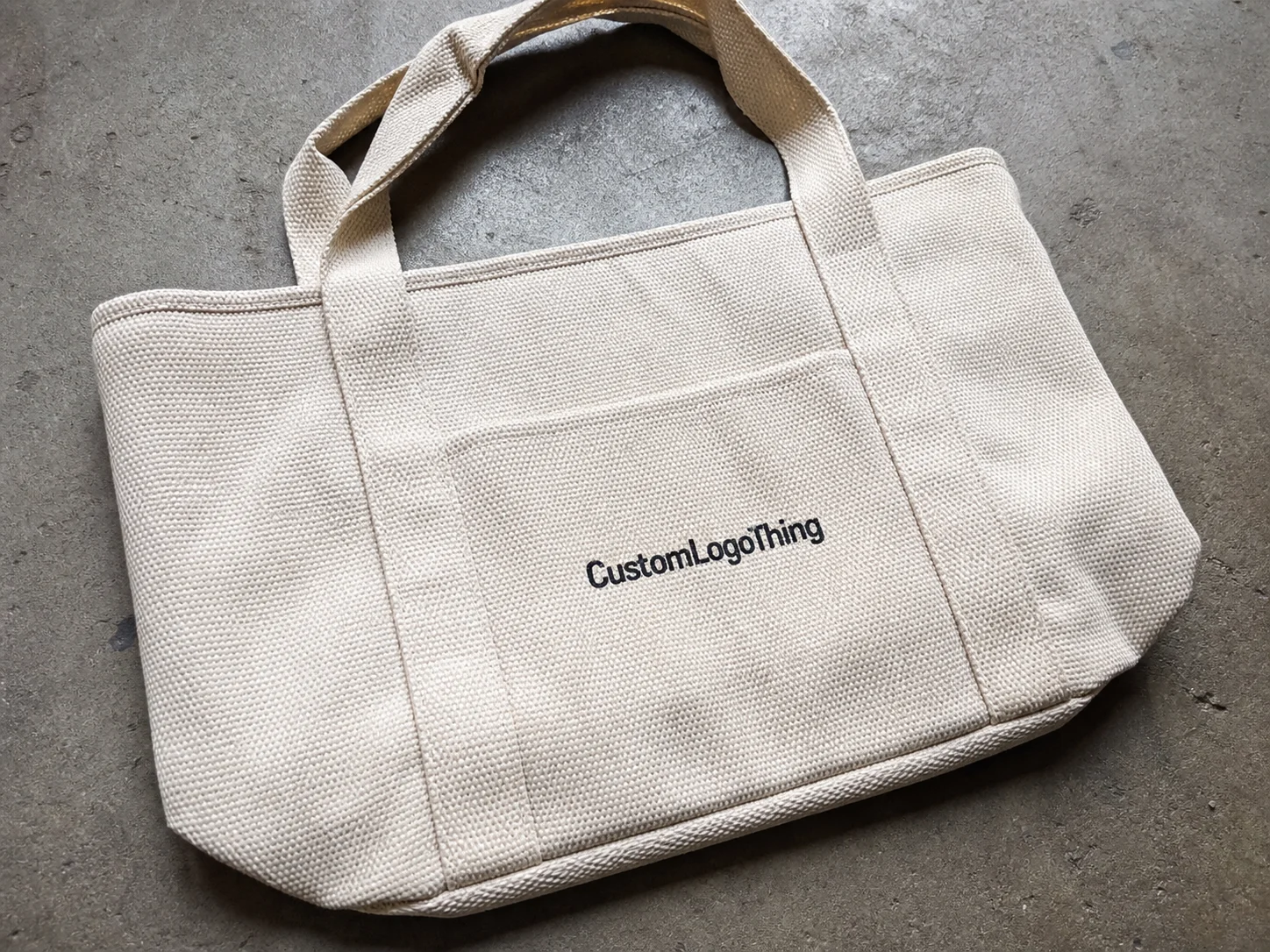
A suit buyer notices the label sooner than most brands expect. Not always consciously, but fast. A clean woven label, a legible care tag, and a size tab that does not irritate the neck or lining can make label custom suits feel considered instead of improvised. The opposite is just as true: weak contrast, frayed edges, or a crowded information block can make an otherwise strong garment feel cheaper than its fabric weight suggests.
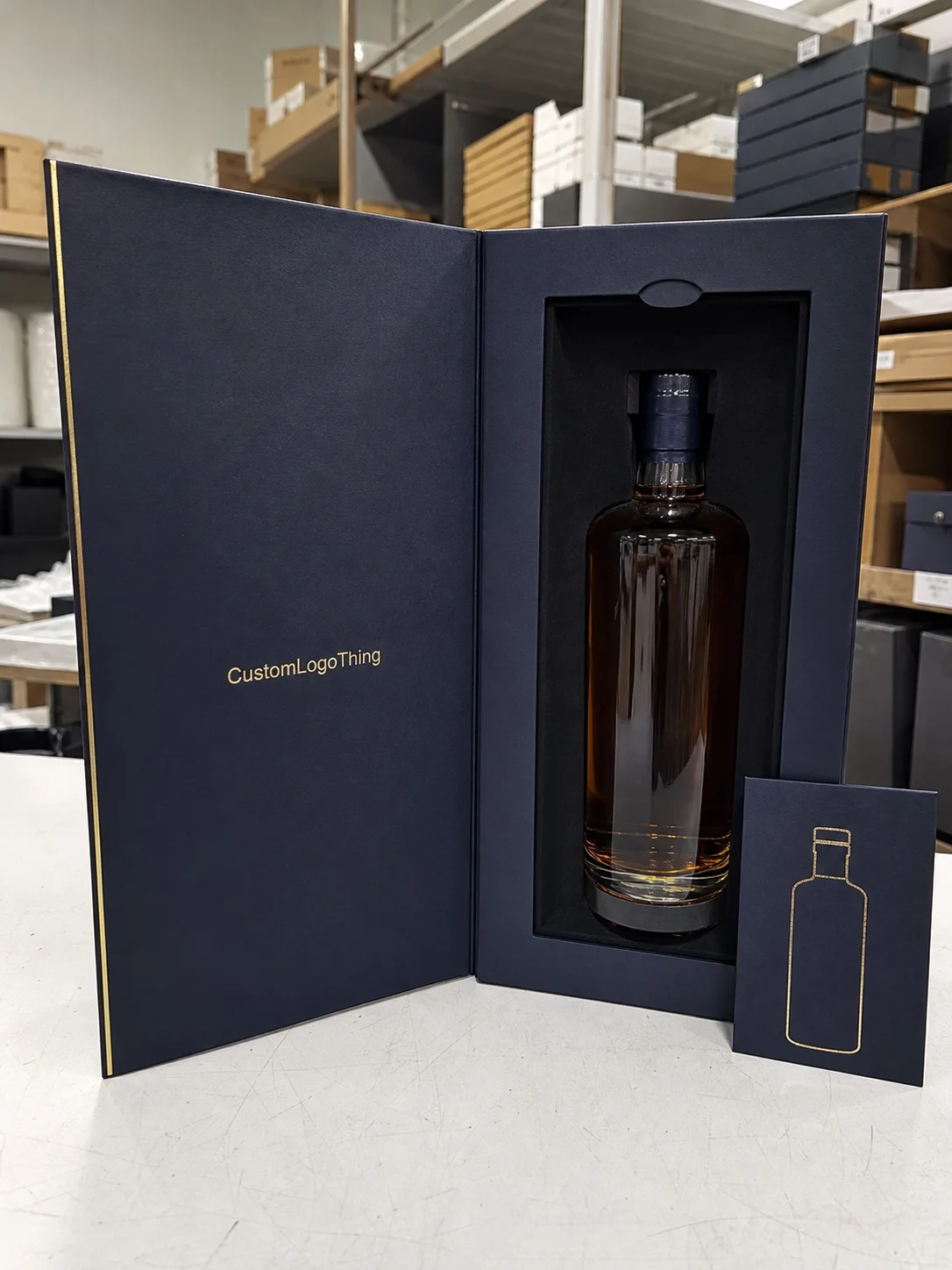
That is why labels should be treated as part of the product system, not as a leftover detail. They sit alongside packaging, hang tags, tissue, and carton inserts, and the customer reads all of those cues together. A suit that arrives in a well-built box but carries a flimsy interior label sends mixed signals. A better approach is to keep the label language, packaging, and garment presentation aligned from the start. That consistency matters more in tailoring than in casualwear because buyers scrutinize the small things: lining, hand feel, stitching density, and the surfaces they touch first.
The practical question is not whether a label looks attractive on a proof. It is whether it still looks right after sewing, pressing, folding, shipping, and repeated wear. That is where production discipline, material choice, and honest proofing separate a polished result from an expensive mistake.
What label custom suits actually do for retail branding
For suit brands, the label is usually a small system rather than a single tag. A typical setup includes a woven brand label, a care label, a size marker, and sometimes an origin label or barcode for stock control. Some brands also use a removable hang tag for price, product story, or seasonal merchandising. Each piece has a different job, and all of them have to work together without crowding the garment.
That distinction matters because suit buyers are unusually sensitive to detail. They expect the jacket front to drape well, the lining to sit flat, the buttons to feel secure, and the inside finish to support the price point. A $350 suit with a rough neck label can feel less trustworthy than a $250 suit with cleaner presentation. The price gap is not always about fabric quality alone. It is often about whether the brand appears to have controlled the whole object.
Labeling also carries a compliance function. Most markets require clear fiber content, care instructions, and origin information in some form. If the copy is tiny, the contrast is too low, or the hierarchy is messy, the label may technically exist but still fail the user. That is a common problem in small production runs where design teams prioritize appearance and leave usability until the end. In practice, the more crowded the label, the harder it is to read once it is sewn into a dark lining.
A suit label should feel invisible until someone looks for it. Then it should be readable, comfortable, and consistent with the rest of the brand.
Well-built labels also support the rest of the packaging system. If the garment arrives in branded boxes with tissue, an insert, and a restrained hang tag, the interior label should match that tone rather than fight it. This is not decoration. It is operational consistency, and customers tend to interpret consistency as quality.
How the process and timeline work from brief to delivery
The production path is simple on paper and less simple in execution. It usually starts with a brief that defines label type, dimensions, artwork, fold style, quantity, placement, and any required compliance text. After that comes a proof, then a sample or strike-off if the design is more specialized, then production, finishing, inspection, and shipping. The sequence is predictable, but small omissions at the brief stage are what create avoidable delays later.
The most common slowdown is unclear artwork. Files that look fine on screen may not survive weaving or printing if the typography is too small, the contrast is too weak, or the layout depends on subtle color differences. Another delay source is late copy changes. If the brand name shifts, the fiber content changes, or the size allocation changes after proof approval, the order may need a full reset instead of a small edit. Woven labels are especially sensitive to that because setup is more involved than it is for a simple printed tag.
Timelines vary by construction. A straightforward printed satin label can move faster than a detailed woven damask label with special folding and cut finishing. For many suppliers, a simple run may land in the 10 to 15 business day range after proof approval, but that estimate can stretch if the order needs sampling, multiple revisions, or a larger run with extra finishing. The more bespoke the label, the more important it is to plan around the garment schedule rather than the launch announcement.
That planning should include the rest of the packaging workflow. Labels rarely ship in isolation. They need to arrive in time for sewing, kitting, or retail packing, and they should be coordinated with box production and insert approval if the brand is building a full presentation system. A late label can become the bottleneck for the whole order. Small component, large delay.
It helps to work backward from the date the suit must be packed or shipped. Add time for proofing, sample review, production, transit, and one revision loop if the order is important. That is the conservative schedule. Buyers who skip that buffer often discover that labels are not the long pole in theory, but they become one in practice.
Cost, pricing, and MOQ for custom suit labels
Price is driven by a small group of variables: material, size, color count, fold style, edge finish, attachment method, and quantity. Quantity matters most because setup costs are spread across the run. That is why a 500-piece order and a 5,000-piece order can have very different unit economics even if the design is identical.
As a working range, a simple printed satin label may fall around $0.08 to $0.20 per unit on mid-size runs. A woven label with more detail often lands around $0.12 to $0.35 per unit, depending on complexity and finish. Heat-transfer options sit in a different part of the pricing curve, usually driven by comfort requirements, low-bulk placement, and the number of colors or layers involved. These are practical estimates, not fixed market rates. They move with quantity and specification.
MOQ should be interpreted as a risk decision, not just a supplier rule. A low minimum order quantity can be ideal for a pilot collection, limited capsule, or seasonal test. The buyer pays more per piece, but the brand avoids overcommitting to an unproven design. For a new suit line, that tradeoff is often sensible. For a stable replenishment program, higher quantities usually make more financial sense because setup costs are diluted across the run.
Ask for a quote that separates the real line items. Sample fees, setup or plate fees, shipping, and post-proof revision costs should be visible. If the supplier only gives one number, it is harder to compare proposals or understand where a later overage is coming from. A clear quote is not administrative fluff. It is part of quality control because it reveals how the job is actually being produced.
| Label type | Typical look and feel | Typical unit price | Best use case | Notes |
|---|---|---|---|---|
| Woven damask | Premium, stitched, highly detailed | $0.12-$0.35 | Luxury suits, visible branding | Good detail retention and a refined finish |
| Printed satin | Smooth, soft, lighter hand feel | $0.08-$0.20 | Care labels and comfort-focused interiors | Often faster to produce and easier to simplify |
| Heat-transfer | Flat, minimal, low bulk | $0.10-$0.28 | Skin-sensitive areas and slim linings | Useful where stitching bulk is a problem |
One useful rule: compare label cost against replacement risk. A cheaper label that rubs, frays, or prints poorly can create more expense later through rework, inspection rejects, or customer dissatisfaction. A better label is not always a luxury expense. In the right context, it is a cheaper operational choice.
Materials, finishes, and attachment methods that affect wear
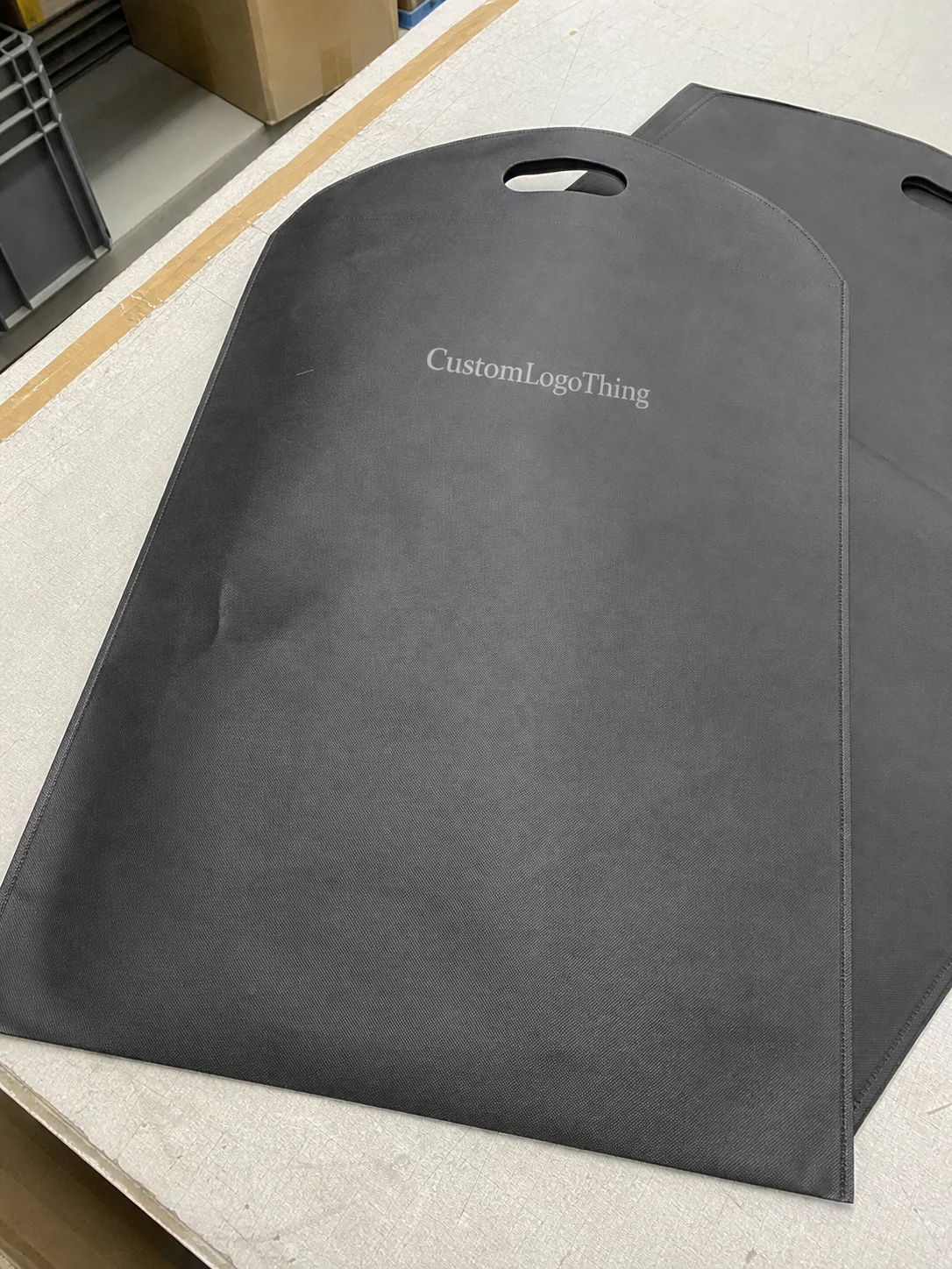
Material choice changes both appearance and wearability. Woven labels are the standard for premium branding because they preserve detail and feel more substantial. Printed satin is softer and usually better for care information or interior placement where the label will sit against the skin or lining. Heat-transfer labels are the low-profile option when bulk has to stay minimal and the customer is likely to notice irritation before they notice the brand mark.
Finish can change the perception of quality more than expected. Matte and glossy surfaces read differently. A softer backing feels different from a firmer one. Fold style matters too. End folds, center folds, and mitre folds all affect how the label sits in the garment and how much edge exposure remains after stitching. On formalwear, that is not a small detail. A stiff edge in a jacket lining can be noticeable every time the wearer reaches for the inside pocket.
Placement should be decided with the garment construction in mind. Neck labels serve identity. Side seam or back neck care labels handle compliance. Waistband labels may support sizing and stock control. A packaging label or barcoded tag serves warehouse and retail intake. Each of those labels has different visibility and durability requirements, which is why a one-size-fits-all spec tends to fail.
Suit construction changes the decision as well. Heavy wool jackets can tolerate a more structured woven label. Lightweight summer blends may need softer materials because the lining is thinner and more prone to telegraphing. Performance tailoring and travel suits usually benefit from low-bulk options that do not interrupt the garment’s drape. Uniform programs need durability first because the label will be read and handled more often than a fashion piece.
Some brands also care about material traceability. If the label stock or packaging needs to support a documented chain of custody, ask for it early rather than as an afterthought. Paper-based packaging components may be specified with FSC-backed sourcing if that is part of the brand standard. For packaging performance and transit durability, the International Safe Transit Association provides useful benchmarks because label and packaging failures often arrive as the same customer complaint: the product looked wrong when it landed.
That link between labels and packaging is easy to miss. But a suit that carries the same visual discipline across the box, insert, hang tag, and interior label reads as more deliberate. The customer may not describe it in those terms, yet they feel the difference immediately.
Step-by-step: sizing, artwork, and proofing before production
Start with dimensions. A label that is too large can add bulk in a jacket lining or waistband area. One that is too small can compress the information until it becomes hard to read. For many interior labels, buyers work within sizes such as 20 mm x 50 mm or 25 mm x 60 mm, but the correct choice depends on garment structure, seam allowance, and how the label will sit once stitched and pressed.
Next, build the artwork with production in mind. The brand name, care instructions, fiber content, origin text, and any SKU or barcode need to be arranged in a hierarchy that survives weaving or printing. Elegant mockups can hide weak information architecture. A low-contrast label might look refined on a screen and turn unusable once it is sewn into dark lining fabric. Compliance text has to be readable first, decorative second.
Proofing should happen against the actual garment color whenever possible. A proof that looks balanced on a white background may look too flat against black lining or too harsh against a pale interior. The surrounding textile changes how the label is perceived. This is one of the reasons sample or strike-off approval is worth the extra step for any order that matters to launch timing or retail presentation.
Before production starts, lock the spec sheet. Include dimensions, fold style, color references, content copy, quantity splits, attachment method, and packaging instructions. Then treat that sheet as the control document for reorders. Without it, the label tends to drift over time. Fonts change slightly, spacing gets tightened, a line of copy disappears, and the brand starts carrying a different interior identity from one shipment to the next.
If the suit line is part of a broader rollout, coordinate the label sign-off with packaging and merchandising approvals. A label can be right in isolation and still clash with the hang tag, carton insert, or retail display card. That is a common miss in premium apparel because teams approve each component separately and only notice the mismatch after assembly. The better approach is to review the whole set at once.
Common mistakes that make suit labels look cheap
The most common failure is readability. Tiny type, weak contrast, or a weave pattern that swallows the copy can make the label hard to use. That is not just a presentation issue. It can create compliance problems and frustration at the point of sale or during care.
Overdesign is the second trap. Too many colors, too many fonts, too much copy, and the label starts to look like a compromise rather than a brand asset. A clean woven mark paired with a separate care label usually reads better than a single overloaded tag that tries to do everything. In labels, restraint often looks more expensive than complexity.
Comfort failures are harder to catch in digital proofs. A label can pass visual review and still irritate the wearer if it sits on a seam, catches at the neck, or uses a stiff substrate against a fine lining. That is why testing on the actual suit construction matters. A swatch is not enough. The garment changes the way the label behaves.
Another mistake is approving samples in isolation. Some teams inspect the label flat on a table and assume the sewn result will feel the same. It will not. Once it is stitched into wool or a blended lining, the hand feel and edge behavior change. That is where field testing beats assumptions.
Cheapness also shows up in inconsistency. If one batch has a slightly different cut, one reprint shifts the color, or the fold style changes between orders, the customer may not name the issue but will sense that the brand is less disciplined than it should be. For retail-facing suit programs, that inconsistency can weaken the whole presentation, including the packaging. A garment, its label, and its box should read as one decision.
Expert tips and next steps for placing your first order
Order a sample in the exact fabric color and construction you intend to use. Not a generic test. The actual suit fabric, the actual lining, the actual finish. That is the only way to judge comfort, contrast, and bulk with any confidence. If the line spans different seasonal fabrics, test the lightest and darkest versions rather than assuming one label will behave the same across both.
Create a one-page spec sheet and keep it stable. It should cover dimensions, label type, fold style, content copy, material, finish, placement, quantity splits, and packaging instructions. The fewer decisions that have to be remade on every order, the easier it is to preserve quality. Reorders should not become design debates.
Build the schedule backward from the packing date. Add time for proofing, sample review, shipping, and one correction loop if the order is critical. Labels are small, but they are not separate from the production chain. If they arrive late, sewing, kitting, and shipping all feel it.
A practical order sequence tends to work best:
- Confirm dimensions, label type, and placement.
- Approve artwork with compliance copy included.
- Review the digital proof against the garment color.
- Check a sample or strike-off on the actual suit construction.
- Release production and lock the reorder spec.
Brands that want a complete retail presentation should coordinate the label order with Custom Labels & Tags and the outer packaging program. The garment, the insert, and the box should share the same visual discipline. If paper-based packaging is part of the spec, FSC-aligned sourcing can support that decision without changing the look of the product. The point is coherence, not decoration.
My blunt advice is simple: do not over-specify. Choose the label construction that matches the garment, the market, and the budget, then keep it stable. That is the difference between a label system that gets in the way and one that quietly supports the brand across replenishment orders, seasonal runs, and future packaging updates. For label custom suits, consistency is the real premium feature.
What should custom suit labels include?
At minimum, include the brand name, size, fiber content, care instructions, and origin details if your market requires them. If the label also supports inventory control, add a SKU or barcode without crowding the layout. Clear hierarchy matters more than decoration.
What material works best for custom suit labels?
Woven labels usually feel the most premium and hold brand detail well. Printed satin is softer and works well for care information or interior labels. Heat-transfer labels are useful when low bulk and comfort matter more than a stitched look.
How long does the process usually take?
Timeline depends on quantity, material, finishing, and whether the artwork is final. A straightforward order can move quickly after proof approval, while woven or multi-step constructions take longer. Ask for a written schedule that separates sample approval, production, and shipping so the timing is clear.
How can I lower unit cost without making the labels look cheap?
Simplify the design, reduce unnecessary copy, and standardize the size. Larger quantities also spread setup costs across more pieces. The best savings usually come from tighter specification, not from removing every premium detail.
What is the best way to label custom suits for retail?
Use a durable brand label for identity, a clean care label for compliance, and a placement that stays comfortable inside the garment. Test the label on the actual suit fabric before full production. Then align the label system with your packaging and inventory workflow so the customer sees one consistent brand story from box to hanger.