Labels for Jars custom are not a decoration choice. They are a packaging specification that has to hold up under condensation, handling, stacking, and shipping while still looking deliberate on shelf. A jar can contain a good product and still look untrustworthy if the label curls, stains, or peels. Buyers usually notice the failure before they notice the formula.
The most efficient way to approach the job is to define the jar first, then the environment, then the label. That sounds obvious, but a lot of projects start with artwork and end with a production headache. A label that works on a dry pantry jar may fail on a chilled cosmetic jar, and a finish that looks premium on a sample can scuff badly in transit.
What custom jar labels actually need to survive
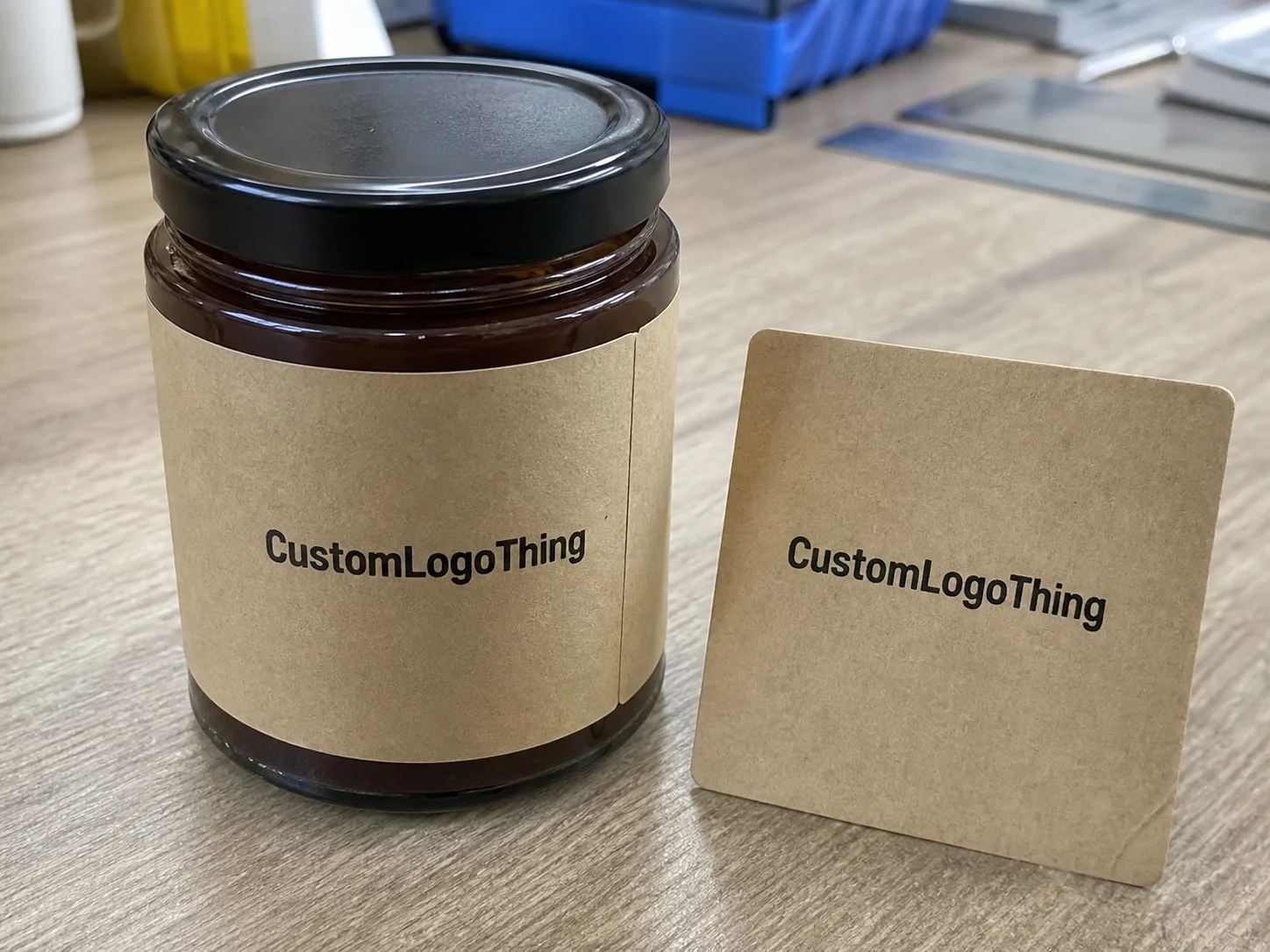
A good jar label has three jobs: fit the container, stay attached, and remain readable at normal shelf distance. Those are basic requirements, yet many labels for jars custom miss one because the buyer treated the order like a graphics problem instead of a packaging decision. The jar shape matters. So does what sits inside it. Honey, candle wax, spice blends, face cream, bath salts, and preserves all punish labels in different ways.
Condensation is one of the fastest ways to expose a weak spec. Refrigerated food, bathroom shelf products, and chilled drinks all create moisture that can creep under an edge if the adhesive is wrong. Oils cause a different kind of failure. A label that looks clean on dry paper can smear, stain, or lift after a few days of handling. On beauty jars, repeated touch matters most. On food jars, it is usually a mix of cold storage and transport vibration. Candle jars add heat, wax residue, and glass that is often handled after the container has warmed up.
A label can look flawless on a proof and still fail in the real world because the real world includes wet hands, cold glass, and poor stacking.
From the buyer’s side, labels for jars custom are judged in a fixed order: fit first, adhesion second, legibility third. If the label is too busy or too small, the product name disappears from shelf distance. If the label lifts at the corners, the whole pack looks careless even if the print quality is excellent. That is why label selection belongs inside packaging design and product packaging, not after them. It also needs to work with the rest of the line. If the jar sits beside retail packaging like cartons, sleeves, or shippers, the color and finish should feel related. A clean label on a mismatched system still reads as weak brand control.
There is a practical reason some labels cost more than they seem to “need” to. The extra dollars usually buy grip, scuff resistance, moisture tolerance, or a finish that stays readable after real use. That is not decorative spending. It is damage prevention.
How the process and turnaround usually work
Most orders follow the same chain. Request a Quote. Confirm jar dimensions and application method. Review artwork. Approve a proof. Produce. Ship. None of that is glamorous, but the boring version usually goes better.
The fastest way to slow a job down is to send a logo file without the jar measurements. For labels for jars custom, the measurements that matter are the jar diameter, the flat label area, whether the label is hand-applied or machine-applied, and the storage environment. A label intended for a dry pantry jar can be built very differently from one that must survive refrigerator condensation or frequent handling in a bathroom.
A digital proof catches layout errors, trim issues, and spelling mistakes. It does not tell you how the stock feels, how the adhesive behaves, or whether a finish will show scratches after shipping. For anything with real shelf exposure, ask for a sample or at least a material swatch before committing to the full order. That is especially useful if the labels need to coordinate with custom printed boxes or a larger launch package where the color relationship matters.
Lead times depend on complexity. Straightforward digital runs often move in about 5 to 10 business days after proof approval. Custom die-cuts, specialty finishes, multiple SKUs, or any job with more than one proof cycle can push that to 12 to 15 business days or longer. Shipping is separate. Buyers often lump production and transit together, then treat a normal freight timeline like a delay. It is not a delay if it was never part of the production clock.
For products that will be shipped hard or handled aggressively, it helps to think like a tester. ISTA standards are useful as a reference point for transit stress even if you are not running a formal certification program. For general packaging education and procurement vocabulary, the Institute of Packaging Professionals is a reasonable reference. Neither source replaces real jar testing, but both help frame the problem correctly.
Material, adhesive, and finish choices that change performance
The stock choice matters more than the logo. That is the part many teams want to skip, and it is usually the wrong place to economize. Paper, BOPP, and other film stocks behave very differently once moisture, abrasion, and temperature swings enter the picture. For labels for jars custom, the right material starts with the environment, not the mood board.
Paper labels are usually the least expensive option and can work well for dry pantry goods, short-life promotions, and jars that will not be handled much. They can look warm, natural, and familiar, which suits some food brands. The weakness is water resistance. If the jar is likely to chill, sweat, or sit in a humid room, paper is a gamble unless the use case is tightly controlled.
BOPP is the workhorse for many jar projects. It resists moisture, wipes clean more easily, and usually holds up better to abrasion than paper. White BOPP is common for food and beauty jars. Clear BOPP is useful if you want the product to show through the label area. Both can look premium if the file setup and finish are clean.
Adhesive choice is where a lot of reorders go wrong. Permanent adhesive is the default for most retail packaging because it gives the strongest grip on glass and plastic. Removable adhesive makes sense for reusable jars, promotional runs, or products that may be relabeled later. It is not a cure for bad conditions. If the surface is cold, damp, dusty, or oily, even a removable adhesive can behave badly.
Finish changes both appearance and wear. Gloss tends to make color feel brighter and is usually easier to wipe. Matte can read more restrained and often suits herbal, apothecary, or food packaging better. Soft-touch feels richer in hand, but it can show marks faster if the jar is handled frequently. If the label will be touched a lot, scuff resistance matters more than the idea of a velvet surface.
| Stock | Best For | Typical Range Per Label | Strengths | Watch-Outs |
|---|---|---|---|---|
| Paper | Dry pantry jars, short runs, budget-friendly launches | $0.06-$0.12 at 5,000 units | Lower cost, natural look, easy to print | Weak around moisture and abrasion |
| White BOPP | Food jars, beauty jars, chilled products | $0.08-$0.18 at 5,000 units | Moisture-resistant, durable, clean shelf appearance | Costs more than paper |
| Clear BOPP | Premium retail packaging, no-label looks | $0.10-$0.22 at 5,000 units | Lets product show through, strong visual effect | Needs careful file prep and print setup |
| Specialty matte or textured stock | Premium lines, apothecary style, giftable jars | $0.11-$0.24 at 5,000 units | Strong brand feel, higher perceived value | Can raise unit cost and setup time |
If you are building a paper-heavy line and want traceable sourcing, FSC-certified paper is worth asking for. Certification is not a cure-all, but it gives you a clear procurement standard for fiber-based materials. See FSC for the framework.
The short version: choose the stock for the jar’s environment first, then choose the finish for the visual direction. Fancy finish on the wrong material is just expensive failure with a polished surface.
Cost, MOQ, and quote factors buyers should watch
Unit cost is driven by size, shape, color coverage, material, finish, and print method. A simple rectangular label on white BOPP is cheaper than a custom die-cut label with a clear window, metallic ink, or several versions in the same run. That is normal. Production economics are not designed to flatter small orders.
MOQ matters because setup cost has to be spread across the run. Digital printing can often support lower quantities, sometimes 250 to 1,000 pieces depending on size and vendor. Flexo usually makes more sense at 2,500 units and up, with better economics as the quantity rises. If you only need 300 labels for a market test, expect a higher unit price. That is the price of flexibility.
Buyers get tripped up when two quotes look similar but one includes a stronger adhesive, better proofing, and a more durable finish while the other is stripped to the minimum. Comparing only sticker price is not useful. Compare the total landed cost, including replacement risk. A cheaper label that fails in cold storage is more expensive than a sturdier label that costs a few cents more.
Common quote drivers include:
- Label size and total print area
- Shape complexity and die-cut requirements
- Stock type and adhesive choice
- Matte, gloss, soft-touch, or spot finish
- Number of versions or SKUs
- Rush timing and proof revisions
For labels for jars custom, the real question is not “What is the cheapest quote?” It is “What quote gives the label enough durability to survive the actual use case without reprints?” A low-cost label that peels under condensation is not a bargain. It is a future invoice.
Step-by-step: spec the right size and layout for your jars
Start with measurement, not design. Measure the jar’s flat label panel or wrap area with a ruler or caliper, then leave room for the curve, the seam, and the tolerance of hand application. A label that looks perfect in a layout file can still wrinkle or lift on a curved wall. The jar does not care how clean the mockup looks.
For round jars, a rectangle, oval, or circle may be enough. For tapered jars, a custom die-cut is often better because it keeps the top and bottom edges from fighting the contour. For lid labels, keep the size smaller and the message tighter. Lid labels are useful for product identifiers, flavor notes, batch codes, or tamper cues, but they should not carry every piece of copy on the pack.
Hierarchy matters more than people admit. The brand mark should be visible first. The product name should be easy to scan second. Legal or functional copy should support the sale, not crowd it. A strong label decides what belongs on the face and what belongs elsewhere. Crowding all the information into one panel usually makes the product harder to buy.
A practical artwork checklist looks like this:
- Use the correct dieline and verify the trim area.
- Keep important text inside a safe zone.
- Build bleed into the file so edge cutting does not expose white slivers.
- Check small text size against the printing method.
- Confirm color expectations against the actual stock, not just a monitor.
If you are coordinating labels with other package branding elements, keep the visual system aligned across cartons, inserts, and outer packs. Our Custom Labels & Tags page covers the label side, and our Custom Packaging Products range helps keep the rest of the launch from drifting into a different visual language.
A useful spec sheet for labels for jars custom should fit on one page and include the jar type, size, stock, adhesive, finish, approved artwork version, application method, and storage environment. That document saves time on reorders and cuts down the expensive sentence, “We thought you meant something else.”
Common mistakes that cause peeling, wrinkling, or wasted runs
The first mistake is choosing the wrong stock for the environment. Paper on a refrigerated jar will usually fail at the edges sooner or later. Moisture is not subtle, and it does not negotiate.
The second mistake is oversizing the label for a curved surface. If the label is too wide, it will wrinkle or tent. If it is too tall, the top and bottom edges may lift as the adhesive fights the jar curve. That is why “looks fine in the mockup” is not enough. The mockup is not the jar.
The third mistake is low-contrast artwork and tiny type. Fine text can disappear once the label is printed, cut, and applied to a curved container. Black on cream is readable. Light gray on glossy pastel stock is risky. If the label carries ingredients, directions, or compliance copy, readability has to survive the actual print method and application process.
The fourth mistake is poor application. Dust, oil, and condensation all interfere with adhesion. Hand application can also introduce twist, bubbles, or edge lift if the team is rushing. A clean, dry jar surface matters more than most people want to hear, because it is less exciting than redesigning the artwork and more important than redesigning the artwork.
The fifth mistake is approving a proof without checking the actual jar dimensions. That is how buyers end up with a box of expensive almost-right labels. They fit the artboard. They do not fit the jar. That distinction costs money.
If the product will live in cold storage, test the label on an actual sample jar, not just a PDF. That single habit prevents a surprising amount of waste on labels for jars custom, especially when the project is moving quickly and nobody wants to slow down for a physical test.
Expert tips for cleaner orders and smarter reorders
Order a sample or short test run before locking in a large quantity, especially if the jar shape is new or the product will see moisture. A 300-piece test is cheaper than a 5,000-piece mistake. That math is simple, even if the pressure around launch makes it feel more complicated than it is.
Keep one master spec sheet. Not five versions. One. It should hold the jar measurements, approved label size, stock, adhesive, finish, artwork version, and reorder history. That reduces quiet drift over time, where every reorder changes a little and nobody notices until the labels start acting differently.
Consistency matters. Reordering from the same supplier, with the same stock and adhesive, gives you the best chance of repeat performance. Changing vendors can alter the release liner, the adhesive tack, or the print profile even if the front-facing design stays identical. On paper, that sounds minor. In production, it is not.
Ask for application notes if the labels are being applied by hand. A good supplier should be able to tell you the clean surface temperature, the minimum application temperature, and any cure time before chill or wash-down. If they cannot give you that, you are buying blind.
For teams building a new line, the order of operations is usually simple:
- Measure the jar and define the storage environment.
- Pick the stock and adhesive based on moisture, oil, or refrigeration.
- Request a proof and, if possible, a sample.
- Compare quotes line by line, not just by total.
- Lock the spec before launch so reorders stay consistent.
The best labels for jars custom are the ones that survive the boring parts: warehouse handling, customer fingers, cold shelves, and the second reorder. If the label still looks right after all that, the packaging system is doing its job.
What makes labels for jars custom different from standard labels?
They are sized for a specific jar shape instead of a generic flat panel. The adhesive and stock are chosen for the actual environment, such as refrigeration, oil exposure, or reuse. They also have to support shelf visibility and brand presentation, which is why labels for jars custom are really a packaging spec, not just a print file.
Which material is best for custom jar labels?
BOPP or another film stock is usually the safer choice for moisture, handling, and longer wear. Paper can work for dry storage and lower-cost runs, but it is less forgiving around water and abrasion. The right choice depends on how the jar will be used, not just the look you want.
How long do custom jar labels usually take?
Timing depends on proofing, material selection, and production method. Simple digital runs can move faster, while custom die-cuts, specialty finishes, or artwork revisions add time. Shipping time is separate from production lead time, so plan both.
What is a typical MOQ for labels for jars custom?
MOQ depends on print method, label size, and how many versions you need. Digital runs can support smaller quantities, while flexo usually makes more sense at higher volume. The lowest unit cost usually comes from larger quantities, but only if the design will stay current long enough to use them.
How do I avoid peeling on glass jars?
Clean, dry jar surfaces matter more than most people think. Choose an adhesive matched to the environment, especially for chilled or humid storage. Test a sample on the actual jar before approving the full run. That one step prevents a lot of rework on labels for jars custom.