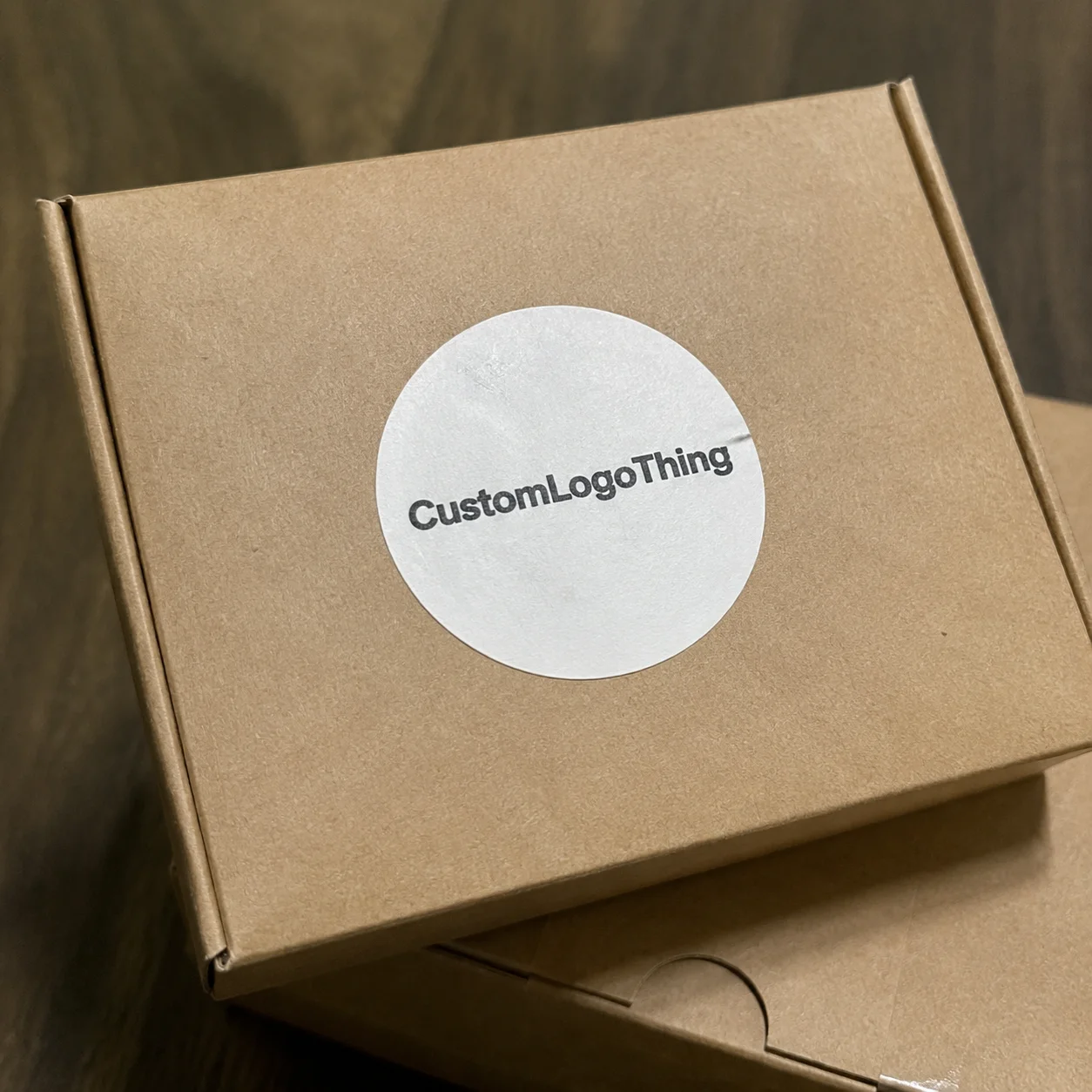
Buyer Fit Snapshot
| Best fit | Logo Design for Retail Packaging projects where brand print, material claims, artwork control, MOQ, and repeat-order consistency need to be specified before quoting. |
|---|---|
| Quote inputs | Share finished size, material target, print colors, finish, packing count, annual reorder estimate, ship-to region, and any compliance wording. |
| Proofing check | Approve dieline scale, logo placement, barcode or warning zones, color tolerance, closure strength, and carton packing before bulk production. |
| Main risk | Vague material claims, crowded artwork, missing packing details, or unclear freight terms can make a low unit price expensive after revisions. |
Fast answer: Logo Design for Retail Packaging: What Actually Sells should be specified like a repeatable production item. The safest quote records material, print method, finish, artwork proof, packing count, and reorder notes in one written spec.
Production checks before approval
Compare the actual filled-product size with the drawing, then confirm tolerance on folds, seals, hang holes, label areas, and retail display edges. Reserve space for logos, QR codes, warning copy, and material claims before decorative graphics fill the panel.
Quote comparison points
Review material grade, print process, finish, sampling route, tooling charges, carton quantity, and freight assumptions side by side. A quote is only useful when the supplier can repeat the same color, closure quality, and packing count on the next order.
Most brands treat Logo Design for Retail Packaging like a cosmetic detail. Big mistake. I’ve stood on press floors in Shenzhen and watched a $12,000 packaging project look like a $1.20 bargain-bin item because the logo was too thin, too gray, and too proud of itself. Good logo design for retail packaging is not decoration. It is sales performance in print form.
Shoppers do not read your brand story first. They spot the package in about two seconds, maybe less if the aisle is crowded and the lighting is trash. That means logo design for retail packaging has to work hard fast. It has to signal trust, fit the format, and survive real production. Pretty on a screen is nice. Pretty on a folding carton with a 0.5 mm registration shift is the actual job.
Why logo design for retail packaging matters more than you think
I’ve seen a basic logo beat a much bigger ad budget because the shelf decision happened in 3 seconds. That sounds dramatic, but retail is dramatic. A customer walking past 40 SKUs is not doing a deep brand audit. They are looking for the one package that feels clear, credible, and worth the money. That’s where logo design for retail packaging becomes money, not art.
Packaging is often the first real brand interaction. Not your website. Not your Instagram feed. A box, pouch, bottle label, or carton is what people actually touch. In my experience, many founders overinvest in brand decks and underinvest in logo design for retail packaging, then act surprised when the product gets ignored on shelf. The package is the salesperson. The logo is the first line of that pitch.
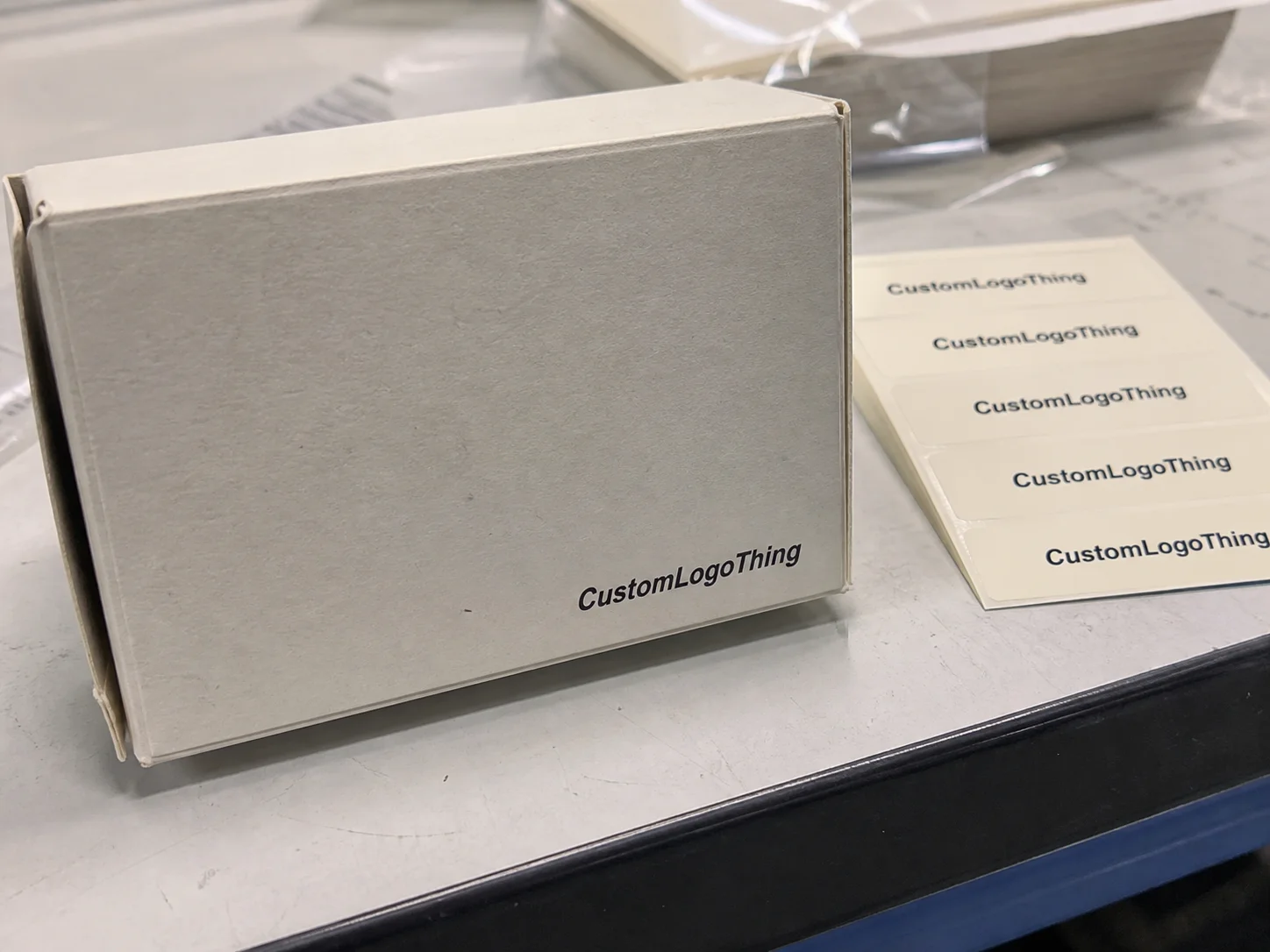
In plain language, logo design for retail packaging means adapting a brand mark so it reads quickly and looks believable on boxes, labels, pouches, sleeves, or cartons. That sounds simple until you try to print a fine serif logo on uncoated kraft with flexo ink at 1,000 meters per minute. I watched one client lose an entire run because the logo’s hairline strokes disappeared against a textured paperboard. The result looked cheap, and no one was thrilled about paying for reprints.
“We thought the logo was fine on screen. On the press sheet, it looked like it needed glasses.” — a very honest client after a 5,000-unit carton proof
That kind of issue is not rare. Tiny color shifts, stroke weights, and spacing can make a premium brand look like an afterthought. I once visited a carton factory where a cosmetic brand insisted on a metallic rose-gold logo with a 0.25 mm outline. On the screen it looked elegant. On the sheet, it looked like the printer had sneezed. We widened the lines, changed the foil spec, and suddenly the whole package felt worth the $0.42/unit premium. That is logo design for retail packaging doing its real job.
The business upside is practical, not fluffy. Better logo execution improves recognition, raises perceived value, and makes repeat buying easier because customers can spot the product faster on shelf. It also reduces costly reprints. A bad first run on 10,000 units can burn $2,500 to $8,000 depending on material and setup. That is not a design problem anymore. That is a margin problem. Strong logo design for retail packaging helps you avoid that mess.
How retail packaging logo design works in the real world
Real logo design for retail packaging starts with the brand concept, but it ends with print-ready artwork and a press check. Those are not the same thing. A designer may create a beautiful identity system, but if the packaging supplier cannot reproduce it on a 300gsm folding carton or a 20-micron BOPP label, the project is not ready. Packaging has to survive production, handling, shipping, and retail abuse. The logo does not get to be fragile.
The workflow usually looks like this: brand strategy, logo adaptation, layout development, dieline review, proofing, sampling, and production. I’ve sat in too many meetings where people skipped from “we love the concept” to “send it to print.” That’s how you end up with a barcode crowding the logo or legal copy swallowing the front panel. Good logo design for retail packaging respects the layout first and the ego second.
Different packaging formats punish logos differently. Corrugated boxes can hide detail because the board is rougher and often needs heavier ink coverage. Folding cartons give you more precision, but they also expose every spacing mistake. Labels are unforgiving because the logo may need to work in very small sizes, especially for cosmetics or food jars. Flexible packaging is its own beast; a logo on a stand-up pouch can warp if the film shifts during sealing. This is why logo design for retail packaging has to be format-specific.
- Offset printing gives clean detail for premium cartons and retail packaging with tight registration.
- Flexographic printing works well for high-volume labels and pouches, but line weight and color control matter more.
- Digital printing is useful for short runs, prototypes, and SKU testing.
- Foil stamping can elevate a logo fast, but fine details can fill in or crack.
- Embossing and debossing add tactile value, though they need enough line thickness to survive the die.
- Spot UV creates contrast, but if overused it can make logo design for retail packaging feel like a sample sale flyer.
Die lines, bleed, safe zones, and minimum stroke thickness are where nice ideas go to either live or die. I usually tell clients that the logo should never be placed like it’s floating in a vacuum. Every package has constraints. On a folding carton, 2 to 3 mm can matter. On a pouch, the seal area may eat into your front panel. On a bottle label, curvature changes how the mark reads from 4 feet away. Real logo design for retail packaging accounts for those limits before anyone approves final art.
The handoff between designer, supplier, and printer matters more than most people think. One weak PDF can waste days. If the supplier is based in Guangdong, the printer might want vector files with outlined fonts, Pantone calls, and a separate foil layer. I’ve had suppliers at facilities like YUTO and local carton plants reject a supposedly “final” logo because the file structure was sloppy. They were right. The logo is only as good as the production file behind it. That is the unglamorous side of logo design for retail packaging.
If you need packaging support beyond the logo file itself, our Custom Packaging Products page is a good place to start. The point is not to make pretty art. The point is to make Product Packaging That prints right, stacks right, and sells right.
Key factors that make a retail packaging logo work
Legibility at shelf distance is the first filter. If your logo cannot be read from 4 to 6 feet away, it is too clever by half. On mobile thumbnails, it may need to survive at 120 pixels wide. That’s brutal, but that’s retail. Strong logo design for retail packaging uses shapes, spacing, and contrast that still read when the shopper is half-distracted and holding a cart with one wheel that squeaks.
Color contrast is another issue people underestimate. A soft gray logo on a warm white carton may feel elegant in a mood board. On the shelf, it may disappear. I’ve seen brands spend $0.08 more per unit on a specialty paper and then sabotage the whole thing with a low-contrast logo. Better to choose fewer inks and more clarity than the opposite. logo design for retail packaging should be built around what you can print consistently, not what looks expensive in a mockup.
Logo size has to share space with the product name, barcode, ingredients, and regulatory copy. That is especially true in food, cosmetics, and supplements. The front panel has a job, and the logo is only one part of it. If the packaging is crowded, the logo loses. If it is too dominant, the package can feel arrogant or hard to shop. Good logo design for retail packaging balances hierarchy instead of screaming.
Material choice changes perception fast. Matte finishes feel quieter and often more premium. Gloss can add energy and improve color punch. Kraft suggests natural, handmade, or eco positioning. Clear film says “look at the product.” Textured stock can feel expensive, but it can also soften fine detail. I’ve tested the same logo on 350gsm C1S, 400gsm kraft, and a soft-touch laminated carton, and the personality changed each time. That is why logo design for retail packaging cannot be approved in a vacuum.
Brand positioning also shapes the logo treatment. Luxury brands usually need restraint and strong spacing. Value brands need clarity and fast recognition. Natural brands lean toward earthy tones, uncoated materials, and simpler marks. Tech-forward brands often use sharper geometry and brighter contrast. Mass-market brands need a Logo That Works from 2 feet away in bad lighting. There is no single winning formula for logo design for retail packaging. There is only fit.
Consistency across SKUs is where many brands get messy. One scent uses a huge logo. Another uses a tiny one. One size has foil, another has none. The brand starts to feel random. I’ve helped clients clean this up by creating a master packaging system with controlled logo versions: primary, compact, one-color, and vertical. That kind of package branding keeps the line unified without making every carton look copy-pasted. Strong logo design for retail packaging should scale across the range.
Step-by-step: designing a logo for retail packaging
Step 1: Audit the product, target shelf, and competitors. Before sketching anything, I want to know where the package will live. Grocery shelf? Salon counter? Ecommerce first, retail later? The answer changes everything. When I worked on a tea brand for a specialty grocer, we measured neighboring cartons and found the logo had to compete with a wall of dark packaging. We switched from navy to a stronger cream base because logo design for retail packaging is not about personal taste. It is about visibility.
Step 2: Decide what the logo must do on-pack. Does it need to feel premium, friendly, clinical, playful, or heritage-driven? Pick one primary job. I’ve seen founders ask the logo to be modern, artisanal, mass market, and luxury at the same time. That is not strategy. That is a group chat. In logo design for retail packaging, clarity beats a laundry list of adjectives.
Step 3: Build layouts using real dimensions. Not fantasy artboards. Not “we’ll figure it out later.” Use the actual dieline, front-panel width, and label circumference. If the carton front is 78 mm wide, design for 78 mm, not a fake 200 mm canvas. One client sent me a logo layout that looked fantastic on screen and collapsed on a 45 mm round label. The issue was simple: the mark had too much horizontal spread. Real logo design for retail packaging respects physical limits from the start.
Step 4: Test readability in Black and White. If the logo only works in color, it is weak. Strip it down. Put it on a plain white background. Then on a kraft background. Then on black. Then shrink it until it is the size of a thumb. If it dies there, it will probably die on shelf too. This is one of the most useful habits in logo design for retail packaging, and it saves a lot of pain later.
Step 5: Review proofs and physical samples. Screen mockups lie. They lie with confidence. Print a sample, hold it under store-style lighting, and check the actual substrate. I’ve done press checks where a gold foil looked rich under office lights and oddly green under fluorescent warehouse lighting. You only catch that by touching the real thing. Good logo design for retail packaging includes sample review, not just design approval.
Step 6: Lock specs and version control. Once the design is approved, define the print method, color values, minimum stroke thickness, safe zones, and approved logo versions. Keep one file for each packaging format if needed. If you are running multiple SKUs, label each one clearly. I have seen a brand lose half a day because someone pulled the “final final” carton logo from a folder that had six nearly identical PDFs. That nonsense is preventable. Solid logo design for retail packaging comes with good file discipline.
“Designing for packaging is not the same as designing for a website. The carton has rules, and the printer is not impressed by your mood board.” — something I’ve told more than one founder in a factory office
Use tools and standards that reflect reality. For packaging and print expectations, groups like the Institute of Packaging Professionals and ISTA offer useful context on packaging performance, shipping, and testing. If your packaging also touches sustainability claims or materials selection, the EPA sustainable materials guidance can help keep claims grounded.
Logo design costs, pricing, and timeline expectations
People love to ask, “How much does logo design for retail packaging cost?” The real answer is: it depends on whether you need a small adaptation or a full identity system that includes packaging structure, print specs, and SKU architecture. A simple packaging adaptation may run from $750 to $2,500. A full custom packaging identity system can easily land between $3,500 and $15,000+ depending on complexity, revision rounds, and whether you need multiple product lines.
That is design only. Print production is separate. Dieline setup might be included by some suppliers, while others charge $50 to $150 per structure file. Specialty finishes like foil, embossing, or spot UV can add $0.03 to $0.25 per unit depending on volume and tooling. I’ve seen founders treat all of this as one line item, then panic when the quote arrives. logo design for retail packaging sits inside a larger cost stack. Pretending otherwise is how budgets get wrecked.
Revisions cost time and sometimes money. If a client changes the logo size after proofing, the printer may need to redo plates or plates-and-tools, especially on offset or flexo jobs. That can add $150 to $800, plus lost days. Multiple SKUs also raise the budget because each variation needs review. One beverage client I worked with had nine flavors and wanted every cap, carton, and sleeve to feel custom. Great idea. More work. That’s the tradeoff in logo design for retail packaging.
Timelines vary too. Simple adaptation with clean brand files can move in 5 to 10 business days for layout and proof review. More complex custom projects may take 3 to 6 weeks before you even get to print approval, especially if samples are involved. If materials have to be sourced from overseas, add more time. I once waited 11 days for a kraft stock sample because the paper mill had a production backlog. No amount of creative enthusiasm fixed that. logo design for retail packaging lives in the real world, and the real world has shipping delays.
What speeds things up? Clean source files, quick approvals, and a clear packaging brief. What slows things down? Committees, vague feedback, and someone insisting on seeing “just one more concept” after the fifth round. My advice: spend where shelf impact matters most. Spend on clarity, material testing, and a proper proof. Save on unnecessary decorative complexity that nobody will notice from aisle distance. Smart logo design for retail packaging is about impact per dollar, not maxing out the invoice.
If you need wider packaging support, it helps to coordinate the logo work with Custom Packaging Products so the print method, board choice, and finish all align. That keeps the package branding consistent and avoids paying for changes twice.
Common mistakes that make packaging logos fail
The biggest mistake is using the same logo treatment everywhere without adjusting for scale or material. A mark that looks elegant on a presentation slide may die on a 30 mm label or a recycled corrugate mailer. I’ve seen brands copy-paste a logo from a website header onto a box and call it done. That is not logo design for retail packaging. That is hope with a PDF.
Another problem is choosing trendy fonts that look cool today and turn into unreadable mush on small labels. Thin sans-serifs and hyper-delicate scripts are frequent offenders. They can be beautiful in a logo file and miserable in print. If the printer has to thicken the lines manually just to get a decent impression, your original file was too fragile. Good logo design for retail packaging respects minimum printability from the start.
Production limits are not suggestions. Fine lines can fill in. Colors can drift. Foil can lose detail. Registration can shift by 0.3 mm or more. On a premium carton that sounds tiny, but on a 20 mm logo it is visible. I once saw a black logo with a red outline come back with the red slightly offset, and the whole box looked tired. Not broken. Just tired. That’s enough to hurt shelf appeal. This is why logo design for retail packaging needs a printer’s eye, not only a designer’s eye.
Overcrowding the front panel is another classic failure. Brands shove in benefits, claims, icons, and feature callouts until the logo has nowhere to breathe. The customer sees noise. If you want the logo to sell, it needs space. I tell clients to protect the logo like it costs money, because it does. Too much copy around it weakens logo design for retail packaging and makes the package feel desperate.
Skipping physical proofing is a rookie move. Mockups are useful, but they are not proof. I’ve watched a green label look rich in Adobe Illustrator and muddy on BOPP film. Another time, a white logo on clear film vanished once the product color changed behind it. You can’t guess your way through this. Good logo design for retail packaging gets checked on the actual substrate.
Store lighting matters too. Fluorescent bulbs, warm LEDs, and cluttered shelves all change perception. A logo that reads beautifully in a studio can blur into the background in a discount retailer. That’s why I like aisle tests. Put the package near competing SKUs and walk away 6 feet. If you can’t spot it fast, neither can the shopper. logo design for retail packaging has to win in context, not isolation.
How do you make logo design for retail packaging work on the shelf?
Start with shelf distance, not screen distance. If the logo reads at 4 to 6 feet, keeps its shape on the actual substrate, and still looks balanced next to competing SKUs, you’re in good shape. The best logo design for retail packaging uses clear contrast, enough breathing room, and a layout built for real retail conditions rather than a polished mockup.
Use hierarchy like your profit depends on it. Because it does. The logo should be instantly recognizable before anyone reads the supporting copy. Secondary text can help, but it should never fight the main mark. In strong logo design for retail packaging, the logo leads and the rest of the design supports it.
Expert tips to make your retail packaging logo stronger
Create one primary logo and a few approved packaging versions. For example: a full horizontal version, a compact stacked version, and a one-color version. That gives you flexibility across box sizes, sleeve labels, and inserts without inventing new art every time. I’ve done this for clients running 6 SKUs and 20-pack club sizes, and it saved them from endless layout debates. Good logo design for retail packaging should have rules, not chaos.
Test the logo on mock shelves, not only in software. Print a rough version, tape it next to competitors, and look at it from a walking distance. I’ve done this with brand teams in showrooms and in actual retail spaces, and the results are humbling. The logo that looked “subtle” on a monitor often disappears in real life. Strong logo design for retail packaging is proven in context.
Keep a one-color version ready. It reduces cost and gives you flexibility for stamps, inserts, corrugate, and simple labels. It also helps if the premium finish gets cut from the budget later. In negotiations with print vendors, a single-color logo is often easier to reproduce cleanly across multiple substrates. That practical backup keeps logo design for retail packaging usable when budgets tighten.
Coordinate with printers early. Not after the design is “done.” Early. I learned this the hard way on a Custom Printed Boxes job where the foil vendor said the line work needed to be 30% thicker than the design file. If we had caught that later, we would have paid for another round of plates. A 20-minute call saved a 4-figure headache. That’s how logo design for retail packaging should work: informed, not reactive.
Think of the package as a salesperson. It should explain the brand without a lecture. If the logo is clear, the materials feel appropriate, and the layout helps the eye move naturally, the package does a lot of selling before a human staff member even touches it. That is the real promise of logo design for retail packaging. Not decoration. Not vanity. Sales support.
Next steps to finalize your retail packaging logo
Start by gathering your current logo files, packaging dimensions, and competitor examples in one folder. Include vector files, color specs, dielines, and photos of shelf competitors if you have them. If the file set is a mess, fix that first. A clean starting point makes logo design for retail packaging faster and cheaper.
Write a short checklist for shelf visibility, printability, and brand fit. Mine usually includes: can it be read at 4 feet, does it work in one color, does it fit the substrate, and does it leave room for legal copy? Simple questions. Useful questions. The kind that prevent expensive mistakes in logo design for retail packaging.
Request a structural sample or mockup before you approve final artwork. Hold it, fold it, or curve it depending on the package type. If possible, compare at least two print methods or material options. A $0.06/unit material upgrade might make the logo look twice as expensive. That is not always the case, but it happens often enough to matter. Smart logo design for retail packaging considers alternatives before locking the job.
Set an internal approval deadline. Otherwise the project drifts. I’ve seen brand jobs sit for 6 months because three people wanted “just one more tweak” and nobody owned the schedule. That delay costs more than design fees. It can push you into a worse production window or force a rushed print run. Keep momentum. Finalize the logo, lock the specs, and move into production-ready files. That’s how logo design for retail packaging gets from idea to shelf.
If you’re also sourcing packaging structures, finishes, or Custom Printed Boxes, it makes sense to align the logo work with the packaging order itself. A good logo on the wrong substrate is still a problem. A good logo on the right retail packaging is what sells. That’s the whole point.
Bottom line: logo design for retail packaging is not just about making a brand look nice. It is about shelf visibility, print reality, and perceived value. Get those three right, and the package does more than sit there. It pulls its weight. If you treat it like an afterthought, the shelf will punish you for it. So build the mark for the actual carton, label, or pouch first, then approve the pretty mockup second. That order saves money. Every time.
Logo Design for Retail Packaging: decision table
| Decision area | Best fit | What to verify | Risk if skipped |
|---|---|---|---|
| Product fit | Protection, display, and unboxing consistency | Measurement, tolerance, material, and sample approval | A nice design fails because the product fit was guessed |
| Brand presentation | Logo visibility, finish, and customer perception | Print method, color target, texture, and proof review | Packaging protects the item but does not sell the brand |
| Operations | Packing speed, storage, shipping, and reorder control | Carton count, warehouse label, and repeat spec | The package is attractive but hard to pack or reorder |
FAQ
What makes logo design for retail packaging different from a regular logo?
Packaging logos must stay legible at shelf distance and on real materials, not just on a screen. They also need to work with dielines, barcodes, legal text, and production limits. A retail packaging logo often needs versioned layouts for different box sizes or SKUs.
How big should a logo be on retail packaging?
Big enough to read quickly from a typical shelf distance, but not so large it crowds the product name or key selling points. The right size depends on package type, viewing angle, and available front-panel space. Always test at actual print size, because mockups can hide readability problems.
How much does logo design for retail packaging usually cost?
Costs vary widely depending on whether you’re adapting an existing logo or building a full packaging identity system. Budget for design, revisions, proofing, and any specialty finishes separately from print production. Complex projects with multiple SKUs or premium finishes cost more because each variation adds setup and review time.
How long does the retail packaging logo process take?
Simple packaging logo adaptation can move quickly if the brand files are clean and decisions are fast. Custom packaging projects take longer because die lines, samples, proofs, and approvals all add time. Production timelines also depend on material sourcing, print method, and whether revisions are needed after sampling.
What are the most common logo mistakes on retail packaging?
Low contrast, tiny type, and overly detailed marks that disappear in print are the big ones. Ignoring material differences like kraft, gloss, or clear film also causes trouble. Relying on digital mockups without checking a physical sample is another classic mistake.