Buyer Fit Snapshot
| Best fit | Logo Packaging Comparison projects where brand print, material claims, artwork control, MOQ, and repeat-order consistency need to be specified before quoting. |
|---|---|
| Quote inputs | Share finished size, material target, print colors, finish, packing count, annual reorder estimate, ship-to region, and any compliance wording. |
| Proofing check | Approve dieline scale, logo placement, barcode or warning zones, color tolerance, closure strength, and carton packing before bulk production. |
| Main risk | Vague material claims, crowded artwork, missing packing details, or unclear freight terms can make a low unit price expensive after revisions. |
Fast answer: Logo Packaging Comparison: Artwork Proof, Packing Count, and Landed Cost should be specified like a repeatable production item. The safest quote records material, print method, finish, artwork proof, packing count, and reorder notes in one written spec.
Production checks before approval
Compare the actual filled-product size with the drawing, then confirm tolerance on folds, seals, hang holes, label areas, and retail display edges. Reserve space for logos, QR codes, warning copy, and material claims before decorative graphics fill the panel.
Quote comparison points
Review material grade, print process, finish, sampling route, tooling charges, carton quantity, and freight assumptions side by side. A quote is only useful when the supplier can repeat the same color, closure quality, and packing count on the next order.
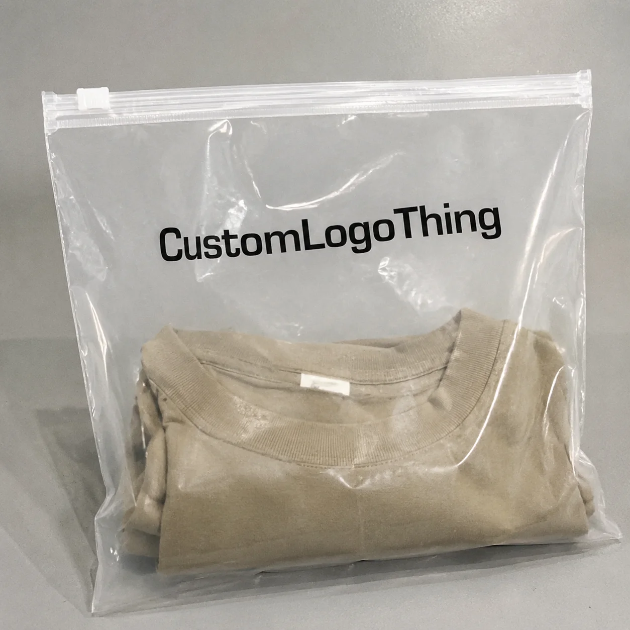
The first time I watched a logo packaging comparison happen on a factory floor in Dongguan, two boxes with the same navy logo landed on the table looking like completely different brands. One was a 350gsm SBS mailer with matte aqueous coating and crisp digital ink; the other was a rigid setup box wrapped in coated art paper with a soft-touch film and 1.5 mm greyboard. Same artwork. Same Pantone target. Totally different signal. That is why a logo packaging comparison matters more than most teams expect, especially when the quote changes from $0.22 per unit at 5,000 pieces to $1.08 per unit for a rigid box with foil and wrap paper.
People like to pretend the logo is the whole story. It isn’t. The logo sits inside the packaging system, and the system includes structure, board grade, print method, coating, inserts, and even how the carton behaves in a 2-meter drop test. I’ve seen a “premium” package look beautiful on a conference table, then fail in transit because the product rattled inside and scuffed the foil mark after 12 business days in a Guangzhou production run. That’s not branding. That’s an expensive lesson. And yes, somebody usually says, “But the mockup looked fine.” Sure. On a table. Not in a truck from Ningbo to Chicago.
For Custom Logo Things, the real question behind any logo packaging comparison is simple: which option makes the brand look sharp, protects the product, and stays inside budget without creating headaches in production? Usually, the best answer is not the most decorative one. It’s the one that balances packaging design, durability, and Cost Per Unit with enough discipline to survive real shipping conditions. My opinion? Fancy is easy. Functional is where the work starts, especially when the difference between a 300gsm folding carton and a 1.5 mm rigid board shows up in both freight cube and unit economics.
Logo Packaging Comparison: What It Really Means
A proper logo packaging comparison looks beyond the artwork file. It compares box styles, pouch formats, labels, coatings, inserts, and printing methods side by side. It also asks a harder question: what does this package communicate before the customer touches the product? A kraft mailer with one-color flexo printing says something very different from a rigid box with foil stamping and embossed type, even if both were quoted out of the same supplier in Shenzhen.
I’ve sat in client meetings where the marketing team kept pointing to the logo while the operations team pointed to the carton compression numbers. Both were right. In a real logo packaging comparison, visual appeal and functional performance need to sit in the same spreadsheet. You cannot judge branded packaging by renderings alone, because the renderings never show crushed corners, scuffed corners, or ink cracking on a fold line. The render can lie. Paper and glue do not, especially when the shipper stack reaches 8 cartons high in a warehouse outside Suzhou.
The comparison usually includes:
- Box styles: mailer boxes, tuck boxes, rigid boxes, folding cartons, sleeve packaging, and pouches.
- Print methods: digital, offset, flexographic printing, screen printing, foil stamping, embossing, and debossing.
- Materials: kraft, SBS, CCNB, corrugated board, rigid greyboard, recycled paper, and specialty stocks.
- Coatings and finishes: gloss, matte, soft-touch lamination, aqueous coating, UV spot varnish, and film wraps.
- Performance: crush resistance, scuff resistance, shelf stability, and shipping durability.
That list sounds technical, because it is. Packaging is physical. It has weight, stiffness, friction, and failure points. A logo packaging comparison that ignores those details is just a design mood board with invoices attached. I’ve seen a 280gsm folding carton pass visual review and fail a simple corner-crush check by 17% because the board stock came from a different mill in Guangdong. The logo looked great. The structure did not.
Customers also make judgments fast. In one retail packaging project I reviewed for a skincare brand in Los Angeles, shoppers spent less than four seconds before deciding which box “felt expensive.” The product inside was identical. The package with a 300gsm matte box, crisp black logo, and clean 5 mm margins won every time. That is not magic. That is package branding doing its job. I still remember the client being shocked, which was funny considering they had spent two weeks arguing about whether the logo should be 2 mm higher.
Client quote I hear often: “We thought the logo was the only variable. Then we tested the samples and realized structure changed everything.” That’s the essence of a smart logo packaging comparison, and it usually shows up right after the first physical samples arrive from Dongguan or Xiamen.
How Logo Packaging Comparison Works
A useful logo packaging comparison starts with a controlled test, not a gut feeling. I like to compare options under the same light, with the same product weight, and the same shipping assumptions. If one sample is viewed under showroom lighting and another under warehouse fluorescents, you are not comparing packaging. You are comparing conditions. And that usually turns into a very expensive opinion war over a 14-day sample cycle.
The practical comparison categories are straightforward:
- Logo placement: front panel, top flap, side panel, wraparound, or partial placement.
- Print method: digital, offset, foil, embossing, debossing, screen printing, or flexographic printing.
- Substrate: kraft, SBS, corrugated, rigid board, or specialty stock.
- Structural strength: tuck lock, crash-lock base, mailer, set-up box, or sleeve.
- Lead time: proofing, sampling, manufacturing, finishing, and freight.
- Total landed cost: unit price plus tooling, freight, storage, and damage allowance.
In my experience, most teams underestimate the last item. A box might quote at $0.42 per unit for 10,000 pieces, but once you add die tooling, foil plates, carton freight, and three rounds of proofs, the real number is closer to $0.55. A logo packaging comparison that stops at the unit quote will miss the budget by a mile. I’ve had suppliers in Shenzhen smile and slide a “small” extra fee into the quote like it was nothing. It was not nothing. A $180 foil plate and a $95 insert knife can quietly wreck the spreadsheet.
When I visited a Shenzhen line making Custom Printed Boxes for a beverage startup, the team had three nearly identical samples. On paper, all three were “eco-friendly.” In reality, one used 100% recycled kraft with water-based ink, another used virgin SBS with a recycled-content claim, and the third had a compostable-looking wrap but a plastic lamination that would fail recycling streams in most regions. That one meeting changed the client’s whole packaging design brief. Honestly, it should have. They had been talking sustainability for 30 minutes without asking what the wrap was actually made of.
Different formats create different expectations, too. Rigid boxes imply higher-end presentation. Mailer boxes feel more e-commerce friendly. Pouches read as lightweight, flexible, and efficient. A logo packaging comparison should score all of that against the product’s actual use case and the supply chain path, whether that’s a warehouse in Dallas or a fulfillment hub in Rotterdam.
For many buyers, a simple framework works best:
- Brand impact: Does the package tell the right story in under five seconds?
- Protection: Will it survive handling, stacking, and shipping?
- Logistics: Can it be assembled, stored, and fulfilled without chaos?
- Price: Does the total landed cost fit the margin model?
That framework keeps the logo packaging comparison grounded. Pretty is not enough. Cheap is not enough either. The package has to earn its place in the supply chain, and it has to do it on a pallet leaving a plant in Dongguan, not just on a polished sales deck.
Key Factors in a Logo Packaging Comparison
Material choice is usually the first fork in the road. Kraft boards suggest honesty, recyclability, and a more natural feel. SBS and coated boards deliver cleaner ink holdout and sharper logos, especially for fine type. Corrugated board adds structure and is often the best choice for e-commerce or heavier product packaging. Rigid board sits at the top end for presentation, but it costs more and takes more freight space per unit, especially when the order ships from Ningbo in a 40-foot container.
In a logo packaging comparison, material tells the customer something before copy does. A black foil logo on uncoated kraft will look warmer and more tactile than the same foil on a glossy folding carton. The difference is subtle on screen. In hand, it can be dramatic. Honestly, this is where a lot of packaging design teams underinvest: they approve a color on a monitor and never account for how paper fiber, coating absorbency, and surface texture alter the final result. A 350gsm C1S artboard can hold a line differently than a 300gsm recycled kraft sheet, and that difference shows up at print approval in about 30 seconds.
Color accuracy deserves its own test. Digital proofs are useful, but they are not final production. A deep red logo can drift warmer on uncoated stock and cleaner on coated stock. Black can look rich on a matte surface, then too flat on some recycled boards. If your logo relies on a specific Pantone, ask for a printed drawdown or a press proof when the brand stakes are high. A logo packaging comparison should never assume the proof equals the final carton, especially if the supplier is running offset in Dongguan and the carton will finish in a different plant in Foshan.
Pricing works on layers, not one neat number. Setup fees, plate costs, die-cut tooling, minimum order quantities, foil charges, and embossing can shift the economics quickly. I’ve seen a basic one-color mailer at $0.18 per unit for 5,000 pieces become a $0.31 per unit order once the client added a custom insert and spot UV. That is normal. What matters is seeing the full quote stack. If a supplier gives you only a unit price and no breakdown for tooling, that is not a quote. That is a teaser.
| Packaging option | Typical look | Common cost drivers | Best fit |
|---|---|---|---|
| Mailer box | Clean, e-commerce friendly | Die cut, one- or two-color print, inserts | Subscriptions, shipping-first brands |
| Rigid box | High-end, presentation heavy | Greyboard, wrap paper, foil, soft-touch lamination | Luxury, gifting, launch kits |
| Folding carton | Retail-ready, efficient | Offset print, coatings, gluing | Cosmetics, supplements, small goods |
| Pouch | Lightweight, flexible | Film, zipper, print coverage | Food, samples, refill products |
Durability matters more than the render suggests. Crushed corners can ruin a logo in a shipping test, and scuffed coatings can make a premium package look secondhand before it even reaches the customer. For shipping-sensitive products, I always ask whether the design has been checked against ISTA-type transit expectations and relevant ASTM methods. If your team wants a formal benchmark, the standards bodies are public for a reason. The ISTA testing framework is a good place to start, and I also look at the environmental side through the EPA’s packaging and waste resources at epa.gov.
Sustainability is no longer a side note in a logo packaging comparison. Recycled content, recyclability, lightweighting, and reduced material use can affect both environmental impact and freight cost. Less board often means lower cube, which can reduce shipping charges by 8% to 14% on some routes. That said, recyclable does not automatically mean better. If a thinner carton causes a 3% damage rate, the waste problem just moved downstream from the factory in Shanghai to the customer’s doorstep in Denver.
Here’s the practical truth: sustainable branding works best when it is honest about tradeoffs. A recyclable kraft mailer with one-color print may support the story better than a laminated rigid box that only looks greener. I’ve seen brands spend extra on “eco” finishes that made recycling harder. The label sounded good. The actual package was muddier. (Which is a nice way of saying nobody had read the fine print or asked the supplier whether the film was PE or PET.)
Print methods and what they do to the logo
A logo packaging comparison gets sharper when you isolate the print method. Digital printing is flexible for smaller runs and variable data. Offset printing gives strong color control and crisp detail at scale. Flexographic printing works well on corrugated and certain film applications. Foil stamping adds reflectivity. Embossing and debossing create tactile depth. Screen printing can deliver bold coverage on unusual surfaces, including specialty pouches produced in Guangzhou or Dongguan.
Each choice changes the personality of the logo. Foil can look elevated, but on textured stock it may break slightly at fine edges. Embossing feels premium, but tiny text can flatten or lose legibility. Screen printing offers strong impact, yet it may be too heavy for brands that want a minimal look. There is no universal winner. The best logo packaging comparison depends on the brand story and the substrate underneath the ink, plus whether the factory can hold a 0.2 mm registration tolerance without turning the logo into a blur.
From a production standpoint, I always warn clients about tiny typography. Six-point type on rough kraft can disappear. Thin strokes can break on uncoated stock. A logo packaging comparison should include a readability check from 3 feet away, not just a close-up view. If a customer can’t read the mark in a quick glance, the package is not doing enough work. If it takes a flashlight in a Shenzhen sample room, the design is already failing.
Step-by-Step Logo Packaging Comparison Process
The cleanest logo packaging comparison process starts with a simple brand brief. Define the emotion first: premium, playful, minimalist, eco-forward, heritage-inspired, or retail-ready. If the team skips that step, the sample review turns into a taste contest. I’ve watched that happen in supplier negotiations more than once in Shenzhen and Ningbo, and it always drags the project into circles. People suddenly become experts in “vibe,” which is a terrible procurement method when there are 8,000 units on the line.
Step 1: Set the brand goal
Choose one primary signal. If the brand wants luxury, then rigid board, foil, and restrained typography might make sense. If it wants affordability and speed, a folding carton or mailer with digital print may be the smarter path. The logo packaging comparison should always reflect the brand’s actual priority, not the loudest opinion in the room. If the launch window is 21 business days away, that changes the conversation fast.
Step 2: Match formats to the product
List the package options that fit the product dimensions. A 180 ml bottle, a folded garment, and a serum vial do not need the same structure. I once helped a client compare a tuck-end carton against a corrugated mailer for glass jars. The carton looked cleaner on the shelf, but the mailer cut damage rates by 2.7% in transit on the Shenzhen-to-Los Angeles lane. That changed the decision immediately, because replacing broken jars at $4.80 each is a lot less fun than approving a slightly plainer box.
Step 3: Request real mockups
Ask for samples that show the logo at actual size. Screen thumbnails lie. A mark that looks elegant at 15% scale can feel clumsy when printed at full size across a side panel. In a solid logo packaging comparison, the artwork file should be tested on the same dieline and same substrate whenever possible. If the supplier sends a “close enough” sample, I usually ask for the real one. Twice. Sometimes three times. If they can’t produce a sample on 350gsm C1S artboard or the actual corrugated spec, the comparison is already compromised.
Step 4: Use a scorecard
Score each option from 1 to 5 across appearance, protection, price, lead time, and customer experience. Keep the scoring visible. That helps the team see why one option wins even if it isn’t everyone’s favorite. A scorecard also prevents the loudest person in the room from overriding the numbers. I’ve watched a 4.8-rated mailer lose to a 2.1-rated rigid box because somebody liked the word “luxury.” Numbers are rude like that. They keep you honest.
Step 5: Test before ordering in volume
Run a real product insert, a shipping simulation, or a retail shelf mockup. I’ve seen a beautiful logo packaging comparison collapse because the insert was 2 mm too tight and bowed the front panel. That kind of issue does not show up in a PDF. It shows up when the packer is trying to assemble 1,500 units before lunch in a plant outside Dongguan. That’s usually the moment everybody gets very quiet, except the person holding the glue gun.
If you need a place to start with component options, our Custom Packaging Products page gives a useful snapshot of the box, insert, and print formats that often come up in these comparisons.
Factory-floor reality: The sample that looks best in a presentation deck is not always the easiest to produce at scale. In my notebook, the lowest-risk package is usually the one with fewer finishing steps, a clearer fold pattern, and a manufacturing run that can hit 12 to 15 business days from proof approval.
Logo Packaging Comparison: Common Mistakes to Avoid
The biggest mistake is choosing on appearance alone. A logo packaging comparison that never checks compression strength, scuff resistance, or closure performance is asking for trouble. I’ve seen brands approve a deep matte finish because it photographed beautifully, then discover it picked up fingerprints by the dozen during fulfillment in a warehouse near Atlanta. That kind of issue becomes a customer service problem fast, usually right after the first 2,000 orders ship.
Another trap is overreacting to low minimum order quantities. A supplier offering 500 units at a low setup threshold may still be expensive on a per-piece basis. The quote looks flexible. The actual economics may be terrible. If you are scaling toward 5,000 or 10,000 units, the more relevant question is what the unit cost becomes at volume. I’ve seen $0.95 per unit at 500 pieces fall to $0.28 per unit at 5,000 pieces. That is not a small difference. That is the whole game.
Logo placement errors are more common than people admit. Margins can be too tight. Artwork can sit too close to a fold. Typography can drift out of alignment after die-cutting. In one supplier review, a logo was placed 4 mm too low on a sleeve, and it made the entire line feel off-center. Nobody in the art room caught it. Everyone in production did. That was a fun day (for exactly no one), especially after the factory in Foshan had already printed 3,200 sleeves.
Timeline mistakes are another classic. Custom dielines, proofing cycles, and special finishes can stretch schedules. A simple printed carton may take 10 to 15 business days after proof approval. Add foil, embossing, or a custom insert and the timeline can climb to 18 to 25 business days, depending on the plant and the season. A logo packaging comparison should include calendar time, not just price. If your campaign launches in Paris on the 7th and the boxes are still on a truck from Yantian, the pretty design won’t save you.
Freight and storage often get ignored until the warehouse calls. Comparing supplier quotes without folding in carton cube, pallet count, and inbound freight can hide the true total. A cheaper rigid box that ships in two pallets instead of one may erase the savings. I always ask for total landed cost because that is the number the finance team actually lives with. A box at $0.62 per unit in Xiamen can become $0.91 landed in California once ocean freight, duties, and drayage show up.
One more mistake: forgetting the customer’s hands. A package that looks good in a studio might be awkward to open, difficult to reseal, or frustrating to stack at home. That hurts product packaging performance even if the logo itself is flawless. A smart logo packaging comparison should account for the unboxing moment, but also for what happens after the unboxing is over, whether the customer is in Tokyo, Toronto, or Tampa.
Expert Tips for a Smarter Logo Packaging Comparison
Compare at least three package types with the exact same logo file. That makes the differences obvious. If one sample uses a serif mark and another uses a bold sans serif, you are comparing typography as much as structure. Keep the artwork constant, and the results become easier to trust. I usually ask suppliers to print all three samples at the same 100% file size on the same board grade, ideally within the same 7-day production window.
Use one hero finish, not three. Foil plus embossing plus soft-touch plus spot UV can turn a package into a cost center. In my experience, a single well-placed finish gives better return. A small foil mark on the top panel or a controlled emboss on the lid often carries more authority than layers of decoration. The best logo packaging comparison usually rewards restraint. A 10 mm foil stamp on a rigid lid can look cleaner than a whole side panel of decoration trying too hard.
Ask the supplier for production stages in writing: proofing, sampling, manufacturing, finishing, and shipping. That detail matters. A quote that says “15 days” is not the same as a quote that says “3 days proof, 4 days sample, 5 days production, 3 days packing.” The second one is useful. The first one is marketing. I want the line items, the handoff points, and the city where each step happens, whether that is Dongguan, Shenzhen, or Huizhou.
There is a simple visibility rule I use on press approvals: if the logo disappears in low light or from three feet away, the contrast is too weak. That does not always mean a design is bad. It may just mean the board, coating, or ink choice is wrong for the intended use. A logo packaging comparison should test visibility under normal retail lighting, not ideal studio conditions. Put the sample next to a window in the afternoon and then under 4,000K warehouse lighting. You’ll learn quickly.
Keep the brand system aligned. Packaging colors should connect to the website, social visuals, and display materials. If your package uses warm ivory but your digital brand uses cool white and blue-gray, the brand can feel fragmented. Package branding works best when the customer experiences one visual language across channels. I’ve watched brands in California spend $12,000 on packaging and then break the whole system with a website hero image that looked like a different company.
For brands scaling into retail packaging, I also recommend checking shelf facings. A box may look elegant alone and still disappear on a crowded shelf. That is where competitive context matters. Place the sample beside three competitors and review it from 2 meters away. The logo packaging comparison changes immediately when the surrounding noise enters the picture. A matte black box can vanish next to glossy white competitors in a store in London, even if it looked perfect in the studio.
Honestly, the smartest teams treat packaging like a commercial tool, not just a design asset. It has to ship well, stack well, print well, and tell the truth about the product. Anything less is expensive theater, and I’ve negotiated enough supplier quotes in Guangdong to know how fast theater turns into a margin problem.
What to Do After Your Logo Packaging Comparison
Once the logo packaging comparison is done, narrow the field to two finalists. Do not keep five options alive unless you enjoy delay. Request physical samples, insert the actual product, and handle them the way customers will. Open them. Shake them lightly. Stack them. Put them on a shelf. That is the quickest way to see which version holds up outside the presentation room, especially when the sample arrives 9 days after proof approval from a factory in Dongguan.
Then lock the launch checklist. It should include artwork approval, dieline confirmation, material selection, finishing specs, timeline verification, and freight planning. I’ve seen projects stall because the team approved the art but forgot to confirm whether the foil plate was included in the quote. Small missing details become large schedule problems. The irony is always rich: everyone wants the perfect box, then nobody wants to read the spec sheet or confirm whether the board is 350gsm C1S artboard, 300gsm CCNB, or 1.5 mm greyboard wrapped in art paper.
Before the full run, I like to see a small pilot order or internal test. Fifty or 100 units may be enough to expose a margin issue, a scuff problem, or an assembly bottleneck. A logo packaging comparison is stronger when it includes real feedback from fulfillment staff and a handful of customers, not only internal opinions. If 12 out of 20 test users struggle with a tuck flap, that is data, not drama.
Build a review cycle too. Packaging should not freeze forever. Seasonal campaigns, product changes, and margin pressure all shift the equation. A brand that revisits its packaging every 6 to 12 months will usually make better decisions than one that waits until the box is a problem. I’ve seen brands in Seattle keep the same box for four years and then wonder why the market thought they were stale.
Finally, document the winner. Save the exact board spec, print method, finishing stack, ink references, dieline version, and approved supplier notes. That document is worth money on the next reorder. It reduces back-and-forth, lowers the chance of drift, and keeps the logo packaging comparison from starting over every time you restock. The best files include the supplier name, plant city, quote date, and target landed cost per unit so nobody has to guess later.
If you remember one thing, make it this: the best result in a logo packaging comparison is the one that protects the product, supports the brand story, and stays efficient in production. That is where smart branded packaging earns its keep. Not in a render. In the real shipment, the real shelf, and the real customer handoff, whether the order leaves Dongguan on Tuesday or lands in Chicago the following week.
FAQs
How do I compare logo packaging options without getting overwhelmed?
Start with four filters: brand look, product protection, budget, and timeline. Use the same logo file and product size across every sample so the logo packaging comparison stays fair. Then score each option from 1 to 5 on appearance, durability, cost, and lead time, and total the results. A simple sheet with unit price, freight, and sample date is usually enough to keep the process from spiraling.
What is the biggest cost difference in a logo packaging comparison?
Setup and finishing costs usually create the largest gap, not the base material alone. Foil stamping, embossing, custom inserts, and special coatings often add more than a simple printed box. Always compare total landed cost, including freight and storage. A folding carton at $0.19 per unit can become $0.27 once you add plates, tooling, and pallet freight from a plant in Guangdong.
How long does the logo packaging comparison process usually take?
Basic mockup comparisons can take a few days. Physical samples, revisions, and approval stages usually take longer than expected. Custom finishes and structural changes can extend the timeline further, especially when artwork or dielines need revision. A typical run is 12 to 15 business days from proof approval for standard cartons, while rigid boxes with foil and inserts can take 18 to 25 business days depending on the factory in Dongguan or Foshan.
Which logo packaging option is best for e-commerce brands?
Mailer boxes and corrugated structures are often strongest for shipping. The best choice depends on product weight, breakability, and unboxing goals. The right logo packaging comparison balances protection with a clean logo presentation that survives transit. For a 1.2 kg product, a 32 ECT corrugated mailer may outperform a lightweight folding carton by a wide margin in shipping tests.
What should I ask a supplier during a logo packaging comparison?
Ask for minimum order quantity, lead time, proof type, finishing options, and exact pricing by volume. Request material samples and print references if color accuracy matters. Confirm whether freight, tooling, and artwork changes are included so the quote reflects the real project cost. I also ask which city the boxes will be printed in, whether the stock is 350gsm C1S artboard or 1.5 mm greyboard, and how many business days pass between proof approval and mass production.