A tray of fudge in a plain carton says one thing. The same product in custom sweet boxes with a clean window, tight insert, and sharp print says something else entirely. Buyers notice it. Shoppers do too. Usually before they even read the flavor name.
Packaging is doing more than holding candy. It is product protection, shelf presentation, and brand signal in one job. If the box looks flimsy, the product feels cheaper. If the structure is clean and the print is controlled, the sweets feel more deliberate. Same recipe. Different margin.
That is why the box choice matters so much in confectionery. Chocolate scuffs. Fudge sweats. Soft centers move around. Individually wrapped pieces rattle if the fit is loose. Good custom sweet boxes control that behavior without making the package feel overbuilt or fussy.
If you are comparing formats, start by matching the box to the product, not the artwork. A practical place to do that is to browse Custom Packaging Products and sort by structure first. That sounds basic because it is. It is also where a lot of teams get it wrong.
What custom sweet boxes change on the shelf
Sweets sell on perception before they sell on taste. A mixed box of chocolates, dates, truffles, or coated nuts can move from “bulk candy” to “gift-ready set” just by changing the carton, the print quality, and the way the product sits inside. That is the value of custom sweet boxes. They lift perceived price without changing what is inside.
Shoppers read signals fast. Crisp panel alignment, controlled color, and a box that closes properly tell them the brand is organized. A weak carton with product that shifts around tells them the opposite. Nobody needs a long explanation. They can see it in two seconds.
There is a practical side too. A good box reduces damage, keeps greasy or sticky products from marking the outside, and helps the product arrive looking like the approved sample. That matters in retail and in gifting. It also matters when a customer opens the box and expects the contents to look as neat as the front panel promised.
From a buyer’s point of view, the box should do two things at once:
- Sell the product on shelf or in a gift display.
- Protect the sweets during packing, freight, and store handling.
If one of those fails, the cheap-looking box ends up costing more than the nice one would have. Damage, returns, repacking labor, and weak shelf appeal are real costs. They just show up later, usually after the purchase order is already closed.
“A better box does not fix a weak product. It does make a good product look priced correctly.”
Gift channels raise the bar further. Customers expect cleaner edges, stronger structure, and a finish that feels intentional rather than improvised. That is where branded packaging earns its keep. The same sweets can command a better price when the presentation feels curated instead of borrowed from a warehouse shelf.
Retail display matters as well. Shelf-ready cartons, counter displays, and gift sets all need different visibility and stacking behavior. A box that photographs well but collapses under case packing is not a win. It is a nice-looking problem.
How custom sweet boxes handle fill, display, and protection
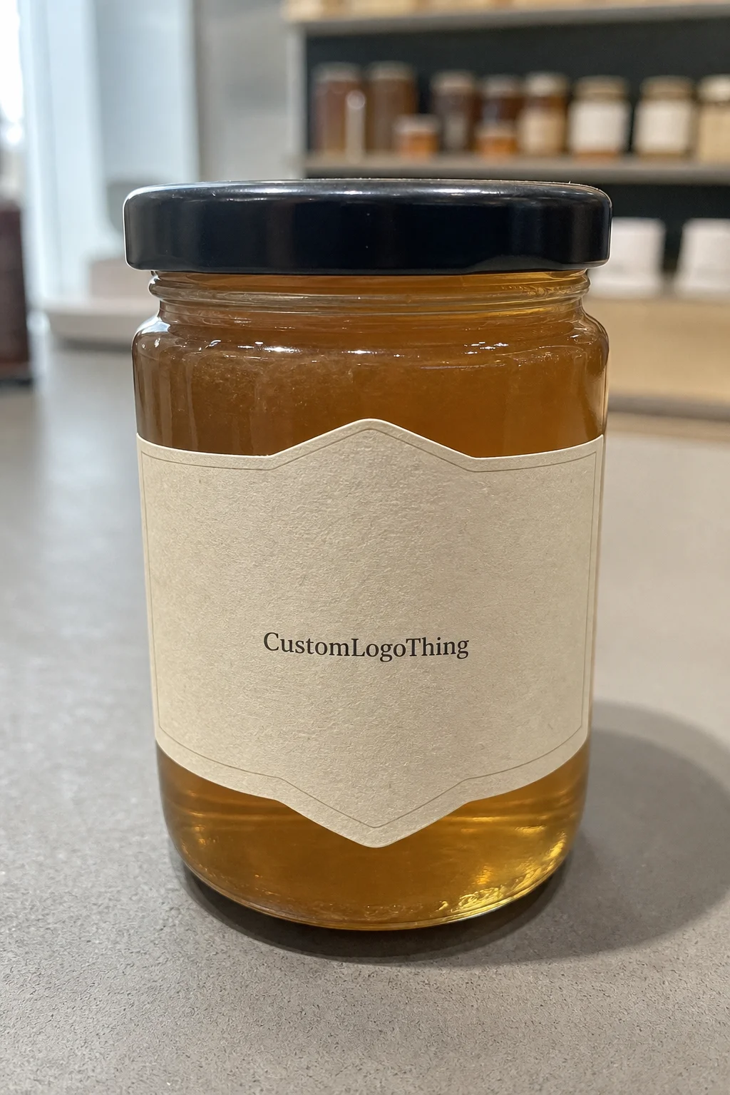
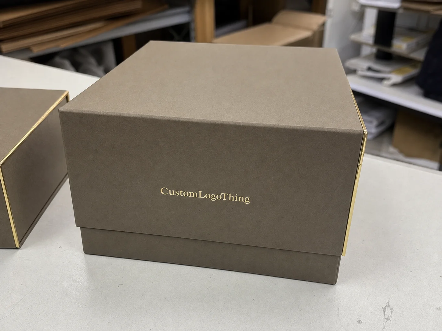
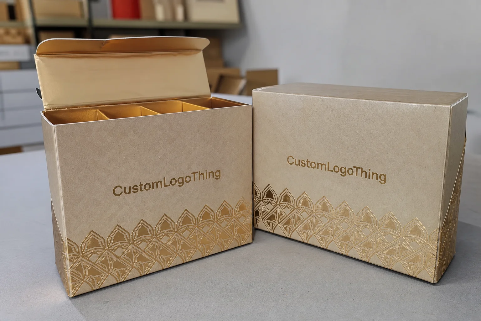
Structure is the real decision. A folding carton is usually the lowest-cost route. A rigid setup box feels more premium and keeps its shape better. Tuck-end cartons are efficient for lighter treats. Sleeves add a clean outer layer. Window boxes let shoppers see color, texture, and decoration before buying. Inserts keep everything centered.
The right format depends on the product weight and how the sweets behave. For lighter candies or individually wrapped pieces, a simple folding carton can be enough. For heavier assortments, truffles, layered gift sets, or anything fragile, a rigid box or reinforced carton is safer. If the sweets have sharp edges, soft toppings, or mixed shapes, add an insert. That is not a luxury. It is damage control.
Common insert options include cardboard trays, paperboard dividers, molded pulp, and thermoformed inserts. Each one solves a different problem. A divider separates flavors. A tray holds rows straight. Molded pulp cushions fragile items. Thermoform works when fit accuracy matters more than premium handfeel. The mistake is choosing an insert because it looks technical instead of because it fits the product.
Dimensions are not a minor spec. They affect shelf presence, shipping efficiency, and how full the box looks. A box that is too large makes the assortment look thin. A box that is too tight crushes decoration or scuffs the surface. Good packaging starts with the actual product footprint, then adds the clearance needed for the insert, the packing method, and normal production tolerance.
Board thickness and coating matter too. A 350gsm SBS or CCNB folding carton with a matte aqueous coating can work well for dry sweets in short retail runs. Premium gifting usually calls for a heavier rigid board wrapped in printed cover stock. If the product is oily or sticky, the surface finish needs to resist transfer. If the shipping route is rough, the structure needs enough compression strength to survive corner hits and stacking pressure.
For parcel shipments, test the packout, not just the mockup. A decent box on a desk means nothing if the contents shift in transit. If you want a real benchmark, compare the package to the relevant test profiles at ISTA. That is a more useful check than guessing whether the box will survive a courier drop and a bad warehouse stack.
Structure selection usually comes down to use case.
- Retail display: prioritize shelf appeal, print clarity, and stackability.
- Gift packaging: prioritize structure, closure quality, and a premium finish.
- Wholesale cartons: prioritize protection, case packing, and unit cost.
- Subscription kits: prioritize inserts, consistency, and fast packout.
Material sourcing affects trust too. If sustainability claims are part of the brand story, specify FSC-certified board where appropriate and confirm the chain of custody with the vendor. The standard is public at FSC. That is cleaner than writing “eco-friendly” on a sweets box and hoping nobody asks what it means.
Cost, pricing, MOQ, and unit cost drivers
Price is a stack of choices. Size, board grade, print method, coating, special finishes, insert type, and freight all move the number. The common mistake is thinking the quote is only about dimensions. It is not. A plain carton with one-color print costs very differently from a full-coverage box with foil, spot UV, and a custom divider.
Minimum order quantity matters because setup work has to be spread across the run. Small orders carry more setup cost per unit. Larger runs usually reward simpler artwork and fewer version changes. If the line has five flavors, each with its own callout and finish, the unit cost goes up. That is normal. Complexity always leaves a bill somewhere.
| Box option | Typical MOQ | Typical unit cost | Best use | Main tradeoff |
|---|---|---|---|---|
| Folding carton | 1,000 to 5,000 | $0.18 to $0.38 | Dry sweets, lightweight assortments, shelf retail | Less premium feel, lighter protection |
| Window tuck box | 1,000 to 3,000 | $0.24 to $0.52 | Colorful candies, gift sets, visual merchandising | Extra die-cut and window film cost |
| Rigid setup box | 500 to 2,000 | $1.10 to $2.80 | Premium gifting, heavy assortments, brand launches | Higher unit cost, more storage volume |
| Sleeve with tray | 1,000 to 3,000 | $0.42 to $0.95 | Layered sweets, sampler packs, repeatable retail packaging | More parts to assemble |
Those numbers are realistic, not universal. Paper markets move. Freight changes. Artwork coverage changes. Vendor capacity changes. Still, ranges like these are useful for comparing quotes. If a quote looks far below them, ask what is missing. Freight? Setup? Proofs? Inserts? If the answer is vague, the quote is vague too.
There are a few repeat offenders when it comes to cost creep:
- Too many SKU versions with separate artwork files.
- Foil, embossing, or spot UV on every panel.
- Oversized boxes that waste board and case space.
- Window cutouts that add tooling and slow production.
- Proof changes after the dieline is already approved.
One habit saves money and arguments: compare quotes on the same exact spec. Same size. Same board. Same insert. Same coating. Same delivery terms. Otherwise you are comparing a premium build to a budget build and calling it procurement. That is how bad decisions get dressed up in spreadsheets.
If the goal is balancing cost against shelf impact, spend on the parts customers notice and simplify the rest. A clean structure with accurate fit usually beats a loud design on weak construction. Custom sweet boxes should feel intentional, not overworked.
Production steps and turnaround: from dieline to delivery
The production flow is straightforward once the spec is fixed. Brief first. Structure selection. Dieline. Artwork placement. Proof approval. Sampling. Production. Packing. Shipment. Each stage has its own failure point. Most delays are boring, which is exactly why they keep happening.
Late artwork causes plenty of them. So does missing bleed. So does sending dimensions before the real product sample exists. If the sweets are still being adjusted and the box size keeps changing, the schedule slips. Not because the vendor is dramatic. Because the math changes.
Simple folding cartons can move quickly. Rigid boxes, specialty finishes, and custom inserts take longer because they add manual steps or separate tooling. A plain carton might be ready in roughly 10 to 15 business days after proof approval, depending on run size and supplier queue. A rigid gift set can stretch closer to 15 to 25 business days, and that does not include freight. International transit adds more time. A lot more if the lane is busy.
Sampling is not production. Treat them as separate stages. A sample helps verify fold lines, panel balance, closure fit, and how the sweets sit in the insert. Production follows the approved version. If those dates get mixed together, launch planning gets messy fast.
The easiest way to protect the timeline is also the least exciting: finalize dimensions early, send print-ready files, and approve proofs quickly. Teams that move fast usually do less backtracking. That is not luck. It is discipline.
If the vendor offers a pre-production sample, use it. Check the closure. Check the fit. Check how the box stacks in a shipping case. If the product is going through parcel carriers or long freight lanes, a quick drop and compression check is worth far more than a guess.
Choosing the right insert, finish, and closure
The insert does more than hold product in place. It controls presentation. A tray that centers each piece makes an assortment look curated. A divider keeps flavors separated. A molded insert protects fragile items that would otherwise slide into each other and lose shape. For mixed sweets with different weights, the insert keeps the top layer from turning into a mess before the box reaches the customer.
Finish changes the read of the box. Matte usually feels calmer and more refined. Gloss looks brighter and helps saturated colors pop. Soft-touch can feel premium when the design already has enough contrast to support it. It is not magic. Put soft-touch on a weak layout and you still have a weak layout, only with a nicer fingerprint trail.
Closure should match the channel. Tuck flaps work well for efficient retail runs. Sleeves feel deliberate and are good for layered presentation. Magnetic lids are common in premium gifting, though they raise cost and storage volume. Window boxes are useful when visual appeal closes the sale before the shopper opens the carton. Each option has a purpose. None of them is automatically better.
Sticky or oily sweets need special attention. Uncoated paper or an open inner pack can leave grease marks, especially after a short display period. Handling matters too. A box that is opened and closed repeatedly in-store wears differently from one that goes straight from shelf to customer bag.
Good packaging design answers a simple question: what does the customer need to see, touch, and trust before buying? If the answer is a neat presentation with no movement and a clear brand message, then the finish, insert, and closure should support that. Not fight it.
It helps to sketch the customer journey first. Retail buyer sees the shelf. Store staff stacks the case. Customer picks up the box. Customer opens it at home. If the packaging feels awkward at any step, the whole experience drops. That is why well-made custom sweet boxes are built around handling, not just decoration.
Common mistakes that make sweet boxes look cheap
The obvious failures are still the most common. Too much artwork. Weak typography. Color drift between screen and print. Crowded panels trying to say everything at once. On a small box, clutter looks worse because there is less room for the eye to rest. Good packaging needs breathing room.
Size errors hurt more than design errors. An oversized box makes the product look underfilled, especially for premium sweets. A tight box crushes toppings, bends inserts, or ruins the closure. Buyers usually underestimate how much empty space changes perceived value. More than they should, honestly.
Finishing mistakes are another trap. Foil on a layout with too little contrast can look cheap instead of premium. Gloss on dark artwork can highlight scratches. Soft-touch can mute colors if the design is already too dark. The finish should support the artwork, not rescue it.
Operational mistakes can sink the whole project. Skipping a physical proof is a classic one. So is ignoring how the sweets behave in transit. Chocolate can soften. Candy can crack. Fudge can pick up moisture. If the box is only tested on a desk and never in a packed carton, it is not really tested. It only looks tested.
If sustainability is part of the brand promise, keep it concrete. Choose the Right board, keep the coating compatible with local recycling guidance, and use the simplest structure that still protects the product. The EPA has practical guidance on waste and materials management at EPA. That is more useful than a vague green label slapped on a dessert box.
The reality check is simple: a pretty mockup means nothing if the pack fails shelf, ship, or handling tests. For sweets, failure is usually visible. Broken corners. Grease spots. Loose inserts. Lopsided fills. Customers notice those things before they notice your flavor notes.
Next steps before you request a quote
Start with the product spec sheet. Exact dimensions. Fill weight. SKU count. Loose product or wrapped product. Tray or no tray. If the sweets are mixed, note which items are fragile, oily, or individually packed. That changes the box recommendation more than most design preferences do.
Next, decide the box’s main job. Does it need to sell on shelf, ship safely, work as a gift item, or support a retail display program? Pick the priority first. Everything else should follow that. If the brief tries to do all four equally, the result is usually a compromise nobody likes.
Have the artwork files ready before asking for pricing. That means logo files, brand colors, dieline-ready layout, and any finish callouts such as foil, embossing, or spot UV. If you want the quote to reflect the real spec, the supplier needs the real spec. Vague files invite vague numbers.
Ask for sample photos, material options, and a written timeline. Better yet, ask what changes the schedule. A supplier who tells you exactly what slows the run is usually easier to work with than one who only promises speed. Speed without detail is just optimism wearing a hard hat.
If you are still comparing formats, use a product-first approach and look at the channel. Retail packaging needs different decisions than a premium gift box or wholesale carton. That is where Custom Packaging Products becomes useful as a planning tool, not just a catalog page.
Before production starts, run a final spec check. Box size, insert fit, artwork version, quantity, ship method, and delivery date all need to line up. Miss one of those and the schedule goes sideways for no good reason.
Done right, custom sweet boxes improve shelf appeal, protect the product, and support margin without making the program feel overdesigned. That is the standard. Everything else is decoration.
What materials work best for custom sweet boxes with heavier sweets?
Use a sturdier board or a rigid construction when the product has real weight or the package needs to survive shipping. Add an insert or tray if the sweets can shift, tilt, or crush each other during handling. Choose coatings based on how the product behaves, especially if the sweets are oily, sticky, or sensitive to moisture.
How do custom sweet boxes pricing and MOQ usually affect the final quote?
Quantity, size, print complexity, and finishing are the main pricing levers, not just the box shape. MOQ matters because setup work is spread across the run, so smaller orders usually carry a higher unit cost. Every extra version, insert, or specialty finish increases the quote, so keep the spec tight unless the upgrade clearly helps sales.
What is the usual production timeline for custom sweet boxes?
The schedule usually includes proofing, sampling, production, packing, and shipping, and each step can move the finish date. Simple folding cartons move faster than rigid boxes or orders with custom inserts and specialty finishes. Fast approvals and final artwork are the easiest ways to protect turnaround time.
Do custom sweet boxes need inserts or dividers?
If the sweets are fragile, mixed, or individually decorated, inserts help keep the presentation clean. Dividers are useful when flavors, colors, or product types need to stay separated inside one box. Skip the insert only when the product naturally stays in place and the package still looks full without it.
What artwork files do I need for custom sweet boxes?
You need a dieline, print-ready artwork, and correct bleed and safe zones so the box builds correctly. Provide brand colors, logo files, and any finish callouts such as foil, spot UV, or embossing. A physical proof or sample is worth it when the box size is new or the design is detailed.