Custom Skincare Boxes: How to Order the Right Packaging
Custom skincare boxes do more than hold a jar or tube. They shape the first read of the product. A plain mailer says commodity. A well-built carton says the brand paid attention. Buyers notice size, print quality, weight, and finish in seconds, and those cues influence whether a product feels basic, clinical, or premium.
For a skincare brand, the box has to do three jobs at once: protect the formula, carry the brand story, and make the line easier to remember on shelf or in ecommerce unboxing. That only works when structure, material, and decoration match the product. For teams comparing formats, Custom Packaging Products is the right place to start thinking about the packaging system as a whole.
What Custom Skincare Boxes Actually Do on Shelf
A cream jar in a plain mailer can read like an off-the-shelf commodity. Put the same jar in a carton with disciplined typography, a proper structure, and a finish that matches the formula, and the product starts to look deliberate. Packaging is often the first brand asset a shopper notices, long before claims or ingredient lists.
In retail, attention is short. A shopper may give a product a few seconds, not a few minutes. The box has to communicate category, audience, and price point quickly. Clinical brands usually need restraint and clarity. Botanical lines need warmth. Luxury skincare needs control, not noise.
The best packaging is built around the route to market. A carton for shelf display is not the same as a carton for direct-to-consumer shipment. Ecommerce packaging needs better crush resistance and often a more forgiving closure. Retail cartons can prioritize shelf presence and tighter graphics. The box should be selected for the channel, not copied from a trend board.
The other mistake is treating packaging as surface decoration. It can raise perceived value, but it can also create friction if the size is awkward, the insert rattles, or the coating scuffs in fulfillment. Good packaging is practical first.
How the Box Structure and Inserts Work
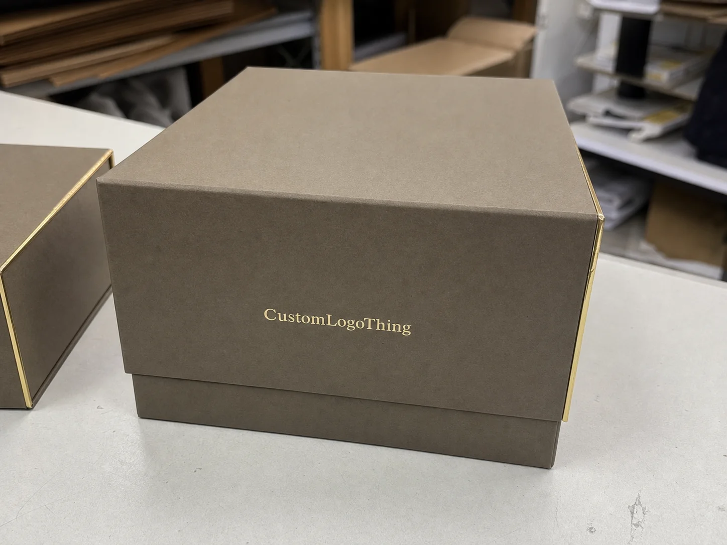
The structure sets the first impression, but it also determines how the product behaves in transit. Tuck-end cartons are common for lighter items such as tubes, masks, and small jars. Sleeve packs work when the presentation needs to stay minimal and material use needs to stay low. Rigid boxes fit premium sets and giftable launches. Mailer-style cartons are usually better for ecommerce because they tolerate handling abuse more comfortably.
Size matters more than most buyers expect. A box can look elegant on screen and still fail on the line if the cap height was ignored, the closure clearance is too tight, or the label increases the true diameter after application. For glass bottles, a millimeter or two can decide whether the fit feels snug or sloppy. For multi-item sets, each component needs to be mapped before the outer carton is finalized.
Inserts are not decorative extras. They stop movement, keep glass from knocking together, and help the product land in the same position every time. Paperboard inserts are lighter and usually cheaper. Molded pulp can add structure with a more natural look. Foam still exists for high-protection jobs, but many beauty brands avoid it because it does not fit every sustainability story.
If the box will go through ecommerce fulfillment, ask whether the carton plus insert can survive a basic drop and vibration profile under ISTA handling methods. That is a practical question, not a theoretical one. It catches weak corners, loose inserts, and lids that shift after repeated movement.
Board thickness and folding style change the hand feel. A 12pt carton with a tight fold feels different from a 24pt rigid setup with wrapped paper. Neither is automatically better. The right choice depends on product value, shipping method, and how much weight the box needs to carry without denting.
Material and Finish Choices That Change Perceived Value
The stock you choose can move the product into a different price bracket in the customer's mind. Coated paperboard is common for printed cartons because it holds fine detail well and protects the print. Uncoated stock feels warmer and more tactile, which suits apothecary-style or ingredient-led brands. Heavier rigid board projects stability and permanence, but it is not necessary for every line.
Finish choices are where packaging branding becomes visible. Soft-touch coating gives a velvety surface that reads upscale without shouting. Matte lamination can make a design feel controlled and modern. Foil accents catch light quickly, which helps on shelf, but too much foil can push a skincare line toward gift wrap territory. Embossing and debossing add depth and are especially effective when the brand wants texture to do some of the speaking.
Spot UV is useful when you want contrast between a flat field and a highlighted logo or ingredient motif. Textured papers support a clean, organic story, but they also create print limitations. Dark solids show scuffs faster. White-on-white systems can look premium, but they demand tighter color control. For brands that want a restrained, credible look, fewer effects usually work better than stacking every finish available.
Production reality: every special effect adds setup, proofing, and sometimes waste. A foil-stamped panel may require another approval round. A soft-touch finish can extend turnaround by several business days. If the launch date is fixed, those choices need to be made early, not after the artwork is already close to final.
For sustainability claims, FSC-certified paperboard can support a more defensible sourcing story. Certification does not make a package automatically low-impact in every sense, but it does provide a recognized chain-of-custody framework through FSC. That matters when the brand sells into retail accounts that ask specific questions about paper sourcing.
Print method also matters. Digital print is useful for short runs, variable artwork, and faster turnaround. Offset tends to win on consistency and unit economics at scale. If color accuracy is critical, the supplier should be working from a calibrated standard, not guessing from a screen render.
Custom Skincare Boxes Cost, MOQ, and Unit Pricing
Price is driven by a few variables: size, board grade, print coverage, finish complexity, insert type, and run length. The more ink, coating, and handwork involved, the higher the cost. Small runs also cost more per unit because setup is spread over fewer boxes. For custom skincare boxes, that is normal print economics, not a supplier trick.
For reference, simple folding cartons often land around $0.18 to $0.35 per unit at 5,000 pieces, depending on size and print coverage. Sleeve packs may come in slightly lower. Rigid boxes usually move into the $1.10 to $2.80 range because of board wrap, assembly, and shipping weight. If an insert is added, budget accordingly. A paperboard insert may only add a few cents, while a custom die-cut or molded option can move the total higher.
MOQ should match the stage of the product, not the mood of the spreadsheet. A pilot launch may justify a smaller order so the brand can test sell-through, claims, and packaging response. A full retail rollout usually needs a larger quantity so unit pricing stays controlled. If formulas, labels, or regulatory copy are still changing, ordering too much is a bad bet.
| Format | Typical Use | Approx. Unit Cost at Mid-Scale | Notes |
|---|---|---|---|
| Folding carton | Single jars, tubes, and retail SKUs | $0.18-$0.35 | Efficient branded packaging with moderate print detail |
| Sleeve pack | Lightweight retail presentation | $0.12-$0.28 | Lower material use, but less protection than a full carton |
| Mailer-style box | Ecommerce shipments and subscription sets | $0.45-$0.90 | Stronger for transit, usually more board and print area |
| Rigid box | Luxury kits, sets, and giftable launches | $1.10-$2.80 | Premium feel, more assembly time, higher freight weight |
To get a useful quote, send the supplier everything in one pass: exact dimensions, style, quantity, print sides, finish, insert needs, and shipping destination. If the product depth or cap height is missing, the quote may look low at first and become expensive after revisions.
Call out white ink, special coatings, foil, embossing, and proofing upfront. Those details affect not only price but also timing. A quote is only useful if it reflects the real job, not a stripped-down version that would never go to press.
Process and Timeline: From Dieline to Delivery
The process usually follows a predictable path: brief, quote, dieline, artwork placement, proof review, sample, production, packing, and shipment. The order seems simple on paper. In practice, delays cluster around the same few points. The dieline changes. The art is not print-ready. The team has not decided on finishes yet.
Sample timing and production timing are not the same thing. A structural mockup or approval sample can add a few days at the front end, but it reduces the risk of discovering a fit problem after the full run is printed. For fragile items, that trade makes sense. A sample that proves the closure works and the insert holds the bottle still is usually worth more than saving a day or two.
For straightforward orders, a realistic lead time is often 12 to 15 business days from proof approval, assuming the artwork is ready and the structure is simple. Complex jobs, special finishes, or imported freight can push that longer. Freight booking matters too. A box can finish on time and still miss launch if shipping was not planned early enough.
There is also the compliance layer. If the carton includes claims, ingredients, warnings, or multilingual copy, those elements should be confirmed before proof approval. That keeps the packaging schedule from collapsing under last-minute edits.
If color is part of the brand system, ask for a hard proof or a controlled press proof, not only a PDF. Screen color is a weak signal. Paper, coating, and lighting all change the result.
Step-by-Step Guide to Ordering Without Rework
Start with product data, not artwork. Measure the item exactly, including cap height, nozzle projection, label build, and whether the package holds glass or plastic. Write down the fill weight and decide whether the pack is meant for retail packaging, shipping-only use, or both. A clear spec sheet removes guesswork from the first quote.
Next, build the artwork checklist. Include brand colors, logo files, barcode location, batch code space, and any regulatory copy that must stay legible. If the product has claims tied to skin type, ingredient story, or usage directions, make sure those lines are final before they go to print.
Review the proof like a production buyer. Check panel order, folds, bleed, and safe areas. Confirm the barcode scans cleanly and that the copy is consistent across panels. If the design includes a window, foil, or special finish, check how those features interact with text and negative space.
Before approving the run, ask for a physical sample or structural mockup if the product is fragile, premium, or part of a set. This matters especially for boxes holding pumps, droppers, or multiple pieces. The extra step can catch movement inside the carton, a loose fit, or a closure that rubs the surface finish.
Then confirm the practical details: final quantity, carton pack-out, shipping destination, and receiving window. If the boxes are ready but the warehouse cannot accept them, the project still stalls. Packaging is a supply chain problem as much as a design problem.
Common Mistakes Buyers Make Before Approval
The first mistake is designing for the render and ignoring transit. A carton can look great on a screen and still crush easily in a fulfillment center. Scuffed soft-touch finishes, weak corners, and loose inserts create avoidable damage that erodes margin.
Another common issue is vague measurement. Buyers often send a “standard jar” description without exact dimensions, which forces the supplier to guess. That guess becomes expensive when a dropper cap does not clear the flap or a pump makes the box too tight.
Overcomplicated decoration can also backfire. A line that needs quick replenishment or lower MOQs may be better served by a cleaner design with one or two well-chosen effects. Not every premium signal has to be loud.
Legal copy is another trap. Teams approve art before checking country-specific label requirements, UPC placement, or ingredient wording. That creates a second approval cycle and often a second production run.
A box that looks premium but crushes in transit is not premium packaging. It is a return risk.
The biggest avoidable issue is timing. Brands often wait until the formula is nearly finished before asking for packaging. That compresses the dieline, proofing, sampling, and freight planning into one crowded window. Packaging should enter the schedule earlier than most teams think.
Practical Tips for a Stronger Order
If the formula, scent, or audience is still being tested, order a small pilot run first. A smaller run lets you see whether the carton feels right in hand, whether the color reads properly under store lighting, and whether the print quality matches the brand promise.
Compare two versions of the same design if the decision feels close. Test matte against soft-touch, or a sleeve against a full carton. Small changes can shift perceived value more than a dramatic artwork overhaul.
Prepare a one-page spec sheet before requesting quotes. Include dimensions, quantity, material target, print effects, launch date, and shipping location. That single page improves quote quality and shortens the back-and-forth that usually drags packaging projects out.
Ask suppliers how they handle proofing, color matching, overage, and reprint scenarios. Those answers reveal process discipline fast. You are not only buying cartons. You are buying a method for keeping the boxes consistent when the next run comes around.
What should I prepare before requesting custom skincare packaging quotes?
Have exact product dimensions, target quantity, and packaging style ready. Include material preferences, finish ideas, print sides, and any insert needs. Add launch date and shipping location so the quote reflects real lead-time and freight constraints.
How do I know the right MOQ for custom skincare boxes?
Match MOQ to the stage of the product line, not just the lowest price. Use smaller runs for pilot launches and higher runs only after the formula and label are stable. Ask whether the supplier's MOQ changes with print complexity or special finishes.
Which finishes work best for luxury skincare boxes?
Soft-touch, matte lamination, embossing, and restrained foil are common premium signals. Choose finishes that support the brand story instead of layering effects just to look expensive. Test samples under real lighting because some finishes look very different on screen than on shelf.
How long does custom skincare box production usually take?
Timelines depend on approvals, sample rounds, print complexity, and shipment method. Simple orders move faster when artwork is print-ready and no structural revisions are needed. Build extra time for proofing and freight so the boxes arrive before the launch date.
What should I check on a sample before approving the run?
Check fit, closure, print clarity, color consistency, and how the box feels in hand. Verify barcode scanability, regulatory text, and insert alignment if the box includes one. Test the sample for shipping durability if the product will travel through ecommerce fulfillment.