Buyer Fit Snapshot
| Best fit | Logo Packaging projects where brand print, material claims, artwork control, MOQ, and repeat-order consistency need to be specified before quoting. |
|---|---|
| Quote inputs | Share finished size, material target, print colors, finish, packing count, annual reorder estimate, ship-to region, and any compliance wording. |
| Proofing check | Approve dieline scale, logo placement, barcode or warning zones, color tolerance, closure strength, and carton packing before bulk production. |
| Main risk | Vague material claims, crowded artwork, missing packing details, or unclear freight terms can make a low unit price expensive after revisions. |
Fast answer: Logo Packaging: Material, Print, Proofing, and Reorder Risk should be specified like a repeatable production item. The safest quote records material, print method, finish, artwork proof, packing count, and reorder notes in one written spec.
Production checks before approval
Compare the actual filled-product size with the drawing, then confirm tolerance on folds, seals, hang holes, label areas, and retail display edges. Reserve space for logos, QR codes, warning copy, and material claims before decorative graphics fill the panel.
Quote comparison points
Review material grade, print process, finish, sampling route, tooling charges, carton quantity, and freight assumptions side by side. A quote is only useful when the supplier can repeat the same color, closure quality, and packing count on the next order.
Logo Packaging: How to Choose When First Impressions Matter
Customers decide fast. Faster than most brands want to admit. I remember sitting in a factory office in Shenzhen, with a humid 34°C afternoon outside and a stack of sample cartons on the table, while a founder showed me phone screenshots of customers posting her box online before they even opened the product. Not the serum. Not the unboxing. The box. That is the pressure behind logo Packaging How to Choose. It is not just a design task. It is sales, logistics, and brand trust packed into one box, mailer, sleeve, or bag.
Packaging often signals quality before the product does. I have watched buyers in Guangzhou handle two nearly identical items, then pick the one in the better-looking carton even though the materials inside were the same. Annoying? Absolutely. Predictable? Also yes. That is why logo Packaging How to Choose matters so much. The logo is the visible shorthand, but the packaging structure, print quality, and finish are doing a lot of invisible work. A clean 1-color logo on 350gsm C1S artboard can outperform a busy full-color design on flimsy stock every single time.
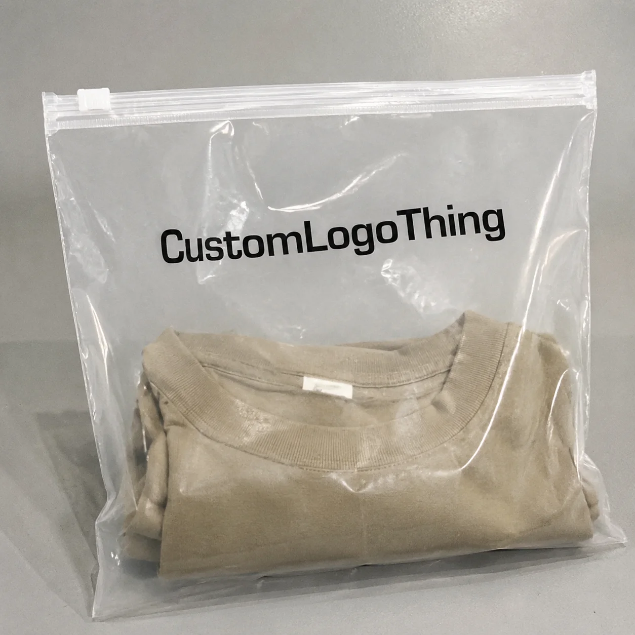
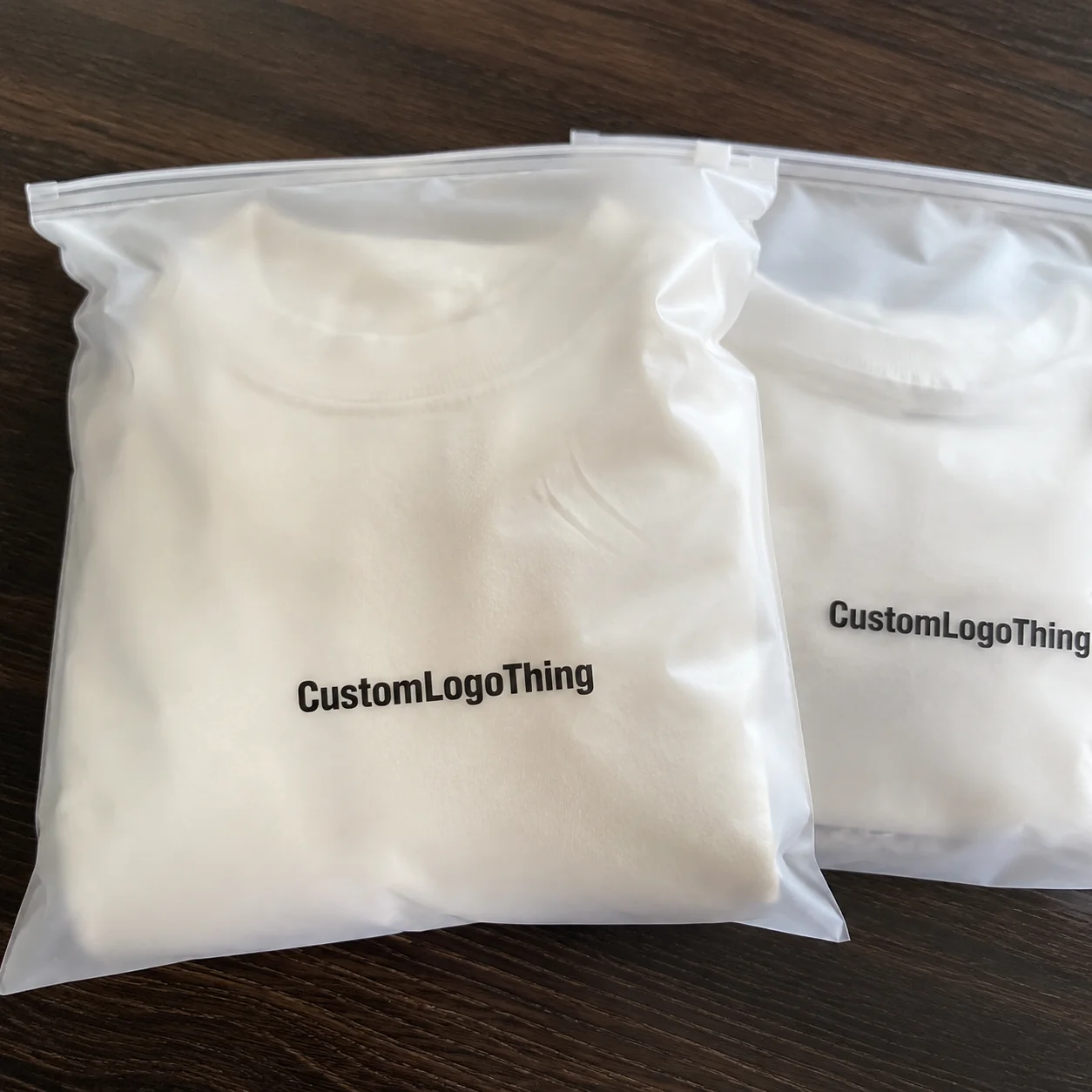
In practical terms, logo packaging includes printed boxes, branded mailers, tissue paper, labels, inserts, sleeves, stickers, tape, and protective packaging that carries a brand identity system. It can be a matte white folding carton with a single-color mark. It can also be a rigid gift box with foil stamping, a magnetic closure, and a custom insert. The right choice depends on what you ship, how you ship it, and what you want the customer to feel when they open it. If the product weighs 180 grams and ships in a polybag, your answer is very different from a 2.4 kg glass set going from Suzhou to Chicago.
I worked with a small skincare brand that started with plain poly mailers and a sticker slapped on top. Nothing wrong with that for week one. Once orders crossed 1,200 units a month, returns and social sharing changed the conversation. They moved to custom printed boxes with a kraft exterior, one-color logo, and a paperboard insert. The boxes were made in Dongguan on 300gsm kraft board, and the unit price came in at $0.28 per box for 5,000 pieces, plus $0.06 for the insert. Their repeat purchase rate rose by 14% over the next quarter, and customer photos tripled. That is not magic. That is package branding doing its job.
The decision lens is simple, but it forces discipline: audience, product fragility, shipping conditions, brand positioning, and order volume all shape what the right package should be. If you are figuring out logo packaging how to choose, start there. Not with foil. Not with a fancy mockup. Start with the product and the customer journey, then work backward from a real shipping lane like Shenzhen to Los Angeles or Ningbo to Rotterdam.
How Logo Packaging Works: From Brand Mark to Finished Box
The workflow looks straightforward from the outside. It rarely is. First, brand assets are adapted to a dieline. Then proofs are checked, materials are selected, and production moves through printing, finishing, cutting, folding, and assembly. If one dimension is off by 2 mm, the whole pack can feel wrong. I have seen that happen on a folding carton run in Dongguan where the client approved art before confirming the neck of the bottle. The box looked great. The bottle rattled inside. Classic. Everyone smiles until the product starts impersonating a maraca.
That is why logo packaging how to choose should always start with structure, not decoration. A structure that fits the product makes every downstream decision easier. A structure that does not fit creates waste, risk, and awkward compromises in artwork placement. For example, a 60 mm tall jar needs a different headspace than a 120 mm serum bottle, and that 15 mm difference can change the entire carton depth.
Production methods matter too. Digital printing is usually the best fit for short runs, test launches, and variable art because setup costs are lower and changes are easier. Offset printing is better for higher-volume consistency, especially when color matching across thousands of units matters. Flexographic printing shows up often on labels, corrugated mailers, and certain flexible packaging formats where speed and repeatability beat ornate detail. If your supplier is quoting 2,000 units on digital and 20,000 on offset, ask for color tolerance in Delta E terms before you compare the numbers.
Logo placement changes production economics more than many people expect. A one-color logo on the top panel is much simpler than full-bleed artwork across six sides. Interior printing adds a nice surprise, but it also adds setup, ink usage, and QC time. Spot accents, like a single foil mark on a black rigid box, can look premium at relatively modest scale, yet they still affect lead time because finishing must be added after print. A hot-stamped gold logo on a 1200gsm greyboard rigid box in Shenzhen can add $0.12 to $0.25 per unit, depending on size and foil coverage.
Beyond the outer box, the whole packaging system matters. Tissue paper, stickers, inserts, and thank-you cards can extend the brand experience without forcing a full redesign. I once negotiated with a supplier in Qingdao who wanted to upsell a brand from a plain tuck-end carton to a rigid gift box. The math did not work, and I could tell by the look on their face that they knew it too. We kept the carton, added a printed belly band, and used a branded insert card. Unit cost stayed around $0.09 per band for 10,000 units, but the customer-facing experience improved enough to support a higher price point.
Logistics can decide the winner too. Flat-packed packaging takes less warehouse space and often ships more efficiently. Pre-assembled packaging saves labor on-site but increases cubic freight and storage needs. If you are ordering 10,000 units, a 15% difference in box efficiency can have a real impact on landed cost. A carton that nests 320 units per shipping master instead of 280 can save two pallets on a 40-foot container. That is why logo packaging how to choose is also a supply chain question.
For teams comparing material categories and packaging formats, I usually point them to the broader product range available through Custom Packaging Products, then narrow the selection by use case rather than by appearance. That simple pivot often saves two or three revision rounds. Fewer revisions. Fewer headaches. Everybody wins, which is rare enough to mention.
“The best-looking package is not the one with the most finishes. It is the one that arrives intact, fits the product properly, and still looks like your brand after a rough shipping lane.”
Key Factors in Logo Packaging: How to Choose Materials, Style, and Finish
If I had to reduce logo packaging how to choose to one sentence, it would be this: match the material to the product, then match the finish to the brand. Too many teams reverse that order. They fall in love with a soft-touch rigid box before they know whether the product needs corrugated protection or a simple folding carton. Happens all the time. It is a very expensive way to learn patience.
Material selection is the first major decision. Corrugated board is the workhorse for shipping and heavier goods. Folding carton and paperboard are good for lightweight retail items, cosmetics, supplements, and small electronics accessories. Kraft paperboard adds an earthy, handmade signal. Rigid boxes work for premium presentation, gifting, and limited editions. Molded pulp is useful when sustainability and protective fit are both priorities. Flexible packaging fits certain consumables and lower-profile shipments, but it is not always the best path for premium visual impact. A 350gsm C1S artboard sleeve can work for a 90 ml serum, while a 2-layer E-flute mailer is better for a 500 ml bottle traveling from Shenzhen to Dallas.
Durability is not optional. If the product is fragile, the package needs to protect it under real handling conditions, not just sit pretty in a render. I once watched a client’s candle boxes pass desk-level inspection but fail in transit because the insert allowed the glass vessel to move by 6-8 mm. The fix was not a fancier logo. It was a better insert and a slightly thicker board grade, moving from 2.0 mm card to 3.0 mm greyboard for the insert walls. That is the kind of reality check people need when asking logo packaging how to choose.
Brand consistency shows up in the details. Color accuracy matters. Typography matters. A logo printed in dull blue on uncoated stock will read differently from the same mark on coated paperboard with gloss varnish. Matte and gloss change perceived value. Embossing, debossing, and foil can elevate the feel, but only if they fit the brand. A low-cost brand trying to mimic a luxury aesthetic with too many finishes usually ends up looking confused, not premium. A single matte black box with a 1-color white logo on 157gsm art paper can look cleaner than a rainbow of effects piled on top of each other.
Sustainability expectations are now part of the buying decision for many customers, but the answer is not always “use the most recyclable material.” Local recycling rules matter. So does product protection. A recyclable box that crushes in transit is not greener once you count replacements and returns. The EPA’s packaging and waste guidance is a useful starting point for teams sorting through end-of-life claims: EPA recycling guidance. In the UK, the APCO and local council recycling labels can change what your packaging team should print on a flap in Manchester or Birmingham.
Channel fit is another filter. Retail packaging has to sell on a shelf, often from 1.5 meters away. Direct-to-consumer packaging has to survive carriers, stacking, and occasional rain. Subscription boxes need repeatable unboxing and predictable dimensions. Gift packaging should communicate occasion and care, sometimes with less text and more tactile finish. The same logo package cannot excel at all four jobs equally well. A folding carton with a gloss varnish may work in Sephora-style retail, while a kraft mailer with a matte sticker fits a subscription brand shipping 2,000 orders a month from Austin.
Order volume also changes the answer. A structure that works beautifully at 500 units may become expensive or operationally awkward at 50,000. Minimum order quantities, die-cut tooling, and warehouse space all get bigger. If you are evaluating logo packaging how to choose for scale, ask what happens when the order doubles. The smartest package at launch is not always the smartest package at volume. A custom rigid box might be perfect at 300 units, but at 30,000 units the same format can swallow margin unless you optimize board grade and insert design.
Common material and finish tradeoffs
| Packaging option | Best for | Typical strengths | Main tradeoff |
|---|---|---|---|
| Corrugated board | Shipping, heavier items | Strong, affordable, protective | Less premium feel without finishing |
| Folding carton / paperboard | Retail, lightweight products | Clean print, efficient storage | Limited protection for fragile goods |
| Rigid box | Gifts, luxury, premium sets | High perceived value, sturdy structure | Higher cost and freight volume |
| Molded pulp | Protective inserts, eco-led brands | Recyclable, custom fit, cushioning | Less suited to glossy brand presentation |
| Flexible packaging | Lightweight consumables | Efficient, low material usage | Can feel less premium for gifting |
If you are choosing between these options, compare them against the product’s actual failure points. Does it scratch? Break? Leak? Crush? Fade? Those answers tell you more than a mood board does. A hand cream in a 50 ml tube may only need a paperboard sleeve, while a ceramic mug shipped from Yiwu to Paris may need molded pulp plus a corrugated outer shipper.
For brands building an entire system, not just one box, I usually recommend starting with Custom Packaging Products that match the dominant channel first, then designing the rest around that anchor. That keeps package branding coherent instead of decorative.
Logo Packaging: How to Choose Based on Budget, Cost, and Pricing
Let’s talk money. Because logo packaging how to choose gets much easier once you understand how pricing is built. Unit cost is only one line. Material cost, print method, size, finishes, structure complexity, setup fees, shipping, and labor all matter. A quote that looks cheap can get expensive fast when you add art revisions, freight, and assembly. Suppliers love to present the pretty number first. The ugly number usually shows up later like a bill nobody invited.
I had a client in beauty who compared two quotes for the same 5,000-unit run. The first was $0.42 per unit for a standard folding carton in Dongguan using 350gsm C1S artboard. The second was $0.31 per unit for a thinner 310gsm board with no interior coating. On paper, the cheaper option won. In practice, the cheaper carton needed additional inserts and had a 4% higher crush rate during fulfillment. Once rework and replacement were counted, the “cheaper” option was actually more expensive by roughly 9%.
The important distinction is between unit price and total cost. A lower-cost box may require more void fill, more labor, or more damage claims. A slightly pricier box may reduce those hidden costs enough to improve margin. That is especially true in DTC shipping where the package has to do three jobs at once: protect, present, and travel. A printed mailer at $0.18 per unit for 10,000 pieces can be smarter than a $0.12 plain mailer if it cuts inserts, tape, and customer complaint time.
Short-run economics and long-run economics are not the same thing. Small brands often pay more per unit because they need flexibility, lower minimums, or faster changes. Once volume increases, setup cost gets spread across more units, which can make offset printing, custom dies, and premium finishes far more attractive. If you are figuring out logo packaging how to choose at 500 units, do not use the same math you would use at 50,000. A 500-piece test run in Shanghai may cost $1.20 per rigid box, while 10,000 units can drop to $0.68 once tooling and setup are amortized.
A practical cost framework
- Estimate your product margin first.
- Decide how much packaging can reasonably consume, often 3% to 12% depending on category and channel.
- Test whether the packaging supports retention, premium pricing, or lower damage rates.
- Include freight, warehouse handling, and assembly labor before making a final call.
Hidden costs catch teams off guard all the time. Plate charges, die charges, proofing, sampling, art changes, and warehousing can shift a quote by hundreds or even thousands of dollars. Freight is especially easy to miss if packaging ships from one site and product from another. I once watched a startup sign off on a “great” packaging deal that ignored one crucial number: cubic feet. Their pallet cost nearly doubled because the rigid boxes took up too much space. The supplier in Ningbo quoted a perfect unit price and forgot to mention the 1,100 mm pallet height limit at the destination warehouse. Nobody enjoys that meeting. Nobody.
The question of where to spend more is simpler than people think. Spend more when packaging is part of retail display, gifting, or premium positioning. Spend less when the product is low-margin, the box is mostly transit-only, or the customer never sees the outer pack. This is not about being cheap. It is about aligning spend with the revenue job the packaging is supposed to do. A $0.95 magnetic gift box can make sense for a $120 skincare set sold in London; it does not make sense for a $14 accessory shipped from Los Angeles to Denver.
For many brands, the best strategy is to compare two or three formats side by side. A plain corrugated shipper, a printed mailer, and a folding carton with a label can create dramatically different economics. That side-by-side view often clarifies logo packaging how to choose better than any design presentation. If the printed mailer adds $0.07 per unit but saves $0.10 in void fill and reduces damage by 2%, the answer is already sitting there.
Step-by-Step Process and Timeline for Choosing Logo Packaging
A good packaging plan is built in stages. If you rush one stage, you usually pay for it in another. The full process for logo packaging how to choose generally includes discovery, design, proofing, sampling, production, fulfillment, and delivery. The total timeline depends on structure complexity, supplier capacity, and how many revisions are needed. A simple printed carton in Guangzhou may take 12-15 business days from proof approval, while a rigid box with foil and inserts can take 20-28 business days, not counting ocean freight.
Step 1: define the packaging brief. Include product dimensions, weight, shipping method, target audience, brand style, budget range, sustainability goals, and whether the pack must work for retail, DTC, or gifting. I always ask clients to bring the product itself, not just a spreadsheet. A 9 oz jar looks different in hand than it does in a mockup, and packaging decisions improve dramatically once people see the real item. If the jar is 78 mm wide with a 92 mm label wrap, that changes the carton immediately.
Step 2: gather supplier specs and dielines. This is where many projects save or lose weeks. Design needs to happen on the actual dieline, not on a freeform canvas. If you know the board caliper, glue flap allowance, and bleed areas, you avoid painful artwork adjustments later. Ask for exact substrate specs, like 2.5 mm greyboard for rigid boxes, 1.2 mm E-flute for mailers, or 350gsm C1S artboard for folding cartons. Those numbers matter more than pretty vocabulary.
Step 3: review proofs and samples. Digital proofs check layout, copy, and logo placement. Physical samples check color, texture, folds, closures, and protection. This is the moment to catch issues like a logo sitting too close to a score line or a box that opens awkwardly because the tuck flap is too tight. A sample approved in Guangzhou on Tuesday can still reveal a problem on Friday when you test it with a 450 g bottle and a 10 mm foam insert.
Step 4: approve production with buffer time. Rushing approval usually creates more risk, not less. A buffer of 5 to 10 business days for revisions and sample validation can save an entire launch. If the supplier says 12-15 business days after proof approval, plan as if it will be 15, not 12. If you need sea freight from Shenzhen to Long Beach, add another 18-25 days, because miracles are not a shipping method.
Step 5: plan inventory and reorder triggers. Packaging becomes a bottleneck surprisingly often. Sales can spike 30% in a month, and suddenly the “extra” 2,000 boxes disappear. Track reorder points so packaging never stops fulfillment. If a carton run is 8,000 units and your monthly shipment pace is 2,400 units, you need to reorder long before the last pallet hits the warehouse floor.
“The supplier who promises the fastest turnaround is not always the safest choice. The one who asks about product weight, freight method, and storage space is usually the one who prevents expensive mistakes.”
For brands that need a structured buying path, a packaging partner can help reduce the number of handoffs. That matters because every handoff is a chance for file errors, color drift, or missed deadlines. The best logo packaging how to choose process is not glamorous. It is disciplined, documented, and repeatable.
When I visited a corrugated converter in Guangdong, the production manager showed me a wall of sample boxes from client approvals that had failed at the final stage. Almost every failure came from the same pattern: the brand approved the render, not the sample. The visual was fine. The structure was not. That lesson stays with me because it is so avoidable. One client had approved a 165 mm box height for a 170 mm bottle, and somehow thought compression would be “fine.” Sure. Fine. Right up until the cap bent.
For teams wanting to connect packaging choices with product sourcing and structure options, Custom Packaging Products is a sensible starting point before final design sign-off.
Common Mistakes to Avoid When You Choose Logo Packaging
The first mistake is choosing packaging because it looks good on a screen. Screens lie. They flatten texture, distort scale, and hide weak points. A box that feels elegant in a mockup may collapse under stack pressure or feel flimsy in hand. Logo packaging how to choose means testing the pack in the real world, not trusting a render. A matte black mailer may look expensive in Figma, then arrive with scuffing after a 600 km courier route from Suzhou to Beijing.
The second mistake is ignoring print limitations. Thin logo lines can disappear on rough kraft. Full-color gradients can shift on uncoated stock. Metallic foils can behave differently depending on the substrate and press. I have seen a brand lose a subtle emblem because the art was designed with 0.25 pt lines that did not survive production. That was avoidable. A print-ready file review would have caught it. So would a sample printed on the exact 280gsm kraft board the supplier planned to use.
Third, brands often order without confirming actual product dimensions. They estimate. They guess. Then they discover the packaging is too tight or too loose. A loose box creates movement and damage. A tight box slows fulfillment and frustrates warehouse staff. Either one damages the customer experience. I have watched a 72 mm diameter jar get packed into a 70 mm cavity because someone measured the label, not the glass.
Fourth, some teams overcomplicate the design. Too many finishes. Too much copy. Too many brand signals fighting each other. Package branding works best when the logo has room to breathe. The packaging should support recognition, not shout over itself. A single foil logo on a 1200gsm rigid box can look sharper than embossing, debossing, gloss UV, and a neck ribbon all fighting for attention.
Fifth, people forget the unboxing sequence. The first layer should match the promise made by the outer package. If the outside says premium and the inside reveals a generic insert with no thought to placement, customers feel the disconnect immediately. I have watched a premium tea brand lose some of its polish because the inner wrap looked like leftover stock. The outer box was fine; the sequence was not. That brand had spent $0.18 extra per unit on the outer carton and forgot the 6-cent tissue wrap inside.
Sixth, teams skip sample approval and assume the digital file is enough. It is not. Physical proofing catches color variance, glue issues, creasing problems, and fit problems that digital files simply cannot show. A proof approved in Shanghai on a monitor at 24 inches does not tell you whether the tab locks after 40 openings.
- Test the package with real product weight, not estimated weight.
- Confirm logo visibility from 1 to 2 meters for retail packaging.
- Check scuffing after transit simulation and manual handling.
- Review how the package looks after a customer opens and reseals it.
These mistakes show up over and over because brands are eager to move quickly. A few extra checks can save a whole production run. That is the practical heart of logo packaging how to choose. A 30-minute sample review in Dongguan can save a $12,000 reprint. That is not theory. That is Tuesday.
Expert Tips for Logo Packaging: How to Choose With Confidence
My first tip is to use a hierarchy approach. Put the logo where customers see it first, then use secondary surfaces for product details, instructions, ingredients, or brand storytelling. A package does not need every panel to shout. In fact, restraint often reads as more premium. A 45 mm logo centered on the front panel of a 110 mm wide carton is usually plenty.
Second, think in systems instead of one-offs. A box, mailer, sticker, tissue sheet, and insert should feel like they belong to the same brand family even if they come from different suppliers. That means consistent color references, matching typography rules, and a simple tone of voice across components. A brand that gets this right can do a lot with modest spend. I have seen a small apparel label in Hangzhou use one Pantone color, one typeface, and one icon set across six packaging items and look far more expensive than they were.
Third, test packaging under actual shipping conditions. Not just one drop. I mean stacking, sliding, moisture exposure, and the way it behaves after a carrier sorts it with 40 other parcels. For compliance-minded teams, standards such as ISTA and ASTM offer useful testing frameworks. If you are comparing shipping durability claims, the International Safe Transit Association is a strong reference point: ISTA testing resources. A 1-meter drop onto corner edges tells you more than a polished sales deck ever will.
Fourth, ask for comparative quotes across at least two or three structures. One structure may be cheaper per unit but slower to produce. Another may be slightly more expensive but easier to warehouse. Side-by-side quotes help you compare more than price. They reveal timing, assembly burden, finishing capacity, and color consistency. A corrugated mailer at $0.23, a printed folding carton at $0.31, and a rigid box at $1.05 are three different business decisions, not just three price tags.
Fifth, do not underestimate memory cues. A distinctive texture, closure, or color can be more memorable than a large logo alone. I have seen brands become recognizable by a specific kraft tone or a ribbon-tie closure even when the logo itself was modest. That is package branding at work. One tea brand I visited in Suzhou used a deep forest green and a debossed corner mark, and customers could identify it from across a cafe table.
Sixth, use packaging as feedback. Track damage rates, return reasons, review mentions, and repeat purchase behavior after the redesign. If customer reviews start mentioning “beautiful box” or “love the unboxing,” that matters. If damage claims fall from 3.2% to 1.1%, that matters even more. Those are the numbers that tell you whether the packaging pulled its weight.
“Good packaging is measurable. If it cannot protect the product, support the brand, and fit the operation, it is not good packaging yet.”
Here is the part many people get wrong: they treat logo packaging how to choose as a one-time creative decision. It is actually a system decision. Once you see it that way, the entire project gets simpler, because each choice has a job.
For brands needing a sourcing baseline or a structure comparison, Custom Packaging Products can help anchor the conversation before you commit to art, finishes, or volume.
Next Steps: Turn Logo Packaging Choices Into a Clear Action Plan
If you want a clean way to move forward, follow the order that works in real production: define the product, set the budget, choose the structure, validate materials, then refine the design and timeline. That sequence avoids the most common rework loops. It also makes logo packaging how to choose far less intimidating. A brand in Melbourne once skipped straight to foil stamping and spent three weeks backtracking because the insert depth was wrong by 4 mm.
Start with a short action checklist. Measure the product in millimeters. Gather your brand files in vector format. Compare at least two quotes. Request a physical sample. Confirm lead times before placing the order. Those five steps sound basic, but they prevent most of the expensive surprises I see in client reviews. If your bottle is 84 mm tall and your carton is 86 mm inside height, you already know you have a problem.
Then create a packaging scorecard. I like a simple 1-to-5 ranking across protection, brand fit, sustainability, cost, and speed. Add notes under each category so the final choice is not just emotional. A scorecard helps cross-functional teams agree, especially when marketing wants a premium look and operations wants faster packing. If protection scores a 2 and cost scores a 5, you can see the tradeoff before anyone starts arguing in a meeting room in Singapore.
If your brand is new to a format, or if the packaging is part of a rebrand, run a pilot before committing to large volume. A 500-unit trial can reveal everything from scuff marks to assembly slowdowns. I have seen pilot runs save brands from ordering 20,000 units of a structure that was slightly too deep for the product. That sort of mistake is very hard to explain to finance. A pilot in Shenzhen with a 48-hour sample turnaround is a lot cheaper than a warehouse full of unusable cartons.
One more thing: do not let packaging be a vanity expense. It should help the product sell, arrive safely, and reinforce memory. If it does all three, it is doing a real job. If it does one and fails the other two, it is costing more than it returns. That is the blunt answer behind logo packaging how to choose.
So yes, logo packaging how to choose starts with a logo. The final answer always includes materials, structure, budget, lead time, and the real-world customer journey. Once you know logo packaging how to choose, the right option becomes a strategic asset rather than a guessing game.
How do I choose logo packaging for a small business with a limited budget?
Start with the simplest structure that still protects the product. A printed mailer or a folding carton with a strong branded sticker can work well for budgets under $1.00 per unit in many categories. In Shenzhen or Dongguan, a 5,000-piece run of a basic mailer might come in around $0.15 to $0.25 per unit before freight. Compare the full landed cost, including freight and assembly, not just the quote price.
What matters most when choosing logo packaging for shipping?
Protection comes first. The box size, board strength, and insert design should reduce movement and damage. If the product is fragile, test it in transit before scaling. A package that arrives intact does more for your brand than a pretty one that breaks. For glass or ceramics, I usually start with a corrugated outer shipper and a molded pulp or paperboard insert, then test a 1-meter drop and a corner crush simulation.
Which materials are best for branded logo packaging?
Corrugated board works well for shipping and heavier products. Paperboard and folding cartons are a strong fit for lighter retail items. Rigid boxes and specialty finishes suit premium presentation. The best choice depends on the product weight, channel, and customer expectation. For example, 350gsm C1S artboard is common for folding cartons, while 2.5 mm greyboard is more suitable for premium rigid packaging.
How long does it usually take to produce custom logo packaging?
Timeline depends on design complexity, proof rounds, and order size. A straightforward printed carton can move faster than a rigid box with foil and inserts. Sampling, approval, and freight can add several days or weeks, so build in extra time before launch. In many factories in Guangdong, production is typically 12-15 business days from proof approval for simple cartons, while rigid boxes can take 20-28 business days.
How do I choose logo packaging that matches my brand identity?
Match color, typography, texture, and finish to your brand guidelines. Then check whether the physical sample feels consistent with your price point and audience expectations. The package should look like your brand even before the customer opens it. If your brand is minimal and clean, a matte finish with one Pantone color and a centered logo usually does more than a crowded design with four effects and three fonts.