Buyer Fit Snapshot
| Best fit | logo packaging style selection for packaging buyers who need material clarity, print proof, packing fit, cost control, and repeat-order reliability where brand print, material, artwork control, and repeat-order consistency matter. |
|---|---|
| Quote inputs | Share finished size, material target, print colors, finish, packing count, annual reorder estimate, and delivery region. |
| Proofing check | Approve dieline scale, logo placement, barcode or warning zones, color tolerance, and any recyclable or compostable wording before bulk production. |
| Main risk | Vague material claims, crowded artwork, or missing packing details can create delays even when the unit price looks attractive. |
Fast answer: Logo Packaging Style Selection: Material, Print, MOQ, and Brand Control should be specified like a repeatable production item. The safest quote includes material, print method, finish, artwork proof, carton packing, and reorder notes in one written spec.
What to confirm before approving the packaging proof
Check the product dimensions against the actual filled item, not only the sales mockup. Ask for tolerance on folds, seals, hang holes, label areas, and retail display edges. If the package carries a logo, QR code, warning copy, or legal claim, reserve that space before decorative graphics fill the panel.
How to compare quotes without losing quality
Compare board or film grade, print process, finish, sampling route, tooling charges, carton quantity, and freight assumptions side by side. A lower quote is only useful if the supplier can repeat the same color, closure quality, and packing count on the next order.
Logo Packaging How to Choose: Why It Matters More Than You Think
Logo packaging how to choose sounds like a tidy branding question until you are standing on a packing line in Dongguan, Guangdong, with a cart full of finished goods, one forklift honking behind you, and a ship date that is absolutely not interested in your feelings. I remember a factory visit where two boxes carried the same logo, same Pantone 186 C, same copy. One felt premium the second it was lifted. The other felt like a plain shipper with a sticker slapped on it. The difference came down to board grade, structure, print method, and finish, not the artwork alone. A 350gsm C1S artboard carton with matte aqueous coating behaves very differently from a 1.5mm greyboard rigid box wrapped in printed paper.
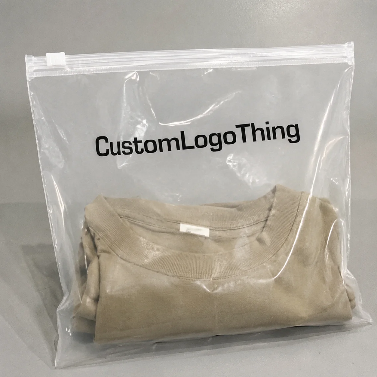
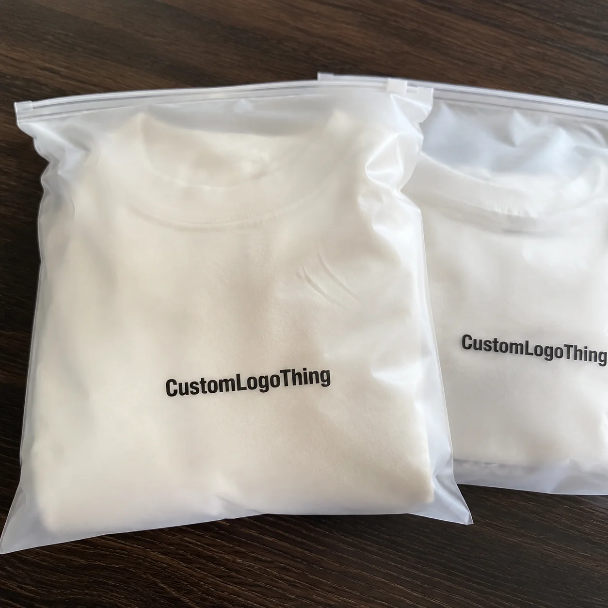
In plain terms, logo packaging is the box, bag, mailer, sleeve, insert, or shipper that carries your brand mark while protecting the product and shaping the customer’s first physical impression. That means logo packaging how to choose is not just about where the logo sits; it is about whether the packaging supports the product, survives transit, and tells the right brand story the moment someone touches it. In practice, that could be a 350gsm SBS carton with matte aqueous coating, a natural kraft mailer with one-color flexo, or a rigid setup box finished with 157gsm coated art paper, foil stamping, and a 2mm EVA insert.
I think a lot of brands get this backward. They start with the logo treatment, then force the packaging around it, instead of starting with the packaging job and letting the logo serve that job. If the package is going to retail shelves in Chicago, ecommerce cartons in Dallas, or subscription fulfillment in Phoenix, the correct answer changes fast. Product Packaging That looks beautiful but crushes in transit is a costly mistake, and branded packaging that saves freight space but looks cheap can hurt repeat purchases just as much. I’ve watched both failures happen, and neither one gets easier to explain to finance when the replacement cost is $4,800 on a 10,000-unit run.
When I visited a cosmetics co-packer outside Chicago, the team showed me two samples with identical artwork: one on a coated folding carton and one on a soft-touch rigid box. The retail buyers picked the rigid box in under ten seconds because the logo felt more deliberate and the lid opening created a slower, more premium reveal. Same logo, different structure, different perceived value. That is the heart of Logo Packaging How to Choose: balancing package branding, protection, and production reality so the box or mailer works in the real world, not just on a render. In that plant, the rigid sample cost $2.18 per unit at 3,000 pieces, while the folding carton came in at $0.41 per unit at 10,000 pieces, which tells you everything about the tradeoff.
There is also an operations side that people underestimate. Choosing the right packaging can affect pack-out speed, return rates, freight costs, and damage claims. In one food brand meeting I sat through in Newark, the marketing team wanted a full-color setup box with a magnetic closure, while the warehouse manager kept pointing out that the line was packing 1,800 units per shift and the closure added 9 seconds per unit. Nine seconds. Per box. That adds 4.5 labor hours on a 1,800-unit day, which is not a rounding error. Logo packaging how to choose is really a branding choice and an operations choice at the same time.
“The prettiest box in the room is not always the best box on the dock.”
How Logo Packaging How to Choose Works in Real Production
When people ask me about logo packaging how to choose, I usually start by walking them through the production flow, because the best decisions happen when you understand what each step can and cannot do. It begins with the dieline, which is the flat template showing folds, glue tabs, cut lines, and panel sizes. From there, structural prototyping confirms whether the product fits, whether the closure is secure, and whether the package opens the way your team expects. Only then do you move into artwork setup, where logo placement, safe zones, bleeds, and barcodes are locked in before proofing. A prototype for a 92mm x 68mm x 140mm serum bottle is not the same as a flat mailer for a 250g apparel kit, and anyone pretending otherwise is selling you a headache.
After proof approval, the order goes into printing and converting. For custom printed boxes, offset printing is usually the choice for crisp detail, tight registration, and fine typography on larger runs. Digital printing works well for shorter quantities or faster sampling, especially when you want to test a new package branding direction without committing to plates. Flexographic printing is common on corrugated mailers and shipper cartons because it handles porous board well and keeps unit cost manageable. Then come finishing steps such as foil stamping, embossing, debossing, matte or gloss coating, spot UV, or soft-touch lamination, each one changing the look and feel in ways buyers notice immediately. For example, foil stamping plates can add $80 to $220 per design, depending on size and complexity, while a soft-touch lamination often adds $0.05 to $0.14 per unit on a 5,000-piece run.
I remember a snack brand in New Jersey that insisted on a deep black logo across a kraft paperboard sleeve. On press, the first proof looked muddy because the brown substrate was pulling down the contrast. We solved it by switching to a white underprint and reducing the coverage area, which cut ink cost and made the logo read much cleaner from four feet away. That is a classic logo packaging how to choose lesson: substrate compatibility matters as much as the artwork itself. The final sleeve used 300gsm kraft board with a 1-color black flexo print, and the white underprint added just enough opacity to keep the logo legible under warehouse lighting.
Common packaging formats each behave differently in production. Folding cartons are efficient, lightweight, and easy to print in volume. Rigid boxes cost more but give you a heavier, gift-like presentation. Corrugated mailers are ideal for ecommerce because they absorb impact and stack well on pallets. Paper bags are useful for boutique retail packaging, while sleeves and inserts can add a branded layer without rebuilding the whole structure. The best choice depends on the product, the sales channel, and the handling conditions. A 200g candle shipped from Portland, Oregon, does not need the same structure as a 1.2kg electronics accessory leaving a warehouse in Shenzhen.
Common formats and where they fit best
- Folding cartons — good for cosmetics, supplements, lightweight consumer goods, and retail shelf display.
- Rigid boxes — strong for luxury, gifting, electronics, and premium branded packaging.
- Corrugated mailers — practical for ecommerce, direct-to-consumer subscriptions, and shipping protection.
- Paper bags — common in boutiques, events, apparel, and takeaway retail packaging.
- Inserts and sleeves — ideal when you need better presentation or product restraint without changing the outer box.
If the package will ship parcel-style, it should be evaluated against drop and compression expectations, and many teams use ISTA 3A or ISTA 1A methods as a reference point for transit testing. For broader material and environmental context, the U.S. EPA has useful packaging and waste reduction resources at epa.gov, and packaging standards organizations like ista.org and fsc.org are worth reviewing if sustainability and shipping performance both matter. FSC-certified paper is widely available from mills in North America and Southeast Asia, and many converters in Vietnam and South China can source it on request.
The last production checkpoint is final quality control, where a line supervisor or QC tech checks print registration, color consistency, die-cut accuracy, glue integrity, and pack-out. I’ve seen beautiful logo packaging fail here because the magnetic closure was off by 2 millimeters and the lid wouldn’t sit flat, or because the spot varnish shifted and created a halo around the logo. Real production has a way of exposing weak decisions quickly. A good QC sheet usually checks four things: color tolerance within Delta E 2.5, die-cut alignment within 1.5mm, glue bond strength, and carton erection speed on the line.
Key Factors in Logo Packaging How to Choose
Logo packaging how to choose becomes much easier once you sort the decision into a few main factors instead of trying to solve everything at once. The first factor is brand positioning. A luxury skincare line usually needs a different material and finish than an industrial tool kit, even if both are sold online. A minimalist brand may use one-color ink on kraft board, while a premium gift brand may prefer rigid chipboard, foil, and a soft-touch wrap. The package branding should match the promise the customer already expects, whether that promise is “practical and affordable” or “expensive and gorgeous.”
The second factor is protection. If the product weighs 180 grams and ships in a retail bag, you have a very different need than a 2.4-kilogram glass jar traveling through parcel networks. Moisture sensitivity, stackability, and crush resistance all matter. For shipping-heavy operations, corrugated board with an E-flute or B-flute profile often gives a better balance of protection and printability than thin paperboard. If the product is fragile, the insert design is as important as the outer box because movement inside the carton causes damage faster than most people realize. A 2mm molded pulp insert can outperform a loose paper tray by a mile when the parcel gets tossed in a warehouse in Atlanta or Louisville.
Budget is the third factor, and this is where people sometimes misread the numbers. A unit price of $0.42 sounds better than $0.58 until you discover the cheaper box needs more void fill, more labor, and creates a 3% higher damage rate. In one supplier negotiation I sat in on in Guangzhou, the buyer kept pushing for a lower print price, but the plant manager showed how a slightly thicker board would reduce returns enough to pay for itself within two months. That’s the kind of math that matters in product packaging. On a 15,000-unit order, saving $0.16 per unit looks nice until $2,250 in replacement and labor costs shows up to ruin the party.
Sustainability is another major filter. Recyclable paperboard, FSC-certified paper, soy-based inks, and reduced plastic inserts are all common goals, but the claim has to match the material. If you are advertising eco-friendly branded packaging, make sure the coating, foil, laminate, or inner tray does not undermine the message. I’ve seen teams spend heavily on green messaging, then choose a non-recyclable film wrap because no one checked the full construction. That always feels a little absurd, like buying a fancy umbrella with holes in it. A water-based aqueous coating on a 350gsm paperboard carton is often easier to defend than a fully laminated structure with mystery plastic.
Customer experience is the last big factor. Some customers want the logo to be bold and immediate. Others prefer a subtle mark that feels restrained and upscale. Finishes change that feeling quickly. Embossing creates a tactile lift, foil catches light, and a matte coating softens the tone. The point of logo packaging how to choose is not to pile on every premium detail you can afford. It is to choose the few cues that reinforce the brand without distracting from it. A 15mm embossed mark on a 120mm lid can feel far more expensive than a full-bleed print that screams for attention.
| Packaging style | Typical use | Approx. unit cost | Key benefit | Main limitation |
|---|---|---|---|---|
| Folding carton | Retail packaging, cosmetics, supplements | $0.18-$0.65/unit at 5,000 pieces | Lightweight and print-friendly | Less crush protection |
| Corrugated mailer | Ecommerce shipping | $0.35-$1.10/unit at 5,000 pieces | Good transit protection | Bulkier than paperboard |
| Rigid box | Luxury and gifting | $1.20-$4.50/unit at 3,000 pieces | Premium feel | Higher setup and material cost |
| Paper bag | Boutiques and events | $0.12-$0.40/unit at 10,000 pieces | Fast handout and brand visibility | Limited structural protection |
If you are shopping for options, the right move is often to compare these formats side by side, then narrow the field based on quantity, shipping method, and the level of polish your buyers expect. The selection process for logo packaging how to choose is rarely about finding the cheapest possible answer. More often, it is about finding the least expensive package that still performs its job without hurting the brand story. A folding carton made from 350gsm C1S artboard can be plenty for a 90g cosmetic jar, while a corrugated mailer is smarter for a 1lb candle that ships from California to Florida.
You can also review our Custom Packaging Products if you want to see how different structures and print styles translate into real packaging choices. I’ve found that once clients can touch samples, the decision usually gets a lot clearer. Humans love arguing from a spreadsheet until they hold the sample in their hands. I have seen a buyer change their mind in under 30 seconds after comparing a 1.2mm rigid sleeve to a 300gsm folded sleeve with the same logo.
Logo Packaging How to Choose Step by Step
Here is the process I recommend when a brand asks me about logo packaging how to choose. Step one is to define the package’s job. Ask what it must protect, how it will be displayed, whether it must ship by parcel, and how the customer should feel when they open it. A box that only sits on a retail shelf has different needs than a carton that must survive a 36-inch drop test. That sounds obvious, but in real meetings it gets skipped more often than you would think. I have sat in conference rooms in Shenzhen and Brooklyn where the artwork was already being approved before anyone measured the product.
Step two is to identify the target customer and sales channel. Ecommerce buyers tend to see packaging in motion: on a porch, at a fulfillment center, or under shipping tape. Retail shoppers see it under overhead lights and compare it against neighboring products in a 10-second glance. Subscription packaging must be easy to open, easy to repack, and pleasant enough to keep the customer engaged. Gifting often justifies more elaborate unboxing, while industrial product packaging needs clarity and efficiency above all else. A mascara kit sold on Amazon does not need the same structure as a corporate gift set handed out in London or Toronto.
Step three is to shortlist structures that fit the dimensions and opening style. If the product is 86 mm wide, 42 mm deep, and 118 mm tall, you should not start with a package that adds 25 mm of dead space on every side. That extra room increases board usage, raises shipping weight, and can make the logo feel disconnected from the product. I’ve seen teams fall in love with a large box because it looked impressive in mockup form, then realize the insert and void fill made the unit cost jump by 22 cents. Every time, someone makes the same face like they’ve just been handed a surprise bill.
Step four is to choose print and finish based on brand goal and budget. Offset printing is excellent for sharp logos, fine gradients, and consistent repeat production. Digital printing gives flexibility for lower quantities and faster iteration. Foil stamping, embossing, and spot UV each create a stronger tactile or visual signal, but they should be used with intention. A clean one-color logo on a well-constructed box can look more polished than a crowded surface with three competing effects. That is one of the biggest truths in packaging design, and it holds whether your run is 2,000 units or 200,000.
Step five is to request samples or prototypes and test them in actual conditions. Open the sample under the lighting your customers will see, not just under a designer’s monitor calibration. Stack three units. Shake them. Fold them. Check whether the logo remains visible after a shipping label is added. Verify the barcode location and make sure the artwork does not interfere with glue flaps, tuck ends, or tear strips. This is where a lot of first-time buyers save themselves from expensive mistakes. A sample approved in a warm office in Los Angeles can fail hard on a cold loading dock in Minneapolis.
A practical decision path
- List the product dimensions, weight, and fragility.
- Write down the sales channel: retail, ecommerce, wholesale, subscription, or gifting.
- Choose the structure first, then the print method.
- Set a target unit cost and a maximum lead time.
- Approve a prototype only after real handling tests.
One of my clearest memories is from a contract packer near Atlanta, where the client insisted on a top-opening rigid box because the logo looked elegant in the mockup. The team tested it on the line and discovered the lid orientation slowed packing by almost 6 seconds per unit. They ended up moving to a sleeve over a folding carton, which preserved the logo impact while keeping throughput where the plant needed it. That is exactly why logo packaging how to choose should always include line testing, not just design review. On a 4,000-unit weekly run, those 6 seconds would have eaten about 6.7 labor hours, which nobody wants to fund.
Cost, Pricing, and Timeline Considerations
Cost drives many packaging decisions, so let’s keep it practical. The main cost drivers are board thickness, print coverage, number of colors, special finishes, custom inserts, and order quantity. A full-wrap, four-color print on coated paperboard will cost more than a single-color logo on kraft stock, and a rigid box with magnet closure will cost more than a plain tuck-top carton. That is not a marketing trick; it is simply how materials and labor add up in a factory. A 1.2mm greyboard setup box wrapped in 157gsm art paper can easily cost 3 to 5 times more than a folded carton using 350gsm C1S artboard.
Short runs usually carry a higher price per unit because setup time gets spread across fewer pieces. Larger runs improve unit pricing, but they also require storage space and stronger demand planning. In one folding carton job I reviewed, the order of 2,500 units came in at $0.61 each, while the 20,000-unit run on the same structure dropped to $0.23 each because the die, plates, and press setup were amortized over a much larger quantity. If you can forecast demand accurately, logo packaging how to choose becomes much easier to budget. I’ve seen a supplier in Ho Chi Minh City quote $0.15 per unit for 5,000 pieces on a simple one-color mailer, then $0.09 per unit at 20,000 pieces. Same structure. Same factory. Volume did the heavy lifting.
Tooling also matters. Custom dielines, cutting dies, embossing plates, and foil dies add upfront expense. Depending on complexity, a new die can add several hundred dollars, and specialty finishing tools add even more. The first order often carries these costs, while repeat orders may only need print and converting charges. That is why buyers should separate one-time setup fees from recurring per-unit cost before comparing quotes. A foil die might be $85 to $160, while a magnetic closure setup can add $0.30 to $0.80 per box depending on size and sourcing.
Timelines are another place where expectations often break down. A simple stock-based printed mailer may move from brief to production faster than a custom rigid setup box. Once you add sampling, artwork revisions, insert design, and freight booking, a complex job can take several weeks from approval to arrival. I usually tell clients to build buffer time for proofing and a second round of samples if the logo placement or structural fit is critical. Rush orders are almost always more expensive, especially if they land in a press schedule that is already full. In many factories, production is typically 12-15 business days from proof approval for a standard printed carton, while rigid boxes or custom inserts can push that to 18-25 business days before freight.
What influences the final price
- Material choice — SBS paperboard, kraft, corrugated, or chipboard all price differently.
- Finish selection — foil, embossing, spot UV, lamination, and soft-touch coating increase cost.
- Quantity — higher volume lowers per-unit pricing, but not always the total spend.
- Structure complexity — inserts, windows, magnets, and custom shapes add labor.
- Logistics — freight, palletization, and storage can change the true landed cost.
Here is the part most teams miss: the cheapest packaging quote is not always the cheapest finished program. If a lower-cost box increases damage by 2% on a 10,000-unit shipment, the replacement cost, customer service time, and lost trust can dwarf the savings. I have seen small brands save 7 cents per box and then spend five times that amount handling returns. Good logo packaging how to choose means thinking beyond the purchase order. A carton that costs $0.31 but adds $0.12 in repack labor is not cheap. It is just disguised.
If you need a working budget range, start with a good, better, best framework. Good might be a standard folding carton with one-color print. Better could add a matte coating or a custom insert. Best might include foil, embossing, or a rigid structure. That tiered view helps a team choose where to spend and where to save without losing the overall package branding. It also gives procurement a cleaner way to compare quotes from suppliers in Qingdao, Mexico City, and North Carolina without pretending every factory spec is interchangeable.
Common Mistakes When Choosing Logo Packaging
The most common mistake I see is choosing a beautiful design that fails shipping tests because the board is too light or the closure is too weak. A package that looks elegant on a design board but crushes in a courier network is not a win. If you are doing ecommerce, the packaging must survive impacts, vibration, and compression, which is why corrugated board and insert design matter so much. Logo packaging how to choose should always begin with the physical reality of handling. A 32 ECT single-wall carton might be fine for local retail delivery, but a parcel route across the U.S. often needs stronger board and a tighter fit.
Another mistake is picking finishes that look stunning on a screen but do not translate well onto the actual substrate. I’ve seen metallic foil look rich on a white coated carton and look muddy on natural kraft because the substrate absorbed too much of the visual contrast. The same is true for soft-touch lamination and heavy coverage. Your printer can guide you, but only if you bring them into the conversation before artwork is finalized. A glossy UV logo on uncoated stock can also look blotchy, which is exactly the kind of surprise that burns production time in a plant in Foshan or Surabaya.
Logo placement errors are also surprisingly common. Sometimes the mark is too low on the panel, sometimes it is buried under other graphics, and sometimes it is oversized to the point that it overwhelms the box. A good logo should have breathing room, a clear visual hierarchy, and enough contrast to read quickly. If a buyer has to hunt for the brand mark, the package is not doing its job. This is a place where package branding should support clarity, not create clutter. I usually want at least 6 to 10 mm of clear space around the logo on small cartons, more on premium rigid boxes.
Lead time problems can hurt launches just as much as design errors. Sampling, revisions, and custom inserts often take longer than teams expect, especially if someone changes copy, barcode placement, or material after proof approval. In one plant I toured in Shenzhen, a delay of only four days in artwork sign-off pushed a client into a higher-cost production window because their press slot moved. That is why I tell teams to treat packaging as a schedule item, not just a design item. If your launch date is June 12 and freight from port to warehouse takes 18 days, your approval needs to happen well before the week you feel “ready.”
Finally, some buyers focus only on unit price and ignore the whole system. A cheap box that slows packing, increases void fill, or raises return rates is not truly cheap. A more durable carton with better inserts and cleaner logo visibility can reduce labor and improve customer experience in ways that justify the extra cents. That is the practical side of logo packaging how to choose, and it is where experienced operations people tend to have the strongest opinions. They are usually right, annoyingly enough.
“If the pack-out team hates it, the packaging is already in trouble.”
Expert Tips and Next Steps for Better Logo Packaging
Start with a packaging brief that includes product dimensions, weight, shipping method, target unit cost, quantity, and sustainability priorities. Add a photo of the product, because a real image often reveals shape issues that a spec sheet misses. If you want logo packaging how to choose to go smoothly, this brief becomes the anchor for every later decision, from structure to print to freight. I have seen clients save days of revision time simply because they sent a clear brief on the first call. One buyer in Austin sent a brief with a 94mm x 94mm x 160mm product photo, and we caught a lid interference issue before the sample stage even started.
Ask for a structure recommendation first, then move into graphics. That order matters because the box has to work before it can look good. Once the structure is right, you can decide whether the logo should be centered, repeated as a pattern, embossed on the lid, or printed as a subtle mark near the flap. I also recommend testing at least two material or finish options side by side. The difference between 350gsm artboard and natural kraft, or between matte coating and soft-touch, can change the entire feel of the product packaging. A sample in South China might show you that a 1-color black logo on kraft looks premium enough without the extra $0.11 per unit for lamination.
Use a real prototype, not just a flat render. A prototype reveals fold memory, scoring quality, logo scale, and how the package reads when stacked on a shelf or packed into a shipping case. Check the barcode, QR code, and any regulatory copy. If your brand is selling through retail packaging channels, make sure the front face is legible from a few feet away and the side panels do not become a cluttered afterthought. Good packaging design always respects the physical object in the hand. A structure that works in a 3D mockup but takes 14 seconds to open on the line is not good design. It is a pretty problem.
My best advice is simple: gather the dimensions, define the budget, request a sample spec sheet, and prepare artwork files before the first supplier call. If you do that, your vendor can focus on matching the right structure and finish rather than spending the first week chasing basics. And if you are comparing suppliers, ask them how they test, what board grades they recommend, and whether they can walk you through expected lead times from proof approval to delivery. The answers will tell you a lot about whether they understand logo packaging how to choose in a real production setting. I also ask where they manufacture. A factory in Dongguan will quote and behave differently than one in Vietnam’s Bình Dương province or one in Mexico’s Monterrey corridor.
At Custom Logo Things, the smartest packaging decisions usually come from a mix of clear goals and honest constraints. That is why I always recommend staying focused on the product, the channel, and the customer’s first physical impression. Logo packaging how to choose is not about making everything flashy. It is about choosing the right style so the logo looks sharp, the product ships safely, and the budget still makes sense. If the final carton lands at $0.27 per unit, fits the item with 3mm of clearance, and survives a 36-inch drop, that is a win worth keeping.
The practical takeaway is pretty simple: choose the structure first, then the logo treatment, then test the sample in the real channel it will face. If it has to ship, make it survive shipping. If it has to sell on a shelf, make the logo read in three seconds or less. If it has to feel premium, use one or two strong finishes instead of piling on everything in the sample room. That order saves money, avoids dumb surprises, and usually gets you a better box the first time around.
logo packaging how to choose for a small business on a budget?
Prioritize one strong structure and one simple print method instead of adding expensive finishes. Choose a stock size close to your product dimensions so you reduce custom tooling and void fill. Kraft or standard paperboard with one- or two-color branding usually keeps costs predictable while still looking polished. A 350gsm kraft tuck box at $0.19 per unit for 5,000 pieces can be enough for candles, soaps, or small accessories.
What is the best material when logo packaging how to choose for shipping?
Corrugated board is usually best for parcel shipping because it absorbs impact better than thin paperboard. E-flute or B-flute can improve protection while keeping the package print-friendly. Match board strength to product weight and drop risk instead of choosing by appearance alone. For a 1.8kg product shipping from Ohio to California, a double-wall corrugated shipper may be smarter than a coated folding carton.
How do I choose logo packaging that looks premium without overspending?
Focus on one premium signal such as embossing, foil, or a soft-touch coating rather than layering every effect. Use restrained logo placement and strong materials to create a high-end look with fewer add-ons. Prototype the package first so you can confirm the visual impact before committing to full production. A 1-color logo on 1.2mm rigid board with a 157gsm wrap can look far more expensive than a full-coverage printed carton with three finishes.
How long does logo packaging how to choose and produce usually take?
Simple stock-based packaging can move quickly, while fully custom structures need time for dielines, proofs, and sampling. Expect extra time if you need inserts, specialty finishes, or multiple artwork revisions. Build in buffer time for freight, approvals, and any changes after prototype review. In many factories, production is typically 12-15 business days from proof approval for standard cartons and 18-25 business days for rigid boxes or custom inserts.
What mistakes should I avoid when choosing logo packaging for ecommerce?
Do not choose a design that looks good but crushes easily in transit. Avoid oversized boxes that increase shipping costs and make products feel loosely packed. Make sure the logo remains visible after labels, tape, and shipping marks are added. A mailer that adds 0.6 inches of dead space on each side can increase freight charges and make the unboxing feel sloppy.