Buyer Fit Snapshot
| Best fit | Logo Placement on Product Boxes projects where brand print, material claims, artwork control, MOQ, and repeat-order consistency need to be specified before quoting. |
|---|---|
| Quote inputs | Share finished size, material target, print colors, finish, packing count, annual reorder estimate, ship-to region, and any compliance wording. |
| Proofing check | Approve dieline scale, logo placement, barcode or warning zones, color tolerance, closure strength, and carton packing before bulk production. |
| Main risk | Vague material claims, crowded artwork, missing packing details, or unclear freight terms can make a low unit price expensive after revisions. |
Fast answer: Logo Placement on Product Boxes: Board, Finish, Dieline, and Unit Cost should be specified like a repeatable production item. The safest quote records material, print method, finish, artwork proof, packing count, and reorder notes in one written spec.
Production checks before approval
Compare the actual filled-product size with the drawing, then confirm tolerance on folds, seals, hang holes, label areas, and retail display edges. Reserve space for logos, QR codes, warning copy, and material claims before decorative graphics fill the panel.
Quote comparison points
Review material grade, print process, finish, sampling route, tooling charges, carton quantity, and freight assumptions side by side. A quote is only useful when the supplier can repeat the same color, closure quality, and packing count on the next order.
The first thing I check on a carton is not the artwork file, it is the panel map. A logo can be beautifully drawn and still miss the mark if logo placement on product boxes runs into a tuck flap, lands too close to a score, or ends up facing a side panel that shoppers barely see. Placement changes how a package reads on shelf, how it photographs, how it feels in hand, and how quickly a buyer understands the brand.
Packaging treats placement as a structural decision as much as a visual one. It includes the location, size, and orientation of the logo across the visible faces, and those choices need to sit beside the box style, the print method, and the journey from warehouse to shelf to unboxing. A strong front panel can do more work than a busy wraparound, and a top panel with the right scale can create a premium first impression that a front-only layout never quite reaches.
That is the real difference between a logo that simply exists on a box and one that helps the box sell. The goal is not to cover every surface with branding. The goal is to choose the strongest panel, protect readability, and make sure logo placement on product boxes supports the product story instead of fighting the structure. For teams comparing cartons, mailers, and rigid packaging, the same thinking applies whether you are ordering simple folding cartons or browsing Custom Packaging Products for a more custom build.
Logo Placement on Product Boxes: Why the Same Logo Can Sell Better in One Spot Than Another
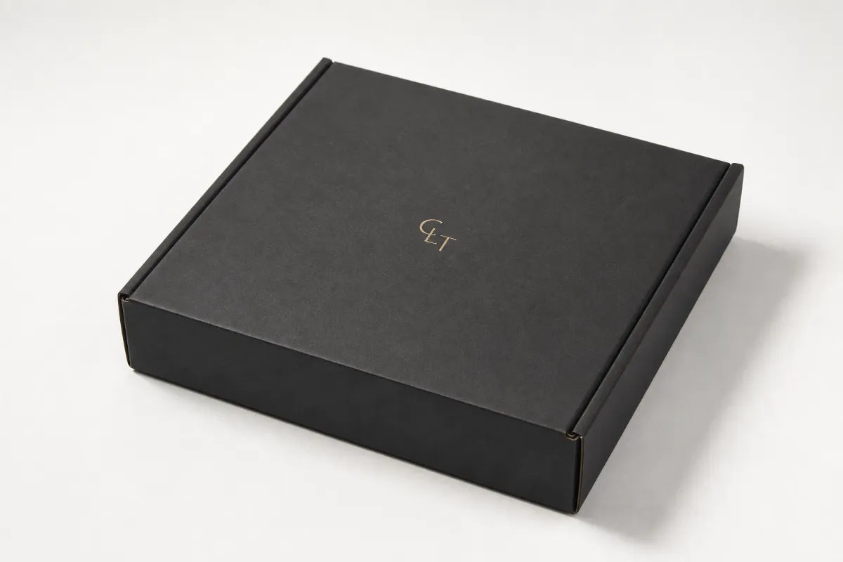
Two boxes can carry the same logo and produce very different results. Put that mark on the front panel of a clean folding carton, and shoppers get it in one glance. Put the same mark across a tuck flap or too close to a fold, and it loses authority before the package even reaches the register. That is why logo placement on product boxes should start with the viewing angle, not with the artwork itself.
From a packaging buyer's point of view, the strongest placement is usually the one that creates instant recognition at the shortest distance. On shelf, that may be the front face. In ecommerce, it may be the top panel because that is what the camera catches first during the unboxing. In a gift set, the lid may carry more emotional weight than the side panel. logo placement on product boxes changes the story each time the structure changes.
There is a psychological layer here that people often overlook. A logo centered cleanly on an uncluttered face reads as confident and organized. A logo forced into a tight corner or broken by a seam reads as an afterthought, even if the artwork itself is beautiful. Good logo placement on product boxes often feels almost invisible because the box seems to have been built around the brand from the start.
I see teams focus heavily on the logo file and miss the panel hierarchy. A carton has a front, a top, a side, and sometimes an interior reveal. Each of those surfaces can do a different job:
- Front panel: strongest for shelf recognition and quick product identification.
- Top panel: strong for mailers, subscription boxes, and premium unboxing.
- Side panel: useful for repeat branding, variant coding, or support marks.
- Back panel: better for ingredients, instructions, or story-driven copy.
- Interior panel: ideal for a surprise reveal, thank-you message, or secondary logo.
The best logo placement on product boxes is the one that fits that hierarchy instead of fighting it. A large retail carton can support more than one branded face, while a small tube-style carton may only have room for one clear hero panel. When the structure gets compact, restraint usually beats decoration. I have watched more than one brand try to cram a logo onto every available face, and the box ended up looking nervous rather than premium.
A logo should sit where the package gives it the most honest real estate, not where there happens to be empty space on the dieline.
That is why the same logo can sell better in one spot than another: the spot itself is doing branding work. In practice, logo placement on product boxes is part graphic design, part structural planning, and part retail strategy. It is also one of the easiest things to get right early and one of the hardest things to fix after printing has started.
How Logo Placement on Product Boxes Works Across Box Styles
Every box style creates a different visual map. A dieline shows the printable panels, the fold lines, the glue tabs, the score marks, and the seams, and that map is where logo placement on product boxes either succeeds or gets complicated. A logo that looks centered in a flat mockup can shift once the carton folds, so the flat artwork must always be checked against the constructed form.
On folding cartons, especially tuck-end styles, the front panel usually carries the primary logo because it faces the shopper directly. On rigid boxes, the lid often becomes the hero surface, which means the top panel may deserve more attention than the front wall. Sleeve packaging gives you a long continuous surface, but it also introduces movement, so logo placement on product boxes must account for the way the sleeve slides over the inner tray.
Mailers and ecommerce cartons tell a different story. Since the first touchpoint may be the shipping-label side, the top panel often becomes the main branding field. For subscription packaging, a top-facing logo can create a better camera angle and a stronger first impression during unboxing than a front-only mark ever could. That is one reason logo placement on product boxes should be planned around how the package will be opened, not just how it sits on a counter.
Production realities change the final position as well. Keep critical art away from the trim line, leave enough space from the score, and give the converter room for registration tolerance. A practical rule is to keep essential type at least 1/8 inch, or about 3 mm, inside the safe zone, and farther if the box has strong board memory or heavy finishing. When the logo sits too close to a fold, even a slight shift can make logo placement on product boxes look off-center after assembly.
Bleed matters too. If artwork is meant to extend to the edge, allow proper bleed so the background prints past the trim instead of stopping short. Finishes add another layer: foil, embossing, spot UV, matte laminate, and soft-touch coating all alter how the mark reads. A glossy foil logo can become too reflective under store lights, while a detailed logo on textured kraft can lose crispness if the strokes are too thin. That is why the best logo placement on product boxes is always decided with the print method in mind.
For teams comparing structures, it helps to think in terms of viewing priority rather than decoration. A front panel may be best for a retail SKU, while a top panel may be best for a premium direct-to-consumer kit. If the box is part of a larger line, side-panel branding can create continuity without crowding the main face. That is the practical side of logo placement on product boxes: the structure decides where the eye naturally goes first.
Key Factors That Shape Visibility, Brand Impact, and Readability
Box size is the first thing to check. A small cosmetic carton, a mid-size supplement box, and a large retail mailer do not give the logo the same breathing room, and logo placement on product boxes has to respect those proportions. On a tiny carton, a wide wordmark can feel crowded in seconds. On a large carton, the same wordmark can look timid if it is scaled too small for the panel.
Viewing distance matters just as much. Retail shoppers may see the box from several feet away on a shelf, while ecommerce buyers may first see it in a product listing image or a handheld unboxing video. That changes how large the mark needs to be and whether the placement should feel bold or understated. Good logo placement on product boxes gives the eye one clear focal point before the rest of the information begins to compete.
Typography and logo complexity deserve a hard look. Thin serif lines, delicate scripts, and fine internal details can disappear on textured board or under a soft-touch laminate. If the artwork is intricate, the logo often needs more contrast, more white space, or a larger footprint than the brand deck suggests. For logo placement on product boxes, simplicity often prints better than a crowded mark with too much micro-detail.
Material choice also changes the result. Kraft board creates a natural, earthy feel, but dark logos may need stronger ink density to hold up. C1S and SBS boards give a cleaner print surface and are common on retail cartons because they carry sharper detail. Soft-touch lamination makes a package feel premium, yet it can mute contrast slightly. Spot UV, foil stamping, and embossing each pull the logo into attention in a different way, which means logo placement on product boxes should be coordinated with the finish rather than treated as a separate decision.
Brand hierarchy is the last major filter. Sometimes the logo should lead the entire package. Other times the product name, flavor, variant, or claim needs to carry more visual weight. In those cases, the logo can move to the top edge, the lower corner, or the side panel without losing identity. The key is to decide what the package should say first. That is the real strategy behind logo placement on product boxes: not every panel needs to shout at the same volume.
There is also a sustainability angle that buyers increasingly ask about. If your packaging program needs FSC-certified board, start by checking the paper source and the chain-of-custody requirements through FSC-certified paperboard resources. For shipping-heavy cartons, transit performance should be considered too. A package that looks good on shelf but fails in distribution costs more in returns and replacements than it saves in print savings, and standards from ISTA packaging test standards are a practical place to begin. Those checks do not replace design judgment, but they do support smarter logo placement on product boxes because a mark is only useful if the box survives the trip and still looks clean at delivery.
From a buyer's point of view, the best packages feel easy to understand. The logo appears where it should, the product name reads fast, and the finish supports the material instead of fighting it. If the package is doing all three, logo placement on product boxes is probably doing its job.
Logo Placement on Product Boxes: Process, Timeline, and Production Steps
The cleanest way to handle logo placement on product boxes is to treat it as part of the packaging workflow from the start. The brief should define the product size, the box style, the sales channel, the needed compliance copy, and the brand rules before anyone starts positioning artwork. Once those basics are clear, the dieline can be reviewed with purpose instead of guesswork.
The first pass usually happens on a flat layout. That is where the designer checks how much room the panel really offers, whether the logo needs to move away from a flap, and whether the side panel should carry supporting branding. A strong proof stage will show all visible surfaces, because logo placement on product boxes cannot be approved properly if the team only sees the front panel.
Revision cycles are normal. A client may ask for the logo to be reduced by 10 percent, shifted upward to clear the score line, or repeated on the side panel for retail visibility. That is not a setback; it is part of building a package That Actually Works. The same applies if embossing or foil is added later, since those effects can force small adjustments to keep logo placement on product boxes balanced and readable.
A practical timeline often looks like this:
- Brief and dimension review.
- Dieline setup and logo placement.
- Digital proof or layout approval.
- Sample or mockup review if needed.
- Print setup, finishing, and converting.
- Final packing and shipment.
Depending on complexity, simple carton orders may move through proof approval to production in about 10-14 business days, while heavier finishing or structural changes can stretch that longer. Special colors, foil, embossing, and multi-panel layouts often add extra proofing time. The important point is that logo placement on product boxes should be locked before the job enters print setup, because late changes can add cost and push delivery back. That part is boring, sure, but it saves real money.
If the package is meant for ecommerce, request a physical sample or a high-fidelity mockup whenever possible. A screen proof can hide panel relationships that become obvious once the carton is folded. This matters more than people think, because logo placement on product boxes may look perfectly centered online and still appear too high, too small, or too close to the seam once the actual box is assembled.
One small habit saves a lot of rework: print the layout, cut it out, and fold it by hand before approving the final file. That simple check reveals whether the logo reads from the front, whether the top panel feels crowded, and whether the side panel should be quieter. In production, those minutes are cheap. After the press has run, they are not. That is why disciplined logo placement on product boxes planning pays off long before the cartons hit the line.
Cost and Pricing Factors for Logo Placement on Product Boxes
Placement itself is usually not a separate charge, but it can influence cost through print coverage, finishing choices, and the amount of proofing the job requires. A simple, one-panel logo can be economical, while logo placement on product boxes that wraps several faces may call for more setup time and tighter registration control. The shape of the artwork matters almost as much as the location.
For a plain folding carton run of 5,000 units, a straightforward print layout might land around $0.18-$0.28 per box, depending on board grade, number of colors, and region. Add foil, embossing, or spot UV, and the price can climb into the $0.30-$0.55 range or higher. That is not because logo placement on product boxes is inherently expensive; it is because special effects and extra passes add labor, tooling, and quality checks. Exact numbers still vary by converter, so any quote should be read as a starting point rather than a promise.
MOQ plays a big role too. Lower quantities almost always carry higher per-unit costs because setup is spread across fewer pieces. A 1,000-piece run may feel very different from a 10,000-piece run if you are using the same carton style, the same board, and the same print finish. If you are comparing options, ask whether the quoted number includes structural setup, plate charges, finishing, and sample costs, because those details shape the real price of logo placement on product boxes.
| Placement option | Best fit | Typical cost effect | Design risk |
|---|---|---|---|
| Front panel only | Retail shelves, clean brand-first cartons | Usually baseline cost; least extra setup | Low, if the panel has enough space |
| Top panel only | Mailers, premium unboxing, gift packaging | Usually no major change unless finishing is added | Low to moderate, depending on opening style |
| Side panel branding | Supporting marks, repeats, variant systems | Can add $0.01-$0.04 per unit if artwork coverage expands | Moderate, because side visibility varies |
| Wraparound or multi-panel | Luxury sleeves, strong visual identity systems | Can add $0.03-$0.10 per unit with extra registration and finishing | Higher, because folds and seams must be managed |
There is a useful cost tradeoff here. A cleaner placement on one panel can sometimes reduce waste and simplify production, while a logo that spans multiple faces may require more careful alignment and higher inspection time. If the budget is tight, logo placement on product boxes can be optimized by reducing print complexity rather than cutting the brand mark down until it becomes ineffective.
Another factor is the number of brand colors. A single-color black mark on kraft board can be economical and elegant. Full-color art, metallic ink, or a PMS match may increase cost, especially if the box style needs more than one side printed. A clear quote should separate structure, printing, finishing, and sample charges so the team can compare options without guessing where the money is going. That level of visibility makes logo placement on product boxes easier to approve because the design choice and the cost choice are visible at the same time.
If you are weighing packaging programs, it can help to compare a few carton builds inside Custom Packaging Products and see how much the structure changes the branding space. Sometimes the smarter move is not a bigger logo, but a better box style that lets the logo breathe.
Common Mistakes to Avoid When Setting Logo Placement on Product Boxes
The most common mistake is placing the logo across a seam, fold, or tuck flap. It may look centered on a flat file, but once the carton is assembled the mark can split visually or disappear at the edge of the flap. That is one of the fastest ways to weaken logo placement on product boxes, because the package starts with a structural conflict instead of a visual flow.
Another common error is designing only for the flat spread and not checking the constructed box from multiple angles. A carton sits differently on shelf than it does on a proof screen. The front may look balanced, but the top could feel empty and the side could show too much or too little. Good logo placement on product boxes respects the real object, not just the artwork file.
Oversizing the logo is just as risky as undersizing it. A giant mark can crowd out product name, claims, or compliance copy, especially on narrow cartons. A tiny mark may feel polished in theory, but if no one can read it from arm's length, the package has failed its basic branding job. In practice, logo placement on product boxes works best when the logo is large enough to recognize instantly and restrained enough to leave room for the rest of the message.
Finish compatibility gets overlooked more often than it should. On kraft stock, a very light logo may not hold enough contrast. On metallic foil stock, a shiny logo may bounce too much light in-store. On soft-touch laminate, subtle strokes can lose their crisp edge. If the finish does not support the art, the logo can look dull or harsh no matter how well it was positioned. That is why logo placement on product boxes should always be reviewed together with the surface treatment.
Skipping a sample is another expensive habit. Digital proofs are useful, but they do not fully show how the folded carton will behave in hand, how the panel angles look under retail lighting, or how the logo sits once the box is closed. A physical sample catches those issues early, especially if the package uses foil, embossing, or a specialty coating. I would rather adjust logo placement on product boxes once on a sample than discover a problem after a full run is packed and ready to ship.
There is also a category-specific mistake that shows up in subscription and gift packaging: trying to make every face equally loud. That usually creates visual noise. A better approach is to assign one hero surface and let the other panels support it. The package feels more deliberate, the brand reads faster, and the customer experience improves without adding more ink or embellishment. That is the quiet strength of logo placement on product boxes done with discipline.
Expert Tips and Next Steps for Better Logo Placement on Product Boxes
My first recommendation is simple: choose the customer-facing panel before you design anything else. If the front face is the best shelf read, build around it. If the top panel is the most visible surface during unboxing, let that panel carry the first impression. Strong logo placement on product boxes starts with the real viewing order, not with a default assumption that the front panel always wins.
Leave quiet space around the logo. That does not mean empty or boring; it means the mark has room to breathe in photos, on screens, and under bright warehouse or retail lighting. A logo surrounded by too many borders, claims, icons, or decorative lines can feel cramped very quickly. For many brands, the best logo placement on product boxes is actually the one that looks a little calmer than the first draft suggested.
Use secondary branding where it helps, not where it overwhelms. Side panels can carry repeats, a short URL, a small icon, or a certification mark. Interior panels can carry a thank-you message or a hidden print treatment. That gives the box more personality without stealing attention from the main face. It also keeps logo placement on product boxes from turning into a clutter problem, which is a common trap when several departments all ask for more space.
If the package will use embossing, foil, or spot UV, review the layout on a printed mockup before you lock the final version. Those effects change where the eye goes first, and they can make a modest logo feel much stronger than expected. They can also expose alignment problems that a flat screen proof hides. A mockup is not a luxury item here; it is one of the best tools for judging logo placement on product boxes with real light and real structure.
Here is a practical checklist I would use before production:
- Confirm the box dimensions and dieline.
- Mark the primary viewing panel.
- Keep the logo outside folds, seams, and flaps.
- Check the safe zone and bleed.
- Review the finish beside the logo color.
- Approve a digital proof or physical sample.
If your team is still weighing options, compare a few package styles inside Custom Packaging Products and see how the structure changes the branding space. That side-by-side view usually makes the answer clearer than a mockup alone. The right structure can simplify logo placement on product boxes more than any amount of resizing or rearranging.
The takeaway is practical: decide the panel hierarchy first, then size the logo for that panel, then test the result in a real fold-and-close sample before production. If the logo reads fast, stays clear of seams, and still looks good under the finish you chose, logo placement on product boxes is doing exactly what it should do.
What is the best logo placement on product boxes for retail shelves?
The best placement is usually on the panel shoppers see first from arm's length, which is often the front face for folding cartons and the top panel for mailers or premium gift boxes. Keep the logo clear of folds, flaps, and dense copy so it stays readable in one quick glance. If the box is displayed vertically or hung, test the viewing angle before finalizing logo placement on product boxes.
How big should a logo be on a product box?
Size depends on the box dimensions, the viewing distance, and how much other information shares the panel. A logo should be large enough to read instantly, but still leave room for product name, claims, and compliance text if needed. A proof on the actual dieline is the safest way to judge scale before production, especially for logo placement on product boxes with narrow panels.
Does logo placement on product boxes affect printing cost?
Yes, it can affect cost if the placement requires extra print coverage, specialty finishes, or more complex setup. A logo that spans multiple panels or uses foil, embossing, or spot UV may increase production complexity. Asking for a detailed quote helps separate placement choices from structural and finishing costs, which makes logo placement on product boxes easier to compare fairly.
Should the logo go on the front, top, or side of a box?
Put the logo where the customer first sees it, which is often the front panel for shelf display and the top panel for mailers and premium unboxing. Use side panels for supporting brand marks or repeat logos when the front face needs to stay clean. The right answer depends on the box style and the product's main sales channel, so logo placement on product boxes should follow the package behavior, not a fixed rule.
What is the safest way to approve logo placement before production?
Review the artwork on a dieline and confirm the logo sits inside the safe zone with enough clearance from folds and seams. Request a digital proof or physical sample so you can see the real panel orientation and finish effects. Check the package under the same conditions your customer will see it, including store lighting or unboxing camera angles, because that is where logo placement on product boxes proves itself.


