Buyer Fit Snapshot
| Best fit | Mailing Bags Design Orders Feel Premium projects where brand print, material claims, artwork control, MOQ, and repeat-order consistency need to be specified before quoting. |
|---|---|
| Quote inputs | Share finished size, material target, print colors, finish, packing count, annual reorder estimate, ship-to region, and any compliance wording. |
| Proofing check | Approve dieline scale, logo placement, barcode or warning zones, color tolerance, closure strength, and carton packing before bulk production. |
| Main risk | Vague material claims, crowded artwork, missing packing details, or unclear freight terms can make a low unit price expensive after revisions. |
Fast answer: Mailing Bags Design Orders Feel Premium: Film, Print, MOQ, and Carton Packing should be specified like a repeatable production item. The safest quote records material, print method, finish, artwork proof, packing count, and reorder notes in one written spec.
Production checks before approval
Compare the actual filled-product size with the drawing, then confirm tolerance on folds, seals, hang holes, label areas, and retail display edges. Reserve space for logos, QR codes, warning copy, and material claims before decorative graphics fill the panel.
Quote comparison points
Review material grade, print process, finish, sampling route, tooling charges, carton quantity, and freight assumptions side by side. A quote is only useful when the supplier can repeat the same color, closure quality, and packing count on the next order.
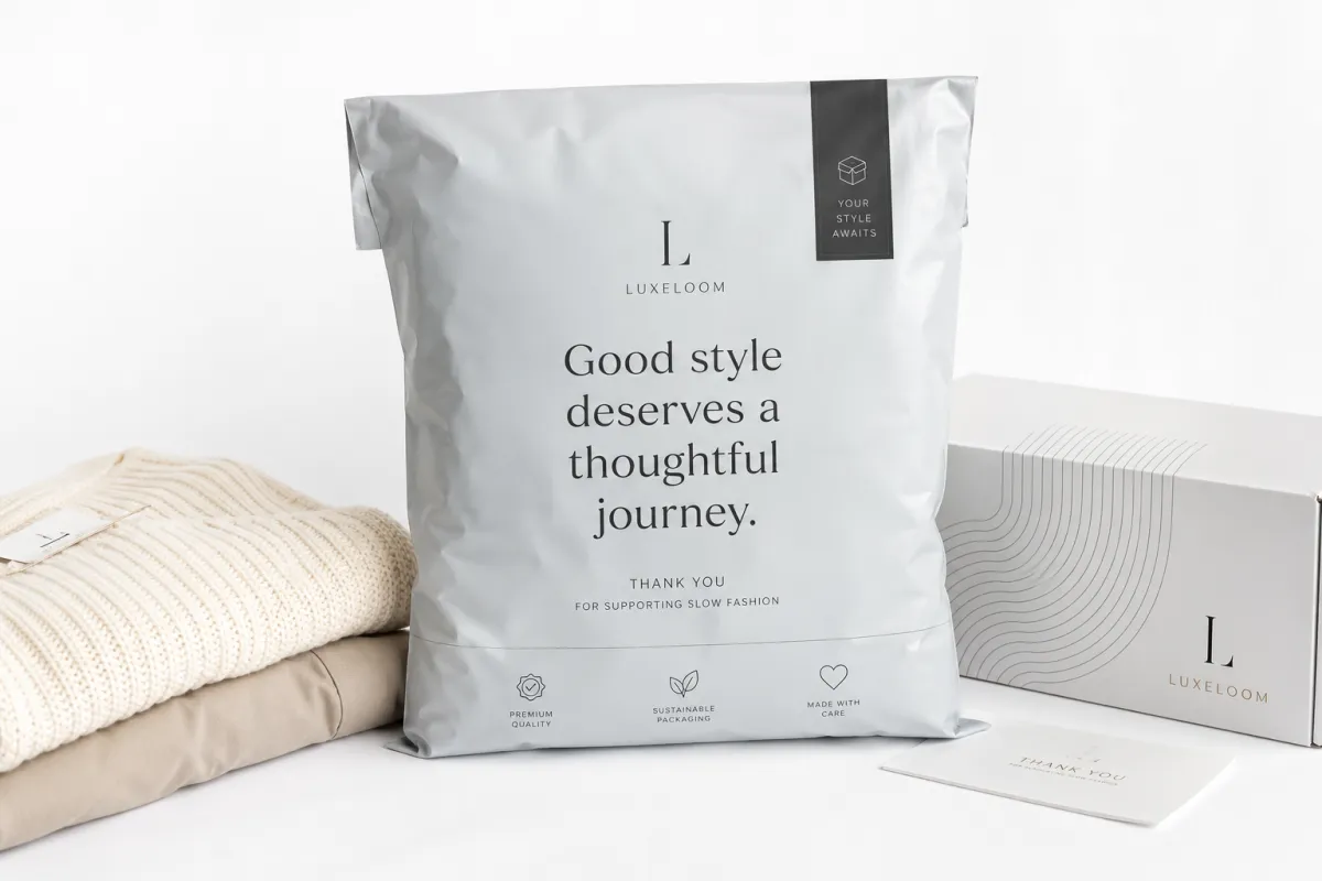
I have seen a $0.02 print tweak change how a mailer feels before the customer even tears it open, and that is why mailing Bags Design Tips matter more than most brands admit. Move a logo 18 mm, swap flat black for deep charcoal, or choose matte instead of gloss, and the same bag can stop reading as a throwaway sack and start looking like a $3.00 brand experience. That is not magic. It is packaging psychology, factory limits, and a little production discipline pulling in the same direction. Honestly, I think that is the part people underestimate because it looks so boring on paper, which is exactly where the trouble starts.
If you sell apparel, accessories, beauty products, or subscription boxes, the mailing bag is usually the first physical object your customer touches. I have watched buyers at a Shenzhen press check compare two versions of the same poly mailer, rub the film with a thumb, and choose the one that looked calmer, cleaner, and more expensive. Nobody said, "What a thrilling seam allowance." They just trusted the better-looking bag faster. That is the point of mailing Bags Design Tips: make the shipping mailer work harder for your brand without blowing the budget or creating production headaches. And yes, I know "work harder" sounds slightly dramatic for a plastic bag, but branding is full of dramatic little truths.
These mailing bags design tips cover branding, protection, cost, and the dull but decisive limits of printing equipment. I will walk through where design choices affect fit, how color and finish change perceived value, and why a polished mockup on a laptop can fall apart once it meets real film, real ink, and a real sealing machine. If you need a starting point for formats and sizes, our Custom Poly Mailers page is the closest match to the kind of bag I am talking about here. I wish I could say the process is always elegant. It is not. Sometimes it is one printer, two proofs, and three people insisting a purple looks "basically black" at 9:15 a.m. in a conference room in Dongguan.
Mailing Bags Design Tips: Why Small Changes Sell More
Here is the blunt version: mailing bags design tips are not about making a bag "pretty." They are about making a customer feel that your brand has standards. I learned that the hard way on a press check for a subscription apparel client where the bag looked fine on screen, but the first physical sample felt flat because the logo sat too low and the white border around it was 7 mm wider than planned. We moved the mark up by 14 mm, tightened the copy block, and the bag stopped looking accidental. It looked intentional. The buyer did not ask for a cheaper price. She asked for a larger order of 8,000 pieces. I still remember the supplier in Dongguan exhaling like we had just saved him from a week of back-and-forth emails and one very avoidable rerun.
That is the part most people miss. A mailing bag gets thrown away, yes, but the impression lasts longer than the plastic. A clean front panel becomes part of the unboxing moment, and the unboxing moment becomes part of repeat recognition. I have seen customers reuse branded poly mailers for returns, gifting, and storage, which means your design keeps working after the original shipment is gone. Good mailing bags design tips treat the bag like a tiny billboard with a three-second attention span. Three seconds. That is barely enough time to decide if something feels premium, let alone explain a product story. So the bag has to do its job quickly, like an employee who knows there is coffee waiting in the break room at 8:30 a.m.
"We changed one print color and the return rate on customer complaints dropped because the package finally looked like the price we charged." That was a beauty brand founder talking to me in a meeting in Guangzhou, and he was right.
There is also a practical side to all of this. If your brand sells a $42 hoodie, a cheap-looking bag makes the price feel harder to justify. If you sell a $14 accessory, the right packaging can raise perceived value without adding much to the unit cost. That is why I keep repeating mailing bags design tips instead of just "brand design." The shipping bag sits at the intersection of brand promise and logistics reality, and the best version is usually the one that looks premium, ships safely, and does not make your operations team want to quit. I have watched operations teams face a bad dieline the way most people face a dentist appointment: nobody is thrilled, everyone is hoping for novocaine, and all of them want it over quickly.
When I visited a factory in Dongguan, the press operator showed me two runs for the same client. One had a dense all-over pattern, three ink colors, and tiny legal copy near the seal. The other used one bold logo, a simple icon, and 30 percent more empty space. Guess which one passed inspection faster? The cleaner one. The operator did not need to chase color registration across every corner of the bag, and the client got a look that felt more premium with less ink. That is one of my favorite mailing bags design tips: less clutter often reads as more expensive, not less. And no, it is not just aesthetic snobbery. It is the machine telling you what it can tolerate without sighing through the shift.
How do mailing bags design tips shape print, fit, and finish?
The design file is only the beginning. Real mailing bags design tips start with how artwork fits the bag panel, where the seal line lands, and which zones are unsafe for logos or text. A good dieline should show bleed, trim, the side gusset if there is one, and the seam-safe area near the closure. If your logo sits too close to the side seal, the printer can place it there, but the folded edge may eat the artwork and make the whole job look sloppy. A clean layout solves that before the first plate is made. I have seen perfectly fine brand marks destroyed by a fold line, and there is something deeply irritating about losing a design to 12 mm of bad planning.
Material choice changes the design outcome more than most buyers expect. Stock poly mailers are usually faster and cheaper, while custom-printed mailers give you control over color, placement, and branding. Co-extruded films, especially multi-layer PE films around 1.75 mil to 2.5 mil, can improve tear resistance and opacity, which matters if you do not want the contents showing through under warehouse lights. I have seen beauty brands choose a slightly thicker film because their pale pink mailer looked washed out at 1.5 mil. The bag was still light enough for parcel shipping, but it finally matched the product story. That kind of mismatch drives me a little crazy because it is so avoidable. One sample is all it takes to notice that the "soft blush" you loved on the monitor turns into "sad grocery sack" in the real world.
Print method matters too. Flexographic printing is usually the workhorse for larger runs, because plate costs make more sense once you are ordering thousands of units. Digital printing can fit shorter runs or fast artwork changes, but the color range, texture, and cost per bag all shift differently. In one client meeting, I had to explain why a 4-color design that looked gorgeous in a mockup would cost more than a 2-color version with the same visual impact. The client was not thrilled for about 90 seconds, then he saw the sample and understood the tradeoff. That is another reason mailing bags design tips need to be grounded in production, not just aesthetics. My honest opinion? If a design only survives in a perfect mockup, it is not a real design yet. It is a wish.
Finish changes the mood. A glossy mailer throws more light and can feel louder on a shelf or in a fulfillment stack, while a matte surface usually feels calmer and more premium. Frosted films are a different animal; they can soften visual noise and hide scuffs better, but they are not a cure-all. Closure style matters too. A peel-and-seal flap with a wider adhesive strip gives a cleaner opening experience than a flimsy closure that curls in transit. Good mailing bags design tips account for all of that at once, because the design does not live on the artboard. It lives on the bag, the seal, and the shipping line. I have had a perfectly lovely bag ruined by an adhesive flap that felt like a sticky note with commitment issues.
- Bleed: usually 3 to 5 mm, depending on supplier specs and print method.
- Safe zone: keep key text at least 8 to 10 mm away from seams and fold lines.
- Thickness: 1.75 mil works for light apparel; 2.5 mil or more is safer for heavier items.
- Finish: matte for a softer look, glossy for stronger color pop, frosted for a muted premium feel.
Before a factory commits to plates or print settings, it should send a proof that reflects actual size, actual seal placement, and the exact artwork scale. A monitor proof can hide problems such as stretched logos or text that is too close to the right edge. I always tell clients to check the proof the way a warehouse worker would: upside down, in bad light, and with shipping labels already on the mind. That sounds silly until a barcode lands on top of a logo because nobody marked the label zone. Mailing bags design tips are mostly about preventing that kind of expensive silliness. Cheap mistakes are only cheap until the reorder lands on the finance desk.
Key Factors That Shape Mailing Bag Design Decisions
Your brand identity should drive the design, not the other way around. If your visual system uses a sharp serif logo, thin linework, and a strict two-color palette, do not cram it into a loud bag covered in four gradients and a giant QR code. That is how brands lose coherence. Strong mailing bags design tips keep the logo readable at arm's length, use type that survives printing on film, and choose colors that still look deliberate after the bag has been folded, stacked, and rubbed against other parcels in a fulfillment center in Ningbo. A mailer can be simple and still feel expensive. A messy one usually just feels confused. Honestly, confusion is expensive in packaging. You pay for it in reprints, headaches, and awkward conversations with suppliers who would rather have been anywhere else.
Size matters more than most people think. A bag that fits a medium sweatshirt with only 15 to 20 mm of extra space on each side will look tighter and more controlled than a bag that could swallow the garment and two spare socks. Oversized packaging makes the contents look cheap, and underfilled packaging makes the mailer sag or crease in transit. I have had clients bring me products that measured 280 mm x 220 mm x 40 mm and ask for a "standard" bag, which is exactly how people end up with folds in the logo or pressure on the adhesive strip. Good mailing bags design tips always start with the actual product dimensions. Not the imagined dimensions. Not the "roughly" dimensions. The actual ones, preferably measured twice so nobody can blame the tape measure later.
Durability is not optional. If you ship jewelry boxes with corners, skincare bundles with glass, or folded apparel with hang tags, film thickness and puncture resistance need attention. ASTM D882 tensile data can help compare film strength, and ISTA 3A testing is useful if you want to know how a package behaves after drops, vibration, and handling abuse. I am not pretending every small brand needs a lab report on day one, but if your product breaks a bag during a 1.2 meter drop test, the customer will not care that the print looked nice. For testing references, I keep the ISTA test standards in my notes, because guessing is not a shipping strategy. It also tends to be expensive guessing, which is the worst kind.
Logistics details also shape the artwork. If the carrier label goes on the front, leave a clean label panel with no dark art behind it. If you use barcodes, make sure the contrast is high enough for scanners and that the background does not make the code noisy. Some brands add the return address, but I prefer to keep that small and tidy unless the postal route requires more. And if you are making any environmental claim, be careful. I have seen too many brands overstate recyclability on plastic mailers because somebody assumed curbside rules were universal. They are not. The U.S. EPA has useful recycling guidance, and it is worth checking before you print claims you cannot defend. This is one of those places where a little skepticism saves you from a very public correction later.
Finish choices affect both cost and shelf appeal. Matte can hide fingerprinting and scuffs, while glossy can make colors feel more saturated. Metallic ink can look expensive, but it can also push your budget higher if the design relies on large coverage areas. A frosted bag can soften the look of a bold logo, but it may also mute contrast if your typography is too thin. One client tried to use a pale gray logo on a translucent bag and then wondered why the print disappeared in warehouse lighting in Guangzhou at 7 p.m. That is the kind of issue mailing bags design tips are supposed to catch before anyone approves the job. A supplier can only say "we warned you" so many times before it starts sounding like a family motto.
For brands working with paper-based mailers or fiber-rich alternatives, the certification side matters too. If you are making sustainability claims, check chain-of-custody details and material sourcing. I often point teams to FSC certification resources so their marketing copy does not outrun the paperwork. If the project needs insert cards or thank-you slips, 350gsm C1S artboard is a common choice for a rigid feel, while 300gsm uncoated stock works better for handwriting and stamps. The packaging industry loves a good claim, but the audit trail is where the story either holds up or falls apart. I have seen this go wrong in the funniest possible way: a very serious meeting, a very expensive sample, and one tiny line in the copy deck that had to be deleted because nobody knew what it actually meant. That sentence cost more than the bag did.
Mailing Bags Design Tips for Cost and Pricing
Cost is where fantasy meets the invoice. The cleanest mailing bags design tips often save money because they reduce setup steps, simplify registration, and keep ink coverage under control. A basic custom poly mailer run might include a $80 to $150 setup fee, plate charges in the $120 to $300 range depending on colors and size, and a unit price anywhere from about $0.14 to $0.38 for larger volumes. At 5,000 pieces, a one-color 250 mm x 350 mm mailer can land near $0.15 per unit from a plant in Dongguan or Foshan if the artwork is simple and the film is standard 2.0 mil PE. That spread is normal. A bag with one or two colors on a standard size is cheaper than a full-coverage design with special inks, custom sizing, and a premium finish. Manufacturing is not a charity, and nobody in the plant is doing magic for free. I know that sounds harsh, but it is better than pretending complex artwork comes with no consequences.
Here is where I see brands overspend: they treat every surface like a billboard. The result is often loud, expensive, and less memorable than a cleaner bag with one sharp logo and one confident accent color. One of my best mailing bags design tips is to stop adding elements every time the design feels "empty." Empty space is not wasted space. It gives your logo air, helps the eye land on the brand mark, and lowers the chances that print defects will ruin the whole run. If you need a premium cue, consider one accent ink, a stronger type hierarchy, or a cleaner matte finish before you reach for five colors and a metallic flood. There is a reason luxury packaging often looks restrained: restraint reads as control, and control reads as value.
| Option | Typical Unit Cost | Best For | Design Impact |
|---|---|---|---|
| Stock plain mailer | $0.06-$0.12 | Testing, temporary promos, low-budget fulfillment | No brand presence, lowest control |
| One-color custom print | $0.14-$0.22 | Apparel, accessories, small brands scaling up | Clean look, lower setup cost, strong readability |
| Two- to four-color custom print | $0.20-$0.38 | Beauty, subscription kits, premium retail brands | More visual control, higher setup and registration risk |
| Special finish or custom film | $0.30-$0.55 | Launches, gift programs, high-margin products | Premium feel, higher minimums, more production variables |
Minimum order quantity changes the math fast. A run of 5,000 pieces can make a custom bag affordable, while 1,000 pieces may carry a unit price that makes your finance team glare at you across the meeting table. I have negotiated with suppliers in Shenzhen and Xiamen who would happily bring a unit from $0.28 to $0.23 if we simplified the artwork from three colors to two and kept the size within their standard toolset. That $0.05 delta does not sound dramatic until you multiply it by 20,000 bags. Then it becomes a very real $1,000, which buys a lot of shipping labels, coffee, or one expensive mistake you no longer need to make. Personally, I would rather spend that thousand on better sampling than on extra decoration nobody notices.
Another thing people miss is waste. Complex art can create longer press setup, more test sheets, and more rejected samples. Fewer colors usually mean faster registration and fewer chances for the logo to drift. If your brand can live with a cleaner layout, the supplier can often keep the line moving and cut hidden costs. I have seen mailing bags design tips reduce not just the printed price but the overall landed cost because the artwork fit the machine cleanly. Design is not separate from operations. It is part of operations. And if operations sounds unglamorous, well, so is paying for 600 rejected bags because one ink shift went sideways in a factory just outside Guangzhou.
My practical rule is simple: design the bag to sell the product, not to win a trophy for the most expensive print. If the packaging adds $0.18 to a $60 order and makes the brand feel more credible, that is one thing. If it adds $0.22 and no customer notices, you have bought decoration instead of value. The best mailing bags design tips keep the bag in the right lane: enough polish to support the offer, enough restraint to keep margins healthy. That balance is where good packaging quietly makes money, which is a much better feeling than explaining a beautiful but useless line item to the founder.
Step-by-Step Mailing Bags Design Process and Timeline
The fastest way to create a clean result is to start with a real brief. Before anyone opens Illustrator, I want product size, brand assets, target quantity, shipping method, and budget on one page. That sounds basic, but it saves days. Good mailing bags design tips do not begin with decoration; they begin with logistics. If the product is 310 mm long and the bag you want is only 300 mm deep, the rest of the conversation is pretend. Start with facts, then build the artwork around them. If that sounds a little unromantic, fine. Packaging is allowed to be unromantic as long as it gets the job done.
From there, the timeline usually runs like this: concept, dieline setup, digital proof, physical sample, revision, and production. A digital proof can come back in 1 to 3 business days if the file is clean, but a physical sample often adds 5 to 10 business days depending on the factory and print method. Final production for a standard custom poly mailer run is often 12 to 15 business days after proof approval, though I have seen rush jobs move faster when the supplier had film in stock and the plate room in Foshan was not backed up. These mailing bags design tips are useful precisely because the schedule is not always forgiving. A missed proof window has a way of becoming everybody's problem, which is a charming little industry ritual nobody asked for.
Proof review is where expensive mistakes get caught, if people actually review the proof. Check the logo placement, the bleed, the seam-safe zones, the label area, and any copy that could become a legal or branding issue. Confirm the colors against a real sample, not a monitor that has been sitting in warm office light for six months and pretending to be accurate. In one client meeting, someone approved a mockup with a promotional phrase that was 11 mm too close to the edge, and the print house caught it just in time. That is the kind of save that makes a supplier look "fussy" until the customer avoids a scrap pile. I would take a fussy supplier over a careless reprint every single time.
Delays usually happen for boring reasons. Artwork arrives late. Dielines are missing. Someone changes the logo after proof approval. Three people sign off on one file and none of them checks the return address panel. I have had brands bounce revisions back and forth for nine days because the legal disclaimer changed by two words. Two words. Not two paragraphs. If you want mailing bags design tips that save time, keep the decision-makers in the room from the start and limit revision rounds to specific, documented changes. Otherwise the project starts to feel like a group text nobody can leave.
- Lock the size and use case first.
- Gather vector artwork, Pantone references, and copy text.
- Ask for a dieline before finalizing the layout.
- Review a physical sample under warehouse-style lighting.
- Approve only after checking the seal, the label area, and the fit with the product.
I still remember a startup founder who brought three SKUs to a sample review: one hoodie, one tote, and one folding beauty kit. We taped out the internal dimensions on a table with 12 mm masking tape and watched the bags stack against each item. That meeting saved them from ordering a one-size-fits-none mailer and then paying for air freight later because the wrong size ate up their carton space. Smart mailing bags design tips often look unglamorous in the room, but they save money later. The glamorous version is the one nobody has to discuss again after launch, which, frankly, is the dream.
Common Mailing Bags Design Mistakes to Avoid
The biggest mistake is oversized artwork that collides with seams, folds, or the shipping label panel. I have seen logos that looked fine in a PDF but lost half a letter when the side gusset folded over during sealing. That is not a printing issue; that is a layout issue. Good mailing bags design tips keep essential branding away from structural trouble spots. If the logo needs the entire width of the bag to work, the bag is probably not the right size or the logo is too ambitious for the canvas. Ambition is useful. Ambition with no seam margin is just asking for trouble.
Another classic mistake is weak contrast. Tiny gray text on translucent film is the packaging equivalent of whispering in a warehouse. Nobody reads it, and the machine certainly does not care. Trendy fonts can cause the same problem. They may look elegant on a laptop, but once they are reduced to 8 pt on plastic, they turn into decorative dust. I am blunt about this because it is one of the easiest problems to prevent. Some of the best mailing bags design tips are just plain common sense: if people cannot read it at arm's length, simplify it. If you need a magnifying glass, the customer is already annoyed.
Ignoring product behavior is another way to waste money. Heavy items need stronger film. Sharp corners need more puncture resistance. Return shipping needs a clean reseal strategy. A beauty brand once sent me a sample with a rigid carton inside a thin mailer, and after a short drop test the corner had sliced a tiny slit near the seal. The print looked great. The bag still failed. I was not impressed, and neither was the client after the replacement run. That is why mailing bags design tips always need a packaging test, not just an art review. The bag has one job: survive the trip. If it cannot do that, the rest is wallpaper.
Too many visual elements make a bag feel busy, not premium. A logo, a tagline, a pattern, a QR code, three icons, and a social handle can all fit on the front panel, but that does not mean they should. The eye needs hierarchy. The brand mark should lead, the supporting message should follow, and the rest should stay quiet unless it genuinely helps the customer. I have watched a supplier in Wenzhou print a bag with five competing focal points, and the result felt cheaper than a plain one-color version. The lesson is boring and useful: better mailing bags design tips usually tell you what to remove. Editing is the hidden talent here, and it is not nearly glamorous enough for most mood boards.
The final mistake is approving only a digital mockup. A screen cannot show how the film reflects light, how the ink sits on plastic, or how a seam cuts through a border line. Physical samples catch those issues. If your supplier offers one, take it seriously and keep the sample next to the actual product, not next to a fantasy. There is a reason I push mailing bags design tips toward real-world checks. Plastic behaves differently than paper, and the factory does not care what your mood board said. Frankly, the factory is usually right to ignore it.
Expert Mailing Bags Design Tips and Next Steps
After years of press checks, supplier negotiations, and more than one argument over a 2 mm logo shift, my best mailing bags design tips are still the simplest ones. Keep the front panel clean. Make the logo readable at arm's length. Use one strong accent color instead of five weak ones. Those choices do not just make the bag look better; they make production easier and approval faster. I have seen brands spend an extra $300 on a complicated concept that looked busy in person and ordinary in photos. Nobody needs that kind of drama. I certainly do not. The last thing anyone wants is a room full of adults debating whether a bag should be "more dynamic," as if that sentence means anything useful.
Test two or three layouts with real product photos before locking artwork. A bag that looks perfect around a mock bottle can feel awkward around a folded sweater or a rigid box with corners. I have sat in client meetings where we printed three versions on plain paper, taped them to sample mailers, and then compared the result under warehouse lighting. That exercise usually exposes the weak version in five minutes. It is low-cost, low-glamour, and very effective. Good mailing bags design tips are rarely flashy. They are disciplined. If discipline sounds dull, remember that dull is often what keeps a reprint from becoming a crisis.
If you want a quick next-step checklist, I keep it short: choose the size, gather brand files, confirm quantity, request a quote, and ask for a sample. That is enough to move from idea to spec without turning the project into a three-week mood board contest. If your supplier asks for Pantone numbers, give them. If they ask for a seam-safe zone, respect it. If they warn you that a full-coverage metallic print will add cost, believe them. I have learned that the hard way, and usually with a schedule attached. The smartest mailing bags design tips save face, time, and budget all at once.
After one shipping cycle, review real feedback. Look at photos from the packing line, scan customer replies, and ask whether the bag protected the product, fit the parcel cart, and matched the brand promise. If the bag arrived scuffed, the film was too thin. If the logo disappeared under the shipping label, the layout needs more discipline. If the customer kept the mailer because it looked good, that is a bonus worth repeating. The next version should fix real problems, not chase guesses. That is how experienced teams use mailing bags design tips: not as decoration advice, but as a feedback loop. The bag is telling you something; the trick is listening before the next order ships.
So yes, design matters even for something that ends up in the trash or recycling bin. It shapes the first impression, the shipping performance, and the way people remember your brand after the box is open. If you apply these mailing bags design tips with a clear brief, a realistic budget, and one honest sample, you will end up with a mailer That Feels Premium without acting expensive. That is the sweet spot. And frankly, it is where the best brands live. Not in overdesigned packaging theater, but in the calm, convincing middle ground where the bag does its job and your customer never has to think twice.
FAQ
What are the best mailing bags design tips for small brands?
Start with the front panel. One logo, one accent color, and enough white space usually beat a crowded design with six things fighting for attention. Keep the bag size matched to the product, not the fantasy version of the product, and test a short run of 1,000 to 3,000 pieces before scaling. Those mailing bags design tips keep the first order manageable and make it easier to adjust after real customer feedback. I would also add one practical rule: if a design looks good only after you explain it, it is probably trying too hard.
How do mailing bags design tips change the printing cost?
Every added color, special finish, and complicated layout pushes cost up. A one-color bag can often land around $0.14 to $0.22 per unit at scale, while a more complex print may move closer to $0.30 to $0.38 or higher. At 5,000 pieces, a simple custom poly mailer in a standard size can hit $0.15 per unit if the factory is using a common PE film and one plate set. Cleaner artwork usually registers faster, wastes less material, and creates fewer rejected sheets. That is why mailing bags design tips are not just about looks; they directly affect the quote. I have watched a "small" logo adjustment change the entire pricing conversation, which is why I now trust the spreadsheet more than the excitement.
What should be included in a mailing bag design proof?
Check logo placement, text size, bleed, seam-safe zones, and the label panel. If the bag will carry a barcode, confirm that the background gives enough contrast for scanning. I also want the proof compared against the actual product dimensions, because a 280 mm bag and a 300 mm bag behave very differently once the seal is closed. Strong mailing bags design tips always include a proof review that feels a little paranoid. That paranoia is cheaper than a reprint, which is a lesson I seem to keep re-learning on behalf of other people.
How long does the mailing bags design and production process take?
If the artwork is ready, a digital proof may take 1 to 3 business days. A physical sample often adds 5 to 10 business days, and final production for a standard custom run may take 12 to 15 business days after approval. Delays happen when files are missing, revisions keep bouncing around, or the supplier has to rebuild the dieline. Good mailing bags design tips include extra time for those steps instead of pretending they will not happen. The calendar always wins eventually, so it is better to respect it early.
What are the most common mailing bags design mistakes for poly mailers?
The worst ones are tiny text, low contrast, oversized logos near seams, and ignoring film thickness for heavy or sharp products. Approving only a digital mockup is another easy way to miss a problem that shows up on the physical sample. I have seen a 1.5 mil mailer fail a corner stress test because the contents were too rigid for the film. That is why I keep repeating mailing bags design tips: the bag has to work on the line, not just on the screen. If it only works in a presentation deck, it is not ready. The most practical takeaway is simple: choose a sample, inspect it under warehouse-style lighting, and do not approve the order until the seams, label area, and print contrast all hold up in your hands.