Buyer Fit Snapshot
| Best fit | Design Minimal Packaging That Feels Premium projects where brand print, material claims, artwork control, MOQ, and repeat-order consistency need to be specified before quoting. |
|---|---|
| Quote inputs | Share finished size, material target, print colors, finish, packing count, annual reorder estimate, ship-to region, and any compliance wording. |
| Proofing check | Approve dieline scale, logo placement, barcode or warning zones, color tolerance, closure strength, and carton packing before bulk production. |
| Main risk | Vague material claims, crowded artwork, missing packing details, or unclear freight terms can make a low unit price expensive after revisions. |
Fast answer: Design Minimal Packaging That Feels Premium: Material, Print, Proofing, and Reorder Risk should be specified like a repeatable production item. The safest quote records material, print method, finish, artwork proof, packing count, and reorder notes in one written spec.
Production checks before approval
Compare the actual filled-product size with the drawing, then confirm tolerance on folds, seals, hang holes, label areas, and retail display edges. Reserve space for logos, QR codes, warning copy, and material claims before decorative graphics fill the panel.
Quote comparison points
Review material grade, print process, finish, sampling route, tooling charges, carton quantity, and freight assumptions side by side. A quote is only useful when the supplier can repeat the same color, closure quality, and packing count on the next order.
I still remember a soap launch I reviewed in a Shenzhen sample room, the kind with fluorescent lights, a fan that never quite turned off, and a table covered in half-trimmed board mockups. The team had built a beautiful carton, then added a sleeve, an insert, a belly band, and a thank-you card because each piece was supposed to "elevate" the experience. The problem was practical, not philosophical: the pack gained weight, the freight quote jumped, and the unit moved from elegant to fussy in one afternoon. That is the lesson I keep coming back to when people ask how to design minimal packaging: remove what does not earn its place, then make the remaining parts do real work for the brand, the product, and the supply chain.
I have seen the same pattern in Dongguan, in a Chicago buyer meeting where everyone stared at a dieline like it might confess, and in a Santa Monica startup that kept adding "just one more card" until the pack cost more than the item inside. Minimal packaging looks easy from a distance. Up close, it is a stack of technical decisions about board caliper, insert geometry, ink coverage, closure strength, and how much restraint the brand can actually carry. Honestly, the best supplier in the room is often the one willing to say, "No, that part is decoration, not protection." For sustainable packaging, that honesty matters more than any glossy render.
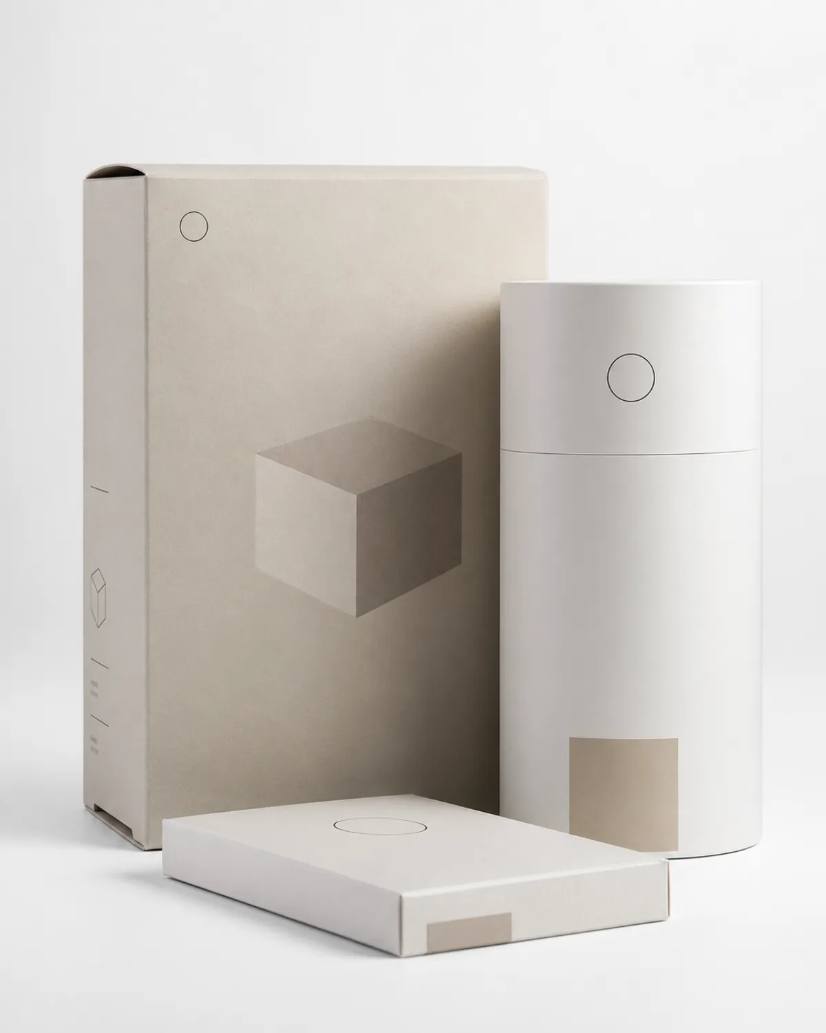
If you are learning how to design minimal packaging, start with the real meaning of minimal: not cheap, not empty, and definitely not beige-for-the-sake-of-beige. It means intentional reduction. Fewer materials. Less waste. Better fit. Clearer hierarchy. A package that protects the product in transit, feels considered in the hand, and still makes sense when it is sitting on a warehouse pallet at 6:30 a.m. A 350gsm C1S folding carton with a well-cut insert and a 1.5 mm tolerance can do that job beautifully if the spec is disciplined. That is where sustainable packaging stops being a slogan and starts being an actual production choice.
How to Design Minimal Packaging: What It Really Means
How to design minimal packaging starts with subtraction, but not the lazy kind. I have watched founders strip out structure, print, and inserts all at once, then act surprised when the product arrived bruised or the box looked like an apology. Real minimal packaging keeps the pieces that earn their keep: the right board weight, the right fold, the right closure, the right amount of copy, and enough visual breathing room to let the product speak. A 90 mm tuck flap and a clean logo set with a little margin can do more than a box crowded with effects. The trick is not to make the package smaller in spirit; it is to make it smarter in structure.
One client brought me a rigid mailer mockup in a Dongguan sample room that had five layers of "premium": a printed sleeve, a foam insert, tissue, a card, and a sticker that tried very hard to be charming. The product was a $24 serum. It looked expensive, sure, but the experience felt like opening a gift basket assembled by someone who had never once packed an order for transit. We cut three components, switched to a 350gsm FSC-certified folding carton with a paperboard cradle, and saved $0.41 per unit at 8,000 pieces. That is the point of how to design minimal packaging: reduce clutter without shrinking value.
Minimal packaging is not visual emptiness. It is not a sad white box with one tiny logo floating in the upper-left corner like it missed the meeting. It is hierarchy. It is restraint. It is a single ink color that carries weight across the whole surface, a quiet finish that does not fight the product, and typography spaced with enough discipline that the panel can hold a 120 mm x 80 mm footprint without feeling crowded. If the logo is small, the type has to be sharp. If the finish is quiet, the proportions have to be honest. I have a pretty strong opinion here: a minimal box should feel chosen, not forgotten.
I usually explain it this way: the best minimal packaging is not "less design." It is better editing. The structure protects the product. The surfaces communicate the brand. The materials make sense for the channel. A DTC mailer in Portland, a retail shelf carton in Dallas, and a subscription box shipping from Ontario all ask for different answers, even if the visual language stays restrained. If you ignore those differences, the package starts lying before the customer even opens it. That is why how to design minimal packaging in production has to begin with the factory, not the mood board.
"We thought minimal meant doing less. What it really meant was making every millimeter count." That came from a buyer I worked with after we removed a 12-page insert set and replaced it with a single 90 mm x 140 mm card printed on 300gsm uncoated stock.
That is the heart of how to design minimal packaging: fewer parts, clearer purpose, less waste, and no fake luxury. If a package needs seven touchpoints to feel premium, it probably is not premium. It is just busy, and busy rarely ships well. I have yet to meet a warehouse team in Louisville, Manchester, or Sacramento that enjoys "busy."
How to Design Minimal Packaging in Real Production
In production, the first simplification usually happens before printing starts. Right-sizing the carton often does more than any fancy finish. I have watched teams shave 8 mm off each side of a custom mailer and cut void fill by 35%, which saved money on freight, corrugate, and warehouse labor on a 10,000-unit order out of Ningbo. That is a much smarter move than adding a $0.09 metallic mark and calling it premium. I know that sounds blunt, but I have seen enough unnecessary foil from Foshan to last a lifetime. For how to design minimal packaging that actually ships well, size and fit usually matter before decoration does.
The material choice matters just as much. Recycled folding carton, molded pulp, and mono-material paper solutions are easier to source and easier to explain on a recycling panel. If you want a clean supply chain, ask for FSC-certified board, paper-based inserts, and water-based coatings before you start looking at soft-touch film. A 350gsm C1S artboard from Guangdong with aqueous varnish is often enough for skincare or supplements, and the cleaner the material mix, the easier how to design minimal packaging becomes in real life, because fewer components mean fewer approvals, fewer surprises, and fewer ways for the spec to drift. That is a practical win for sustainable packaging, not just a visual one.
At a meeting in Dongguan, a supplier showed me three versions of the same cosmetics carton. Version A used a 1.8 mm grayboard tray, a PET window, and two adhesives. Version B used molded pulp with a paper wrap. Version C used a simple folding carton with a locking insert. The buyer chose Version C, not because it looked fancy, but because it reduced assembly time by 22 seconds per unit and cut labor by roughly $0.05 per box at 20,000 units. Multiply that across a run that size and the difference is not small. It is a labor line item with teeth. That is why how to design minimal packaging in a factory needs to be measured in seconds, not adjectives.
Decoration should follow restraint. One or two inks, one focused finish, and typography with breathing room can feel more premium than a pack stuffed with UV, foil, embossing, and spot varnish all at once. A crisp 2-color print on 400gsm C1S board from Suzhou often looks sharper than a crowded rainbow on coated stock, especially under 4,000K retail lighting. How to design minimal packaging is really about making the print choices feel deliberate, not accidental, and that kind of discipline reads instantly on shelf. It also keeps paperboard packaging from drifting into overworked territory.
Logistics is part of design, not a separate problem. Smaller blanks mean better carton nesting. Lower unit weight means cheaper outbound shipping. Fewer layers mean faster pack-out in the warehouse. I have seen a cosmetics brand in Los Angeles save $0.27 per shipper by removing a paper sleeve and switching to a tighter insert, which also cut pallet height by 24 mm across a 400-case run. That kind of change does not show up in a mood board, but it shows up on the monthly P&L, and finance notices long before design does. They always do, unfortunately. How to design minimal packaging in practice is often a freight story disguised as a branding decision.
For teams comparing options, I often point them to Custom Packaging Products early in the process, because the structure decision changes everything downstream. If the pack has to ship flat, stack neatly, and survive a 3-foot drop, the right form factor usually reveals itself fast. And yes, I mean fast in factory terms in Shenzhen, which still allows for three revisions, one color proof, and one annoyed sample tech who has been asked to "just make it feel lighter" for the third time that morning. That is where how to design minimal packaging gets real.
How to Design Minimal Packaging Around Key Factors
The first factor is product protection. Weight, fragility, shape, and shelf life decide how far you can simplify. A 65 g soap bar can live happily in a slim carton with a paper wrap, especially if the board is 300gsm and the inner fit stays within 1 mm. A glass tincture bottle with a 15 mm neck finish, by contrast, needs more thought and usually a molded pulp cradle or a carefully tuned insert. If you skip that thinking, the returns department will do it for you, and they charge a higher price than the sample room ever will. I have watched one cracked bottle cancel out three weeks of good design. That is why how to design minimal packaging has to start with the product, not the render.
The second factor is brand hierarchy. Ask a blunt question: what should the customer notice first at 1 meter, then at 30 cm, then at hand level? The logo might lead on shelf packaging, while texture leads in DTC packaging, and copy leads for a technical product. How to design minimal packaging depends on deciding what gets the spotlight and what stays quiet, because every square centimeter of the pack sends a message whether you planned it or not. I have seen a 22 mm logo and a 4 mm subtitle create more confidence than a box full of expensive effects.
The third factor is compliance. You still need barcodes, warning copy, ingredient statements, recycling marks, and in some cases legal text that takes more space than the logo. I have seen a sleek supplement carton in Chicago get reworked because the required label copy swallowed 28% of one panel and the UPC needed a 37 mm x 25 mm quiet zone. That is not bad design. That is the law, and the law does not care about your mood board or your preferred type size. Brutal, but fair. How to design minimal packaging gets easier when the compliance panel is treated as a design surface, not an afterthought.
The fourth factor is regional sustainability rules. A material that looks clean on a pitch deck may be inconvenient in real markets. A matte film laminate may look elegant, but it can complicate recycling streams. If you are selling in the U.S., Europe, and Canada, you need to check local rules before approving the final spec. For a solid reference point, I keep an eye on the EPA recycling guidance and the FSC certification framework because those two pages answer more questions than a dozen vague eco claims, especially for teams shipping from California to Toronto or Hamburg. That is the difference between sustainable packaging in theory and sustainable packaging that survives procurement.
There is also the channel itself. Retail packaging needs shelf clarity from 6 feet away. DTC packaging needs unboxing efficiency and shipping durability. Wholesale packaging needs pallet logic and fewer touchpoints. If you ignore channel behavior, how to design minimal packaging turns into a guessing game with a lot of wasted cartons, a lot of awkward repacking, and usually one panic email from operations in Ohio or New Jersey. I have received that email more than once.
One more thing: minimum order quantity changes the whole equation. A structure that saves $0.08 per unit at 50,000 pieces may cost more at 2,000 because tooling, hand assembly, and short-run setup fees wipe out the savings. I have had suppliers in Shenzhen quote a "simple" mailer at $0.18 per unit in volume, then the landed number landed closer to $0.34 because the custom die and assembly did not care about the buyer's optimism. Numbers have a way of being rude like that. How to design minimal packaging is never just about the art; it is also about the run size.
How to Design Minimal Packaging Step by Step
First, run a brutal audit. List every component, its job, and its cost. Not the "feels important" cost. The real one. If there is a card, a sleeve, a sticker, a foam insert, or a spacer, ask what problem it solves in millimeters and cents. On one project for a tea brand in Seattle, we found a decorative insert that added $0.06 per box and prevented nothing. It was there because someone liked the look in a sample photo from a showroom in Guangzhou. That is how budgets leak, quietly and with terrible timing. How to design minimal packaging begins with a full inventory of what can leave without harming the product.
Next, define the non-negotiables. I usually push teams to lock four things before design starts: protection level, target unit cost, sustainability requirement, and the two or three brand cues that cannot disappear. For one skincare line, the non-negotiables were a soft ivory board, a blind emboss logo, and no plastic windows. That gave us a clear path, and how to design minimal packaging became a structural problem instead of a philosophical argument. That was a relief, frankly, because the team stopped debating Pantone chips and started solving geometry.
Then move into structural sketching. I like quick paper mockups, rough dielines, and cheap prototypes before anyone starts talking about lacquer or foil. A 15-minute board mockup can reveal a bad opening flap faster than a polished render ever will. If the closure feels clumsy at the prototype stage, it will still feel clumsy after you spend $1,200 on tooling in Dongguan, and that is an expensive way to learn what a ruler already knew. I have made that mistake once, and I am still annoyed about it. If you want to master how to design minimal packaging, the prototype table is where the learning gets honest.
Prototype testing comes next. You do not need a lab coat to learn something useful. Try a 3-foot drop from three angles, pack 25 units in a row, and time the process. If the assembly takes 47 seconds per unit, your warehouse team in Indianapolis will eventually mutiny, politely or otherwise. For fragile items, I also recommend a basic vibration check and an ISTA-style transit review. The ISTA transit testing standards are useful because they turn "looks sturdy" into something measurable.
Refinement is where good minimal packaging gets better. Remove one line of copy, widen the margins by 2 mm, shift the logo up 4 mm, or simplify the insert. I have watched a luxury candle carton in Brooklyn improve dramatically just by moving the brand mark from center to upper third and swapping a two-layer insert for a single paperboard cradle. The box looked calmer. The freight cube got smaller. The buyer stopped frowning, which felt like a minor miracle after a 90-minute review. That is how to design minimal packaging without losing the sense of value.
For teams building Custom Printed Boxes, I usually recommend a side-by-side review of two to three samples. Use one with a slightly heavier board, one with a stripped structure, and one with a different finish. Then compare them under the same lighting and on the same shelf, ideally under 4,000K to 5,000K retail lights. If possible, test the samples beside your current retail packaging solutions so the differences are obvious in real context, not just on a screen or inside a presentation deck. Screens lie. Shelves do not.
Approval discipline closes the loop. Get sign-off on board spec, print method, finishing, and carton dimensions before mass production. I have seen one missing barcode on the back panel create a four-day delay and a $380 reprint bill on a 12,000-unit run. That kind of problem is painfully avoidable if how to design minimal packaging stays tied to a clean approval checklist and a team that respects the sequence. I know that sounds boring, but boring is cheaper than reprinting.
- Audit: component-by-component review with cost per piece, even for small things like tissue paper at $0.03 or a sticker at $0.02.
- Prototype: low-cost sample first, usually within 3 to 7 business days depending on tooling and the factory schedule in Shenzhen or Dongguan.
- Test: fit, drop, vibration, assembly speed, and shelf impact under the same store lighting.
- Revise: remove parts that do not protect, communicate, or speed up handling.
- Approve: lock the final dieline, color target, and material spec before PO release.
How to Design Minimal Packaging: What It Costs and Where the Money Goes
Minimal packaging can save money, but not by magic. The quote still breaks into board stock, printing, coatings, tooling, inserts, and assembly. If a supplier gives you one flat number and refuses to itemize, I get suspicious fast. I want to know where the extra $0.12 came from, whether the foil plate was $65, or whether the hand-glue step pushed labor up by 18%. That is the difference between a useful quote and a fantasy spreadsheet, especially on projects running through Guangdong or Jiangsu. How to design minimal packaging for cost control begins with line items, not vibes.
Here is the tradeoff most buyers miss: a simpler-looking package can still cost more if the volume is low or the material is special. A 2,000-piece run with a Custom Die Cut and FSC board can cost more per unit than a 10,000-piece run with a standard structure. I have seen a "minimal" mailer priced at $0.29 at scale and $0.57 at a small MOQ because the setup and die fee did not spread out enough. Size matters. Annoying, but true.
Freight changes the math too. If your pack is lighter by 18%, you may save on dimensional weight and warehouse handling. But if the structure becomes too thin and the rejection rate rises from 1% to 4%, those savings disappear. This is why how to design minimal packaging should be reviewed with a supplier, not treated like a purely graphic decision or a mood-led brand exercise. I have watched "simple" become "expensive" because the carton flexed in transit from Long Beach to Chicago and everybody suddenly remembered the return policy.
| Option | Typical Use | Unit Cost at 5,000 pcs | Notes |
|---|---|---|---|
| 350gsm C1S artboard folding carton | Skincare, soap, supplements | $0.18-$0.28 | Good for print clarity, easy recycling, light structural loads |
| 450gsm carton with paper insert | Premium retail packaging | $0.32-$0.48 | Better stiffness, slightly higher freight, stronger shelf feel |
| Molded pulp tray + sleeve | Fragile DTC products | $0.40-$0.62 | Better protection, less plastic, more tool-dependent |
| Rigid box with minimal print | Gift sets, premium kits | $0.85-$1.80 | Higher perceived value, heavier freight, more assembly time |
Those numbers are not gospel. They change with board grade, print coverage, region, and labor market. But they are close enough to make a smart conversation with a supplier. If a quote is wildly outside those ranges, ask whether the board is domestic or imported, whether the finish is film or aqueous, and whether hand assembly is inflating the cost by $0.05 or more per unit. That question alone has saved me hours of head-scratching in meetings with factories in Suzhou and Ningbo. It is one of the clearest ways to understand how to design minimal packaging without getting lost in pricing noise.
For reference, I usually push clients to compare at least three options before they lock a run: a standard folding carton, a slightly upgraded carton with one tactile finish, and a more protective structure for fragile products. If you are building branded packaging or custom printed boxes, that three-way comparison usually shows where premium stops being premium and starts being wasteful. I have saved clients $2,400 on a 10,000-unit order simply by removing one unnecessary insert and switching the print coverage from four panels to two. No drama, no mystery, just smarter spec writing. That is sustainable packaging logic in the language of the purchase order.
How to Design Minimal Packaging: Timeline From Brief to Shelf-Ready Sample
A clean brief can move quickly. A vague brief can eat three weeks. I am not joking. If you send product dimensions, closure preference, board target, branding assets, and print requirements on day one, a supplier can usually build a first dieline in 48 hours. If the brief says "make it feel premium" and nothing else, everyone wastes time guessing at the mood of the box. I have sat through those calls in Los Angeles and Hong Kong, and they are somehow longer than meetings that actually do something. How to design minimal packaging moves faster when the brief is concrete.
The first sample cycle usually follows a predictable rhythm: dieline setup, prototype build, internal review, corrections, and a second sample. For how to design minimal packaging, the first sample often reveals spacing issues more than structural issues. A logo that sits 3 mm too low can make a box feel dense. A panel with 14 words of copy can make a minimalist pack look strangely cramped. Those are small fixes, but they matter because the eye notices tension before it notices text.
In my experience, the sample stage is where people either get honest or get expensive. A founder once told me the box needed "more presence," which is consulting language for "I do not know what is wrong." We printed two revisions: one with a larger mark and one with a blind emboss and more margin. The embossed version won, and the reason was simple. It felt confident without shouting. It also stayed within a $0.36 unit target at 7,500 pieces. That kind of result is exactly why how to design minimal packaging should be tested in physical form, not only in a slide deck.
Production lead time depends on material availability, finishing complexity, and factory workload. A simple folding carton might be 12 to 15 business days from proof approval. Add foil, embossing, or specialty paper, and the schedule stretches. If the supplier is busy, even a clean structure can sit in queue for several days in a plant outside Guangzhou. That is why I build a buffer of 7 to 10 days before launch. It is not paranoia. It is experience, and in packaging, experience usually beats optimism.
Shipping and customs need their own cushion. I have seen one late art correction hold a product launch for 9 days because the barcode on the outer shipper was wrong and the freight was already booked through the Port of Long Beach. The art team blamed the factory. The factory blamed the brief. Everyone blamed the weather. The truth was simpler: the approval chain had too many people and not enough discipline. How to design minimal packaging gets easier when the timeline includes real human errors, not just ideal production time.
For packaging teams comparing suppliers, I always ask for a clear schedule with milestones. A good factory will tell you the date for dieline, sample, revision, final proof, and shipment. If they only give you a single "delivery date," I would treat that as an estimate with a hopeful haircut. That kind of answer makes me nervous every time, especially when the order is coming out of Dongguan or Taichung and the launch date is fixed by retail.
How to Design Minimal Packaging: Next Steps
The biggest mistake is taking minimal packaging too far. When that happens, the pack looks accidental, not intentional. The board feels thin. The typography feels too small. The interior support looks improvised. I have seen brands remove so much that the customer thought the item was a sample, not the actual product, especially when the final carton used 250gsm board and a tiny 6 pt type treatment. That is a branding failure, not a sustainability win, and nobody wants to explain that to sales. How to design minimal packaging means keeping enough visual authority to feel finished.
The second mistake is trying to solve everything with finishes. A blind emboss, a soft-touch film, and a foil logo can all be useful in moderation, but three weak premium cues rarely beat one strong one. I would rather see a well-proportioned carton with 350gsm board and a single deep emboss than a cluttered pack with four finishes and no visual discipline. How to design minimal packaging gets sharper when you let the structure carry more of the load.
My supplier-first advice is simple: bring the brief early, ask for two or three sample routes, and compare them side by side under real lighting. If you can, place the samples on a shelf next to a competitor's product and your current packaging, ideally in a retail setting in Minneapolis or San Diego where the overhead lights are unforgiving. That is where weird spacing and weak color choices show up instantly. It is also where a clean design often wins without saying a word. I like that part, honestly, because good packaging should not need a speech.
I also recommend a brief that fits on one page. Use product dimensions, target price, material preference, print method, finish, and shipment method. Add one photo of the product in hand. That alone prevents half the back-and-forth I used to see in supplier negotiations. One page, six bullets, zero poetry. That is usually enough to get a useful quote and a realistic sample from a factory in Shenzhen, Suzhou, or Dongguan. It also keeps how to design minimal packaging grounded in the product instead of the presentation.
Here is the workflow I would use if I were starting a new project tomorrow:
- Write a one-page spec with dimensions, budget, and material target.
- Request 2 to 3 samples with different board weights or insert styles.
- Test each sample for fit, drop resistance, and pack-out speed.
- Compare the actual quote line by line: board, print, setup, inserts, freight.
- Approve the version that proves how to design minimal packaging with the fewest compromises.
If you need a starting point for structure, browse Custom Packaging Products and compare the board specs, insert options, and print methods before you brief a supplier. That is a faster way to make a sane decision than falling in love with a render and hoping the factory can translate it later. I have seen that movie in three different time zones, and the ending is usually a rework bill. It is also one of the easiest places to improve sustainable packaging without making the customer experience feel thinner.
And yes, I still think minimal packaging should feel premium. Not loud. Not overbuilt. Premium in the way a well-cut jacket looks expensive before anyone sees the label, like a navy wool blazer with a clean sleeve head and just enough structure in the shoulder to hold its shape. If you remember one thing from all of this, make it this: how to design minimal packaging is about editing with intent, then proving that edit in the factory, on the scale, and in the hands of the customer.
Frequently Asked Questions About How to Design Minimal Packaging
How do you design minimal packaging without making it look cheap?
Use one strong structural idea instead of piling on decoration, because clutter is what makes a simple pack look cheap. Keep typography, spacing, and material choices disciplined so the package feels intentional rather than unfinished, and use a board spec like 350gsm C1S artboard or 400gsm SBS where the product weight calls for it. Choose one premium cue, like texture or embossing, and let everything else stay quiet; a 350gsm FSC board with one clean blind emboss usually beats three weak finishes. I have had more luck with restraint than with "just one more effect," which tends to age badly after the first production run. That approach is one of the simplest ways to apply how to design minimal packaging without losing perceived value.
What materials are best for minimal packaging?
Recycled folding carton works well for many dry goods and retail products because it is easy to print and widely recyclable. Mono-material paperboard or molded pulp helps keep the pack simpler for recycling and reduces mixed-material headaches, especially for teams shipping into California, Ontario, and the EU. Avoid laminations and mixed substrates unless the product truly needs a barrier or extra protection, because the extra layer can complicate both cost and disposal. If a material choice makes the spec harder to explain than a 350gsm C1S artboard with aqueous coating, that is usually a sign to slow down. For sustainable packaging, that is often the right balance between performance and simplicity.
How much does minimal packaging usually cost?
It often saves money on materials and freight, but the final price still depends on structure, print complexity, and volume. Tooling, low minimum order quantities, and specialty papers can push the price up even when the design is visually simple. Ask suppliers to itemize board, printing, inserts, and setup so you can see where the real cost lives; a quote of $0.22 can turn into $0.39 fast if the hand labor is not included. I learned to ask for that breakdown after one quote from a factory in Guangdong arrived with all the fun stuff hidden in "miscellaneous." That is why how to design minimal packaging also means learning how to read a quote.
How long does minimal packaging take to develop?
A clean brief can move quickly, but sample rounds usually take the most time because you need to test fit and protection. Plan for dielines, prototype checks, revisions, and production scheduling before you promise a launch date, and expect a simple carton to take 12 to 15 business days from proof approval once the materials are in stock. Add buffer for shipping and artwork fixes, because one small correction can stall the whole project by several days. A calendar with no padding is just a wish with numbers on it, and how to design minimal packaging is easier when the schedule has a little breathing room.
How do I design minimal packaging for fragile products?
Protect first and decorate second, because the pack has to survive transit before it can look elegant. Use a snug internal fit, molded pulp, corrugated supports, or custom inserts where needed, and keep the structure tight enough that the item does not rattle in a 36-inch drop. Test drops, vibration, and shelf handling before you lock the design and order production, ideally with an ISTA-style checklist and a sample run of 10 to 20 units. If the product rattles, the package is not minimal; it is underbuilt. That is the rule I return to whenever someone asks how to design minimal packaging for a fragile item.
How do you keep minimal packaging sustainable?
Use fewer materials, favor recycled or FSC-certified board, and avoid mixed substrates unless there is a real functional need. Sustainable packaging is easier to maintain when the package can be explained in one sentence and disassembled without a knife. If the spec requires a long recycling disclaimer or three different material families, it is probably not as minimal as it looks. I usually push teams toward paperboard packaging or molded pulp first, then refine from there based on protection and channel needs.