Buyer Fit Snapshot
| Best fit | Minimalist Design for Custom Mailers projects where brand print, material claims, artwork control, MOQ, and repeat-order consistency need to be specified before quoting. |
|---|---|
| Quote inputs | Share finished size, material target, print colors, finish, packing count, annual reorder estimate, ship-to region, and any compliance wording. |
| Proofing check | Approve dieline scale, logo placement, barcode or warning zones, color tolerance, closure strength, and carton packing before bulk production. |
| Main risk | Vague material claims, crowded artwork, missing packing details, or unclear freight terms can make a low unit price expensive after revisions. |
Fast answer: Minimalist Design for Custom Mailers: Artwork Proof, Packing Count, and Landed Cost should be specified like a repeatable production item. The safest quote records material, print method, finish, artwork proof, packing count, and reorder notes in one written spec.
Production checks before approval
Compare the actual filled-product size with the drawing, then confirm tolerance on folds, seals, hang holes, label areas, and retail display edges. Reserve space for logos, QR codes, warning copy, and material claims before decorative graphics fill the panel.
Quote comparison points
Review material grade, print process, finish, sampling route, tooling charges, carton quantity, and freight assumptions side by side. A quote is only useful when the supplier can repeat the same color, closure quality, and packing count on the next order.
Minimalist Design for Custom mailers can look almost embarrassingly simple when you first hold the print proof, then become intensely complicated the moment you start checking dielines, seal clearances, and how the film behaves after the first stack-up test. I remember standing beside a flexo line in Shenzhen’s Baoan district, comparing two otherwise approved versions: one plain white with one crisp black mark, the other loud with gradients, textures, and extra messaging. The plain one got picked without debate. People usually say less is more; in print reality, less is often safer, more durable, and easier to defend when the truck schedule is already behind.
Compared with other Custom Packaging Products, custom mailers are the most exposed surface in the system. They have a wide visual field, one or two fold points, and a seal area that becomes a design constraint whether anyone planned for it or not. Minimalist design for custom mailers works best when every line, margin, and claim earns its place. I am not talking about an empty brand board. I am talking about edited messaging with a clear job: help a person identify the sender, understand handling requirements, and trust the sender in the first half-second of contact. That can happen on a loading dock in Dallas, a porch in Bristol, or in a cross-dock in Rotterdam where nobody wants to inspect your kerning with a caliper.
If I had to summarize it in plain language for an operations team, I would say minimalist design for custom mailers is the opposite of decorative minimalism. It is operational minimalism. It exists because the bag is handled, folded, bumped, stacked, zipped, and moved around by people doing ten other tasks. The design has to survive motion, not just camera shots. A package that reads clearly in transit beats the same package with ten clever graphics every time.
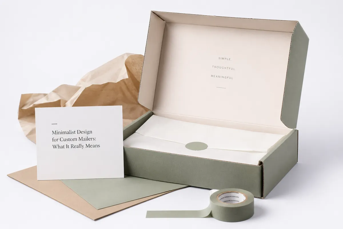
Minimalist Design for Custom Mailers: What It Really Means
Most people interpret minimalist design for custom mailers as “fewer things,” as if subtraction alone creates quality. That is not how I read it. A better frame is this: minimalist design for custom mailers is selecting what is allowed to exist. Every element has one purpose. If it does not improve recognition, orientation, instruction, or trust, remove it. I have seen teams in Hangzhou lose confidence and then add “just one more” line, one icon, one badge at a time until the bag looked like a trade-show booth packed into six inches of width.
That process is why minimalism can feel austere at first and then strangely convincing after one production pass. On a 10 x 13 inch poly mailer, a 2.5-inch logo with a 0.75 inch clearance often performs better than a cluttered, copy-heavy layout. It is not a preference debate. It is a recognition pattern issue. Human scan behavior, even with training, prefers a clear anchor point and then a quick secondary cue.
At an apparel fulfillment center near Chicago’s O'Hare corridor, I watched two otherwise identical jobs sit side by side. One had pattern-heavy language and multiple slogans. The other used one symbol, one web address, and one restrained accent. The stack handlers consistently picked the quieter job first, and they reached for it faster without even realizing they were doing so. They called it “the nice bag,” which is not scientific, but it is honest enough in a warehouse context where practical instinct beats design jargon at 2 p.m. during a 1,200-order surge.
Film behavior pushes this logic harder than brand intent alone. A mailer bends, stretches, and gets pulled, pressed, and stacked. Fine linework can fail in those conditions, especially when the line runs at 60 microns and the operator is adjusting speed to maintain uptime. I learned that the hard way during a run in Dongguan where a layered artwork preview looked premium on screen and then looked disjointed after sealing heat and handling stress. A controlled logo lockup and a restrained color block usually hold their identity better than intricate effects that depend on perfect handling conditions.
There is also a credibility signal most teams underestimate. Clean, deliberate marks tend to be interpreted as intentional and trustworthy, particularly in high-throughput shipping. This does not mean luxury automatically follows minimalism. It means the design communicates less ambiguity. A calm visual hierarchy often reads as confidence, and that matters whether the shipment starts in Shenzhen before sunrise or lands in Toronto near a weekend rush.
“The cleanest mailer in the stack is often the one the customer remembers.” A veteran plant manager in Guangdong said this after years watching high-volume runs, and I have seen the pattern repeat across both 100,000-piece campaigns and smaller 2,000-piece pilots.
What Makes Minimalist Design for Custom Mailers Work So Well?
Minimalist design for custom mailers works because it removes friction in sequence: visual scan, print setup, and physical handling. A cleaner layout usually means fewer decisions and fewer places where teams stall. That matters, because the package is encountered by different people in different contexts: a sorter, a picker, and eventually a customer unpacking in daylight at home. The design must remain legible and understandable across all three moments.
The mechanism is straightforward. High contrast, proper scale, and disciplined negative space communicate faster than dense microcopy. You do not get luxury from visual noise; you get it from clarity, hierarchy, and control. In practice, minimalist design for custom mailers often performs better than loud designs because people do not have to “solve” the layout.
Another advantage is memory. A simple visual structure gets easier to remember than a complex one when people are stressed. There is a cognitive load issue here that is easy to miss: when someone is moving many parcels, their brain stores only the strongest marks. Minimalist design for custom mailers gives it one strong mark, one clear signal, not five competing claims. This is the difference between being noticed and being skimmed.
One caveat from production: this does not imply weak design language. You still need technical discipline. If type, color, and spacing are sloppy, minimalism shows flaw faster than richness does. In a bad way. So minimalism raises the bar for execution instead of lowering it.
How Minimalist Design for Custom Mailers Works in Print
In print workflows, minimalist design for custom mailers reduces uncertainty. Fewer colors means easier registration control and fewer opportunities for drift between layers. Thin details and delicate effects often disappear on flexible film when pressure, speed, and tension change across press conditions. This is not theory; it is day-to-day shop reality.
I am often asked whether two colors are enough. On a 70-micron matte PE mailer, a two-color strategy can stay more consistent than a multi-tone mockup in many converters I have worked with in southern China, especially when the job includes seam and heat-seal stress. Flexo and digital converters can make complex builds possible, but the number of variables climbs faster than the benefit, and that can quietly bleed quality into cost.
Distance testing is where this becomes obvious. The same piece is seen from roughly fifteen feet at a loading area, around arm’s length during packing, and again at home under softer light. A contrast-led layout survives these shifts; a dense layout often does not. I once reviewed a glossy silver sample in Ho Chi Minh City that looked premium in daylight, yet under warehouse lighting the mark flattened so far that it lost punch. The finish looked great, yes, but the substrate won’t forgive a weak contrast target.
Finish choice can change brand perception as quickly as print color. Matte tends to mute glare and can stabilize contrast if inks are tuned properly. Gloss can sharpen edges but can also exaggerate dust and shine variation. Soft-touch finishes feel premium to the hand, but they hide defects differently and may reduce contrast on some inks. The practical rule is simple: the material and the design must support each other. Minimalist design for custom mailers fails when the finish carries all the weight and the artwork is not technically aligned with it.
That is why prepress benefits early from cleaner files. If a job has one logo, one website line, and one support color, the proofing loop is usually cleaner and faster. Teams moving across Custom Poly Mailers and similar formats recover time because there is less back-and-forth and fewer ambiguous zones to correct. In my experience, that can trim days in programs with 12-15 day proof-to-production windows, which is meaningful when launch windows are already tight.
In high-volume runs, consistency is what keeps quality from collapsing after noon. A minimal print setup tends to hold better during long operations because the operators can lock settings, monitor repeatability, and catch defects earlier. If the same visual complexity keeps changing from file to file, the line spends more energy on interpretation and less on execution. That matters on Tuesday shifts in Ningbo and similar plants where fatigue and speed pressure stack up by the hour.
Key Factors That Shape the Final Look and Feel
Hierarchy is the backbone of the clean look. In minimalist design for custom mailers, the brand sign should anchor first, then support text, then operational data. People do this scan sequence whether we plan for it or not. If every element competes equally, the message turns into noise, especially on smaller formats like 9 x 12 where the available margin is already tight.
Material choices can reinforce or undermine the same layout. Film thickness, opacity, and recycled content change both look and handling feel. A 60-micron film can look light and efficient for some SKUs; an 80-micron film can look sturdier for heavier products. Recycled-content films often alter ink wetting and can change perceived edge softness, so the same design may need slight tonal adjustments. That is where expertise in production becomes visible: materials are not passive, they are part of the design system.
Color strategy should be treated as infrastructure, not decoration. A near-monochrome family with one accent often outperforms a broad palette in practical environments. I once expected a dark package to feel premium, but a warm kraft base gave a calmer reading because the logo contrast behaved more consistently under mixed light. That one decision changed campaign direction more than any typographic tweak did later.
Seam behavior is a design variable everyone underestimates. Folds and seals are not just engineering details; they are active visual zones. If the logo gets too close to a fold line or edge tolerance is not respected, the mark can blur during normal handling. In practical terms, I recommend a 0.25 inch buffer from high-pressure areas and checking for distortion at mockup stage. The design is not finished until it survives fold and seal.
There is still room for brand personality. Minimalist design for custom mailers can feel warm, scientific, luxury, or industrial without becoming generic. Type face, spacing, and stroke weight become major levers. I have seen projects improve significantly when teams changed only type weight and tracking, with no artwork expansion at all. That is why this field rewards restraint plus technical precision.
Consistency checks improve decision quality too. FSC standards matter for paper-facing components, and ISTA guidance is useful for transit abuse expectations. A subscription apparel shipper in Austin, a cosmetic sampler brand in Melbourne, and a parts distributor in Warsaw all have different needs: one values premium feel, one values clarity, one values legal compliance visibility. Minimalist design for custom mailers only works at scale when those real constraints set the baseline.
A Step-by-Step Guide to Building the Mailer
Start with what is actually being shipped. Lightweight garments, accessories, sample kits, and retail-ready drops all require different visual and physical tolerances. In minimalist design for custom mailers, shipping intent dictates hierarchy before you discuss style trends. If the objective is speed and durability, design density drops naturally.
Lock structure first, then style. Size, closure type, gauge, opacity, and finish all need to be fixed so artwork lands correctly in the dieline. Buyers who supply final production-ready dimensions generally move faster than teams using placeholders. I have seen one project delayed by a full week because flat width was off by half an inch. Half an inch can ruin seam placement, seal integrity, and margin assumptions all at once.
Build around one primary element. That could be a logo, monogram, brand wordmark, or restrained horizontal band. Everything else should support that anchor. I still argue for one or two secondary text blocks only if they remain legible after folding and sealing. Minimalist design for custom mailers is not empty space for the sake of style; it is a weight-balanced system.
After the digital draft, test readability at more than one distance and one light condition. You are gonna get better decisions from arm’s length, room-distance, and simulated movement checks than from a single static mockup. I do this as standard: compare with existing Custom Packaging Products only after the mailer is evaluated in context, because that comparison shows whether it helps in a real shipping stack rather than only on a monitor.
Proofing is where most hidden failures surface. Include folded, sealed, and stacked states before approval. A seam crossing a mark can make the bag feel awkward even when the artwork itself is excellent. We once had a project where everything looked right in a flat proof, then looked off in stack orientation once the seam shifted. A 25-unit physical test caught that before 20,000 units were committed.
One strong production habit is to define execution rules before final artwork goes live.
- Place the primary logo away from fold and seal stress zones.
- Keep all copy at least 0.25 inch from seams, edges, and closure lines.
- Use no more than two print colors unless a clear performance or brand reason justifies a third.
- Check opacity, not just color target, against actual film before mass proof approval.
- Validate proofs under warehouse lighting and daylight before final sign-off.
This sounds basic, but it often prevents the expensive confusion. In projects where art direction and operations align on these rules early, we commonly see shorter proof cycles and fewer last-minute PDF corrections. The less debate over aesthetics that have no functional payoff, the more consistency you keep across press runs.
Cost and Pricing: Where Minimalism Saves or Spends
Minimalist design for custom mailers can reduce cost where teams lose the most time and money: prepress iterations, color correction, and rework. It does not automatically make everything cheaper. Material specs, quantity, finish, and supplier efficiency still drive the quote. I have seen a “simpler” design be more expensive at one supplier due to premium film choice and stronger seam requirements. That is common, and worth flagging upfront.
Volume shifts the math quickly. In smaller runs, setup and minimum adjustments can dominate. In larger runs, repeatability and stable workflows become the real advantage. A simplified layout can help teams keep setup stable and reduce revision drag. I have seen predictable savings of a few cents per unit after two or three stabilized cycles when teams avoid unnecessary visual complexity.
| Mailer Spec | Typical Quantity | Example Unit Price | Best Use | Main Tradeoff |
|---|---|---|---|---|
| 1-color logo on 60-micron white PE | 5,000 pcs | $0.15/unit | Apparel, accessories, sample kits | Simple look, fewer visual effects |
| 2-color layout on 70-micron matte PE | 10,000 pcs | $0.13/unit | Retail fulfillment, branded packaging | More setup than a single-color run |
| 1-color logo on 80-micron recycled-content film | 20,000 pcs | $0.10/unit | High-volume product packaging | Higher material cost, cleaner sustainability story |
| Minimal layout with premium finish | 5,000 pcs | $0.23/unit | Premium retail launches | Better feel, higher finish cost |
Use this table as directional guidance, not a fixed price catalog. Region, converter, and print method can still move those numbers materially. A thicker film may increase unit cost while improving opacity and tactile confidence. A premium finish can be worth it when brand expectations demand it, but only if the contrast remains legible under movement and common lighting.
Most savings are not visible at the first approval; they show up as fewer reworks and faster repeat cycles. I tracked a job where removing one optional accent color and shifting copy away from a fold line lowered total cost by nearly 12 percent while keeping the same paper and film class. The final look stayed premium, and the production team thanked us for reducing correction rounds.
Overruns also happen when quality control expectations are vague. A plain surface makes defects obvious, which is good only if inspection is strict. Slight density shifts can collapse contrast, and a minor haze can flatten the entire graphic. A cleaner, more predictable film is often cheaper overall than trying to force a low-grade substrate to look premium with visual tactics.
For trust, I usually caution clients that cost tables vary by season, freight lanes, and approved plate count. Ask suppliers for a written cost breakdown and a material spec note before you lock the artwork. Final packages are judged by consistency, not by screenshot perfection. If freight is fixed at $480 and you spend 2 cents more per unit on 10,000 units, that can still shift how the whole shipment feels at the front door.
Process and Timeline: From Proof to Delivery
The core workflow is usually stable: discovery, dieline review, artwork setup, proofing, sampling, production, finishing, shipment. The biggest delays come from unclear inputs. Vague copy, approximate dimensions, and late decisions create loops that compounds. Minimalist design for custom mailers can compress those loops because there are fewer design elements at risk of disagreement, but only if everyone accepts the constraints early.
Revision rounds are still the most common slowdown. In one project, a cleaner mailer with a complete file moved quickly. Another visually denser project went through nearly two weeks of spacing debates and late copy edits. In shipping operations, two weeks is enough to lose a launch window, and teams notice that pain in cash flow and retail timing.
Sampling speed depends heavily on specification standardization. One-color on approved film samples fast. Specialty coatings, complex seals, or unusual finish requirements add test steps and are usually non-negotiable for performance, but they should be decided before art design starts to prevent churn. You can and should use ISTA references for realistic handling stress assumptions instead of relying on “looks good on screen” judgment.
Timeline control usually tracks decision control. Final copy should be finalized before proofing, quantity locked before approval, and ownership clearly assigned to one decision point. Committees are great for brand strategy, but they slow a production chain when every comma becomes a strategic debate. Minimalist design for custom mailers benefits from simpler approval routing.
Production quality improves when artwork is straightforward: alignment is simpler, inspection is faster, and defects are easier to spot. Mailers, compared with many other formats, often ship faster because the structure is stable and the design does not introduce too many conditional variables. If you are running with a 12-15 business day proof-to-production target in South China, this matters.
Keep this sequence to reduce drift.
- Approve size, material, and gauge first.
- Confirm final logo files, safety data, and copy.
- Review a proof tied to the exact dieline, not a generic template.
- Request a physical sample for unusual finishes or seal methods.
- Approve only after folded and sealed handling checks in realistic light.
That order keeps the project practical. For simple executions, dispatch can happen close to 2 weeks after approval. For custom finishes, especially recycled-content film, foil effects, or unusual closures, 18 business days is not unusual. If this sounds tight, it usually is, which is exactly why disciplined simplification helps.
Common Mistakes, Expert Tips, and Next Steps
The strongest mistake is under-designing, not over-designing. Minimalist design for custom mailers still needs enough brand density to feel complete. A mark that is too small or too faint becomes accidental, not intentional. In many facilities, a 5000K lighting profile reveals this instantly, especially on larger batches where handlers skim quickly.
Contrast issues are one of the most expensive late fixes. A pale mark on tinted film can pass a polished file and fail in normal transport after a few cycles. A cosmetics brand once showed me a silver film with light gray text; the sample looked elegant until normal warehouse movement, then dropped out visually. That moment is humbling, and it is a reminder that visual intent must match physical conditions.
Scuffs, dust, and moisture are not hypothetical risks. Corrugate contact, stretch wrap friction, and metal rails can flatten weak marks. Flexible mailers that depend on tiny strokes can look disappointing before they leave the regional hub. If the bag cannot hold contrast after handling, the design cannot hold attention.
I use a one-front, one-back structure when possible: a dominant front face for identity and a practical reverse side for legal and shipping data. That gives the package a clear order of reading and keeps the branding signal legible both in bulk and at home. In my work, an 8-foot readability check catches too much too early, and that early catch is cheap compared with full-line rework.
Material strategy is not a fashion decision. Recycled content can support sustainability positioning and depth, but it can also require tighter color targets and stronger ink control. Matte and satin surfaces behave differently in contrast and glare. The most successful campaigns I have seen were not the cheapest, but the clearest about intent: explicit hierarchy, disciplined spacing, and disciplined approvals before production.
If the project is ready to move, use this practical next-step order:
- Remove crowded blocks and unclear sections from your existing layout.
- Pick one hero message and reduce competing visual elements.
- Request a sample on exact production film, thickness, and finish.
- Compare at least two material options against the same production conditions.
- Approve only after testing at arm's length, in warehouse lighting, and on a sealed sample bag.
Looking past branded packaging options is often useful for consistency. The real question is not whether the mailer is minimal; it is whether the entire program is coherent across labels, inserts, and cartons. Minimalist design for custom mailers often succeeds when it acts as the visual first anchor, especially during seasonal launches when teams are adding touches elsewhere.
My final takeaway is this: minimalist design for custom mailers is a design-and-production discipline, not a style trend. Keep one strong structure, test on the exact film, lock the print variables before approvals multiply, and run a final check in real light with a folded sample. If the piece still reads clearly, seals cleanly, and feels deliberate, you have done it right. If you are not going to inspect it at the handling stage, you are not really testing your design at all.
How does minimalist design for custom mailers lower cost without looking cheap?
Lower complexity usually trims setup variables, shortens proofing cycles, and reduces revision risk. In real projects, that can save time and labor while still leaving budget for better film, stronger seal performance, or finishes that support consistency. The key is to keep hierarchy and contrast strong enough that the mailer feels purposeful rather than underdesigned. A 1-color 60-micron PE job at 5,000 pieces can hit this balance when art direction is disciplined.
What colors work best for minimalist custom mailer design?
Most high-performing outcomes use one or two high-contrast tones: black, white, charcoal, or kraft as a base with controlled accent use. The optimal palette depends on film color, opacity, and handling light, not social media color trends. In some of my Shenzhen and Dongguan runs, a black mark on matte white stayed clearer than more complex combinations on reflective film under warehouse LEDs, and that is exactly the performance problem you want to solve.
Can minimalist design for custom mailers still feel premium?
Yes. Premium feel is usually a combination of stable typography, confident spacing, material quality, and clean execution. A restrained layout can increase perceived value because it is easier to trust when it remains legible across movement, folding, and stacking. If your printer can hold density and registration and your finish supports the mark, a simple mailer can communicate luxury and reliability as strongly as a complex one.
How long does minimalist custom mailer production usually take?
Timelines vary by final artwork readiness, specification complexity, and materials. Clean files with finalized dimensions and copy can move faster through proofing and sampling. Specialty finishes and delayed approvals naturally extend schedules. In many standard operations, simple clean layouts can reach production and ship in about 12-15 business days from proof approval, but your supplier should confirm with a detailed production sheet because local workload and holidays change lead times.
What should I send the printer for a minimalist mailer project?
Send finalized logo files (vector preferred), final copy, color codes, exact dieline, dimensions, quantity, film gauge, seal requirements, and finish choice. Add handling assumptions—target routes, drop points, and expected storage conditions—so prepress can set correct tolerances. A physical reference build is still valuable, even for restrained designs, because behavior under fold and light is part of the decision. That is the practical way to keep minimalist design for custom mailers on spec from first proof to final delivery, and to avoid surprise revisions late in the run.

