Buyer Fit Snapshot
| Best fit | Minimalist Logo Design for Mailers projects where brand print, material claims, artwork control, MOQ, and repeat-order consistency need to be specified before quoting. |
|---|---|
| Quote inputs | Share finished size, material target, print colors, finish, packing count, annual reorder estimate, ship-to region, and any compliance wording. |
| Proofing check | Approve dieline scale, logo placement, barcode or warning zones, color tolerance, closure strength, and carton packing before bulk production. |
| Main risk | Vague material claims, crowded artwork, missing packing details, or unclear freight terms can make a low unit price expensive after revisions. |
Fast answer: Minimalist Logo Design for Mailers: Quote Scope, Sample Proof, MOQ, and Lead Time should be specified like a repeatable production item. The safest quote records material, print method, finish, artwork proof, packing count, and reorder notes in one written spec.
Production checks before approval
Compare the actual filled-product size with the drawing, then confirm tolerance on folds, seals, hang holes, label areas, and retail display edges. Reserve space for logos, QR codes, warning copy, and material claims before decorative graphics fill the panel.
Quote comparison points
Review material grade, print process, finish, sampling route, tooling charges, carton quantity, and freight assumptions side by side. A quote is only useful when the supplier can repeat the same color, closure quality, and packing count on the next order.
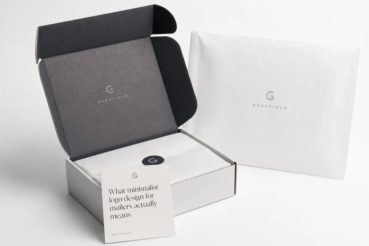
Minimalist Logo Design for Mailers: Clean Branding Tips
People decide whether a brand feels credible the moment the package lands in hand. If the first mark they see is muddy, crowded, or hard to decode, your positioning starts slipping before the box is even opened. That is why minimalist logo design for mailers is not ornament. It is the first argument your brand makes, and it has roughly 0.2 seconds to make sense.
This guide focuses on what survives poly-film printing, where costs really come from, and where teams waste money by overcomplicating a small surface. Expect practical ranges, production sequencing, and the unglamorous checks that separate a clean brand mark from a file that looks perfect on screen and collapses in print. I have seen brands spend weeks polishing a logo system only to discover the film made the thinnest lines look kind of apologetic. That kind of mismatch is avoidable.
Minimalist Logo Design for Mailers: What to read first
Mailers are often the first physical contact a customer has with your brand. They get seen before the unboxing mood, before the tissue paper, before the thank-you card. Someone walking to a desk, standing in a lobby, or sorting deliveries at speed is not studying your packaging; they are scanning it. A logo on a mailer needs to behave like a headline, not a gallery piece. That is the core reason this strategy matters.
Brand teams often spend most of their time polishing details that disappear once the packaging enters the real world. The numbers flip on a mailer. Flexible film reflects light, bends under pressure, and hides delicate detail without asking permission. A logo that looks crisp on a monitor and turns soft under glare has failed at the point where the brand pays for itself: the first touchpoint. I have watched a beautiful wordmark lose its sharpness on a glossy white bag in under ten seconds on the packing floor.
Can minimalist logo design for mailers win at first glance?
People do not read a mailer logo like they read a website hero. They recognize it like they recognize a signature: by pattern, contrast, and rhythm. If the design survives one second of motion, then and only then does the rest of the brand story get a chance.
In practice, this is a comparison game. Detailed marks are like dense novels on a sticky note; they look smart in isolation, but fail in motion. A restrained mark is like a haiku: less material, more memorability. At a practical level, you are measuring read speed under movement, not elegance under stillness. That is a much less romantic test, but it is the one that matters.
What minimalist logo design for mailers actually means
Reality check before the sketchpad
Minimalist logo design for mailers means one idea, one visual path, and no decorative panic. It can be a wordmark, symbol, or monogram. What makes it minimalist is discipline. Clean alignment, strong edges, and negative space that does real work. Minimal is not the same as dull. Dull is a timid layout with no hierarchy. Minimal is a mark with structure, and that distinction matters once ink meets film.
Poly mailers are brutal on tiny serifs, ornamental swashes, and micro-text. The surface reflects light and shifts under handling, so delicate detail loses the fight quickly. Many teams bring the full brand lockup to a proof and then call it “too thin” when print looks fragile. That is usually not a proofing problem. It is a design decision that ignored the behavior of the material. Mailer planning starts with the physics of film, not wishful thinking.
Minimal vs vague: where the line is
Minimal does not mean stripped until nothing is left. It means fewer elements carrying more weight. A minimal logo has stronger contrast, better scale, and cleaner geometry than a cluttered one. The final mark should read instantly from arm’s length and still hold its identity when scaled down. If the design depends on tiny internal detail, it is probably not printer-safe.
A quick test says a lot: show the working file to someone standing 3 to 4 feet away. If they cannot identify the brand name and category within a few seconds, the logo needs another pass. If they have to zoom, squint, or tilt the page to make sense of it, the mark was built for a screen, not a shipping surface.
What makes poly mailers special
Poly mailers flex, fold, catch reflections, and hide artwork under seams or taped edges. A logo that depends on perfect flatness will stumble fast. The artwork needs to survive slight distortion and changing viewing angles. In broad production terms, strokes below about 0.35mm become risky on dark-to-light combinations, especially when the run is high speed and consistency is tied to film behavior rather than ideal mockups.
Material thickness changes how the same art reads. A 2 mil film can make ink feel uneven, while a 3.5 to 4 mil film usually holds registration more cleanly. The same artboard can appear lighter or thinner simply because of reflectivity and light transmission. That is why thickness and finish belong in the decision before final artwork lock, not after. Screen proofs are useful; actual film samples are the real test, and they are the anchor for mailer printability decisions.
“If the mark cannot hold shape in one color and one glance, it is not minimalist. It is underbuilt.”
How minimalist logo design for mailers works in print
Why less detail is a print advantage
Flexible film is not a flat paper proof. It behaves differently under pressure, light, and heat. Minimalist logo design for mailers prints better because the process preserves broad shapes far more reliably than fragile detail. A single strong mark with a clear negative space strategy usually beats a detailed illustration by a wide margin once the bag starts bending during handling.
Gradients, narrow strokes, and tight intersections can merge in dark areas after curing. Clean outlines and stable counters keep their shape. The simpler mark also tends to read more consistently on one-color runs, reflective film, and UV-heavy printing. That is not an aesthetic preference. It is a production advantage with a better failure rate.
Contrast, line weight, and negative space
Contrast is the first safety net. On glossy poly, pale-on-pale combinations fail quickly. Matte buys a little forgiveness, though low contrast still struggles outdoors and under strong overhead lighting. A practical starting point is a 60 to 70 percent contrast ratio for the exact print conditions you expect.
Line weight is the next safeguard. Keep the core strokes thick enough to survive print conversion and distance. Around 1.2 to 1.5mm is a good working range for larger placements, and under 0.8mm gets dangerous on smaller mailer applications below 70mm in height. Those numbers are not sacred. They are useful because they keep debate grounded in output, not taste.
Negative space carries more weight than people expect. Clear spacing inside letters and around the logo gives the design room to breathe. On a moving package, that breathing room matters. Balanced counters and careful kerning tend to outperform a tighter layout because the eye has less work to do.
Print methods in plain English
Three routes show up most often: spot color, flexographic, and digital. Spot color or two-color runs are usually the best match when consistency and budget both matter. Flexo makes sense at scale, often past 5,000 units, though registration and tone stability depend on film batch, equipment, and operator skill. Digital suits shorter runs and variable data, but it exposes fragile details fast if the logo carries too much complexity.
If a logo cannot survive one-color printing, it is too complicated for a mailer. That sounds blunt because it is. One-color testing catches problems early, and early is cheap. Late is reprint territory.
Placement matters just as much as the mark itself. Centered logos create balance and a clean premium feel for many ecommerce brands. Corner placements feel quieter and more restrained, which can suit smaller marks. Repeating a simple icon pattern across the surface can work too, but only if the spacing and scale stay disciplined. Once repeated elements start competing for attention, minimalism is gone.
Key factors that decide whether the design works
Size and proportion
A logo that looks elegant in a mockup can become undecodable at production scale. A 14pt wordmark on a screen may turn into visual dust if it sits too low or too close to a seam on a 10 x 13 inch mailer. For mailers under 4 inches in height, a simplified lockup usually performs better than the full word count.
Use measured mockups at the actual die-line scale. A practical baseline many teams follow is a minimum logo height of about 35 to 50mm for primary front placement on common 10 x 13 and 11 x 13.5 inch mailers, and about 22 to 28mm for corner placement. If the full brand mark drops below that range and the secondary text starts crowding it, shorten the lockup instead of forcing it.
Color decisions that protect legibility
Minimalist marks usually perform best with high-contrast pairings: black on white, white on black, or one strong brand color against a neutral base. Multi-color palettes can look polished in a presentation and noisy in production. Fewer colors reduce risk, speed up approval, and usually simplify setup.
One color does not mean one dull choice. A black mark with a narrow accent line in a recyclable yellow or deep green can still feel distinct. Ask the printer for ink density targets before approval. If those targets are vague, the color process is probably running on guesswork, and print legibility will be a negotiation instead of a decision.
Material finish and visual field
Glossy film makes thin lines look weaker because the surface throws light back into the viewer’s eye. Matte tends to handle subtle shapes more gracefully and often pairs well with line-based marks. Still, matte softens highlights too, so both finishes deserve real testing before the order is locked. A thin horizontal bar can vanish in glare even when the vector file is perfect.
Finish and logo speak to each other. A restrained mailer mark with soft-touch lamination can look expensive, but that finish may cost more than the color work itself on small runs. Minimal does not automatically mean cheap. It means the design is asking the material to do less, which often improves output and sometimes raises the production bill.
Brand fit and file readiness
A good mark is not a generic mark. Minimal still needs category cues. A medical brand and a craft coffee brand should not carry the same visual weight, even if both use restrained shapes. The language can stay minimal while the proportions, curvature, and spacing give the brand a distinct temperature.
Technical cleanliness matters as much as style. Clean vector files, outlined fonts, no clipping mask artifacts, and no hidden low-resolution raster fragments keep production from stalling. Use PDF/X-4 or AI/PDF files with the CMYK profile your printer expects, and keep layers separate for artwork, registration marks, and trim instructions. A raster logo sent in hope is already a problem before press time.
For teams packaging boxes and inserts too, consistency beats novelty. Keep the same spacing logic across the mailer, sleeve, insert, and label. Repeating the same visual rules across the system does more for trust than adding a second slogan ever will.
If shipping standards enter the conversation, ask direct questions. Confirm whether the printer aligns with ISTA handling expectations and how it manages barcode or marking constraints during finishing. For recycled-content claims or fiber-based components, check your documentation against FSC requirements where relevant.
Step-by-step process and timeline for mailer artwork
Phase 1: simplify before decoration
Start with the current brand files and remove everything ornamental that cannot survive one-color printing. A mark can be reduced without becoming generic. Strip gradients, drop secondary lockups, and simplify any icon detail that relies on delicate linework. The goal is a print-safe master and a fallback version with less complexity. That is the difference between design theater and production readiness.
If the logo currently uses overlapping symbols and a tagline, build three versions: primary, condensed, and one-color fallback. Keep the character width and weight logic consistent so the versions feel related rather than improvised. When the full version becomes too complex, the fallback should already be approved and waiting.
Phase 2: map the package, not just the artboard
Mailers are not blank fields. They contain seams, side seams, peel strips, seal zones, and fold or handle areas. Review the printable area and seam locations before finalizing anything. A logo placed in an unusable zone is expensive decoration that nobody will notice. The artwork should clearly define printable zones, unprintable zones, and margin clearance.
At this stage, test front-only, back-only, and repeated-surface placements. If the brand wants side repeats, you are gonna want at least 8 to 12mm of safe distance from seam lines depending on the format. A single prepress adjustment here can prevent an entire rejection cycle later.
Phase 3: mockup and review
Build mockups directly on the die-line file. A plain PDF on screen hides too many problems. You need the closure, flap orientation, and actual panel geometry in view to judge spacing, balance, and readability from likely camera angles.
Use a review sequence that forces reality into the room:
- Approve a grayscale proof first.
- Approve contrast in the final intended colorway.
- Approve one harsh-light photo and one soft indoor photo.
- Approve placement from at least two distances: 0.5m and 2m.
For production teams, this is the point where the design either proves itself or exposes its weak spots. Here, marketing imagination collides with die-line reality, and the file stops being an idea. That is a useful thing.
Phase 4: timeline and delay points
A practical timeline for most batches looks like this:
- Days 1 to 2: artwork cleanup and versioning.
- Days 3 to 4: die-line mockup and internal review.
- Days 5 to 7: proofing and first corrections.
- Days 8 to 10: sample approval and one optional adjustment cycle.
- Days 11 to 15: production for mid-size orders after approval.
Production is often faster than approvals. The delays usually come from missing files, vague brand rules, too many sign-off voices, or a late change in print method. The fastest job is the one that enters the line ready on day one with a clear yes or no from the decision-makers.
For higher-risk categories, add a short prepress buffer. A typo, a locked layer, or a misplaced spot color can cost days. If custom foil or UV overprint is involved, build in one extra revision before the schedule is finalized.
Cost and pricing for minimalist logo design on mailers
What actually drives cost
Cost is not just a function of color count, despite how often that myth gets repeated. Quantity, colors, print coverage, mailer size, and how clean the files are matter just as much. For example, a basic 10 x 13 inch run at 5,000 units with a simple mark can often land around $0.18 to $0.28 per unit when one color prints cleanly and the film is standard. The same order with two spot colors and a premium matte lamination can move to $0.28 to $0.42 per unit. Add custom die work or special finishing and the price rises again.
Prepress cleanup is the hidden expense in many small jobs. If the files arrive clean, one-color, and low coverage, setup may stay modest. Raster-heavy art, weak ink coverage, or mismatched colors can add both money and time. A technical estimate before approval helps keep budget conversations honest.
Minimal is not always cheapest
People assume a minimal mark always lowers the bill. Sometimes it does. Sometimes the opposite happens. Short runs, rush windows, custom tooling, and premium finishes can erase any savings quickly. A 250-piece rush job with special effects can cost more than a clean 3,000-piece two-color run.
That is not a flaw in the approach. It means you are paying for certainty and performance rather than confusion. A simple mark does not escape setup, conversion, or logistics just because it looks restrained.
Compare real options before ordering
| Option | Print method | Typical setup complexity | Cost range (10x13, 5,000 pcs) | MOQ behavior | Best use case for minimalist logo design for mailers |
|---|---|---|---|---|---|
| 1-color (black or white) | Flexo or digital | Low | $0.18 - $0.28 | Works from low MOQs to high, best consistency | Best for clean wordmarks and icon-only brands |
| 2-color spot | Flexo (better at scale) | Medium | $0.24 - $0.42 | Good at medium to large runs, better with stable film batches | Good when the brand needs accent and stronger contrast |
| 4-color process | Digital / flexo advanced | High | $0.38 - $0.65 | Useful only when volume or campaign justify | Reserve for larger graphic campaigns, not baseline logo only |
| 1-color + soft-touch or matte film | Flexo + finishing | High | $0.30 - $0.55 | MOQ often higher due to handling and conversion | Premium feel with clean logo retention, especially for high-end direct shipping |
Hidden costs people ignore
Three silent leaks show up often:
- Artwork correction rounds after sample approval.
- Express turnarounds and weekend factory windows.
- Reprints caused by contrast failure, seam obstruction, or an unreadable mark in real light.
Regulatory and sustainability claims can add another layer. If you request recyclability language, certification notes, or environmental claims, the print area may grow and coverage may shift. For brands using sustainability cues, check relevant guidance from the EPA and keep claims conservative.
The smartest spend rule is simple: invest in legibility and trim decoration that does not help the mark read. Unreadable branding is expensive silence. If the logo reads instantly and clearly, most of the hard work is already done.
Common mistakes with minimalist logo design for mailers
Mistake one: too tiny, too thin
If the thinnest parts of your letterforms fall below about 0.6 to 0.8mm after conversion, the proof is lying to you. Many teams keep the web-sized version because it looks polished on a laptop, then wonder why production looks hazy. Simplify the shape before the order turns into a rescue operation.
For the system, less micro-detail means better retention under different lighting conditions. Opening counters, thickening stems, and easing tight negative spaces often improve performance more than a complete redesign.
Mistake two: weak contrast choices
Light gray on white looks elegant in a deck and unreadable on film. Dark navy on matte black can disappear once the surface picks up a slight sheen. Avoid soft contrast pairs unless the proof is run on the exact substrate and under real light. A useful rule: if the edge loses separation in a side-angle photo, the color pairing fails.
Mistake three: stacking content like a brochure
Minimalist gets misused when teams cram micro-calls-to-action, decorative glyphs, and long value statements onto a narrow panel. Mailers reward restraint because they are seen at a glance and then moved along quickly. Every piece of extra text needs a job. If it cannot be read and justified fast, cut it.
Use a strict hierarchy: brand, product line, handling instructions, then optional secondary messaging. If a secondary message steals room from the logo, the architecture is wrong.
Mistake four: forgetting the physical packaging layout
Seams, folds, and heat seals are not background noise. Logos get chopped, warped, or partially hidden when the layout is not mapped early. If the mark sits on the seam, move it in prepress. One misplaced element can make the mailer feel like it belongs to someone else.
Mistake five: raster and low-res files
Never enter production with low-resolution artwork and expect a miracle. Send vector masters. If the art was scanned from a PDF, it was not designed for print. The result is almost always the same: fuzzy text, muddy edges, and a brand that looks cheaper than the budget suggested.
If you need an external benchmark, references from Packaging Connections and related educational material on materials and operations can help align process language. Not design direction. Process language.
Expert tips and next steps for minimalist logo design for mailers
Test early, test physically
Proof PDFs matter. Printed samples matter more. One digital proof and one sample on the actual material are the bare minimum. You are buying brand perception, not pixels. If contrast cannot be judged on a real bag, the project is still half imaginary.
One useful rule for teams: if two people from different functions, such as brand and operations, can both identify the logo instantly from the physical sample, the design is close. If one person says it looks fine and the other says they cannot tell what it is, the artwork needs another pass. That is not overcautious. That is prevention.
Keep two versions and keep calm
Keep a primary lockup and a simplified fallback for smaller placements. The primary can hold subtle typography and spacing nuances. The fallback should survive one-color printing and scale-down conditions. That gives you room when the buyer switches print method or reduces the available area at the last minute.
Keep a transparent or spot variant for unusual backgrounds, plus dark-on-light and light-on-dark versions. Relying on one file creates expensive surprises every time the substrate changes.
Use consistent spacing across packaging family
Apply the same visual system across mailers, boxes, sleeves, and inserts. Keep edge margins, logo-safe zones, and typographic rhythm aligned. That consistency makes the whole packaging system feel deliberate instead of assembled on the fly.
Check your current suite against Custom Packaging Products. If the sleeve uses a different spacing logic than the mailer, the brand hierarchy starts leaking.
Build a production checklist
- Final logo file type and version naming
- Number of colors and whether it is spot or CMYK/CMYK-based
- Printable area, seam map, and prohibited zones
- Die line and margin checks
- Color proof and sample approval log
- Final signoff with date and revision number
The checklist is boring on purpose. It prevents six-month delays, reprints, and avoidable confusion. A clean checklist can cut total correction cycles more effectively than another round of “creative” discussion.
If the run is poly-focused, compare substrate behavior and cost with Custom Poly Mailers options before locking your finish. You do not need every finish. You need the one that keeps your mark readable in handoff and honest under light.
Final step: one decision at a time
The workflow I trust is simple: choose one mailer size, one print method, and one logo version. Approve one physical sample. Scale only after the mark proves itself. Rushing scale magnifies weak choices. Minimalist logo design for mailers is not harder than complex design. It is just less forgiving.
The goal is not a clever mark. It is a clear one. If your logo survives glare, motion, and distance, it gives customers confidence before they open anything. That is what premium looks like in shipping, and that is exactly what minimalist logo design for mailers can deliver when the work is technically disciplined. The actionable takeaway is plain: simplify to the smallest version that still reads cleanly on real film, then verify it under actual lighting before you place a single order.
Frequently Asked Questions
How small can a shipping logo be and still look clear?
If you have to squint to read it in a physical proof, it is too small. A practical approach is to test readable height at actual print size first, then set that as the lower bound for small placements. Thin strokes usually need simplification before a production run on poly. If the mark still feels uncertain at 50 to 60cm viewing distance, increase the scale or simplify the structure.
What colors work best for minimalist logo design on poly mailers?
High contrast wins: black on white, white on black, or one strong brand color on a neutral base. Glossy film can mute subtle tones, so test on real samples before the final approval. In most practical runs, one or two colors stay safer, more consistent, and easier to approve.
Is minimalist logo design for mailers cheaper to print?
Often yes, because fewer colors and simpler geometry can reduce setup and correction complexity. Not always, though. Short runs, rush windows, and premium finishes can still push the total cost upward. The cheapest route is the one that prints correctly the first time and avoids correction cycles.
How long does the mailer design and production process usually take?
If the files are ready and approvals stay focused, cleanup and proofing can move quickly. Delays usually come from missing vector files, stakeholder churn, and slow final signoff. Production timing depends on quantity and print method, so sample approval should happen before the schedule is locked.
Should I use a wordmark, icon, or monogram on mailers?
Use a wordmark when name recognition matters most. Use a monogram or icon when space is tight and the identity can land in one glance. If your system includes both, test the stripped version first and save the fuller lockup for larger packaging formats.


