Buyer Fit Snapshot
| Best fit | Logo Packaging for Ecommerce projects where brand print, material claims, artwork control, MOQ, and repeat-order consistency need to be specified before quoting. |
|---|---|
| Quote inputs | Share finished size, material target, print colors, finish, packing count, annual reorder estimate, ship-to region, and any compliance wording. |
| Proofing check | Approve dieline scale, logo placement, barcode or warning zones, color tolerance, closure strength, and carton packing before bulk production. |
| Main risk | Vague material claims, crowded artwork, missing packing details, or unclear freight terms can make a low unit price expensive after revisions. |
Fast answer: Logo Packaging for Ecommerce: Why Packaging Pays for Trust should be specified like a repeatable production item. The safest quote records material, print method, finish, artwork proof, packing count, and reorder notes in one written spec.
Production checks before approval
Compare the actual filled-product size with the drawing, then confirm tolerance on folds, seals, hang holes, label areas, and retail display edges. Reserve space for logos, QR codes, warning copy, and material claims before decorative graphics fill the panel.
Quote comparison points
Review material grade, print process, finish, sampling route, tooling charges, carton quantity, and freight assumptions side by side. A quote is only useful when the supplier can repeat the same color, closure quality, and packing count on the next order.
Logo Packaging for Ecommerce: Why Packaging Pays for Trust
Logo Packaging for Ecommerce lives between two worlds that don’t always cooperate: marketing promises on one side and hard logistics realities on the other. A brand can spend heavily on ad creative and still get shrugged off on delivery day if the package feels improvised. That is not theory; it is what we see in post-mortems when fulfillment teams are involved after returns start climbing.
From the buyer side, this is a fast, almost invisible decision process. A courier leaves the truck, the recipient sees the outer package, and within seconds they form a judgment about care, credibility, and whether this was a serious brand or a random side hustle pretending to be one. The important part is that this judgment can happen even before the product is handled.
As someone who has reviewed operations for multiple direct-to-consumer launches, the pattern is consistent: packaging does not need to be fancy to be trusted, but it must be intentional. A plain but organized parcel with coherent logo use often outperforms a decorative package with weak fit, poor folds, or sloppy print registration. The buyer is not reading the full brand story yet; they are reading your execution discipline.
Good logo packaging for ecommerce therefore acts like a post-click conversion checkpoint. It confirms the transaction was real, prepared, and worth the buyer’s time. It is small, yes, but not small in impact.
A package has to do three jobs at once: survive the courier network, signal the brand, and make the customer feel the purchase was worth opening carefully.
Logo packaging for ecommerce is one of those rare brand investments that must satisfy both emotion and physics. Emotional clarity gets somebody to keep the brand in mind; physics keeps it from arriving damaged. Skip one, and the other may not carry the day.
Logo packaging for ecommerce: the hidden conversion lever you can measure
Imagine two skincare brands with similar products, pricing bands, and customer response times. One ships in plain padded mailers with a label printed in thin black ink. The other ships in logo packaging for ecommerce with a printed outer shell, clean brand marks, and a short unboxing insert that explains care and use. On pure aesthetics, the second may not look dramatically “better,” but it feels far more controlled. That control is what customers absorb as competence.
In a campaign review, the brand with stronger packaging consistency reduced “first-purchase uncertainty” comments and gained more repeat orders even though product quality scores between competitors were within noise. That happened because logo placement, seam logic, and insert structure removed doubt at delivery.
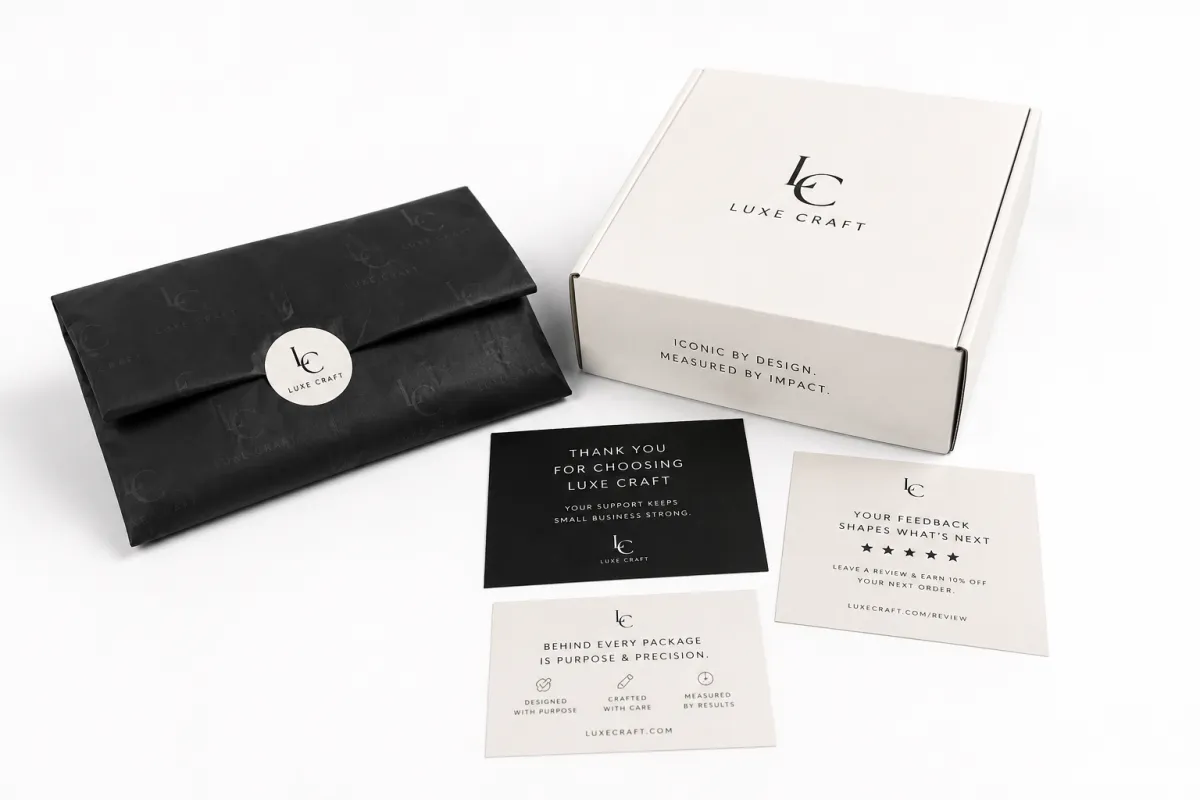
Logo packaging for ecommerce is not a single object. It is the route your identity takes through design, assembly, transit, and opening. That route can include mailers, cartons, sleeves, labels, tissue, insert cards, seals, and return-side identifiers. The logo’s job is to be visible, durable, and repeated in a way that feels human rather than mechanical.
In ecommerce the shelf disappears the second checkout is done. There is no aislescape to recover from a weak impression. That means your parcel is doing retail work in a very short moment: identity, quality proof, and memory anchor. A shopper can forget the feature list and still remember what the package looked and felt like.
Another practical lens: bare packaging often implies a system that stopped once minimum legal requirements were met. A stronger logo packaging for ecommerce program signals there is a process behind the process: approved files, stable fold logic, and repeatable assembly. That is why this area can be treated like operational infrastructure, not a one-time creative campaign.
Teams often miss the most important distinction. You are not “adding art.” You are designing a hierarchy. Outer layer for brand visibility, middle layer for shock and compression resistance, inner layer for instructions or reassurance. That is architecture, with a brand face attached. Once you view it this way, pricing conversations get cleaner, not more emotional.
How does logo packaging for ecommerce work from artwork to delivered box?
Most brands feel this pain eventually: logo packaging for ecommerce collapses before shipping starts because production details were never nailed down. It usually begins at the digital stage. Logos must arrive as print-ready assets with locked versions, approved lockups, and output profiles for the exact presses being used. If the source file is visually fine but not production ready, the project gets expensive later.
For practical teams, the first gate is file hygiene. Keep vector files clean, define CMYK and spot use, lock white areas, and include bleed with enough tolerance. If your team passes a logo through a designer-to-printer path without these details, the first correction pass is usually unavoidable, and correction passes commonly cost more than expected.
Dieline work is where ideas stop being marketing and start being manufacturable. Flap depth, seam depth, tuck-in fold angles, and panel overlap all change how a package performs when it is squeezed between other parcels. A beautiful CAD mock can look elegant and still fail because the fold lines were optimized for a showroom, not a parcel route.
Before choosing the structure, many teams compare core options in our Custom Packaging Products portfolio. Substrate choice comes next. Corrugated board, SBS, C1S board, kraft, chipboard, and flexible films each behave differently under compression, heat, and humidity. As a practical benchmark, single-wall C-flute corrugate is often chosen for higher protection profiles, while SBS films are common for lighter goods that prioritize speed and postal efficiency.
In common production scenarios, teams often see three bands:
- Light soft-goods runs where printed poly mailers are common and speed matters more than rigid impact resistance.
- Mid-weight consumer goods where a custom printed box or sleeve plus inserts balances brand impact and courier handling.
- Heavier or fragile SKUs where rigid structures, stronger reinforcement, and often secondary void control are usually required.
Proofing is where teams either get disciplined or end up firefighting. Digital reviews catch gross placement and spacing problems early. Physical approvals still catch the real-world mismatches: ink laydown under varied lighting, edge rounding after shipping, fold memory, and how much the logo degrades when handled under repeated touch pressure. In a world where most first impressions are filmed on a phone, that matters.
Then come hidden layers: barcode windows, tamper features, reinforcements around stress edges, inserts for fragile interiors, and anti-fade or anti-static treatments where climate is uncertain. These are not cosmetic extras; they are behavioral controls. You may spend less than you think if you include them before production, instead of after complaint spikes.
Print control is where premium positioning often gets quietly lost. A logo that drifts across shades can make a premium brand look rushed. That does not require perfectionism for every piece, but it does require agreed tolerances. Decide what “acceptable variation” means before press start, and make it enforceable. Typical print setups in ecommerce work often lock CMYK tolerance targets and contrast thresholds at file review, then use approved samples as the source of truth.
In high-velocity environments, version chaos is a hidden killer. Keep a single master, and route every revision through one source of truth. If several logo versions are running for the same SKU in production, the cost usually shows up as rework, mispicks, and delayed fulfillment. In ecommerce, one-day delay on one line often becomes a margin event within the week.
When comparing options, teams can usually map three dominant tradeoffs: damage risk, visual integrity, and per-unit cost. The table below summarizes common patterns for logo packaging for ecommerce projects.
| Packaging option | Typical unit cost | Best use | Main strength | Main tradeoff |
|---|---|---|---|---|
| Plain mailer with label | $0.12-$0.28 | Low-margin, low-fragility items | Lowest cost | Weak brand signal |
| Printed poly mailer | $0.18-$0.40 | Apparel, soft goods, accessories | Lightweight branded packaging | Limited protection for rigid products |
| Rigid mailer or sleeve | $0.35-$0.85 | Premium flat goods, print items, gifts | Better unboxing feel | Higher material cost |
| Custom printed boxes | $0.55-$1.60 | Beauty, specialty retail packaging, gift sets | Strong brand recall and protection | More setup and storage complexity |
These numbers are directional, not promises, and they shift by printer location, finish choices, and quantity tiers. To make this realistic, many teams see lower-than-expected unit costs only after they move from one-off jobs to batch repeats of 500, 1,000, or 2,500 units. They are useful because they make teams discuss logo packaging for ecommerce in layers: structure, ink, inserts, and freight profile. Treating everything as one “box cost” often hides the true lever that is creating value.
Key factors that shape high-performing ecommerce brand packaging
The first filter is signal hierarchy. A brand logo should be readable at a distance, clear in dim hallways, and still visible after quick handling. Teams often map this with a simple test grid: arm’s-length readability, one-handed opening, and one-hour light-from-lamp condition. If it falls apart in these conditions, the design is not ready for scale.
Material behavior is the second filter. A lighter paper might look elegant in photos and still fail under repeated compression. ECT grade, surface finish, and moisture resistance determine whether the package preserves shape and logo sharpness. In cold-weather routes, coatings can behave differently than in humid zones, so route context belongs in your spec, not just in shipping notes.
Unboxing psychology works like story pacing. Most people move through recognition, anticipation, reveal, then use. If everything is revealed instantly, the moment feels thin. If the reveal is too theatrical, customers sense overproduction. A clean progression usually works better: logo first, a short cue, then product. The better logo packaging for ecommerce supports that progression without overloading every side of the carton.
Distribution realities also matter more than render realism. Parcels are stacked, clipped, rotated, and dragged in conveyor systems. A package approved in a studio is not automatically transit-ready. Practical standards like ISTA are useful to move discussion beyond opinion. For many teams, ISTA-style checks expose weak folds and edges long before launch pressure mounts.
Sustainability should be treated as systems design, not a badge. FSC paper is valuable when paired with clear material choices and end-of-life logic. Recyclable composites can still become operationally messy if separation is impossible. A simpler, cleaner stream often beats a complex “green” stack if the goal is credible claims and efficient operations at scale.
Social-proof behavior should influence design too. Many buyers evaluate a package in the way they expect to post it. If their feed clips flatten your logo contrast, you lose earned visibility and possibly conversion momentum. Test with actual phone cameras, low light, and compressed video frames before full run. Mockups are useful, but they are not the final arbiter.
Step-by-step guide to planning logo packaging for ecommerce
Step one: brand and sku audit. Before choosing a print vendor, map each SKU by weight, dimensions, fragility, and bundling pattern. You cannot choose logo packaging for ecommerce in the abstract because fragility and shipping density quickly change both structure and profit. Ask where returns are coming from: corners, openings, delays, or perceived mismatch.
Step two: lock constraints early. Set print boundaries, dieline limits, contrast thresholds, barcode zones, and language expansion room before creative starts. In multilingual operations, this is the moment that prevents later emergency resizing. If packaging already has compliance text and batch coding requirements, include those from day one.
Step three: demand structured proofing. Run a premium proof, a value proof, and a stress proof. Premium proofs show what the brand can look like; value proofs reveal where simplification is possible; stress proofs tell you whether the concept holds up under likely handling cycles. This trio usually surfaces a majority of late-stage surprises before production starts, and that is the point.
Step four: finalize a production-ready brief. You are now defining varnish order, finish logic, adhesive behavior, and fallback palettes for expedited replenishment. Build version control into the handoff and freeze editable fields. If three logo variants are floating, you will pay for that chaos in press rework and warehouse confusion.
Step five: bring fulfillment into design reviews. It sounds obvious, but fulfillment teams are the first to reveal where a premium touchpoint breaks operational speed. A deep insert can add beauty and complexity at the same time; a few seconds per parcel can become meaningful labor and freight drift at scale. If line speed falls, premium intent gets translated into higher cost and slower dispatch.
Step six: monitor after launch. Returns, photos, and first-touch complaints are your real QA. If customers mention dents three times in a week, you have a structural clue. Compare results by channel because marketplace and direct storefront routes can produce different handling patterns and therefore different failure types.
A practical planning sequence keeps teams from circling without direction:
- Map SKU protection needs and margin expectations.
- Choose structure and print surfaces based on route behavior, not aesthetic preference.
- Approve artwork and dimensions together in one controlled review.
- Sample, test, and revise before release.
- Track post-launch signals and update specs, one variable at a time.
If you are staring at a current catalog and unsure where to begin, start by comparing present packaging against your most reliable seller profile. Then identify which existing units can carry your current brand system into the next spec upgrade with minimal changes. That keeps teams from redesigning the entire portfolio.
Common mistakes that quietly destroy brand credibility
Mistake number one is overdesigning the logo. A polished mark can become unreadable when wrapped around curves, squeezed by humidity, or rubbed during scanning. Readability beats elegance here. A buyer who cannot identify you quickly becomes a buyer who stays undecided a bit longer, and undecided in ecommerce can mean a refund request.
Mistake number two is ignoring package scale. Oversized boxes increase damage risk and freight waste; undersized boxes increase internal movement and abrasion. Teams often over-protect to look safe or under-protect to save money, and both can backfire. Logo packaging for ecommerce should match the shipment reality, not a mood board.
Mistake number three is under-testing. A tiny correction batch feels painful, but it is typically cheaper than a full restart and usually cheaper than the support surge that follows a large misrun. Route-level tests are especially important if products include glass, electronic contents, or delicate inserts.
Mistake number four is treating finish as decoration. Foil, UV, embossing, and edge treatment can be useful if they support handling and brand memory. If they only support visual “noise,” they tend to become wasted cost. A simple check works: does this finish improve an action, such as opening, scanning, or retention, or does it merely look busy?
Mistake number five is forgetting interior sequence. People encounter interior space before the product, and blank interiors are missed opportunity. A minimal, intentional interior message can reset anxiety and improve perceived care without adding much cost. If you are going to spend on premium packaging, at least one interior element should also earn its keep.
The final trap is category imitation. Copying a structure from a neighboring product category can create a visual mismatch. A sleeve that works for soft goods can collapse for metal. A premium cosmetic look on hardware can feel unserious. A package should reflect what travels inside and what the buyer expects from that category.
Expert tips to make logo packaging for ecommerce look premium without overspending
The smartest spend pattern is simple: put your resources where the buyer actually sees and re-sees the brand. In logo packaging for ecommerce programs, that is often one strong brand mark plus one well-placed structural element, not five competing effects. A stable logo lockup plus a clean insert often beats “do-everything” decoration.
For high-volume brands, standardized structures beat one-off hero packs. If you keep the same carton family and vary inserts and labels, you retain consistency and reduce setup friction. That often lowers incremental cost while keeping brand recognition higher than expected.
Modularity is another underrated move. One outer format can serve multiple SKUs if the interior system flexes. In many programs, modular systems reduce chaos more than any design tweak because they preserve memory while allowing product-level adjustments. This approach works well when there are frequent SKU additions and seasonal extensions.
Design for camera reliability from the start, especially if social and review content drives demand. Matte or soft-touch can support contrast, while aggressive gloss can create glare under phone flash. Most customers with UGC habits frame the top section first, so ensure logo legibility in that zone, not only in fully staged photos.
Evaluate outcomes with business metrics, not just visual preference. Track first-purchase completion, return categories, repeat rate changes, and support themes mentioning packaging. If spend rises but returns and repeat behavior do not move, your system is probably overbuilt for the wrong problem. That is the point where teams should recalibrate quickly.
Use this second table as a practical comparison for balancing spend and effect.
| Approach | Estimated setup complexity | Typical landed cost impact | Brand effect | Best use case |
|---|---|---|---|---|
| Minimal printed mailer | Low | Lowest | Functional, light brand lift | High-volume, low-fragility items |
| Printed box with insert | Medium | Moderate | Clear premium cue | Most consumer goods |
| Rigid mailer with reveal layer | Medium to high | Moderate to higher | Strong unboxing impression | Gifting, flat goods, specialty retail packaging |
| Multi-part custom printed boxes | High | Highest | Maximum brand theater | Premium launches and high-value kits |
Before finalizing, test your choice against three outcomes that matter: perceived premium, shipping resilience, and social photo quality. Then select the minimum architecture that still passes all three. Any extra flourish beyond that is a margin decision, not a brand decision.
Process and timeline: practical planning across design, proof, and launch
Most logo packaging for ecommerce delays start as communication gaps. Designers see aesthetics, printers see files and approvals, fulfillment teams see line speed, and finance sees landed cost. Those views differ, but they are solvable when aligned to a shared timeline.
A practical sequence usually has five gates. Concept and brief alignment can sit at 2–5 days if requirements are locked. Sample prototyping often needs 5–10 days depending on material and finish. Revision lock can add 3–7 days. Production commonly lands in 7–21 business days. Fulfillment sequencing and label setup usually add 3–7 more. These windows are not perfect, but they are far better than “we’ll estimate later.”
Delays usually explode from late changes. A color tweak after sampling can add two to five working days. A late barcode or compliance update can add even more. During seasonal peaks, press and freight queues widen these windows, and one small change can ripple into campaign misses. In this phase, “tiny change” is often code for “real financial delay.”
Back-planning is your strongest control. Start from promised launch date, then fit artwork, proofing, sample review, production, freight, and platform updates into reverse order. Add receiving and compliance approvals as dependencies, especially in categories with regulated claims. This avoids sprinting at the end with no room to correct.
Decision logs are underrated by many teams. Keep approved structure files, version notes, cost assumptions, and timeline deviations in one controlled record. I have seen teams lose weeks because old assumptions remain in chat threads. A short log beats perfect memory, especially when the program repeats across seasons.
Versioned file sets complete the chain. Keep a master lockup, production file, approved sample file, and approved rush-reorder file. When demand spikes, this prevents emergency improvisation and reduces fulfillment disruption. If you treat consistency as routine, scaling becomes much less chaotic.
How much does logo packaging for ecommerce cost, and what comes next?
Costing for logo packaging for ecommerce is typically split between fixed and variable buckets. Fixed costs include dieline setup, prepress, and structural tooling. Variable costs include substrate, inks, finishing, inserts, freight effects, and storage complexity. This split matters because teams can improve quote clarity dramatically by understanding where each dollar comes from.
In most cases, the first cut should reduce finish complexity before reducing protection. If budget pressure is urgent, simplify lamination and coating choices first, then revisit structure only after damage, return, and handling criteria are preserved. This is where teams usually lose less margin than expected.
Second, re-check carton footprint and void fill. A 5% reduction in volume can shift freight classes and reduce storage penalties faster than many print upgrades. Third, validate order quantity against historical sell-through and channel velocity. Over-ordering ties cash in slow-moving stock; under-ordering drives expedites and spikes in unit cost. Many teams find that typical minimums sit around 300–500 pieces for first production runs and 1,000+ pieces for stable pricing tiers, depending on material and finish.
Decision framing matters as much as arithmetic. If a stronger structure raises repeat rate and reduces damage complaints, it can still be the right choice in premium or repeat-driven categories. In fast-replace, low-margin categories, a lighter structure might produce better total margin even with less visible “wow.” No universal winner exists.
Execution should stay simple and repeatable:
- Run a current SKU audit and isolate the biggest trust weak points.
- Collect five real customer mentions from reviews, DMs, or social comments.
- Draft a production-ready logo packaging for ecommerce spec with exact dimensions, materials, and print targets.
- Request at least two printer bids on the same technical spec.
- Run a two-batch pilot and compare damage, defects, and repeat behavior.
- Scale only when versioning, storage, and reorder process are stable.
When comparing options, include your own product family in Custom Packaging Products as a benchmark for practical MOQ, finish standards, and lead-time expectations. That usually makes leadership decisions faster and less emotional.
That sequence gives leadership a cleaner story: measurable confidence improvement instead of taste-based upgrades. The evidence usually lands better, especially when leadership asks where the spend is helping retention.
If a pilot performs well, lock the winning spec and replicate it for the next production cycle. If it underperforms, change one variable at a time and re-test. One controlled adjustment is usually stronger than a complete redesign, especially after rollout data exists.
For brands needing trust over time, logo packaging for ecommerce should be treated as part of the product promise, not an optional visual bonus. Done right, it reduces friction, raises recall, and strengthens future purchasing confidence. Done wrong, it becomes a recurring cost sink and an avoidable source of bad first impressions.
Frequently Asked Questions
How much does logo packaging for ecommerce typically cost by order volume?
Costs vary with materials, print depth, route requirements, and finish choices. Low-volume premium work can still be pricier than high-volume basics, which is why total landed cost usually gives the clearest view. For most logo packaging for ecommerce programs, the biggest gains come from structure and process consistency rather than chasing a one-off low bid.
What is the fastest process for logo packaging for ecommerce launches?
Use a pre-approved template kit, complete one digital proof and one physical sample, then move into full production if both pass. Keep dielines, barcode placement, and logo lockups current so final checks do not restart from square one. The speed is usually won in early decisions, not in late-day execution speed.
Can logo packaging for ecommerce use a single design across multiple products?
Yes, if the architecture is modular. Maintain core brand structure, then vary inserts, labels, and protective systems by SKU. This keeps logo packaging for ecommerce consistent without paying full redesign costs every season.
Which logo packaging for ecommerce materials resist shipping damage best?
For fragile products, stronger corrugated support, rigid systems, and protected internal channels are usually the strongest bets. Real route tests still matter, especially where parcels cross multiple sort centers. In many programs, the largest damage reduction comes from better inserts and edge protection before upgrading the entire carton class.
How can I estimate a realistic timeline for custom logo packaging for ecommerce?
Set windows for artwork, proofing, sample review, and label compliance before estimating production days. Expect revisions to add about 2–5 business days each, depending on scope. If launch dates are fixed, plan backward from fulfillment and freight milestones, include warehouse receiving, and lock corrections ahead of campaign cutoffs.


