Why jewelry hang tag printing changes how a piece is perceived
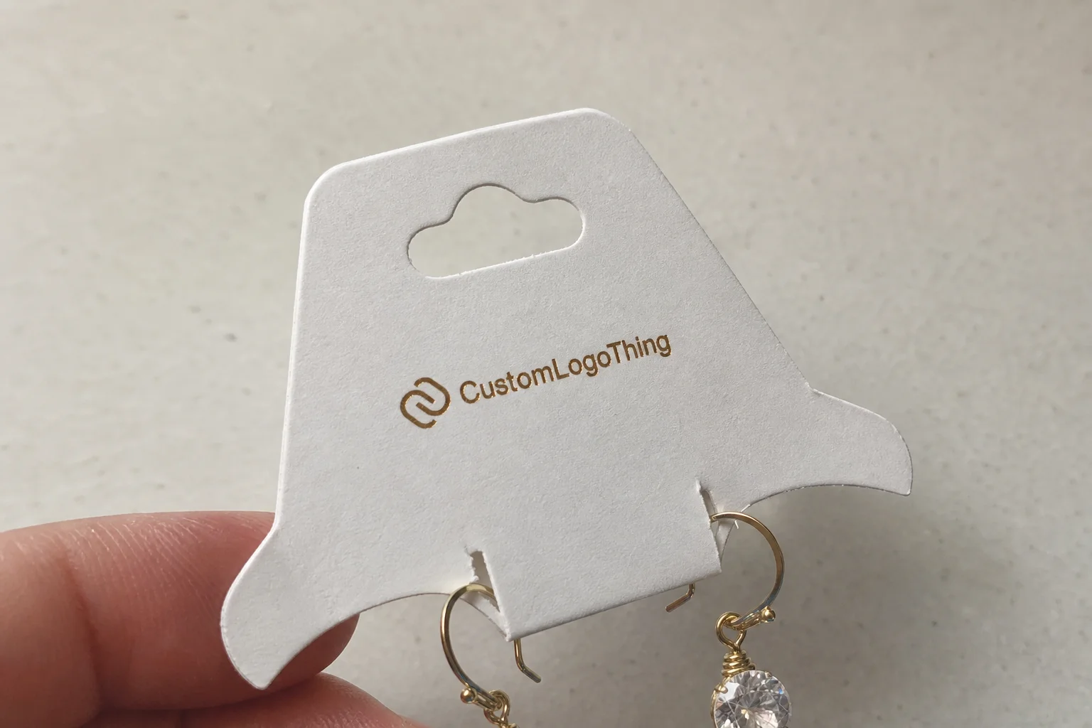
Jewelry Hang Tag Printing looks like a small line item until a customer picks up the piece. Then the tag does a lot of work in a few seconds. It signals price, material, size, and brand discipline before anyone asks a question. If the tag feels thin, crowded, or poorly printed, that feeling transfers to the product. If it feels considered, the jewelry usually gets more benefit than the paper deserves.
That matters because jewelry is judged at close range. A shopper does not inspect a necklace from six feet away the way they might inspect a box on a shelf. They hold it near the light, rotate it, and read the tag while deciding whether the piece feels worth the price. A tag with sharp type, the right weight, and a clean attachment can make the product look deliberate. A weak tag makes even well-made jewelry feel less finished.
The buyer mistake is treating hang tags like generic labels. They are not the same thing. Jewelry tags sit closer to the customer, often in bright retail lighting, and they need a tighter balance of legibility, strength, and presentation. That means print quality, hole placement, barcode space, and stock choice all matter more than they would on a basic carton label.
There is also a brand consistency issue. A silver chain on a bright white, glossy tag sends a different message than a brass cuff on a warm, uncoated card. Neither is inherently right or wrong. The point is alignment. The tag should support the line, not fight it. That is why seasoned packaging buyers usually look at tags as part of the retail system, alongside inserts, boxes, and labels rather than as a separate print job.
For lines that need a consistent family of printed components, Custom Labels & Tags and the broader Manufacturing Capabilities pages are useful references because the tag spec should match the print method and finishing route from the start.
Good tag design disappears into the sale. The customer notices the jewelry, but the tag quietly supports the purchase instead of creating doubt.
Paper stock, coating, and finish choices that shape the result
Stock choice is the first real decision in jewelry hang tag printing, and it affects both the look and the handling. A lightweight text stock may print cleanly, but it will often feel too flimsy once it is cut, punched, and threaded. A cover stock adds body, resists bending, and holds shape better near display fixtures and trays. For most jewelry programs, the practical range starts around 14pt and moves up to 18pt or heavier depending on the collection.
Uncoated stock gives a softer, more natural look. It also accepts handwriting better if staff need to mark prices, sizes, or inventory codes. Smooth coated stock usually prints sharper color and finer details, which helps small logos and thin type. The tradeoff is glare. Under show lighting, a reflective coating can make type harder to read, especially if the design uses pale colors or delicate serif fonts.
Finish should follow readability first and decoration second. Matte and soft-touch finishes reduce glare and can make the tag feel more refined. Gloss can boost saturation, but it is less forgiving in real retail conditions. If the tag is handled often, soft-touch can show wear faster than buyers expect. That is the kind of issue that does not show up in a digital mockup but becomes obvious after a week on the floor.
White point matters more than many buyers expect. A bright white board tends to make metallic jewelry and brand colors pop. A warmer white can feel more restrained and less clinical. Both can work. The decision should be driven by the jewelry line, the photography style, and how much contrast the printed information needs. A brand using pale neutrals and fine typography may want a cleaner bright white. A line with earthy materials often benefits from a warmer stock.
For rough buying comparisons, these options come up often:
| Stock / Finish | Typical Feel | Best Use | Typical Unit Range at 5,000 pcs |
|---|---|---|---|
| 14pt uncoated cover | Natural, writable, straightforward | Everyday retail tags, inventory-heavy programs | $0.18-$0.28 |
| 16pt smooth coated cover | Crisp, clean, more polished | Fashion jewelry, color-rich branding | $0.22-$0.35 |
| 18pt premium board with matte or soft-touch | Substantial, tactile, elevated | Giftable collections, higher perceived value | $0.30-$0.48 |
| Specialty stock with foil or spot varnish | Distinctive, more decorative | Limited editions, display-focused launches | $0.42-$0.75 |
The lower end of that table can still look good if the layout is disciplined. The expensive end can still look cheap if the art is crowded or the coating makes the barcode unreliable. Material choice helps, but it does not rescue weak design.
Buyers who need environmental documentation should ask for it directly instead of assuming the stock qualifies. If FSC-certified material matters, request chain-of-custody proof and check the standard through fsc.org. For packaging that has to survive transit, stacking, and storage, some teams also review guidance from ista.org so the finished goods arrive in usable condition.
Process and timeline from artwork to finished tags
The production path starts with file setup, not with printing. A solid prepress review checks trim size, bleed, safe areas, hole position, barcode placement, and whether the artwork suits digital printing, offset printing, or another route. Skipping that review usually costs more later than doing it properly the first time.
Digital printing is often the practical choice for shorter runs or variable data. It is quicker to set up and easier to revise if a collection changes late. Offset printing becomes more efficient as quantities rise and color consistency matters across a large batch. Flexographic printing can work well for certain tag constructions and repeating formats, especially where the artwork is simple and the line is high volume. Each method has a different cost profile. The wrong one can add expense without improving the tag.
Timeline depends heavily on file quality. Missing bleeds, low-resolution logos, untested barcodes, and unclear dielines are the usual causes of delay. If a design needs to be rebuilt after proofing because the hole shifted into the trim area or the code does not scan cleanly, the schedule usually stretches. That kind of revision is avoidable if the spec is clear before the quote goes out.
Most buyers should separate proof time from production time in their schedule. A straightforward tag on standard stock with standard finishing often moves through print and finishing in about 5 to 8 business days after approval. Add foil, custom die cutting, multiple print passes, or variable data, and the timeline more often lands in the 10 to 15 business day range. If the paper has to be sourced first, the lead time starts before production even begins.
If the barcode has to scan at the register, treat it as a functional element. Quiet zone, contrast, and size are part of the layout, not extras added later.
Finishing is where the tag becomes a retail object rather than flat paper. Common steps include die cutting, corner rounding, hole punching, stringing, banding, foil stamping, and spot UV. Each step needs control. A custom shape is not automatically better than a clean rectangle. A rounded corner is not automatically premium. The right finish is the one that fits the product, the budget, and the retail environment.
Packing format also matters more than buyers expect. Some teams want tags loose in boxes. Others want them bundled in counted sets. If the receiving team is assembling fixtures or kits, the packing method can save time immediately. That is a small detail with a real operational effect, and it is easiest to solve before production starts.
That is the practical value of a clear specification. Jewelry hang tag printing moves faster, costs less to manage, and produces fewer surprises when the art and the finish are both designed for the same result.
Cost, pricing, and MOQ factors that move the quote
Pricing is driven by a short list of variables, and most of them are predictable. Quantity has the biggest effect. Lower quantities carry more setup cost per piece, while larger quantities improve unit cost but tie up more cash and storage. Stock choice, print sides, finishing, and custom cutting also change the number quickly.
A one-color tag on standard stock is not comparable to a full-color tag with foil, soft-touch laminate, and a custom die line. The difference is not cosmetic. It changes the press setup, the finishing route, and often the inspection steps as well. Two quotes can look close until you compare the actual spec line by line.
Minimum order quantity usually reflects production efficiency, not a hard rule. A printer may accept a short run, but the unit price rises because the same setup work is spread over fewer pieces. That is why a 1,000-piece order can look disproportionately expensive next to a 5,000-piece order. The opposite problem also happens: ordering too many tags creates storage pressure and leaves you exposed if the collection changes before the stock is used.
There is a simple way to judge whether a price is worth challenging. Compare the quote against the shelf effect. A tag that looks cheap can drag down a product price point, while a slightly better-built tag can support the perceived value of the item. That matters most for giftable jewelry, where the customer is reacting to tactile quality as much as to the metal, stone, or finish.
A practical quote framework looks like this:
- Basic run: standard stock, one or two colors, simple hole punch, no special coating.
- Mid-range run: heavier board, CMYK or spot color, matte laminate, tidy die cut.
- Premium run: thick stock, foil or soft-touch, custom shape, variable data, and more detailed finishing.
If the tags are part of a larger retail system, compare them with the box, insert card, and label spec rather than treating them as a standalone object. A tag that matches the rest of the line usually feels more expensive than one that tries to impress on its own.
For teams building a broader print package, the Manufacturing Capabilities page is useful because it helps match the job to the right process family. That becomes important when one supplier is expected to handle tags, inserts, and related printed pieces across the same brand line.
There is one place where cutting cost is usually a false economy: stock weight. If the tag bends easily, feels thin in hand, or starts to curl after printing, the savings rarely hold up in retail. The tag may be inexpensive, but the product can end up looking underpriced.
How to spec barcode, hole, string, and security details
Once the visual direction is settled, the functional details need to be fixed. Barcode placement comes first. The code needs enough quiet zone around it so scanners can read it without interference from borders, logos, or decorative artwork. A barcode placed too close to the edge or over a busy background is a common reason for failed scans at the counter.
Hole size and hole position come next. A hole that is too small can tear, especially if the tag is attached and removed often. A hole too close to the edge weakens the card. For jewelry hang tag printing, the attachment point has to work with fine cords, elastic loops, satin string, or plastic fasteners without making the tag bulky or awkward.
Attachment choice changes the visual feel. Satin string reads softer and more giftable. Elastic loops are practical when the tag will be removed and replaced. Thicker cords can look premium, but they also take up more visual space, which matters on small tags. If the piece itself is delicate, the tag should not overpower it.
Security and operational details should be discussed before proof approval. If the tag includes SKU numbers, sequential numbering, care icons, or tamper-resistant attachments, those elements affect layout and space planning. A compact tag is usually better than one trying to cram in too much information. The best small tag is not the one with the most content. It is the one that makes the right content easy to read at a glance.
Before a quote is finalized, these are the details that should be locked:
- Finished size and whether the tag is flat or folded.
- Barcode type, size, and scan requirement.
- Hole diameter, hole location, and attachment material.
- Whether variable data, SKUs, or numbering are required.
- Whether the tag must match an existing box, card, or label system.
If the tags need to fit into a larger rollout, alignment with Custom Labels & Tags helps keep the line visually coherent. The customer usually sees the tag, the box, and the insert as one system, even if the buyer sourced them in separate orders.
Common mistakes that make printed jewelry tags underperform
The most common failure is overcrowding. Tiny fonts, too many logos, long care notes, and packed pricing all compete for space. Under store lighting, the clutter gets worse. On a shelf or in a product photo, it can make a good piece look less polished than it actually is.
Weak contrast is the next problem. Silver-gray type on a pale white stock may look elegant on screen and disappear in the store. Pale backgrounds under reflective finishes behave the same way. Jewelry hang tag printing works best when readability is prioritized before decoration, especially when the tag has to support a quick purchase decision.
Finish choice can also backfire. Gloss can look rich in a sample, then throw glare under showroom lights. Soft-touch feels upscale, but repeated handling can mark it faster than buyers expect. There is no finish that solves every problem. The correct finish is the one that matches how the tag will actually be used.
Brand inconsistency is another quiet failure. If the tag stock is noticeably thinner than the packaging, or the brand color shifts enough to be visible, the whole line feels less controlled. Buyers often describe that as “cheap,” even when the real issue is simply mismatched print specifications. The fix is not always a bigger budget. It is usually tighter coordination.
These mistakes appear again and again:
- Approving artwork before checking the final trimmed size.
- Skipping a barcode scan test on the proof.
- Ignoring bleed and safe-zone warnings on the template.
- Choosing a hole size without testing the actual string or loop.
- Using a finish that looks good online but fails under real store light.
The last one matters more than most teams admit. A tag is not judged in a presentation deck. It is judged in a hand, under a lamp, next to a real product, with a cashier or customer reading it in a few seconds. That is the environment the spec has to survive.
The cleanest-looking tag is usually the one that was planned for use, not just for appearance. That is what separates a printed piece that supports sell-through from one that simply exists in inventory.
Building a spec that is ready to quote
The fastest way to get an accurate quote is to send a complete spec package. Start with finished size, stock, finish, quantity, barcode requirements, string or loop choice, and any folding or shaping details. Add one clean logo file, the final copy, and a reference image if the visual direction still needs interpretation.
If the job needs to move cleanly, remove guesswork from the brief. State whether the tags must be retail-ready, whether they will carry variable SKUs, and whether the artwork has to match an existing packaging system. Every missing decision invites another round of proofing, and every extra round burns time.
When comparing quotes, do not stop at the lowest number. Check whether the paper is actually comparable, whether the finish is included or added later, whether the proof process is clear, and whether the turnaround covers finishing and packing. A quote that looks low can become expensive if the spec is incomplete or the production route changes after approval.
For a jewelry line that relies on presentation, the tag is not a side item. It is part of the retail story. The strongest tags feel consistent with the rest of the package, survive handling, and support the purchase without competing with the product. That is the real test of jewelry hang tag printing: the piece should look ready, priced with confidence, and built for the way stores actually sell.
Handled well, the tag does not ask for attention. It earns trust, keeps the operation moving, and makes the product feel finished before anyone leaves the counter.
What stock works best for jewelry hang tag printing?
A heavier uncoated or smooth cover stock is usually the safest starting point because it feels sturdy, prints cleanly, and stays readable at close range. If the tag needs a more premium feel, choose a coated or specialty stock only after checking glare, fold behavior, and barcode performance.
How long does jewelry hang tag printing usually take?
Timing depends on proof approval, stock availability, print complexity, finishing, and whether the job includes custom shapes or variable data. Simple specs move faster, while special coatings, foil, or detailed die cutting add steps that can extend the schedule.
What affects the price of custom jewelry hang tags the most?
Quantity, material choice, print sides, finishing, and custom cutting usually have the biggest impact on unit cost and total quote. Adding barcode numbering, unique SKUs, or premium finishes can raise cost, but they may improve usability and presentation enough to justify it.
Should hang tags include barcodes for jewelry items?
Yes, if the tag will support retail operations, inventory control, or POS scanning, the barcode should be built into the layout from the start. The barcode needs enough quiet space, strong contrast, and the right size so it scans reliably after printing and finishing.
How do I make jewelry hang tags look more premium without overspending?
Use a strong stock, keep the layout clean, and choose one or two deliberate finishes rather than stacking too many effects at once. Premium usually comes from restraint, sharp typography, good contrast, and a finish that matches the jewelry line instead of fighting it.
What information should be on a jewelry hang tag?
Most tags need the brand name, price, SKU or item code, material or metal description, and a barcode if the tag is used in retail operations. Some lines also include care notes, size, or origin, but the layout should stay readable after the hole is punched and the tag is attached.