What Frosted Zipper Bags Logo Placement Really Controls
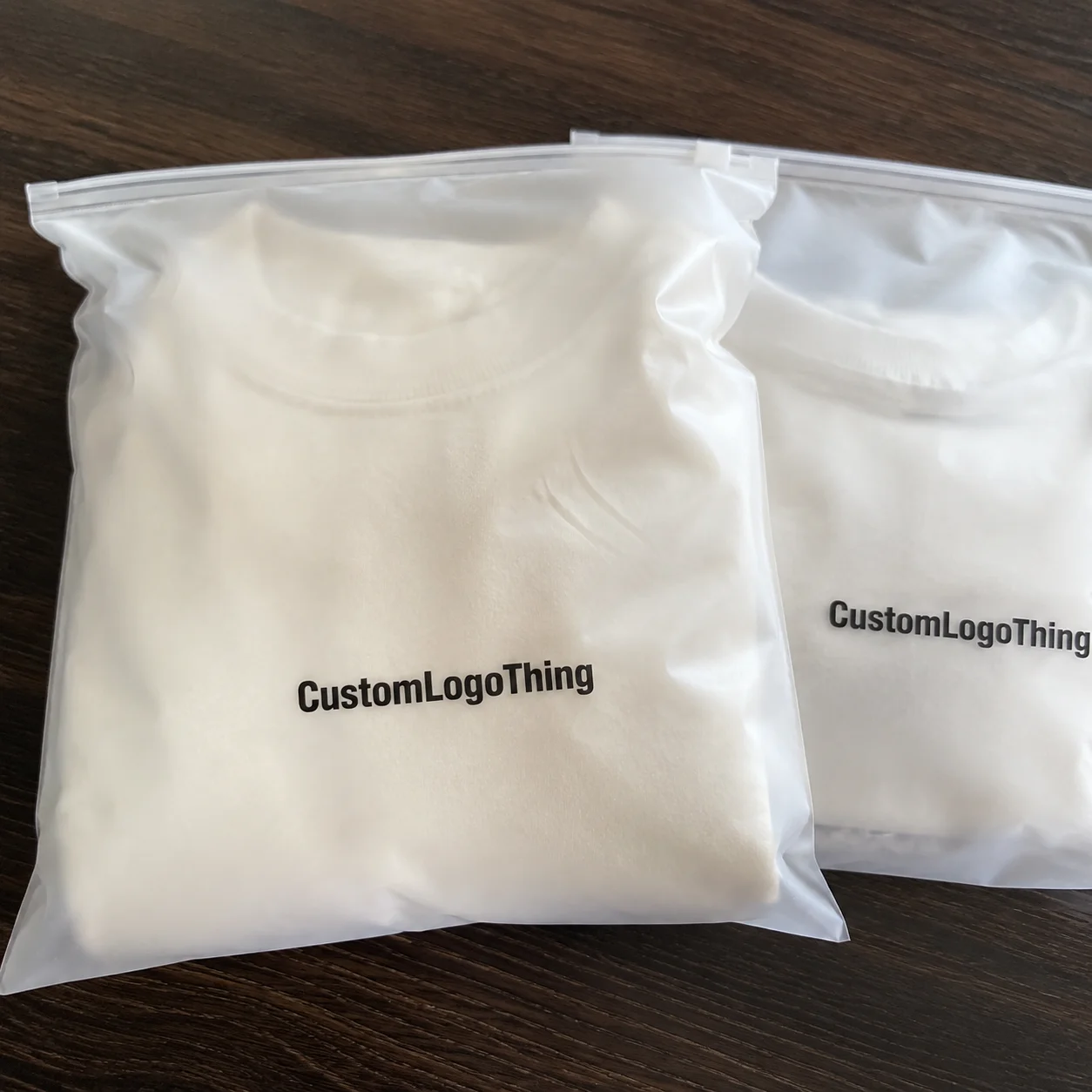
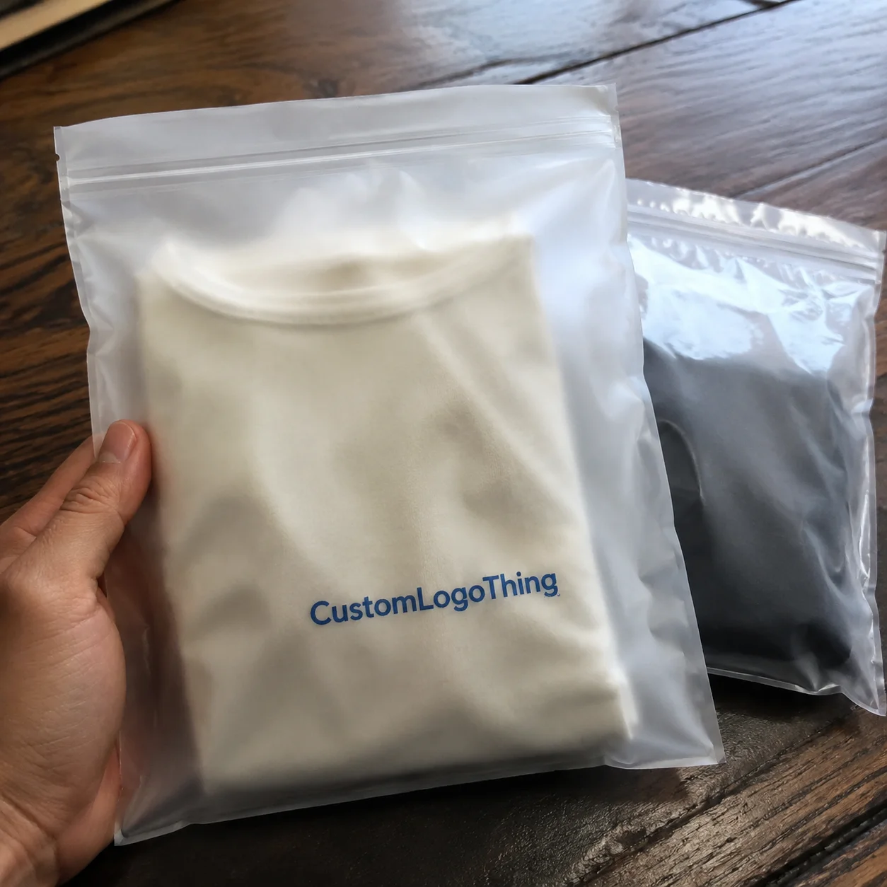
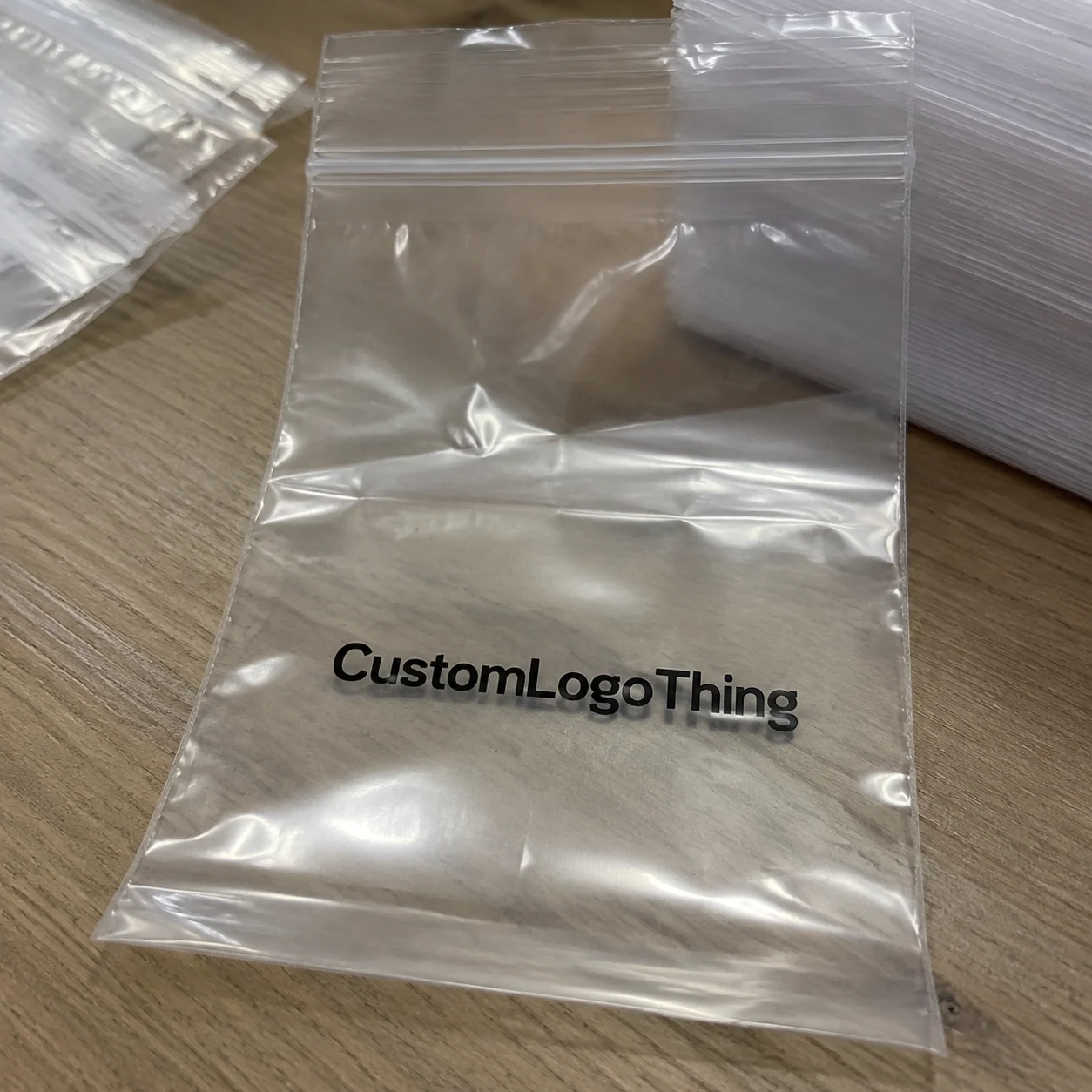
Two Frosted Zipper Bags can come from the same roll of film, use the same zipper, and hold the same product. One looks ready for a retail buyer's sample table. The other looks oddly unfinished. Frosted zipper bags logo placement is not a minor design preference; it controls readability, perceived value, scanning distance, and whether the package still looks intentional after it is filled, sealed, handled, boxed, and shelved.
A flat proof behaves politely. A filled pouch does not. Product presses against the film. The zipper creates a hard horizontal line. The bottom fold steals visual space. Frosted plastic softens contrast just enough to punish thin artwork, especially under bright store lighting.
Frosted plastic is usually a semi-translucent LDPE, HDPE, EVA blend, or specialty film that scatters light. That haze reduces glare compared with clear glossy plastic and gives dark ink a quieter finish. The tradeoff is edge sharpness. Fine type that looks crisp on a white PDF may lose definition once it lands on a flexible, satin-like surface. Placement has to be judged on the material, not only on screen.
From a retail buyer's view, the printable face has three jobs in about three seconds: identify the brand, suggest the product category, and signal that the item can be trusted. Nielsen has reported for years that many purchase decisions happen close to the shelf. Exact percentages vary by category, but the packaging lesson is stable: shoppers judge fast.
The main placement zones look simple. Their behavior is not.
- Front center: best for quick recognition on shelves, trays, and product photos.
- Upper third: useful for hanging displays because the mark stays visible below the hang hole and zipper.
- Lower third: helpful when the upper bag needs to show contents, though it can disappear in bins.
- Corner mark: effective for boutique or minimalist packaging, usually 15% to 25% of panel width.
- Back panel: practical for care instructions, compliance copy, reorder codes, or secondary branding.
- Repeat pattern: strong as brand texture, but higher print coverage can raise cost and spoilage risk.
The zipper track, hang hole, heat seals, bottom fold, and side seams are production boundaries, not empty white space. Respecting them protects print consistency, zipper function, and the basic human act of opening the bag without tearing through the brand mark.
Frosted Zipper Bags Logo Placement Rules for Film, Zippers, and Ink
Frosted film changes ink behavior before the shopper sees the product. LDPE feels soft and flexible. HDPE can feel slightly crisper. EVA blends can add a more rubbery hand. Compostable-look films may carry a warmer haze. All of these materials scatter light. That matte effect is the reason brands like the format, but it also means ultra-light gray, thin script, and tiny registered trademark symbols can fade into the surface.
The zipper is the visual horizon line. Put a logo 0.25 inch below it on a small 4 x 6 inch bag and the design can feel squeezed. Drop that same logo too low on a 9 x 12 inch apparel bag and it may hide when the bag lies in a carton or bends over soft goods. The safest placement depends on the real display method, not just the dieline.
Print method changes the answer again. Screen printing is often the cleanest choice for bold one- or two-color logos on short to mid-size runs. Flexographic printing makes more sense when quantities rise and plates can be justified. Digital printing helps with lower minimums or complex art, although ink opacity and surface adhesion need to be checked. Hot stamping can add a premium accent, but large foil areas may crease on flexible Frosted Zipper Bags.
A white ink underbase can make brand colors pop. It can also turn a delicate logo into a heavy block if the underbase is too large. Buyers sometimes approve a pleasing color match, then miss that the added white layer has changed the whole weight of the mark.
Proofing test: view the logo at arm's length, then shrink the proof on your phone until the bag is roughly thumbnail size. If the brand mark stops reading, the shelf will not be kinder.
Scale gives useful perspective. A centered 3-inch logo on a 6-inch-wide bag occupies 50% of the front panel width and commands attention. A 1-inch corner logo on that same bag acts more like a discreet signature. Neither choice is automatically better. The real question is whether the bag needs to sell from six feet away, support a premium unboxing moment, or let the product itself carry the visual weight.
Key Placement Factors: Size, Fill Level, Seals, and Shelf Angle
Start with bag size. A 4 x 6 inch sample bag and a 9 x 12 inch apparel bag do not share the same visual field, even if the logo file is identical. On the small bag, a 2-inch logo may feel dominant. On the larger bag, it may look timid and accidental. Good logo positioning starts by measuring the bag that will actually be used.
Packaging teams often talk about total dimensions, but designers should work from the live area. That means usable design space after clearance from zippers, side seals, bottom seals, gussets, tear notches, hang holes, and required warnings. For many stock zipper bags, conservative clearance may be 0.25 to 0.5 inch from seals and closure features. The supplier's dieline still outranks any general rule.
Fill behavior is the hidden variable. Powders settle into a slope. Candies create lumps. Hardware makes pressure points. Documents keep the bag flat. Soft goods, especially textiles and accessories, push the front panel into curves that can stretch a centered logo into an oval. The flatter the product, the more predictable the artwork.
Shelf angle matters just as much. Bags may hang vertically from a peg, lie flat in bins, ship stacked in cartons, or sit upright in acrylic trays. Upper-third placement tends to work for hanging displays because the logo remains visible below the hang hole. Center-front placement usually wins for shelf photos and tray displays. Lower-third placement can work for contents-led packaging, especially if the frosted film gives just enough visibility to show color or texture.
Regulatory and operational marks also claim space. Recycling symbols, suffocation warnings, barcode labels, batch codes, ingredient stickers, and country-of-origin copy can force a more disciplined layout. Retail channels may have their own packaging and labeling expectations, so review them early. The EPA's recycling guidance is a useful starting point for consumer-facing recycling language, though local rules and material structure still matter.
Ask for a dieline or printable area template before finalizing frosted zipper bags logo placement, especially for bottom gusset bags or unusual closures. Guesswork is cheap until plates are made.
Where Should the Logo Sit for Retail Display?
For hanging retail displays, start in the upper third of the front panel. The logo should sit below the hang hole and zipper, with enough clearance that the closure does not feel like it is pressing down on the brand. This keeps the mark visible when several bags overlap on a peg. It also protects the top of the package, where fingers, hang tabs, and header labels often create visual noise.
For tray displays, product photography, and flat storage, center-front placement usually performs better. It gives the camera and the shopper a clear target. On custom frosted zip bags used for accessories, stationery, skincare tools, or small apparel, the centered mark can make the package feel more finished even when the product inside varies in color or shape.
Lower-third placement is riskier but useful in one specific case: the contents are the hero. Think colorful candy, handmade pieces, or textiles where the material itself sells the item. The logo becomes a caption instead of a headline. On matte plastic packaging, that can look restrained and expensive. In a deep retail bin, it can vanish.
Corner placement works when the brand already has recognition or the design intent is deliberately quiet. A 15% to 25% panel-width logo in the lower right or upper left can feel editorial, almost like a maker's mark. But corner placement needs more discipline than it appears to need. Move it too close to the side seal and tolerance becomes obvious. Move it too far inward and it looks like a mistake.
The practical answer: choose the logo zone after choosing the display method. A pouch is not a poster. It bends, fills, stacks, and gets touched.
Process and Timeline From Artwork to Finished Bags
A clean production path follows a predictable order: confirm bag dimensions and material, choose the print method, request a dieline, place artwork, review the digital proof, approve a pre-production sample if needed, then move into printing and bag conversion. Skipping the dieline step saves an hour and can cost a week.
A digital proof checks position, scale, spelling, orientation, and color callouts. A physical sample checks the things a PDF cannot: ink opacity, frost level, hand feel, zipper strength, seal quality, and how the logo behaves after filling. If the packaging is tied to a retail launch, subscription box calendar, trade show, or influencer kit, order samples early enough to allow a second decision.
Typical timing varies by supplier and order type. A simple one-color logo on a stock-size frosted zipper bag may move through proofing and production in roughly 10 to 15 business days after approval. Custom sizes, new flexo plates, multiple ink colors, special finishes, overseas freight, or added inspection requirements can push the schedule into 4 to 8 weeks. That range is not a promise. It is a planning guardrail.
Buyers often miss the quiet lead-time variables: artwork revisions, PMS color matching, plate making, film availability, zipper color, packing method, inspection queue, and shipping speed. A delayed logo decision can stall production more effectively than a mechanical issue because printers need locked artwork before setup.
Before approving the final position, check these details in one pass:
- Final bag width, height, gusset, and film thickness, such as 2.5 mil or 3 mil LDPE.
- Logo dimensions in inches and as a percentage of the front panel width.
- Distance from zipper line, side seals, bottom fold, and hang hole.
- Ink colors, including PMS references if color matching is required.
- Proof orientation, quantity, delivery address, and target in-hands date.
For transit-sensitive launches, ask whether the packed cartons should be evaluated against standards such as ISTA test procedures. A zipper bag is only one layer of the system, but crushed cartons can still make careful front-panel branding arrive wrinkled.
Cost, Pricing, and MOQ Drivers for Logo Placement Choices
Placement itself is rarely a standalone line item on a quote. It still affects setup complexity, print area, ink coverage, spoilage risk, and whether a standard bag can be used. A small centered logo in one color is usually more economical than a full-panel pattern, edge-to-edge art, two-sided design, or artwork requiring tight registration near seams.
Major cost drivers include bag size, film thickness, material type, zipper style, print method, number of colors, one-side versus two-side printing, ink opacity, and order quantity. MOQ logic is blunt: setup time, plate costs, washups, and press calibration get spread across more bags as quantity rises. That is why a 1,000-piece run may feel expensive per unit while 10,000 pieces can look dramatically better.
| Option | Typical Use | Cost Impact | Placement Watchout |
|---|---|---|---|
| One-color screen print | Bold logos, short to mid runs | Often efficient for 500 to 5,000 pieces | Keep fine lines thick enough for matte film |
| Flexographic print | Higher-volume retail packaging | Plate costs spread better over 10,000+ pieces | Confirm registration tolerance near seals |
| Digital print | Complex art, lower minimum testing | Higher unit cost, lower setup burden | Check ink density on frosted material |
| White underbase | Color accuracy on translucent film | Adds ink and setup cost | Can make a subtle logo look heavy |
| Two-sided print | Front branding plus back instructions | Higher than one-side print | Reserve back panel space for barcode labels |
As a rough planning range, custom printed stock frosted zip bags might land around $0.18 to $0.45 per unit at 5,000 pieces for simpler one-color work, depending on size, film gauge, and supplier. Smaller runs can sit much higher. Larger flexo runs may lower unit cost, but only after plate and setup economics make sense.
Premium choices such as metallic ink, PMS matching, white ink, matte-on-matte effects, or repeat patterns can lift perceived value. They should also be justified by retail price. A $4 accessory and a $68 skincare kit do not need the same print spend. Strong placement often does more for perceived value than adding a second ink color.
Quote requests should include size, thickness, material, quantity, zipper type, logo size, logo location, number of ink colors, print sides, delivery ZIP code, and target in-hands date. Add one more line: "Please confirm printable area and placement tolerance." The cheapest quote may hide thinner film, weaker zipper tolerance, less accurate print placement, or a longer lead time.
Step-by-Step Guide to Placing a Logo on Frosted Zipper Bags
Good packaging decisions get easier when the sequence is disciplined. Use this process before approving frosted zipper bags logo placement for a retail order.
- Choose the real bag size first. Base it on product dimensions, fill volume, and display method before resizing the logo. A bag with 0.5 inch of extra headspace behaves differently from a tight fill.
- Mark the non-print zones. Identify the zipper, heat seals, gussets, hang hole, tear notch, bottom fold, and required warning text. Treat these areas as boundaries, not design opportunities.
- Decide the brand hierarchy. Should the logo be first, the product name first, or should the contents carry most of the selling? A clinical supplement pouch and a playful candy bag need different visual priorities.
- Set logo scale by panel percentage. A primary logo often starts around 35% to 55% of front panel width. A quiet corner mark may sit around 15% to 25%. Percentages help keep proportion consistent across small, medium, and large bags.
- Test contrast against frosted film. Black, charcoal, navy, deep green, and white usually read well. Pale gray, beige, yellow, and low-contrast pastels need caution unless subtlety is the point.
- Check the filled bag. Product shape can pull artwork into curves, folds, or shadows. This is especially true for socks, cables, handmade goods, candies, and hardware assortments.
- Approve exact measurements. Confirm logo width, height, distance from the zipper line, and distance from side edges. Do not approve placement by screenshot alone.
- Document the approved position. Keep the proof, dieline, and physical sample on file so reorders match the first run instead of drifting by memory.
ASTM packaging test methods can also be relevant if the bag is part of a larger shipping system, especially where puncture, drop, or compression risks affect the filled presentation. For most retail zipper bags, though, the daily test is simpler: fill it, seal it, move it, and see whether the brand still looks deliberate.
Common Logo Placement Mistakes That Make Bags Look Cheaper
The first mistake is zipper crowding. Artwork placed too close to the closure looks mechanically constrained, and the print zone near thick closure features may be less forgiving. Even 0.25 inch of extra breathing room can make a small pouch look more considered.
The floating logo problem is subtler. The mark is technically centered on the flat bag, but once the bag is filled or hung, it looks too low. Upper-third placement often solves this for peg displays, while center-front placement can still work for flat trays or product photography.
Oversizing can backfire. A large logo may look confident on a mockup, then wrinkle across curved contents or dominate the product so aggressively that the bag feels like a promotional giveaway. Retail packaging needs confidence, not shouting.
Key details placed near side seals, bottom folds, gussets, or tear notches face trimming tolerance, handling stress, and visual distortion. If a barcode, batch code, or ingredient sticker also lands nearby, the back panel starts to look improvised.
The contrast trap is real. Frosted plastic can make pale gray, beige, yellow, or thin-line logos fade under store lighting. A logo that reads under office lighting at 18 inches may fail at three feet on a bright shelf.
Inconsistent sizing across bag ranges creates a different kind of cheapness. Brands order small, medium, and large zipper bags, then use the same 2-inch logo on all three. The small bag looks crowded, the large bag looks underbranded, and the line loses rhythm. Better: scale the mark as a percentage of the live front panel and keep the visual relationship consistent.
Most weak logo placement comes from treating the decision as a graphic design task only. It is also a converting task, a filling task, a retail task, and sometimes a compliance task.
Next Steps Before You Approve the Final Bag Proof
Before signing off, print the proof at actual size. Mark zipper and seal clearances with a ruler. Compare logo visibility at three feet. Ask how the bag will actually sit, hang, ship, or be photographed. A proof that survives all four questions is much safer than a pretty PDF.
Fill a blank sample bag with the real product and tape a paper logo mockup to the front. Crude? Yes. Useful? Absolutely. It reveals scale, bulging, shadows, and fold lines before money is committed to plates, screens, or printed inventory.
Request confirmation of print tolerance if the design aligns close to the zipper, edge, gusset, or hang hole. A supplier may quote a normal placement tolerance of plus or minus 1/16 inch or 1/8 inch, depending on process and bag construction. Tight registration near a seal is a design risk, not just a production preference.
Keep one approved physical sample or signed proof on file for reorders, quality checks, and vendor comparisons. Choose one decision owner for final artwork approval as well. Packaging delays often come from too many late opinions rather than actual manufacturing limits.
Send the supplier product photos, display context, and a desired impression such as premium, clinical, playful, minimalist, or sustainable-looking. Those cues help the production team understand why the logo belongs in a specific zone, not merely where the art file happened to land.
The best frosted zipper bags logo placement survives the real-world test of filling, sealing, shipping, shelving, and being judged in seconds.
FAQ
Where should a logo go on frosted zipper bags for retail display?
For hanging retail displays, the upper third usually works best because the logo remains visible below the hang hole and zipper. For flat shelf or tray displays, centered front placement often gives stronger brand recognition. Keep the logo clear of zippers, heat seals, gussets, and warning text so the design does not look cramped or distorted.
How large should a logo be on custom frosted zip bags?
A practical starting point is 35% to 55% of the front panel width for a primary logo, then adjust based on product visibility and brand style. Small boutique marks can work at 15% to 25% of the front panel width if the contents are meant to carry more visual weight. Always review the logo on a filled sample because bulging products can make a correctly sized flat logo look oversized.
Does frosted zipper bags logo placement affect printing cost?
Placement can affect cost indirectly if it increases print area, requires two-sided printing, needs tighter registration, or pushes the design beyond a standard printable zone. A one-color logo in a standard front-center position is usually more economical than a full-panel pattern or edge-aligned artwork. Ask for pricing based on logo size, ink colors, print sides, and quantity so the quote reflects the actual design.
What logo colors work best on frosted plastic zipper bags?
Black, charcoal, navy, deep green, and white ink usually read well on frosted film because they create stronger contrast. Pale gray, yellow, beige, and thin pastel artwork can disappear under bright retail lighting. A white underbase can improve color accuracy for some brand colors, but it may add cost and change the visual weight of the design.
Can I print a logo close to the zipper on frosted zip bags?
Yes, but it needs enough clearance so the logo does not collide visually with the zipper track or fall into a less reliable print zone. The exact clearance depends on bag construction, print method, and supplier tolerance. Request a dieline or printable area template before approving artwork that sits near the zipper.