Buyer Fit Snapshot
| Best fit | packaging branding practices decision review for packaging buyers comparing material specs, print proof, MOQ, unit cost, freight, and repeat-order risk where brand print, material, artwork control, and repeat-order consistency matter. |
|---|---|
| Quote inputs | Share finished size, material target, print colors, finish, packing count, annual reorder estimate, and delivery region. |
| Proofing check | Approve dieline scale, logo placement, barcode or warning zones, color tolerance, and any recyclable or compostable wording before bulk production. |
| Main risk | Vague material claims, crowded artwork, or missing packing details can create delays even when the unit price looks attractive. |
Fast answer: Packaging Branding Practices Decision Review: Dieline, Finish, Proof, and Buyer Review should be specified like a repeatable production item. The safest quote includes material, print method, finish, artwork proof, carton packing, and reorder notes in one written spec.
What to confirm before approving the packaging proof
Check the product dimensions against the actual filled item, not only the sales mockup. Ask for tolerance on folds, seals, hang holes, label areas, and retail display edges. If the package carries a logo, QR code, warning copy, or legal claim, reserve that space before decorative graphics fill the panel.
How to compare quotes without losing quality
Compare board or film grade, print process, finish, sampling route, tooling charges, carton quantity, and freight assumptions side by side. A lower quote is only useful if the supplier can repeat the same color, closure quality, and packing count on the next order.
What are the packaging branding best practices that actually work?
The same SKU can lose trust before the buyer sees a single bullet point, and you can watch that happen in one afternoon during a product launch. I have sat in postmortem calls where sales were flat despite good creative, because the package looked tired the moment it arrived. A good pack does not just sit on a shelf; it is the first physical contract between the brand and the buyer. If that contract feels off, everything else has to spend twice as much effort to recover it.
Packaging branding best practices are not a visual polish exercise. They are a discipline where structure, material choice, print behavior, and shipping logic line up so the package performs as reliably as the product it contains. I have seen teams pour budget into metallic inks while skipping edge reinforcement, then wonder why every second batch gets dented and starts the return cycle. Visual impact matters. So does mechanical strength. The brand only gets a win when both exist together.
My quick verdict: choose rigid custom cartons when the positioning needs a premium signal, sleeves for speed and frequent variation, and mailer sleeves for direct-response volume where handling and storage are constant. That is the map I keep using when clients ask, which one should we start with?
It sounds blunt, and that is the point. Blunt decisions early usually save money later.
If you are moving from 100 units to 5,000, or if you are building repeat orders for e-commerce, packaging branding best practices become the guardrail. The question is not how shiny can I make this?
The question is how dependable will this stay after ten reorder cycles?
A pretty pack that changes every run is a branding headache disguised as design progress.
A pretty box that cracks in transit is not branding. It is a complaint generator with a logo.
That is why this review stays practical. I focus on packaging branding Best Practices That hold up in production, freight, and unboxing, because I have watched teams lose weeks trying to fix avoidable defects after press. If you want a broad materials landing point before narrowing format, the Custom Packaging Products page is a practical on-ramp. If you want to see how these ideas perform in live jobs instead of theoretical decks, the Case Studies page is the better mirror.
Who this helps most:
- Brands graduating from pilot runs into repeat ordering of 500 to 5,000 units
- E-commerce operators tightening branded identity without letting freight explode
- Manufacturers comparing retail formats across multiple SKUs and channels
- Product teams that care about repeatable execution more than one-off mockup applause
Top Options Compared: sleeves, rigid mailers, and inserts for packaging branding best practices
Packaging branding best practices start with behavior under stress, not just how things look in Photoshop. Sleeves, rigid mailers, and inserts each solve different operational problems, and each one behaves differently when the truck load tilts, temperature swings, or warehouse hands the pack an extra twist. I judge these options the way I would judge a software rollout: which one creates fewer silent failures.
Sleeves are the cheapest path to visible brand space, and the first thing they do right is speed: fast adaptation, familiar workflows, easy replacement. They are especially useful when you need fast line-to-line variation because they wrap existing boxes and can be refreshed without reengineering the base container. But sleeves also inherit the baseline pack’s weaknesses. If the core carton is thin, the sleeve looks like a fashion layer over a cheap frame. In practical terms, this means sleeves are fast, not always final.
Rigid mailers create a stronger perception of care. They hold edge shape, photograph consistently, and deliver a premium hand-off feel. The tradeoff is physical reality: more mass and more cubic volume can push freight faster than you expect, especially if you are shipping across zones or stacking by pallet. A useful comparison from my own work: rigid mailers often increase unboxing quality by a lot, but that premium only pays off if the category supports the touchpoint. For subscription kits and gifting, I’d expect that upside. For commodity replenishment, I often skip it.
Inserts do not look loud, and that is their strength. They lock structure, improve guidance, and keep compliance and instruction data readable when shelf space and front-face real estate are limited. Because inserts are cheap to update, they are where brands often test offers, seasonal instructions, and barcode updates without touching the outer pack. If you need packaging branding best practices that are both flexible and repeatable, inserts are the quiet winner.
Here is the matrix I rely on when teams want a quick compare-and-commit moment:
| Format | Best Use | Typical Unit Cost at 500 | Typical Unit Cost at 5,000 | Strengths | Tradeoffs |
|---|---|---|---|---|---|
| Sleeves | Promo packs, lightweight e-commerce, layered branding | $0.35-$0.75 | $0.12-$0.26 | Low setup, quick artwork changes, decent shelf impact | Limited protection, weak if the base pack is weak |
| Rigid mailers | Subscription boxes, samples, premium launches | $0.80-$1.60 | $0.45-$0.90 | High perceived value, sturdy structure, strong unboxing experience | Higher freight, more storage space, dents still visible |
| Inserts | Kits, retail packaging, instruction-heavy packs | $0.10-$0.25 | $0.04-$0.10 | Cheap to print, easy to update, strong for messaging and barcodes | Insufficient alone for premium positioning |
Shipping durability is the first credibility test. A package that cannot survive rough handling will lose the benefit of every print choice you make. If you need an objective checklist for transport resistance, review the ISTA test standards. They are not magical, but they force teams to account for corner crush, drop behavior, and vibration before release. Packaging branding best practices become real the moment those tests are built into planning, not after dispatch.
Material sourcing also deserves hard skepticism. If a vendor says stock is responsibly sourced, ask for FSC documentation or equivalent chain-of-custody proof. I have worked with teams who got excited about the “eco story” and later had to scrub it after a retailer asked for validation. No fancy grammar fixes that after-the-fact, please.
My practical recommendation: if your category is impulse-driven and logistics-heavy, sleeves or inserts usually keep pace and keep costs sane. If the category is premium gifting or tightly regulated retail, rigid mailers or custom cartons usually preserve brand confidence better over multiple touchpoints. If budget pressure is still tight, start with one stable structure and one finish. It is boring in a good way, and boring is better than six effects that contradict each other.
Detailed Reviews: packaging branding best practices by format and finish
Packaging branding best practices move from concept into reality when print consistency, fold tolerance, and finish behavior are tested against real handling. A package can look sharp in the office and fail after one week of warehouse life; I have seen that happen enough times to trust physical samples over mockups every single time. If your brand claims durability, your packaging process has to prove it one crease at a time.
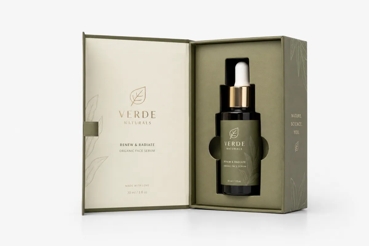
Paper sleeves: These are strong when you need cost control and quick deployment across SKUs. On most light-duty products, I see sleeves around 250gsm to 350gsm for enough stiffness to prevent collapse. Go too light and they wrinkle under repeated handling. Go too heavy and the wrap becomes cumbersome and expensive to ship. Coating choices matter more than expected: matte hides fingerprints and scuffs, gloss raises initial shelf contrast, and soft-touch can create a premium sensation but can also show transfer marks from rougher handling. That is why handling validation belongs in packaging branding best practices and not in the finish-only approval meeting.
Rigid mailers: These are often the right choice when the package has to look premium and still fit a moderate budget. A rigid structure can make a mid-priced product feel intentional, particularly when interior messaging or controlled reveal sequencing is used. The production caveat is structural: poor glue cure timing, edge wrap inconsistency, and aggressive scoring can all flatten the finish and show ugly lines. If you are testing this format, the first sample should include fold memory check, stack load test, and edge stress pass before artwork is finalized.
Insert cards and product slips: They do not compete for front-face glamour, so they do hidden heavy lifting quietly. A clear insert can carry instructions, QR support links, compliance notes, and reorder prompts while protecting the outer brand message from clutter. In retail where shelf time is short and confusion costs margin, this separation is often a conversion advantage. I tend to call inserts the invisible layer of clarity
because they rescue both communication and customer confidence.
Print consistency: If your process depends on a specific red, copper, or skin tone, lock it before bulk production. I insist on a proof system that tests final behavior under coated and uncoated stock because color shifts under varnish and substrate are the usual reason brands have to rework at scale. CMYK and Pantone references are fine as starting points, but I trust physical proof ladders more than screen calibration claims. If the color drifts at run two, that’s a preventable defect, not fate.
Checklist for production-level review:
- Proof approved against the exact dieline, not a approximated panel
- Color targets and tolerances defined before plate and ink approvals
- Foil, spot UV, or other decorative layers checked against physical samples
- Glue line integrity and fold tension reviewed under consistent lighting
- Barcode, warnings, and compliance text validated at scanning distance and size
- Storage and stacking profile confirmed before release to freight
One hard lesson: expensive finish choices cannot hide weak structure. Spot UV on a flimsy fold line does not create premium perception. Foil on a badly creased carton does not improve trust. Packaging branding best practices means build reliability first, then polish the story. I have seen teams discover this too late, with returns climbing before launch photos are even posted.
That does not mean minimalism is always right. A clean matte sleeve with one disciplined color and clear hierarchy can outperform a noisy premium pack that tries to impress every metric. Strong brand messaging is not about ornament count. It is about instant readability, trustworthy cues, and repeatable production. In a retail aisle, three seconds is often all the time you get. In that window, clarity beats decoration.
One more buyer risk point: storage and transit assumptions must be part of the same plan from day one. High humidity can warp corners, unwrapped insert stacks can curl, and sensitive finishes can scuff before launch if handling protocols are not included. Those defects never appear in the design file. They show up in returns, support inboxes, and those awkward customer photos where a corner looks bruised.
If you are balancing a structured and a secondary branding layer, use inserts, labels, and tags as controlled variables, not panic buttons. Custom Labels & Tags work best when they are pre-defined to support the main pack logic, rather than rewriting it every campaign.
Price Comparison: setup fees, run size economics, and packaging branding best practices
Packaging branding best practices can look expensive because most people underestimate fixed costs. The first-run stack is what hurts: design sign-off time, plate or die setup, coating profiles, tooling, sample approval cycles, and freight-ready QC steps. If you only compare line-item base stock, you are only seeing part of the invoice, and that part is usually the easiest one. It is like pricing software by login screen and ignoring integration cost.
At low volume, fixed setup dominates unit price. A 100 to 250 unit run can still be smart for testing, but per-unit math should be treated as an experiment number, not a scalable operating assumption. From roughly 500 to 1,000 units, the curve usually improves once the design is stable and the supplier knows exactly what is locked. Above 1,000 units, economics become much more predictable if materials and finishes are standardized.
Here is a practical planning range, and I will use the same language I tell clients:
- 100 to 250 units: likely highest per-unit pricing, often $1.50-$4.00 depending on structure and finish
- 500 to 1,000 units: noticeable improvement, commonly $0.45-$1.60 per unit for many branded packaging formats
- 1,000+ units: per-unit cost starts to flatten when spec changes are controlled
- 5,000 units and up: stronger discounts become visible if artwork, fold style, and finish are repeatable
Quoted price is not final cost. Freight can change the ranking overnight if cartons are oversized or fragile to stack. Return shipping, reshoot costs, and correction cycles matter. Return rates climb fastest when barcode placement, finish resistance, or structural weakness were under-validated. That is where most budgets quietly disappear.
Typical cost drivers that push price up:
- Custom windows, unusual windows, or one-off die-cuts that demand more setup
- Additional color separations and metallic effects
- Combinations of soft-touch, foil, emboss, or spot UV
- Tight color standards on highly saturated backgrounds
- Expedited production windows when queue delays are already present
Here is the painful truth: the cheapest quote is not usually the safest one. A low setup number can hide color surcharge, a low base price can hide proof risk, and weak sample process can hide a second print run. Packaging branding best practices are supposed to reduce that risk. If they do not, you are not managing branding, you are gambling on assumptions.
Rule of thumb: around 1,000 units, a finish upgrade is usually justified when it improves visual consistency, shelf clarity, or retailer acceptance. If it only wins a subjective “nice-looking” reaction, it has weak ROI. Buyers are not paying for the feeling you had while approving it at your desk. They pay for how clearly the pack communicates and how safely it arrives.
If you want less back-and-forth and more decision quality, build a component shortlist before contacting the supplier. Ask for a narrow matrix: two stock options, two finish options, and one sample round each. That approach usually catches the silent cost drivers before your margin does.
And one honest note: regional factors can swing these numbers by 10 to 20 percent, depending on material sourcing, freight routes, and approved supplier base. Always use these ranges as planning signals, not fixed promises.
Process and Timeline: from creative brief to production-ready pack
Most packaging branding best practices failures begin with an emotional workflow, not a technical one. Someone changes copy during prepress. Someone else approves a visual revision in a different file. Another teammate changes a color profile because it looked better on their monitor. I have watched three people agree for ten minutes and no one own the final sign-off for twenty days. That is how delays happen, not in ink chemistry.
A practical timeline that I have used with teams works like this:
- Brief and benchmark photos: 2 to 3 days
- Design and structural revision: 4 to 7 days
- Proof review: 2 business days
- Production: 5 to 14 business days depending on complexity
- Shipping buffer: 2 to 5 days for domestic movement, longer for freight
This assumes your files are mostly frozen. If artwork keeps changing, if claims copy is still moving, or if the dieline is not locked, the timeline can stretch to three to six weeks. That shift is not always a supplier issue; it is usually revision churn and approval ambiguity.
Use this workflow:
- Lock the core story, claims, and legal language first
- Approve the dieline before design polish work begins
- Document color standards and finish targets in writing
- Assign one final approver and one backup approver only
- Use clear version names, not random names like
final_final2
Vendor checkpoints need equal rigor. A good production process has at least: first proof lock, pre-press validation, conditional production sample, then final QC sign-off before full release. If your vendor cannot explain these steps plainly, build contingency into your timeline. You are buying packaged output, not mystery output.
Speed warning: rushing approvals usually saves pennies and costs dollars. Late copy changes create reproof fees, structural edits mean retool, and missing proof steps usually become expensive in shipping. I once advised a team that shaved days on revision but added two extra weeks and a painful margin hit after a second run had to be corrected. That is the kind of paradox that burns brands and creates avoidable stress.
There is a brand-level benefit to moving methodically. Brands that are calm in production look consistent in market. Brands that scramble look inconsistent, even if they look expensive. And buyers are not wrong to feel that tension. They can’t always name it, but they respond to it.
If you are building a repeatable system, document the process in one source of truth: brief version, approved artwork, finish standard, sample review, shipping standard, and reorder trigger logic. Do it once and the next run goes from panic-prone to predictable. Predictable is underrated in packaging branding best practices, but it is one of the strongest value drivers a team can own.
If you want proof of how this works in real jobs, the Case Studies page is where process discipline becomes visible, because the same teams usually show lower correction rates after they standardize this loop.
How to Choose: packaging branding best practices that match your growth path
Picking a format is not about the boldest mockup in the folder; it is about what your order profile can support for the next six to twelve months. Packaging branding best practices must match revenue model, inventory rhythm, and customer expectation. A brand selling seasonal gift kits once a quarter needs a different architecture than a daily replenishment brand with high return exposure. That sounds simple until you are standing in a room with six slides and no criteria.
Here is the decision model I use, and it keeps emotional choices in check:
- Brand image: 35%
- Unit economics: 25%
- Production reliability: 20%
- Speed: 10%
- Sustainability: 10%
- Future-proofing: 10%
Once you assign those percentages, score every option honestly and compare only apples-to-apples choices. A premium format that crushes freight math should score lower if it damages margins. A cheap format that causes handoff frustration is not cheap once returns and support begin. Packaging branding best practices are a weighted compromise, not a beauty contest.
Match the format to the market:
- Repeat-purchase categories: prioritize barcode clarity, consistency, and unboxing reliability
- Impulse categories: prioritize shelf contrast, quick legibility, and simple brand recall
- Logistics-heavy categories: prioritize structure, crush resistance, and storage behavior
- Premium gift categories: prioritize tactile cues, controlled finish, and clean presentation flow
Supplier transparency often decides outcome faster than quote headline price. Ask clear questions: who handles sampling, what is proof-to-production average time, and what is the correction policy if first production is off spec. “Probable” is not a commitment. “We can likely do that” is not a production standard. What helps is a documented process and an accountable response time.
Common buyer traps:
- Over-investing in premium stock before photography and channel assets are stable
- Under-investing in finish performance and then blaming sales for weak shelf trust
- Ignoring carton dimensions until freight labels and invoice totals arrive
- Assuming identity is evaluated in the mockup rather than at the handoff
The practical workaround is plain: pick one core structure, one finish, one approval owner, and scale versions later. The first run should verify the pack system, not test half a dozen uncertain ideas. A stable package will outperform a beautiful concept that never repeats.
And keep secondary branding tactical, not chaotic. Labels, slips, and inserts are useful for compliance updates, campaigns, and seasonal changes, especially when the main shell is already stable. The Custom Labels & Tags family is useful here, as long as it supports a single, repeatable outer structure.
Our Recommendation: a no-fluff action plan and conclusion on best branding execution
If you want packaging branding best practices that hold up after launch and not just in launch presentations, start with controlled testing and strict standardization. Run two physical samples, not one, because the second sample usually reveals handling behavior the first one hides. Pick one core structure, lock one finish, and define a fallback color version for future optimization. It may feel conservative, but conservative execution is often the difference between momentum and chaos.
Execution stack for practical teams:
- Brand style guide with logo clear space, color targets, and typography rules
- Packaging spec sheet with dieline, stock spec, finishing method, and barcode placement
- Production QA checklist for print color, fold behavior, glue lines, edge integrity, and storage handling
- Reorder playbook that defines what can change and what stays fixed
This stack is what turns packaging branding best practices into a repeatable operating system. Without it, every reorder becomes a debate over old decisions and new assumptions. With it, teams keep improving on what already works, which is way more efficient than relaunching from scratch.
Budget bands, plainly stated:
- Controlled-test budget: sleeves or inserts, minimal effects, stronger proofing over showmanship
- Growth budget: upgraded structure, one meaningful finish, strict shipping guardrails
- Premium budget: durable structure, tactile cues, interior messaging, and repeatable QC gates
I tend to recommend this sequencing: controlled budgets standardize materials first, growth budgets optimize customer touchpoints next, premium budgets invest where every touchpoint can be improved without creating variance. Fancy is easy. Reliable is harder and usually pays more over multiple orders. If you are running a brand that must last, reliability is where your branding survives.
Yes, the unboxing matters. Buyers read the sequence as proof of brand care. But unboxing is not a theatrical event for everyone, and it does not need to be. A stable open, a clean insert, and readable support info already communicate competence. I have seen small brands build real trust with that exact formula long before they could afford theatrical packaging.
One practical decision that changed outcomes for me in multiple programs: instead of asking which format is best?
ask which format matches the next 3 to 5 reorder cycles?
That question pulls together volume, freight, and positioning into one conversation. It gives better packaging branding best practices than any visual mood board can deliver.
My final takeaway is this: build repeatability first, then beauty, and only then optimize cost. If repeatability is not locked, the brand ends up with a rotating mix of outcomes and no clear learning loop. Set that order, and packaging branding best practices become a disciplined way to deliver consistent identity, lower returns, and stronger repeat behavior.
Frequently Asked Questions
What exactly are packaging branding best practices you should enforce before ordering?
Lock the essentials first: legibility, consistency, and durability. Then set core specs before design moves to full production, including material, finish, barcode position, and color tolerance. In most projects, the biggest delays come from late spec changes, which is why the cleanest route is usually fewer moving variables.
How much can packaging branding best practices increase order cost for 500 to 1,000 units?
Expect noticeable setup spend in early stages, then a smoother per-unit trend by around 1,000 units if the design and materials are stable. Most added cost usually appears in samples, finish setup, and correction cycles, not in base board or film alone. Strong preparation reduces rework, and rework is where budgets get quietly eroded.
How long should I expect a packaging branding best practices overhaul to take from start to first ship?
If artwork is in order, 10 to 20 business days is a practical target. If copy, claims, or dielines are still moving, 3 to 6 weeks is common, especially with additional proof and approval loops. The biggest delay is revision churn, not ink, and that is why I insist on an early lock before prepress.
Can packaging branding best practices really affect conversion enough to justify premium printing?
Yes, when premium finish supports trust and usability. A premium laminate or foil only pays when it reinforces product clarity and reinforces shelf and unboxing messages that customers already expect. Better indicators are lower return friction, steadier reviews, and stronger repeat behavior, not only visual applause on launch day.
What are the most common packaging branding best practices mistakes before a full production run?
Skipping physical samples, ignoring edge and corner stress, and trusting monitor color are the top mistakes. The other major error is not including shipping geometry and secondary packaging in cost planning from day one. The result is usually margin drift that a discount can never fully absorb.


