Buyer Fit Snapshot
| Best fit | Packaging Branding Comparison projects where brand print, material claims, artwork control, MOQ, and repeat-order consistency need to be specified before quoting. |
|---|---|
| Quote inputs | Share finished size, material target, print colors, finish, packing count, annual reorder estimate, ship-to region, and any compliance wording. |
| Proofing check | Approve dieline scale, logo placement, barcode or warning zones, color tolerance, closure strength, and carton packing before bulk production. |
| Main risk | Vague material claims, crowded artwork, missing packing details, or unclear freight terms can make a low unit price expensive after revisions. |
Fast answer: Packaging Branding Comparison: Strategies That Win Shelf Space should be specified like a repeatable production item. The safest quote records material, print method, finish, artwork proof, packing count, and reorder notes in one written spec.
Production checks before approval
Compare the actual filled-product size with the drawing, then confirm tolerance on folds, seals, hang holes, label areas, and retail display edges. Reserve space for logos, QR codes, warning copy, and material claims before decorative graphics fill the panel.
Quote comparison points
Review material grade, print process, finish, sampling route, tooling charges, carton quantity, and freight assumptions side by side. A quote is only useful when the supplier can repeat the same color, closure quality, and packing count on the next order.
I’ve spent enough time on factory floors in Dongguan, Shenzhen, and Columbus to know that a packaging branding comparison can shape a product’s future long before anyone tastes, sprays, opens, or uses it. Two boxes can hold the exact same serum, candle, or subscription kit, yet one gets picked up, photographed, and remembered while the other gets passed over in three seconds flat because of finish, structure, or print method. I remember watching that play out at a folding carton line in Guangdong, where a 350gsm C1S artboard carton with a soft-touch laminate and a single foil mark outperformed a busier mockup that looked expensive on screen but muddy under 4,000K warehouse lighting. Then I saw the same pattern again during a client review in Ohio, where a matte kraft mailer with one clean hot-stamped logo beat a heavier, more ornate sample that cost $0.48 per unit at 5,000 pieces. Honestly, the shelf won that argument without even trying.
At its core, packaging branding comparison is the process of evaluating how different packaging designs, materials, and brand signals affect perception, shelf impact, and buying behavior. You are comparing more than artwork. You are comparing how the box or pouch presents your brand identity, how it travels through the supply chain, and how much it costs to repeat that same result at scale, whether that scale is 3,000 units in a trial run or 50,000 units for a national rollout. That three-part view is where most teams either win or waste money, and I say that with a little scar tissue from projects that started with “we just need something nicer” and ended with three extra rounds of revisions, a delayed proof in Nashville, and a freight bill that was 11% higher than planned.
Packaging Branding Comparison: Why Small Design Choices Change Big Results
On a cosmetics run I visited in Jiangsu, one client had two nearly identical custom printed boxes. Same dimensions, same product, same logo. The difference was the finish: one used a soft-touch aqueous coating with a single spot UV on the brand mark, and the other used a gloss laminate with full flood ink. The soft-touch version looked calmer, more expensive, and more giftable under store lighting, while the gloss version reflected every fluorescent tube in the aisle. That is the kind of detail a strong packaging branding comparison should catch before you spend $18,000 on tooling, plates, and print setup. If you have ever stood in a plant under brutal white lights squinting at two samples that “looked the same” in the office, you know exactly why I’m grumbling here.
In plain language, packaging branding comparison means putting packaging options side by side and judging them on the things that actually matter: how they look, how they feel, how they protect the product, how they fit the sales channel, and how practical they are to produce. You are not asking, “Which design looks nicest?” You are asking, “Which package communicates the right message, survives shipping, and can be made consistently without creating a headache at the plant?” That distinction saves people from making expensive choices based on a pretty rendering and a hopeful mood board, especially when a 2D mockup hides the fact that a tuck flap needs a 1.5 mm tolerance to close correctly.
Three layers usually decide whether a package earns its keep. Visual branding covers color, typography, logo placement, finishing, and how quickly a customer understands the offer. Structural branding deals with the box style, opening experience, insert strategy, and the way the structure supports the product. Production practicality looks at board thickness, machine compatibility, lead time, waste, and labor. A package can be beautiful in a rendering and still fall apart in real life if it takes 40 seconds to fold or needs a custom insert that doubles assembly time. I have seen that movie more than once, and it is not a fun sequel when the carton plant in Huizhou quotes a manual insert at $0.11 per unit and the marketing team thought it would be closer to $0.02.
That gap between mockup and reality is where I see a lot of mistakes in packaging branding comparison. A design studio might build a sleek rigid box with hidden magnets and layered inserts, and on a screen it looks like luxury. Then a factory has to quote it, and suddenly the customer learns the unit cost is $4.20 at 3,000 pieces, the assembly time is 2.5 minutes per unit, and freight jumps because the pack-out is too bulky. The design was not wrong, but it was incomplete. Good comparison closes that gap before anyone starts pretending a $1.20 budget can support a five-piece presentation box with three finishing steps, two custom trays, and a ribbon pull tab that adds 18 seconds of labor per unit.
Channel differences matter too. Retail packaging needs fast readability from 6 to 8 feet away, e-commerce packaging has to survive drops and still photograph well, and subscription packaging has to create an unboxing experience that feels intentional without being wasteful. A package that works in a boutique in Brooklyn may not survive a carton line moving through a fulfillment center in Dallas, especially if the corrugated outer is only E-flute and the contents weigh 1.8 kg. That is why I treat packaging branding comparison as a decision tool, not a design exercise.
“The box looked beautiful on the render, but it failed the drop test and our team could not fold it fast enough.” That was a line I heard from a buyer during a sample review in Chicago, and it stuck with me because it sums up the whole problem. Packaging has to look right and work right, with real measurements, real labor time, and real shipping conditions.
How Packaging Branding Comparison Works in Real Production
The best packaging branding comparison starts with a brief that is more specific than “make it premium.” I usually ask about the product weight, fill material, dimensions, shipping method, target price point, and where the package will live first: retail shelf, direct-to-consumer box, marketplace fulfillment, or gift sets. That matters because a 120 ml glass bottle inside a corrugated mailer needs a different structure than a 200 g candle in a rigid set box, and both of those need different board grades, insert depths, and closure styles. If the team cannot answer those basics, the comparison gets fuzzy fast, and fuzzy packaging decisions become expensive packaging problems.
From there, the comparison moves through prototypes. A good factory will compare dielines, substrates, print methods, and finishes before artwork is finalized. Offset printing gives you fine detail and tight color control on folding cartons, while flexo often makes more sense for corrugated runs and higher volumes where speed matters. Digital printing is excellent for short runs and fast revisions, though it can carry a higher unit cost, such as $0.62 per unit at 500 pieces compared with $0.18 per unit at 10,000 units on a simple carton. Foil stamping, especially on a heavy paperboard or rigid box wrap, adds sharp metallic contrast, but it also adds setup and registration challenges that need to be planned early in any packaging branding comparison. I still remember one foil line on a black carton that looked gorgeous on a proof and then decided, at production speed, to wander half a millimeter off center like it had somewhere better to be.
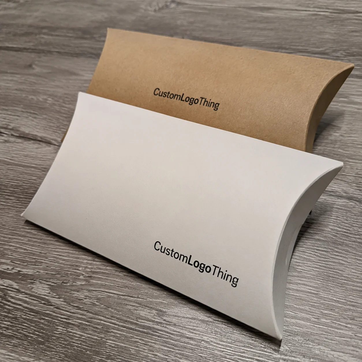
I’ve seen a beauty brand choose between four packaging styles during a plant visit in Suzhou: folding cartons, rigid boxes, mailers, and printed pouches. The folding carton offered the best balance of cost and retail visibility at 20,000 units, landing at $0.24 each with a matte AQ coating and 2-color offset print. The rigid box won on perceived value but nearly doubled the total landed cost at $1.86 per unit before freight. The mailer was strongest for e-commerce protection, especially when paired with 32 ECT corrugated board. The pouch was cheapest at $0.09 per unit, but it weakened the brand story because the product line was moving upmarket. That kind of side-by-side analysis is exactly what packaging branding comparison should do.
Finishes Matter More Than many buyers expect. A matte laminate can soften a brand and make it feel more editorial, while gloss can sharpen contrast and improve pop on crowded shelves. Soft-touch coating gives a velvety feel, though it can scuff if the logistics chain is rough. Embossing and debossing add tactile depth, but they need enough board caliper to hold the impression cleanly, usually at least 1.5 mm on a rigid wrap or a 400gsm paperboard with proper backing. Spot UV can create a strong focal point, especially on branded packaging, but too much spot UV on a dark field can look busy instead of premium. I’ve watched more than one client discover that after seeing the sample under warehouse lights in Atlanta, which is a humbling place for a “luxury” argument to die.
Factories look at three practical questions during packaging branding comparison: Can it be printed consistently? Can it be assembled without wasting labor? Can it survive shipping, stacking, and customer handling? A concept that answers yes to all three is worth serious attention. A concept that only answers yes to one probably needs revision, even if the mockup team spent 16 hours polishing the render in Adobe Illustrator and KeyShot.
If you want examples of finished structural styles, our Custom Packaging Products page shows how different formats can support different brand stories, and our Case Studies page gives a clearer look at how those choices perform once they hit production in places like Dongguan, Portland, and Monterrey.
For teams comparing labels as part of the broader package system, Custom Labels & Tags can also play a huge role in brand recognition, especially when the main container has limited printable area, such as a 30 ml bottle shoulder or a narrow cosmetic jar lid.
Key Factors to Compare Before You Choose a Packaging Style
The first factor in any packaging branding comparison is brand positioning. Are you trying to look premium, playful, minimalist, eco-conscious, luxury, or mass-market? Those are not just adjectives. They drive structural decisions, print coverage, substrate choices, and finish selection. A skincare brand aiming for clinical trust might use white SBS paperboard with restrained typography and a clean die-cut window. A craft chocolate maker might choose kraft paperboard with a simple foil accent and a warm uncoated feel. Same product category, very different package branding, and that difference is often visible within the first 2 seconds on shelf.
Material choice comes next. Paperboard is often ideal for retail packaging, especially when you want crisp graphics and manageable costs. Corrugated board is the workhorse for shipping protection and heavier products. Kraft can signal natural or handmade qualities, but it can also mute certain colors. Rigid chipboard sends a stronger value signal, though it adds cost and freight weight. Plastic film and specialty substrates can work well for flexible formats like pouches or barrier packs, but they need careful sustainability scrutiny and supply chain alignment. A real packaging branding comparison looks at how each substrate affects both appearance and functional performance, not just whether it makes a nice Photoshop comp. For example, a 350gsm C1S artboard carton with aqueous varnish may print cleanly at 12,000 units, while a natural kraft sheet at the same size may require a different ink approach because the brown base absorbs color differently.
Shelf presence is another big one. Typography size, icon placement, and panel hierarchy determine whether a package can be read in a blink. I still remember a supplement client in Minneapolis who used a beautiful serif typeface at 7 pt on a dark background. It looked elegant in the studio and nearly invisible on shelf. We increased the font to 11.5 pt, improved the contrast ratio, and moved the product claim higher on the front panel. Sales reps later told me the package was finally “understandable from the aisle,” which is exactly what retail packaging is supposed to do when the shelf set is crowded at a chain like CVS or Target.
Durability is where a lot of packaging branding comparison decisions get exposed. A package that looks elegant but crushes during transit is not elegant for long. If the product is being shipped via parcel networks, it needs to be assessed against real handling conditions, not just a clean desk drop. In many categories, I like to reference ISTA testing protocols and, where relevant, compression or material standards from ASTM. You do not always need a full lab program, but ignoring transit reality is expensive, and the box will not politely forgive you later.
Sustainability claims deserve careful treatment. A package made from a paper outer wrap and a plastic-coated inner layer may look recyclable at a glance, but the actual structure may complicate recovery. If you want to make a claim, make sure the material structure supports it and that your supplier can document it. The FSC certification path can help support responsible fiber sourcing, but it is not a magic stamp for every environmental question. A trustworthy packaging branding comparison checks the actual construction, not just the marketing copy. I get a little prickly about this because “eco” on a mockup is easy; proving it in production is the part that matters.
Pricing also needs to be compared correctly. I’ve seen buyers compare a $0.34 folding carton to a $0.51 rigid box and declare victory on cost, then forget the rigid box includes inserts, better protection, and a lower return rate. Real comparison includes setup charges, tooling, plate costs, finishing, assembly, spoilage, freight, and storage. For example, a 5,000-piece run might carry a $650 die charge, a $220 foil plate, and a unit price that falls from $0.42 to $0.29 when you move to 15,000 units. A 10,000-unit quote can also shift materially if you change from 2-color litho to 4-color process, or if the plant is in Shenzhen versus Vietnam, where labor and freight structures are not identical. Without that fuller view, packaging branding comparison turns into a guessing game with a fancy spreadsheet header.
Step-by-Step Packaging Branding Comparison Process
Step 1 is defining the product and the environment. Before any packaging branding comparison begins, I want to know whether the item is fragile, temperature-sensitive, stackable, leak-prone, or heavily handled. I also want the channel details: club store, specialty retail, Amazon-style fulfillment, direct mail, or gift packaging. A tube of lotion shipped in a warehouse tote has different needs than a luxury candle presented in a boutique with a 12-inch shelf face. If those two get treated like cousins instead of separate jobs, the comparison gets sloppy right away.
Step 2 is creating a shortlist. I usually recommend comparing three to five packaging directions rather than ten. Too many options slow decisions and blur the real differences. One direction might be a folding carton with matte varnish, another a rigid setup box with foil and emboss, and a third a kraft mailer with minimal print. This is where a side-by-side packaging branding comparison starts getting useful because the team can see how each option behaves under the same brand message without drowning in choice paralysis. It also keeps sample costs manageable, because each prototype might run $35 to $120 depending on board, finish, and whether the sample is hand-built or produced on a short-run digital press in Hangzhou.
Step 3 is requesting dielines, prototypes, or digital comps. Dielines tell you scale and panel placement. Prototypes show how the package opens, closes, and holds the product. Digital comps help with color discussion, though they should never be the final word on tactile finishes. In one client meeting, we discovered a front-panel logo that looked perfect in the flat artwork but landed too close to the glue flap on the actual carton. That mistake would have created a clean-looking disaster on the line, and it only surfaced because the packaging branding comparison included a real dieline check. The customer was relieved; the factory was relieved; I was relieved, and also mildly annoyed that the original file had been so optimistic.
Step 4 is comparing total landed cost. This means print, finishing, assembly, freight, insurance, storage, and any secondary packaging needed to ship the product. A glossy embossed rigid box might be stunning, but if it requires hand assembly at $0.18 per unit and adds another 8% to cube volume, the economics change quickly. On the other hand, a simpler box with smart print hierarchy may deliver most of the brand lift at half the cost. That is why a mature packaging branding comparison goes beyond the quote sheet and looks at the final cost per order, not just the carton price in isolation.
Step 5 is testing for unboxing, stacking, shipping durability, and recognition. I like to use a basic internal scorecard that asks: Does the package open cleanly? Does it protect the product? Does the customer understand the brand within three seconds? Does it look good under retail lighting and on a phone camera? Those four questions catch a lot of problems early. If the answer is no to two or more, the package probably needs a second pass. And if the answer is “maybe,” that usually means the team is hoping the customer will be more forgiving than the packaging deserves.
Step 6 is finalizing specs. At this stage, the artwork, finish, substrate, color targets, and timeline should all be locked. I tell teams to confirm the board grade, coating type, Pantone references, and packaging orientation before approving production. A detailed packaging branding comparison ends with clear specifications, not assumptions. If there is any ambiguity, it usually shows up later as rework, delays, or color drift, especially when the job is split between a printing plant in Shenzhen and an assembly partner in Foshan.
For teams that want more context on production-ready choices, our Case Studies section shows examples of how a packaging branding comparison plays out once a concept meets actual manufacturing constraints in facilities from Guangdong to Ohio.
Timeline, Sampling, and Production Planning for Branded Packaging
A clean packaging branding comparison needs time built into the schedule. The typical flow includes concept review, structural design, sample development, artwork approval, production, and fulfillment. If you already have a finished dieline and print-ready files, the process can move quickly. If not, add extra time for structural revisions and proof rounds. I’ve had projects where one tiny board adjustment fixed a fit issue and saved a whole launch, which is a nice reminder that the boring stuff is often the expensive stuff when the ship date is fixed and the retailer wants cartons in hand by Friday.
Simple digital packaging runs can be ready faster because they skip plates and often avoid long setup steps. A short-run mailer or label project might move from approval to production in 7 to 12 business days, depending on the supplier and material availability. By contrast, a fully customized rigid box with foil stamping, embossing, and an insert can require 18 to 30 business days from proof approval, especially if imported wrap stock or custom tooling is involved. A standard folding carton in 350gsm C1S artboard usually lands somewhere in the middle, often 12 to 15 business days from proof approval when the factory is running normally in Dongguan or Shenzhen. That is why the timeline belongs inside the packaging branding comparison, not off to the side.
Several factors extend lead time. Custom dies add tooling time. Imported specialty papers can sit in transit or get held up by procurement delays. Special coatings may require vendor coordination if the coating plant is separate from the printing plant. Multiple proof rounds slow things down, but sometimes they are worth it because one round of corrections can save an entire production run. I have personally seen a misregistered foil plate delay a launch by ten days, and nobody remembers the savings on a cheap proof when the launch date slips by a week and a half.
Planning also depends on inventory strategy. If you are launching a seasonal product, your packaging branding comparison should happen early enough to leave room for pre-production samples and transit test corrections. If your run is tied to a hard retail ship date, I recommend building a buffer of at least 10 business days. That cushion has saved more than one client when artwork revisions or color approvals took longer than expected, especially when approvals were bouncing between a New York brand team and a supplier in Guangzhou.
Speed has a price. Fast-turn packaging often means fewer finish options, narrower material choices, and a less complex structure. That is not a flaw; sometimes it is the smartest path. If the goal is a high-end gift presentation, though, it may be better to invest a little more time in a box that supports the brand story. A good packaging branding comparison makes that tradeoff plain instead of hiding it in a cheerful production calendar.
Common Mistakes in Packaging Branding Comparison
The biggest mistake I see is choosing the prettiest sample without thinking about transit or retail reality. A package can photograph beautifully and still fail in distribution. During one beverage project in California, the client loved a slim carton with a tall silhouette, but it kept toppling in tray packs because the center of gravity was too high. The design looked elegant in a deck. It was a nuisance on the line. That is a classic packaging branding comparison error, and it tends to show up right after everyone has already fallen in love with the first pretty thing.
Another mistake is comparing only unit price. If one option is $0.21 each and another is $0.33 each, the cheaper line item may not actually be cheaper once you add setup, spoilage, freight, and labor. I have seen a lower-unit-cost carton become the more expensive choice because it required a separate inner protector and manual assembly. A proper packaging branding comparison should include a total-cost view, even if it means doing a little spreadsheet work and staring at the numbers until they stop pretending to be friendly.
Color drift is a huge issue too. Brand red on coated SBS paperboard will not always match brand red on kraft, film, or rigid wrap. The substrate changes how the ink sits, how light reflects, and how saturated the color appears. If the brand relies on a very specific blue, green, or metallic tone, test it on the actual material. Otherwise, your packaging branding comparison may produce a beautiful but inconsistent family of packs that feel related only in theory, especially across factories in different regions where press calibration and climate can shift the final result.
Some teams overdesign. Too many logos, too many claims, too many finishes. I once reviewed a skincare carton that had foil, emboss, spot UV, a window, three seal badges, and six separate marketing claims on the front panel. It did not look premium; it looked crowded. Simplicity often wins because it gives the customer one message to process instead of six. That is especially true in retail packaging, where the customer gives you a few seconds at most and the package has to read clearly from about 6 feet away.
Skipping prototypes is another common misstep. There is a world of difference between a render and a physical sample, especially for custom printed boxes and folding cartons with tight tolerances. Glue flaps, tuck positions, and insert friction are not visible on a screen. I have seen a package that looked perfect in the PDF but was impossible to open without tearing the corner. A sample would have caught that in one minute and probably saved a 2,500-unit reprint.
Sustainability claims can also create problems if they are not supported by the structure. “Eco-friendly” on the front of a package means very little unless the material makeup, inks, coatings, and end-of-life path support it. This is where a grounded packaging branding comparison protects both brand trust and legal sanity. If the claim cannot be backed up, do not print it. Trying to clean up that mess after launch is the kind of phone call nobody wants on a Friday afternoon, especially if the job already left the factory in 14 pallets bound for an East Coast warehouse.
If you want to see how packaging choices affect final customer perception, the examples on our Case Studies page are useful because they show not only the finished look, but also the practical decisions behind it, including materials, lead times, and production constraints.
Expert Tips for Smarter Packaging Branding Comparison and Next Steps
I like to use a simple scorecard for packaging branding comparison. Give each option a weighted score for brand fit, durability, cost, timeline, and sustainability support. If a premium gift box scores 9/10 on brand fit but 4/10 on shipping durability and 5/10 on cost, you can see the tradeoff clearly. That kind of structure keeps emotional preferences from overwhelming practical needs. It also gives everyone in the room a shared language, which is handy when one person keeps saying “luxurious” without explaining what that actually means in paperboard, finish, or assembly time.
Whenever possible, ask for real samples from actual production runs instead of only computer renderings. Renderings are helpful, but factory samples tell the truth about coating feel, ink density, board stiffness, and registration. I still remember a supplier conversation where the quoted sample looked fine online, but the actual spot UV was too heavy and created a sticky feel on stacked cartons. The production sample exposed the issue immediately, which saved a bad run of 8,000 units.
Match the finish to the sales channel. Retail packaging often needs stronger shelf contrast and sharper brand marks. Subscription packaging can benefit from an unboxing experience with layered presentation, but not so much paper and filler that the pack feels wasteful. Luxury gifting can support heavier board, foil, and embossing. E-commerce usually rewards protection first, then visual polish. A smart packaging branding comparison respects the channel instead of forcing one style everywhere, whether the shipment is going to a boutique in Seattle or a fulfillment center in Louisville.
Keep one or two signature cues consistent across every format. That might be a specific color bar, a logo lockup, a type treatment, or a recurring pattern. Consistency is how customers recognize your package instantly whether they see it as a carton, mailer, label, or pouch. When I worked with a personal care client, the strongest brand recognition came from a simple vertical color stripe that appeared on every SKU. It cost almost nothing to reproduce and did more for recognition than two expensive finishes combined, especially across a 6-product line sold in both retail and DTC channels.
Build your next action plan before placing the order. Collect dimensions, define the budget range, request samples, and create a side-by-side matrix with at least three options. If you are buying at volume, ask the supplier to quote multiple tiers, such as 3,000, 10,000, and 25,000 units, because pricing can move sharply at each break point. If the timeline is tight, ask for a realistic schedule in business days, not vague assurances. A credible packaging branding comparison should leave you with clarity, not fog, and it should tell you whether the best fit is a $0.24 folding carton, a $1.86 rigid setup box, or a hybrid format that lands somewhere in between.
For packaging teams who need a broader starting point, our Custom Packaging Products page can help you narrow which format deserves a closer look, and our Custom Labels & Tags page is useful when labels carry most of the branding weight on glass, plastic, or paper containers.
My honest opinion? The best packaging is usually not the flashiest one. It is the one that tells the right story, ships safely, respects the budget, and can be made again and again without drama. That is the real value of packaging branding comparison. It turns a creative choice into a business decision, and that is where good packaging branding comparison work saves money, sharpens the brand, and keeps the launch on schedule.
If you remember only one thing, make it this: compare the package as a whole system, not as a pretty object. Structure, print, finish, freight, labor, and customer experience all belong in the same conversation. That is how a packaging branding comparison earns its keep.
What Is Packaging Branding Comparison and How Do You Use It?
A packaging branding comparison is the structured process of weighing two or more packaging options against the same set of goals so you can see which one actually fits the product, the brand, and the budget. It is useful because packaging is not just a container; it is a sales tool, a shipping system, and a physical expression of the brand all at once. If you compare options with a scorecard for appearance, durability, cost, and production practicality, you can make a better decision faster and avoid relying on guesswork or a nice-looking render.
Packaging Branding Comparison: decision table
| Decision area | Best fit | What to verify | Risk if skipped |
|---|---|---|---|
| Product fit | Protection, display, and unboxing consistency | Measurement, tolerance, material, and sample approval | A nice design fails because the product fit was guessed |
| Brand presentation | Logo visibility, finish, and customer perception | Print method, color target, texture, and proof review | Packaging protects the item but does not sell the brand |
| Operations | Packing speed, storage, shipping, and reorder control | Carton count, warehouse label, and repeat spec | The package is attractive but hard to pack or reorder |
FAQ
What is packaging branding comparison and why does it matter?
It is the process of comparing different packaging styles, materials, finishes, and print methods to see which best supports your brand and product goals. It matters because packaging affects first impressions, shelf visibility, shipping performance, and perceived value, whether the job is a 2,000-piece pilot run or a 40,000-piece retail rollout.
How do I compare packaging branding options on a budget?
Use a scorecard that includes unit cost, setup fees, finishing costs, and shipping impact instead of comparing only quoted price per piece. Choose the simplest material and finish combination that still communicates your brand clearly, such as a 350gsm C1S carton with matte varnish rather than a heavily finished rigid box if the budget is under $0.30 per unit.
What should I compare first: materials, design, or price?
Start with the product’s protection needs and sales channel, then compare materials and structure, and only after that evaluate visual design and price. This order helps avoid choosing a package that looks good but fails in real use, especially for fragile items shipping through parcel networks or retail displays with tight shelf depth.
How long does a packaging branding comparison process usually take?
Simple comparisons can be completed quickly if you already have dielines and artwork ready. Custom structural and finished packaging often takes longer because samples, proofs, and finishing approvals add time, with typical production windows ranging from 7 to 12 business days for simpler digital jobs to 18 to 30 business days for foil-stamped rigid boxes after proof approval.
What is the biggest mistake in packaging branding comparison?
The biggest mistake is choosing based on appearance alone without checking cost, durability, and production realities. A strong comparison balances brand impact with manufacturability and customer experience, and it usually includes real quotes, sample testing, and a clear view of labor, freight, and timeline by supplier region.