Buyer Fit Snapshot
| Best fit | packaging design comparison choose option for packaging buyers comparing material specs, print proof, MOQ, unit cost, freight, and repeat-order risk where brand print, material, artwork control, and repeat-order consistency matter. |
|---|---|
| Quote inputs | Share finished size, material target, print colors, finish, packing count, annual reorder estimate, and delivery region. |
| Proofing check | Approve dieline scale, logo placement, barcode or warning zones, color tolerance, and any recyclable or compostable wording before bulk production. |
| Main risk | Vague material claims, crowded artwork, or missing packing details can create delays even when the unit price looks attractive. |
Fast answer: Packaging Design Comparison Choose Option: Dieline, Finish, Proof, and Buyer Review should be specified like a repeatable production item. The safest quote includes material, print method, finish, artwork proof, carton packing, and reorder notes in one written spec.
What to confirm before approving the packaging proof
Check the product dimensions against the actual filled item, not only the sales mockup. Ask for tolerance on folds, seals, hang holes, label areas, and retail display edges. If the package carries a logo, QR code, warning copy, or legal claim, reserve that space before decorative graphics fill the panel.
How to compare quotes without losing quality
Compare board or film grade, print process, finish, sampling route, tooling charges, carton quantity, and freight assumptions side by side. A lower quote is only useful if the supplier can repeat the same color, closure quality, and packing count on the next order.
I’ve stood on enough corrugate lines, rigid box benches, and folding-carton floors to know one thing: packaging design comparison is rarely as simple as choosing the prettier box. Two packages can look equally premium on a render, yet one may run 18% faster on the pack-out line, survive a 36-inch drop test better, and cost $0.14 less per unit on a 5,000-piece run. That gap matters, especially when the product is moving through real warehouses, real trucks, and real customer hands.
In my experience, the smartest packaging design comparison looks at structure, materials, print method, labor, freight, and customer experience side by side. I’ve seen brands fall in love with a foil-heavy carton that drove their defect rate up by 7%, and I’ve also seen a simple kraft mailer outperform a more decorative option because it shipped flatter and packed faster. The right answer is usually the one that fits the product and the process, not the one that just photographs best.
What Packaging Design Comparison Really Means
At its core, packaging design comparison is the discipline of evaluating two or more packaging options against the same set of business and production criteria. That means looking at structural design, materials, decoration, logistics, protection, and customer perception in one view, rather than making decisions from a single mockup table. A box that sells well in a sales deck can still be the wrong choice if it needs extra hand assembly, a custom insert, or a special freight setup that adds $1,200 to a small run.
Most teams run into trouble when they compare product packaging only by appearance. A good packaging design comparison has to answer practical questions too. Does the closure stay secure in transit? Can the fulfillment team fold 300 units an hour without hand cramps? Will the package survive humidity in a Southeast warehouse or cold-chain movement for a temperature-sensitive item? Those questions separate a nice concept from a working solution.
When I visited a contract packager in New Jersey, their team showed me two nearly identical retail packaging formats for a skincare client. One used a 16pt C1S folding carton with a snap-lock bottom, and the other used a heavier 20pt board with a simple tuck. The heavier board looked more luxurious, but the lighter carton reduced line jams by 11 minutes per shift because it folded cleaner and loaded easier. That is why packaging design comparison must include production reality, not just shelf appeal.
The main comparison categories I recommend are appearance, protection, cost, speed, sustainability, and user experience. Keep those six categories in view and you avoid the trap of overvaluing one feature while underestimating the rest. For brands building branded packaging or Custom Printed Boxes, that balance is where the real value lives.
Packaging design comparison is not about finding the “best” box in the abstract. It is about choosing the best box for a specific product, channel, and budget, with enough room for growth that you are not redesigning six months later.
How Packaging Design Comparison Works in Practice
On a factory floor, packaging design comparison usually starts with a dieline, a few rough sketches, and a very honest conversation about the product’s real dimensions. I’ve seen teams bring in a “2.5-inch wide” product that measured 2.63 inches after the shrink band and label were applied, and that extra eighth of an inch changed the whole carton design. Good comparison work starts with accurate specs, not wishful thinking.
From there, the design team compares structural styles. Tuck End Boxes are often efficient for lightweight retail packaging, while mailer boxes are common for e-commerce and subscription kits because they ship well and open with a neat customer moment. Rigid boxes create a premium feel, but they take more board, more wrap material, and more labor. Corrugated shippers bring strength and stacking performance, especially for heavier items, and inserts can be used to lock the product in place for fragile contents. A smart packaging design comparison puts those options on the same scorecard instead of treating them like interchangeable shells.
Print technology changes the outcome too. Offset printing usually gives crisp detail and excellent color consistency for larger runs, while digital printing is often faster to set up for shorter quantities or frequent artwork changes. Flexographic printing can be excellent for corrugated work, especially where speed matters and ink coverage is simpler. Foil stamping, embossing, and spot UV can lift a package visually, but they also add Cost, Lead Time, and sometimes waste during setup. I’ve had clients request spot UV on every panel, then discover it made their packaging design comparison tilt heavily toward the simpler option once they saw the price difference—sometimes $0.22 to $0.40 more per unit depending on quantity and finish coverage.
Practical tests reveal what a screen mockup never will. A sample board may look beautiful under warehouse lights, but the real test is whether the insert supports the product, whether the board cracks at the fold, and whether the closure opens cleanly without the customer wrestling with it. In one Atlanta fulfillment center, I watched a team compare two custom packaging concepts for a candle set. The prettier one had a tighter fit and looked stronger in photography, but the outer sleeve scraped the varnish during insertion, which would have created a 4% reject rate. The simpler build won because it held the glass jar safely and packed 22 seconds faster per unit.
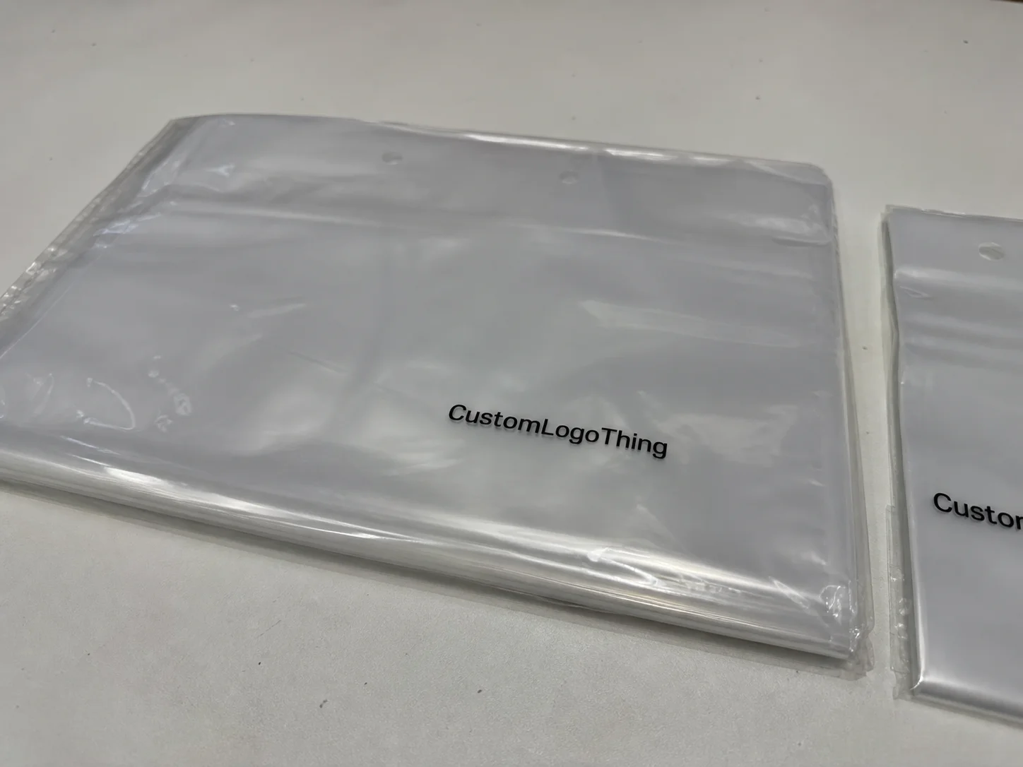
That is why sample boards, white samples, and fully printed prototypes matter so much. White samples help verify structure and fit, while printed prototypes tell you whether the branding works in real light and whether the package feels aligned with the product positioning. If your business sells premium branded packaging, those sample stages are not optional; they are part of a proper packaging design comparison.
For reference on packaging materials and sustainability standards, I often point clients toward industry bodies like the Institute of Packaging Professionals and the EPA’s packaging and waste guidance at epa.gov. The details matter, and external standards give the conversation some backbone.
Key Factors That Change the Outcome in Packaging Design Comparison
Material choice changes almost everything in packaging design comparison. Paperboard, corrugated cardboard, rigid chipboard, kraft stock, and specialty laminates each bring different strengths, different print behavior, and different price points. A 24pt SBS carton with aqueous coating will behave very differently from a 32 ECT corrugated mailer or a wrapped rigid set-up box with a 1200gsm chipboard base. On paper, they may all be “boxes.” In production, they are not remotely the same.
Cost is not just unit price, either. It includes board thickness, printed coverage, finishing complexity, tooling, minimum order quantities, freight, and labor. I’ve watched a client choose a design quoted at $0.78/unit because it looked cheaper than a $0.86/unit option, only to discover the first design needed a hand-inserted tray, added 9 seconds of labor, and required a larger master carton that increased pallet count by 14%. That is where a serious packaging design comparison saves real money.
Brand positioning matters because the package is part of the product story. Luxury, eco-friendly, subscription, retail-ready, and industrial product packaging all use different signals. A matte black rigid box with foil may support a premium skincare line, while a natural kraft mailer and soy-based ink might be a better fit for an organic household brand. Neither is universally better. In a proper packaging design comparison, the package should reinforce the promise the brand is already making.
Protection and product integrity sit near the top of the list for a reason. Fragile glass, heavy metal components, temperature-sensitive formulas, and electronics all need packaging that can absorb shock, resist compression, and keep the item stable. For those products, inserts, double-wall corrugated, or higher-grade board may be worth the extra cost. I once worked with a beverage accessory client whose elegant folding carton failed a vibration test because the insert allowed the cap to rub through the printed surface. The visual design was fine; the functional design was not. That kind of lesson changes how you approach packaging design comparison.
Sustainability is now a core factor for many brands, and it should be measured honestly. Recycled content, recyclability, reduced ink coverage, plastic-free structures, and right-sizing all matter, but they have to be weighed against protection and shelf life. A package that uses less material but causes 6% more damage in shipping is not the cleaner option in any meaningful sense. For sourcing and certification questions, FSC guidance at fsc.org can help teams think through responsible paper sourcing.
I think the best packaging design comparison is the one that treats sustainability as a design constraint, not a decorative label. That mindset tends to produce better structures and fewer empty claims.
How do you compare packaging design without missing the details?
You compare packaging design by using the same product specs, the same scoring criteria, and the same real-world tests for every option. Start with dimensions, weight, shipping method, and brand goals, then evaluate structure, materials, print method, protection, labor, and total landed cost. A careful packaging design comparison also includes white samples or printed prototypes, because what looks right in a render can behave very differently on a line.
Step-by-Step: How to Compare Two Packaging Designs
Start by defining the product requirements. Measure the item in three dimensions, record the weight, note any fragile components, and write down how the package will move through the supply chain: direct-to-consumer, retail shelf, palletized bulk, or mixed-channel. If the product ships by parcel and also sits on a store peg, the packaging design comparison changes immediately because the priorities shift from display-only to display-plus-transit.
Next, build a simple comparison matrix. I like columns for cost, protection, setup time, visual impact, sustainability, assembly difficulty, and storage footprint. Assign a weight to each factor based on what matters most to the business. A beauty brand may give 30% weight to visual impact, while a heavy hardware accessory might give 40% to protection and 20% to labor. That weighted approach keeps the packaging design comparison honest.
- Gather product specs and order history.
- Request two or three structural options.
- Ask for white samples first, then printed prototypes.
- Test with the actual product and actual inserts.
- Measure pack-out time, defects, and pallet efficiency.
- Score each design with marketing, operations, and fulfillment in the room.
Request samples or prototypes from the supplier and test them with the real product, not a substitute item. A foam dummy or a generic weight block can hide fit issues, especially if the product has uneven edges, a cap, a pump, or an accessory bundle. I’ve seen a rigid box pass a desk review and then fail because the magnetic closure snagged on the ribbon pull during assembly. That kind of issue only appears when the sample is handled at line speed.
Production realities deserve their own row in the comparison sheet. Ask how long it takes to fold, glue, and fill the package, how much storage space the flat stock requires, and how many units fit on a pallet or in a master case. These details can swing a packaging design comparison more than a prettier image ever will. If one design stores 20% more efficiently and ships in fewer cases, the savings can outlast the first impression.
Then review the numbers with stakeholders from marketing, operations, procurement, and fulfillment. If those teams disagree, that does not mean the process failed. It means the comparison is doing its job by revealing tradeoffs. The final choice should be balanced, not one-sided, because product packaging has to work in the warehouse, on the truck, and in the customer’s hands.
Process and Timeline Considerations That Affect Comparison
Timeline can change the whole packaging design comparison. If a design needs custom tooling, new dielines, print plates, special inserts, or unusual finishing, the schedule grows. A straightforward digital sample may take only a few business days, while a more complex rigid box with foil, embossing, and a custom insert can stretch much longer depending on material availability and approval timing. In many factories, the bottleneck is not the machine itself; it is the queue before the machine.
Fast-turn digital runs usually make sense when artwork is still fluid or when the order quantity is modest. Offset or rigid-box production can be the better answer for larger runs where color consistency, premium detail, or lower unit cost matters more than speed. The trick is matching the method to the use case. A strong packaging design comparison should ask not only, “Which looks better?” but also, “Which can be produced reliably at our required pace?”
Sampling and approval cycles Matter More Than many teams expect. If the first proof comes back and the brand changes the logo size, the board finish, or the insert configuration, the calendar moves. One client I worked with in Chicago changed their artwork after approving structure, and that single revision added 12 business days because the foil plate had to be remade and the printer had to reschedule the run. That delay was not dramatic, but it was expensive. A thoughtful packaging design comparison anticipates that sort of chain reaction.
Common bottlenecks include paper stock shortages, finishing queues, insert assembly, and freight coordination. Specialty laminates can be beautiful, but they can also create a scheduling pinch if the coating line is already full. Corrugated work can move fast, but only if the board grade is in stock. Rigid packaging often depends on handwork and drying time, which can extend lead times more than the spec sheet suggests. Comparing designs without considering these realities gives you an incomplete picture.
So, compare not just how the boxes look today, but how consistently they can be made next month, next quarter, and during your busiest shipment period. That kind of packaging design comparison protects the business from last-minute surprises.
Common Mistakes People Make During Packaging Design Comparison
The biggest mistake is comparing only on appearance and ignoring shipping performance, cost, and assembly labor. A beautiful retail box that crushes in transit is not the better design. A clean-looking mailer that takes 14 extra seconds to assemble may also be the wrong choice once volume grows. In the real world, packaging design comparison has to include the work the package creates, not just the look it delivers.
Another mistake is choosing a premium finish that slows production or increases defects. I’ve seen soft-touch lamination look fantastic in a sample room and then create scuffing issues in bulk when cartons rubbed against one another in transit. The finish was elegant, but the handling risk was too high for the channel. A better comparison would have flagged that before the run started.
Teams also forget to test the package with the actual product. That leads to fit issues, weak protection, or awkward unboxing. If the product is slightly irregular, has accessories, or includes a pump, charger, or spoon set, the prototype must be tested with the exact contents. It sounds simple, but it saves money and headaches. A good packaging design comparison uses the real item every time.
Overlooking total landed cost is another common trap. Freight, warehousing space, labor, and handling often matter as much as the quote itself. A design that ships flat and stacks tightly may beat a cheaper-looking alternative once the warehouse math is included. The same is true for assembly time: 5 extra seconds per unit becomes very real at 50,000 units.
Some brands ignore the customer’s use of the package. Is it easy to open? Does it communicate the brand clearly? Can it be resealed or reused? Does the unboxing feel deliberate rather than fussy? These details affect satisfaction, reviews, and repeat sales, especially in branded packaging and subscription product packaging. A strong packaging design comparison pays attention to the end user, not only the spec sheet.
Expert Tips for Smarter Packaging Design Comparison
I always recommend comparing at least three options: one lower-cost structure, one balanced choice, and one premium build. That spread makes the tradeoffs visible without forcing the team to guess where the “middle” should be. If the cheapest version fails a drop test and the premium version adds $0.31 per unit for appearance only, the balanced option often becomes obvious.
Use a weighted scorecard. Protection and cost should usually carry more weight than nice-to-have features like spot UV or embossing, unless the product lives and dies on shelf presence. A scorecard also makes the packaging design comparison easier to explain to leadership, because the reasoning is documented instead of remembered loosely from a meeting.
Test edge cases if the product is sensitive or the shipment distances are long. Drop tests, vibration tests, humidity exposure, and compression checks can reveal weak points before you commit to a run. Standards from groups like ISTA are useful here, because they give the team a common language for transit performance. For more on transit testing standards, ISTA’s site at ista.org is a solid place to start.
Bring prepress, converting, and fulfillment into the conversation early. On the shop floor, small details like glue flap size, grain direction, or insert orientation can change the whole production flow. I’ve seen a 1/8-inch dieline adjustment fix an assembly problem that had been driving a 3% reject rate. That kind of factory-floor feedback is gold during packaging design comparison.
Design for scale, not just launch. A structure that works for 3,000 units may become awkward at 30,000 if it needs too much hand labor or storage space. If you expect the channel mix to expand, choose a package that can survive that growth without a full redesign. A smart packaging design comparison should leave room for the business to move.
“The best package is usually the one that disappears into the process,” one operations manager told me after we reduced pack-out time by 15 seconds per unit. “It protects the product, looks right on shelf, and doesn’t fight the line.”
What to Do Next After Your Comparison
Once your packaging design comparison is complete, gather the basic inputs: product dimensions, weight, shipping method, desired price point, and any sustainability goals. Then request quotes and samples from your supplier. If you already know your product type, you can also review Custom Packaging Products to see which structural styles match your use case before you move into artwork.
Create a simple comparison sheet for the team. Keep columns for cost, material, protection, timeline, assembly, and customer experience, then add notes for any special concerns such as moisture, temperature, or retail display. This makes future reviews faster, because the logic is already written down. In many companies, that document becomes the starting point for the next launch, and it saves hours of repeated debate.
Review the results with marketing and operations together. That meeting is often where the best decisions happen, because branding and warehouse reality finally sit in the same room. Finalize the artwork only after the structural choice is approved, since changing the box after print approval can trigger avoidable expenses. When the winning design is documented clearly, the next packaging design comparison becomes much easier to run.
I like to keep the reasons for the winning choice on file: why it won, what it beat, and what tradeoffs were accepted. That simple record helps future teams stay consistent, especially when product lines expand or fulfillment changes.
FAQs
How do I start a packaging design comparison for my product?
Begin with product dimensions, weight, fragility, shipping method, and brand goals so you compare designs against real needs. Then request samples or mockups and test them with the actual product before deciding.
What should I compare besides the visual design?
Compare total cost, material strength, assembly time, print method, sustainability, and how the package performs during shipping. Also check whether the design fits your warehouse process and customer unboxing experience.
Does a more expensive packaging design always perform better?
Not necessarily, because higher price can come from finishes or materials that improve appearance more than protection. The best design balances cost with product safety, production speed, and customer impact.
How long does a packaging design comparison usually take?
Simple comparisons can take a few days if samples already exist, while custom structural and printed prototypes may take longer. Timeline depends on revisions, material availability, finishing complexity, and approval speed.
What is the best way to compare packaging design costs accurately?
Look beyond unit price and include tooling, freight, storage, labor, assembly time, and waste. A true comparison uses total landed cost and production efficiency, not just the quote on paper.
If you remember one thing from this packaging design comparison, make it this: the best option is the one that performs well in production, protects the product in transit, fits the budget, and still feels right to the customer. I’ve seen too many teams pick the showiest option first and fix the fallout later. A calmer, more measured comparison almost always saves time, money, and a few headaches along the way. So before you approve a structure, run the samples through real tests, compare total landed cost, and make sure the design can hold up on the line as well as on the shelf.