Buyer Fit Snapshot
| Best fit | packaging design comparison choose the fit for packaging buyers comparing material specs, print proof, MOQ, unit cost, freight, and repeat-order risk where brand print, material, artwork control, and repeat-order consistency matter. |
|---|---|
| Quote inputs | Share finished size, material target, print colors, finish, packing count, annual reorder estimate, and delivery region. |
| Proofing check | Approve dieline scale, logo placement, barcode or warning zones, color tolerance, and any recyclable or compostable wording before bulk production. |
| Main risk | Vague material claims, crowded artwork, or missing packing details can create delays even when the unit price looks attractive. |
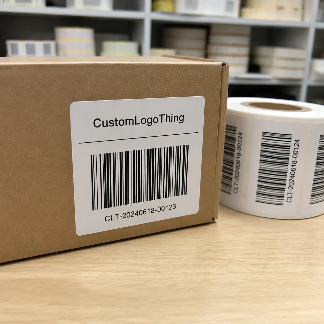
Fast answer: Packaging Design Comparison Choose The Fit: Dieline, Finish, Proof, and Buyer Review should be specified like a repeatable production item. The safest quote includes material, print method, finish, artwork proof, carton packing, and reorder notes in one written spec.
What to confirm before approving the packaging proof
Check the product dimensions against the actual filled item, not only the sales mockup. Ask for tolerance on folds, seals, hang holes, label areas, and retail display edges. If the package carries a logo, QR code, warning copy, or legal claim, reserve that space before decorative graphics fill the panel.
How to compare quotes without losing quality
Compare board or film grade, print process, finish, sampling route, tooling charges, carton quantity, and freight assumptions side by side. A lower quote is only useful if the supplier can repeat the same color, closure quality, and packing count on the next order.
Packaging design comparison sounds boring until it saves you $8,400 on one launch. I’ve seen two boxes with the same outer dimensions ship at completely different costs because one had a sloppy insert design and the other used a better board grade. Same footprint. Same product. Totally different outcome. That is why packaging design comparison matters for any brand that cares about damage rates, freight, and how the box feels in a customer’s hands.
At Custom Logo Things, I’ve spent enough time in corrugated plants in Dongguan, Shenzhen, and a few very loud folding carton lines near Guangzhou to know this: pretty mockups do not pay damage claims. A smart packaging design comparison looks at structure, materials, print method, assembly speed, and customer experience side by side. If you only compare the artwork, you are basically judging a car by the paint job and ignoring the engine. Brave. Also expensive.
This piece is for brands choosing between Custom Printed Boxes, mailers, folding cartons, and other product packaging options. I’ll keep it practical. No fluff. No corporate fairy dust. Just real decision factors, real sample timelines, and the stuff factory teams actually care about, like whether a 350gsm C1S artboard carton folds cleanly on a line running 1,200 units per hour.
Packaging Design Comparison: What It Really Means
Packaging design comparison means lining up two or more packaging options and judging them on more than looks. You compare structure, board grade, print quality, finishes, cost, protection, and the unboxing experience. In plain English: you figure out which box actually does the job Without Wasting Money. Simple idea. Messy execution. Especially once freight from Ningbo to Los Angeles or a U.S. domestic truckload from Dallas to Chicago gets involved.
I remember a client in skincare who came to me with two rigid box concepts. Both were 220 x 160 x 70 mm. Both had soft-touch lamination and silver foil. One used a 1.5 mm greyboard with a tight tray. The other used a thinner board and a heavier insert to hold glass jars. On paper, they looked close. On the production floor, they were miles apart. The heavier insert added 11 seconds of pack time per unit. Across 12,000 units, that became real labor money, not theoretical “brand value.” That’s packaging design comparison in the real world.
Brands get tripped up because they think packaging design comparison is just about choosing the prettier render. It is not. It is about performance. A gorgeous dieline that crushes in transit is a liability. A basic box that cuts packing time by 25% and reduces breakage by 3% can be the better business move. I know. Not glamorous. Still true. Especially if you’re paying $0.15 per unit for 5,000 pieces versus $0.19 per unit for a sturdier spec that avoids a $1,200 return wave.
The difference between packaging design looks and packaging performance is huge. Looks affect shelf impact and brand perception. Performance affects freight, returns, labor, and customer satisfaction. Good branded packaging has to do both. If you’re comparing retail packaging options for a boutique in Austin or a chain rollout in Toronto, ask yourself: which one helps me sell, ship, and retain customers without making operations miserable?
“We loved the premium mockup, but the warehouse team hated the 9-step assembly. We switched to a simpler insert and cut pack time by 14 seconds per order.”
That quote came from a DTC client I worked with after a messy first run. They had beautiful package branding, but the box design created bottlenecks at the pack line. The lesson was brutal and useful: if your packaging slows down operations, it costs more than the unit price shows. Their supplier in Suzhou quoted the fancy version at $1.32 per unit for 3,000 units; the simpler version came in at $0.88 per unit and shipped in 14 business days after proof approval. Guess which one got reordered?
So yes, packaging design comparison is about balancing brand, budget, and production reality. That balance is the whole game. And if someone tells you otherwise, they either don’t buy packaging often or they’re selling you something with a very shiny sample.
How Packaging Design Comparison Works in Practice
In a real packaging design comparison, the process usually moves through six phases: brief, concept sketches, material selection, prototype review, quote review, and final approval. Skip one of those and you usually pay for it later. I’ve seen teams rush from sketch to purchase order and then discover the insert barely fits the bottle neck. That is an ugly meeting. Usually with bad coffee and one person trying to blame the dieline.
The brief comes first. You define product size, weight, fragility, shipping method, and budget. Then you compare concepts. A mailer, a tuck-end carton, and a rigid set-up box do not solve the same problem. They each create different costs and different customer experiences. Good packaging design comparison starts with the actual job, not vibes. A 120 ml glass serum shipped from Miami needs a different structure than a 2 oz candle sold in a retail store in Portland.
Then suppliers build samples or prototypes. Companies like EcoEnclose, Packlane, and local corrugated converters in Los Angeles or Foshan usually have different sample workflows. Some move fast on digital proofs and simple sample packs. Others need a physical dieline and a few rounds of revision. Neither approach is wrong. They just fit different project types. I’ve toured enough facilities to know a short-run digital sample can save a week, but it won’t always tell you how the carton behaves under real freight pressure.
At the quote stage, a proper packaging design comparison checks what’s really included. One supplier may quote $0.62/unit for 5,000 units, while another quotes $0.74/unit with a better insert, thicker board, and no setup surprise. Which is cheaper? Depends. If the lower quote hides tooling, proofing, or extra labor, it’s not really cheaper. It’s just quieter about the fees. I’ve seen Shenzhen vendors quote a nice-looking box at $0.29/unit, then add $180 in plates, $95 in proofing, and a freight delta that made the “cheap” option more expensive by 12%.
Here’s a practical example. I once compared two mailer concepts for a supplements brand. Option A was a 1.8 mm E-flute mailer at $0.41/unit with a simple one-color print. Option B was a 2.0 mm B-flute mailer at $0.53/unit with a better tuck-lock and a custom insert that cut product movement by half. Option A looked better on a spreadsheet. Option B reduced damage claims by 2.6% over the first 8,000 shipments and shaved 6 seconds off packing time. That is why packaging design comparison has to include operations, not just the carton itself.
Below is a simple way I’d compare typical packaging types when a client wants a fast starting point. Prices are examples only, because actual quotes change with order quantity, board grade, print coverage, and city of manufacture. A carton made in Dongguan can price differently from one produced in Chicago or Monterrey based on labor, MOQ, and freight. Anyone claiming one fixed price for all packaging is either guessing or selling stock they want off the shelf.
| Option | Typical Unit Cost | Strength | Assembly Speed | Best Use |
|---|---|---|---|---|
| Mailer box, E-flute | $0.38-$0.58 | Light to medium protection | Fast | DTC shipments, light retail packaging |
| Mailer box, B-flute | $0.48-$0.78 | Higher crush resistance | Fast to medium | Fragile product packaging, heavier items |
| Folding carton | $0.22-$0.46 | Presentation, not heavy-duty shipping | Fast | Shelf-ready product packaging |
| Rigid box | $1.20-$3.80 | Premium presentation | Slower | Luxury branded packaging |
A good packaging design comparison is not design-to-design alone. It is design-to-operations. That means packing labor, freight cube, warehouse handling, and customer experience all belong in the same conversation. I’ve watched companies save $0.09/unit and then lose $0.31/unit in labor because the box was annoying to fold. That math is not cute. A mailer with a bad lock tab can add 8 to 12 seconds per packer, which sounds tiny until you’re shipping 18,000 units from a plant in Vietnam to a 3PL in New Jersey.
Key Factors in a Packaging Design Comparison
Every packaging design comparison should include cost, material, print quality, sustainability, customer experience, and timeline. If one of those is missing, you are comparing half a box to a full box and pretending it’s fair. It isn’t. That’s how teams end up approving a $0.24 carton that needs $0.11 of extra tape because the folds don’t hold.
Cost and pricing are the easiest place to get fooled. Look beyond unit price. Ask about tooling, plate charges, setup fees, MOQ, overage, warehousing, and freight. I once had a supplier quote a gorgeous folding carton at $0.29/unit. Nice number. Then the plate charge added $420, the proof fee was $85, and the freight from Shenzhen to Los Angeles wiped out the savings because the cartons shipped on a larger pallet than the competitor’s. Packaging design comparison should always use total landed cost, whether the factory sits in Dongguan or North Carolina.
Material and structure matter more than most people realize. Paperboard is good for light, retail-facing packaging. Corrugated is stronger for shipping. Rigid boxes are great for premium presentation but slower to build. Single-wall and double-wall corrugated have very different crush performance. If you are shipping glass, electronics, or anything with corners that love to dent, you need actual compression thinking, not hope. A 350gsm C1S artboard carton is fine for a cosmetic serum. It is not the right answer for a 1.8 kg appliance kit.
Branding and print quality shape how the packaging feels. A design can look elegant on screen and still print muddy in production if the ink coverage is too heavy or the color profile is wrong. Spot UV, embossing, foil stamping, and matte lamination each change the feel and the cost. I’ve stood beside a Heidelberg press watching a navy tone shift because the team approved proof colors too fast. One bad approval can haunt an entire run of custom packaging, especially if the printer is running in Guangzhou with a tight window and a 12,000-unit order.
Sustainability deserves a clear-eyed packaging design comparison. Recycled content, FSC certification, recyclability, and coating choices all matter. But here’s the part people skip: sustainable packaging still has to protect the product. A thin recycled carton that causes breakage is not the hero people think it is. If you want to read more about responsible packaging standards, the EPA recycling guidance and FSC certification resources are useful starting points.
Customer experience is another big one. Does the box open cleanly? Does the insert hold the product upright? Does the lid feel premium or cheap? The unboxing matters because it shapes how customers judge the brand. A sharp packaging design comparison considers the first five seconds after opening, not just the CAD drawing. If the customer has to rip a flap or fight a tray, the “premium” feeling vanishes fast.
Timeline and process can kill a project if you ignore them. Artwork prep, print proofing, sample revisions, and production slots all add days. A simple run can take 10-14 business days after approval. Custom printed boxes with special finishes often take 18-25 business days, and a prototype cycle can add another 5-10 days. If your launch date is fixed and your packaging design comparison ignores timing, you’re not comparing options. You’re gambling. For offshore manufacturing in Shenzhen or Dongguan, I usually tell clients to budget 12-15 business days from proof approval for standard mailers and 20-28 business days for rigid boxes with foil and lamination.
Here’s a quick way I explain the tradeoffs to clients who are comparing branded packaging options for a launch with a fixed budget:
- Lowest price often means simpler print, thinner board, or more labor on your side.
- Mid-range packaging usually gives the best balance of presentation and shipping performance.
- Premium packaging increases perceived value but can add tooling, assembly time, and freight cost.
The best packaging design comparison depends on the product. A candle brand, a cosmetics brand, and a subscription box brand do not need the same structure. They shouldn’t even be compared with the same scorecard unless you enjoy making bad decisions with confidence. A lip balm line in a 100 x 30 x 30 mm carton is not shopping in the same league as a 240 x 180 x 90 mm gift set.
Step-by-Step Packaging Design Comparison Checklist
Here’s the process I recommend when a client asks for a proper packaging design comparison. Keep it consistent, keep it measurable, and do not change specs halfway through just because one supplier gave you a shiny sample. That ruins the comparison faster than bad glue in humid weather in southern China.
1. Define the packaging job
Start by ranking the box’s job: protect, ship, display, or impress. Most brands want all four, but one always leads. A heavy fragrance line might prioritize premium presentation. A supplement subscription box might prioritize shipping protection and fast packing. A retail packaging project for a boutique shelf display might prioritize shelf impact. Packaging design comparison gets easier once you know the actual hierarchy, especially if the product is leaving a factory in Foshan and going straight to a warehouse in California.
2. Compare apples to apples
Collect 2-4 options with the same product dimensions. Same length, width, height, and insert requirements. If one quote uses 400gsm SBS and another uses 24pt CCNB with a gloss AQ coating, you are not comparing like for like. You are comparing two different packaging design assumptions and pretending the numbers mean the same thing. They don’t. A 200 x 120 x 50 mm carton with a foam insert is a different animal than the same size box with folded paperboard supports.
3. Request identical quote specs
Every packaging design comparison should ask for the same board grade, print method, finish, insert style, and quantity. I once saw a procurement team compare two quotes where one supplier included reverse tuck end cartons and the other quoted straight tuck end cartons. The prices looked similar until production started. Then the assembly labor split them apart. Very exciting. For the wrong reasons. If you want a real number, ask for 5,000 pieces, 10,000 pieces, and 20,000 pieces separately. MOQ changes the math fast.
4. Review prototypes, not just PDFs
Physical samples catch problems screens hide. Check fit, friction, crush resistance, print clarity, fold ease, and insert alignment. If the box takes two hands and a prayer to assemble, it is probably not the best choice. When I visited a corrugated plant in Dongguan, a line supervisor told me, “If it slows the packing bench by five seconds, someone pays for it later.” He was right. Packaging design comparison gets real when somebody actually folds the thing, drops it from 1 meter, and watches whether the corners hold up.
5. Calculate total landed cost
Unit price is only one line item. Add freight, duties, warehousing, damage rates, and waste from slow packing. If a box costs $0.07 more but saves 4% in breakage and 8 seconds in labor, that extra cost may be the smarter buy. Packaging design comparison should always include what the finance team would call the ugly truth. I’ve seen a carton made in Mexico City beat a lower-priced quote from Vietnam once freight, duty, and rework were all counted.
6. Score and decide
Use a simple matrix. Weight cost, protection, branding, sustainability, and timeline. Assign each option a score from 1 to 5. Then multiply by the category weight. That keeps opinion from hijacking the decision. I like this because it stops the loudest person in the room from “winning” with whatever sample looks prettiest under fluorescent light. For a launch in Q4, I’d rather see a box that scores 4.2 overall than one dramatic sample that looks amazing and misses a 15-business-day deadline.
Here’s a sample scorecard you can copy into your own packaging design comparison process:
| Category | Weight | Option A Score | Option B Score | Notes |
|---|---|---|---|---|
| Cost | 30% | 4 | 3 | Option A has lower unit price |
| Protection | 25% | 2 | 5 | Option B has stronger insert and board |
| Branding | 20% | 4 | 4 | Both print well |
| Sustainability | 15% | 3 | 4 | Option B uses FSC board |
| Timeline | 10% | 5 | 3 | Option A is faster to produce |
If you need more packaging options, our Custom Packaging Products page is a useful place to start seeing what’s available before you build your comparison matrix. I’ve used it myself when a client needed to compare a mailer, a folding carton, and a rigid gift box in one afternoon before a buyer meeting in Dallas.
Common Packaging Design Comparison Mistakes
The biggest packaging design comparison mistake is comparing artwork and forgetting the structure. I’ve watched brands fall in love with a mockup that looked expensive and then discover the insert let the bottle rattle like coins in a jar. Pretty boxes do not automatically protect products. Shocking, I know. A 300gsm art paper wrap over weak corrugated still ships like a sad compromise.
Another common mistake is using inconsistent specs. One quote has 16pt board, another has 24pt board. One includes matte lamination, another includes no finish. Then someone says the supplier is “too expensive,” which is adorable because the numbers were never equal. If the specs differ, the packaging design comparison is broken before it starts.
Cheapest-unit thinking is another trap. A client once tried to save $0.05/unit on mailers for a beauty brand. On 30,000 units, that felt smart. Then labor increased because the flimsy mailer was harder to fold. Then returns ticked up because corners crushed in transit. The real cost increase was closer to $0.11/unit after labor and damage were counted. That is the kind of math people only notice after the invoice and the complaint emails arrive together.
Skipping prototyping is one of my favorites, because it always sounds like a time-saver until it isn’t. A prototype costs money. Sure. A bad dieline correction after you’ve already printed 20,000 units costs much more. I’ve seen brands eat a $3,200 reprint because the insert slot was 2 mm too tight. Two millimeters. Tiny typo, big bill. One supplier in Shenzhen told me the revised sample would take 4 business days; the client tried to skip it to save time and lost 17 days fixing the mistake later.
Lead times matter too. Factories do not sit around waiting for your launch window. During busy months, a converter in Guangdong or a local corrugated plant in the U.S. may already be booked. If you ignore production schedules, your “best” design can become your delayed design. Packaging design comparison has to include calendar reality, especially if your shipment needs to clear customs through Long Beach before a retail drop in September.
Finally, people forget to test the box the way customers and warehouses actually use it. Stack it. Drop it. Pack it. Ship it. Open it with one hand. Put it on a retail shelf. The ISTA test standards are a useful benchmark if you want to evaluate packaging against real transport abuse instead of wishful thinking. Good packaging design comparison respects the physics. A 1.2 kg candle set shipped from Ningbo needs more than hope and a nice render.
Here are the mistakes I see most often in quick list form:
- Comparing only the mockup, not the shipping performance.
- Accepting quotes with different material specs.
- Choosing the lowest unit price without labor math.
- Skipping a physical sample because the art file “looks fine.”
- Ignoring freight cube and pallet efficiency.
- Forgetting supplier lead times during peak season.
The funny part? Most of these problems are preventable with one calm packaging design comparison meeting and one half-decent checklist. But people love winging it until the damage report lands on their desk. Then suddenly everyone is very interested in board grade and assembly time.
Expert Tips for Smarter Packaging Design Comparison
After years of sourcing custom packaging, I’ve got a few habits that make packaging design comparison cleaner and faster. Nothing fancy. Just disciplined, boring, money-saving stuff. The kind of thing procurement teams like and marketers eventually thank you for, usually after the second round of samples.
First, ask for itemized quotes. If a supplier refuses to break out tooling, plates, freight, or packaging design revisions, that is a clue. Not always a disaster, but a clue. A transparent quote helps you compare apples to apples. Without it, you are guessing. Guessing is expensive. A proper itemized quote might show $0.24 per unit for the carton, $160 for plates, and $85 for sampling, which is a lot more useful than one vague total.
Second, use a weighted scorecard. I know, everyone says they have one and then they don’t use it. Still, it works. For example, if your launch is e-commerce heavy, protection might be 35%, cost 25%, branding 20%, timeline 10%, sustainability 10%. If your packaging is retail-facing, branding may move up to 30% or 35%. Packaging design comparison becomes much clearer when the scoring reflects the business model.
Third, insist on print proofs and at least one physical sample before a big run. Digital images are useful, but they won’t show you how a foil finish behaves on coated board or whether the insert lining actually matches the bottle shape. I once caught a shade mismatch on a cobalt blue carton because the proof looked fine on screen and ugly in daylight. That saved a reprint. Cheap lesson, thankfully. The corrected sample came back in 6 business days from a printer in Shenzhen, and the final run held the color within a Delta E of 1.8.
Fourth, trade smart on specs during supplier negotiations. Maybe you can reduce foil coverage by 20%, shift from embossing to debossing, or simplify the insert without hurting the customer experience. That can move your price by $0.04 to $0.18/unit depending on quantity. The goal is not to strip the box bare. It is to protect your margin without wrecking the brand. If the box is going to a cosmetics retailer in Seoul or a subscription customer in Atlanta, a cleaner spec often wins.
Fifth, reuse a packaging design comparison template. If you run multiple launches a year, the same structure will save hours. Keep columns for dimensions, board grade, print method, finish, MOQ, lead time, freight, and notes. The first time takes effort. The second time feels like cheating, in a good way. I keep one spreadsheet that compares 350gsm C1S folding cartons, 1.5 mm rigid boxes, and E-flute mailers across supplier quotes from three countries, and it saves me from repeating the same argument twice.
And here’s my honest opinion: too many teams overdesign their packaging. They add one more special finish, one more insert piece, one more color, and one more premium touch. Then the cost climbs and the pack line slows. Packaging design comparison is where that habit gets exposed. If the extra feature does not improve sell-through or reduce damage, I usually question it. A $0.12 embellishment that adds 9 seconds of handling is not elegance. It is a tax.
For brands building out a broader product packaging strategy, it also helps to compare by channel. A box that works for direct-to-consumer shipping may not work for retail packaging, and a display carton for stores may not survive a courier belt. Different channels, different priorities. That sounds obvious, but I’ve seen teams forget it twice in the same quarter, once in Chicago and once in a facility outside Ho Chi Minh City.
One more thing: if sustainability claims matter, verify them. Ask about FSC board, recycled content percentages, and coating types. Some coatings interfere with recyclability. Some do not. This depends on local recycling rules and the exact material stack. I’d rather tell a client “let’s verify” than pretend every green claim is automatically true. That’s how brands get burned in public, especially after a buyer asks for documentation and the supplier sends a vague PDF from 2022.
Packaging design comparison is not about finding the perfect package. There isn’t one. It is about finding the package that makes the fewest compromises in the places that matter most to your business, whether that means a rigid box from Shenzhen, a corrugated shipper from Ohio, or a folding carton from Dongguan.
How do you choose the best packaging design comparison for your product?
Start with the product’s real job and compare options against the same criteria every time. For most brands, that means cost, protection, branding, sustainability, and lead time. A strong packaging design comparison should also include sample testing and total landed cost, because a cheap-looking quote can turn expensive once labor and freight are added. If the box has to travel, stack, or be opened by a customer, test those things instead of guessing.
What to Do After Your Packaging Design Comparison
Once you’ve completed your packaging design comparison, lock the winning spec and document why it won. Seriously. Write it down. Otherwise someone on the team will reopen the debate three weeks later because they found a prettier mockup in an email thread from nowhere. I have seen this happen more times than I care to admit, usually right before a launch date and usually in a meeting that should have been 10 minutes long.
Your next step is a production-ready checklist. Include the dieline version, artwork files, Pantone references, finish callouts, insert dimensions, and approval sign-off. If the supplier is in Shenzhen, Dongguan, or a domestic plant in Ohio, they all need the same clarity. Confusing instructions create expensive surprises. Packaging design comparison should end with clean execution, not more meetings. A good handoff packet can include board grade, glue type, fold sequence, and carton count per master shipper.
Set a realistic timeline too. For a custom packaging run, I usually plan for 3-5 business days for artwork cleanup, 5-10 days for sample revision and approval, and 12-20 business days for production depending on complexity. Add freight and a buffer. If the launch is high stakes, add another 5 days because reality enjoys showing up late. For a carton made in Dongguan, the typical timeline is 12-15 business days from proof approval for standard mailers and 18-25 business days for rigid packaging with foil and specialty inserts.
If you still have two close options after the packaging design comparison, run a pilot order. A 500-piece test can reveal pack speed, customer response, and damage issues before you commit to 10,000 units. That small test can save a large correction. It also gives your team actual data instead of opinions dressed up as certainty. I’ve seen a 500-unit pilot expose a 3 mm insert tolerance issue that would have wrecked a full run.
Finally, keep the comparison results for future negotiations. Suppliers remember volume, and they respond to proof. If one structure reduced damage by 2%, that data becomes useful in your next quote cycle. Not the weird kind of leverage. The normal kind. The “here are the numbers from 8,000 shipped units” kind. That data also helps when you ask a factory in Vietnam or Guangdong to sharpen pricing for a second run.
For brands sourcing custom printed boxes, this is where packaging design comparison becomes a repeatable advantage. You stop buying boxes emotionally and start buying them strategically. Your team moves faster. Your packaging looks better. Your freight and labor numbers stop wandering around like they own the place. And yes, that usually means fewer angry emails from operations, which is a lovely bonus.
And yes, if you’re working through your own packaging design comparison right now, the winning choice usually sits somewhere between the cheapest quote and the fanciest sample. Funny how that works. The best option is the one that balances brand, budget, and production reality without making your warehouse hate you. A $0.41 mailer that saves 6 seconds per pack may beat a $0.36 mailer that creates 2% more damage. That’s the math nobody likes until it saves the quarter.
My practical takeaway: compare the same specs, test physical samples, and calculate total landed cost before you approve anything. If a packaging design comparison doesn’t account for labor, freight, and breakage, it’s not a real comparison. It’s just a prettier guess.
FAQs
How do I start a packaging design comparison for custom boxes?
Start with the job the packaging has to do: protect, ship, display, or impress. Then compare designs using the same product dimensions, material specs, print method, and order quantity. Request samples and quotes from at least two suppliers so your packaging design comparison is based on real numbers and physical results, not just renderings. If you can, ask for a sample turn in 5-7 business days and a formal quote with MOQ, tooling, and freight listed separately.
What should be included in a packaging design comparison checklist?
A good checklist should include cost, structure, material grade, print quality, sustainability, assembly time, and lead time. Add practical tests like fit, crush resistance, stackability, and the customer opening experience. If you use the same checklist for every option, your packaging design comparison stays consistent and easier to defend internally. I’d also add supplier location, such as Shenzhen, Dongguan, or Chicago, because manufacturing region changes freight and speed.
How do I compare packaging design pricing without getting tricked?
Compare total landed cost, not just the unit price. Watch for setup fees, plates, tooling, freight, minimum order quantities, and revision charges. Make sure every quote uses the same specs, because if the specs differ, the packaging design comparison is basically fake pricing with extra steps. A quote of $0.27 per unit for 10,000 pieces can look cheaper than $0.31 per unit until you add $380 in plates and a $240 freight difference.
How long does the packaging design comparison process usually take?
Simple stock-based comparisons can take a few days to a week. Custom printed packaging with prototypes and revisions often takes several weeks before approval. Lead time depends on sample speed, artwork readiness, and how many changes you request, so a careful packaging design comparison should always include calendar time, not just cost. For offshore production, 12-15 business days from proof approval is common for standard mailers, while rigid boxes with foil can run 18-28 business days.
What is the biggest mistake in packaging design comparison?
The biggest mistake is judging packaging by looks alone. A design that looks premium but fails in shipping or slows packing will cost more in the end. Always compare real-world performance, not just the mockup, because packaging design comparison only works when the box can do the job. If a carton needs 14 seconds to assemble and another needs 6, the prettier one may not be the smarter one.