Printed Gable Boxes: Structure, Cost, and Production Details
Printed gable boxes look straightforward until someone has to buy them in volume. The silhouette is familiar enough to feel low-risk, but the final result depends on details that are easy to miss: board strength, print coverage, handle geometry, folding tolerance, and how the finished pack will be used after it leaves the carton line. That mix is why the format shows up everywhere from food service and gift packaging to sample kits, retail bundles, and event sets.
The appeal is practical as much as visual. A gable box ships flat, assembles quickly, and gives a brand a visible top surface plus a built-in handle. That is a useful combination. It lowers packing time, improves shelf presence, and makes a small product feel more deliberate without requiring a rigid box or an expensive insert system. When the spec is right, the box does more than hold the product. It helps sell the experience around it.
The catch is that the box is never just the box. The dieline controls what can be printed and where, the stock determines how the structure behaves, the finish affects both price and handling, and the run size decides whether the project belongs in digital or offset production. Miss any one of those and the carton can look good in a mockup while failing in the warehouse, the gift bag, or the delivery van.
What Printed Gable Boxes Actually Do in Hand and On Shelf
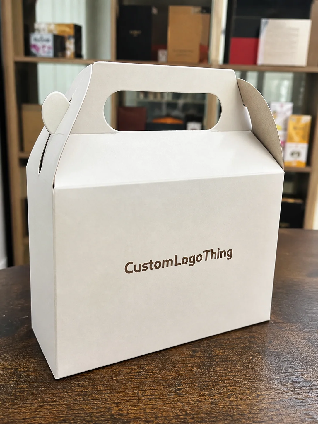
A gable box is a folding carton with a built-in handle at the top. That sounds ordinary until you watch how it changes user behavior. People carry it differently, set it down differently, and remember it differently from a flat tuck carton. The handle makes the pack feel more complete. The peak shape also gives the package a recognizable profile on a table, counter, or display shelf, even before anyone reads the branding.
That is part of why printed gable boxes are common for bakery items, party favors, seasonal gifts, sampler kits, retail add-ons, and direct-to-consumer bundles. They are flexible enough to fit many use cases, but not so generic that they disappear in the crowd. Compared with a plain mailer, the form communicates a little more ceremony. Compared with a rigid gift box, it keeps cost and shipping weight under control.
The practical upside is speed. Flat-shipped cartons take less warehouse space and are easier to kit when deadlines get tight. They also give operations teams a box that can be assembled without a complicated setup sequence. That matters more than people admit. If a box takes too long to build, the pack line pays for it. If it is simple to fold, the savings show up in labor rather than in the brochure.
There is another reason buyers keep returning to the format: perceived value. A modest item can feel more premium when the carton has a clean top panel, good registration, and a finish that suits the brand. That does not require heavy decoration. In fact, too much decoration can work against the shape. The handle and upper panels already give the box visual structure. The graphics only need to support that structure, not fight it.
Shape also matters in crowded retail settings. On a shelf packed with rectangles, the gable peak reads differently. That difference is small on paper and obvious in person. It is one of those packaging advantages that does not show up in a spec sheet but can still affect how quickly a customer notices the item.
How the Structure, Fold, and Print Areas Work
Most gable boxes are built from paperboard or light corrugated stock with scored fold lines, side panels, locking tabs, and a top that folds into a carry handle. Some versions ship flat and lock together at assembly; others use a slightly different closure sequence to improve load stability. The structural differences are small, but they matter when the box is being packed at speed or carried by a customer with heavier contents inside.
The dieline is where most quoting problems start. On a flat layout, the panels look generous and simple. Once the box is folded, those panels move, wrap, and meet at seams. A logo that seems centered on-screen can land too close to a crease. A barcode can disappear into a flap. Fine type can sit in a zone that bends more than expected. That is why real dieline files are not optional. They are the only reliable map of what the final box can actually show.
Print areas usually include the front, back, sides, top flaps, and sometimes the handle zone itself. Each surface has a different visual priority. The front panel does the heavy branding work. The sides tend to carry secondary copy, product information, or repeating motifs. The top is often what the customer sees first when the box is picked up. Ignoring that hierarchy is a common mistake. Good packaging design uses the structure instead of pretending the structure is invisible.
Print method affects both quality and economics. Digital printing fits short runs, test launches, and jobs that may still need artwork changes. Offset printing becomes more efficient as quantity rises and color consistency matters across a larger batch. Neither method is universally better. The right choice depends on volume, timeline, and how tightly the brand needs the color to hold from unit to unit.
Finish is the last part people tend to overestimate. Matte, gloss, soft-touch, spot UV, embossing, and foil can all improve shelf appeal, but each one changes how the carton is built and how much it costs. A controlled finish on one panel usually has more impact than a heavy effect across every surface. Once a box starts carrying too many finishes, the result can look busy rather than premium.
If the box needs a window, vent, insert, or grease-resistant lining, those decisions should be made before artwork is finalized. They affect tooling, substrate choice, and assembly time. Food applications deserve particular caution. The board, coatings, and inks need to match the end use, not just the aesthetic. A carton that looks refined but softens with moisture is not a finished spec. It is a liability.
For transit and packaging performance standards, the technical references from ISTA are useful when a carton has to survive parcel movement, stacking, or repeated handling. For responsible fiber sourcing, FSC remains the clearest shorthand when procurement wants documentation instead of vague sustainability language.
Spec Choices That Change the Final Look and Feel
Material is the first major decision because it determines stiffness, durability, and print behavior. A lighter paperboard can work for sampling, cosmetics, or small gifts, but it may feel underbuilt for dense products or high-touch retail use. Heavier paperboard improves the hand feel and helps the box keep its shape through assembly and transport. Corrugated options add even more strength, though they change the visual profile and can increase unit cost.
Coated and uncoated stocks produce very different results. Coated board usually supports sharper imaging, better color density, and cleaner solids. Uncoated board has a softer, more natural look, but it absorbs ink differently and can mute small details. That is not a flaw; it is a material behavior. Buyers sometimes choose an uncoated sheet for its tactile character and then wonder why the colors feel less saturated. The answer is in the paper, not the press.
Size is another variable that looks simple until it creates waste. Oversized printed gable boxes eat freight volume, take up shelf space, and let products shift around in transit. Undersized boxes create packing friction and can force awkward inserts or folded product placement. The right size is the one that fits the item with just enough tolerance for loading, closure, and movement control. In packaging, a few millimeters can matter more than a lot of people expect.
Color accuracy is usually where approval gets harder. CMYK works well for most jobs, especially when the brand can tolerate normal print variation. If color is central to the identity, spot inks or a tighter proofing process may be worth the extra time. A screen preview is not proof. It is simply light on glass. The printed box lives in a different environment, under different lighting, on different stock, with different absorption and ink gain.
Finishing should be selected with restraint. Foil can highlight a logo. Spot UV can separate a focal area from the rest of the layout. Embossing can give the box a more physical, memorable surface. But every added effect complicates setup and can create a risk of overdesigned packaging. A strong spec usually picks one or two accents and lets the structure do the rest.
There is also a durability question that gets overlooked. If the box will travel in a tote bag, sit in a refrigerator, or move through a parcel network, scuff resistance and moisture tolerance matter. A pretty carton that deforms after a short trip is not premium. It just arrives with a problem.
Cost, MOQ, and Unit Price: What Actually Moves the Quote
The quote for printed gable boxes usually turns on seven variables: size, board grade, number of printed surfaces, ink coverage, finish complexity, quantity, and whether any inserts or custom tooling are required. Change one and the price can shift more than expected. Add specialty finishing and the quote rises quickly. Reduce the artwork to fewer panels and the unit cost usually falls, sometimes dramatically.
Quantity is the most obvious lever because setup costs spread out as the run grows. A short run carries more overhead per box. A larger run lowers unit price, but it also ties up more cash and storage space. That tradeoff is easy to miss when the first line item looks attractive. A lower unit price is not always a better purchase if the order is too large for actual demand.
Minimum order quantities are not arbitrary. They reflect how the job will be printed, cut, finished, and packed. Digital production usually supports lower quantities, which helps with new launches and seasonal promotions. Offset production becomes more efficient at higher quantities and is often better when the design is settled and the box will be reordered. The right MOQ is the one that matches the business risk, not the one that sounds easiest to approve.
| Option | Typical Use | Approximate Unit Range | Main Cost Drivers |
|---|---|---|---|
| Digital short run | Launch tests, small events, seasonal drops | $0.65-$1.40 | Size, coverage, stock, quick file changes |
| Offset volume run | Retail replenishment, repeat campaigns | $0.22-$0.55 | Setup spread over quantity, color control, finishing |
| Premium finish spec | Gifts, PR kits, high-visibility packaging | $0.40-$0.95 | Foil, embossing, spot UV, heavier board |
When comparing quotes, ask for more than the print price. Setup fees, plate charges, proof costs, freight, color matching, and assembly labor can change the total materially. The lowest-looking quote sometimes becomes the most expensive once those items are added. That is not unusual. It is a function of how packaging is priced, and it is one reason buyers should compare landed cost rather than a single unit number.
A cheap quote is only cheap if the spec is the same. Different board, different finish, different freight, different result.
If you are comparing pack formats, it helps to line up the options inside our Custom Packaging Products range before settling on one structure. A side-by-side review often reveals cost differences that are invisible in a single quote.
Production Steps and Lead Time From Dieline to Delivery
The production sequence is straightforward: brief, dieline review, artwork placement, proof approval, printing, cutting, folding, finishing, packing, shipping. The delay usually does not come from the machine. It comes from the handoffs. Missing dimensions, unclear copy, color indecision, and repeated proof revisions take more time than many buyers expect.
Digital jobs can move quickly because setup is lighter. Offset jobs need more coordination, especially when they use specialty coatings, multiple passes, or complex finishing. Add curing time and inspection, and the schedule stretches further. A plain carton may be fast. A printed gable box with heavy finishing, exact brand color, and a tight launch date needs buffer time built in from the beginning.
One of the most reliable approval habits is simple: sign off the structure before the final artwork approval. Structural proofing catches fit issues early. Color proofing catches brand drift before the full run is produced. Separating those checks reduces waste and shortens the loop when something needs to be corrected.
Freight and receiving deserve the same attention as production. A carton that ships on time but lands late is still late. If the product launch depends on the boxes arriving, the calendar has to include transit, receiving, and internal kitting time. Too many teams plan only the factory schedule and then discover that the warehouse is now the bottleneck.
For goods that will move through parcel networks or be stacked repeatedly, ask whether any drop-test or transit guidance is relevant. ISTA-style testing language can be useful early, before a damage issue turns into a reorder. It is cheaper to simulate shipping stress than to discover it by opening a crushed carton.
A Step-by-Step Way to Order Without Guesswork
Start with the actual product dimensions. Not the idealized dimensions. The real ones. Include any insert, accessory, closure allowance, or product pair that has to fit together inside the box. If the packaging will hold multiple items, test the full arrangement before asking for pricing. One careful measurement can prevent a long chain of expensive corrections later.
Next, define the use case. Retail shelf, takeaway packaging, subscription bundle, event gift, sample kit, and direct-to-consumer add-on each produce a different spec. Retail usually asks for more visual polish. Food service usually asks for speed, durability, and cleanliness. Event packaging often needs a box that looks higher-value than its materials suggest. The purpose should drive the build.
Then request the dieline before finalizing artwork. Design should sit on the actual template, not on a guessed rectangle. Fold lines, glue areas, handle points, and quiet zones all need to be known before the layout is locked. If those zones are ignored, the finished carton can end up with text too close to a crease or a logo hidden by a flap.
Quantity should be chosen with risk in mind. New design? Smaller run may be smarter. Stable design with predictable demand? Larger run can make sense because setup cost is spread more efficiently. There is no virtue in guessing too low or too high. The wrong quantity creates either stock pressure or a reorder scramble.
Finally, Choose the Right approver. Someone has to evaluate color, copy, structure, and compliance at the same time. If the wrong person signs off, the project may move faster for a day and cost more for weeks. Approval discipline is not bureaucracy. It is how packaging avoids preventable mistakes.
Before requesting pricing, it helps to have the basics in one place. Our custom packaging options are easier to compare once size, finish, and target quantity are already defined.
Common Mistakes That Create Reprints and Waste
The most expensive error is designing before the dieline exists. It happens constantly. The artwork looks polished in a mockup, then the folds arrive and the text crosses a seam, or a logo gets split by a closure line. That is not a minor cosmetic issue. It is a production mistake that can trigger a reprint or a manual work-around.
Underordering is another common problem. A low minimum looks safe until the campaign performs better than expected or the first batch gets damaged in transit. Then the team has no buffer. Small runs can be smart, but tiny runs with no margin are a gamble disguised as prudence.
Color surprises also create waste. A monitor preview is not the final box, and the gap between the two can be large enough to matter. If the brand depends on exact color, ask for a proof or sample and inspect it under ordinary lighting. That is a better use of time than debating a shade that never actually existed on paper.
Overdesign is less dramatic but just as expensive. Too many effects, too much ink, too many competing visual treatments. The result is crowded and harder to print cleanly. A single premium treatment usually works better than several competing ones. Packaging rarely improves when every surface is trying to win attention.
Damage in transit is not always a carrier problem. Weak board, poor sizing, sloppy folding tolerance, and inadequate closure strength often sit at the root of the issue. If a box fails before it reaches the customer, the spec deserves scrutiny before the shipping label does.
Expert Shortcuts and Next Steps Before You Request a Quote
The fastest way to get a useful quote is to send complete information in one pass: final dimensions, artwork files, target quantity, preferred finish, and the needed ship date. If any of those are missing, expect a follow-up cycle. Complete specs shorten quoting because the supplier is pricing a real job rather than trying to guess what the box should be.
For high-visibility projects, request both a digital mockup and a physical sample if the timeline allows it. The mockup catches layout issues. The sample catches what a screen cannot: stiffness, fold memory, finish texture, handle comfort, and how the carton behaves under weight. Those differences are not theoretical. They are often what separates a good-looking box from a reliable one.
A simple decision rule usually holds up. Use a lean spec when speed and budget matter most. Use premium finishes when the package has to work harder as a branding object, such as for gifting, launches, or retail display. That is where printed gable boxes earn their keep: not by pretending to be luxury packaging, but by delivering a better presentation without forcing the budget into a corner.
Comparing a basic version, an upgraded version, and a rush-friendly version before approval can save time later. Tradeoffs are easier to see when they are set side by side. That is the real advantage of disciplined packaging buying. It turns a vague decision into a measured one.
Printed gable boxes work best when they are treated as a production item with design consequences, not as a decorative afterthought. Get the structure right, keep the artwork inside the dieline, choose finishes for a reason, and build the quote around the actual use case. That approach is less glamorous than a mood board, but it is far more likely to produce a box that prints cleanly, ships safely, and does its job without drama.
How much do printed gable boxes usually cost per unit?
Unit price depends on size, stock thickness, print coverage, finish, and quantity. A short digital run can sit around $0.65-$1.40 each, while larger offset runs often fall into the $0.22-$0.55 range. Always compare freight, proofing, and special finishing before calling one quote cheaper.
What is the minimum order quantity for custom printed gable boxes?
MOQ varies by print method and material. Digital production usually supports lower quantities, while offset printing, specialty finishes, and custom inserts tend to push the minimum higher. The right MOQ is the one that matches demand, storage space, and launch risk.
How long does production take for printed gable boxes?
Lead time depends on proof approval speed, print method, finishing, and shipping distance. Simple digital orders can move faster than complex offset jobs with specialty decoration. Add time for artwork changes, freight, and warehouse receiving if the boxes are tied to a launch date.
What files do I need to order custom printed gable boxes?
Usually you need a dieline, final artwork, logo files, and exact dimensions. If brand color matters, send approved swatches or color references instead of only screen images. A clear spec sheet removes most of the back-and-forth during quoting and proofing.
Can printed gable boxes be used for food or retail products?
Yes, but the board, coating, and inks should match the product use case. Food contact, moisture, grease, and handling requirements can all change the recommended material. Retail boxes often need stronger visual impact, while food boxes need more attention to safety and durability. That is how the packaging stays useful instead of merely attractive.