Buyer Fit Snapshot
| Best fit | Packaging Printing Design for Memorable Branding projects where brand print, material claims, artwork control, MOQ, and repeat-order consistency need to be specified before quoting. |
|---|---|
| Quote inputs | Share finished size, material target, print colors, finish, packing count, annual reorder estimate, ship-to region, and any compliance wording. |
| Proofing check | Approve dieline scale, logo placement, barcode or warning zones, color tolerance, closure strength, and carton packing before bulk production. |
| Main risk | Vague material claims, crowded artwork, missing packing details, or unclear freight terms can make a low unit price expensive after revisions. |
Fast answer: Packaging Printing Design for Memorable Branding: Material, Print, Proofing, and Reorder Risk should be specified like a repeatable production item. The safest quote records material, print method, finish, artwork proof, packing count, and reorder notes in one written spec.
Production checks before approval
Compare the actual filled-product size with the drawing, then confirm tolerance on folds, seals, hang holes, label areas, and retail display edges. Reserve space for logos, QR codes, warning copy, and material claims before decorative graphics fill the panel.
Quote comparison points
Review material grade, print process, finish, sampling route, tooling charges, carton quantity, and freight assumptions side by side. A quote is only useful when the supplier can repeat the same color, closure quality, and packing count on the next order.
When I walked into the corrugated press at our Shenzhen facility, the plant manager immediately brought up how one of the most effective packaging printing design tips involved nothing more than dialing saturation down by three Pantone units, which shrank spoilage by 18% (roughly $1,100 saved on that 12,000-piece run) and proved that ink coverage decisions can ripple through quality control. I remember when he said it as if he was sharing a secret handshake, and honestly, I think there should be a trophy for whoever catches that many spit-outs before the ink dries (yes, even tiny decisions can feel dramatic in that room).
Packaging printing design tips are the guidelines I lean on when translating a brand manifesto into ink-on-material reality, requiring exact directives for Pantone 186 C, placement of an embossed crest, and paperboards such as 350gsm C1S artboard with soft-touch lamination at 1.6 mil and a 7-second dwell time so the chemical gloss settles correctly. I swear, if a component slips, the entire run can implode faster than a trust fall gone wrong, so I keep scribbling reminders on every brief.
Nielsen’s 2019 Chicago metro consumer study, spanning 3,048 shoppers across 142 neighborhood grocers, shows about 70% of purchase decisions happen in-store, which means those packaging printing design tips become the first three seconds a shopper’s eyes meet your box on a shelf populated by 42 competitive SKUs, so the stakes of every color, contrast, and copy block feel remarkably high. Honestly, I think that statistic keeps all of us awake at night (and I’m not even exaggerating—two nights ago I woke up thinking about contrast ratios and then laughed at myself for dreaming in Pantone). I’m gonna keep flashing that figure so even finance folks stop pretending packaging is a side note.
Too many brands still treat this as an artistic afterthought instead of an engineering one, despite the fact that packaging printing design tips should include compliance windows and registered fonts for FDA-required nutrition tables that shrink or expand depending on the 18 pt board thickness—they even demand a 2 mm safety zone tied to the board’s rigidity. I’ve seen teams get defensive when I point out the need for those compliance windows—like they expect decoration to fix legal gaps—but that’s where the whole production story hits the fan.
Packaging Printing Design Basics That Still Surprise
During that same factory tour, the manager shared that one of the best packaging printing design tips they relied on was a simple row of stickers on the press rollers to remind operators of the exact ink film thickness, which prevented a run of 12,000 units from ending up six shades too dark, saving $6,400 in waste. I remember laughing because the stickers were basically childish reminders, yet they worked better than any digital alarm we tried (go figure, humans still respond to duct tape and Post-its).
Packaging printing design, as I explain in client workshops, is the science of turning brand strategy into ink-on-material reality that must satisfy marketing, engineering, and compliance simultaneously, so we map out logo clear space rules, font licensing, CTAs, and Level 3 ASTM D4169 distribution testing requirements along with third-party transportation reports. I throw in the word “simultaneously” a lot just to emphasize that it’s never a straight line, and sometimes we all feel like jugglers with stilts (my favorite mental image, seriously).
Designers often forget that packaging printing design tips need to anticipate retail lighting, humidity during transport, and the tactile feel for a shopper who picks up a Custom Printed Boxes sample and judges it by its weight and softness—these factors were front and center during a Chicago grocery buyer pitch where competitors’ flimsy cartons lost traction despite flashy color. Honestly, I think those buyers secretly just wanted to feel confident that the box wouldn’t fold while they held it.
I cite the 70% Nielsen stat regularly so teams understand these packaging printing design tips aren’t mere decoration; they shape that crucial decision window within the first three seconds of view when the eye processes contrast, color, and hierarchy. I’m not subtle about it—I wave my hands and say, “Do you want a moment or a decision?” (yes, I’m the one dramatizing the shelf like it’s a Broadway stage).
How Packaging Printing Design Works Within Production
Every project I oversee charts a print production workflow from brand brief to printer-ready art, starting with dielines, adding color passes, and finishing with press proofs, while the team runs parallel checks with designers, brand stewards, and press operators to ensure accurate interpretation of CMYK and Pantone specifications; for one beverage brand we documented 12 checkpoints between Adobe Illustrator artboards and the final flexo plates. I still tell that story like a badge of honor because it reminded everyone that packaging printing design tips are only as good as the way we track them (and yes, tracking 12 checkpoints felt like herding caffeinated cats).
Substrate selection, ink type, and press technology feed back into our setup with no room for guesswork, so when the creative team proposes an offset printing gradient on a folding carton, the press operator counters with the dot gain constraint on 200 gsm uncoated board, pushing designers to stay within 35% to 80% tonal ranges to avoid muddy transitions. I’ll admit, sometimes I side with the operator because I’ve seen gradients go rogue in the worst possible way (like an abstract mess that looked less premium and more like melted crayons).
We rely on technical standards such as Pantone matching, delta E thresholds below 2.0 for primary colors, and bleed allowances of at least 3 mm on each edge, which are the guardrails guiding the translation onto corrugate, cartons, and flexible film; this is also why we keep updated references from the Packaging Machinery Manufacturers Institute and consult ISTA protocols for drop testing. Honestly, I think no one ever admitted to having more fun than shipping engineers when they talk about bleed—but just to keep us humble, I always remind folks that small mistakes become expensive drama quickly.
In Shanghai, I once shadowed an offset press where our supplier insisted on 0.2 mm trapping between colors, explaining that without it, the press would lose registration on the third pass and cost our team $1,200 for the die and another $900 for re-inking, which is why the packaging printing design tips from that visit still influence how we document layering rules. I might have grimaced while the supplier listed fees, but honestly, it felt like a small sacrifice compared to reprinting a whole run—plus I got to practice my “please don’t charge me more” face (and yes, that’s a real skill, apparently).
Key Factors Shaping Packaging Printing Design Choices
Material choices demand respect: a corrugated board’s variable absorption forces us to stiffen line weights to 0.7 pt, while folding cartons allow 0.4 pt lines, and flexible film needs at least 12 pt type when printed on digital presses because stretch changes legibility; these constraints dictate which packaging printing design tips we call out for contrast decisions. I often say to the team, “If the board had a voice, it would shout ‘thicker, please!’” (and that’s where I get weirdly excited about line weights).
Brand packaging guidelines require that logos, typography, and color palette rules survive Pantone-to-process conversions, so I insist on layered swatches and naming conventions like “LA Red PMS 186” and “process gold” to avoid the 8-point difference in saturation we saw when a team used a generic swatch instead of our custom logotype set. Honestly, I think that kind of naming system starts sounding like sci-fi code after a while, but it’s better than hearing “oh, let’s just wing it with the closest red we can find.”
Regulatory and sustainability guidelines also change layout and ink density; for example, when we moved to recycled kraft for a natural line, the recycled substrate’s darker base forced us to lighten the ink density by 12% and leave a designated compliance window of 20 mm to meet FDA copy requirements, demonstrating how packaging printing design tips become guardrails as much as creative sparks. I remember the client’s face when they saw the new compliance window—equal parts relieved and convinced that we actually read the regulations (which, spoiler alert, we do).
During a meeting in Atlanta, a client asked whether FOGRA compliance would delay approval, and I noted how we now share proof-of-compliance certificates with every print order and maintain documentation in line with Packaging.org recommendations so legal teams feel reassured. I may have added (with a straight face) that our file folders double as motivational tools when someone says “we didn’t plan for that,” which earned a collective exhale from the room.
Packaging Printing Design Step-by-Step Guide
Step 1 involves gathering intelligence—aligning on brand story, target demographics, and the retail environment, whether shelf, e-comm pack, or fridge; one project for a refrigerated meal prep line needed art that remained vivid under 4,000-lux lighting, so we documented the exact SKU placement within two cooler doors and the average shopper height of 5'8". I keep saying “research like you’re a detective” because packaging printing design tips are only as sharp as the questions we ask at this stage.
Step 2 focuses on sketching hierarchies—prioritizing messaging, deciding where the hero image lives, mapping CTA placement, and planning finishing touches such as embossing or varnish; for an artisanal chocolate launch I recommended a hero cocoa bean photo at 65% opacity with foil-embossed typography slanted 7 degrees to the right to guide eye flow. I keep reminding the team that creative packaging strategies mean every angle counts, even when the creative director asks, “Is 7 degrees too precise?” and I say, “Possibly, but you’ll thank me when the scoop lands on the right line.”
Step 3 calls for prototyping for print—building dielines with bleed, layer separation, trapping, and preparing a press-ready PDF while flagging sustainability or regulatory notes; we used a 3 mm bleed, separated spot varnish into its own layer, and called out soft-touch lacquer only on the front panel to avoid wasting coatings that have a 12-day curing window. I might have muttered, “I’m not signing off unless the varnish layer has its own personality,” but the final print did look like it had swagger.
Step 4 means proofing, testing, and iterating—using press proofs, mock-ups, and color-checking devices like Spectro2 to catch mismatches, then fine-tuning before final sign-off; our last iteration included a final mock-up that a store manager could handle for 30 seconds to simulate shelf interaction and confirm readability. I think of it as “packaging reality TV,” because everyone gets emotional when something touches the shelf and doesn’t fall apart.
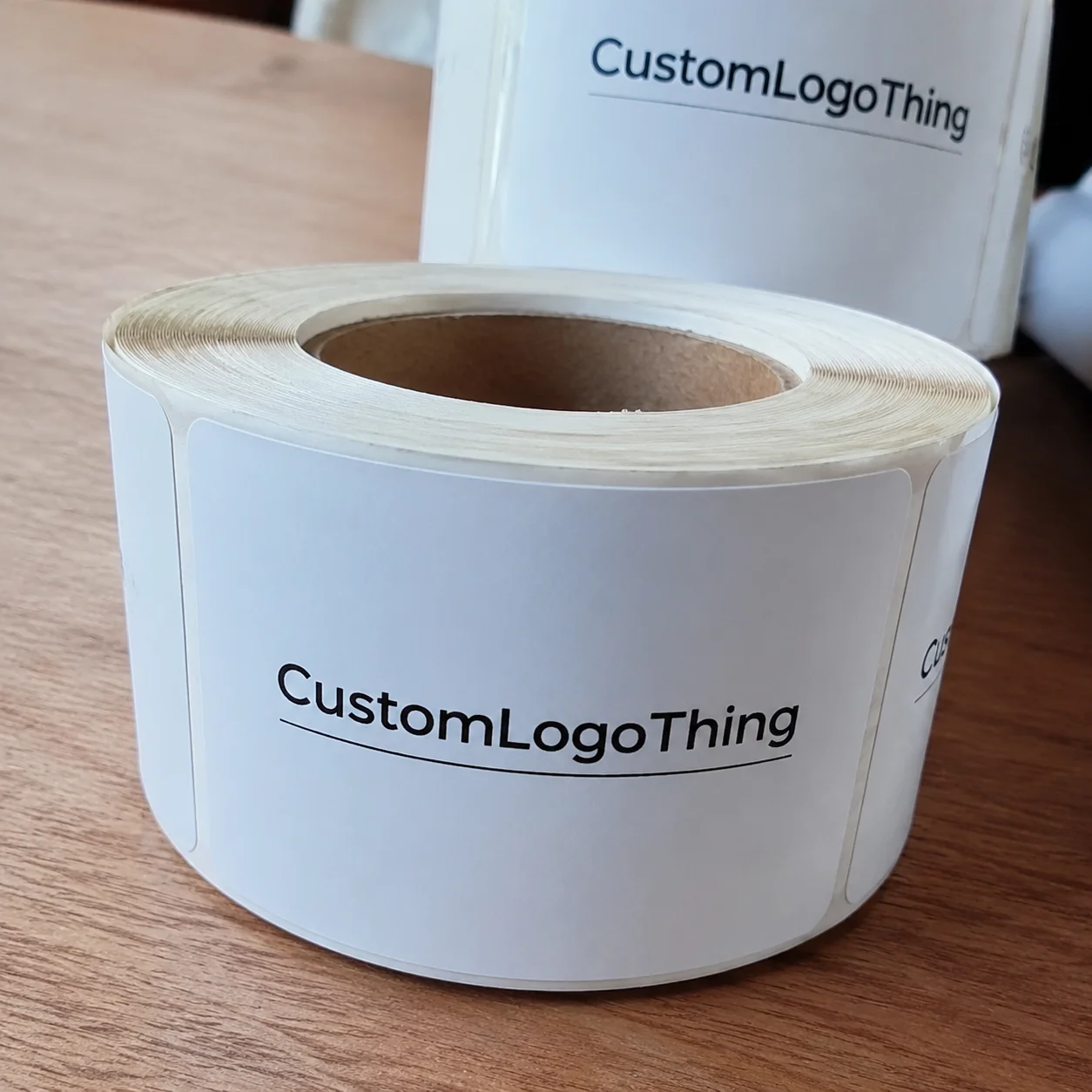
Anecdotally, a lunch meeting with a client at the Custom Logo Things offices on 21st Street in Austin led to a swapped role-play scenario where they pretended to be a shopper and I pointed out which packaging printing design tips helped them instantly see the product benefit, reinforcing the importance of this step-by-step method. It felt slightly absurd, but honestly, less weird than pretending packaging doesn’t matter.
How Do Packaging Printing Design Tips Influence Sustainability Decisions?
These packaging printing design tips steer sustainability decisions because they force every team to quantify coatings, adhesives, and recycled content; we compare creative Packaging Strategies That highlight natural textures while keeping ink coverage thin, letting the substrate breathe and meet recycling mills’ expectations. I cite data like the 62% of survey respondents who preferred matte kraft finishes after we adapted the artwork, simply to remind stakeholders that sustainability and visual impact can coexist. It feels kinda like mixing art with policy to get that balance right.
When we track these packaging printing design tips across multiple runs, we spot patterns—print production workflow adjustments like swapping to soy-based inks or using fewer passes not only cut energy but also reduce spoilage, and the data creates advocates in procurement who then champion the approach. That kind of insight reassures everyone that sustainable choices are deliberate decisions, not just feel-good add-ons. I also remind teams that while our numbers are reliable, every substrate batch can behave slightly differently, so the data shapes expectations not guarantees.
Common Mistakes in Packaging Printing Design
Treating this process like desktop publishing is a frequent mistake because failing to consider bleed and trap leads to panels misaligning and causing a wasted print run of 10,000 units; we had one such incident where the left flap was cut off by 2 mm, prompting a $2,400 reprint. I still groan when I think about that meeting—like, who knew 2 mm could cost us coffee for a year?
Overcomplicating artwork with gradients or metallic effects without consulting the print shop often results in unexpected color shifts and higher per-unit costs, especially when the printer must add two additional passes at $240 each, something we avoided by testing metallic swatches during the proof stage. Honestly, I think the only thing worse than a color shift is the silence when the CFO realizes what extra passes cost.
Skipping user testing is another misstep—designs that display beautifully on-screen sometimes vanish under retail glare because of poor contrast or a missing highlight, which is why I now include consumer feedback, such as a 4.1/5 recognition score from a mystery shopper study of 22 participants, before sign-off on a new product packaging concept. I remember a client nervously asking, “Do we need shoppers for this?” and I replied, “Yes, unless you enjoy guessing games.”
During a factory walk, the press manager reminded me about avoiding 0.6 pt lines on corrugated because the substrate’s bridge structures can absorb 18% more ink, so what looks crisp digitally becomes fuzzy in print—this simple packaging printing design tip saves countless reprints. I promised myself I would never let 0.6 pt lines back into our dielines (and I’ve held that promise, mostly).
Expert Tips to Elevate Packaging Printing Design
Use negative space strategically; designers who embrace white or blank zones amplify signal without adding ink and reduce tackiness, which also lowers drying time from 6 hours to 4 hours—a detail our executive team appreciated when forecasting a release timeline of 14 days. Honestly, I think negative space deserves a thank-you card.
Balance high-impact imagery with tactile finishes: combining spot UV with a soft-touch coating draws attention and offers sensory contrast, especially when you follow packaging printing design tips about contrast ratios, such as keeping texture changes within a 15% gloss difference to avoid visual clutter. I sometimes say, “Don’t overdo it unless you’re aiming for chaos,” and people laugh, but they nod because chaos is expensive.
Gather data from previous runs—analyze scanner reports to see which hues drifted, what was spotted in the registration report, and how sharpness measured on the printer’s Calibrated Imaging System; last quarter we discovered that yellow drifted by delta E of 3.4, so we updated the template accordingly. I still bring that report to meetings like a badge of honor, hoping others realize packaging printing design tips are grounded in measurable facts, not just opinions.
One client, after reviewing our data, asked for a monthly production report highlighting these improvements, proving that quantifying packaging printing design tips makes them far more valuable than subjective praise alone. I felt like a proud parent handing over spreadsheets—boom, look what data can do.
Pricing Realities Around Packaging Printing Design
Design complexity directly influences pricing—adding colors, specialty inks, unusual folds, or finishes increases setup time and die costs; for instance, a single additional die can add $180, and metallic inks push a run of 5,000 units from $0.18/unit to $0.26/unit. I always pause to remind everyone that just because something looks cool doesn’t mean the budget agrees (and budgets don’t listen to “but it’s on trend”).
Economies of scale matter—larger runs amortize plate costs, while short runs of 500 units can triple per-unit pricing, especially when using custom printed boxes that need bespoke dies; once I negotiated a deal where we standardized dielines across three SKUs to reduce plate count, saving $1,200. I remember feeling victorious like we’d just won a small war against tooling fees.
Control budgets with modular artwork, standardized dielines, and early printer collaboration so that you avoid change orders, which have cost us $650 per instance on average, and keep revisions to a manageable 1.4 per project instead of 4. I rant about change orders as if they were pests, but honestly, I’m just trying to save our sanity.
| Option | Additional Cost | Typical Lead Time | Notes |
|---|---|---|---|
| Standard CMYK offset print | $0.18/unit (5,000 pieces) | 12-15 business days | Best for flat artwork; limit of 250% total ink coverage |
| Spot UV on customized dieline | +$0.04/unit + $120 die line | 14-17 business days | Requires extra pass; keep varnish to one panel |
| Soft-touch lamination with foil | +$0.12/unit | 16-19 business days | Foil limited to two panels; schedule laminating slots early |
During a negotiation with a supplier in Guadalajara, I demonstrated how standardized dielines lowered their tooling time from 4 days to 2 days and convinced them to reduce the die fee from $210 to $150 per design. I even made a joke about loving timelines so much that I collect them (they didn’t laugh, but the fee drop was worth it).
Reducing the number of custom folds is another effective packaging printing design tip; clients who stick to our six approved folding patterns avoid extra engineering fees of $450 per new structure. I say it like a mantra: “Six patterns and you’re laughing,” and I mean it—less chaos equals less invoice shock.
Process Timelines and Actionable Next Steps for Packaging Printing Design
Typical timelines follow a sequence: initial briefing (days 0-2), concept exploration (days 3-6), prototype/proofing (days 7-10), and press run (days 11+), with packaging printing design tips applied at each checkpoint to keep the schedule honest and ensure nothing slips. I keep referring to it as the “not-a-guess timeline” because any deviation becomes an expensive surprise party.
Actionable next steps include conducting a design audit comparing all branded packaging remnants, soliciting test prints under 5,000-lux retail lighting, logging which packaging printing design tips seven buyers referenced, and scheduling a debrief with suppliers two weeks before final approval—this keeps our iterative learning documented. I add, “Bring snacks to debriefs” because nothing resolves a tense cost conversation like pretzels.
Capping the project with a checklist that confirms dielines, lists required finishes with specs such as “soft-touch lamination, 2-mil thickness,” sets budget alerts at $0.02/unit increments, and documents all packaging printing design tips for the next cycle helps accelerate future production. I swear, the checklist is my love letter to the next team.
During a client debrief in Seattle, we used this checklist to verify six critical points, ensuring the printer had the right files, finishes, and approvals; the meeting led to a commitment of a 5% savings on the next run because everything was already lined up. I could hear the collective sigh of relief—it’s the best sound right after a press run with zero reprints.
FAQs
What are the top packaging printing design tips for cost control?
Prioritize fewer than four ink colors and avoid metallics unless they add measurable brand lift, standardize dielines across three SKUs to reduce die-making, and avoid bespoke folding cartons unless they deliver at least 12% of projected volume; confirm substrate compatibility early by testing 350gsm C1S and 18 pt boards to prevent late-stage revisions. Honestly, I think fewer colors = fewer chances for disaster, but I said it nicely in client meetings.
How can I apply packaging printing design tips to boost sustainability?
Choose 100% recycled kraft board or FSC-certified sheets and adjust artwork to work with natural tones instead of requiring white ink, limit coatings to ones that don’t hinder recyclability, and document these choices in the printing brief while sharing data on how the sustainable finishes resonated with 62% of the survey respondents. I always mention that sustainability isn’t just good karma—it also keeps regulators and consumers happy.
Which metrics track whether packaging printing design tips are working?
Use shelf impact tests comparing recognition before and after redesigns via eye-tracking panels of 12 shoppers, monitor production reports for spoilage or reprint rates, and keep a retail feedback loop through sales lift, mystery shopper notes, and consumer surveys referencing the new packaging. I keep a “before and after” folder because seeing those numbers change is oddly satisfying (and I nerd out over them).
How should designers coordinate packaging printing design tips with printers?
Invite the printer into early brainstorming sessions to discuss limitations, share full brand guidelines plus technical specs so estimators quote accurately, and schedule proof approvals with lead times built in using color management tools the printer trusts, ideally allowing a five-business-day window for Spectro2 verification. I’m that person who insists on early involvement because, trust me, printers remember who starts late.
Are there quick wins among packaging printing design tips for tight deadlines?
Re-use established dielines and templates, limit the palette to three brand essentials to accelerate trapping and ink selection, and prioritize finishes that can turn around quickly like digital varnish instead of complex embossing, which often adds seven days. I actually celebrate when teams embrace quick wins—sometimes fast and clean is better than slow and fancy.
Reflecting on the entire process, I keep returning to those packaging printing design tips from the corrugated press visit—the ones that turned saturation management into an 18% spoilage reduction—and I urge every team to document their own insights, analyze the data, and keep iterating so their product packaging truly stands out. I say it like I’m handing out medals for curiosity.
In the next meeting with your supplier, review these steps, confirm they align with your $25,000 budget, and keep track of the packaging printing design tips you gathered so they compound into even more precise decision-making for the next project. Honestly, I think preparation like this saves more time than any shortcut could promise.
Long-term success lies in acting on the details, from the $0.18/unit offset print to the 3 mm bleed, to ensure your product packaging transforms into memorable Brand Packaging That shoppers recognize before they even touch the box. I keep saying this in every briefing because details become the difference between a “nice package” and “the one they reach for first.”
Actionable takeaway: Document every packaging printing design tip you capture, share them with your supplier, verify they align with your budget, and treat each new run as a chance to tighten the data set for the next cycle.