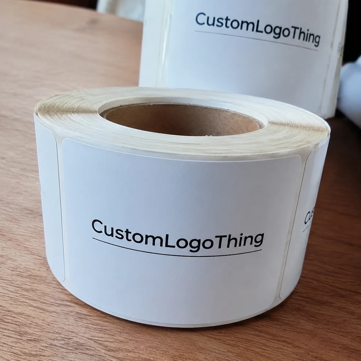
Buyer Fit Snapshot
| Best fit | Packaging Printing Design for Better Branding projects where brand print, material claims, artwork control, MOQ, and repeat-order consistency need to be specified before quoting. |
|---|---|
| Quote inputs | Share finished size, material target, print colors, finish, packing count, annual reorder estimate, ship-to region, and any compliance wording. |
| Proofing check | Approve dieline scale, logo placement, barcode or warning zones, color tolerance, closure strength, and carton packing before bulk production. |
| Main risk | Vague material claims, crowded artwork, missing packing details, or unclear freight terms can make a low unit price expensive after revisions. |
Fast answer: Packaging Printing Design for Better Branding: Material, Print, Proofing, and Reorder Risk should be specified like a repeatable production item. The safest quote records material, print method, finish, artwork proof, packing count, and reorder notes in one written spec.
Production checks before approval
Compare the actual filled-product size with the drawing, then confirm tolerance on folds, seals, hang holes, label areas, and retail display edges. Reserve space for logos, QR codes, warning copy, and material claims before decorative graphics fill the panel.
Quote comparison points
Review material grade, print process, finish, sampling route, tooling charges, carton quantity, and freight assumptions side by side. A quote is only useful when the supplier can repeat the same color, closure quality, and packing count on the next order.
Why Packaging Printing Design Tips Matter More Than You Think
Some of the prettiest artwork I’ve ever seen has failed the moment it hit a press sheet, and that is exactly why packaging printing design tips matter so much. I remember standing on a folding carton line in a facility outside Chicago, watching a cosmetics box rejected because the gold type sat 1.5 mm too close to a score line and disappeared once the board folded. On a monitor, the design looked clean and premium; on the production floor, it turned into a costly lesson in how packaging printing design tips have to respect real manufacturing limits. The job used 18pt SBS artboard, a matte aqueous coating, and a 6-color offset press, and the issue still came down to a tiny shift in panel placement.
In plain language, packaging printing design is the bridge between branding ideas and physical production. It’s the part of packaging design where creative decisions meet dielines, ink behavior, press tolerances, and substrate choice, whether you’re working with SBS paperboard, corrugated cardboard, kraft stock, rigid chipboard, or flexible films. The best packaging printing design tips don’t just make a box look good; they help it print correctly, fold correctly, ship correctly, and still look strong when it reaches a customer’s hands. That is especially true on jobs built for a plant in Dongguan, Shenzhen, or Ho Chi Minh City, where a missed tolerance of even 0.5 mm can ripple through the whole run.
That matters for retail packaging, sure, but it matters just as much for e-commerce and shipping packs too. A box may need to look sharp under store lighting, survive a warehouse drop, and still photograph well in an unboxing video. I’ve seen brand teams spend hours perfecting a front panel for shelf appeal, then forget that the same carton has to move through a case packer, a courier network, and maybe even a humidity swing in a regional distribution center in Dallas, Rotterdam, or Singapore. Good packaging printing design tips account for all of that, including the 30% to 80% humidity range that can change how kraft and laminated board behave after packaging leaves the factory.
Here’s the part a lot of teams miss: design is not only a visual decision, it is a production decision. Every color choice, finish choice, and text placement changes registration risk, finishing options, and how the substrate behaves. If you want custom printed boxes that hold up in real production, your artwork has to be built with the press in mind from the start. That’s the heart of practical packaging printing design tips, especially when a project needs quoted pricing like $0.15 per unit for 5,000 pieces or a 12 to 15 business day turnaround from proof approval.
How Packaging Printing Design Works From File to Finished Box
The production path usually starts with concept, then moves to the structural dieline, artwork setup, prepress checks, proofing, plate or cylinder creation, printing, finishing, cutting, folding, and final inspection. That sequence sounds simple on paper, but each handoff can introduce problems if the file isn’t prepared correctly. In my experience, the cleanest jobs are the ones where the design team and the packaging supplier talk early, before anyone locks in a layout that won’t fit the board or the press. A carton run in Qingdao or Xiamen can move from proof approval to finished shipment in about 12 to 15 business days for a standard offset job, but only if the dieline, ink specs, and finish callouts are correct on the first pass.
Packaging printing design tips have to reflect the print method too. Offset lithography is often the right fit for premium folding cartons because it gives strong detail, smooth solids, and excellent image reproduction on white SBS artboard. Flexographic printing is more common for corrugated packaging and flexible packaging, especially when the run is long and the substrate is less forgiving. Digital printing is useful for short runs, fast proof cycles, seasonal launches, and pilot projects where speed matters more than plate setup economics. A 1,000-piece digital sample run may cost $0.28 to $0.55 per unit, while a 10,000-piece offset carton on 350gsm C1S artboard can drop closer to $0.09 to $0.22 per unit depending on coating and finishing.
Technical file setup matters just as much as the press choice. I always tell clients to watch CMYK versus Pantone matching, safe zones, overprint settings, trapping, resolution, and embedded fonts. If you’ve ever had a rich navy shift into a dull purple because the color build was wrong, you already know why these packaging printing design tips are not cosmetic advice; they’re production controls. A 300 dpi image may sound sufficient, but if it’s stretched beyond its native size or placed over a textured kraft background, the result can still print soft or muddy. On a 0.25 mm trap, a small error in overprint settings can be enough to show a white halo on the finished carton.
Finishing also changes the story. Coatings, laminations, foil stamping, embossing, and spot UV can make the same art direction look dramatically different, and each one needs to be planned before the file goes final. A matte aqueous coating over a vibrant orange behaves differently than a soft-touch lamination over the same artwork. I’ve watched a brand’s logo shift from crisp to slightly subdued simply because they moved from gloss to uncoated stock. That’s why the strongest packaging printing design tips always include finishing decisions early, not after the artwork is already approved. In many factories around Suzhou and Guangzhou, a foil plate change alone can add 2 to 3 business days and $80 to $240 in setup cost, so the design needs to respect the finish from day one.
For practical packaging teams, the job is to make the design fit the manufacturing route. That’s true for branded packaging and for plain utility cartons, because if the file doesn’t respect the process, the process will rewrite the design for you. Nobody wants that rewrite happening on press at 2:30 p.m. with 8,000 sheets already planned for the shift, especially when the run is booked in a facility that bills by the hour and measures make-ready in minutes.
Key Design Factors That Affect Print Quality and Brand Impact
Substrate selection is one of the biggest influences on print quality, and it shows up immediately in both color and texture. Kraft paper absorbs ink differently than white SBS paperboard, and both behave differently from premium rigid board or corrugated board. On kraft, colors can lose brightness because the natural brown tone absorbs and dulls the ink film. On SBS, you get stronger contrast and cleaner detail. Corrugated adds flute structure, so the surface is less uniform, and that changes how small text and fine lines hold up. These are the kinds of packaging printing design tips that save a project from looking flat or inconsistent, especially on 32 ECT or 44 ECT shipper boxes used in North American distribution centers.
Color consistency is another area where a disciplined system pays off. If a brand uses one red on a folding carton, another on an insert, and another on a shipper, the customer notices even if they can’t articulate why the package feels off. I’ve seen this happen in supplier negotiations more than once: marketing wants “the exact same red everywhere,” while production is fighting three different substrates and two different print methods. The best packaging printing design tips account for the reality that ink on board is not the same thing as RGB on a screen. If you need tighter control, build a brand color standard with Pantone references, approved tolerances, and substrate-specific expectations, then test the ink drawdown on the actual stock before approving a 20,000-unit run.
Typography deserves more respect than it gets. Small type can break down on textured materials, especially recycled kraft or rougher corrugated liners, and low-contrast type can disappear fast under store lighting or in a phone camera. I’ve seen beautiful minimalist packaging fail because the legal copy dropped below the readable threshold once it hit press. A good rule is to keep hierarchy simple: brand name first, product claim second, supporting copy third, and compliance information placed where it remains legible without cluttering the front panel. Smart packaging printing design tips always protect readability, and on many cartons that means keeping critical copy at least 4 pt on coated board and closer to 5.5 pt on uncoated kraft.
Structural fit matters too. Barcode placement, legal copy, and any required recycling or compliance text need a home that won’t be swallowed by folds, seams, or glue flaps. On custom printed boxes, a front panel that looks spacious in the comp can suddenly feel crowded once the folding geometry is applied. I’ve had clients approve a carton layout in the office, then watch the barcode land half a millimeter too close to a side seam in the factory. That kind of miss is avoidable with better packaging printing design tips and a careful review of the dieline, especially for tuck-end cartons that use a 3 to 5 mm glue flap and a 1.5 mm crease allowance.
Now for the money side, because design choices absolutely affect pricing. Heavy ink coverage can raise cost by increasing press difficulty and drying demands. Specialty finishes like foil, embossing, and spot UV add setup complexity and often push up minimum order quantities. More complex structures can mean more waste during setup, and more waste means higher unit cost. For example, a simple 4-color digital run of 2,000 folding cartons might come in around $0.18 to $0.42 per unit depending on stock and finishing, while a foil-stamped offset job on premium board could jump significantly higher. If you’re budgeting a launch, ask your supplier where each of your packaging printing design tips will add cost before the art is locked. On a 5,000-piece production in Shenzhen, adding cold foil and embossing can increase the quote by $0.06 to $0.14 per unit, which changes the margin fast.
Honestly, one of the most underrated parts of packaging design is knowing when to stop adding things. More finishes do not always equal a better brand. Sometimes a clean 2-color layout on premium board looks more confident than a busy carton loaded with foil, emboss, spot gloss, and a laminated surface that costs twice as much to make. The best packaging printing design tips often reduce noise rather than add it. I’ve had to talk more than one client down from “just one more effect,” and yes, the package usually looked better after we removed the extra glittery ideas. Marketing does not always love hearing that, but the press certainly does.
“The box looked perfect on the computer, but once we checked the dieline and material sample, the contrast changed completely. That’s why we test, not guess.”
If you want to see how material choices and finish capabilities affect the final result, our Custom Packaging Products page is a useful starting point, and our Manufacturing Capabilities page shows the production methods behind the work. The reason I point that out is simple: the design should follow the process, not fight it. That’s one of the most practical packaging printing design tips I can give anyone buying packaging for the first time, especially if they need a quote for 10,000 pieces, 350gsm C1S artboard, and a matte lamination schedule.
Step-by-Step Packaging Printing Design Process
Start with brand goals and the actual use case. Is the package meant to stand out on a retail shelf, protect product during e-commerce shipping, or create a memorable unboxing experience? Each outcome changes the structure, the graphics, and the finishing plan. A luxury skincare carton, for example, may need a matte soft-touch feel and restrained typography, while a subscription box might benefit from bolder graphics and more durable corrugated construction. Strong packaging printing design tips always begin with that business decision, not with decoration. A skincare brand in Los Angeles may choose a rigid setup box with 157gsm art paper wrap, while a pet supply brand in Manchester may need a 3-ply corrugated mailer with water-based flexo print.
Next, choose the box style and dieline before the art direction gets too far along. I’ve walked into too many meetings where the artwork had already been built around a shape that didn’t exist in production. That creates avoidable revisions, and revisions cost time. If the packaging is a folding carton, rigid setup, mailer box, tuck-end carton, sleeve, or insert, the structure determines where panels, folds, glue flaps, and display surfaces live. Good packaging printing design tips respect that structure from the first sketch, whether the carton is built for a 500 ml bottle or a compact cosmetic vial.
Then build the layout in the correct template. Use bleed, safe area, and fold-aware placement for logos, copy, and imagery. A common mistake is placing a key product claim too close to an edge and then losing it to trimming variance. Another is letting a background pattern cross a fold in a way that visually stutters when the box is assembled. On press, even a fraction of a millimeter matters. That’s not designer paranoia; that’s how physical production works. The most reliable packaging printing design tips are built around tolerance, not wishful thinking, and many factories will specify at least 3 mm bleed and a 2 mm safe zone as a starting point.
Proofing should be treated like a technical review, not a formality. Check color values, image resolution, barcode scans, finishes, and text readability on the actual proof file. If possible, request a press proof or material sample before full production, especially for new brand launches. I’ve seen a rich black that looked beautiful on screen turn slightly warm on coated board, and I’ve seen fine serif type become fragile on uncoated kraft. Proofing is where strong packaging printing design tips save you from expensive surprises. A press proof in a factory near Shenzhen may add 1 to 2 business days and cost $45 to $120, but that is far less painful than reprinting 8,000 cartons.
Approval timelines should be mapped honestly. A simple digital packaging run can move quickly once art is locked, but offset printing, foil, embossing, and complex custom structures usually need more setup and approval time. A realistic schedule for a straightforward digital prototype may be 5 to 10 business days from final file to sample, while a more involved offset carton with specialty finishing might run 12 to 18 business days or longer, depending on proof rounds and tooling. If a supplier promises speed without asking for your artwork status, that should make you cautious. Real packaging printing design tips include a timeline that matches the job, and that timeline should include dieline confirmation, sample approval, and pallet packing in the final factory city.
One small factory-floor habit has saved me more headaches than I can count: always ask who is signing off on what. Marketing signs off on messaging, operations signs off on fit, and production signs off on printability. When one person is responsible for all three without technical support, errors slip through. That’s why packaging printing design tips should be shared across the team, not held by the art department alone, especially when the source files are moving between New York, Toronto, and a contract packager in Vietnam.
Common Packaging Printing Design Mistakes to Avoid
The most common mistake is designing without a dieline. It sounds basic, but it still happens all the time, especially when teams rush to launch. A box drawn from memory or a mockup file used as final artwork often creates fold problems, crop issues, and panel misalignment. If the package shape is custom, the dieline is not optional. It is the map. Among all packaging printing design tips, this one prevents the most expensive rework, because a rerun of 5,000 boxes can easily add $600 to $2,000 in avoidable cost depending on stock and finishing.
Another frequent problem is putting critical text too close to folds or edges. That includes product names, claims, expiration details, and barcodes. Once trimming tolerance and folding behavior are accounted for, text that looked centered can wind up visually off-balance or partly hidden. I once saw a food carton rejected because the nutrition panel sat just far enough into the score line to be hard to scan in quality control. The print itself was fine; the layout was not. Practical packaging printing design tips treat every fold as a risk zone, and they assume a 1 to 2 mm production variance even on well-calibrated equipment.
Screen color is a poor substitute for print reality. Monitors do not show ink absorption, varnish behavior, metallic reflection, or substrate texture accurately. That is why a pale beige on screen may look gray on uncoated stock, and why deep blues can shift under certain coatings. The fix is to work from proofs, swatches, and material samples, not optimism. If a designer says, “It looked right on my laptop,” I know we need another round of packaging printing design tips before production, preferably with a printed drawdown from the exact paper mill and coating line.
Too many finishes can also create trouble. A package does not become more premium simply because it carries foil, embossing, spot UV, and a soft-touch laminate at the same time. In some cases, those extras fight each other, add cost, and slow the line without improving brand perception. Strong brands often look better with one or two carefully chosen effects than with five competing ones. The smartest packaging printing design tips are selective, not excessive, and they often save 8% to 18% of the finishing budget by removing unnecessary layers.
Branding mistakes are common too. I’m talking about inconsistent logo spacing, tiny contact details, unreadable regulatory information, and front panels that are overloaded with claims. When every panel screams for attention, nothing gets attention. Good package branding works with hierarchy, white space, and disciplined messaging. If your customer can’t identify the product in three seconds from two meters away, that’s a sign the artwork needs another pass. This is exactly where packaging printing design tips protect both brand clarity and sales performance, especially in retail environments in Berlin, Tokyo, or Dubai where shelf time is short and competition is intense.
Then there are file mistakes, which are boring until they cost you money. Low-resolution art, missing fonts, incorrect dimensions, and ignored overprint or transparency settings can all delay production. A 72 dpi image hidden inside a beautiful layout is still a 72 dpi image. If you want fewer surprises, export final files properly, check the linked assets, and confirm the printer’s prepress requirements before submission. Many packaging printing design tips sound simple because the simple ones are the ones that prevent reprints, and a single bad link file can hold up a shipment leaving a factory in Foshan by 3 to 4 business days.
For broader production and environmental standards, I also like to point teams toward authoritative resources such as the Packaging School and PMMI ecosystem for industry education, the ISTA packaging test standards for transit performance, and the FSC certification site when sourcing responsibly managed fiber. If your packaging has to survive shipping, retail handling, and sustainability scrutiny, those references are worth bookmarking alongside your own packaging printing design tips. I also recommend checking whether your supplier can provide ISTA 3A or 6A test reports, especially for mailer boxes headed into Amazon-style fulfillment centers.
Expert Packaging Printing Design Tips From the Factory Floor
Design for the actual print method. That sounds obvious, but it is where many teams go wrong. Offset printing rewards clean vector art, controlled solids, and crisp image reproduction. Flexographic printing prefers simpler art in many cases, especially for corrugated and film applications where heavy ink coverage or tiny serif type may not reproduce cleanly. Digital printing gives flexibility for short-run custom packaging, variable data, and quick iterations, but it still has its own limits around color range, surface texture, and finishing compatibility. The best packaging printing design tips always start with the machine, not the mockup, and that becomes even more true when the run is split between a plant in Jiangsu and a finishing partner in California.
Test spot colors, black builds, metallics, and gradients early, especially on textured or recycled materials. I’ve watched a beautiful silver ink turn flat on kraft and a rich black split into muddy undertones because the wrong underbase was used. If your design depends on subtle color movement, request a sample on the actual board stock. A 350gsm C1S artboard with soft-touch lamination will behave very differently from 18pt uncoated SBS or 32 ECT corrugated. Specificity matters here, and so do your packaging printing design tips. On a plant floor in Dongguan, a simple ink drawdown can expose issues that a screen proof never will.
Keep the hierarchy disciplined. The brand should be readable from a distance, the product should be identifiable in a second glance, and the supporting details should be easy to find without taking over the panel. I prefer designs that make the first read obvious and the second read rewarding. That works for retail packaging on a shelf and for e-commerce product photography, where the camera exaggerates clutter and uneven spacing. One of my favorite packaging printing design tips is simply this: if a shopper has to work to understand the carton, the design is doing too much. A 12-inch shelf test in a retail mock aisle can tell you more than a whole day of screen tweaks.
Communicate with your packaging supplier before final approval, not after. Confirm the board stock, coating, die compatibility, and finishing tolerances while the file is still flexible. During one client meeting at a folding carton plant in New Jersey, we caught a foil panel that would have landed inside a glued seam because the die had been updated but the artwork file hadn’t. That one conversation probably saved a week of delay and a few thousand dollars in remake cost. Clear communication like that is one of the most underrated packaging printing design tips in the whole process, especially on jobs where the minimum order quantity is 3,000 or 5,000 units and there is little room for waste.
My strongest factory-floor advice is simple: fewer surprises at press usually come from cleaner files, cleaner vector art, and a design team that respects manufacturing constraints. A printer can fix a lot, but they should not be asked to rescue a layout that never fit the process in the first place. In my experience, the best branded packaging results happen when creative and production act like partners, not adversaries. That mindset turns ordinary packaging printing design tips into reliable manufacturing practice, whether the job is running on a Heidelberg offset line in Poland or a flexo press in Mexico.
And if you’re building a new line of product packaging, don’t forget that the carton is part of the customer experience, not just a container. The same design logic that improves shelf presence can improve unboxing, storage, and repeat purchase perception. A package that feels intentional tells the customer the product inside was made with care. That is good branding, and it is also good production discipline. In my book, the best packaging printing design tips do both, from the first CAD line to the final packed pallet.
Your Next Steps for Better Packaging Printing Design
Start with the structure, gather your brand assets, choose the print method, and review a proof against the final dieline. Those four steps sound basic, but they eliminate a surprising amount of trouble. If the box style is wrong, the artwork will struggle. If the file is wrong, the press will struggle. If the proof is ignored, everybody struggles later. Solid packaging printing design tips are really just a disciplined sequence, and that sequence is easier to manage when your supplier can quote clearly for 2,500, 5,000, or 10,000 pieces with defined material and finishing specs.
Create a packaging checklist before files go to production. Include color values, finishes, barcode placement, copy compliance, image resolution, proof sign-off, and print deadlines. I also recommend adding a material note, such as SBS, kraft, corrugated, or rigid chipboard, because the same artwork may need small adjustments depending on the stock. A checklist may not feel glamorous, but it keeps the entire team aligned and helps your packaging printing design tips become repeatable instead of ad hoc. For example, a 350gsm C1S artboard carton for a skincare launch in London may need different fold allowances than a 32 ECT mailer built in Ontario.
Request a sample or short-run proof whenever the product is new or the design is changing in a meaningful way. Even a single physical sample can reveal things a screen never will, such as light reflection, glue flap visibility, or how a matte laminate changes contrast. I’ve seen teams save an entire launch by catching a small issue on a proof rather than discovering it in finished inventory. That is one of the highest-value packaging printing design tips you can follow, especially if the sample costs $35 to $85 and prevents a $1,200 remake.
If you’re sourcing packaging now, the right partner can make the difference between a stressful launch and a controlled one. Look for a supplier that can speak plainly about substrates, press limits, finishing, and turnaround times, and who can back that up with real manufacturing experience. Our team at Custom Logo Things focuses on practical, production-aware packaging printing design tips because the package has to work in the real world, not just in a presentation deck. That means clear answers about lead time, whether the job is shipping from Shenzhen, Ningbo, or a domestic plant in Ohio.
My final advice is straightforward: align design, material, and production early so the package looks polished, prints accurately, and arrives on time. That’s true for startup launches, national retail rollouts, and everything in between. Good packaging is never accidental. It comes from decisions made carefully, with the press, the substrate, and the customer all in mind. If you apply these packaging printing design tips consistently, you’ll reduce errors, control costs, and give your brand a much stronger chance to stand out for the right reasons, whether the final carton costs $0.11 per unit or $0.48 per unit depending on finish and volume.
What Are the Best Packaging Printing Design Tips for Clean Print-Ready Results?
The best packaging printing design tips start with the dieline, use the right color system, and keep artwork inside safe zones so nothing falls into folds or trims. From there, the most reliable workflow is to choose the print method, confirm the substrate, and proof on the actual material before full production. That combination helps you avoid file errors, color shifts, and finishing surprises, whether the job is a folding carton, mailer box, or a premium rigid setup.
One of the most practical packaging printing design tips is to treat your art file like a manufacturing document, not a presentation board. That means checking bleed, trap, resolution, overprint settings, font embedding, and barcode readability before sending the file to prepress. It also means knowing how your chosen stock behaves, because kraft, SBS, corrugated, and chipboard all respond differently to ink, varnish, and lamination.
Packaging Printing Design Tips for Better Branding: decision table
| Decision area | Best fit | What to verify | Risk if skipped |
|---|---|---|---|
| Product fit | Protection, display, and unboxing consistency | Measurement, tolerance, material, and sample approval | A nice design fails because the product fit was guessed |
| Brand presentation | Logo visibility, finish, and customer perception | Print method, color target, texture, and proof review | Packaging protects the item but does not sell the brand |
| Operations | Packing speed, storage, shipping, and reorder control | Carton count, warehouse label, and repeat spec | The package is attractive but hard to pack or reorder |
Frequently Asked Questions
What are the most important packaging printing design tips for beginners?
Start with the dieline, not the artwork, so your layout fits the box correctly. Use print-ready files with proper bleed, safe zones, and high-resolution images. Choose colors and fonts that will remain readable on the actual substrate you plan to use, whether that is 18pt SBS, 350gsm C1S artboard, or kraft stock from a mill in Vietnam or Taiwan.
How do packaging printing design tips help reduce packaging costs?
They help you avoid expensive reprints caused by file errors, poor color setup, or layout problems. They keep specialty finishes and heavy ink coverage from driving up material and production costs unnecessarily. They reduce waste by making the first proof closer to final production, which can save $250 to $1,500 on a mid-size carton run depending on the factory and the tooling.
How long does the packaging printing design process usually take?
Simple digital packaging projects can move quickly once artwork is approved. More complex jobs with custom dielines, offset printing, foil, embossing, or multiple proof rounds take longer. The timeline is often shortened when the design team and packaging supplier review technical details early, and a typical factory schedule is 5 to 10 business days for a digital sample or 12 to 15 business days from proof approval for a standard offset carton.
What file format is best for packaging printing design?
Vector-based PDF files are commonly preferred for final print delivery because they preserve quality and layout accuracy. Editable source files may also be requested during the proofing stage. Always check with the printer for specific file requirements, because different factories may have different prepress standards, especially if the job is being prepared in China, Mexico, or Eastern Europe.
How do I make sure my packaging design prints accurately on different materials?
Request material samples or proofs because kraft, SBS, rigid board, and corrugated all print differently. Use color standards, not just monitor previews, to confirm how brand colors will appear in production. Review typography, image contrast, and finish choices against the final stock before approving the job, and test the art on the exact board grade, coating, and print process before releasing a 5,000-piece order.