Buyer Fit Snapshot
| Best fit | Packaging Printing with Logo projects where brand print, material claims, artwork control, MOQ, and repeat-order consistency need to be specified before quoting. |
|---|---|
| Quote inputs | Share finished size, material target, print colors, finish, packing count, annual reorder estimate, ship-to region, and any compliance wording. |
| Proofing check | Approve dieline scale, logo placement, barcode or warning zones, color tolerance, closure strength, and carton packing before bulk production. |
| Main risk | Vague material claims, crowded artwork, missing packing details, or unclear freight terms can make a low unit price expensive after revisions. |
Fast answer: Packaging Printing with Logo: Material, Print, Proofing, and Reorder Risk should be specified like a repeatable production item. The safest quote records material, print method, finish, artwork proof, packing count, and reorder notes in one written spec.
Production checks before approval
Compare the actual filled-product size with the drawing, then confirm tolerance on folds, seals, hang holes, label areas, and retail display edges. Reserve space for logos, QR codes, warning copy, and material claims before decorative graphics fill the panel.
Quote comparison points
Review material grade, print process, finish, sampling route, tooling charges, carton quantity, and freight assumptions side by side. A quote is only useful when the supplier can repeat the same color, closure quality, and packing count on the next order.
Packaging printing with logo sounds simple until you stand beside a pressman and watch the same artwork move from a bright white SBS board to a rough kraft mailer. I’ve seen a navy logo look crisp on coated paperboard and then turn dull and heavy on uncoated corrugated, and that one shift can change how customers read the entire product. That is why packaging printing with logo is not just an art decision; it is a substrate decision, a production decision, and a branding decision all at once.
At Custom Logo Things, I always tell brands that the box is not a blank object. It is part of the message. Whether you are ordering Custom Packaging Products for a subscription kit, retail shelves, or a direct-to-consumer launch, the way your logo appears on the package shapes first impressions before a customer ever touches the item inside. And if the packaging is doing its job well, the logo feels like it belongs there, not like it was dropped on top at the last minute.
Packaging Printing With Logo: What It Means and Why It Matters
In plain terms, packaging printing with logo means placing a brand mark, wordmark, pattern, tagline, or full visual system directly onto packaging so the package carries the identity of the brand. That can be a single-color logo on a kraft mailer, a full-color design on a folding carton, or a foil-stamped mark on a rigid setup box. I’ve stood on floors where one client swore their logo was “the same everywhere,” yet the result on SBS board looked clean and premium while the same file on recycled corrugate lost detail around the thin serifs. The substrate matters just as much as the artwork, and sometimes more.
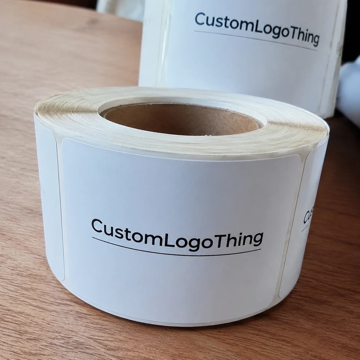
You’ll see packaging printing with logo used across custom printed boxes, Rigid Setup Boxes, folding cartons, paper bags, tissue paper, labels, sleeves, and even product inserts. Each format sends a different signal. A matte printed mailer suggests understated confidence. A foil-stamped rigid box suggests luxury. A simple one-color logo on kraft can feel earthy and honest, which is exactly what some handmade brands want for their product packaging and branded packaging.
The practical value is easy to miss if you only think about decoration. Strong package branding helps shoppers recognize products faster at retail, especially when a shelf is crowded with similar shapes and colors. In e-commerce, packaging printing with logo makes the unboxing moment shareable, which matters because one good photo from a customer can do the work of ten paid ads. It also improves consistency across product lines; if your boxes, bags, and tissue all speak the same visual language, the brand feels organized and trustworthy.
“A package is often the first physical proof a customer gets that your brand keeps its promises.”
Honestly, I think a lot of brands underestimate how print changes perception. A plain brown mailer can feel cheap or eco-conscious depending on how it is executed, while a well-registered logo on the same mailer can make the whole shipment feel deliberate. That is the quiet power of packaging printing with logo: it affects judgment before a product is even opened. I’ve watched buyers make that judgment in seconds, and they usually do it without saying a word.
How Packaging Printing With Logo Works
The production path starts long before ink touches board. Good packaging printing with logo begins with artwork prep, then moves into color proofing, plate or file setup, printing, finishing, die-cutting, gluing, and final inspection. On a typical factory floor, that sequence might run through prepress in the morning, press in the afternoon, and converting the next day, with sample pulls checked at each stage for color and registration. If the job is being run at a busy plant, a change in one department can ripple into the next pretty quickly, so communication matters.
The print method changes the workflow. Offset printing is usually the choice for sharp detail, tight color control, and larger volumes, especially on folding cartons and paperboard packaging. Digital printing is often preferred for shorter runs, test launches, and quicker revisions because there are no traditional plates to make. Flexographic printing is common for corrugated and roll-fed applications, where speed and repeatability matter. Screen printing can handle specialty surfaces, though it is slower and usually reserved for specific effects. Hot stamping and embossing are not full-color print methods, but they are often used to enhance a logo and make packaging printing with logo feel more tactile and premium.
Prepress is where many projects are won or lost. A print-ready file needs the right bleed, usually 1/8 inch on most carton jobs, along with safe zones so no key detail lands too close to a fold or trim edge. Vector artwork is ideal for logos because it keeps edges clean at any size. If the file is built in RGB, the color conversion to CMYK may shift the brand color more than the client expects, and that is why Pantone matching is common when consistency matters. I’ve had a cosmetics client bring in a logo drawn from a low-resolution JPEG, and once we rebuilt it as vector art the whole package looked sharper, cleaner, and more expensive without changing the layout at all. That kind of fix is not glamorous, but it matters.
Finishing matters just as much as the print itself. Matte lamination softens glare and makes a box feel calmer. Gloss coating brightens color and makes retail packaging pop under store lights. UV coating gives a tougher surface. Foil stamping, spot UV, emboss, and deboss all change the way a customer experiences the logo in hand. In packaging printing with logo, the finish can be the difference between “nice box” and “I want to keep this box.”
Quality control happens at multiple checkpoints. Press crews check registration against target marks, measure ink density, and compare drawdowns to the approved standard. Carton fit testing confirms that folds, tabs, and glue points work as intended. If the package is for shipping, many teams also test against basic transit stress or refer to standards used in the industry, including guidance from the International Safe Transit Association. For broader packaging guidance, the Flexible Packaging Association and FSC are useful references when sustainability claims or fiber sourcing matter.
Key Factors That Affect Print Quality, Brand Impact, and Cost
The first big variable is the substrate. Packaging printing with logo on coated SBS board usually gives the cleanest image reproduction because the surface is smooth and receptive to fine detail. Corrugated board is stronger for shipping but rougher in texture, so the logo may need thicker lines and stronger contrast. Rigid board creates a luxury feel but adds material cost. Kraft paper can look beautiful, yet its natural tone will warm up the color, which is great for some brands and a headache for others. Recycled fiber content can also affect ink holdout and visual brightness, so a brand that wants a bright white logo may need to test more than one board option.
Color complexity changes pricing quickly. A one-color logo on a plain mailer is far less complicated than a four-color photographic layout with gradients, metallic ink, and a spot varnish. If your packaging design needs exact brand colors, Pantone spot colors can improve consistency, but they can also add setup considerations depending on the press and quantity. I’ve seen customers start with a simple black logo and then add gold foil, then spot UV, then an interior print panel, and by the time the spec sheet was done the packaging had become a premium build with premium costs. That is not a bad outcome if the budget was planned for it, but it can catch people off guard.
Size and structure also affect the budget. Larger cartons use more board and more ink coverage. Custom windows, unusual shapes, and special inserts increase die-cut tooling and setup time. A straight tuck carton is far cheaper to produce than a heavily customized structure with thumb cuts, locking tabs, and multiple panels for storytelling. That is why packaging printing with logo can vary so widely in price even when the logo itself never changes.
Pricing usually reflects quantity, print method, number of colors, finishing, tooling, plate fees, and freight. For example, a run of 5,000 simple folding cartons might be priced very differently from 20,000 mailers with foil and embossing, even if both carry the same logo. Exact numbers depend on factory location, board availability, and whether the job runs on offset printing or digital printing, but the logic stays the same: more setup and more finishing mean more cost. Add storage or split shipments, and the bill changes again.
Brand goals matter too. Some products need to read clearly from 10 feet away on a retail shelf, while others need to feel intimate and handcrafted during unboxing. A luxury candle brand may care deeply about tactile feel and soft-touch lamination. A meal kit may care more about durability and label clarity. Sustainability also matters here; many brands now ask for right-sized packaging, recycled fiber board, and water-based inks to keep the packaging print strategy aligned with their values. If the package is too large, too shiny, or too busy, the logo can lose the very message it was meant to send.
Step-by-Step Process From Logo File to Finished Packaging
The safest way to begin packaging printing with logo is to review the logo and dieline together. I want to know where the mark sits, how big it will print, and whether folds, flaps, glue areas, or curved panels will affect the artwork. I once worked with a tea brand whose logo landed too close to a tuck flap on a folding carton, and every finished box made the last letter look squeezed. The artwork was fine on screen; it was wrong on the structure. That sort of issue is small on a monitor and glaring in hand.
Next comes file preparation. The artwork should be in vector format, usually AI, EPS, or print-ready PDF. Fonts need to be outlined or embedded correctly. If the package includes photography, texture, or fine pattern work, the image resolution should be checked so it holds up at print size. Brand colors should be named clearly, and the printer should know whether the job is CMYK, Pantone, or a mix of both. This is the point where packaging printing with logo becomes technical, not just creative.
Proofing is where smart brands protect themselves. Digital mockups help visualize layout, but physical samples tell the truth about board feel, print finish, and color behavior. Press proofs are even more useful when the color match is sensitive. I always recommend reviewing both structure and color before full production begins, because a box can look beautiful in a PDF and still arrive too dark, too glossy, or too narrow once folded. That kind of mistake is avoidable with disciplined approvals.
Production sequencing usually follows a predictable path: substrate ordering, press setup, print run, drying or curing, converting, finishing, folding, and packing. Depending on the method, a simple digital job may move fast, while offset printing with foil stamping and embossing may require plate making, tooling, and press scheduling around other jobs. A realistic timeline for standard packaging printing with logo can be 12 to 18 business days from approved proof for many jobs, but specialty finishes, larger quantities, or complex structures often take longer. It depends on what the line is running and how many approvals are still open.
That sign-off discipline matters more than most people think. One unchecked spelling change, one shifted color field, or one cropped logo can create thousands of flawed units. On the factory floor, mistakes scale fast. A bad file becomes a bad plate, a bad plate becomes a bad run, and suddenly a pallet of cartons is waiting for rework. That is why the final approved proof should be treated like the contract for packaging printing with logo. In my experience, the teams that slow down at this stage usually move faster overall because they avoid reprints and awkward back-and-forth later.
Common Mistakes Brands Make With Logo Packaging
The most common mistake is assuming a logo that works on a screen will work on a printed package without adjustments. Thin strokes, tiny text, and low-contrast color combinations often disappear on textured stock or show weakly on corrugated surfaces. A design that looks elegant in a mockup may need thicker lines and more spacing once it moves into packaging printing with logo. I’ve seen pretty logos get simplified not because the design was weak, but because the board demanded it.
Color mismatch is another frequent problem. I’ve seen brands design in RGB on an uncalibrated monitor, send the file to print, and then act surprised when the final box doesn’t match their website. Print production lives in CMYK and spot color systems, not on glowing screens. If the brand needs strict color control, a physical proof is usually worth the extra time because it gives everyone a real reference, not a guess. That part can feel tedious, but it saves headaches.
Structure mistakes can be expensive. Logos placed too close to folds, seams, or cut lines may distort once the carton is glued and folded. Windows and inserts can hide key elements if the layout is not checked in the flat and folded state. This is one of those practical issues that separates polished branded packaging from a box that feels rushed.
There is also the finish mismatch problem. Some brands want a high-gloss box because it looks expensive in theory, but the product itself is handmade, natural, or minimalist. In that case, a matte kraft finish may tell the story better. I’ve sat in supplier meetings where a glossy foil-heavy look was rejected after one sample because it made a clean skincare product feel too loud. The box should support the product, not argue with it.
Budget mistakes show up late. Brands over-specify finishes, order too few units, or forget freight and storage. A lower quantity can drive unit cost up quickly, especially when tooling and setup are spread across a small run. If your packaging printing with logo needs a special die or coating, ask for the full landed picture, not just the print quote. That includes pallets, shipping cartons, and any warehousing the project may require.
Expert Tips for Better Results in Real-World Production
Design for the substrate first. A logo that looks graceful on coated SBS may need simplification on corrugated or uncoated kraft. I usually advise clients to think in terms of print behavior, not just aesthetics. If the board is absorbent, expect a softer edge. If the surface is glossy, expect more reflection. When the design respects the material, packaging printing with logo tends to look better and cost less to fix.
Build a tiered system if you sell multiple product lines. One core logo treatment can work across premium, standard, and seasonal packaging, but the finish can shift. For instance, a premium line might use soft-touch lamination and foil, while a standard line uses matte aqueous coating and a clean single-color mark. That keeps the package branding consistent without forcing every box to have the same expensive spec.
Ask for drawdowns and compare samples under more than one light source. Daylight tells you one thing; store lighting tells you another. I’ve seen a white logo look perfect in the sample room and a little gray under warm retail LEDs. If your brand depends on precision, that test is worth the 10 minutes it takes. It is a small step that protects the larger packaging design.
Use one strong finishing feature instead of three weak ones. A clean foil logo can carry the whole package if the layout is disciplined. A carefully placed spot UV panel can create depth without clutter. Too many effects, on the other hand, can make the box feel busy and expensive for the wrong reason. Good packaging printing with logo should feel intentional, not crowded.
Sustainability choices can also improve the result. Recycled fiber board, water-based inks, right-sized packaging, and fewer inserts where protection allows all help reduce waste. The Environmental Protection Agency has helpful packaging and materials guidance at epa.gov, and it is worth checking if your team is balancing appearance with environmental claims. In real production, the best result is usually the one that protects the product, supports the brand, and avoids unnecessary material. That balance is what clients remember after the shipment lands.
What to Do Next Before You Place an Order
Start with three things: a print-ready logo file, a clear package structure, and a realistic quantity. If you already have a dieline, send it with the artwork so the printer can check placement, folds, and trim against the actual shape. If you do not have a dieline yet, ask for one before approving graphics, because a flat mockup can hide problems that show up only after folding and gluing.
Then decide what matters most for your job. If speed matters, digital printing may fit the timeline better. If exact color and scale matter, offset may be the stronger option. If your package needs rough handling in transit, corrugated or a stronger board may be the better base even if the logo has to be adjusted a little. This is where a good supplier earns their keep, because the right setup keeps the logo looking right without forcing the whole package into the wrong category.
Request a sample recommendation before you lock the spec. A board swatch, finish sample, or physical prototype can save a lot of guesswork. I’ve had clients change their mind after holding two material options side by side; the choice became obvious in a way that no spreadsheet could show. That kind of clarity is worth a little extra time.
Prepare an internal approval sheet with logo placement, colors, finish, box dimensions, and shipping requirements. This sounds basic, but I’ve seen it cut approval cycles in half because everyone is looking at the same details. It also reduces the risk of revisions after press setup begins. For clients who want a full manufacturing conversation, our Manufacturing Capabilities page is a useful place to start.
The most practical takeaway is simple: send the artwork, choose the substrate with the finished product in mind, and insist on a physical proof before production. Do those three things and packaging printing with logo stops being a guessing game. It becomes a controlled production step, which is exactly what you want when your brand name is going on every unit.
Packaging printing with logo is part engineering, part design, and part brand psychology. Get the substrate right, match the print method to the run size, and respect the proofing process, and your packaging will do more than carry a product. It will carry the brand with it, and it will do that work quietly every time a customer picks up the box.
FAQ
What is packaging printing with logo used for in custom packaging?
It is used to place a brand mark or design directly on boxes, mailers, bags, labels, and inserts so the package supports recognition and looks finished. It also helps products stand out on shelves, creates a more memorable unboxing experience, and can make even simple packaging feel more premium.
Which print method is best for packaging printing with logo?
Offset printing is often best for high-volume jobs that need sharp, consistent color. Digital printing is usually better for short runs, fast changes, and test orders, while flexographic printing works well on corrugated and roll-fed packaging. The right choice depends on quantity, substrate, and finish requirements.
How much does packaging printing with logo usually cost?
Pricing depends on quantity, material, print method, number of colors, and finishing choices like foil, embossing, or UV coating. A simple one-color design on a standard box will usually cost less than a multi-color premium package with specialty finishes and custom tooling.
How long does packaging printing with logo take?
Timelines vary based on proofing, material availability, print method, and finishing complexity. Short digital runs can move quickly, while offset or specialty projects usually take longer because of setup, approvals, and production scheduling.
What file do I need to start packaging printing with logo?
A vector file such as AI, EPS, or PDF is preferred for clean logo reproduction and scalable print quality. You should also provide brand colors, placement instructions, and any dieline or packaging dimension details so the artwork can be set up correctly.