Personalized checks and address labels still have a practical role in daily operations, especially for small businesses, clubs, nonprofits, and households that send mail often enough to feel repetitive admin drag. The right set reduces handwritten errors, keeps names and addresses consistent, and shortens the time spent on routine payment or mailing tasks.
That value is easy to underestimate because it is spread across dozens of small actions. A check format that fits bank requirements, paired with labels that carry the same name, logo, and return details, can remove tiny delays that otherwise compound over a month. No single step looks dramatic. The total effect usually is.
Why personalized checks and address labels still matter in everyday business
A small brand sending invoices, a side business paying vendors, or a household managing bill mail can waste time quickly if payment tools and return details are inconsistent. One form has last year's address, another uses an outdated logo, and someone still retypes the same information by hand. That is where personalized checks and address labels earn their place.
The real efficiency is not glamorous. It is mostly about removing repeat work. Preprinted identity details cut down on manual writing, transcription mistakes, and the pauses that happen every time someone searches for the correct contact information. If you mail 20 to 50 items a week, that friction becomes visible fast.
There is also a credibility factor. Matching check stock and label design creates a cleaner administrative surface, much like consistent garment labeling makes a product line feel organized rather than improvised. Buyers rarely ask for that polish directly, but they notice it. A vendor envelope with a clean label and a check printed with the same visual language feels more controlled than a stack of mismatched office supplies.
For organizations that also use other printed materials, a coordinated system can help reduce errors across departments. A set that works alongside Custom Labels & Tags keeps branding and filing details aligned across outgoing mail, storage, and internal records. That matters because the cost of inconsistency is rarely visible in one transaction. It shows up later as a misfiled document, a missed payment, or a reorder that no one can easily recreate.
“The lowest unit price is not always the lowest order cost. If the layout is wrong, or the labels fail under real use, the correction bill is what people remember.”
There is also a simple operational truth here: the products are only as useful as the accuracy of the data printed on them. Good design cannot rescue a wrong address, and an expensive security feature does not matter if the stock is too thin for routine handling. Practical buyers look past the mockup and ask how the product behaves once it leaves the proof stage.
How the order and production process works
The workflow is usually more structured than buyers expect. You start by choosing the check style and label format, submit the copy, review a proof, and move into production once the details are confirmed. Good vendors build checks at each stage because the biggest mistakes are often data errors rather than printing errors.
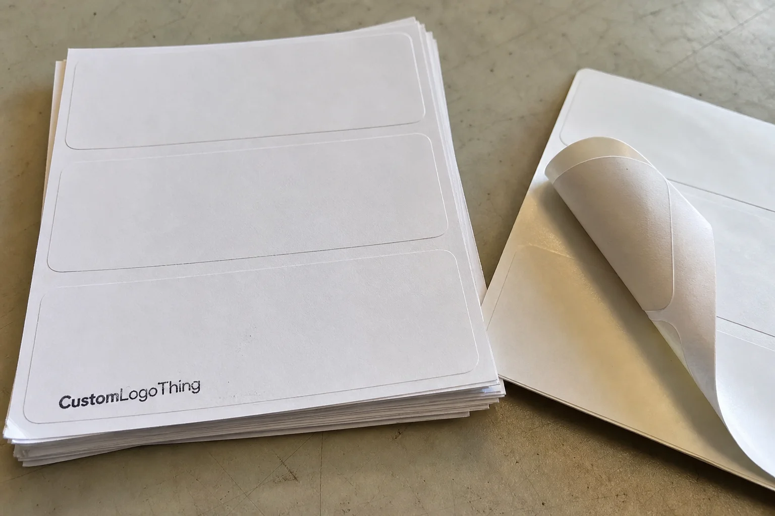
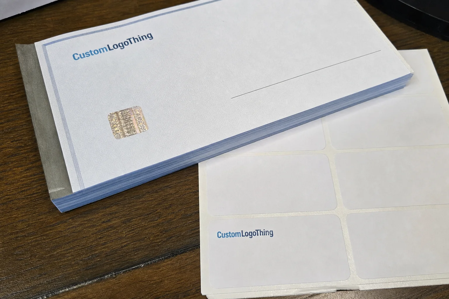
For checks, the required information usually includes the account holder name, address, routing and account numbers, bank-approved check format, and any security features printed or embedded in the stock. For labels, buyers typically need exact dimensions, intended use, return address copy, and any brand elements such as a logo or color band. If a logo is included, vector artwork is cleaner than a low-resolution screenshot, especially on small labels where edges and line weight matter.
Proofing is the part that prevents avoidable waste. A decent proofing process should catch spelling mistakes, line breaks, spacing issues, logo placement errors, and alignment problems before a press sheet is committed. For banking products, the proof also confirms MICR positioning and routing details. If a vendor treats proofing as a formality, that is a warning sign.
Personalization is transferred into the final product through typesetting and batch setup. The printer applies your approved data to the template, then sets the print alignment for the check stock and the label stock separately. That sounds mechanical because it is. The nuance lives in setup. Small changes in font size, margin width, adhesive stock, or perforation placement can change how the finished set behaves in daily use.
Production timing usually has three stages: proof time, print time, and shipping time. Simple orders may move from proof approval to shipment in about 5 to 10 business days. More customized orders often take 12 to 15 business days, especially if security printing, specialty label material, or custom artwork cleanup is involved. Rush service can shorten the window, but it usually increases cost and reduces the margin for correction.
Quality control matters at this stage. On the check side, that means verifying MICR readability, sequence accuracy, and the clean placement of any security tint or warning band. On the label side, it means checking die-cut consistency, adhesive behavior, color accuracy, and whether the print smears after handling. A proof can look perfect on screen and still fail on paper if the substrate or press setup is wrong.
If durability matters for shipping materials or document sleeves, industry standards help frame expectations. For transport-related packaging decisions, the ISTA test protocols are a useful benchmark, while FSC-certified paper can support sourcing goals for paper-based components. Neither standard solves every issue, but both give buyers a clearer basis for comparison.
Cost, pricing, and what changes the quote
Pricing usually comes down to five variables: quantity, paper or material quality, security features, ink coverage, and label finish. A 1,000-piece order looks very different from a 5,000-piece run, and the unit price almost always drops as volume rises. The catch is inventory. Paying less per unit for stock that will sit unused for a year is not smart buying.
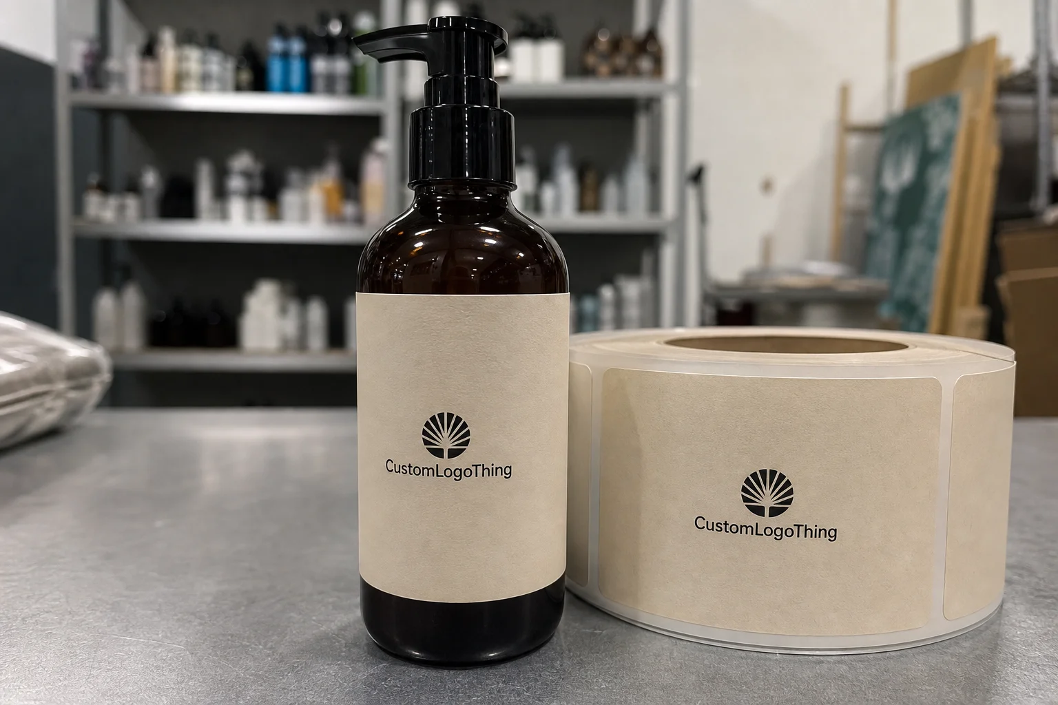
For checks, premium options often include extra fraud deterrents, heavier stock, and tighter control over MICR printing. Standard options keep the design simpler and the price lower. For labels, the main upgrade paths are adhesive strength, finish, die-cut precision, and whether the label needs to hold up to humidity, handling, or friction. A matte paper label for filing is not the same product as a synthetic label that has to survive shipping or repeated handling.
Here is a practical pricing comparison that reflects common buying patterns for modest custom runs. Exact numbers vary by print method, layout, and vendor, but the ranges below are realistic enough for early budgeting.
| Option | Typical Order Size | Usual Price Range | Best For |
|---|---|---|---|
| Basic checks + standard paper labels | 1,000 to 2,500 units | $0.14 to $0.24 per check, $0.05 to $0.12 per label | Low to moderate usage, simple branding |
| Security checks + branded label sheets | 2,500 to 5,000 units | $0.18 to $0.32 per check, $0.08 to $0.18 per label | Small business mailings, recurring payments |
| Premium stock + specialty finish | 5,000+ units | $0.25 to $0.45 per check, $0.12 to $0.28 per label | Higher branding needs, stronger durability |
Setup fees can matter as much as print price. Some vendors include proofing and basic typesetting, while others charge for artwork changes, extra proof rounds, or nonstandard layouts. Checks and labels are often priced separately even if they are ordered together. Buyers sometimes assume the bundle creates automatic savings, but that depends on the vendor's production model and whether the products share the same press workflow.
The better comparison is total value, not the lowest advertised price. A cheaper order can become expensive if labels peel, the check layout fails approval, or the quantity runs out too soon and forces an emergency reorder. That is especially true for personalized checks and address labels used in a business with monthly payment cycles or recurring donor mailings.
If you are trying to control cost, ask for a quote that separates product price, setup, shipping, and revision fees. That makes it much easier to compare like for like. Without that breakdown, the lowest quote often hides the highest total.
Key factors to compare before you order
Compatibility comes first. The check format has to fit bank requirements, and the labels have to match the actual job: mailing, filing, inventory, or mixed use. A good-looking design does not help if the check stock is rejected or the label size wastes half the sheet.
Security and durability matter more than many first-time buyers expect. For checks, look for proper MICR quality, clean line placement, and any anti-fraud features the bank or vendor recommends. For labels, inspect adhesive performance, legibility, and how the printed text holds up over time. If the label is going onto glossy envelopes or recycled boxes, adhesion is not a minor detail.
Branding consistency is another practical test. Typography, logo placement, and color accuracy should make the check and label set feel related. Buyers do not need a magazine-grade design. They need a readable, repeatable system that will not drift from reorder to reorder.
Workflow fit should not be ignored. Some buyers want single-sheet handling, some need office printer compatibility, and some prefer a compact format that stores in a desk drawer. If the product is awkward to store or feed into a printer, people stop using it correctly. That is how a useful purchase becomes shelfware.
Audience and purpose also change the right spec. A household paying utilities does not need the same customization level as a nonprofit mailing donor letters or a small retailer sending reimbursement checks. A strong buyer profile narrows the options quickly.
One useful comparison is whether the order should lean toward function or appearance. You do not need both to be perfect, but you do need the correct balance for your use case.
- Function-first: simple layout, durable print, easy reordering, lower cost.
- Appearance-first: stronger branding, refined typography, better presentation.
- Control-first: extra security, tighter proofing, clearer documentation.
For labels in particular, buyers should ask about material behavior, not just size. Paper labels are fine for folders, envelopes, and short-term office use. Polypropylene and other synthetic films cost more, but they resist moisture and abrasion better. Adhesive also matters: permanent adhesive is safer for shipping and asset tags, while removable stock is better for temporary internal use. Those details sound technical because they are, and they affect whether the order actually fits the job.
Step-by-step buying guide for first-time buyers
Step 1: Define the main use case. Is the order for bill payment, business mailing, donor communications, or home organization? The answer drives the design, quantity, and level of security you need.
Step 2: Measure or confirm label specs and review check requirements before you request pricing. A label that is off by even a small margin can waste sheets, and a check format that misses your bank's requirements can stop the entire order.
Step 3: Gather exact copy for names, addresses, logos, and payment details. Verify spelling, spacing, punctuation, and capitalization before submission. This is a small task with a large payoff because proof fixes are much easier than press corrections.
Step 4: Request a proof and inspect it carefully. Check the visible details, but also pay attention to alignment, line breaks, readability, and any design elements that may look fine on-screen but fail in print. If a logo is too small to read, it will not improve on press sheet.
Step 5: Approve, place the order, and plan storage. If you know how fast you use checks or labels, set a reorder point before the box is empty. That is especially useful for personalized checks and address labels because lead time is rarely zero.
A practical tip: keep the first order conservative unless you already have stable monthly usage. Many buyers overbuy the first time, then discover a logo change, bank update, or address move before the stock is gone. That creates avoidable waste.
For paper-based materials, sourcing can also matter. If your organization tracks sustainability criteria, ask whether the stock is FSC-certified and whether the vendor can document paper origin. It does not change print quality by itself, but it gives procurement teams something concrete to evaluate.
Finally, do not treat the proof as a formality. It is the last clean chance to correct layout, legal details, and copy. Once production starts, the cost of being casual rises quickly.
Common mistakes that drive reprints or delays
The first mistake is obvious: submitting outdated address or account information and assuming it can be fixed after production starts. In most cases, it cannot. Once the print file is set and the batch is moving, edits become expensive or impossible.
The second mistake is choosing the wrong label size or adhesive type. That can lead to peeling corners, crooked placement, or wasted sheets. If the labels are for mailing, test the adhesive against the envelope stock or carton surface you actually use. Smooth paper, textured kraft, and glossy finishes behave differently.
The third mistake is treating the proof as close enough. Small problems hide in plain sight: line breaks that change the visual balance, a logo that is slightly blurred, or spacing that makes the address look crowded. These issues are easy to miss in a thumbnail and hard to ignore once the product arrives.
The fourth mistake is under-ordering. Emergency reorders often cost more because you pay setup again, lose the volume discount, and sometimes add rush fees. Buyers usually regret this more than ordering a bit extra.
The fifth mistake is overcustomizing. Too many design flourishes can make the final product harder to read, harder to print cleanly, and less useful in routine work. A check or label is not a brand campaign. Its job is to be reliable first.
Most delays are preventable. The common thread is unclear specs, incomplete copy, or rushed approvals. If the buyer side is organized, the vendor side has a much easier path to on-time delivery.
There is one more issue that does not get enough attention: file hygiene. If the final logo file is mislabeled, the address text lives in three different spreadsheets, or someone overwrites the approved proof with a later draft, reorders become messy. A good print vendor can only work with the file state they receive. Clean inputs produce predictable output.
Expert tips for getting better value and smoother reordering
Keep a standard spec sheet. Include quantity, dimensions, paper type, ink color, logo file location, account details, and any special instructions. This single document can save a surprising amount of time during repeat orders, especially if more than one person places purchases.
Bundle only when the usage pattern supports it. If checks and labels are consumed at very different rates, separate quantities can reduce waste and make inventory easier to manage. A bundle that looks efficient can turn into dead stock if one item runs out much faster than the other.
Ask for sample proofs or digital mockups when branding accuracy matters more than speed. That is useful if the piece has a small logo, a special font, or a color system that needs to stay consistent from order to order. A few extra minutes in proofing can prevent a costly mismatch later.
Track usage over a month or quarter. If you know the average consumption rate, you can set a reorder point that avoids emergency purchases without tying up cash in excess inventory. For a small operation, that is often the difference between organized and messy.
Store approved files, proof notes, and exact product specs in one place. Not scattered across inboxes. Not buried in a text thread. One clean folder is enough. It gives you a fast path back to the same result next time, which is exactly what good print procurement should do.
For buyers who care about long-term consistency, the real value of personalized checks and address labels is repeatability. The best set is the one you can reorder with minimal friction, minimal correction, and no surprises in the final stack.
Another useful habit is to annotate what actually worked after the first run. Note whether the label stock fed cleanly, whether the ink dried fast enough for stacking, and whether the check quantity matched real usage. Those details are more useful than a glossy sample pack because they reflect actual handling, not a sales demo.
Next steps: how to prepare a clean order brief
Start with a short checklist: quantity, size, names, addresses, design preferences, and any banking or compliance requirements. If you can answer those points clearly, most of the hard work is already done. The rest is proof review and production timing.
Then review your current mailing and payment workflow. Decide whether you need a basic set, a mid-tier setup with better branding, or a premium version with stronger security and finish. A household with occasional bill payments does not need the same spec as a business with weekly outgoing mail.
Compare at least two quote options using the same specs. If the details are aligned, the price differences are meaningful. If the specs are different, the comparison is mostly noise. That is a common trap and a costly one.
Save the final approved artwork and copy. Keep the spec sheet with it. That way, the next reorder does not start from zero, and the risk of subtle changes goes down sharply. For personalized checks and address labels, consistency is part of the product, not an extra.
Place the order only after confirming the proof. The fastest way to avoid problems is still the least dramatic one: fix them before production begins. A careful brief, a precise proof, and a realistic reorder plan usually beat last-minute urgency every time.
If the order has any compliance sensitivity, add one more layer of review before approval. Banking details, nonprofit return addresses, and legal business names are not areas for casual editing. A few minutes spent checking the final file is cheaper than correcting a full run.
How do personalized checks and address labels work together in a small business workflow?
They reduce repeated writing and keep payment and mailing information consistent across daily tasks. Matching formats also make admin materials look more organized, which helps when the same name, address, or brand details appear on every outgoing item.
What affects the price of personalized checks and address labels the most?
Quantity, material quality, security features, and design complexity are the main drivers. Proof revisions, rush service, and unusual formatting can add cost. Unit price usually improves at higher volumes, but only if you will actually use the inventory before details change.
What should I check before approving the proof?
Verify spelling, spacing, logo placement, and address accuracy. Confirm that the check details meet banking requirements and that the labels match the intended use. Also look for alignment issues that may not stand out in a small preview.
How long does production usually take for personalized checks and address labels?
Timing depends on proof approval speed, print complexity, and shipping method. Simpler orders usually move faster than highly customized ones. If you need a specific delivery date, build in extra time for proofing and transit.
Can I reorder the same personalized checks and address labels later without starting over?
Yes, if you keep the approved artwork, specs, and exact copy on file. A saved spec sheet makes repeat ordering faster and lowers the risk of new mistakes. It also helps maintain branding and formatting consistency across future runs.