The return label is a small part of a holiday package, but it affects both presentation and workflow. Personalized holiday Return Address Labels keep mail organized, make plain packaging look intentional, and remove handwritten setup when shipping volume climbs.
That matters more during the holidays than it does the rest of the year. A clean return panel helps a kraft mailer or white envelope look deliberate; a smudged or crowded address line makes even careful packing look rushed.
If the return address is hard to read, the label has already failed. Decoration matters less than legibility and adhesion.
For clothing brands, boutique sellers, and gift shippers, the return panel is both a brand cue and a practical shipping tool. When orders stack up and staffing gets thinner, that combination is useful because it reduces errors and speeds up pack-out.
Why holiday mail gets more noticed than you think
People see the outside of a package before anything else. The return label is often the first brand element on the parcel, especially on minimalist mailers, kraft paper, or uncoated envelopes. A tidy return panel makes the shipment feel considered. A handwritten address with uneven spacing makes it feel improvised.
That perception matters beyond aesthetics. The return address passes through packing, sorting, carrier handling, and doorstep delivery. Personalized holiday Return Address Labels keep that touchpoint consistent, which is useful for brands that want a polished look without moving into fully custom packaging.
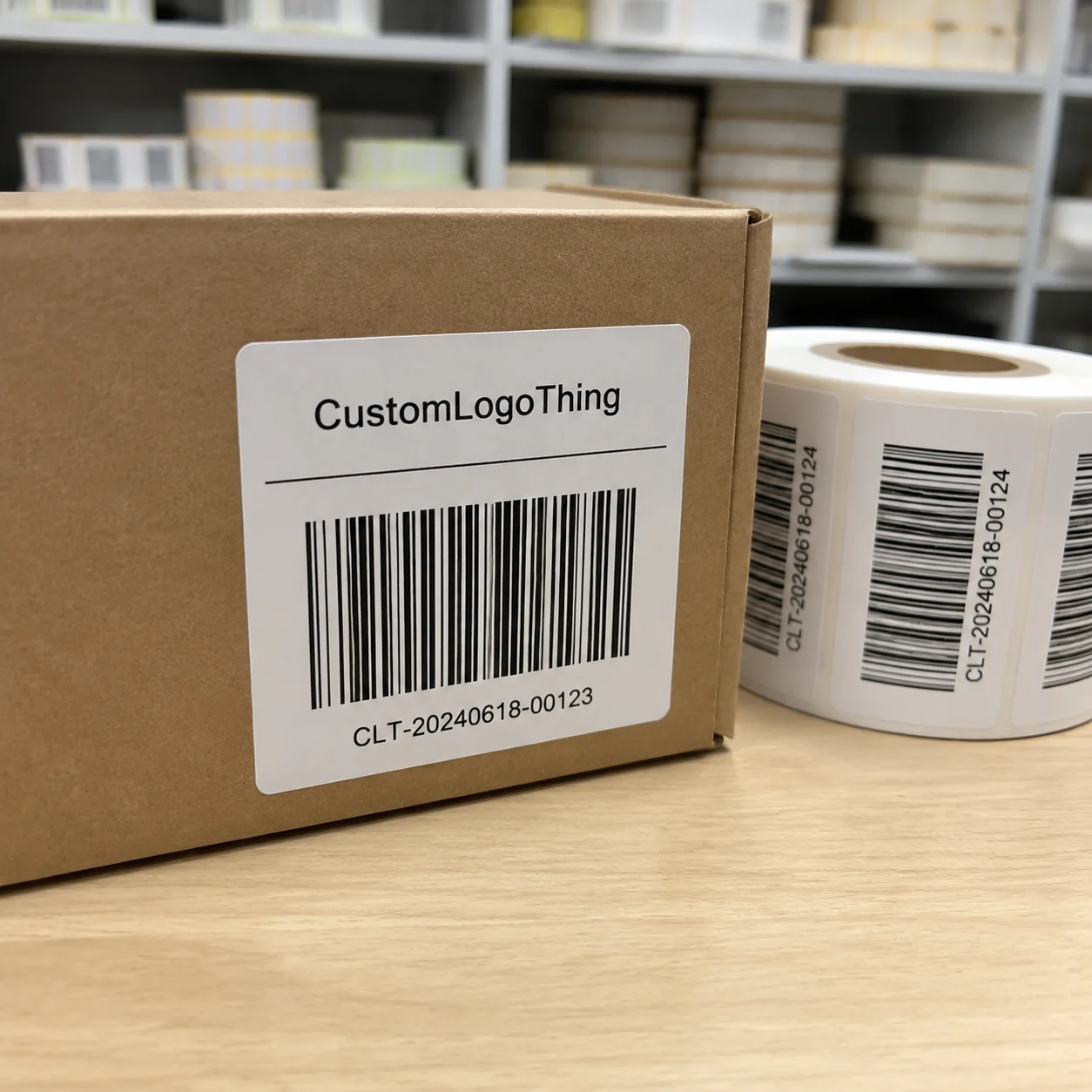
Printed labels also reduce avoidable mistakes. Writing 200 return addresses in a week increases the odds of missing an apartment number, swapping ZIP digits, or crowding the line until it is hard to read. During peak season, those errors turn into reprints, delays, and extra work at the packing table.
Consistency is another practical advantage. If every envelope, box, or mailer uses the same label layout, the shipping process moves faster and the brand looks more unified across batches. That is especially noticeable on lower-finish packaging where the label carries more of the visual weight.
For a buyer, the value is straightforward: one small component identifies the sender, supports the brand, and reduces friction in the shipping workflow.
How personalized holiday return address labels are made and applied
The production flow is simple, but each step affects the result. It starts with the copy: business name, return address, and any seasonal line or secondary identifier. Then comes layout. A good proof balances the brand name, street line, and city-state-ZIP block so the label reads cleanly at arm’s length.
After that, the vendor prepares the file, checks trim or kiss-cut dimensions, and sends a proof for approval. The proof stage matters because a small typo or spacing issue can affect an entire batch. In holiday shipping, that means rework, lost time, and extra sorting at the packing table.
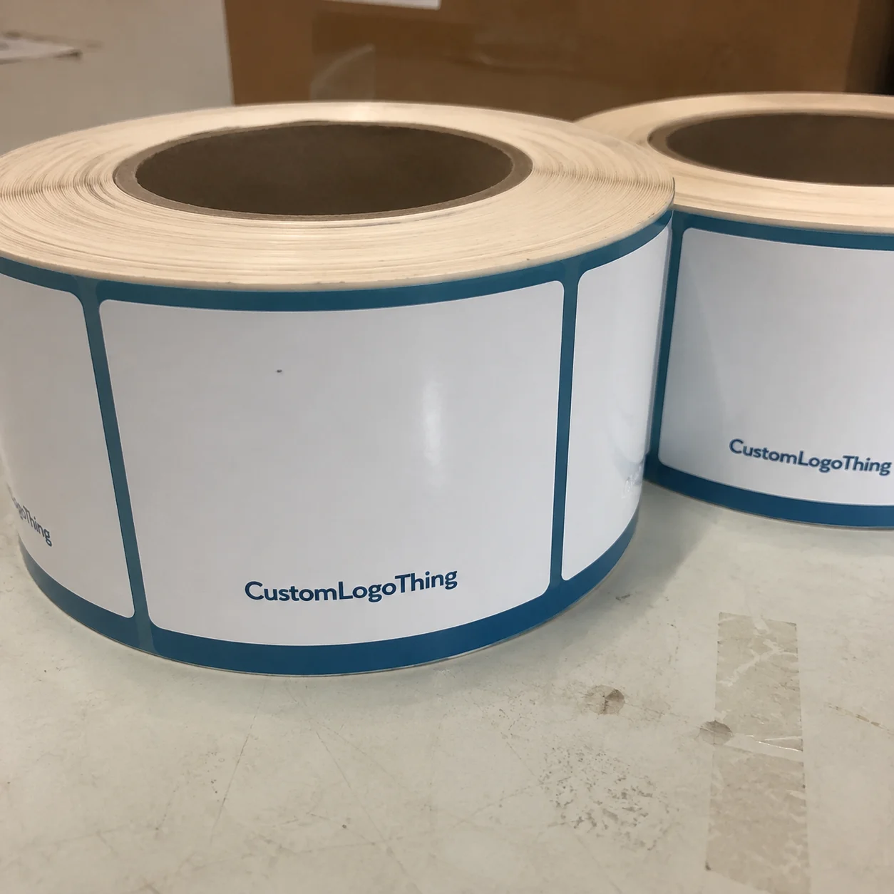
Label format is the next decision. Sheets work well for smaller teams and home-office shipping because they are easy to store and count. Rolls fit higher-throughput hand application. Individual kiss-cut labels are useful for manual application when clean peel matters more than speed. If you already source Custom Labels & Tags for other pack-out pieces, matching the format to the workflow usually matters more than choosing by appearance.
Placement should be intentional. On envelopes, the return label usually sits in the upper left or on the back flap, where it can be read quickly without competing with the recipient address. On mailers and outer packaging, it should stay visible after tape, seams, and graphics are applied. If the carrier has to search for it, the label loses value.
Seasonal design can stay restrained. A border, a small icon, or a subtle color shift is usually enough. The address should stay the priority.
Cost and pricing factors that change your per-label rate
Pricing varies more than many buyers expect because labels are small, but the economics are not simple. Quantity is the biggest driver. A 250-piece run carries more setup cost per label than a 5,000-piece run because proofing, prepress, and changeovers are spread across fewer units. Smaller runs often feel expensive on a per-label basis for that reason.
Material and finish come next. A basic matte paper label is usually the lowest-cost option. Film stocks, weather-resistant facestocks, and specialty finishes cost more because they hold up better under handling, moisture, and abrasion. If the label has to survive cold porches, condensation, or long transit, the cheaper option can become expensive after a few failures.
Here is a practical pricing snapshot, using common custom runs as a reference rather than a quote:
| Format | Typical run | Typical unit price | Best use |
|---|---|---|---|
| Sheet labels | 250 to 2,000 | $0.18 to $0.40 | Home-office fulfillment, light seasonal volume |
| Roll labels | 2,000 to 20,000 | $0.05 to $0.18 | Faster hand application, higher throughput |
| Kiss-cut individual labels | 100 to 1,000 | $0.20 to $0.45 | Gift mailers, boutique orders, small batches |
Artwork complexity also changes the number. A one-color return label on white stock costs less than a full-bleed layout with multiple ink passes, metallic accents, or a Custom Die Cut. Decorative detail should only be added when it improves the label, not just when it looks different.
The cleanest rule is simple: pay first for readability, adhesion, and the right substrate. Add decoration after the label has proven it can survive the mailing environment. That same logic applies to any pack-out component, including a broader Custom Labels & Tags program.
Process and turnaround: from proof to delivery
A realistic schedule starts with clean artwork and ends with a delivery date that still leaves room for packing. If the file is ready and the proof is approved quickly, many custom label runs move through production in roughly 5 to 10 business days, then ship after that. During peak holiday demand, a more conservative window is often 12 to 15 business days from proof approval to delivery, depending on quantity and finishing complexity.
The slower part is usually decision-making, not printing. Delayed approvals, missing address details, and late-stage layout changes stretch the timeline more than the press itself. Once the return address copy is final, keep it fixed for the season unless there is a real compliance reason to change it.
Three steps protect the schedule better than anything else:
- Approve the proof as soon as typography, spacing, and address details are correct.
- Confirm the shipping destination early so the finished labels do not sit in transit while your packing deadline closes in.
- Order a small buffer quantity, usually 5% to 10% extra, so replacements are available if a sheet gets damaged or a rush order appears.
That buffer is not wasteful. It is insurance against holiday behavior, which is predictably messy. A label job that looks oversized in October often looks appropriately sized once orders start climbing and the desk gets crowded.
Good label planning is boring in the best possible way. It removes one more moving part from the final week before shipment cutoffs.
Choosing the right materials, adhesive, and finish
The substrate should match the surface it is going onto. Paper labels work for many envelopes and light-duty mailers, especially when the package is dry and handled once. Film labels, usually polypropylene or another moisture-resistant stock, are better when the package may see condensation, rough handling, or outdoor drop-off conditions. On coated mailers, a stronger adhesive often matters as much as the material itself.
Adhesive performance changes with temperature. Winter shipping exposes weak glue faster than summer does, particularly if the package sits in a cold truck, enters a warm facility, and then gets handled again. Permanent acrylic adhesives are a common choice because they hold well once they bond. Pressure-sensitive labels still need a clean, dry surface and enough dwell time to set.
Finish affects both look and readability. Matte reduces glare and usually gives the address a more restrained feel. Gloss can make colors look brighter, but it can also create reflections under packing lights. Soft-touch feels more upscale, though it is not always the best choice for high-volume shipping because it can show lint or scuffing rather than solving it.
There is also a sustainability angle, but it should be real. If the paper stock is sold as responsibly sourced, check for credible certification such as FSC rather than relying on vague marketing language. If packages face rough transport, the ISTA framework is a useful reminder that abrasion, vibration, and compression are part of the journey.
From a branding standpoint, the material should fit the product story. A jewelry brand may want a subtle matte label that disappears into a clean envelope. A gift seller may want a brighter finish with a small seasonal element. A clothing brand may care more about legibility, peel strength, and consistency across batches than about decoration.
Common mistakes that make labels look generic or peel early
The most common design mistake is trying to do too much. Tiny fonts, stacked lines, and low-contrast color choices turn a useful label into visual noise. If the customer has to lean in to read the address, the layout needs work. The goal is to make the return address obvious at a glance.
Another mistake is choosing a label spec without testing it on the actual packaging surface. A label that sticks well to uncoated paper may fail on a glossy mailer, and a stock that looks great on a screen may curl on recycled kraft after sitting in a cold room overnight. Test one sample on the real surface before committing the full run.
Spelling and line breaks deserve a proper check. Apartment numbers, suite identifiers, and ZIP codes are easy to miss when the order is rushed. That kind of error undermines both the delivery and the brand.
The seasonal trap is timing. Many buyers wait too long, then accept whatever label size or stock is still available. That often means settling for a format that is too small, too decorative, or too fragile for the job.
- Do not crowd the address block.
- Do not use a finish that hides readability under bright packing lights.
- Do not assume every adhesive will perform the same in cold weather.
- Do not skip a physical test on the mailer or envelope you actually use.
A label is a working part, not just a printed accessory. If it peels, blurs, or slows packing, it has failed regardless of how attractive it looked in proof.
Actionable next steps for ordering the right run
Start with the exact return address copy you plan to use. Include apartment, suite, unit, or internal routing details now, because changing them after proof approval is where delay begins. If the label also needs a seasonal line, decide whether that text belongs on every unit or only on a limited holiday run.
Then choose one label size and one finish based on the packaging surface you use most often. That prevents a common mistake: trying to make one label work equally well on small envelopes, corrugated boxes, and padded mailers. In practice, one size usually wins. The other surfaces can be handled by a separate format if the volume justifies it.
If you are ordering for a brand, align the label with the rest of the pack-out system. That includes tape, thank-you cards, shipper inserts, and any other branded component in the parcel. The more those pieces share the same visual language, the more intentional the shipment feels. If you need a broader packaging program, start with Custom Labels & Tags and build from there.
Before you place the order, request a proof, confirm the turnaround window, and ask for a realistic shipment date, not a best-case estimate. If your holiday cutoff is firm, build in a buffer. A two-day cushion can keep you from using the wrong label spec just because the right one arrived late.
The practical takeaway is simple. The best personalized holiday return address labels fit the workflow, survive the package surface, and still look intentional when the box reaches the door.
What size works best for personalized holiday return address labels?
Choose a size that keeps the return address readable at arm's length without crowding the envelope or mailer. If the package surface is small, use a compact format; for larger mailers, a wider label can improve visibility and branding.
How long do custom holiday return address labels usually take to produce?
Production time depends on proof approval, order size, and whether the design is ready to print without revisions. Build in extra buffer during peak shipping weeks, because holiday volume can stretch standard turnaround schedules.
What should I include on personalized holiday return address labels?
Use the exact return address you want customers or gift recipients to see, including apartment, suite, or unit details if needed. Many brands also add a logo, short seasonal line, or simple decorative element, but the address should stay the visual priority.
Are personalized holiday return address labels durable on cold-weather packages?
Durability depends on the stock and adhesive, so choose materials designed to hold up in lower temperatures and drier winter air. Test the label on the actual mailer or envelope surface before committing to a full run.
How do personalized holiday return address labels compare with handwritten labels?
Printed labels usually look cleaner, stay more consistent across batches, and save time when shipping multiple orders or gifts. Handwritten labels can feel personal, but they are slower, less uniform, and more likely to become hard to read under holiday pressure.