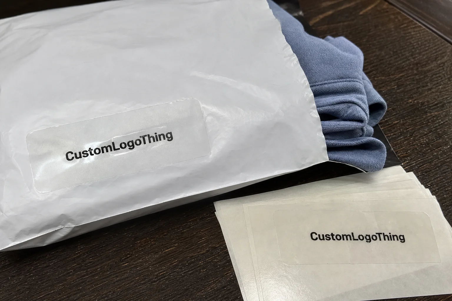
Custom Clear Return Address Labels for Clothing Mailers
Custom clear Return Address Labels do one job, but they do it in public. They sit on the outside of the package, which means customers, warehouse staff, and carriers all see them before anyone opens the box or mailer. If the label looks clean, the package feels planned. If it looks slapped on, the whole shipment loses polish.
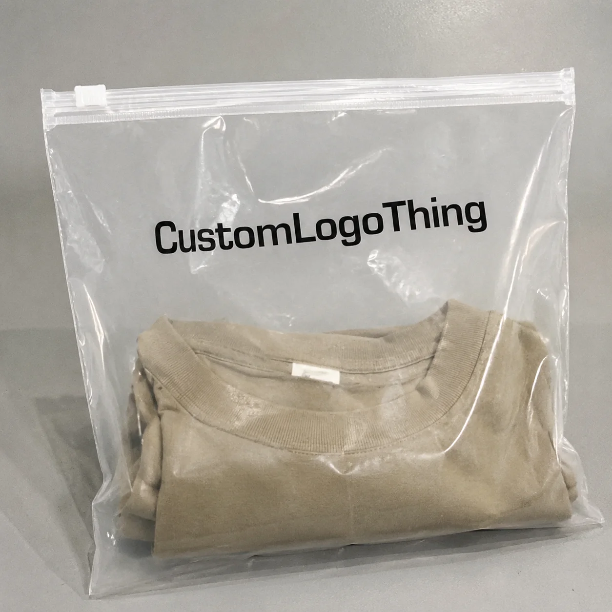
That matters for clothing brands more than most people admit. Apparel is visual. Your packaging should not fight that. A white rectangle on a patterned mailer can be fine if the package is plain and the print is strong. Put the same label on a branded poly mailer, a kraft envelope, or a carton with a tight visual system, and it can start to look like an afterthought. Clear stock solves that problem better than opaque paper because it disappears into the surface instead of sitting on top of it.
The catch is simple: clear labels are less forgiving than paper labels. Weak contrast, sloppy art, poor adhesive, and bad placement show up fast. So if the goal is to make the packaging feel more intentional without adding noise, the material and print choices matter. A lot.
That is the part buyers miss. They focus on the label size or the logo. The real difference is usually made by the substrate, the adhesive, and whether the label was tested on the actual mailer instead of a mockup on a screen.
Why clear labels matter on apparel packages
Return Address Labels are small, but they carry more weight than their footprint suggests. They help sort packages, confirm sender information, and make the outer surface of the shipment feel deliberate. For apparel brands, that last part matters because the package is part of the product experience. Not the whole experience. Just enough of it to be noticed.
Clear labels work especially well on poly mailers, kraft mailers, and coated cartons because they do not create a hard visual block. A standard white label can interrupt the design. A clear one usually sits lighter. That is useful when your packaging already has a logo, repeat pattern, seasonal print, or a strong material texture. The label still has to read quickly, but it does not need to dominate the surface.
There is also a functional upside. In fulfillment, people are moving fast. Labels get scanned, checked, and sorted under less-than-perfect lighting. When the address block is clear and the placement is consistent, the label helps. When contrast is weak or the layout is crowded, it slows things down. No one wants to pick at the corner of a wrinkled sticker while orders are backing up.
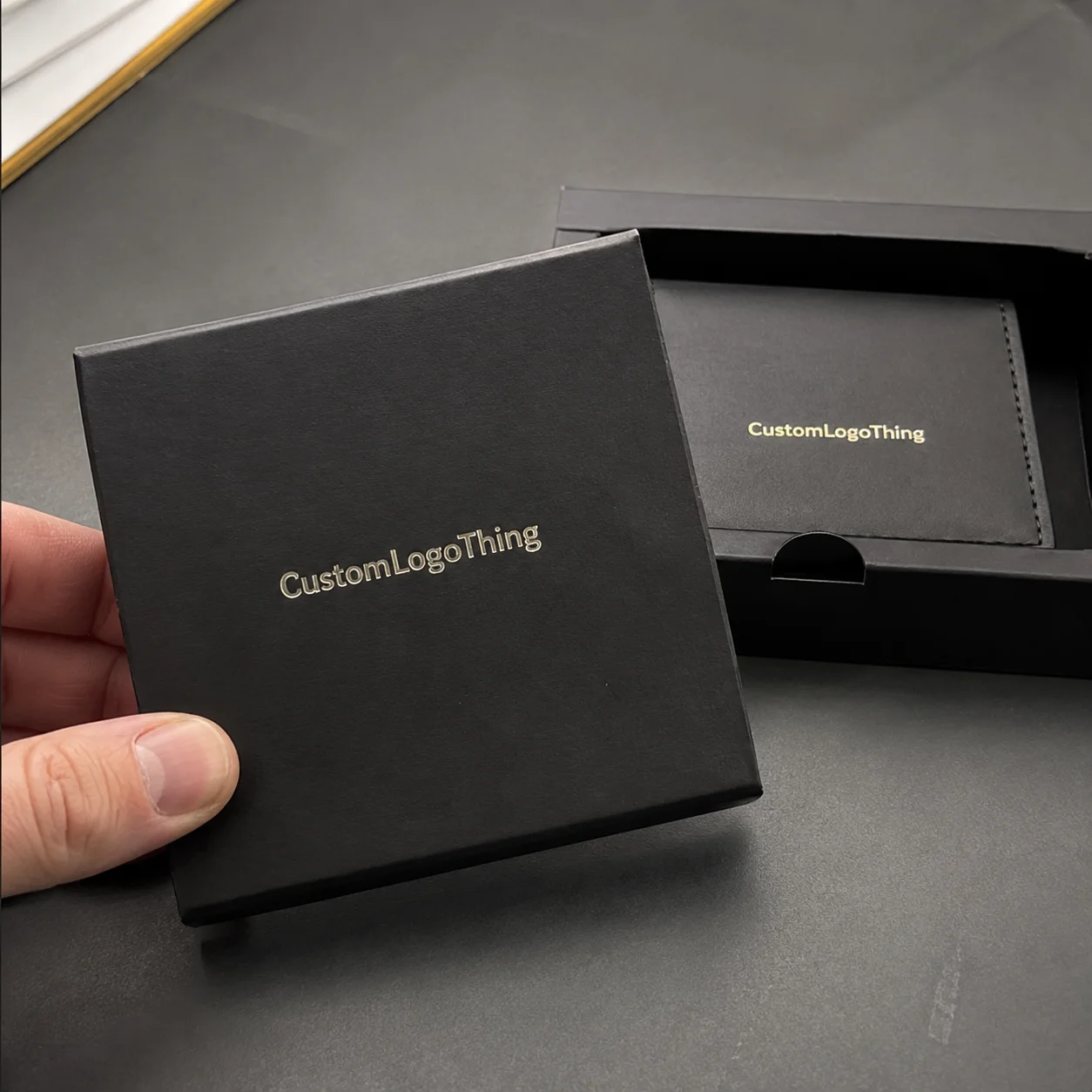
For brands already investing in packaging design, clear return labels fit the same logic as custom tissue, branded seals, and printed cartons. They are part of the system. If one piece looks cheap, customers notice. They may not know why. They just know the package feels off.
The smallest sticker on the parcel can still tell you whether the whole shipment was planned or patched together at the last second.
One practical benefit is flexibility. If you ship from more than one location, switch packaging by season, or use different mailer sizes, labels are far easier to update than reprinting every outer package. That is why many brands choose labels instead of direct-print packaging when they want control without locking themselves into one format.
How they are printed and applied
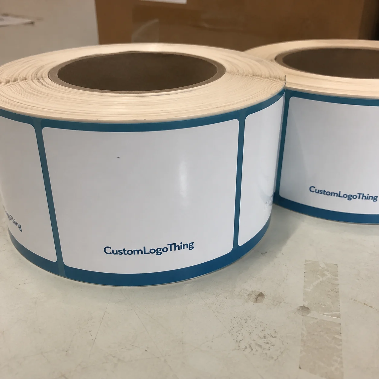
Most custom clear Return Address Labels use a transparent face stock, a printed ink layer, and a pressure-sensitive adhesive. The face stock is what people see. The adhesive is what keeps the label attached through packing, transit, and handling. The print method matters because transparent stock changes how color reads. What looks crisp on paper can look thin or washed out on clear film if the artwork is not built for it.
There are two common print approaches. One is direct print on clear stock with strong contrast management. The other is reverse print, where the design is built from the back side so the front surface stays cleaner and better protected. Reverse print usually gives a more premium look, especially when the label needs to feel polished rather than purely functional. It also adds setup complexity, which is why it tends to cost more.
Placement matters just as much as print. Top-left is still the default for a reason: it is easy to find and it keeps the package face tidy. The label should not cross a seam, flap, or fold. If it does, the corner will eventually lift. Packaging does not care about your design intent. It only cares about friction and gravity.
Surface type changes the result. Smooth gloss poly mailers usually give the cleanest look and the best initial adhesion. Matte kraft surfaces often need stronger tack and a little more care during application. Coated cartons can work well, but the coating can affect how quickly the adhesive grabs. Textured surfaces are the hardest. They are also the most likely to expose poor label choices.
The fastest way to check whether a spec is right is to test the label on the actual packaging under the same lighting used in fulfillment. A file preview is useful. It is not a substitute for a physical test. Clear labels expose mistakes that paper stock hides. If the type is too small or the logo is too thin, the label will tell on you.
For packaging standards and handling context, the ISTA resources are useful for understanding how labels and packaging behave through transit. For broader packaging information, the Packaging School is a practical reference point.
Material choices that change the result
Not all clear labels are the same, and that is where many orders go sideways. Some stock is crystal clear. Some has a slight frosted cast. Some is made for short-term indoor use. Others are better suited to humidity, cold rooms, and longer courier cycles. If the package is going through a warm pack line, a truck, and a wet doorstep, the material needs to be chosen with that route in mind.
A permanent adhesive is usually the safer option for shipping labels. Removable adhesive sounds flexible, but in shipping it often creates the opposite result: corners lift, dust gets trapped, and the label starts to look tired before the package even arrives. If the packaging surface is textured or slightly uneven, stronger tack becomes more important, not less.
Finish affects readability. Crystal-clear stock gives the most invisible look, but it can reflect light and expose alignment issues. Slightly frosted clear stock softens glare and often improves visibility on darker mailers or cartons. If the design uses thin lines, delicate type, or a small logo, frosted stock can be the safer choice. If the goal is for the label to almost vanish, crystal-clear is the better fit.
Contrast is the part buyers underestimate. Transparent stock does not forgive weak artwork. Light gray type on clear film is asking for trouble unless there is a white underprint or the packaging background is controlled. Black text usually performs best. Deep navy can work. Some brand colors are fine too, but only if they are dark enough to hold up under warehouse lighting and transit scuffing.
White underprint is worth discussing early. It adds opacity behind the design so the text stays readable on busy or dark backgrounds. That helps with logos, but it also adds cost and setup time. If the return label is simple, you may not need it. If the artwork is branded and subtle, it may be the difference between a polished result and a label that looks half-finished.
If your packaging program has sustainability claims, ask where the liner or backing stock comes from and whether the paper stream is FSC-certified. That does not turn the label itself into a green product. It does give you a more accurate sourcing story if you already document material decisions across the rest of your packaging. The reference site for chain-of-custody questions is fsc.org.
Keep the label spec aligned with the rest of the packaging. If the mailer is recyclable or paper-forward, the sticker should not feel like it belongs to a different brand philosophy. Customers notice those mismatches even when they cannot explain them cleanly.
Pricing, MOQ, and what drives the quote
Pricing for custom clear Return Address Labels usually comes down to five inputs: size, quantity, material thickness, print complexity, and finish. Bigger labels cost more. Simple black text is cheaper than a layered logo with white underprint and a special finish. Crystal-clear stock can also price differently from frosted stock depending on the supplier and the adhesive system.
MOQ matters because setup costs do not shrink just because the order is small. A 500-piece order will almost always look expensive next to a 5,000-piece order. That is normal. Prepress, proofing, material setup, and cutting all get spread across fewer units. If a quote looks surprisingly low, ask what is missing. Adhesive quality, material grade, and proof control are common places where corners get cut.
Here is a practical pricing range for common apparel label runs. These are market ranges, not promises, but they are useful for spotting nonsense quickly.
| Option | Typical Use | Approx. Unit Cost at 1,000 | Approx. Unit Cost at 5,000 |
|---|---|---|---|
| Clear label, simple black text | Basic return information on poly mailers | $0.18-$0.32 | $0.06-$0.12 |
| Clear label with logo and white underprint | Higher contrast, more premium appearance | $0.24-$0.42 | $0.08-$0.15 |
| Frosted clear label with heavier adhesive | Textured mailers, glare reduction, stronger hold | $0.22-$0.38 | $0.07-$0.14 |
If you want to save money without wrecking the result, keep the size standard. Common formats like 2 x 1 inches or 3 x 2 inches are easier to run and easier to apply. Keep the artwork simple. One return address block and a logo is usually enough. Every extra layer adds handling, and handling is where cost creeps in.
Do not save on adhesive, proofing, or artwork cleanup. Those three items are cheaper than reprints and missed shipments. A label that peels off a textured mailer costs more than a better spec would have. That is not a theory problem. It is a warehouse problem.
If a supplier gives you a price that sits far below market, ask for the exact material spec and print method. If they cannot explain the differences clearly, the quote is missing something important. Usually more than one thing.
Production timeline: from proof to shipment
The process usually starts with artwork review. The file gets checked for size, resolution, bleed, type legibility, and whether the design actually works on clear stock. That last part matters more than people think. A layout that looks balanced on a white screen can break apart on transparent film.
Next comes the proof. This is often where first-time orders slow down. Not because the printer is dragging their feet. Because the buyer notices the return address is too small, the logo lines are too thin, or the artwork needs white underprint to stay readable. That is normal. It is also the stage where bad specs should be fixed.
After approval, the job moves through printing, finishing, cutting, and packing. Simple runs move quickly. Jobs with unusual adhesives, custom die lines, or special finish requirements take longer. There is no clean shortcut around that. The material still has to be printed, cured, cut, and inspected.
A realistic timeline for standard orders looks like this:
- Proof review: 1-2 business days
- Revisions, if needed: 1-3 business days
- Production after approval: 3-7 business days for common specs
- Shipping: 2-5 business days depending on method and destination
That puts many standard orders in the 7-15 business day range from file submission to delivery. Smaller jobs can move faster. First orders with artwork cleanup or special material requests often take longer. That is the honest version. Anyone promising a perfect timeline without looking at the file is guessing.
If your labels are part of a larger launch, coordinate them with the rest of the packaging early. Labels, cartons, inserts, and mailers are easier to approve together than in separate waves. If the packaging is already in motion, the label ends up trying to fix a system problem that should have been handled upstream.
Ask for a proof on the actual substrate, not just a mockup that looks cleaner than real life.
That one step saves time and money. Clear film changes how color reads. It also exposes registration problems that paper can hide. A physical proof tells the truth. A screen does not.
Common mistakes that make labels look bad
Poor contrast is the first problem. If the return address is too light, too small, or too thin, the label starts to look cloudy even when the print quality is technically fine. Transparent stock needs stronger typography than paper labels do. Thin script fonts and pale logos are risky unless you have already tested them on the real package.
Bad layout is next. People eyeball placement and then wonder why the label feels crooked. Use a template. Keep consistent margins. Keep the return block aligned. A label that is off by a millimeter or two can still look wrong because the eye is very good at spotting uneven spacing.
The third mistake is choosing the wrong adhesive for the surface. Smooth poly mailers and coated cartons usually behave well. Textured kraft mailers are less predictable. Dust, humidity, cold storage, and oily surfaces all reduce adhesion. If the label is going onto a new packaging material, test it first. A sample run is cheaper than a full reprint.
Some failures show up after the package leaves the packing table:
- Bubbles from rushed application or trapped air
- Peeling corners from weak tack or dirty surfaces
- Smudged edges from poor curing or low-grade ink
- Unreadable text from artwork that was built too small
These problems are avoidable. Clean the surface before application. Build the file at final size. Keep the text simple. A return address label is not the place for a brand essay.
Brands that already think carefully about packaging design usually handle this better because they treat every outer surface as part of the same system. That same logic applies whether you are ordering labels, stickers, or a full set of Custom Labels & Tags. If the pieces feel unrelated, the package feels improvised.
What to send before you request a quote
If you want a useful quote, do not send a vague message and hope the supplier fills in the blanks. Give them the basics up front: label size, quantity, packaging surface, artwork file, shipping deadline, and any color or finish requirements. That alone improves the quote quality fast.
Also tell them where the label will live. A clear label on a glossy poly mailer is a different job from one on a matte kraft envelope. If you use multiple packaging types, say so. It affects adhesive choice and may change the finish recommendation.
Before approving the full run, ask for a proof on the exact packaging surface. If you are testing a new mailer, start with a small sample order. It is cheaper to catch a problem with 250 labels than with 5,000. That is not clever. It is just not wasting money.
For apparel brands that want the outer package to look clean without adding visual clutter, custom clear return address labels are a practical choice. They work when they are treated as part of the packaging system, not as an afterthought. Get the substrate right. Keep the artwork readable. Match the adhesive to the surface. Then the label does its job without getting in the way.
Are custom clear return address labels better than printed mailers for clothing brands?
They are better when you need flexibility across different mailer sizes, warehouses, or seasonal packaging changes. Printed mailers make more sense at very high volume because you skip the extra application step, but they are less forgiving if your packaging changes. Labels let you adapt without replacing every outer package.
Will custom clear return address labels stick to poly mailers and kraft mailers?
Yes, if the adhesive matches the surface. Smooth poly mailers usually give the best hold. Textured kraft mailers are more demanding and may need a stronger adhesive. Surface coating, dust, and humidity all affect tack, so test on the real packaging before committing to a full order.
What size works best for custom clear return address labels on apparel shipments?
Common sizes are around 2 x 1 inches to 3 x 2 inches. The right size depends on how much return information you include and whether the label also carries a logo. Keep the text large enough to read quickly. Tiny type on clear stock is a bad idea.
How long does production take for custom clear return address labels?
Standard jobs are often ready a few business days after proof approval. Exact timing depends on quantity, material, finishing, and whether the artwork needs cleanup. First orders tend to take longer because proof revisions and file corrections are common.
What file format should I send for custom clear return address labels?
Vector files like AI, EPS, or PDF are best because they keep text and edges sharp at small sizes. If you only have a raster file, make sure it is high resolution and built at final print size so the address remains legible on transparent stock.