Buyer Fit Snapshot
| Best fit | poly mailers brand design more orders for packaging buyers comparing material specs, print proof, MOQ, unit cost, freight, and repeat-order risk where brand print, material, artwork control, and repeat-order consistency matter. |
|---|---|
| Quote inputs | Share finished size, material target, print colors, finish, packing count, annual reorder estimate, and delivery region. |
| Proofing check | Approve dieline scale, logo placement, barcode or warning zones, color tolerance, and any recyclable or compostable wording before bulk production. |
| Main risk | Vague material claims, crowded artwork, or missing packing details can create delays even when the unit price looks attractive. |
Fast answer: Poly Mailers Brand Design More Orders: Film, Closure, Print, and Fulfillment should be specified like a repeatable production item. The safest quote includes material, print method, finish, artwork proof, carton packing, and reorder notes in one written spec.
What to confirm before approving the packaging proof
Check the product dimensions against the actual filled item, not only the sales mockup. Ask for tolerance on folds, seals, hang holes, label areas, and retail display edges. If the package carries a logo, QR code, warning copy, or legal claim, reserve that space before decorative graphics fill the panel.
How to compare quotes without losing quality
Compare board or film grade, print process, finish, sampling route, tooling charges, carton quantity, and freight assumptions side by side. A lower quote is only useful if the supplier can repeat the same color, closure quality, and packing count on the next order.
Poly mailers brand design is one of those packaging choices that looks tiny in a spreadsheet and very loud in the real world. One customer gets a plain white bag. Another gets a mailer that looks considered. Guess which one gets remembered, photographed, and associated with a brand that knows what it is doing. That is the point of poly mailers brand design: not decoration for its own sake, but a shipping surface that supports brand identity, customer perception, and recognition before the package is even opened.
From a packaging buyer’s point of view, poly mailers brand design sits between marketing and operations. It has to look good, print cleanly, survive handling, and still fit the unit cost you can actually live with. Done well, it lifts the unboxing experience without turning into a vanity project. Done badly, it wrinkles, scuffs, and tells the customer more about your shortcuts than your product.
The smartest poly mailers brand design work starts with a blunt question: what should the bag do for the business besides hold the product? Maybe it should drive repeat recognition. Maybe it should look better on social. Maybe it should stop the shipment from feeling generic. Once you know the job, the design gets a lot easier. And if you do not know the job, the mailer will usually tell on you anyway.
Poly mailers brand design: why the plain mailer is a missed sale
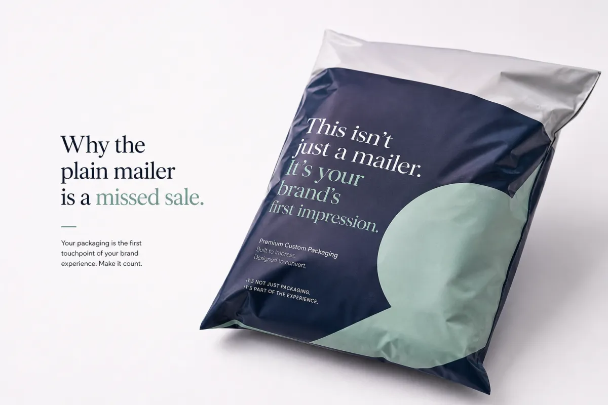
Picture two orders leaving the same warehouse. Same product. Same price. Same shipping label. One goes out in a plain gray mailer that could belong to anyone. The other uses poly mailers brand design with a bold logo, a clean color field, and enough restraint to look deliberate instead of noisy. The second one does more work before the customer touches the product. It builds recognition in transit, on the doorstep, and in the unboxing moment. That is not fluff. That is packaging pulling its weight.
Poly mailers brand design means using graphics, copy, color, and material choices to turn a shipping bag into part of the brand identity. It is not just slapping a logo on plastic. It is deciding whether the mailer should feel premium, playful, minimal, technical, or blunt. A skincare brand may want soft colors and a clean wordmark. A streetwear label may want high contrast and a sharper edge. A pet supply business might lean into clarity and warmth. Same substrate. Different story.
The business upside is real, even on cheaper orders. A branded mailer can improve customer perception before the product is opened, which matters because customers judge packaging fast and emotionally. It can also drive repeat orders when the bag is memorable enough to stick in someone’s head after delivery. And yes, it helps with social content. People post packaging that looks designed, not accidental. That matters because the unboxing moment is part marketing asset, part proof that the brand pays attention.
People usually do not remember the shipping label. They remember the package that felt considered.
That said, poly mailers brand design is not decoration with better PR. A good design still has to survive loading docks, conveyor belts, drops, scraping, and the occasional overconfident opener with scissors. If the print cracks, the color looks muddy, or the logo lands across a fold line, the whole effect falls apart fast. Packaging is one of those places where “pretty in the mockup” is a liar. Real use is the test.
I have seen brands spend money on a fancy finish and then lose the whole effect because the film was too thin and came out looking tired after one trip through fulfillment. That kind of mistake stings because it is avoidable. A cleaner, simpler bag that prints well usually beats a flashy one that cannot handle a Tuesday.
For brands comparing options, I usually tell them to look at their current packaging stack alongside Custom Packaging Products and Custom Poly Mailers. Seeing the options side by side makes the upgrade decision less vague. If your current bag is forgettable, poly mailers brand design is one of the cheapest ways to stop looking generic.
Plain mailers still have a place. If the order is highly price-sensitive, the product is low margin, or the buyer never sees the bag twice, plain can be the right call. For most consumer brands, though, plain is a missed sale of attention. Poly mailers brand design gives that attention somewhere to land, which is exactly why the plain option often feels cheaper than it really is.
How poly mailers brand design works from artwork to shipment
The process behind poly mailers brand design is straightforward on paper and fussy in practice. It usually starts with a brand brief: logo files, color values, tone of voice, target mailer sizes, and the practical details people love to skip until production starts. From there, the artwork gets built on a dieline, not on a polished flat mockup. That distinction matters because a mailer is folded, sealed, heat-pressed, and handled before it ever reaches the customer.
After the artwork is laid out, the supplier usually prepares a proof. This is where a lot of poly mailers brand design projects either stay clean or go sideways. The proof should show exact placement, bleed, safe zones, seal areas, and anything that might get cut off by seams or closures. If the layout assumes a perfectly flat surface and ignores the real shape of the bag, it is already wrong. A mailer is not a poster. It is a moving object with opinions.
Print method changes the result. Flexographic printing is common for larger runs and tends to favor lower unit cost once setup is handled, but it does involve plate costs and color limits. Digital printing is better for shorter runs, more color variation, or faster prototyping, though it can push the unit price up. Some buyers want sharp artwork and assume every upgrade is worth it. It is not. The right method depends on order volume, design complexity, and how much precision the bag actually needs.
Material choice matters just as much. Thickness, gloss or matte finish, opacity, tear resistance, and recycled content all affect how poly mailers brand design looks in the hand. A matte mailer often feels more premium and photographs differently from a glossy one. A thicker film may resist punctures better, but if it looks bulky and wrinkled, the aesthetic takes a hit. In practice, material is part of the brand statement whether marketing teams admit that or not.
If sustainability is part of the brief, ask for real material documentation, not vague green language. Many brands now want recycled content or paper-based inserts, and that is fair. If you are using paper components, FSC certification can be useful for the paper portion of the package, but it is not a blanket claim for every material in the system. For broader packaging context, the Packaging Organization at packaging.org has useful baseline information on packaging fundamentals. If your team wants the environmental story to stay honest, that homework matters.
Layout decisions are the other big piece of poly mailers brand design. Return addresses, barcode zones, adhesive strips, tear notches, and flap areas all fight for space. If the logo sits too close to a seam or the QR code lands where a fold will distort it, the bag loses both polish and usefulness. The best designs work with the structure instead of pretending the structure does not exist.
Most brands trip over a simple mistake: they design for a computer screen, not for a folded shipped object. That is why proofing should include multiple views, not just one tidy mockup. Flat, folded, in-hand, stacked, and labeled are the views that expose problems. Poly mailers brand design is a production workflow first and a visual exercise second. If that sounds unromantic, good. Packaging usually rewards the boring truth.
Key factors that make poly mailers brand design effective
Good poly mailers brand design is not magic. It usually comes down to five things: color, logo placement, messaging, audience fit, and durability. If one of those is weak, the rest of the bag has to work harder. If two are weak, the whole package starts looking like a rushed procurement decision. That is the honest version.
Color strategy
Color has to read fast. That means it should work in warehouse lighting, in a porch photo, and in a customer’s quick phone shot. High contrast usually wins because shipping bags do not always show up in perfect conditions. Soft tones can look beautiful in a brand deck and flat in real life. Deep colors can feel premium, but if the print process cannot hold the saturation cleanly, the result turns muddy. Strong poly mailers brand design usually uses one dominant field, one accent, and enough negative space to keep the bag from feeling busy.
One thing people forget: color also changes how cheap or expensive a bag feels. A harsh white with a tiny logo can look like commodity packaging. A carefully chosen color field can make the same mailer feel like a real brand object instead of a warehouse supply item. That difference is subtle, but customers notice it quicker than they can explain it.
Logo placement and scale
The logo needs to be visible from a distance, but not so oversized that the bag starts looking like a billboard. That balance is harder than people think. Too small, and the brand disappears once the mailer is stacked with others. Too large, and the design can feel desperate. The best poly mailers brand design layouts usually keep the logo centered or anchored in a controlled corner, with generous breathing room around it. That space is not wasted. It is part of the visual branding.
I usually tell clients to think about the warehouse first and the photo second. If the logo can be seen while the bag is moving through fulfillment, it will probably hold up in a customer photo too. If it only works in a pretty mockup, it is probably too fragile to trust.
Messaging hierarchy
Not every mailer needs a paragraph of copy. Some should lead with the logo. Others should lead with a tagline, website, social handle, or QR code. The key is hierarchy. A mailer should communicate in a second, not ask the customer to read it like a pamphlet. If the message is too dense, the bag becomes cluttered and the brand loses confidence. I see this mistake a lot: people try to squeeze marketing, product info, and a slogan into one surface. That is not poly mailers brand design. That is a flyer trapped in plastic.
For packaging standards and consumer expectations, trade groups like the Institute of Packaging Professionals are worth keeping on the radar. If your team wants a deeper baseline, the industry side of fsc.org is useful when certified paper materials are part of the conversation. For shipping abuse tests, ISTA drop and transit protocols matter more than people admit. A bag can look elegant and still fail the abuse test. That is a bad trade.
Audience fit
A luxury beauty label should not use the same poly mailers brand design language as a budget marketplace seller. A kids’ brand can be friendlier and more illustrated. A technical accessory brand may want structure and restraint. A pet brand can be warm and readable. These choices are not aesthetic trivia. They shape customer perception before the product gets a chance to explain itself. Brand consistency matters here because the mailer should feel like it belongs to the same company as the website, inserts, and product labels.
Audience fit also decides how much personality is enough. A playful brand can get away with a little more color and copy. A premium brand probably should not. If the bag feels kinda generic, the customer will usually assume the rest of the operation is generic too. Harsh, maybe, but that is how the brain works.
Durability and tactile feel
A premium look collapses fast if the bag wrinkles badly, tears at the seams, or scuffs during transit. The surface finish, film strength, and seal quality all shape how the mailer feels in the hand. People notice that. They do not always describe it in technical terms, but they notice it. Strong poly mailers brand design should survive the journey and still look intentional at delivery. If the bag arrives beat up, the brand looks beat up too.
One useful test is to ask whether the mailer would still look good after being stacked, dragged, and photographed under lousy light. If the answer is no, the design is not ready. If the answer is yes, you are probably close. I know that sounds almost too simple, but it is usually the right filter.
Poly mailers brand design cost: what drives pricing
Poly mailers brand design cost comes down to a few basic variables, and none of them are exotic. Size, film thickness, number of print colors, number of printed sides, finish, and order quantity are the main levers. Change one and the price moves. Change three and the quote moves a lot more than your first target.
Lower quantities cost more per unit because setup has to be spread over fewer bags. Plates, color matching, proofing, and press setup all carry cost. That is why a 1,000-piece order usually looks expensive next to a 10,000-piece order, even if the artwork is simple. This is not a supplier trick. It is just production math. Poly mailers brand design gets more efficient as quantity rises because the fixed setup work gets diluted.
| Option | Typical Use | Estimated Unit Range | Main Tradeoff |
|---|---|---|---|
| Stock unprinted mailers | Lowest-cost shipping, internal use, fast replenishment | $0.05-$0.14 | Cheapest, but almost no brand recognition |
| Simple one-color custom print | Small brands, minimal layouts, tighter margins | $0.18-$0.32 | Good value, but artwork must stay disciplined |
| Two- to four-color custom print | Stronger visual branding, richer identity systems | $0.24-$0.45 | Better photo impact, higher setup complexity |
| Premium material or recycled-content build | Brands emphasizing tactile feel or sustainability claims | $0.28-$0.60 | Better perception, but margin can get tight fast |
Those ranges are not fixed quotes. They move with bag size, film gauge, print coverage, order volume, and supplier location. Still, they are useful for planning because they keep a brand from overshooting the budget by accident. Poly mailers brand design should improve perceived value, not eat so much margin that the product itself has to subsidize the bag.
There are hidden costs people forget. Artwork cleanup can take time if the logo files are messy. Proof revisions can slow the schedule. Freight can be uglier than expected if the bags are bulky. Storage matters too, especially for larger runs. If the design is wrong, reprinting is the expensive lesson nobody wants to buy twice. That is why I always recommend treating poly mailers brand design like a landed-cost decision, not a unit-price decision.
One practical buying rule: pay for the parts customers actually notice. If a slightly thicker film improves durability and the design still prints cleanly, that is usually worth more than a fancy finish nobody can see in transit. If a premium finish barely changes the customer experience, skip it and put the money into the product or fulfillment process instead. There is no prize for over-specifying a mailer. There is also no award for paying extra just because a sample looked nice in a conference room.
Poly mailers brand design process and timeline
The timeline for poly mailers brand design depends on whether you are buying stock bags with light customization or a full custom printed run. Stock mailers with simple branding can move quickly. Fully custom work needs more time for setup, proofing, and production. If a launch date matters, the best move is to build in buffer time early. Gambling on a last-minute order is a classic way to create avoidable stress.
- Brief and setup: confirm size, quantity, print method, finish, and target delivery date.
- Artwork development: place the logo, define the message hierarchy, and build on the dieline.
- Proofing: review placement, color expectations, bleed, safe zones, and seal areas.
- Production: run the bags after approval, then inspect for print and seal consistency.
- Packing and shipping: confirm carton counts, freight timing, and receiving details.
A simple internal workflow makes poly mailers brand design far less painful: one decision maker, one master brand file, one approval round, and one final checklist before production starts. The more voices you add late in the process, the more likely you are to discover “tiny” changes that are actually expensive. Someone always wants to move the logo by a few millimeters after proof approval. That is how schedules slip.
Where do delays usually happen? Missing bleed is one. Wrong file format is another. Color changes after the proof stage can cause rework. Freight delays happen too, especially if the bags are coming from far away or if the receiving dock is backed up. Most of these problems are preventable with cleaner communication and faster approvals. Poly mailers brand design rewards brands that answer quickly and keep the process tight.
Here is a practical planning rule: if the launch date matters, do not plan the order on the launch date. Plan it before the launch date. Give yourself enough room for proof corrections, shipping slippage, and one backup option if something goes wrong. That is not pessimism. That is how packaging actually behaves.
For brands that want a bigger picture view, Case Studies can help show how different packaging choices affected recognition, order presentation, and customer perception. Seeing a few real outcomes usually makes the timeline conversation a lot more grounded. It also keeps everybody honest about what actually changed, instead of what people hoped changed.
Common mistakes in poly mailers brand design
The most common mistake in poly mailers brand design is trying to say too much. People treat the mailer like a brochure and then wonder why it looks crowded. A shipping bag has limited real estate. If the layout uses every corner, the bag stops feeling premium and starts feeling noisy. A simple design with discipline usually performs better than a busy design with enthusiasm.
Weak contrast is another easy miss. A color can look beautiful on screen and disappear on plastic, especially under warehouse light or in phone photos. Low contrast also hurts brand recognition because the logo and message are harder to read at a glance. Good poly mailers brand design should read fast from a few feet away. If it does not, the design is fighting the material.
Ignoring the structure of the bag is another expensive habit. Seams, seals, flap placement, and fold lines can all interrupt artwork. QR codes placed too close to a seam can become frustrating. Logos that cross a fold can look warped. Return information that lands where the adhesive strip sits can become unreadable. These are not design theories. They are production realities.
Designing for vanity instead of shipping is a mistake too. A pretty mockup means very little if the mailer leaks, tears, or arrives wrinkled beyond recognition. The customer does not award points for a stunning render. The customer judges the bag that lands on the doorstep. That is why poly mailers brand design has to be built around actual handling, not just a presentation deck.
Skipping proof checks can wreck an entire run. One wrong Pantone conversion, one typo, one bad barcode placement, and the whole order looks sloppy. If you have ever seen a carefully planned package ruined by a misplaced website or a fuzzy logo, you know how fast confidence drops. Better proofing saves money. Not glamorous, but true.
- Keep copy short and readable.
- Use contrast that survives real-world lighting.
- Map artwork around seams and adhesive zones.
- Check every proof as if it were final.
- Test the bag in real handling, not just a mockup.
One more mistake worth calling out: brands often copy a competitor’s mailer without copying the competitor’s product mix, margin, or audience. That is how you end up with a bag that looks expensive but does nothing for the business. Strong poly mailers brand design should fit your own shipping profile, not somebody else’s Instagram feed.
And if the only reason a design feels “premium” is because someone said so in a meeting, walk it back. Packaging should survive contact with reality. If it does not, it is just a mood board with a shipping label.
Expert tips and next steps for poly mailers brand design
If you want better results from poly mailers brand design, start with a one-page brand spec. Keep it blunt. Include logo usage, color values, tone, must-have copy, and the exact mailer sizes you use most often. That single page kills a lot of circular email threads later. It also helps you keep brand consistency when different people touch the project.
Order samples before you commit. Compare material feel, print sharpness, seal quality, and how the bag behaves after handling. A sample in the hand teaches more than a polished mockup ever will. Fold it. Stack it. Photograph it. Put shipping labels on it. That is the fastest way to see whether poly mailers brand design is holding up or just looking good on a screen.
Test the layout against real use cases. Flat lay is one view. Held in hand is another. Stacked in a warehouse is another. Photographed for social media is another. If a design only works in one of those environments, it is not finished. Good poly mailers brand design should perform across the actual journey, not just the presentation moment.
Pick one primary goal for the mailer. Recognition, premium feel, product category clarity, or social sharing are all valid goals. Trying to force all four into one bag usually ends in clutter. You can still support more than one outcome, but one should lead. That keeps the design clean and the buying decision easier.
Budget with discipline. Sometimes one-color printing is enough. Sometimes a larger, better-printed bag is the right move. Sometimes the smartest decision is a simpler design that ships faster and holds margin better. The point is to align poly mailers brand design with actual business needs, not with what looks fancy in a presentation.
If you want to see how packaged goods are framed in real projects, the Case Studies page is useful because it shows how packaging choices affect the full customer journey, not just a single mockup. That context matters. Packaging is never isolated. It sits inside the product, pricing, fulfillment, and repeat-buy loop.
My practical recommendation is simple: audit your current mailer, rebuild the proof with real structure in mind, price out two material options, and launch a small test batch before you scale. That sequence keeps poly mailers brand design under control and gives you evidence instead of guesses. If the new bag improves customer perception and brand recognition without blowing up the margin, keep going. If it does not, adjust before you lock in a larger run. That is how smart packaging decisions get made.
One last thing: do not judge the design only from a laptop. Walk a sample through receiving, packing, transit, and opening. If it still looks intentional after that trip, you have something worth scaling. If not, keep refining until it does.
FAQ
How do I choose the right size for poly mailers brand design?
Pick the smallest size that fits the product with enough room for sealing and protection. Oversized bags look sloppy, waste shipping space, and make poly mailers brand design feel less intentional. If you ship multiple product types, build a size chart first so you are not redesigning the mailer every time the SKU changes. The layout should match the size too, because logos and copy that look fine on one bag can crowd out quickly on another. I have seen a brand lose a lot of polish because the graphics were scaled from the wrong template, and the customer noticed immediately.
Is one-color poly mailers brand design enough for a small brand?
Yes, if the logo is strong and the contrast is clean. One-color printing can look premium when the layout is disciplined, and it often keeps poly mailers brand design cost under control. Use it when margins are tight or when you want a bold, minimal look that prints reliably. Add more colors only when the design problem actually needs it, not because more colors feel fancier on paper. A good one-color bag can do more than a cluttered four-color print that nobody remembers.
What is the fastest turnaround for custom poly mailers brand design?
Stock mailers with simple printing move fastest, while fully custom runs need more time for proofing and production setup. The real bottleneck is usually approval, not printing, so quick answers from your side can cut days off the schedule. If your launch date is fixed, build in buffer time for corrections, freight, and one backup plan. That gives poly mailers brand design room to be corrected before it becomes expensive. If you are in a rush, keep the artwork simple and keep the decision chain short.
How much should I budget for poly mailers brand design?
Budget depends on size, quantity, print colors, and film thickness, but low-volume custom work will always cost more per unit. Compare total landed cost, not just unit price, because shipping, setup, and proof changes can move the final number a lot. Spend more on the pieces customers see first, and do not overspend on details that do not improve perception or durability. That approach keeps poly mailers brand design useful instead of decorative. If the upgrade does not change how the bag looks, feels, or lasts, it is probably the wrong place to spend.
What should I put on poly mailers besides my logo?
Add only what supports the brand: tagline, website, social handle, QR code, or a short message that fits the space. Keep the hierarchy simple so the mailer reads in a second, not ten seconds. If extra text makes the bag feel crowded, cut it; the product should do the talking once the customer opens it. The best poly mailers brand design is clear enough to be remembered and restrained enough to stay sharp after shipping. If you need more than a few words to explain the bag, the design is probably trying too hard.
How can I tell if my poly mailers brand design is actually working?
Look at repeat recognition, customer photos, and whether the bag still feels intentional after transit. If people can identify your shipment from a quick glance, that is a good sign. If the mailer looks tired or generic once it reaches the doorstep, the design needs work. Poly mailers brand design should make the package easier to recognize, not just prettier in a mockup. A simple field test is enough: show the bag to someone who does not know the brand and ask what it feels like. Their first answer is usually the honest one.


