Buyer Fit Snapshot
| Best fit | Printed Bakery Boxes Branding projects where brand print, material claims, artwork control, MOQ, and repeat-order consistency need to be specified before quoting. |
|---|---|
| Quote inputs | Share finished size, material target, print colors, finish, packing count, annual reorder estimate, ship-to region, and any compliance wording. |
| Proofing check | Approve dieline scale, logo placement, barcode or warning zones, color tolerance, closure strength, and carton packing before bulk production. |
| Main risk | Vague material claims, crowded artwork, missing packing details, or unclear freight terms can make a low unit price expensive after revisions. |
Fast answer: Printed Bakery Boxes Branding: Stand Out on Every Shelf should be specified like a repeatable production item. The safest quote records material, print method, finish, artwork proof, packing count, and reorder notes in one written spec.
Production checks before approval
Compare the actual filled-product size with the drawing, then confirm tolerance on folds, seals, hang holes, label areas, and retail display edges. Reserve space for logos, QR codes, warning copy, and material claims before decorative graphics fill the panel.
Quote comparison points
Review material grade, print process, finish, sampling route, tooling charges, carton quantity, and freight assumptions side by side. A quote is only useful when the supplier can repeat the same color, closure quality, and packing count on the next order.
Printed Bakery Boxes branding is not decoration. It is the first sales pitch your pastry makes before anyone takes a bite, and in a bakery that sells by sight, scent, and habit, that first impression does a lot of heavy lifting. The box sits on the counter, rides home in a delivery bag, gets photographed on the kitchen table, and stays in the customer’s hands long enough to shape customer perception, brand recognition, and the unboxing experience all at once.
From a packaging buyer’s point of view, that matters more than most people want to admit. A plain carton says “we packed something.” Printed bakery boxes branding says “this product belongs here, costs what it costs, and was made on purpose.” Same croissant. Different story. Different price ceiling. Different repeat-order behavior. The packaging does not need to shout to make the point, either; it just needs to look deliberate, clean, and consistent.
If you run a bakery, cafe, dessert shop, or giftable food brand, the box is doing visual branding work every day. The trick is making sure it does that work without wrecking your budget, slowing production, or turning the packaging line into a headache. That balance is where printed bakery boxes branding earns its keep, because the best box feels easy for staff, obvious to customers, and credible in photos, pickup orders, and delivery runs.
Why printed bakery boxes branding matters more than the pastry
Customers see the box before they taste the pastry. That sounds obvious, yet plenty of bakeries still act like the product starts the moment the tart leaves the oven. It does not. Printed bakery boxes branding starts the sale at the counter, on the shelf, in the delivery stack, and in every image that gets posted, shared, or ignored.
There is a blunt truth here: packaging is first-contact marketing. A standard cookie in a plain white carton feels different from the same cookie in printed bakery boxes branding with a clean logo, a clear color system, and a shape that looks considered. The cookie did not change. The customer perception did. That shift is often enough to turn a casual purchase into a premium one, or a one-time visit into a habit.
That matters because people buy with shortcuts. A branded box can make a simple bun feel like a premium treat, turn a half-dozen pastries into a gift, and help a bakery justify a higher ticket without sounding defensive about it. In practice, printed bakery boxes branding is one of the most efficient ways to influence how valuable the product appears, especially when the item itself is familiar and the packaging needs to do some of the storytelling.
It also drives repeat orders. A customer may not remember every flavor, but they remember the box on the desk, the ribbon color, the distinctive pattern that stood out in a crowded delivery stack, or the way the lid opened cleanly without crushing the frosting. That is brand recognition doing real work, not a buzzword on a mood board. Good printed bakery boxes branding makes the box easy to spot from ten feet away and easy to remember a week later.
There is a second layer too: the unboxing experience. Bakery boxes are opened in kitchens, offices, party tables, and car seats. That moment can feel special or careless. If the lid opens cleanly, the print looks crisp, and the brand identity feels consistent across the front, side panels, and insert, the customer gets a small hit of confidence before the first bite. That confidence matters because food is emotional; people notice when the package feels as thoughtful as the pastry inside.
If the box cannot survive the trip, the branding is just expensive decoration. Good printed bakery boxes branding has to look right and hold up in real use.
That is why bakeries should think of printed bakery boxes branding as a mix of visual branding, product protection, and operations. A pretty mockup does not matter if the fold lines split, the grease bleeds through, or the stack collapses in a delivery bag. Real packaging earns its keep on a busy Friday, not just in a presentation deck. The best results come from treating the box as part of the product, not as a last-minute wrapper added after the real work is done.
I have seen bakeries gain more pricing confidence from a well-made carton than from a month of menu copy edits. That sounds small, but it is real. Customers are quicker than we like to think, and they read quality in packaging almost immediately. A good printed box can make a familiar item feel fresh again without changing the recipe one bit.
One more point tends to surprise new buyers: identical pastries sold in plain versus printed packaging can create completely different perceived value. A basic scone in a plain carton can feel like a commodity. The same scone in polished printed bakery boxes branding can feel artisan, giftable, and worth a little more. That difference is not magic. It is disciplined presentation, and it is one of the main reasons bakery packaging has become such a serious part of the brand conversation.
If you want a broader view of packaging options, the Custom Packaging Products catalog is a useful place to compare box styles against other formats. And if your bakery sells complementary items like stickers or top seals, Custom Labels & Tags can help keep printed bakery boxes branding and product labeling on the same visual page.
What printed bakery boxes branding actually includes
Printed bakery boxes branding is more than putting a logo in the corner and calling it done. The strongest versions use a few connected layers: logo placement, color system, typography, messaging, pattern work, and the box shape itself. If one of those pieces is off, the whole package feels less intentional, even if each element looks fine on its own.
Start with logo placement. Too large, and it shouts. Too small, and it disappears the second the box stacks up on a counter. Good printed bakery boxes branding usually gives the logo a clear home on the lid or front panel, then backs it up with secondary elements so the brand still reads when the box is partly obscured. A bakery box rarely gets a perfect full-frame view, so the design has to work in motion, in a stack, and at an angle.
Color is the next big lever. Some bakeries lean into warm neutrals, others use bold contrast, and some build a seasonal system that changes with the menu. Either way, the color palette should match the brand identity and hold steady across packs, stickers, menu boards, and delivery inserts. Brand consistency is boring to talk about and wildly effective in practice, especially when customers are comparing your box to the generic cartons they see everywhere else.
Typography matters more than people think. Script fonts can look lovely on a design board and completely unreadable under bakery lighting. Sans serif type often holds up better at small sizes, especially on stacked boxes or delivery photos. Printed bakery boxes branding should be readable at arm’s length, on a moving counter, and in a half-open bag where only one panel is visible. If the type needs a second glance, it is probably too delicate for production.
Messaging is another layer. Some brands print a short tagline. Others use a product note, a thank-you line, or a simple origin story. That copy should be brief. No one wants to read a manifesto while holding a cinnamon roll. The goal is to support the brand story, not bury the pastry in text. A few well-chosen words can do more than a crowded paragraph ever will.
Patterns and decorative systems can help a lot when a logo alone is too plain. Repeated icons, flourishes, ingredient motifs, or geometric borders can make printed bakery boxes branding feel fuller without adding clutter. The trick is restraint. A busy surface can make the box feel cheap if every square inch is fighting for attention. A controlled pattern, placed with intention, often looks more expensive than a box covered edge to edge with unrelated graphics.
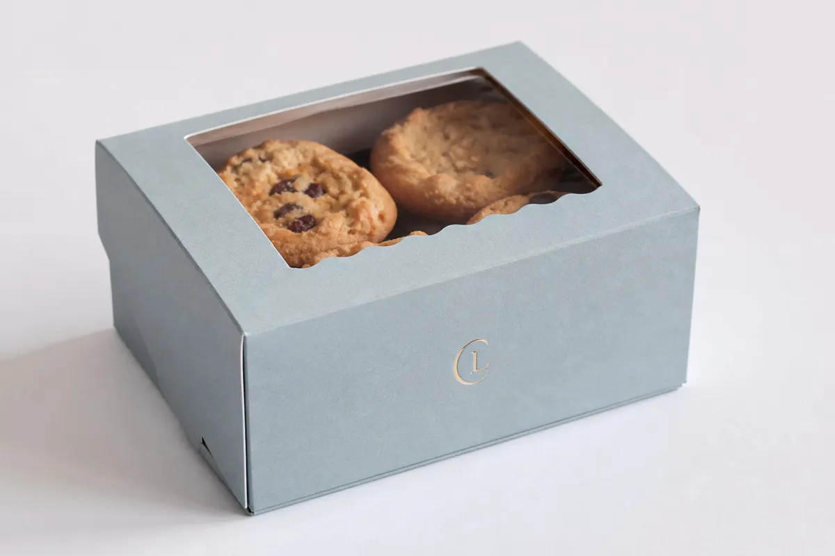
Then there is structure. Tuck-top, window, gable, sleeve, and display-style bakery boxes all change how branding is experienced in the hand. A window box puts the product on stage. A tuck-top box gives a larger canvas for print. A sleeve can feel more premium and often gives better control over the reveal. The structure is part of the branding, not an afterthought, because the opening motion and the way the box holds its shape both shape how the customer reads the brand.
Here is a simple way to match style to brand personality:
- Artisan: natural tones, minimal copy, textured paperboard, restrained logo use.
- Playful: brighter colors, bolder type, repeat pattern work, stronger contrast.
- Luxury: matte finish, quiet colors, precise typography, minimal clutter, stronger edges.
- Seasonal: modular graphics that can change without redesigning the whole pack.
- Mass-market: clear naming, strong shelf read, efficient print setup, predictable layout.
Printed bakery boxes branding only works if the customer can understand it fast. That means the box needs a clear focal point, a practical information hierarchy, and a look that survives the chaos of a real bakery counter. If you want proof that this balance matters, the best place to look is a packaging-heavy brand rollout. Our Case Studies page shows how presentation and structure work together in actual product launches.
For packaging standards and general best practices, industry groups like the ISTA are useful because they remind brands that transit performance is not a side issue. In bakery packaging, it is the difference between a clean handoff and a crushed corner.
Printed bakery boxes branding process and timeline
The production process for printed bakery boxes branding is not complicated, but it is easy to slow down if the handoffs are sloppy. The cleanest projects start with a brief, move to dieline review, then artwork setup, proofing, printing, finishing, and final packing. Each step has one job. Skip one and the whole order tends to wobble.
First comes the brief. It should include box dimensions, product weight, how many pastries each box must hold, print coverage, finish preference, launch timing, and the order quantity. If those basics are missing, a supplier is forced to guess, and guessing is expensive. Printed bakery boxes branding works best when the bakery owner, designer, and packaging partner are looking at the same facts, not translating half-finished notes across three different email threads.
Then comes the dieline. This is where good ideas either fit the box or get exposed as wishful thinking. A logo placed two millimeters too close to a fold line can vanish on the finished carton. A background pattern can break awkwardly at a glue tab. A window cutout can interfere with brand copy. The dieline is not a technicality. It is the map, and every serious bakery packaging project should treat it that way.
After that, artwork setup begins. This is where the designer should think in terms of panel visibility, stack behavior, and how the box will look in photos. Printed bakery boxes branding has to make sense both closed and half-open. If the box will be carried in a bag, the top panel matters more than the side panels. If it will sit on a shelf, side reads become more important. A design that only works in one position is too fragile for everyday service.
Proofing is the stage where most preventable problems show up. Digital proofs help catch copy errors, panel alignment issues, and proportion problems. Physical samples go further because they reveal fit, closure tension, and how ink areas behave on the actual substrate. If the bakery needs a snug fit for frosted items or tray inserts, a sample is worth the delay. Cheap mistakes are still mistakes, and printed bakery boxes branding tends to expose them faster than people expect.
From a timing standpoint, simple printed bakery boxes branding can often move in about 2-3 weeks after proof approval if the artwork is ready and the structure is standard. Custom shapes, special coatings, or complex finishes usually push that to 3-5 weeks, sometimes longer if the order lands during a busy factory window. That range is realistic. Anyone promising magic is selling stories, not packaging.
Where delays happen most often?
- Missing dieline specs.
- Slow proof approval from too many decision-makers.
- Color corrections after the first proof.
- Last-minute copy changes.
- Confusion about exact board thickness or food-safe coating needs.
A clean workflow keeps printed bakery boxes branding moving. Give the designer the dieline early. Lock the box size before artwork starts. Approve the print layout with one decision-maker if possible. Confirm whether the bakery needs grease resistance, window film, or stack strength before anyone chooses finishes. This is not glamorous work, but neither is fixing a pallet of unusable cartons.
It also helps to build a testing step into the schedule. For food packaging, transit testing and handling checks matter, and standards such as ISTA protocols are a good reminder that shipping is part of the product experience. If the box is going to ride in a delivery bag, tip in a car, or stack under other orders, printed bakery boxes branding should survive that reality without peeling, bowing, or rubbing off at the corners.
Some bakery owners ask whether they really need a physical sample. Honestly, if the order is large or the box has a window, special closure, or matte-heavy finish, yes. A sample catches fit issues, ink coverage surprises, and panel alignment problems before full production turns them into inventory. That small step protects the budget better than any apology ever will.
There is also a practical rhythm to all of this. The faster the menu changes, the more disciplined the box system needs to be. I have seen a short seasonal run stall for a week because the team tried to rework copy after proofing had already started. That kind of drag is avoidable, and it usually starts with unclear ownership, not bad design.
Printed bakery boxes branding cost, pricing, and MOQ
Pricing for printed bakery boxes branding depends on the usual suspects: box size, board grade, print colors, finish type, quantity, and whether the design needs custom tooling. If any supplier gives a flat answer without asking about those variables, they are either guessing or simplifying so hard that the quote is not useful.
For practical planning, small-run printed bakery boxes branding often costs more per unit because setup is spread across fewer boxes. Larger runs bring the per-unit price down because prepress, plate setup, and finishing prep are absorbed at scale. That is why a bakery testing a new seasonal line may pay more for the first order than for the second or third. The difference is not a penalty; it is simply how production math works.
Here is the part people ignore: price is tied to print coverage and finishing choices more than they expect. A one-color logo on a kraft box is very different from a full-bleed full-color carton with soft-touch lamination and a window patch. The first keeps costs lean. The second looks polished, but each extra effect adds labor, material, or waste. Printed bakery boxes branding can be smart and restrained or visually rich and more expensive, and both choices can make sense if they match the product.
| Option | Typical order range | Approx. unit cost | Best for | Main tradeoff |
|---|---|---|---|---|
| Standard printed tuck-top box | 1,000-5,000 units | $0.18-$0.38 | Everyday bakery items, cost control | Less shelf drama, simpler finish choices |
| Full-color custom bakery box | 2,000-10,000 units | $0.28-$0.65 | Strong brand identity, delivery orders | Higher setup and proofing attention |
| Window box with specialty finish | 3,000-10,000 units | $0.40-$0.85 | Gift sets, premium pastry lines | More finish cost, more care in handling |
| Short-run test order | 200-1,000 units | $0.55-$1.20 | Menu trials, seasonal launches, design checks | Highest unit cost, lower risk |
Those numbers are broad on purpose because specs move the market fast. A bakery box with minimal print coverage and a standard size can stay lean. A heavily printed premium carton with specialty coating will not. That is just how printed bakery boxes branding behaves once production gets involved.
MOQ, or minimum order quantity, is another piece buyers need to understand in plain language. It is the smallest quantity a supplier will produce at the quoted price. If your bakery rotates flavors every month, MOQ can be a problem unless you plan smartly. A 5,000-unit minimum makes sense for a stable menu. It is awkward for a tiny seasonal test unless the packaging can carry multiple SKUs with one base design.
Here is a practical rule: if sell-through is fast and storage is good, larger orders usually save money. If the bakery is still refining the menu or the brand system is not settled, a shorter run protects you from ending up with boxes you do not want to use. Printed bakery boxes branding should support growth, not trap cash in the back room or lock the business into packaging it outgrows.
Common pricing traps are easy to spot once you have seen enough quotes. Too many colors can raise setup cost. Overuse of spot coatings can make the carton pricier than the pastry inside. A box size that is a little too large wastes board and shipping space. Fancy shapes can be fun, but they are not free, and they are rarely necessary for the first branded rollout.
For bakers who want to keep the line lean, a clean printed shell plus product stickers can be a smart middle ground. That is where a packaging system with printed bakery boxes branding and a supporting label set can keep the design sharp without dragging the whole order into premium territory. It is also where a simple decision tree helps: if the box carries the main brand read, let labels handle flavor or batch details.
If you are balancing packaging against other launch items, the most useful mindset is this: spend where the customer can see the value. A cleaner print layout, better closure, or stronger board usually beats an extra finish effect nobody notices. Printed bakery boxes branding should look deliberate, not overfed, and it should make the product feel ready for sale the moment the box is handed over.
How to choose materials and print finishes for bakery boxes
Material choice decides whether printed bakery boxes branding feels sturdy or flimsy. For most bakery applications, paperboard is the default because it prints well, folds cleanly, and can be made food-safe with the right coating or liner. The real question is not whether to use paperboard. It is which grade, which finish, and how much protection the product needs once the box leaves the prep table.
Board stiffness matters. A box holding light cookies can get away with less rigidity than a pastry box carrying layered cakes or filled buns. If the carton walls flex too much, the box feels cheap and the lid does not close properly. That is bad for presentation and worse for transport. Printed bakery boxes branding should support structure, not fight it, because the shape has to look composed even when the bakery staff is moving fast.
Grease resistance is another practical issue. Butter, icing, and laminated pastry surfaces can leave marks fast. If the board has no protective layer, the graphics can stain or warp. Food contact suitability also matters, especially if the inside panel touches the product or an insert. The safest path is to specify the condition the box will actually face, not the ideal one in a mockup that only exists on a screen.
Finish choice changes the brand feel. Matte finishes tend to read calmer and more premium. Gloss can feel brighter and more energetic, though it can also show fingerprints and scuffs more easily. Soft-touch gives a tactile, upscale feel, but it adds cost and is not always the best choice for greasy or high-handling boxes. Uncoated stock can feel natural and honest, but it may absorb more oil and show wear faster. Printed bakery boxes branding should use finish as a tool, not as a default upgrade.
Window patches are useful, but not free of tradeoffs. A clear window can help sell the pastry by showing icing, filling, or decorative detail. That is good for retail displays and gift boxes. The downside is that windows can weaken stacking strength, pick up smudges, or create extra handling issues if the film sits too close to the product. Printed bakery boxes branding should use windows for a reason, not because they look nice on a sample wall.
For brands that care about certified sourcing, FSC options can matter. If the board is FSC-certified, that can support sustainability claims without sounding fluffy or vague. More on that can be found through the FSC system. I would still say the box has to perform first. A sustainable box that crushes in transit is not a win. It is a recycling lesson with a logo on it.
Here is a simple decision rule that keeps printed bakery boxes branding grounded:
- Choose finishes that support the product, not just the render.
- Choose board strength based on actual carry and stack conditions.
- Choose coatings that protect the print from grease, flour dust, and condensation.
- Choose a surface that matches the brand story without making the box hard to handle.
That last point matters more than most people expect. A luxury look is fine. A slippery, overcoated box that is awkward to open is not. The customer may not know why the package feels off, but they will feel it. Printed bakery boxes branding only earns trust when the tactile experience matches the visual one, from the moment the box is lifted to the moment the pastry is removed.
In my experience, the best packaging choices are rarely the loudest ones. They are the ones that survive the rush, hold shape after the third stack, and still look clean when someone opens the lid in the parking lot. That kind of reliability is kinda invisible until it is missing.
Common mistakes in printed bakery boxes branding
The most common mistake is cramming too much onto every panel. A logo, tagline, ingredient callout, pattern, social handle, QR code, flavor name, and decorative border all competing for space usually turns the box into a billboard nobody wants to read. Printed bakery boxes branding should guide the eye, not attack it. A quieter design often lands harder because it gives the product room to breathe.
Weak contrast is another trap. Tiny beige type on a kraft background may look tasteful on a screen, then vanish under warm bakery lighting or in a delivery app photo. Busy backgrounds can do the same thing. If the brand identity cannot be read quickly, the box is wasting the few seconds it gets from the customer. Clear contrast is not a luxury; it is part of the job.
Designing for a mockup instead of the actual box size causes a lot of pain too. A digital render often hides fold lines, glue tabs, closure flaps, and stack pressure. Once production starts, a beautiful layout can look cramped or misaligned. Printed bakery boxes branding should always be checked against the real dieline, not just a flat concept board. The flat layout may be attractive, but the finished carton is what the customer sees.
Operational blind spots create expensive problems. If the box will hold greasy pastries, the print choice needs to tolerate that. If staff will fold hundreds of boxes a day, the structure has to be easy to assemble. If the boxes travel in delivery bags, top panels and side panels need to keep their read. A bakery owner can love the artwork and still lose money if the packaging slows the line. Strong printed bakery boxes branding respects both the front-of-house impression and the back-of-house workflow.
Another mistake is spending on premium finishes before the brand system is stable. If the logo is still changing, the color palette is not settled, or the product lineup keeps shifting, luxury effects can become expensive noise. Printed bakery boxes branding works best after the core brand rules are clear. Clarity first. Fancy later, if it still makes sense. A restrained box with a strong structure usually ages better than a flashy one built on a temporary idea.
There is also a habit I see too often: teams approve a sample because it looks good on the table, then realize later that the box is awkward in the hand. That is why I keep pushing practical handling tests. If staff hate folding it, customers will probably hate opening it, and neither group is gonna baby the packaging just because it looked great in a photo.
Here is a quick diagnostic that saves time:
- If the box is hard to read, simplify.
- If the box is hard to fold, redesign the structure.
- If the box stains fast, change the board or coating.
- If the box photographs badly, revise contrast and placement.
- If the box feels more expensive than the product, recheck the budget split.
That last one sounds harsh, but it is real. A bakery box should help the product earn its price, not compete with it. Printed bakery boxes branding is meant to lift sales and strengthen brand consistency, not impress a designer in a vacuum. The customer is the only judge that matters, and the box has to make sense to them in seconds.
If you want to see how different packaging pieces work together, browse a few examples in the Case Studies section. It is often easier to spot a design problem once you compare a finished box with the rest of the packaging system.
Expert tips and next steps for printed bakery boxes branding
Start with a one-page packaging brief. Keep it plain and practical: box dimensions, product weights, brand colors, quantity, finish preference, storage limits, and launch date. That one sheet reduces confusion more than ten scattered email threads. For printed bakery boxes branding, clarity is money, and a tidy brief prevents a lot of expensive guessing.
Order a sample or short proof run before committing to a big quantity if the bakery sells multiple item sizes or the structure is custom. A small test is cheaper than finding out too late that the lid scuffs, the insert shifts, or the branding feels crowded once the pastry is actually inside. Printed bakery boxes branding should earn confidence before it scales, not after the inventory arrives.
Test the box in the real world. Fill it. Stack it. Carry it. Photograph it under your store lighting. If it will travel in refrigerated storage, put it through that too. Condensation and cold handling can change how inks and coatings behave. Packaging people learn this the hard way. Better to be boring and correct than excited and wrong.
Here is the checklist I would use before final approval:
- Confirm the dieline and dimensions.
- Finalize the logo and copy placement.
- Verify MOQ and reorder expectations.
- Lock the finish and board choice.
- Approve color expectations against a proof.
- Check stack, carry, and opening behavior.
- Confirm the timeline leaves room for one revision.
If the brand sells packaged add-ons like cookies, tags, or gift bundles, keep the look aligned across formats. That is where printed bakery boxes branding and supporting print pieces help the brand feel organized instead of scattered. A coordinated system usually does more for customer trust than a louder box ever will, especially when the shopper is deciding whether the order feels thoughtful enough to gift.
Also, do not ignore sustainability claims. If you are using certified paperboard or recycled content, make sure the claim is accurate and consistent. Packaging buyers are tired of vague green talk. So are customers. Practical sourcing matters more than slogans, and standards from groups like FSC exist for a reason. Clear sourcing information builds more trust than any oversized eco badge ever will.
For most bakeries, the smartest move is not the fanciest box. It is the box that fits the product, matches the budget, and can be ordered again without drama. That is what printed bakery boxes branding should do: support the sales process, protect the pastry, and give the brand a cleaner face in the market. A good package does not ask for attention; it earns it every time the customer carries it out the door.
If you are ready to move, start with the structure and the message. The rest gets easier after that. Printed bakery boxes branding works best when design, budget, and production all point in the same direction. If they do not, the box may still print, but the result will feel less like branding and more like a compromise that the customer can sense immediately.
The most useful takeaway is simple: pick the box structure first, then decide the print system, then test one physical sample under real handling conditions before placing the full run. That order keeps printed bakery boxes branding practical, protects the budget, and gives you a package that supports the pastry instead of fighting it.
FAQ
How much does printed bakery boxes branding usually cost?
Pricing depends on quantity, board stock, print colors, finish, and whether the box size is standard or custom. Small orders usually cost more per box because setup fees are spread across fewer units, while larger runs lower the unit cost. For planning, a simple short-run order can land around $0.55-$1.20 per unit, while larger standard runs may fall closer to $0.18-$0.65 depending on specs. The most accurate quote usually comes after the dieline, quantity, and finish are locked.
What affects the turnaround time for printed bakery boxes branding?
The biggest timing factors are artwork approval, dieline changes, finish complexity, and factory workload. Simple orders can move in roughly 2-3 weeks after proof approval, while custom structures or specialty coatings often take longer. If the design is still changing, the schedule stretches. That part is not mysterious; it is just workflow, and packaging schedules tend to move at the speed of the slowest approval.
What materials work best for printed bakery boxes branding?
Food-safe paperboard with enough stiffness for stacking and transport is usually the safest choice. If grease or moisture is a concern, choose a finish or coating that protects the print without making the box slippery or cheap-looking. For premium presentation, matte or soft-touch can work well, but only if the handling conditions suit them. The box should feel secure in hand and keep its shape through pickup, delivery, and display.
Can small bakeries afford printed bakery boxes branding?
Yes, but the smart move is to start with a focused design and a quantity that matches real sell-through speed. Avoid overcomplicating the box. A clean branded design usually delivers better value than a fancy one with weak function. If cash flow is tight, test with a short run and scale once the design proves itself. Many smaller bakeries find that a restrained box with strong logo placement and simple color discipline creates more impact than a crowded premium build.
How do I make printed bakery boxes branding look premium without overspending?
Use strong typography, disciplined color choices, and one or two high-impact design cues instead of piling on expensive extras. Premium often comes from clarity and consistency, not from stuffing the box with every finish option available. A clean layout, good print registration, and the right board can do more than a pile of coatings ever will. Good printed bakery boxes branding feels composed, not overloaded, and that restraint usually reads as higher quality.


