Buyer Fit Snapshot
| Best fit | Printed Boxes Design for Better Packaging projects where brand print, material claims, artwork control, MOQ, and repeat-order consistency need to be specified before quoting. |
|---|---|
| Quote inputs | Share finished size, material target, print colors, finish, packing count, annual reorder estimate, ship-to region, and any compliance wording. |
| Proofing check | Approve dieline scale, logo placement, barcode or warning zones, color tolerance, closure strength, and carton packing before bulk production. |
| Main risk | Vague material claims, crowded artwork, missing packing details, or unclear freight terms can make a low unit price expensive after revisions. |
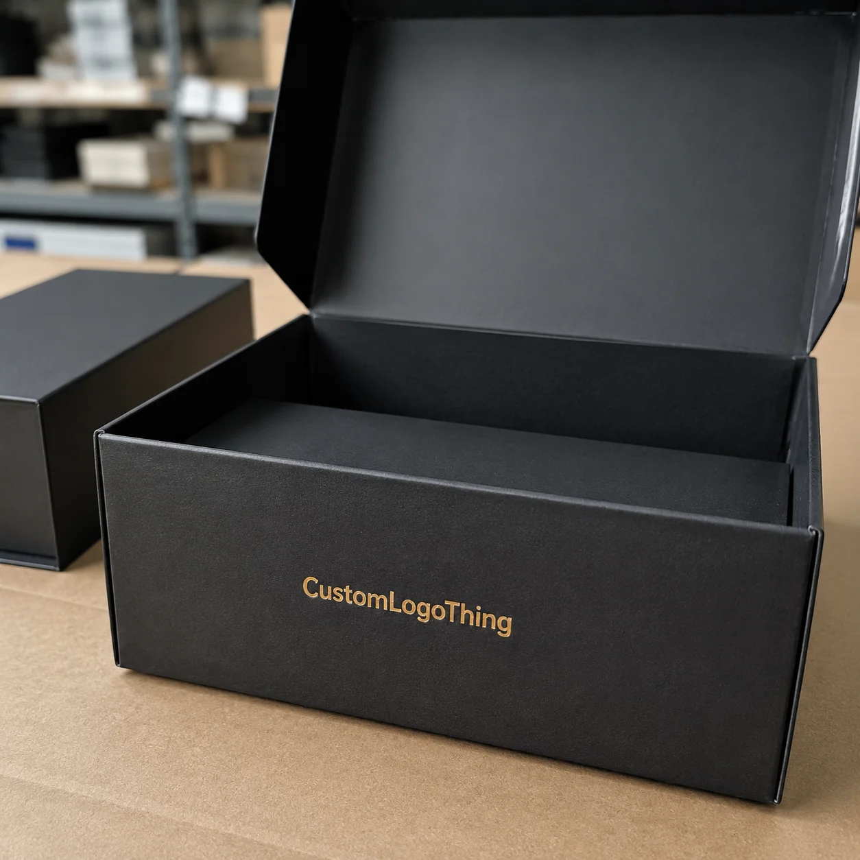
Fast answer: Printed Boxes Design for Better Packaging: Board, Finish, Dieline, and Unit Cost should be specified like a repeatable production item. The safest quote records material, print method, finish, artwork proof, packing count, and reorder notes in one written spec.
Production checks before approval
Compare the actual filled-product size with the drawing, then confirm tolerance on folds, seals, hang holes, label areas, and retail display edges. Reserve space for logos, QR codes, warning copy, and material claims before decorative graphics fill the panel.
Quote comparison points
Review material grade, print process, finish, sampling route, tooling charges, carton quantity, and freight assumptions side by side. A quote is only useful when the supplier can repeat the same color, closure quality, and packing count on the next order.
On a press floor in Dongguan, I once watched a carton that looked flawless on screen turn dull and crowded on the first print pass, all because the line weight was too fine and the logo sat too close to a fold. The job was a 4-color offset run on 350gsm C1S artboard, and the problem showed up immediately when the ink spread about 0.2 mm on the coated surface. That kind of headache is exactly why printed Boxes Design Tips matter so much: the design has to look good in a mockup, yes, but it also has to survive ink spread, score lines, glue tabs, and the reality of production. I still remember standing there with a cup of terrible machine coffee, staring at the proof and thinking, “Well, that escalated quickly.”
In my experience, the difference between a box that feels premium and one that feels cheap is often a matter of millimeters, not grand artistic vision. A 0.5 pt stroke, a 2 mm bleed, or a barcode placed 8 mm too close to a seam can decide whether the finished carton lands in the “clean and confident” pile or the scrap bin. On a 250-piece short run, even a 1 mm shift can be visible under a fluorescent inspection lamp at the plant in Shenzhen, and that alone can change the approval outcome. Good printed Boxes Design Tips start with that reality, and honestly, that’s the part people usually discover the hard way.
Custom packaging is one of those areas where branding and manufacturing are welded together. If you want a box that sells, protects, and prints well, you need a design that respects both marketing goals and factory limits. That’s what this piece is about: practical printed Boxes Design Tips built from years on the shop floor, client approvals, and more than a few late-night file fixes. I’ve had plenty of nights where one missing bleed line turned a calm project into a small crisis, and on a 10,000-piece order that can mean a $180 reproof fee plus three lost days, which is not my favorite hobby, if I’m being honest.
What Printed Boxes Design Really Means
Printed boxes design is not just “making a box look nice.” It is the blend of structural packaging design, brand graphics, print specifications, board selection, and finishing choices that turn plain paperboard or corrugated stock into a sales tool. The best printed boxes design tips always start here, because the box is doing several jobs at once: it carries the product, communicates the brand, supports retail compliance, and creates shelf impact in a few seconds of attention. On a crowded shelf in Los Angeles or Manchester, that attention window can be under 3 seconds, which is a lot for one little rectangle to handle, poor thing.
I’ve stood beside a litho-lam press in Ningbo where a beautiful gradient looked silky on the designer’s screen but broke into bands on the sheet because the artwork was too close to the press’s practical ink limit. The run was scheduled for 8,000 folding cartons, and the correction required a new plate set at roughly $220 per plate on top of a 2-day delay. That’s a classic example of why printed boxes design tips need to be grounded in production, not just aesthetics. A design that ignores the dieline, the glue area, or the direction of corrugation will usually cost more to print and look less polished. And yes, the machine operator will probably give you the look that says, “Who approved this?”
Designing for appearance is one thing; designing for production is another. When a carton folds, every panel interacts with the next one, and the artwork must respect that geometry. Score lines can distort thin text by 0.5 mm or more on long runs, glue flaps can hide important copy, and on corrugated cartons the flute direction can make a fine pattern look wavy on B-flute or E-flute stock. These are not minor issues; they are the mechanics that separate a strong packaging program from a frustrating one. Good printed boxes design tips account for all of them before a file ever reaches prepress in Dongguan, Foshan, or Ho Chi Minh City.
Think of the printed box as a communication surface. One panel may carry the logo and product promise, another may hold ingredients, warnings, or QR codes, and a side panel may reinforce brand story or a key benefit claim. On a 200 mm x 120 mm carton, that layout has to be deliberate because every millimeter counts once the carton is folded and glued. The box is not only a container; it is a structured message system. That is why printed boxes design tips should cover hierarchy, readability, legal copy, and shelf visibility, not just color and style. Honestly, if the front panel can’t do its job in three seconds, no amount of fancy foil will save it.
Behind the scenes, common factory steps also shape the result. Prepress proofing checks overprint and bleed, plate making at the Shenzhen plant can slightly alter fine detail, and ink matching affects brand consistency from one run to the next. Finishing changes touch, sheen, and even perceived color, especially on matte aqueous coating or 18-micron soft-touch lamination. I still remember a cosmetics client who insisted on a dark navy with spot UV on the logo; the first hard proof looked almost black under fluorescent light, so we adjusted the ink build and saved a 6,000-piece run from a costly reprint. That kind of adjustment is part of real printed boxes design tips, not an exception. Related terms like packaging printing, dieline setup, and finishing options matter here because the artwork never lives alone; it always passes through a real production chain.
How Printed Boxes Design Works in Production
The production path matters because every stage can influence the final carton. A clean workflow usually starts with a product brief, then dieline setup, artwork creation, prepress checks, proofing, printing, die cutting, folding, gluing, and final inspection. At a typical carton factory in Dongguan, that full cycle often takes 12-15 business days from proof approval for standard offset folding boxes, while digital prototype jobs can move in 3-5 business days if the artwork is already clean. If one step is rushed, the rest of the chain feels it. I’ve seen projects where a 10-minute dieline review prevented a $1,400 plate remake, which is why printed boxes design tips should always include a production sequence, not just a creative one. It’s not glamorous, but neither is paying for avoidable rework.
Different print methods change the design rules. Offset lithography gives crisp detail and smooth solids, which is why it’s often favored for premium folding cartons and retail packaging in markets like Guangzhou and Suzhou. Flexography is common on corrugated boxes because it runs efficiently on kraft liners and larger volumes, though fine detail can be less forgiving on rougher paper surfaces. Digital printing is excellent for shorter runs, prototypes, seasonal launches, and quick market tests because it avoids plate setup and can shorten lead time by 4-7 business days. Smart printed boxes design tips take the print method into account before the artwork gets too complex.
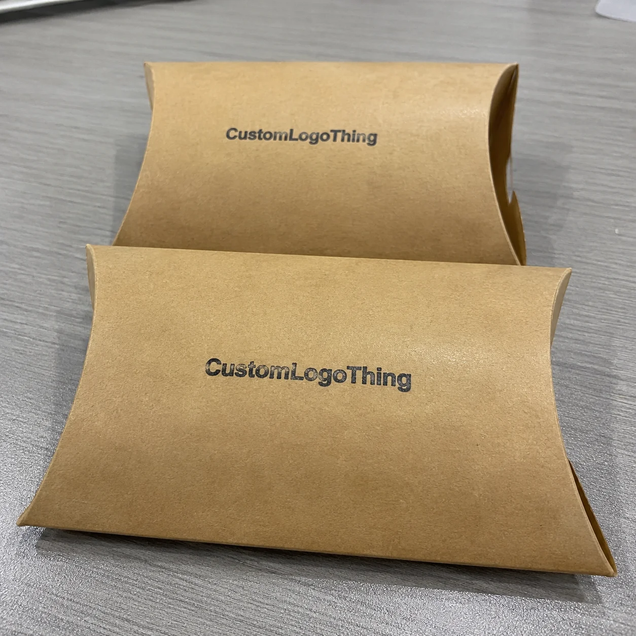
Material choice also changes everything. SBS paperboard, often in the 300-400 gsm range, usually gives a clean print surface for cosmetics, supplements, and consumer goods, while 350gsm C1S artboard is a common choice for premium folding cartons that need sharp detail on one side and a clean interior on the other. E-flute corrugated can be a strong choice for mailers, with a smoother face than B-flute and a good balance of strength and printability. Kraft paper carries a natural, earthy look but shifts color differently than coated stock, often warming blues and muting dark reds by a small but visible margin. Specialty papers with aqueous coating, matte lamination, or soft-touch film can feel more upscale, yet they may require different ink handling. That is why printed boxes design tips must be tied to substrate selection from the start, and why terms like corrugated board, paperboard, and custom packaging are not interchangeable in production conversations.
File preparation is where many projects either stay smooth or get messy. CMYK is fine for many designs, but if a brand color has to be exact, a PMS spot color often gives better consistency. Safe zones should usually stay at least 3-5 mm inside the trim line, while bleed should extend 2-3 mm beyond it, depending on the manufacturer’s spec in Dongguan, Xiamen, or Shenzhen. Text should be outlined or packaged correctly, images should generally be 300 dpi at final size for offset work, and overprint settings should be checked carefully so white text does not disappear on press. These are not abstract rules; they are some of the most practical printed boxes design tips I can give, especially when a client says, “It looked fine on my laptop.”
Proofing is where a lot of confidence gets built. A screen mockup can lie, especially under backlit office monitors in New York or Singapore. A hardcopy proof, a white sample, or a press sheet tells a more honest story. I once had a food brand approve a warm tan on screen, only to see it dry down cooler on uncoated stock from a mill in Guangdong, which changed the whole feel of the package. That’s why I tell clients that printed boxes design tips are incomplete without sampling and proof comparison.
For more technical packaging references and industry resources, I often point teams to The Packaging School and packaging industry resources and ISTA testing standards. If the box will ship through rough handling, transport tests matter just as much as the artwork, and an ISTA 3A or 6A test can reveal corner crush issues before a 5,000-piece shipment leaves port. I’ve seen boxes survive a gorgeous approval only to get crushed in transit because nobody checked the distribution route from Shenzhen to Chicago, which, yes, is as annoying as it sounds.
Key Factors That Shape Strong Printed Boxes Design
Brand hierarchy is usually the first thing I check. If the logo is too small, the product name is too clever, or the value proposition hides behind decorative graphics, the box loses its job on the shelf. A shopper standing three to six feet away in a retail aisle should be able to read the main message without squinting, and that’s one of the most practical printed boxes design tips anyone can use. Contrast, type size, and focal point matter more than flashy decoration, even if the mood board insists otherwise.
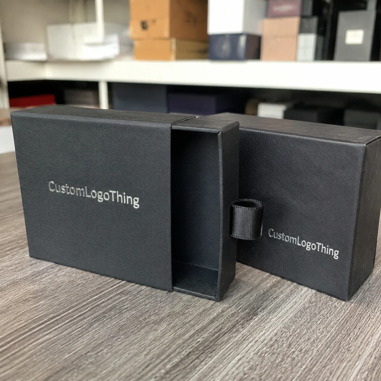
Structural compatibility comes next. A tuck-end folding carton gives you different panel options than a rigid mailer or a display box with a tear-away front. A lid-and-base style may allow a more elegant opening experience, while a shipper box needs graphics that still look orderly after tape and transit labels are added in a warehouse in Dallas or Rotterdam. I’ve seen a subscription client redesign their entire layout after realizing the seam ran straight through the logo, and that single adjustment made the box feel ten times cleaner. That is exactly the kind of issue covered by strong printed boxes design tips.
Cost is another major factor, and it should be discussed openly. More ink colors usually mean more setup and higher unit cost, and specialty finishes, custom die cuts, and heavier board grades can move the budget quickly. For example, a simple 1-color flexo mailer might sit near $0.15 per unit at 5,000 pieces from a plant in Shenzhen, while a 4-color litho-laminated retail carton with foil and embossing can climb above $0.82 per unit at the same quantity depending on board, size, and location. Those numbers are not universal, but they show why printed boxes design tips must include price awareness, not just style advice. Budget surprises have a funny way of showing up right after everyone falls in love with spot UV.
Here is a simple way I explain print feature tradeoffs to clients:
| Option | Typical Use | Cost Impact | Design Impact |
|---|---|---|---|
| CMYK offset print | Retail cartons, premium folding boxes | Moderate setup, efficient at scale | Fine detail, smooth images, rich color |
| Flexographic print | Corrugated mailers, shipping cartons | Lower cost on larger runs | Bolder graphics, fewer fine lines |
| Digital print | Short runs, prototypes, fast launches | Lower setup, higher unit price on large runs | Fast changes, variable data, quick proofs |
| Foil, emboss, spot UV | Premium branding accents | Raises tooling and labor cost | Strong tactile and visual emphasis |
Finish choices can elevate a design, but they can also stretch the timeline. A matte aqueous coating may add a clean, soft look and protect the surface without much drama, usually adding 1 extra production day on a standard 8,000-piece carton run. Soft-touch lamination feels upscale, though it can show scuffs differently in transit between Guangdong and the U.S. west coast. Foil stamping and embossing make sense when the logo needs a strong premium cue, but they add tooling steps and more quality checks. One of the most honest printed boxes design tips I share is this: use finishes where they strengthen the hierarchy, not where they merely fill space. If a finish is only there because someone said “we should probably add something,” I get nervous.
Sustainability and compliance matter more every year. FSC-certified paperboard, recyclable coatings, minimal-ink design strategies, and right-sized box structures can all reduce waste or improve a brand’s environmental story. For official guidance on recycled content, packaging waste, and related environmental topics, I also recommend the U.S. Environmental Protection Agency. If your package includes claims, nutrition panels, warning statements, or barcodes, those elements need to be placed carefully and reviewed for readability. In practice, some of the strongest printed boxes design tips are the simplest: keep the message clear, the structure logical, and the compliance copy easy to scan.
At Custom Packaging Products, I usually advise customers to think about their box as a blend of brand asset and production asset. If one side wins but the other fails, the project is incomplete. A box that looks stunning but falls apart in the line doesn’t get to brag on shelf, whether it was made in Dongguan, Mexico City, or a small facility outside Ho Chi Minh City.
Step-by-Step Printed Boxes Design Tips
The best projects start with a tight design brief. Before anyone opens Illustrator or ArtiosCAD, I want the team to know the product dimensions, fill weight, target customer, sales channel, packaging budget, and performance needs. A box for a 120 g cosmetic jar is not the same as a box for a 2 lb supplement bottle or a mailer shipping spare parts across zones, and the difference can change board selection by 1 or 2 grades. Clear inputs create better outputs, and that is one of the foundational printed boxes design tips that saves time later. I’ve watched teams skip this part and then act surprised when the box doesn’t fit the product, which is a remarkable way to make everyone tired.
Build the dieline first, then design to it. That sounds basic, but I still see artwork built on a pretty mockup without understanding where the folds, seams, and glue tabs land. If the barcode straddles a score line, the scanner may struggle. If a face image crosses a flap, the visual breaks when the box closes. If the dieline does not include the correct bleed and safe area, trimming can nick important copy. Honestly, this is one of the most repeated printed boxes design tips I give, because it prevents the most expensive mistakes.
Color strategy should be decided early, especially if brand-critical hues are involved. A deep red logo can drift under CMYK, and a light metallic blue may not reproduce consistently on uncoated stock. If the color has to stay exact, a PMS match or a controlled ink drawdown is often the safer route. I once worked with a tea brand that insisted on a very specific green, and we ran three samples before settling on the one that held best on 350 gsm C1S artboard with a matte aqueous coat at a factory in Guangzhou. That kind of practical color work is part of the best printed boxes design tips, not an afterthought.
Copy should read like packaging copy, not a landing page. That means short, useful phrases, a clear product promise, and claims that can be supported. The front panel should carry the main message, while side panels can handle instructions, ingredients, sustainability notes, or a brand story. If the box must include regulatory copy, make sure the type size remains readable after print and finishing, especially on cartons under 180 mm wide where panel space disappears fast. I’ve seen many boxes where good design was buried under too much text, and that’s a failure of prioritization, not of creativity. Strong printed boxes design tips help the package say less, but say it better.
Proofing should happen in layers. First, check the digital mockup for layout and hierarchy. Second, review a hardcopy proof or white sample for size, folds, and type legibility. Third, if the project is high value or color sensitive, ask for press approval. Colors can shift once ink hits a coated sheet or a kraft liner, and a sample on screen cannot fully predict that. Many of the best printed boxes design tips come from patience here: a slow approval now can save a reprint later. I know “slow” sounds boring, but it beats panic every single time.
Finish strong with production checks. Confirm that all linked images are embedded or packaged, the dieline aligns correctly, the bleed extends to the trim edge, the safe zone stays protected, and the barcode scans under standard lighting. Export files according to the printer’s preferred spec, whether that means PDF/X-1a, PDF/X-4, or a press-ready AI package with outlines, usually submitted 24-48 hours before prepress lock on a tight schedule. I’ve watched a 30-minute export review prevent a 4,000-piece delay, and that is why I keep returning to the same core printed boxes design tips: the final file is a manufacturing document, not just artwork.
- Confirm dimensions before any layout work.
- Pick the print method that matches the run size and finish level.
- Lock the color strategy with PMS or CMYK intent.
- Set safe zones and bleed using the factory’s dieline spec.
- Review proofs physically, not only on a screen.
Common Printed Boxes Design Mistakes to Avoid
The most common mistake is designing a box as if it were a flat billboard. Once the carton folds, key text can disappear over a seam or split across panels in a way that feels awkward. On a mailer, a centered graphic may vanish where the flap tucks in. On a folding carton, a headline can get cut by the top dust flap. Good printed boxes design tips always account for the shape of the final package, not just the front view.
Too many fonts, colors, and effects can also weaken a package fast. I’ve seen brands use three type families, a metallic gradient, spot UV, and foil all on one small box, and the result looked busy rather than premium. A cleaner hierarchy almost always prints better and feels more intentional, especially on a 220 mm x 160 mm retail carton where the eye has no room to rest. If you want memorable packaging, choose one or two dominant cues and let the rest support them. That is a quieter but smarter application of printed boxes design tips.
Low-resolution artwork causes another layer of trouble. A logo pulled from a website may look fine on a laptop but become jagged or fuzzy at print size. Thin reverse text can fill in on uncoated board. Rich black set incorrectly can print muddy, especially on textured kraft or heavy corrugation. If you’ve ever seen a dark panel print gray-brown instead of black on a run in Ho Chi Minh City, you know exactly how fast quality can slip. This is why technical printed boxes design tips matter as much as the visual ones.
Manufacturing tolerances are easy to ignore until the boxes arrive. Score shift, wraparound on curved or rigid structures, and minor panel variation on large runs can all affect alignment. A 1 mm drift may sound tiny, but on a tight design with fine borders, it stands out immediately. I remember a client in the personal care space who wanted hairline borders around every panel; after one sample, we widened the borders by 1.5 mm and the whole pack looked steadier. That’s one of those quiet printed boxes design tips learned only after you’ve seen enough boxes run.
Last-minute revisions are the hidden budget killer. A changed logo, a revised ingredient list, or a shifted barcode can mean new plates, new proofs, and new shipping dates. Even on digital jobs, late edits can mean rework and extra inspection. Design teams sometimes assume the factory can “just update it,” but plates, cutters, and approval cycles don’t work that way, especially when production is scheduled at 9:00 a.m. the next day in Dongguan. Among all the printed boxes design tips I’ve collected, this one probably saves the most money: lock the artwork before production begins. Otherwise you end up paying for a very expensive version of “almost done.”
“The box looked expensive on screen, but we fixed it on press by removing one color, moving the logo 4 mm, and widening the type. After that, the whole thing finally felt calm.” — a brand manager I worked with on a specialty food launch
Expert Printed Boxes Design Tips from the Shop Floor
Design for the print method you will actually use, not the one that looks most impressive in a mood board. That sounds blunt, but it is the truth I’ve learned across flexo lines, offset plants, and short-run digital rooms in Shenzhen, Dongguan, and Suzhou. A beautiful design that ignores the machine’s realities will always be more expensive than a slightly simpler design that runs cleanly. That is one of my most practical printed boxes design tips: start with the press, not just the concept board. Mood boards are lovely, but they don’t stack pallets.
Use one strong focal point on the front panel, then let side panels do supporting work. The front panel should carry the product name, brand mark, and a single clear benefit. The sides can carry usage instructions, icons, or a compact brand story. If the box opens with an interior print or a hidden message, that can create a stronger unboxing moment without cluttering the outside. I’ve seen a simple black-and-white mailer outperform a heavily decorated one because the inside reveal was done thoughtfully on a 1,000-piece launch for a skincare brand. That’s the kind of layered thinking behind effective printed boxes design tips.
Test color on the actual board whenever you can. White paperboard, kraft liner, and coated SBS all behave differently. Kraft can warm up a blue. Uncoated paper can mute contrast. A matte film can deepen color, while gloss can brighten it. Those shifts are normal, but they need to be anticipated. If a brand is serious about color consistency, I recommend a sample on the chosen stock before full production, even if it adds 1-2 days to the schedule. In my view, this is one of the smartest printed boxes design tips for premium work.
Build extra time for prepress review. A fifteen-minute file check can catch a hidden transparency issue, a missing link, or a barcode that is too close to the edge. I’ve been in meetings where a rushed approval created a reprint, and the cost of that mistake was far higher than the cost of a slower review. On a 12,000-piece carton order, one overlooked overprint issue can cost $300-$600 to correct after plates are made. Honestly, the best printed boxes design tips are often about patience and discipline, not artistic flair. Nobody posts about the hours spent checking overprint settings, but those hours save the day.
Keep finishes intentional. A matte base with selective gloss on the logo can be elegant. A foil accent on a signature mark can feel premium without overwhelming the surface. Embossing on a small badge can add touch and depth. But when every surface is trying to shout, the package stops feeling refined. There’s a reason many top brands rely on restraint; they know that selective finish use is one of the most effective printed boxes design tips for creating value without visual noise.
Here’s a simple checklist I use before approving a design file:
- Front panel message readable at arm’s length.
- Dieline verified against the production spec.
- Barcode placed away from folds and glue.
- Images at final print resolution.
- Spot colors confirmed or converted intentionally.
- Finish notes called out clearly for production.
For brands that are building a packaging line from scratch, it also helps to browse a supplier’s catalog of structural and branded options. You can compare carton styles, insert options, and finishing combinations through Custom Packaging Products, which often makes the design conversation more concrete than talking about visuals alone. A single sample pack from a factory in Guangdong or Jiangsu can clarify what a spreadsheet never will.
What are the best printed boxes design tips for approval?
The best approval-ready printed boxes design tips begin with one question: what will the carton need to do in the factory, in transit, and on the shelf? If the answer is clear, the rest of the work gets easier. A box that looks polished in a presentation file may still fail if the barcode crosses a fold, the logo sits too near a seam, or the finish callout is vague. Approval gets smoother when the design team thinks like prepress, not just like marketing.
For the actual approval cycle, I prefer a three-step review. First, confirm structure and dimension against the dieline. Second, check typography, color, and legal copy on a proof that has been folded or mocked up. Third, if the project is high value, request a press sheet or physical sample for sign-off. That sequence catches more problems than a fast email approval ever will. Among all the printed boxes design tips I’ve seen save projects, physical review is one of the most reliable.
It also helps to assign one decision-maker. A packaging file can get stuck if five people are debating the shade of blue or whether the QR code should move 2 mm left. Clear ownership keeps the timeline moving and gives the factory a single source of truth. If you are working with a printer in Shenzhen, Dongguan, or Guangzhou, a single finalized marked-up proof is far more useful than a long thread of contradictory comments. That is one of those unglamorous but powerful printed boxes design tips that makes approvals feel less like a traffic jam.
Finally, make room for one production reality check: ask the factory what they need to lock plates, cutters, and finishing tools. If the team can tell you the exact cutoff for revisions, you can avoid the expensive habit of “one more tiny change.” That habit is how otherwise solid designs get delayed, reproofed, and overcomplicated. Approval is not just about liking the look; it is about confirming the design is ready to become a real carton.
Next Steps for Better Printed Boxes Design
If you want better packaging, start with the basics: product dimensions, budget, audience, print method, and material. Once those are fixed, the artwork can serve the packaging instead of fighting it. That is the cleanest way I know to apply printed boxes design tips without wasting time or money. It also keeps the whole project from turning into a trail of expensive opinions.
Ask for a sample, and compare it under both natural light and indoor light. A box that looks rich in daylight may look dull under warm LEDs, and some coatings react more visibly than others. Check the barcode with an actual scanner, fold the carton fully, and verify that side-panel copy still reads clearly after the box is assembled. These are small actions, but they catch big problems. The best printed boxes design tips are practical enough to use on the shop floor, not just in a design studio.
Build a simple decision checklist for every project: what the box is supposed to do, who will buy it, how it will ship, what finish it needs, and how fast it must be produced. If sustainability matters, choose FSC-certified board, right-size the structure, and avoid decoration that serves no purpose. If budget matters, simplify the color count and reserve premium finishes for the areas that will actually be seen and touched. That kind of discipline is what turns generic packaging into a more effective brand asset, and it keeps your printed boxes design tips useful across product lines.
Collaborate early with packaging engineers, printers, and prepress staff. In my experience, the strongest projects are the ones where design and production talk before artwork is final. A 6 mm shift in panel width, a different board grade, or a change in print process can improve cost and consistency without hurting the brand. That is the real heart of printed boxes design tips: making sure the final carton works as hard as the product inside it. I’d rather solve that on paper than at 2 a.m. on a deadline call, and I suspect you would too.
From the customer’s point of view, the box should feel obvious, clear, and trustworthy. If the front panel says the right thing fast, if the structure opens cleanly, and if the finish matches the price point, the packaging has done its job well. Keep applying printed boxes design tips consistently across your folding cartons, mailers, display boxes, and shipping cartons, and the whole brand starts to feel more controlled and more valuable, whether the Boxes Are Made in Dongguan, Newark, or a regional facility outside Melbourne.
FAQ
What are the most important printed boxes design tips for small brands?
For smaller brands, I’d focus on three things first: clear branding, strong contrast, and one primary message on the front panel. Keep the layout simple enough to print consistently on shorter runs, and choose a board and finish that match the price point of the product, whether that’s a 300 gsm SBS folding carton or a kraft mailer with a matte aqueous coat. In many factories in Shenzhen or Ningbo, a short run of 500-1,000 pieces can still be very cost-effective if the artwork is clean and the dieline is correct. The smartest printed boxes design tips for small businesses usually come down to clarity and discipline, not expensive effects. Fancy finishes are nice, but a readable box that arrives on time is nicer.
How do printed boxes design tips change for corrugated boxes?
Corrugated boxes need bolder type, stronger graphics, and layouts that respect flute direction, score lines, and shipping wear. Tiny details can disappear on rougher board surfaces, especially if the print method is flexography on kraft liner or E-flute stock from a mill in Guangdong. When I’m reviewing corrugated projects, I tell clients to simplify the artwork, keep reverse text heavier, and avoid delicate borders. Those are essential printed boxes design tips for mailers and shipping cartons. Corrugated is not the place to be precious.
What should I know about pricing when following printed boxes design tips?
Pricing usually rises as you add more ink colors, specialty finishes, complex die cuts, and higher board grades. Larger runs can lower unit cost, but setup, proofing, and shipping still affect the total budget. A simplified design can save money without looking cheap if the hierarchy is strong and the print quality is clean. For example, a 5,000-piece order of a basic 1-color mailer might land around $0.15-$0.20 per unit, while a premium 4-color carton with foil and embossing can move well above $0.80 per unit. In practice, the best printed boxes design tips for cost control are often about reducing unnecessary complexity. I’ve seen a single removed foil pass save more money than three rounds of anxious spreadsheet debate.
How long does the printed boxes design and production process usually take?
The timeline depends on how ready the artwork is, how quickly proofs are approved, what print method is used, and whether finishes like foil or embossing are involved. A digital prototype might move in 3-5 business days, while a custom die-cut retail carton with coating and special finishes can take 12-15 business days from proof approval at a factory in Dongguan or Shenzhen. Clean files and fast approvals usually matter more than almost anything else. That’s one of the most practical printed boxes design tips I can offer for planning lead time.
What files do I need to start a printed boxes design project?
Start with a proper dieline, editable artwork, linked images, brand color references or Pantone values, copy, barcode data, and any finish notes. It also helps to include the product dimensions, fill weight, and packaging purpose so the factory can check feasibility early. The more production-ready your file package is, the fewer revisions you’ll face later. That’s a core part of good printed boxes design tips and one of the best ways to avoid delays. If you hand over a file with missing links and “final_v7_realfinal.ai,” you’re basically inviting trouble.
Final thought: the strongest packaging I’ve seen never relied on decoration alone. It used clear structure, smart print choices, the right board, and a layout that respected the machine as much as the brand. Keep testing your files on the actual stock, lock the dieline before artwork gets fancy, and confirm every print and finish choice against the way the box will really be made. That’s the practical takeaway behind printed boxes design tips: design for the shelf, yes, but build for the press first.