Buyer Fit Snapshot
| Best fit | Printed Boxes Design for Better Packaging Results projects where brand print, material claims, artwork control, MOQ, and repeat-order consistency need to be specified before quoting. |
|---|---|
| Quote inputs | Share finished size, material target, print colors, finish, packing count, annual reorder estimate, ship-to region, and any compliance wording. |
| Proofing check | Approve dieline scale, logo placement, barcode or warning zones, color tolerance, closure strength, and carton packing before bulk production. |
| Main risk | Vague material claims, crowded artwork, missing packing details, or unclear freight terms can make a low unit price expensive after revisions. |
Fast answer: Printed Boxes Design for Better Packaging Results: Board, Finish, Dieline, and Unit Cost should be specified like a repeatable production item. The safest quote records material, print method, finish, artwork proof, packing count, and reorder notes in one written spec.
Production checks before approval
Compare the actual filled-product size with the drawing, then confirm tolerance on folds, seals, hang holes, label areas, and retail display edges. Reserve space for logos, QR codes, warning copy, and material claims before decorative graphics fill the panel.
Quote comparison points
Review material grade, print process, finish, sampling route, tooling charges, carton quantity, and freight assumptions side by side. A quote is only useful when the supplier can repeat the same color, closure quality, and packing count on the next order.
Printed Boxes Design Tips matter because a carton can look polished on a monitor and still fall apart once the dieline brings folds, glue areas, and tight panel tolerances into the picture. In packaging, the box is never only decoration; it carries branding, protects the product, and serves as a production file that has to survive prepress, printing, die cutting, folding, and transit. If you are comparing structures or browsing Custom Packaging Products, the smartest move is to shape the box around the real product first and the artwork second.
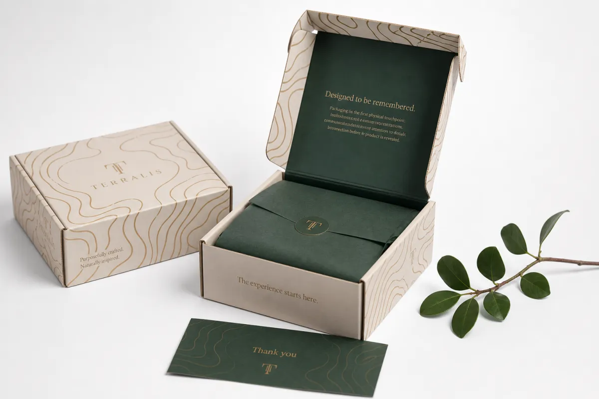
The unboxing moment sets expectations before the customer ever touches the item. A clean opening panel, readable copy, and a finish that fits the price point tell the buyer what to expect, while a cramped layout or a weak material choice tells operations where trouble may show up later. Good printed boxes design tips help both sides at once, which is why the strongest packaging work feels calm, deliberate, and easy to assemble even before it looks impressive.
Printed Boxes Design Tips: Start with the Unboxing Moment
Most packaging problems begin with a simple mistake: the design team imagines a flat rectangle instead of a real box. One of the most practical printed boxes design tips is to think about the unboxing moment before you think about the artwork treatment. A screen mockup can hide a lot, but once the box is folded, the front panel may shrink, the top flap may steal space, and a glue seam may land exactly where a logo was supposed to breathe.
That is why printed boxes sit at the intersection of branding, protection, and production planning. A good carton protects the product from scuffing, compression, and handling, while it also carries the brand story in the first few seconds of contact. From a buyer's point of view, the box has to do three jobs at once: sell the item, survive the supply chain, and make packing easier for the people on the line. Those are not separate goals. They all shape the same design file, and the strongest printed boxes design tips respect that reality.
The unboxing sequence matters more than many teams expect. The outer face creates the first impression, the opening flap builds anticipation, and the inside print can either reinforce the brand or make the package feel generic. If the product is premium, the box should feel intentional in hand, with enough structural stiffness, close registration, and a finish that does not look cheap under retail lighting. If the item is a lower-cost subscription product, the packaging still needs clarity, but the design can stay simpler and spend less on ornament.
Here is the early mistake I see most often: teams design graphics before confirming the exact box style, panel sizes, and product fit. A tuck-end carton, a mailer box, and a rigid setup box do not offer the same visual map. The front panel may be small on one style and generous on another. The side panels may be hidden in a retail display or highly visible in e-commerce. Those differences change layout, hierarchy, and print coverage, which is why printed boxes design tips always begin with structure, not decoration.
"The box does not fail on the screen. It fails where folds, glue, ink, and handling meet."
That sentence sounds simple, but it captures the whole job. Good printed boxes design tips help a brand avoid the gap between concept and manufacturing, and they do it by asking practical questions early: How is the box opened? What does the customer see first? Where will the barcode live? Which face needs the strongest branding? Once those answers are clear, the design can support the product instead of fighting it.
Printed Boxes Design Tips in the Production Process
Packaging moves through a chain of decisions, and the earlier the right ones are made, the fewer expensive surprises show up later. The production path usually starts with a brief, then a dieline, then artwork setup, proofing, printing, finishing, cutting, folding, and final assembly. Good printed boxes design tips are useful because they reduce friction at every stage. A clean file with the right measurements and layer setup can save days of back-and-forth, while a rushed file can create color drift, misaligned panels, or a rejected proof.
The handoff between design and manufacturing is where many delays begin. A supplier usually needs final dimensions, board grade, print method, finish choice, ink requirements, and any compliance text before a job can be released. If the carton will carry a UPC, lot code, ingredient statement, or warning copy, that content should be confirmed before prepress starts. It is much easier to correct a paragraph in the artwork file than to fix it after plates, dies, or samples have already been produced. This is one of the most practical printed boxes design tips for keeping lead times under control.
Proofing matters because the eye does not judge packaging the same way a print file does. Digital proofs catch layout, spelling, and panel placement, but they can miss subtle color behavior or finish issues. Physical samples add another layer of confidence, especially for launch-critical packaging, where a different paper shade or a stronger fold line can change how the whole box feels. In practice, I tell buyers to treat the proof stage as a design checkpoint, not a formality.
For shipping performance, many teams reference ISTA test methods such as 3A or 2A, and the standards are outlined by ISTA. That matters because a beautiful box that collapses in transit is not good packaging. It is just expensive waste. If sustainability documentation matters, FSC-certified board from FSC can support sourcing claims, but only if the material and chain-of-custody paperwork are correct. Printed boxes design tips are not only visual; they also protect the practical side of the job.
A typical timing flow often looks like this:
- Artwork revision and dieline alignment: 1-3 business days for a clean file, longer if dimensions are still changing.
- Digital proof approval: 1-2 business days once the layout is settled.
- Physical sample or prototype: often 5-10 business days depending on structure and finishing.
- Production run: frequently 10-15 business days after proof approval for standard carton work, more for complex finishes or rigid builds.
- Transit and receiving: 2-7 business days depending on location and shipping method.
If the timeline feels tight, the safest move is not to rush the artwork. It is to simplify the box and tighten the decision list. That is one of the least glamorous but most valuable printed boxes design tips: fewer unknowns usually beat more ambition.
Key Factors That Shape Printed Box Design
Material choice is not an afterthought. It controls how ink sits, how the box folds, how strong the structure feels, and how premium the final package looks in a customer's hands. One of the most useful printed boxes design tips is to match the substrate to the job instead of forcing one style to do everything. SBS board, kraft board, corrugated, and rigid chipboard each behave differently, and the artwork should respect that behavior rather than fight it.
SBS, or solid bleached sulfate board, gives a smooth coated surface and usually supports crisp detail, solid coverage, and more predictable color. It is common for folding cartons that need a retail-ready finish. Kraft board has a natural brown tone and a more earthy look, but lighter colors often print darker or softer on it. Corrugated board is built for strength and shipping abuse, so the graphics often need more contrast and less fine detail. Rigid board adds stiffness and a premium feel, but the build cost rises because of the material and labor involved. Those differences are exactly why printed boxes design tips should always begin with stock selection.
Structure matters just as much. A tuck-end carton gives you a very different canvas than a sleeve, mailer box, or setup box. Mailers usually offer a larger exterior footprint and often become the hero of the unboxing experience. Folding cartons can be more compact, which means the front panel and side panels need a sharper hierarchy. Rigid boxes can carry magnetic closures, wrapped paper, inserts, and multiple print surfaces, but they also require more careful planning because the build is less forgiving.
Color behaves differently on each substrate. Coated board often holds brighter inks and cleaner gradients, while uncoated or kraft surfaces absorb more color and can mute delicate tones. A soft gray that looks elegant on screen may disappear on kraft. A small black type lockup that looks fine in a design file may lose contrast once it prints on a textured surface. That is why printed boxes design tips should include an early conversation about color expectations, not just the chosen palette.
Finishes add another layer of choice. Matte varnish can tone down glare and make the box feel more restrained. Gloss can heighten contrast and give graphics more pop. Foil adds metallic interest, embossing creates tactile depth, and spot UV can isolate a logo or pattern. None of these effects is automatically better. They should earn their place by supporting the product story and the budget. A small brand does not need every finishing trick on the market; it needs the right one, placed in the right spot.
Shipping conditions and handling count too. A box that moves through parcel networks needs stronger edges, clearer print placement, and better resistance to scuffing than a carton that sits only on a display shelf. Product weight, stacking pressure, and temperature changes can all influence how the printed finish holds up. Good printed boxes design tips keep the package honest about its job.
Step-by-Step Printed Boxes Design Tips for Artwork
Start with exact product measurements. Not estimates. Not a guessed size based on a competitor's box. Measure the product, the insert if there is one, and the clearance needed for easy loading. A carton that is too tight can damage the item or slow down packing, while a carton that is too loose can look cheap and create movement during shipment. Among all printed boxes design tips, this one saves the most time because the right size makes the rest of the design logic easier to solve.
Once the size is fixed, map the dieline panel by panel. Front, back, sides, top, bottom, and closures each need a defined visual role. The front panel should carry the primary brand message. The side panels can hold product details, imagery, or secondary branding. The back panel often works best for instructions, ingredients, story copy, or compliance text. Closures and tuck flaps should stay clean unless the brand specifically wants a reveal or a hidden message. Printed boxes design tips work better when every face of the box has a purpose.
Then set the technical guardrails. Bleed usually extends 0.125 in to 0.25 in beyond the trim line, depending on the printer's requirements. Safe zones should keep text and logos away from folds and edges, often at least 0.125 in to 0.1875 in inside the trim area. Critical elements such as barcodes, legal copy, and tiny reverse type need extra breathing room because a small shift can make them difficult to scan or read. A fold line is not a design edge. It is a high-risk zone, and one of the oldest printed boxes design tips is simply to respect it.
Hierarchy is what makes a box readable at a glance. A customer should know the brand, product type, and key claim without squinting. The packaging should not force the eye to hunt across six panels before finding the useful information. For a retail box, that may mean a strong front logo, a concise product descriptor, and one controlled accent graphic. For e-commerce, it may mean a clearer shipping-safe exterior and a more dramatic interior print because the customer sees the inside at opening time. Printed boxes design tips need to account for how the package will actually be seen, not just how it will look in a design presentation.
Before export, check image resolution, color mode, line weight, and font handling. Raster images should usually sit at 300 dpi at final size for clean print reproduction. Fonts should be outlined or embedded, depending on the workflow. Spot colors and special finishes should live on separate layers if the supplier asks for it. If the artwork includes thin rules or fine reversed text, verify that the smallest stroke will still survive print and die cutting. These details are not glamorous, but they are the kind that separate decent files from production-ready files.
One practical habit helps a lot: print the layout full size on paper and fold it by hand. This catches awkward panel flow, hidden copy, and visual imbalance faster than staring at a screen. It also makes it obvious when a logo is too close to a fold or a sentence runs into a tuck flap. Strong printed boxes design tips often look like simple old-fashioned discipline, and that is because they are.
Common Printed Boxes Design Mistakes to Avoid
The first mistake is designing without the final dieline. If the dieline changes after artwork is built, critical copy can shift onto folds, flaps, or glue areas. That can turn a polished design into a rework job very quickly. Good printed boxes design tips always insist on the approved structural file before the visual design is locked.
Another common problem is overcomplication. Busy graphics can look impressive in a presentation, but once they repeat across multiple panels or wrap around a compact carton, the box can start to feel crowded. Too many callouts, icons, gradients, and decorative elements compete with each other. A cleaner hierarchy often looks more expensive because the customer sees the brand faster. That does not mean the box should be plain; it means every mark should earn its place.
Poor contrast is another issue that shows up on press day. Tiny type, light gray text on a natural stock, or a logo placed over a highly active pattern can disappear under real lighting. This matters in retail, but it matters just as much in e-commerce, where the camera, the warehouse, and the customer can all view the box differently. Printed boxes design tips should account for the least forgiving viewing condition, not the best one.
Ignoring material behavior causes a lot of avoidable pain. Ink can crack at folds on heavy coverage areas. Registration can drift more visibly on textured stock. Kraft can shift the whole color mood darker than expected. Gloss can show scuffs that matte would hide. None of these are surprises if the team reviews material samples early, but they can look like disasters when the artwork was approved too quickly.
The final mistake is skipping a real sample check, especially for premium launches, seasonal packaging, or products with regulatory copy. A proof on a monitor is not the same as a box in hand. A physical prototype often reveals panel proportions, closure tension, and finish behavior that no file preview can show. This is one of the most expensive but important printed boxes design tips: if the package matters to the launch, make time for a sample.
Here is a grounded rule that saves budgets: if the design team has to explain the box for more than a minute, the box may not be doing enough visual work on its own. Packaging should be clear before it is clever. That is especially true for brands that want repeatable results across multiple SKUs.
Printed Boxes Design Tips for Cost, Quote, and MOQ
Packaging cost is shaped by more than size alone. Board grade, print method, finish count, structure complexity, quantity, and even the way the box is packed for shipment all push the price up or down. A simple folding carton with one or two colors will usually cost less than a rigid setup box with foil, embossing, and custom inserts. One of the most honest printed boxes design tips is to build the design with the cost model in mind, not after the quote arrives.
MOQ changes the picture quickly. Smaller runs often carry a higher per-box cost because setup fees, cutting tools, press setup, and proofing are spread across fewer units. A 500-piece run may look expensive next to a 5,000-piece run, but that is normal. If the brand needs to test the market first, the design should stay simple enough that revisions remain affordable. If the brand already knows the box will scale, there is more room to invest in finishes and structure.
Comparing quotes only works if the specs are truly the same. Two quotes can look similar on paper while hiding different board weights, different ink coverage allowances, different finish types, or different packaging tolerances. Ask for exact board grade, exact size, exact print count, and exact finishing method. If one quote includes a sample and another does not, they are not equivalent. Printed boxes design tips are as much about comparison discipline as they are about visual layout.
| Box style | Typical unit cost at 5,000 pcs | Best fit | Design notes |
|---|---|---|---|
| Folding carton | $0.18-$0.45 | Cosmetics, supplements, small retail goods | Needs tight panel control and clean fold-safe artwork |
| Mailer box | $0.35-$0.90 | E-commerce, subscription kits, gift sets | Offers strong outside branding and more interior print space |
| Corrugated shipper | $0.55-$1.40 | Shipping protection, heavier products, retail transit packs | Prioritize contrast, durability, and stack strength |
| Rigid setup box | $1.80-$4.50 | Luxury goods, premium gifts, limited editions | Higher labor and finish cost, but strong tactile value |
The biggest cost drivers are usually special coatings, multiple print passes, complex structures, oversized formats, and custom inserts. Foil and embossing are excellent tools when the brand story supports them, but they add tooling and labor. A large box also consumes more board and may increase freight cost because it takes up more volume. If the budget is tight, simplify the outside surfaces first, then keep one strong accent instead of three or four competing effects.
There are smart ways to save without cheapening the box. Standardize size families across product lines. Reduce full-coverage artwork where only one or two panels need strong branding. Use one high-quality finish rather than several small ones. Keep the dieline stable so the design can run again without extra file work. These printed boxes design tips help a team spend where it matters and cut where the customer is least likely to notice.
If you are still comparing structures, it can help to review a few packaging options side by side and match the box style to the product size, shipping method, and target margin. A little structure discipline at the start usually beats a discount that later forces a redesign. For buyers, that is often the real savings.
Expert Printed Boxes Design Tips and Next Steps
The best packaging projects begin with a checklist, not a mood board. Before artwork starts, confirm the product dimensions, target finish, shipping method, label requirements, approval chain, and quantity target. Those decisions give the design team a framework that supports the real job instead of guessing at it. One of the most dependable printed boxes design tips is to write those details down and treat them as production inputs, not optional notes.
Then ask for the tools that expose problems early: a dieline, a preflight review, and a sample or prototype. The dieline shows where the art can safely live. The preflight review catches font issues, image resolution problems, and layer mistakes. The sample shows the real box in your hand, where the panel sizes, stock feel, and opening behavior can all be judged properly. A good supplier will be used to this workflow, and it is the fastest path to fewer revisions.
Plan backward from the ship date. Count proofing time, revision time, production time, and transit time before the launch calendar gets crowded. If the product is tied to retail placement, influencer shipping, or a seasonal drop, buffer time matters even more because one late approval can compress the entire schedule. A buyer who respects the schedule usually gets better packaging decisions because the team is not trapped by urgency.
It also helps to keep marketing and operations in the same conversation. Marketing wants a package that looks memorable and on-brand. Operations wants a box that packs fast, ships safely, and does not create avoidable damage claims. The strongest printed boxes design tips sit at the intersection of those two needs. If the artwork is attractive but the box is hard to assemble, the design has missed part of its job. If the box is durable but generic, it has missed another part.
For brands working through a launch, the practical conclusion is simple: align artwork, structure, and budget before the first press run starts. That is where the best results usually come from. If you do that well, printed boxes design tips stop feeling like rules and start feeling like a reliable way to get the package right the first time. And that, honestly, is what most buyers want more than anything else.
What printed boxes design tips help a first run avoid reprints?
Lock the final dieline, exact dimensions, and panel layout before any artwork is approved. Use a digital proof or physical prototype to catch fold placement, barcode readability, and color problems early. For a first run, keep the structure simple enough that a correction is affordable if the design needs a small adjustment. Those printed boxes design tips protect both time and budget.
How do printed boxes design tips change for mailer boxes versus folding cartons?
Mailer boxes usually allow more exterior branding space and often give you a stronger unboxing surface, while folding cartons need tighter control around folds, tuck flaps, and closure zones. Folding cartons often demand more attention to safety text and product display panels. The printed boxes design tips stay the same in principle, but the structure changes where artwork can safely live.
Which printed boxes design tips improve color accuracy on kraft or corrugated stock?
Expect the natural stock color to influence how inks appear, especially with pale colors and fine gradients. Ask for a printed sample because kraft and corrugated surfaces can soften contrast more than coated board. Stronger color contrast and simpler palettes are usually safer choices, and they are some of the most practical printed boxes design tips for textured materials.
How do printed boxes design tips affect cost, MOQ, and turnaround?
More complex structures, special finishes, and oversized formats usually raise both unit cost and production time. Lower MOQ runs often cost more per box because setup costs are spread across fewer units. A simpler design can also speed approvals and reduce revisions, which is why printed boxes design tips often save money before production even begins.
What file setup is best when following printed boxes design tips?
Use the supplier's dieline file, keep artwork in the correct color mode, and set proper bleed and safe zones. Outline or embed fonts and verify that linked images are high resolution before export. Separate special finishes, spot colors, and dieline layers so the printer can review each element clearly. That file discipline is one of the quietest but strongest printed boxes design tips.
If you keep the box structure, artwork, and production plan aligned, printed boxes design tips turn into fewer surprises, better shelf appeal, and a packaging result that holds up from proof to shipping to the customer's hands. The most practical next step is simple: approve the dieline first, test one full-size sample by hand, and only then lock the artwork, because that sequence catches the problems that expensive reprints usually expose.


