Buyer Fit Snapshot
| Best fit | Printed Food Cartons Branding projects where brand print, material claims, artwork control, MOQ, and repeat-order consistency need to be specified before quoting. |
|---|---|
| Quote inputs | Share finished size, material target, print colors, finish, packing count, annual reorder estimate, ship-to region, and any compliance wording. |
| Proofing check | Approve dieline scale, logo placement, barcode or warning zones, color tolerance, closure strength, and carton packing before bulk production. |
| Main risk | Vague material claims, crowded artwork, missing packing details, or unclear freight terms can make a low unit price expensive after revisions. |
Fast answer: Printed Food Cartons Branding: How Packaging Builds Trust should be specified like a repeatable production item. The safest quote records material, print method, finish, artwork proof, packing count, and reorder notes in one written spec.
Production checks before approval
Compare the actual filled-product size with the drawing, then confirm tolerance on folds, seals, hang holes, label areas, and retail display edges. Reserve space for logos, QR codes, warning copy, and material claims before decorative graphics fill the panel.
Quote comparison points
Review material grade, print process, finish, sampling route, tooling charges, carton quantity, and freight assumptions side by side. A quote is only useful when the supplier can repeat the same color, closure quality, and packing count on the next order.
Printed Food Cartons Branding: How Packaging Builds Trust
Printed food cartons branding often does the selling before the food is even tasted, because the carton is usually the first brand touchpoint in a crowded cooler, on a counter, or inside a delivery bag. From a packaging buyer's point of view, that first impression carries more weight than people expect. A plain carton can make a premium product feel forgettable, while a thoughtful carton can make a simple menu item feel considered, consistent, and worth a second look. That is why printed food cartons branding is never just about placing a logo on board stock; it is about shaping customer perception, signaling freshness, and reinforcing brand identity in a format that gets handled, stacked, and judged in seconds.
The carton has to do two jobs at once. It needs to carry visual branding with enough clarity to build recognition, and it needs to survive real use without losing legibility. Grease, condensation, freezer moisture, refrigerated displays, courier handling, and tight stacking all put pressure on the package. If the graphics scuff, the color shifts, or the copy disappears in a seam or fold, credibility drops fast. Strong printed food cartons branding respects that reality, which is why the best projects always balance design with production method, substrate choice, and finishing decisions.
For food brands, the carton also becomes part of the unboxing experience, even when the customer is simply opening lunch or tearing into a bakery order. The package may be the only branded surface the customer remembers after the meal is gone. That gives printed food cartons branding a real job to do, and it deserves the same care as a menu, a website, or a storefront sign. If you want examples of how packaging choices influence the final result, our Case Studies page shows a range of formats, and our Custom Labels & Tags page is useful when cartons need supporting packaging assets for consistency.
Printed Food Cartons Branding: Why It Catches Eyes Fast
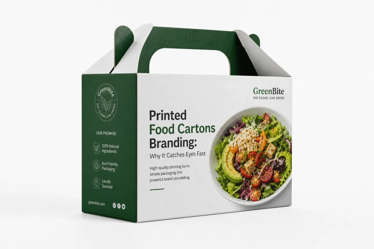
Printed food cartons branding works quickly because the carton sits right in the customer's decision path. On a cooler shelf, in a delivery order, or inside a retail display, the carton may get less than three seconds of attention before someone decides whether it feels trustworthy, premium, or easy to ignore. That short window is why strong printed food cartons branding leans on contrast, hierarchy, and one clear message at a time. A carton does not need to say everything. It needs to say the right thing first.
The biggest mistake I see is treating the carton like a blank canvas for more copy, more graphics, and more claims. That usually backfires. Too much information slows the eye down, and the package starts to feel crowded instead of confident. A carton with a well-placed logo, a readable product name, one or two benefit callouts, and a clean color system often performs better than a busier design with seven selling points. That is not a theory pulled from a style guide; it is how real shoppers scan packaging in motion. Printed food cartons branding succeeds when the structure of the message is easy to absorb from arm's length.
There is also a perception issue that many brands underestimate. Packaging signals how the operation runs. A carton that looks deliberate and clean suggests care in prep, filling, and fulfillment. A carton that looks generic can make even excellent food feel like an afterthought. From a buyer's point of view, printed food cartons branding helps the product earn a price point. It says the brand has thought through the details, from portion size to presentation, and that attention tends to build trust.
A carton is not a billboard. It is a handled surface, a shipping object, and often the last piece of brand communication before the food is eaten.
Freshness cues matter too. Bright whites, crisp type, and organized information can make a carton feel clean and current. Natural kraft boards send a different message: more earthy, handcrafted, and ingredient-forward. Neither is automatically better. The right choice depends on the brand identity and the customer it wants to reach. Printed food cartons branding should fit the food, the channel, and the price point, otherwise the package creates confusion instead of confidence.
Good packaging design starts earning its keep once the carton supports the full brand system instead of sitting off to the side as a disposable container. The package is there to frame the food in a way that supports brand consistency across shelves, photos, delivery, and repeat ordering. If a customer recognizes the package immediately the second time they see it, printed food cartons branding has already done part of the loyalty work.
How Printed Food Cartons Branding Works From Design to Carton
Printed food cartons branding begins long before ink hits board. It usually starts with a brand brief, a carton size, and a hard look at the product itself. Is the item refrigerated? Is it greasy? Does it need freezer performance or steam venting? Is the package going to sit on a counter, travel in a delivery bag, or move through a retail shelf? Those questions shape the dieline, the board selection, and the print approach. If the team skips that part, they end up designing for a graphic mockup instead of a real carton.
The workflow tends to follow a familiar path. A brief gets turned into a quote request. The supplier or converter builds or confirms the dieline, which maps every panel, fold, glue flap, and closure. Artwork is then placed onto the dieline and checked in prepress for bleed, safe zones, color mode, and trapping. That prepress step is where many printed food cartons branding projects either stay on schedule or lose a week correcting avoidable mistakes. A clean file with correct dimensions can move quickly. A file with low-resolution logos, missing dieline marks, or unconverted spot colors can slow everything down.
Printing method becomes the next major decision. Offset printing is a strong fit for high-detail artwork and tighter brand color control, especially on smoother boards. Flexographic printing is common for larger runs and can be cost-effective when the design is straightforward. Digital printing is often the most flexible choice for shorter runs, pilot launches, seasonal cartons, or fast-turn projects. The right method depends on quantity, color consistency, and how much artwork detail the project really needs. Printed food cartons branding is not improved by choosing the fanciest process; it is improved by choosing the process that fits the run.
Finishing matters more than many non-packaging people realize. Aqueous coating can add scuff resistance and reduce rub-off without making the carton feel plastic-heavy. Varnish can sharpen the look or alter sheen. Soft-touch lamination gives a premium hand feel, but it can also increase cost and affect recyclability depending on the structure. Printed food cartons branding should treat finish as part of function, not just decoration. A matte carton can read as artisanal. A gloss carton can feel brighter and more promotional. The choice changes customer perception in the hand, not just on screen.
The substrate itself changes how the graphics land. A bleached SBS or C1S board tends to hold bright color and fine type well. A kraft board softens the palette and creates a more natural look. Recycled content boards often have their own texture and brightness limitations, which is not a flaw; it is a design factor. If the brand wants vivid reds or fine gradients, the board and press setup need to support that goal. Printed food cartons branding works best when the substrate, ink, and finish are chosen as one system rather than as separate line items.
For brands that want to see how those choices play out in real projects, it helps to review packaging examples with similar print methods and structures. Industry resources at packaging.org can also help teams understand basic packaging terminology before they start quoting.
Key Factors That Affect Printed Food Cartons Branding
Carton structure drives a lot of the branding conversation. A tuck-end box gives you a different layout than a sleeve, a gable carton, or a folded food tray with a lock feature. Once the structure is fixed, the panel count determines where the logo, product name, ingredients, barcode, and regulatory text will live. Good printed food cartons branding respects the structural map instead of trying to force a flat-layout concept onto a three-dimensional package. Panels exist for a reason, and the most important information should land where it can be seen easily, not where it merely fits.
Board selection is another major factor. A smoother, bleached board usually supports sharper graphics and cleaner type. A natural kraft board gives a more rustic impression, but the color palette needs to account for the warmer base tone. If the brand tone leans toward premium and polished, a bright white stock with a controlled matte coating may be a better fit. If the brand wants handcrafted or organic cues, kraft can reinforce that message. Printed food cartons branding should always align the stock with the promise the food is making.
Color management can make or break printed food cartons branding. Reds, blues, deep blacks, and skin-tone-like food photography all behave differently depending on print method and substrate. A design that looks strong on a monitor may flatten out in production if the contrast is too low or if the ink coverage is too heavy. Packaging buyers should ask for color targets, press-approved proofs, or match standards where possible, especially if brand consistency matters across multiple SKUs. Even a small drift between cartons can weaken brand recognition over time.
Regulatory content also affects the layout. Depending on the product, there may be nutrition panels, ingredient statements, allergen notices, lot coding space, recyclable language, or barcode placement requirements. That copy has to stay readable without crushing the marketing message. Printed food cartons branding is at its best when the information hierarchy is planned early: brand name first, product descriptor second, selling points third, compliance content where it belongs. That order keeps the package useful rather than chaotic.
Sustainability belongs in the decision tree too, although it often gets oversold without enough detail. The practical questions matter more than the marketing claims. Is the board recyclable in the intended stream? Are the inks food-safe and appropriate for indirect food contact where required? Does the finish interfere with recovery or make the package harder to repulp? The answers vary by structure and local systems. The EPA's general packaging and materials guidance at epa.gov is a useful starting point when teams are thinking about disposal and recovery, but the final call should always match the actual material build.
For fiber sourcing, many brands also look at FSC certification and chain-of-custody requirements. If a carton line claims responsible sourcing, it should be backed by real documentation, not just a leaf icon on a panel. That kind of proof supports trust, and trust is the whole point of printed food cartons branding in the first place. If you are comparing carton specs, ask for board grade, coating type, print method, and source certification in the same quote so you can judge the full package, not just the artwork.
Printed Food Cartons Branding Process and Timeline
Most printed food cartons branding projects move faster when the team understands where the handoff points are. Creative approval is not the same thing as production approval. That distinction sounds small, but it saves a lot of headaches. A design can look finished on a screen while still missing the exact dimensions, copy blocks, or finish choices needed for a clean production run. Once the file is in prepress, changes get more expensive and more disruptive. The earlier the team locks the variables, the better the schedule behaves.
A realistic timeline usually starts with concept and estimating, then moves into dieline review, artwork setup, proofing, and sample approval. For a simple digital carton run, the total lead time may be around 7-12 business days after proof approval, depending on quantity and finishing. For a larger custom conversion job with offsets, coatings, or special structural elements, 12-15 business days is a common planning window, and more complex jobs can take longer. Printed food cartons branding rarely fails because the printer is slow; it usually slips because somebody sent a late copy change or delayed proof approval.
Here are the stages I would expect on a well-run project:
- Brand and product briefing, including carton size, fill weight, and shelf conditions
- Dieline confirmation and layout placement
- Prepress review for bleed, safe zones, barcodes, and color conversion
- Digital proof or contract proof approval
- Press setup, print run, cutting, folding, and gluing
- Inspection, packing, freight coordination, and delivery
Each of those steps can be simple or complicated. A carton with one-color flexo and no special coating can move cleanly. A carton with foil accents, custom windows, and multiple SKU variations will require more coordination. Printed food cartons branding should be scheduled based on the most complex element, not the easiest one. That is a lesson many launch teams learn the hard way.
Sampling is worth the effort. A flat proof can confirm text placement, but a physical sample shows how the carton opens, where the folds land, and whether the artwork survives actual handling. If the branding depends on perfect logo placement across a fold or a panel that wraps around a corner, a sample is often the only way to catch the issue before production. Printed food cartons branding benefits from this extra step because cardboard does not behave like a digital mockup.
There is also a launch logistics piece that gets overlooked. A strong carton design still fails if the team runs out of inventory too early or receives product before the cartons arrive. Good packaging planning includes a simple checklist: approved artwork, approved proof, confirmed quantity, pallet counts, freight timing, and a buffer for spoilage or rework. That is not glamorous work, but it keeps the branded cartons from becoming a bottleneck.
Printed Food Cartons Branding Costs and Pricing Basics
Pricing for printed food cartons branding starts with quantity. That is the first thing buyers need to understand. Setup costs exist whether you order 500 cartons or 50,000, so smaller runs usually carry a higher unit cost. Once the run gets larger, those setup costs spread out and the per-unit number drops. That is why a pilot program can feel expensive on paper even when the carton itself is simple. Printed food cartons branding is a volume game as much as a design game.
The biggest cost drivers are print method, carton size, board grade, number of colors, coatings, and structural complexity. Custom tooling, dies, cutting rules, and prepress work can also add meaningful cost, especially if the job is not a standard size. Specialty finishes like foil, spot gloss, embossing, or soft-touch lamination make a carton feel more premium, but they also add process steps and often more waste control. A buyer should always ask what is included in the quote. Sometimes the lowest quote leaves out a detail that gets added back later.
To give a practical planning picture, here is a rough comparison. These are broad market planning ranges, not fixed quotes, and they will vary by region, board choice, artwork coverage, and supplier capability.
| Print Method | Typical Run Fit | Relative Setup Cost | Planning Price Range per Unit | Best For |
|---|---|---|---|---|
| Digital | 500-5,000 units | Low to moderate | $0.22-$0.38 | Short runs, pilots, seasonal cartons, fast updates |
| Flexographic | 5,000-50,000+ units | Moderate | $0.14-$0.24 | Straightforward graphics, steady repeat orders, cost control |
| Offset | 3,000-25,000 units | Moderate to high | $0.16-$0.30 | Fine detail, strong color control, sharper brand presentation |
Those numbers can move in a hurry once you add coatings, windows, unusual die shapes, or heavy ink coverage. Full-bleed dark cartons generally cost more to print than lighter designs because they use more ink and demand tighter control. Likewise, multi-panel artwork with lots of tiny type can slow press setup and increase approval time. Printed food cartons branding is cheaper when the design is clean and structurally realistic.
One smart budgeting move is to request two or three quote scenarios. Ask for a natural board option, a bleached board option, and a premium-finish option if the supplier can support them. That side-by-side view helps a brand see what a small change really costs. In many cases, the most effective carton is not the most expensive one; it is the one where the brand message, substrate, and print process line up without extra ornament. That is where printed food cartons branding becomes efficient rather than merely attractive.
If you are comparing packaging programs across formats, keep an eye on companion items too. Sometimes a carton line looks weak because the labels, tags, or inserts are inconsistent. That is where coordinated packaging systems matter, and it is one reason brands often pair carton development with Custom Labels & Tags so the visual system stays unified.
Step-by-Step Planning for Printed Food Cartons Branding
The cleanest printed food cartons branding projects usually follow a simple planning sequence. Start by defining the business goal. Is the carton supposed to support a premium price, create consistency across a product family, or improve shelf visibility in a crowded case? The answer changes the design strategy immediately. A launch carton for a new frozen item will not need the same message hierarchy as a bakery box that customers already know well. The branding job is not abstract; it should serve a specific sales purpose.
Production facts should be gathered before the artwork gets too far along. I mean actual facts: carton dimensions, product weight, storage conditions, shipping method, carton closure style, and the copy that must appear on pack. If the food needs a lot code, allergen language, or a recycling note, that text should be planned early. Printed food cartons branding becomes much easier when everyone knows what must fit and what can be simplified. Designers hate surprises, and printers charge for them.
After that, build the layout around a strong information hierarchy. The brand name should be easy to spot. The product descriptor should be larger than the support copy. Secondary claims should not fight the logo for attention. If photography is used, it should either create appetite appeal or clearly explain the item, not just fill space. In my experience, the cartons that perform best often have one dominant focal point and a tight supporting structure around it. That approach strengthens brand recognition without making the package noisy.
Then review the artwork on the actual dieline. This is where the real packaging thinking happens. A nice front panel can be ruined by a fold line through a word, a barcode too close to glue, or a window panel that cuts off an important visual. Printed food cartons branding is built in two dimensions but lives in three. The mockup has to respect that fact. Once the layout is approved, a proof or sample should follow so the team can confirm color, folding behavior, and panel alignment before the full run starts.
Here is a practical checklist that keeps projects moving:
- Confirm the carton size and fill weight.
- Decide on board grade and finish early.
- Lock all required copy before proofing.
- Review the dieline with production in mind.
- Approve a physical proof if the run is important.
- Set inventory and delivery dates before launch.
That last step sounds basic, but it prevents a lot of stress. There is no point having beautiful cartons if the product launch slips because freight, fulfillment, or approval timing was not lined up. Printed food cartons branding is strongest when it is treated as part of the full go-to-market plan, not a last-minute design task.
Common Mistakes, Expert Tips, and Next Steps
One of the most common mistakes in printed food cartons branding is overcrowding the panels. Teams want to mention ingredients, origin, benefits, nutrition, sustainability, and brand story all on the front. The result is often weak contrast and too much visual noise. Another mistake is ignoring fold lines and glue areas. A logo that looks centered on a flat mockup may land awkwardly on the assembled carton. Printed food cartons branding needs to be checked on the folded structure, not just in a design file.
Color contrast matters more than people think. A beautiful palette can fail if the text is too light or the background is too busy. On refrigerated shelves, under warm lighting, or in photos taken by customers, low-contrast packaging quickly turns muddy. My best advice is simple: keep the main message legible at a quick glance and test it in real light. If the carton has to compete with condensation, glare, or a dim display case, the branding should be designed for that environment from the start.
There is also a tendency to design for the hero mockup and ignore real handling. Cartons get stacked. They rub against other cartons. They flex during loading. They get opened with one hand. A design that only looks good in a polished render is not enough. Ask for board and finish samples whenever the brand tone depends on texture. A matte carton can feel understated and premium, while a gloss finish can brighten colors and create a more retail-forward look. Printed food cartons branding becomes much more dependable once those samples are in hand.
Here are a few expert habits that consistently pay off:
- Keep one focal point dominant instead of splitting attention across too many claims.
- Use higher contrast than you think you need, especially for small text.
- Check cartons under the same lighting conditions where customers will see them.
- Match finish choice to the brand story, not just to personal taste.
- Ask for a companion label or tag system if the packaging family needs consistency.
For brands that want to go deeper, it helps to compare finished samples, production notes, and real shelf photos before locking the next order. That kind of review often reveals small changes that improve the package more than a full redesign would. If you want a broader reference point for structural and print decisions, fsc.org is a useful source for certification and fiber-sourcing context, especially when sustainability claims need to be grounded in documentation rather than slogans.
The most practical next move is not a big brand overhaul. It is a short materials check: write down the exact carton dimensions, list the copy that has to stay on pack, choose two board options, and ask for pricing that separates setup from unit cost. Then compare shelf impact, cost, and timeline side by side. If those three pieces line up, printed food cartons branding can do its real job, which is to build trust before the first bite and keep that trust strong enough to bring the customer back.
How does printed food cartons branding differ from simple label design?
A carton carries more than one face of information, so the branding has to work across multiple panels rather than one flat label area. The structure, fold lines, and finish all affect visibility, durability, and how premium the package feels in the customer's hand. Carton branding also has to balance marketing copy with regulatory content, which makes hierarchy and spacing much more important.
What affects the price of printed food cartons branding the most?
Order quantity, print method, and carton size are usually the biggest drivers because they affect setup and unit cost. Special coatings, extra colors, custom tooling, and premium board choices can quickly move the price higher. Artwork that requires heavy coverage or special effects may also increase press time and overall packaging cost.
How long does a printed food cartons branding project usually take?
Simple digital runs can move faster, while larger custom jobs with tooling, special finishes, or approval cycles take longer. The schedule depends on how quickly the artwork is finalized, how many proof rounds are needed, and whether samples are required. Late copy changes are one of the easiest ways to add days or weeks, so final approval should happen before production is scheduled.
What carton materials work best for food packaging branding?
The best material depends on product type, handling conditions, and the look the brand wants to project. Smoother boards usually support sharper graphics, while natural or kraft-style boards create a more earthy, handmade feel. Food-safe inks, coatings, and board performance should all be considered together so the package looks good and still functions well.
How can I make printed food cartons branding look more premium without overspending?
Use a strong layout hierarchy, high-contrast color, and a clean logo placement before adding expensive specialty effects. Choose one or two high-impact finishes instead of layering every possible enhancement onto the carton. Ask for sample boards and compare options early, because the right substrate and print method can improve the look without unnecessary complexity.


