Printed postage boxes sit in a strange middle ground. They are expected to survive conveyors, corners, drops, and impatient warehouse handling, yet they also need to carry a brand story in a space that is often ignored until the package lands at the door. That dual job is why the best cartons are rarely the flashiest ones. They are the ones that move through fulfillment without drama and still look considered when the tape is cut.
For many teams, the real question is not whether to print the box. It is how much print the box can support without becoming expensive, fragile, or hard to pack. A one-color kraft mailer with a clean logo can outperform a heavy, overdesigned carton if the shipment is small, the margins are tight, and the brand wants a restrained presentation. In other cases, a stronger corrugated structure with more coverage is the correct answer because the product needs protection first and branding second.
That is why packaging decisions should start with the product, not the mockup. Weight, fragility, transit distance, and pack-out speed tell you more than a design board ever will. Once those are clear, the box style, board grade, and print method can be matched to the job instead of forcing the job to fit a convenient format.
If you need to compare broader packaging formats before committing to a carton structure, it helps to review Custom Packaging Products alongside the shipping spec. A mailer that looks affordable on paper can become costly once inserts, freight, and damage rates are added back in.
Practical rule: if the carton does not protect the product in plain form, print will not fix it. The structure has to earn the decoration.
What printed postage boxes are and why they matter
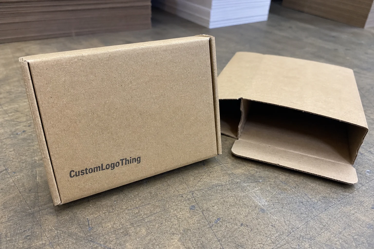
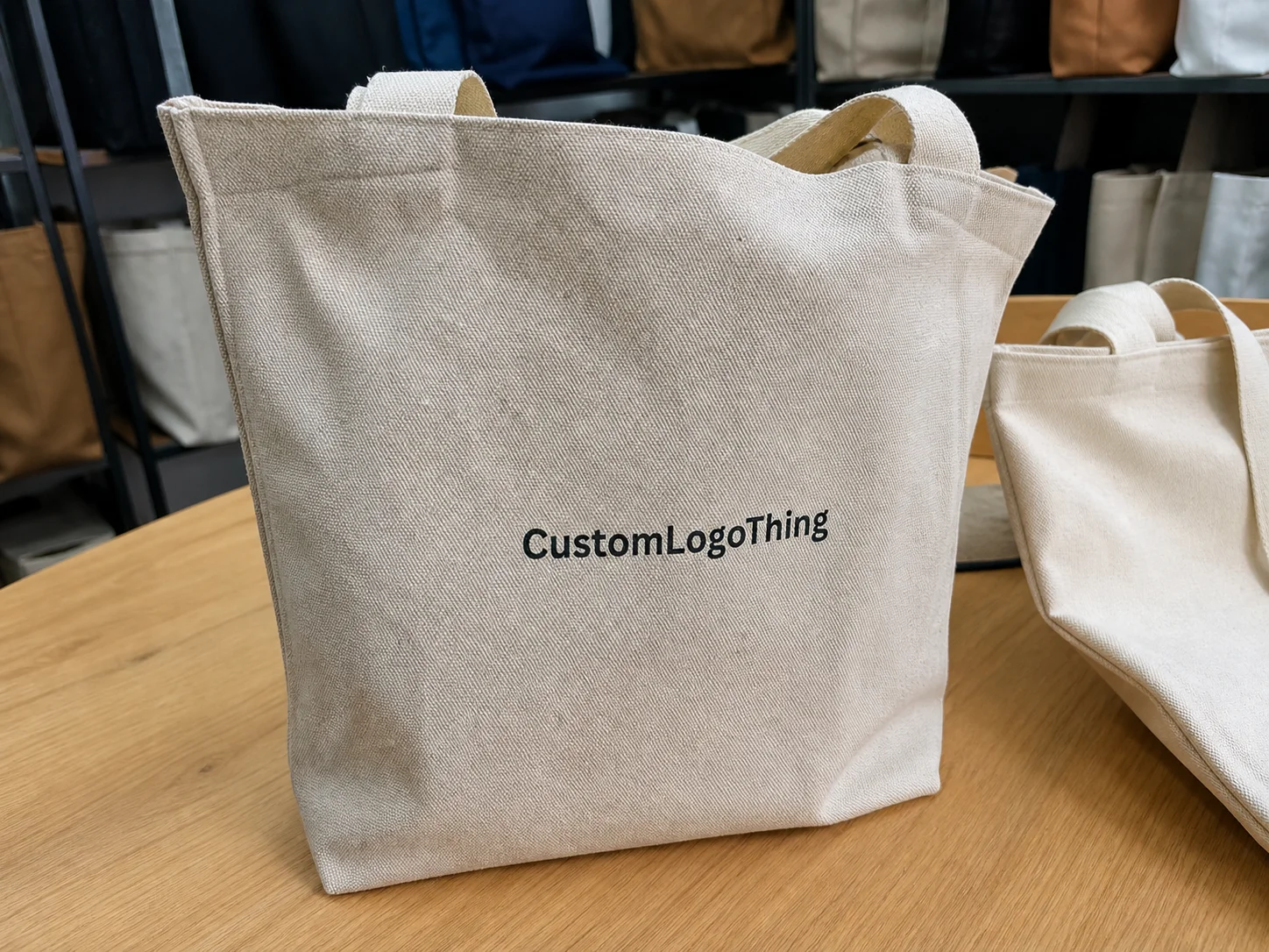
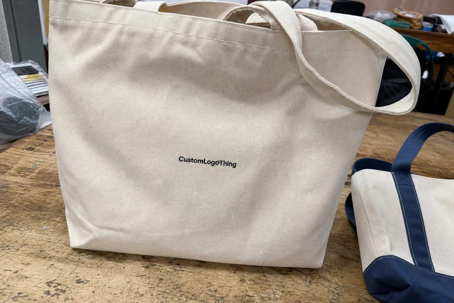
Printed postage boxes are shipping cartons made from corrugated board or paperboard and customized with branding, handling instructions, product messaging, or shipping identifiers. They are used by e-commerce brands, subscription programs, retail replenishment teams, and direct-to-consumer operations that want the outer package to do more than act as a shell.
The value is practical before it is visual. A printed return instruction can reduce customer service friction. A barcode or handling note can make internal sorting easier. A clean logo on the top panel can create recognition without adding labels or extra inserts. On a busy fulfillment line, every piece of information that can live on the carton instead of on a separate sticker reduces one more decision point.
There is also a cost angle that gets overlooked. A box that prints well and packs quickly can reduce labor more effectively than a cheaper carton that slows down the line. If the design is simple enough to fit standard manufacturing steps, it can also hold unit cost lower than a highly decorated alternative. This is why restraint often pays off. A box that is easy to print is usually easier to produce consistently.
Corrugated mailers deserve special attention here. Their structure is strong enough for transit, but the board surface can vary more than buyers expect. Smooth liner, flute direction, score placement, and glue seam location all affect how the artwork lands. A logo placed too close to a fold can disappear into the crease after assembly. Small type can soften if the liner is rough or the ink coverage is too heavy.
That is the point where good packaging becomes a production decision instead of a design decision. The box has to look right, but it also has to survive the line, the pallet, the truck, and the doorstep. Those stages do not forgive guesswork.
How the printing process works from dieline to finished box
The process starts with the dieline, which is the structural map of the carton. It defines dimensions, fold lines, tuck points, glue areas, and bleed zones. If the dieline is wrong, everything built on top of it will be wrong too. Artwork should not be created until the box style has been confirmed, because a layout that looks correct on a flat file can shift once the carton is folded and glued.
From there, the print method is selected. Flexographic printing is common for longer runs and repeat programs because it is efficient once the setup is complete. Digital printing is often better for shorter runs, quick proof cycles, or orders with variable artwork. Litho-lamination is used when the visual finish needs to be sharper and more premium, but it adds steps and cost. Each method has a different sweet spot. The wrong one can make a carton look overbuilt or overpriced very quickly.
Board choice matters just as much as print method. E-flute is often chosen for lighter mailers because it gives a smoother face and good print clarity. B-flute and C-flute can offer more structure, but they may soften fine detail more than buyers expect. If the artwork depends on crisp typography or strong color blocks, the substrate needs to be chosen with the graphic in mind, not after it.
Proofing is where many problems are caught or missed. A digital proof can confirm color placement and content, but it will not always reveal how the finished box behaves under pressure. A white dummy, hard proof, or sample run is more revealing because it shows closure pressure, panel alignment, fit, and whether the printed areas sit where the carton actually folds. That matters if the logo crosses a score line or the carton needs to close tightly without buckling.
Production quality checks should cover more than appearance. Good suppliers test for ink rub, carton squareness, seam adhesion, and dimensional stability. For shipping boxes, drop behavior and compression resistance matter more than a polished render. If the packaging will be stacked, palletized, or routed through rough carrier networks, it should be judged by that reality instead of by the mockup alone.
Standards from organizations such as ISTA are useful reference points for teams that want to think beyond visual approval. They help frame drop, vibration, and compression as part of the design brief, not as an afterthought. That perspective is usually what separates packaging that looks good from packaging that performs well.
Key factors that affect cost and unit price
The biggest cost drivers are straightforward: box size, board grade, print coverage, number of colors, finishing steps, and order quantity. Larger cartons use more fiber and often more freight space. Heavier print coverage means more ink and more risk of visible variation. Specialty coatings, foil, and spot UV add setup complexity and can change the economics quickly.
Quantity has an outsized effect because setup cost is spread across the run. That is why 500 boxes can look expensive on a per-unit basis while 5,000 boxes move into a much better price band. The curve is not linear. It usually drops in steps, and those steps can be meaningful. Buyers who forecast with discipline tend to get better pricing than buyers who place small, repeated emergency orders.
Smaller boxes are not automatically cheaper. A compact carton for glass, electronics, or fragile accessories may need stronger board, tighter tolerances, or custom inserts. That means more tooling and more production control than a larger carton carrying soft goods. Product risk often matters more than visible size.
Freight and storage should be part of the cost discussion from the start. A carton that ships flat but occupies significant warehouse space can become a burden if it arrives too early or in too large a quantity. If the warehouse has limited receiving hours or tight pallet capacity, the landed cost can rise even when the unit price looks good. This is where packaging buyers get caught: the lowest quote is not always the lowest total cost.
| Print Method | Typical Run Range | Typical Unit Cost | Best Fit |
|---|---|---|---|
| Digital print | 500 to 2,000 units | $0.70 to $1.60 | Short runs, fast turns, variable graphics |
| Flexographic print | 2,500 to 20,000 units | $0.18 to $0.55 | Longer runs, repeat programs, simple brand graphics |
| Litho-lam / premium finish | 3,000 units and up | $0.55 to $1.20 | Higher-end presentation, retail-ready impact |
Those ranges are directional, not guarantees. A low-coverage two-color shipper can price near the bottom of the range, while a heavy-coverage mailer with inserts and special finishing can move well above it. The more useful question is not “What is the unit price?” It is “What does the finished box reduce?” Fewer damages, fewer mispacks, and fewer touchpoints can justify a modest increase faster than a neat spreadsheet suggests.
Printed postage boxes process and timeline: what to expect
A normal project moves through quote review, structural approval, artwork prep, proofing, production, finishing, and shipping. If the box spec is final and the files are clean, digital jobs can often move in about 7 to 12 business days after approval. Flexographic and litho-lam orders usually take longer because they require more setup and more time in line, with many jobs landing closer to 12 to 20 business days.
That timeline changes quickly if the brief is incomplete. Missing dimensions, unclear print placement, or a late change to the closure style can send the project back to the beginning of the approval chain. Even a small revision can matter if it affects the die line or shifts the artwork away from a fold. Buyers who treat structural approval and artwork approval as separate checkpoints usually avoid rework.
Seasonality matters too. Holiday freight congestion, promotional launches, and retailer deadlines can shorten the margin for error. A project that looks comfortable in March can feel tight in November if the warehouse wants cartons earlier than expected or the product team is still making copy changes. Build buffer into the schedule if the launch date is fixed. Do not assume the calendar will stay polite.
Communication has to be exact. The production team needs quantity, delivery address, receiving hours, pallet requirements, and any labeling instructions before release. If those details are incomplete, the box can still be made correctly and still arrive inconveniently. That is a logistics failure, not a print failure, but the buyer ends up paying for it either way.
Step-by-step guide to ordering boxes that print well and ship cleanly
Start with the product. Measure internal dimensions, weigh the item, and note whether it is fragile, stackable, crush-sensitive, or likely to need cushioning. A lightweight apparel order and a ceramic accessory may both ship in cartons, but they are not solved by the same box.
Choose the structure next. For small e-commerce orders, a mailer with an easy tuck can keep pack-out fast and presentation tidy. For heavier goods or long carrier routes, a stronger corrugated style is usually the safer choice. Closure style matters too. If the carton opens too easily, the package may look good on a shelf and fail in transit.
Then design for print, not just for appearance. Keep critical copy away from score lines and seams. Use enough contrast to survive handling and scanning. If the package includes labels or inserts, align those components so the box, label, and enclosed materials work together. A carton that, label that, and packing slip that all speak in different visual tones tends to look more improvised than premium.
Request a sample, white dummy, or hard proof before committing to volume. That is the fastest way to test fit, check closure pressure, and see whether the print lands where it should once the box is assembled. If variable shipping information needs to sit outside the carton, pair the order with Custom Labels & Tags so the box can stay visually clean while the operational details still get where they need to go.
Only approve the final spec once quantity, lead time, destination, and material choice are aligned. A clean approval trail reduces mistakes later. It also stops the familiar problem where the packaging is correct but the shipment is not, because one field was assumed instead of verified.
Common mistakes buyers make with custom shipping packaging
One of the most common errors is designing for a flat mockup instead of the assembled carton. A layout can look precise on screen and still fail once the box is folded. Logos may cross a crease. Text may land too close to a flap. Glue areas may be ignored entirely. The render is a preview. The actual box is what ships.
Another mistake is under-specifying board strength. If the carton is going through a rough carrier network, stacked in a warehouse, or used for a heavier product, compression strength matters. A box that bows or crushes creates returns, replacements, and customer complaints that are far more expensive than the upgrade that would have prevented them.
Buyers also overprint more often than they need to. A full-coverage design can look impressive in a pitch deck and underperform on a production line. Strategic print placement usually gives a better result: a strong top panel, a clear brand mark, and maybe a message inside the flap. That approach lowers risk and often lowers cost too.
Testing is skipped more often than it should be. Ink rub, tape adhesion, scuff resistance, and edge wear all matter, especially on dark cartons or heavy-coverage artwork. A box that looks premium during approval can show scratches quickly once it rides next to other parcels. Finishes should be chosen for the shipment, not for the PDF.
There is also a logistics mistake that keeps repeating: underestimating warehouse constraints. If a facility cannot receive a full pallet load at once, the packaging order needs to reflect that before production starts. Good packaging work includes practical receiving details, not just structure and art.
Expert tips for better print quality, efficiency, and unboxing impact
Think in systems. The carton, label, insert, and packing slip should work together instead of competing for attention. If the box already shows the handling cue, there is no reason to repeat it in three other places. If the product needs cushioning, place the cushioning where it helps most and leave the rest of the package to do its job quietly.
Keep high-contrast artwork away from edges, seams, and closure points. Those are the first places to show wear. Dark colors, heavy coverage, and soft coatings can look strong in a proof but mark up quickly in transit if the finish is wrong. Matte, satin, and gloss all behave differently under warehouse lighting and at the doorstep. Choose with the use case in mind.
For repeat programs, consistency matters more than a perfect first run. Small shifts in color density, score accuracy, or panel placement can become visible across multiple production cycles. A stable spec sheet helps more than a long creative brief. Packaging teams that document the things that matter tend to get fewer surprises on reorders.
Sustainability claims should be treated carefully. FSC-certified board can support responsible sourcing narratives if the chain of custody is documented correctly; see FSC for the framework. Recycled content can be useful too, but only if the board still meets strength and print requirements. A green claim that weakens the box is not a good trade.
Used well, printed postage boxes can lower confusion, improve doorstep presentation, and make fulfillment feel deliberate without pushing the budget into vanity territory. The best version is rarely the loudest. It is the one that survives shipping, packs quickly, and still carries enough identity to feel like part of the brand rather than an afterthought.
Next steps before requesting a quote or sample
Before asking for pricing, gather the internal dimensions, product weight, quantity target, print colors, artwork files, and delivery window. If any of those inputs are uncertain, say so early. Quotes built on vague assumptions tend to become corrections later, and corrections are slower and more expensive than a careful brief.
Compare a few options side by side. A different board grade, closure style, or print method can change the result in ways that are not obvious from unit price alone. The best choice usually balances strength, print area, pack-out speed, and landed cost. That balance is what keeps the box useful after launch instead of merely impressive in approval.
The most reliable order of operations is simple: confirm the structure, request pricing, review the proof, approve the sample, then schedule production. That sequence keeps the process clean and reduces rework. Before release, verify the shipping address and receiving requirements one last time. One missed detail can turn an otherwise solid carton into an avoidable receiving problem.
FAQ
What is the difference between printed postage boxes and plain mailer boxes?
Printed versions add branding, handling cues, or product messaging while still functioning as a shipping container. Plain mailers protect the contents, but printed boxes do more work on presentation and can reduce the need for extra labels.
How do I know which box material is best for printed postage boxes?
Start with product weight, fragility, and shipping distance. Corrugated board is common for transit strength, while lighter paperboard can suit smaller or lower-risk items. The right choice depends on the package’s job, not its appearance.
What affects the cost of custom printed postage boxes the most?
Quantity, box size, board grade, print coverage, and finishing details usually drive the price most. Setup charges, freight, and storage can also change the total landed cost, especially on smaller runs.
How long does it usually take to produce printed postage boxes?
Simple digital jobs can move in about 7 to 12 business days after approval if files are ready. Flexographic and litho-lam runs usually take longer because of setup, proofing, and production time, often closer to 12 to 20 business days.
Can printed postage boxes still be strong enough for shipping?
Yes, if the board grade, structure, and closure method are matched to the product and transit conditions. Good print should work with the carton, not weaken it.